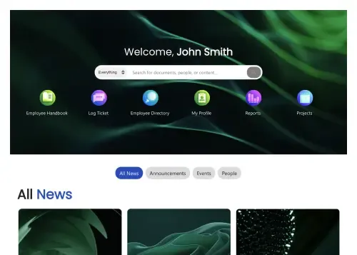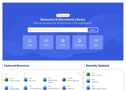
Documents Resources
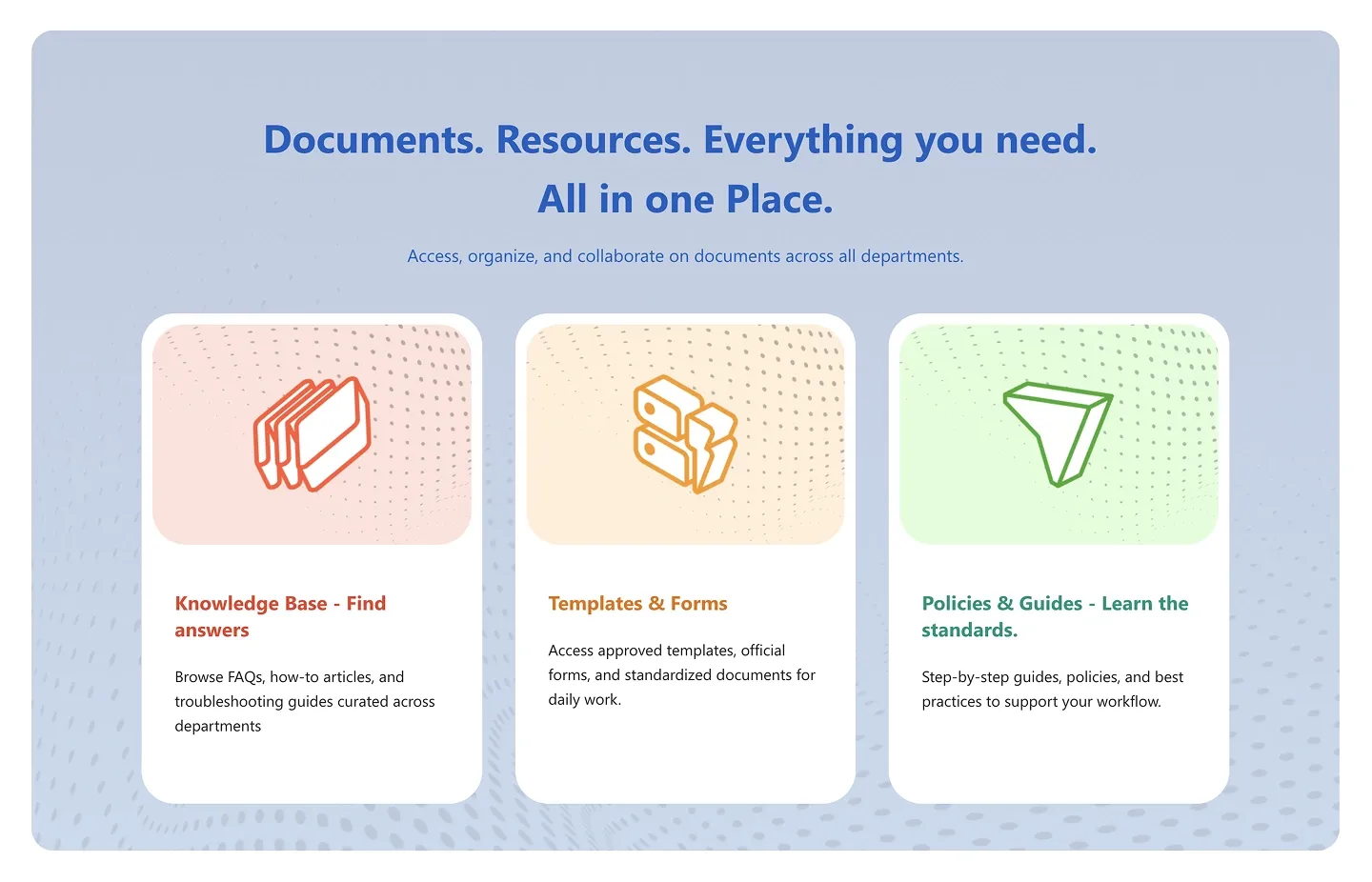
Headline and tagline above three illustrated cards, each with a title, description, and link. It's built for pointing to your knowledge base, templates, or policies.
Headline and tagline above three illustrated cards, each with a title, description, and link. It's built for pointing to your knowledge base, templates, or policies.
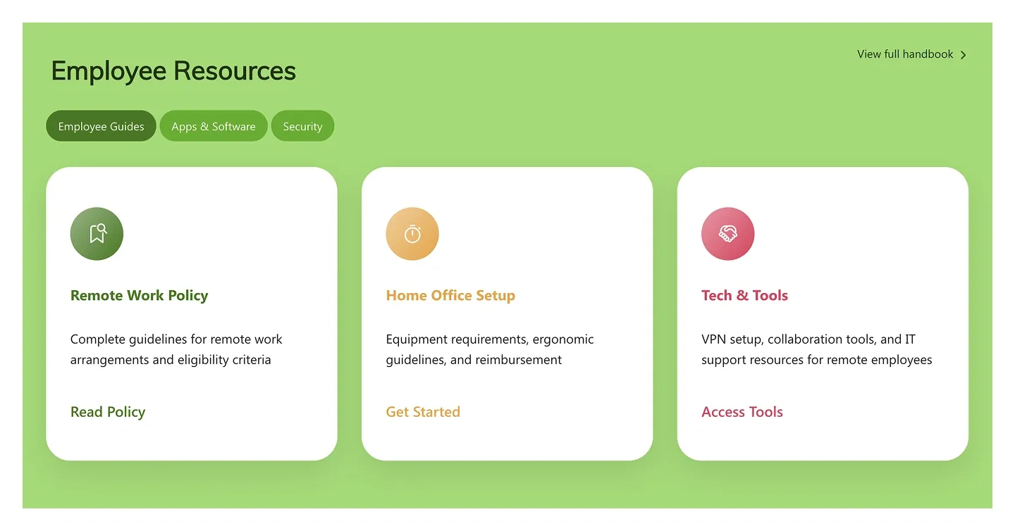
Resource panel with filter chips and three cards, each with an icon, title, description, and text link. The cards are filterable by category.
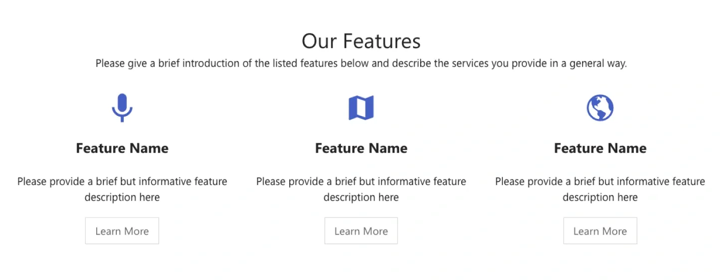
Classic three-column features row with an icon, feature name, short description, and a button per column. It's built for services or product highlights.
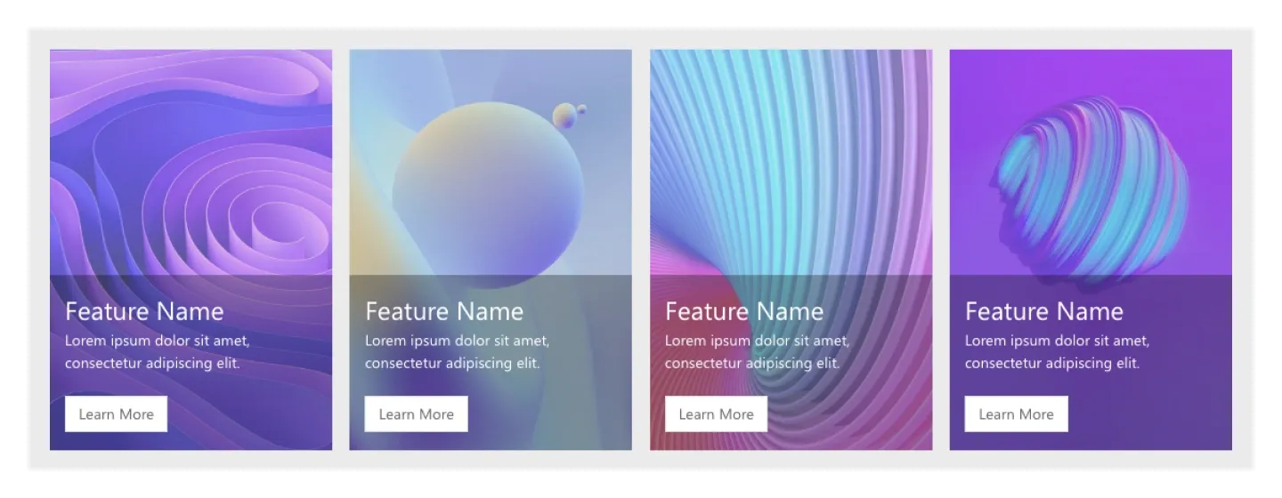
Four tall image cards with overlaid feature name, description, and button. It's an image-led alternative to icon features.
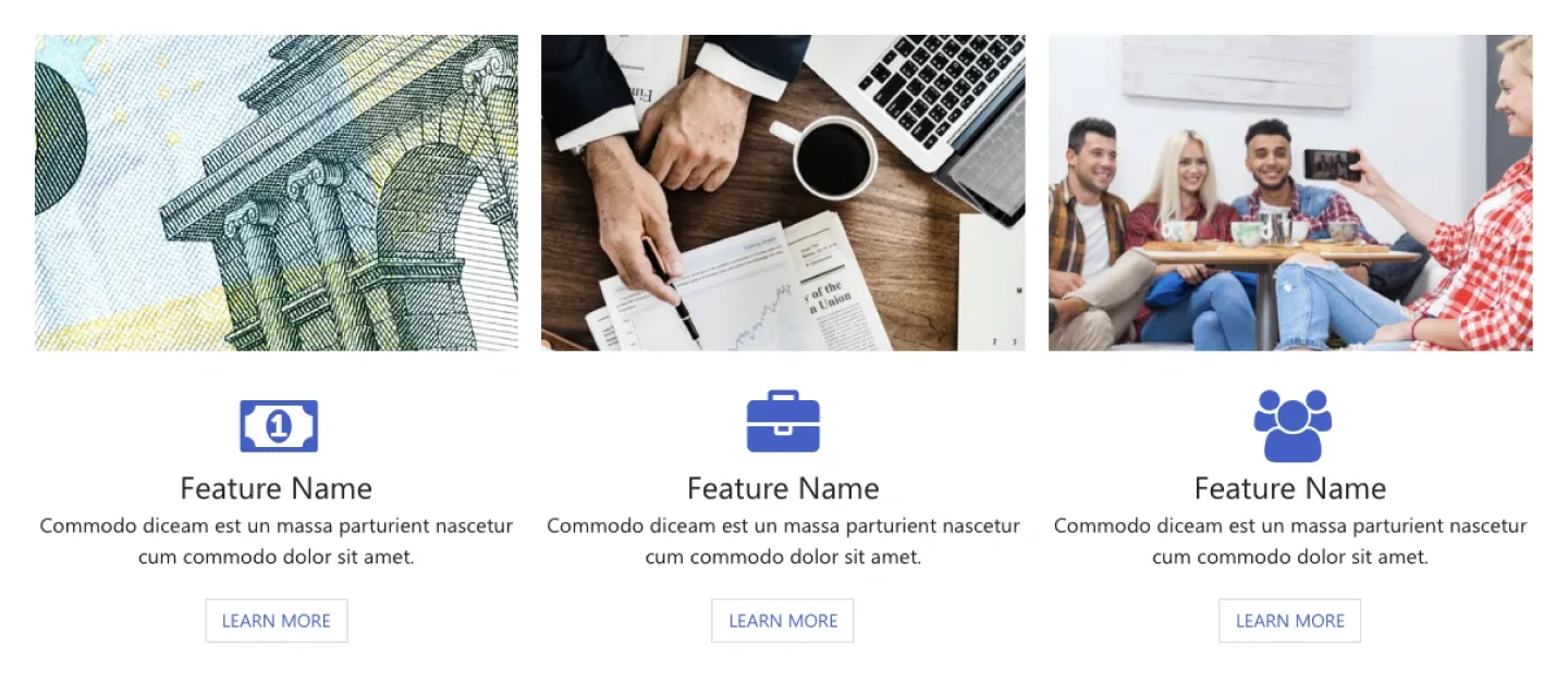
Three features with an image on top, then icon, name, description, and button. It combines photography with icon labeling.
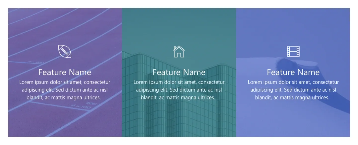
Three edge-to-edge panels, each with a large icon, feature name, and description centered. It works as a bold, text-light features band.
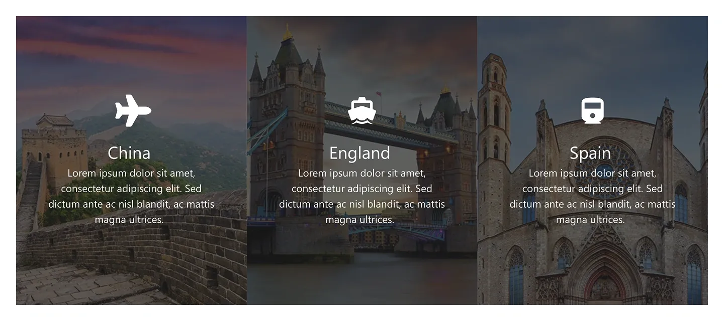
Three full-height image panels with overlay, icon, title, and description. They're suited to locations, offices, or program highlights.
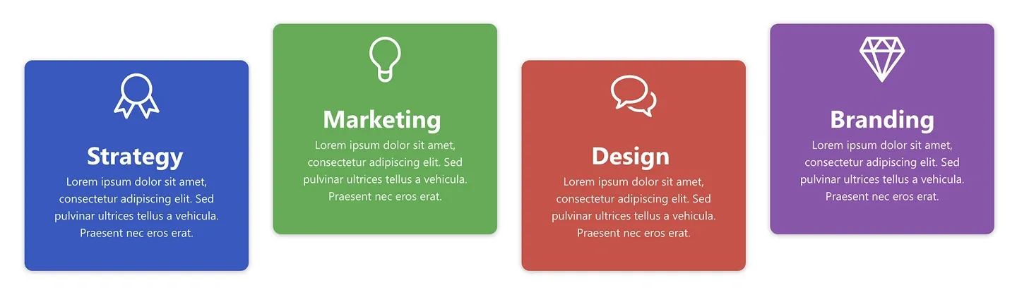
Four solid-color cards, each with an icon, title, and short description. Theme colors map directly to your brand palette.
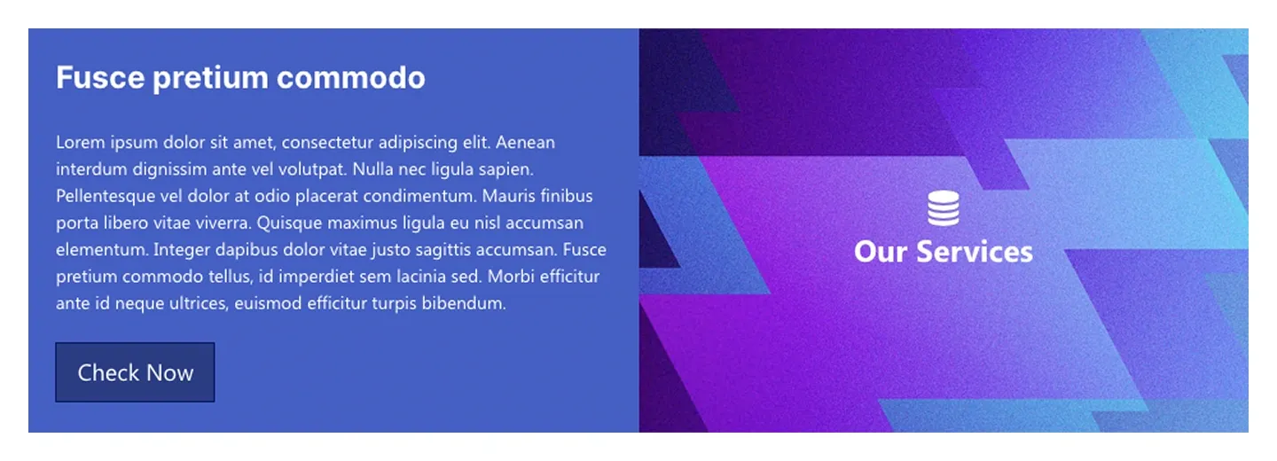
Split service block: a headline, paragraph, and button on one side, and a graphic panel with icon and title on the other.
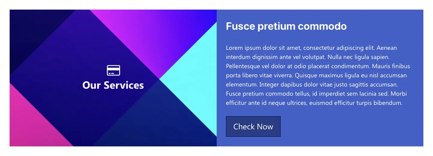
Mirror of Service Block 1: graphic panel with icon and title first, then headline, paragraph, and button.
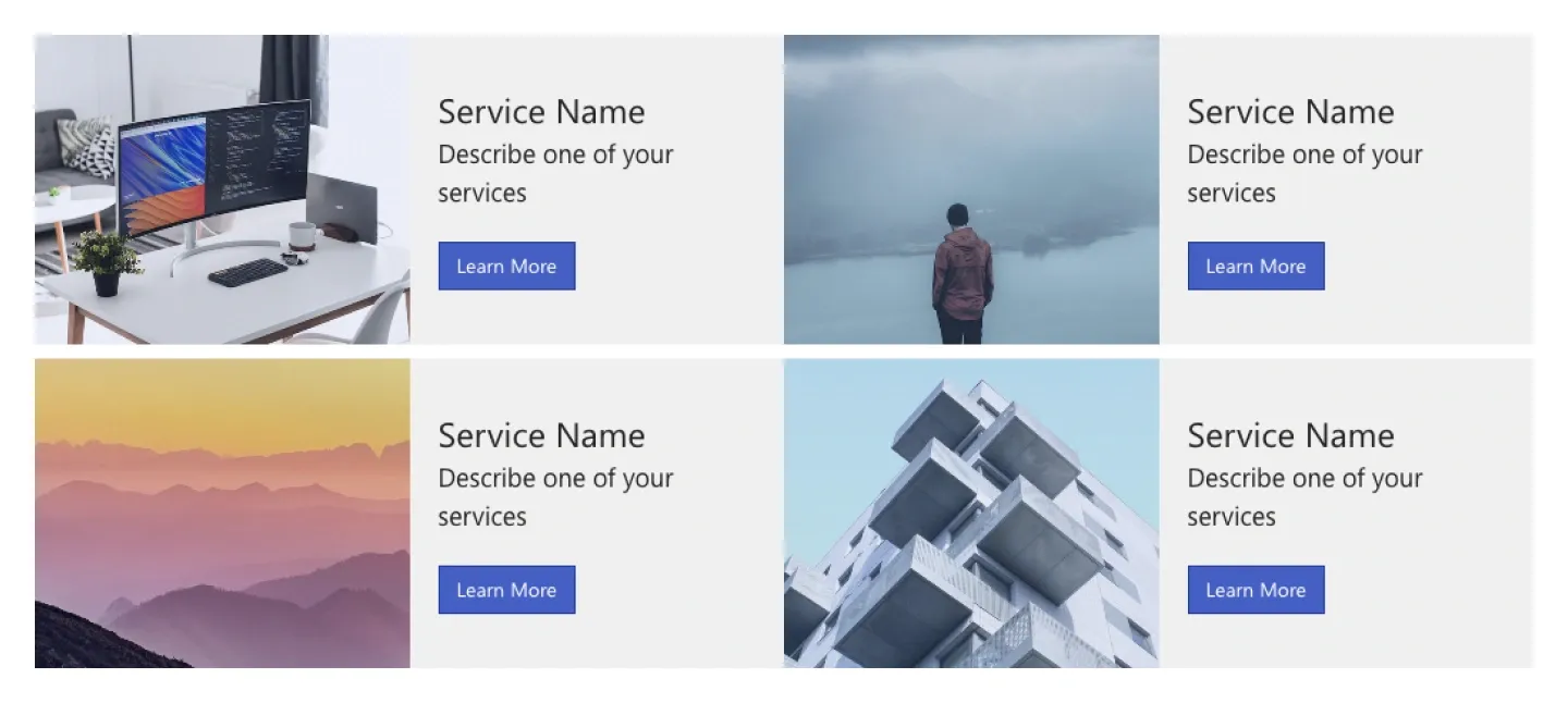
Two-by-two grid of service cards, each pairing an image with a service name, one-line description, and button.
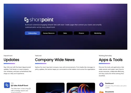
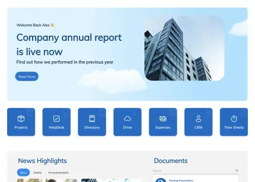
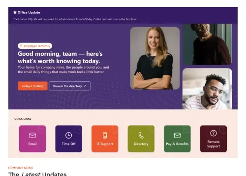
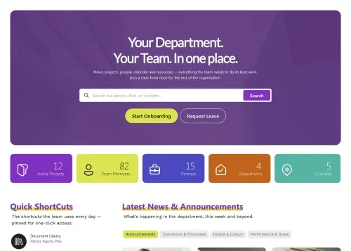
A feature section is a pre-built block of SharePoint tiles, each with an icon or image, a title, a short description and a link, that presents services, resources or tools in a grid people can scan. SharePoint's Quick links web part offers basic tile layouts in your site theme. ShortPoint feature kits and service blocks add image-topped cards, full-bleed panels, filter chips and text-and-graphic service blocks, using icons from the built-in library or your own, in layouts that adapt from phone to widescreen. Use them for employee resources, IT services or any "what can I do here" moment. Compare every design in the carousel, from a simple three-column row of icon features to tall image panels and two-by-two service grids, and preview each one live.
Use ShortPoint to add branded icon tiles to any SharePoint page: choose a feature kit, pick icons from the library or upload your own, link each tile, and let Theme Builder keep colors and spacing consistent across the intranet.
Describe the section you need and let AI Designer write and build the block.
Swap layouts, resize the block and edit every piece of content visually.
Apply your brand colors, typography and corner radius in one place.
Pull headlines, dates and items from SharePoint lists so the block updates itself.
Reuse the same section across every department page and site.
Proper labels, contrast and keyboard support for every reader.
Link straight to Microsoft Forms, Planner, Teams or any external tool.
Pre-styled variants that match the rest of your page.
Built from standard ShortPoint elements you can reuse anywhere else.
Everything stays readable and tappable when the block stacks on mobile.
Add branded SharePoint icon tiles and service blocks to a page in minutes. No coding required.
Start free trial & add ShortPoint to your site : Click "Start a Trial" and get access to ShortPoint instantly. No credit card needed. Sign in with your Microsoft 365 credentials to activate your trial instantly, or download the package manually and activate it from there.
Insert a Section : Edit your SharePoint page, insert the ShortPoint web part, and pick any feature section (Features Kit 1, Service Block 2, Employee Resources) from the Sections tab of the Templates Library. It drops into your page as a ready-made block you can move, duplicate, or restyle.
Customize & Publish : Replace the placeholder content with your own, connect your SharePoint data sources, apply your company branding with Theme Builder, and publish the page for immediate use.
SharePoint tiles present a set of links or services as icon cards, so people can scan and click quickly. They work well for resources, tools, and department entry points on any intranet page.
The icons come from ShortPoint's icon library, and you can also upload your own SVG or PNG icons to match your brand.
Yes, you can change the number of columns and the tile size. Adjust columns, spacing, and tile size directly in the section, and layouts adapt automatically on phones and tablets.
Yes, each tile can link to any URL, whether it's a SharePoint page, a document in a library, or an external app your team uses.
Yes, feature sections work with both Microsoft 365 and on-premises SharePoint. That includes SharePoint Online in Microsoft 365, as well as SharePoint Server Subscription Edition, 2019, 2016, and 2013.
Yes, you can Copy & Paste a tile grid onto any page or site. Edit the icons and links locally where needed, so each site gets the same layout with its own destinations.