
ShortPoint Academy
This course is made specifically for beginners who want to learn everything about ShortPoint in just a few minutes and finish designing an intranet page fast.


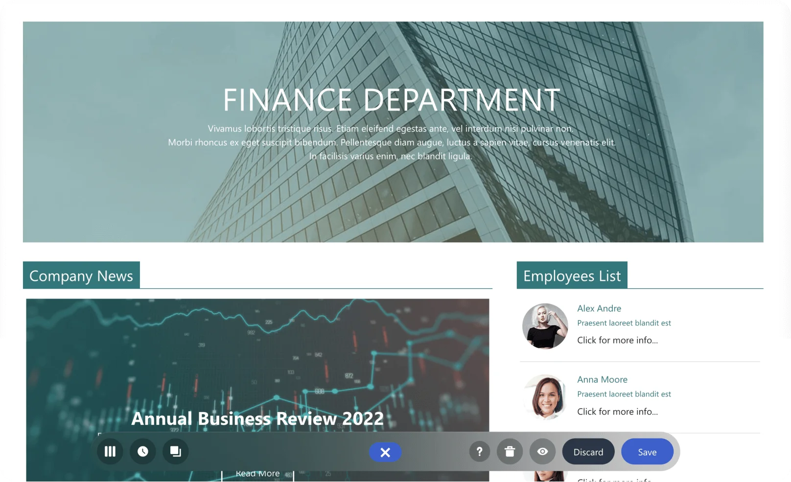
Getting started with ShortPoint
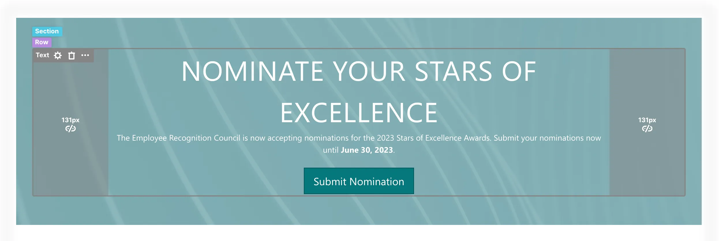
Start using ShortPoint
1:51
Building the page
Use ShortPoint templates
3:48
Customize page layouts
3:29
Add and edit a Design Element
3:29
Explore Grid Mode
3:53
Connecting to content
Connect to SharePoint news
3:39
Connect to an Outlook calendar
3:24
Customizing site themes
Apply branding and site customizations
4:32
Making your intranet accessible
Enable ShortPoint Accessibility
5:52
Continuing to explore ShortPoint
Access ShortPoint resources and support
4:43
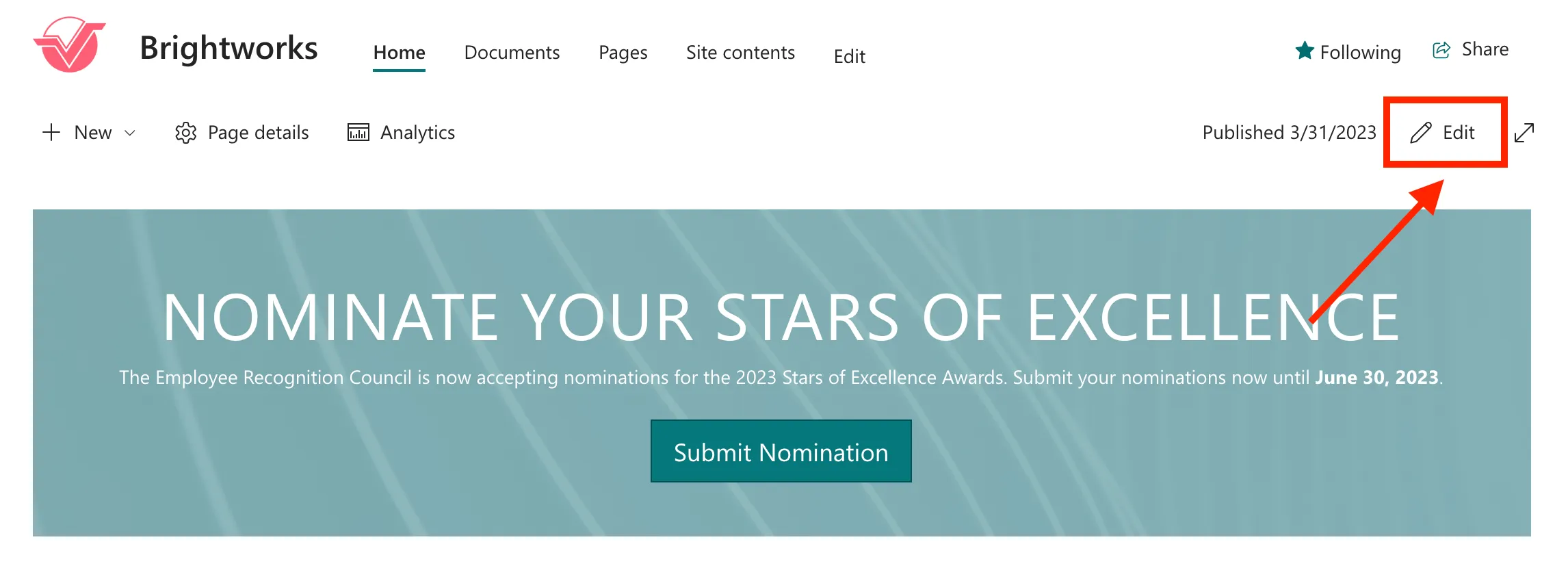
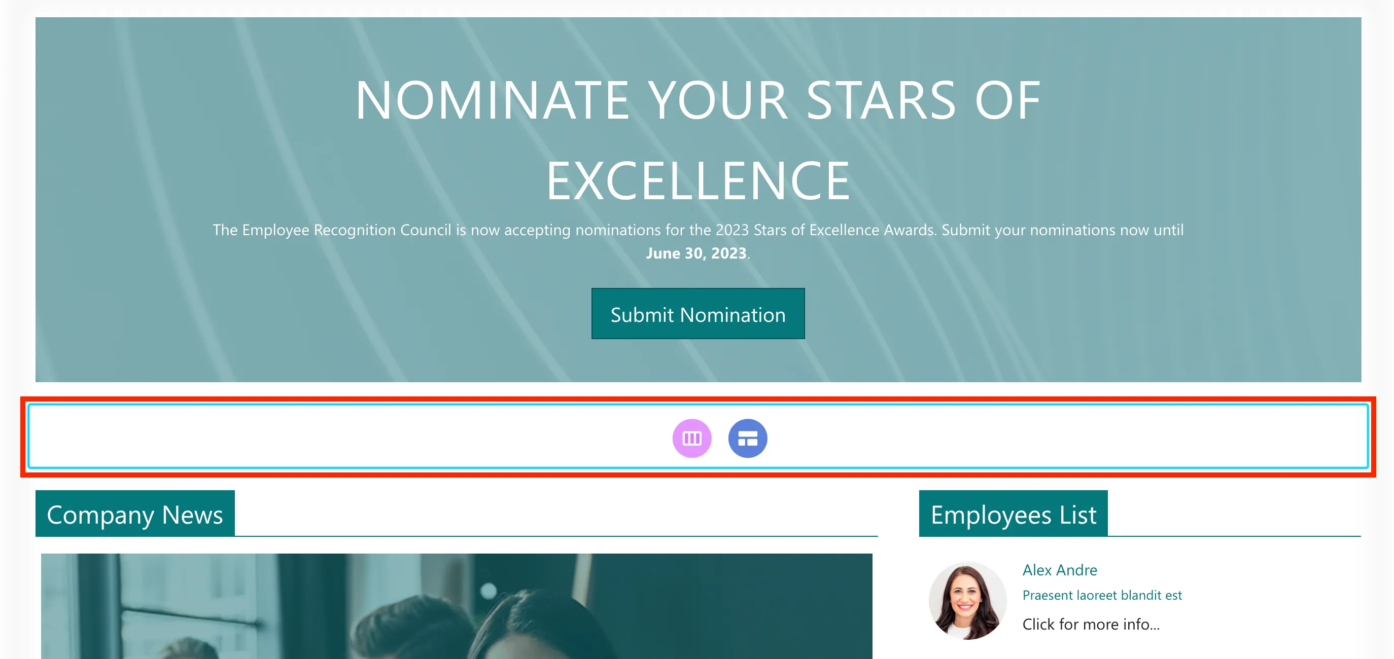
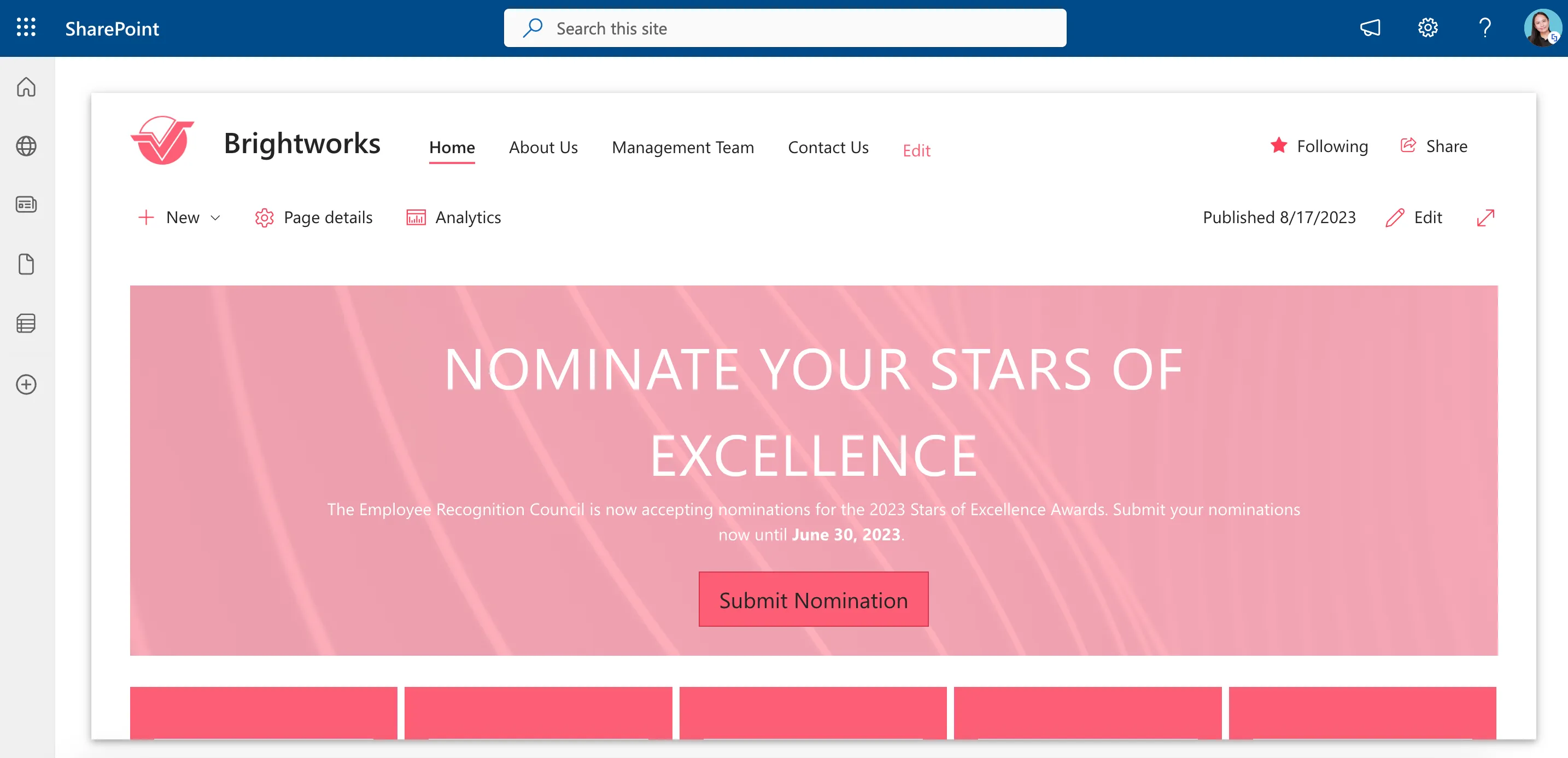
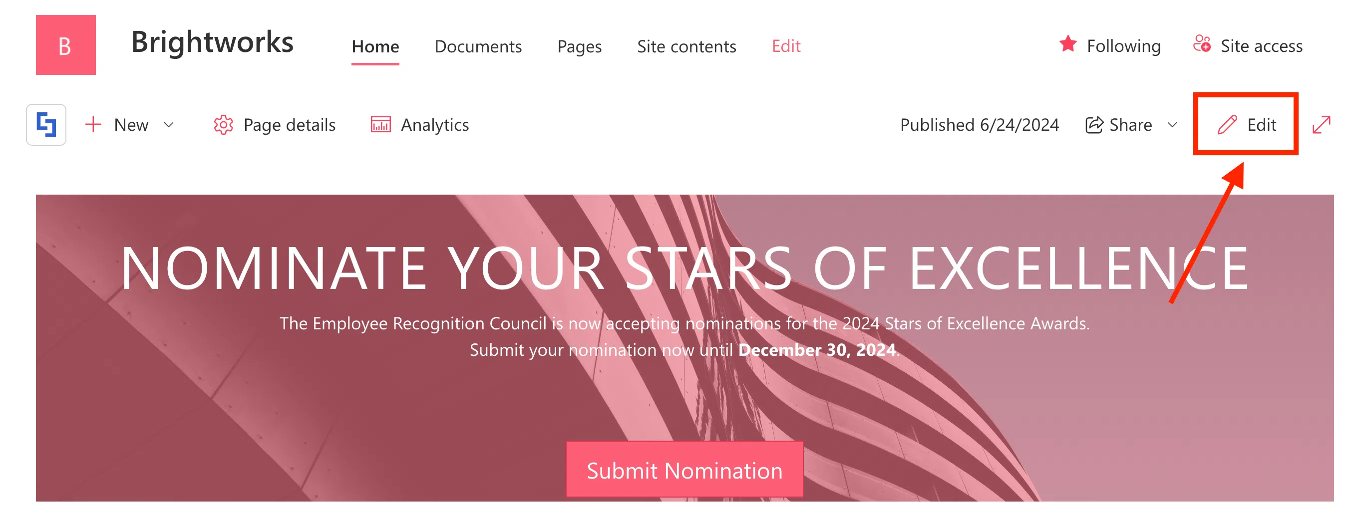
Start using ShortPoint
In this tutorial, you’ll learn how to start using ShortPoint including how to insert a ShortPoint web part and how to use the designing options you will see once you enter ShortPoint Page Builder.
Working with a SharePoint page
First, you’ll need to navigate to your SharePoint site. For this intranet project, we will be using a SharePoint Communication Site, but you can also use a Team Site.
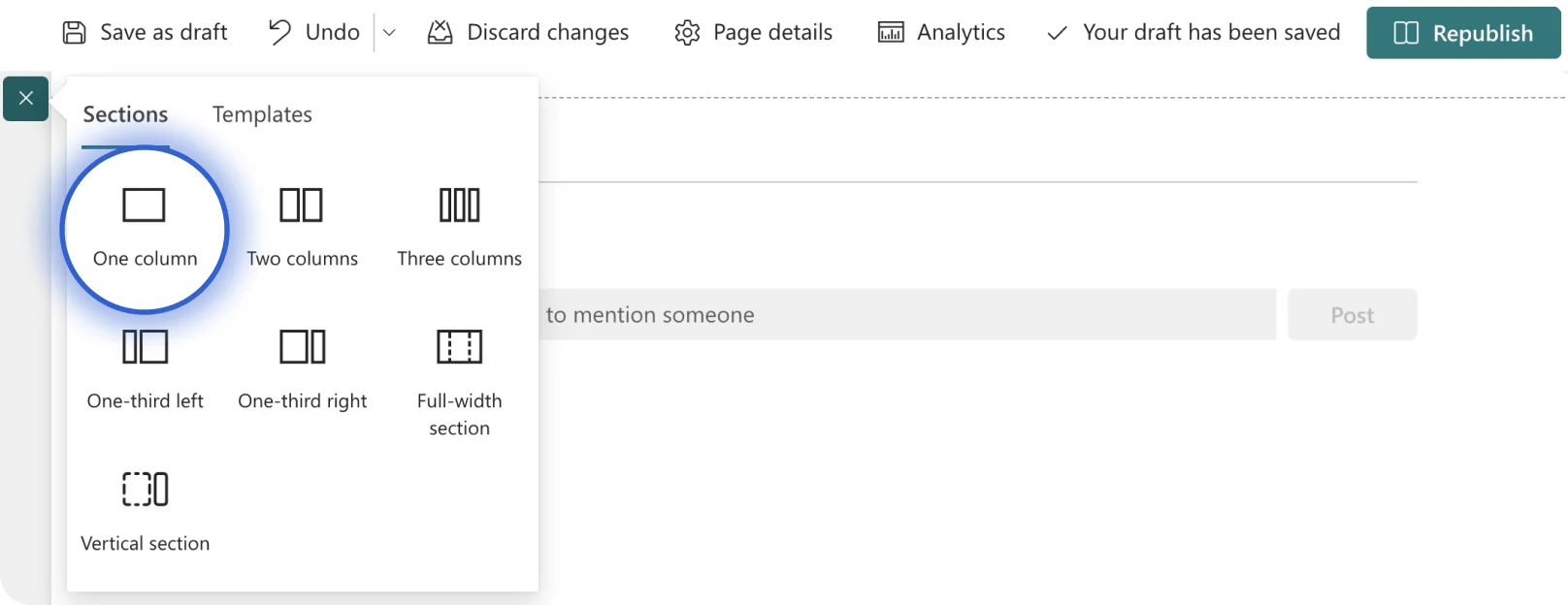
When you click the plus icon, you will see a couple of SharePoint section layouts to start with. We recommend using One column.
This is how your page will look like with the One Column section layout:
Adding a ShortPoint web part
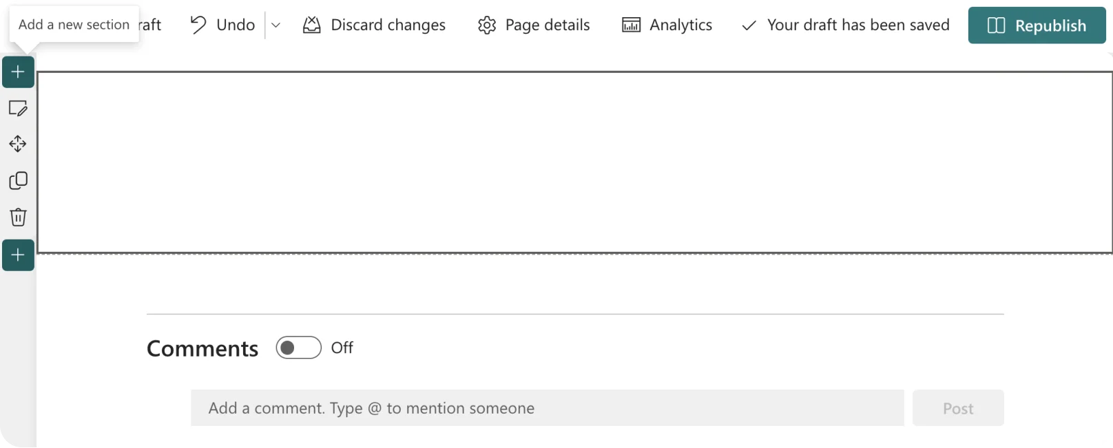
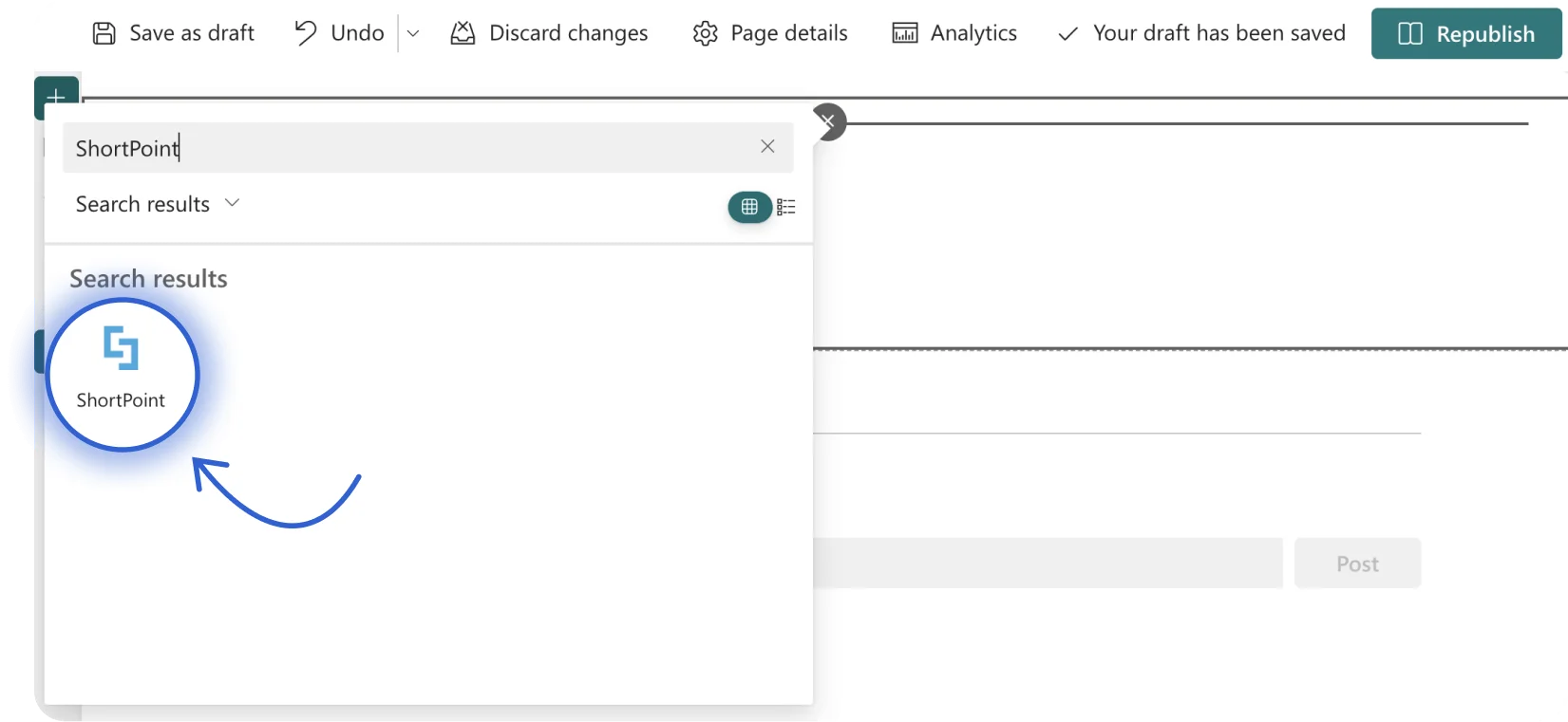
Now, you are ready to add the ShortPoint web part. Hover over the SharePoint section and click the plus icon to add a web part.
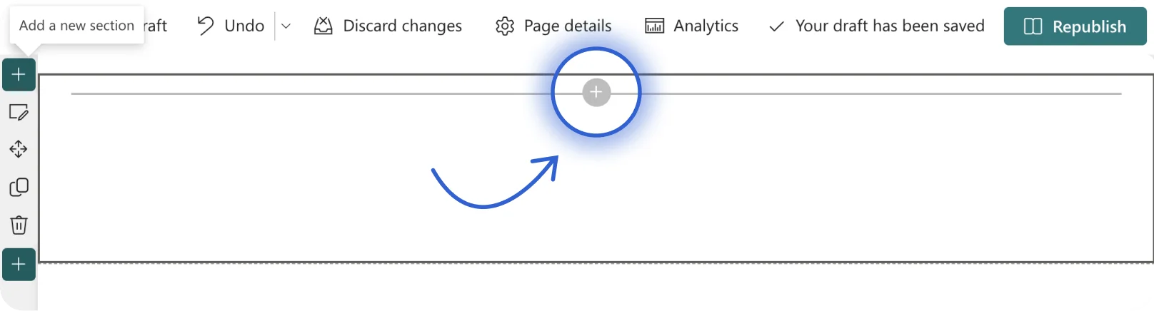
You can scroll down to look for ShortPoint or use the search bar. Click the ShortPoint icon to add the web part to your page.
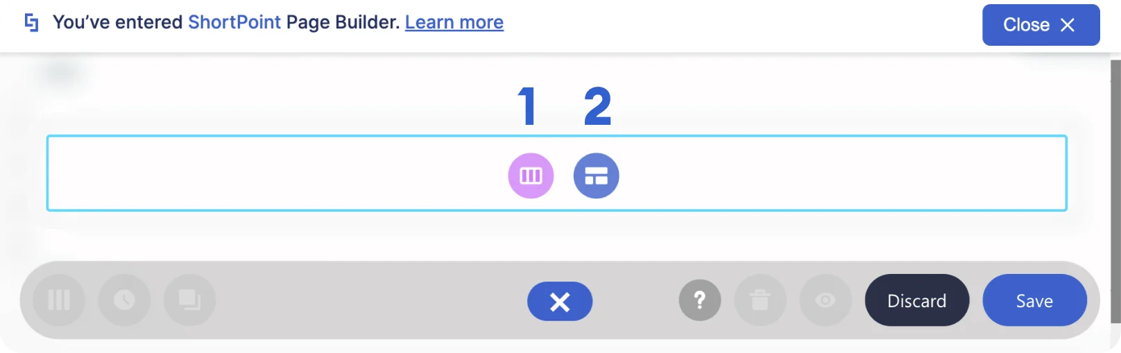
You have now successfully added the ShortPoint web part to your page.
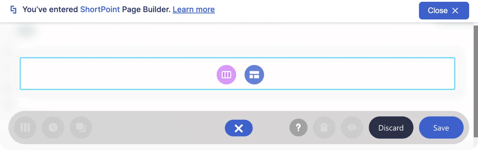
Choosing a designing option
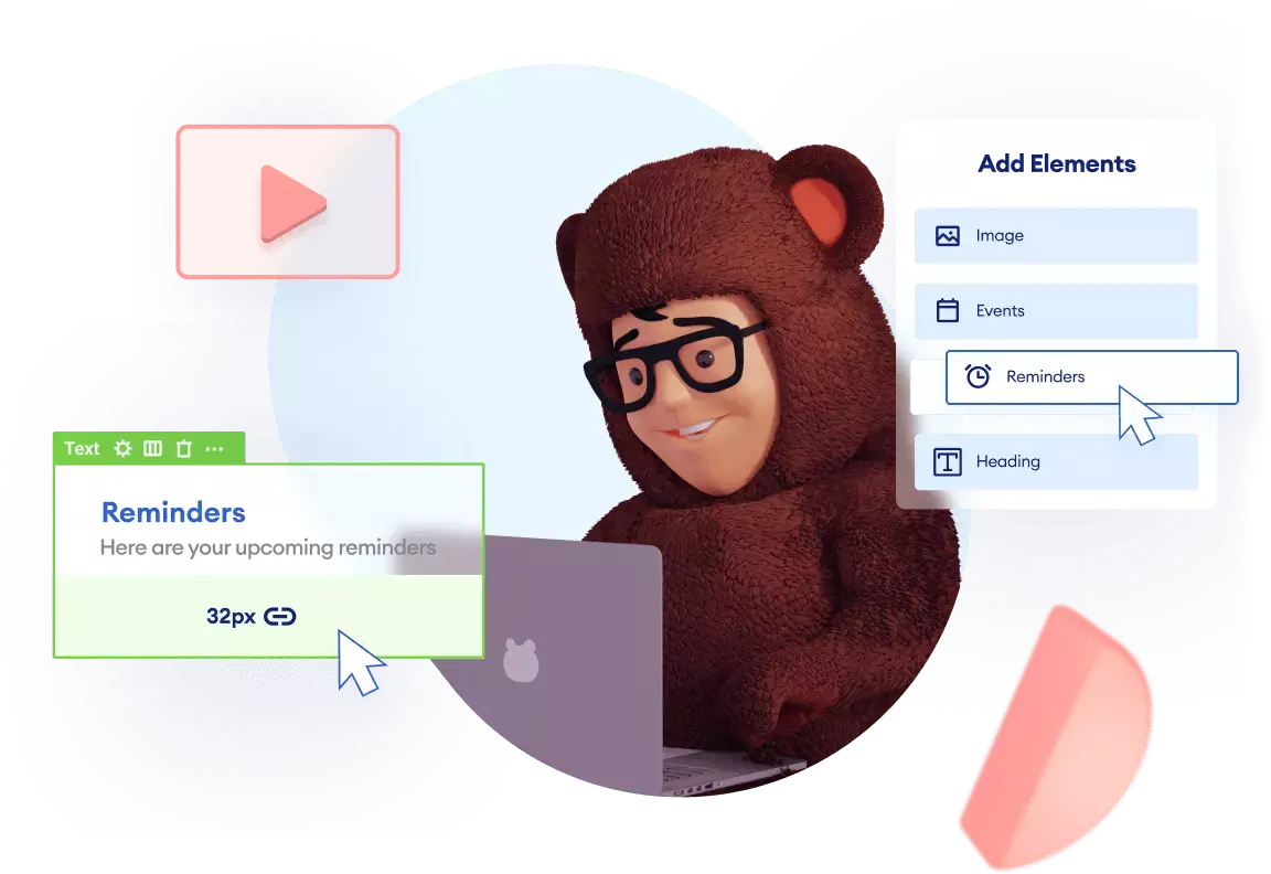
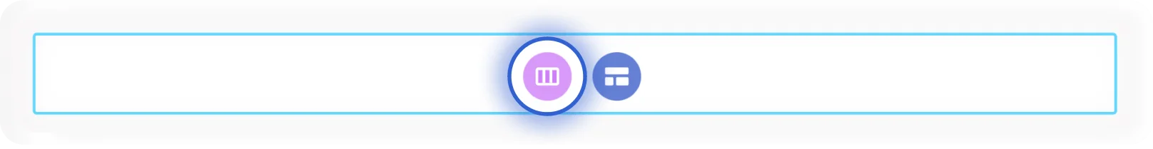
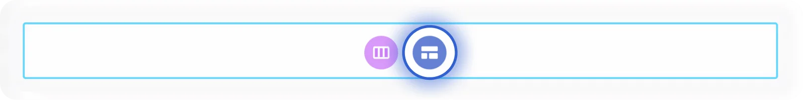
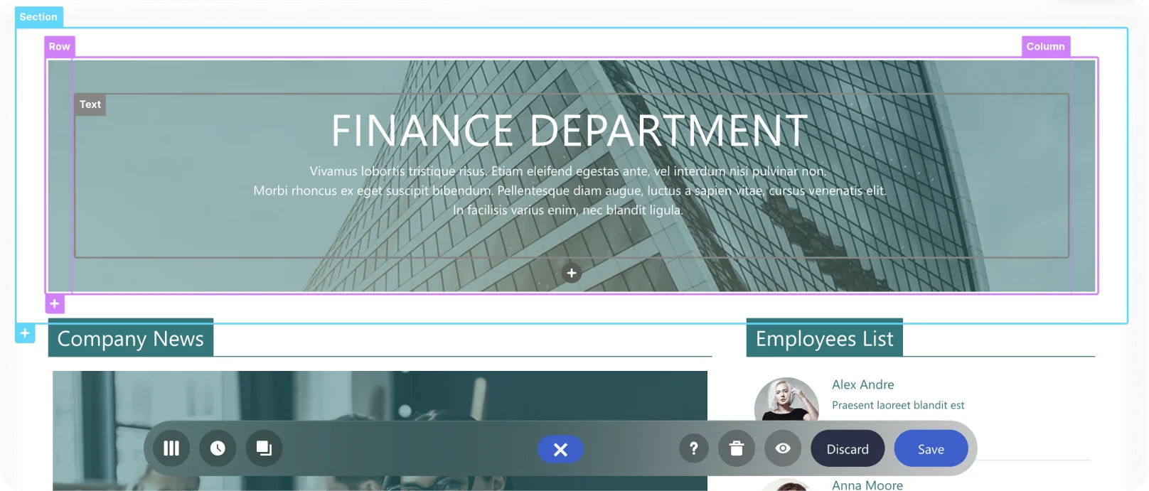
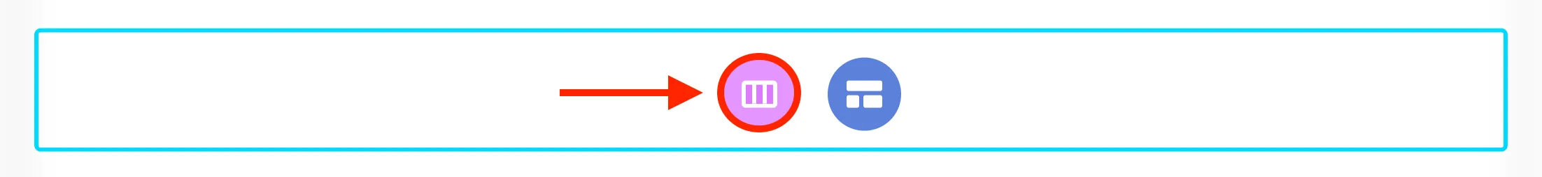
You will notice that a Section has been added. Inside it are two designing options: Choose Layout (1) and Open Templates (2).
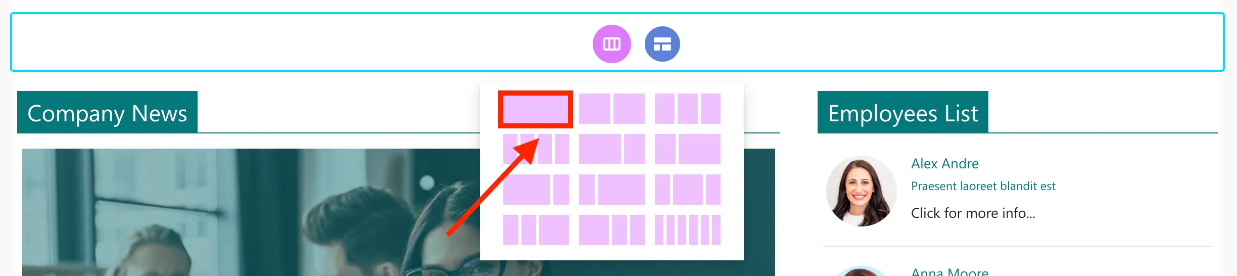
Click the Choose Layout icon if you already have a specific design in mind.
Here, you can choose from a list of layouts.
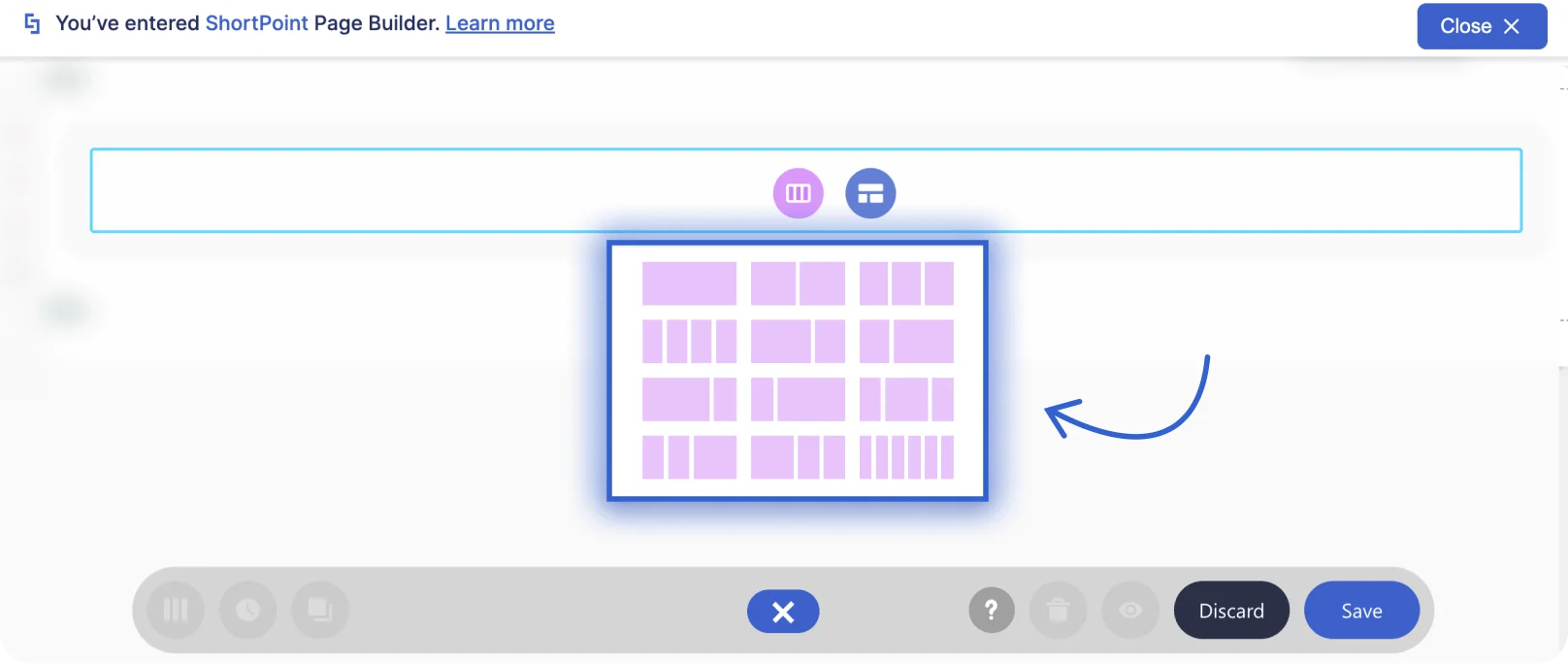
Then, you can begin adding Design Elements to complete your page.
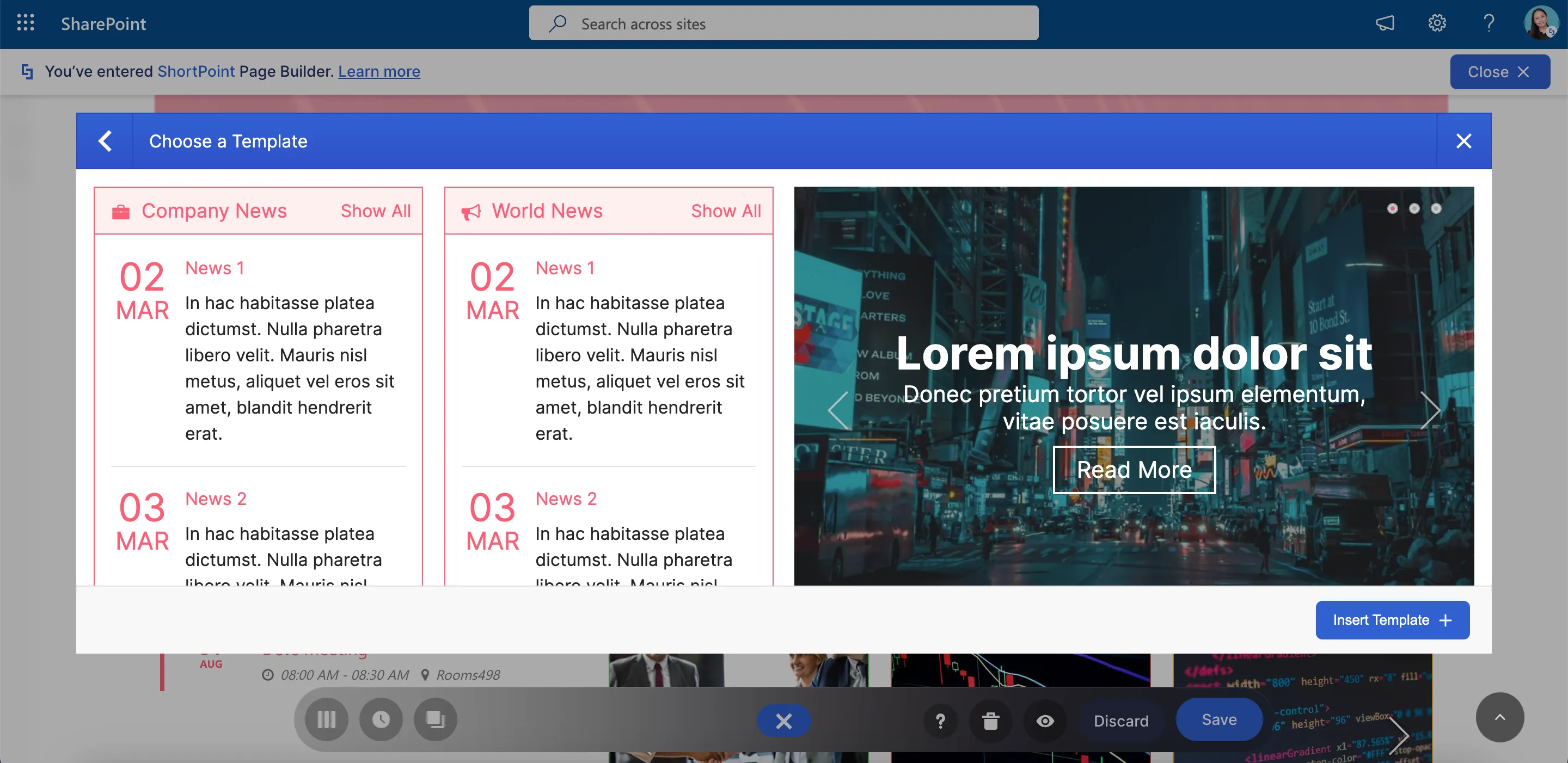
However, the quickest way to build a page is by selecting the Open Templates icon.
Here, you can mix and match different Sections.
Or apply an entire page template.
That’s it! You have just learned how to get started with ShortPoint. You are now ready to build stunning pages.
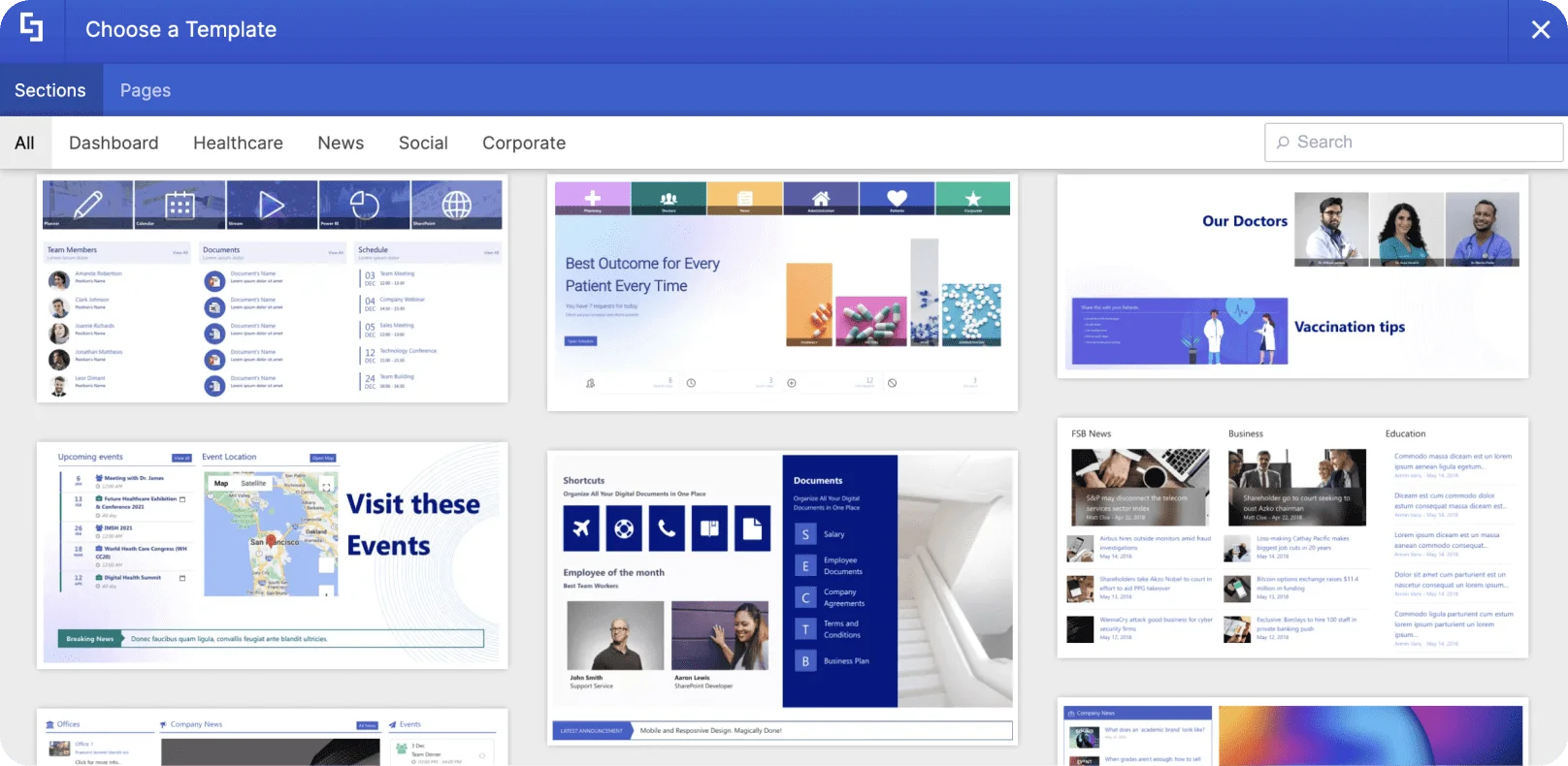
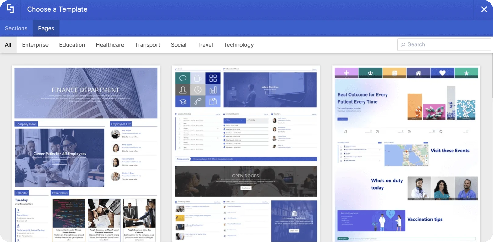
Use ShortPoint templates
In this tutorial, you’ll learn how to quickly build a SharePoint page using ShortPoint templates. You will find out how to insert a template, how to edit it to display your own content, and how to modify its settings to suit your needs.
Choosing a template
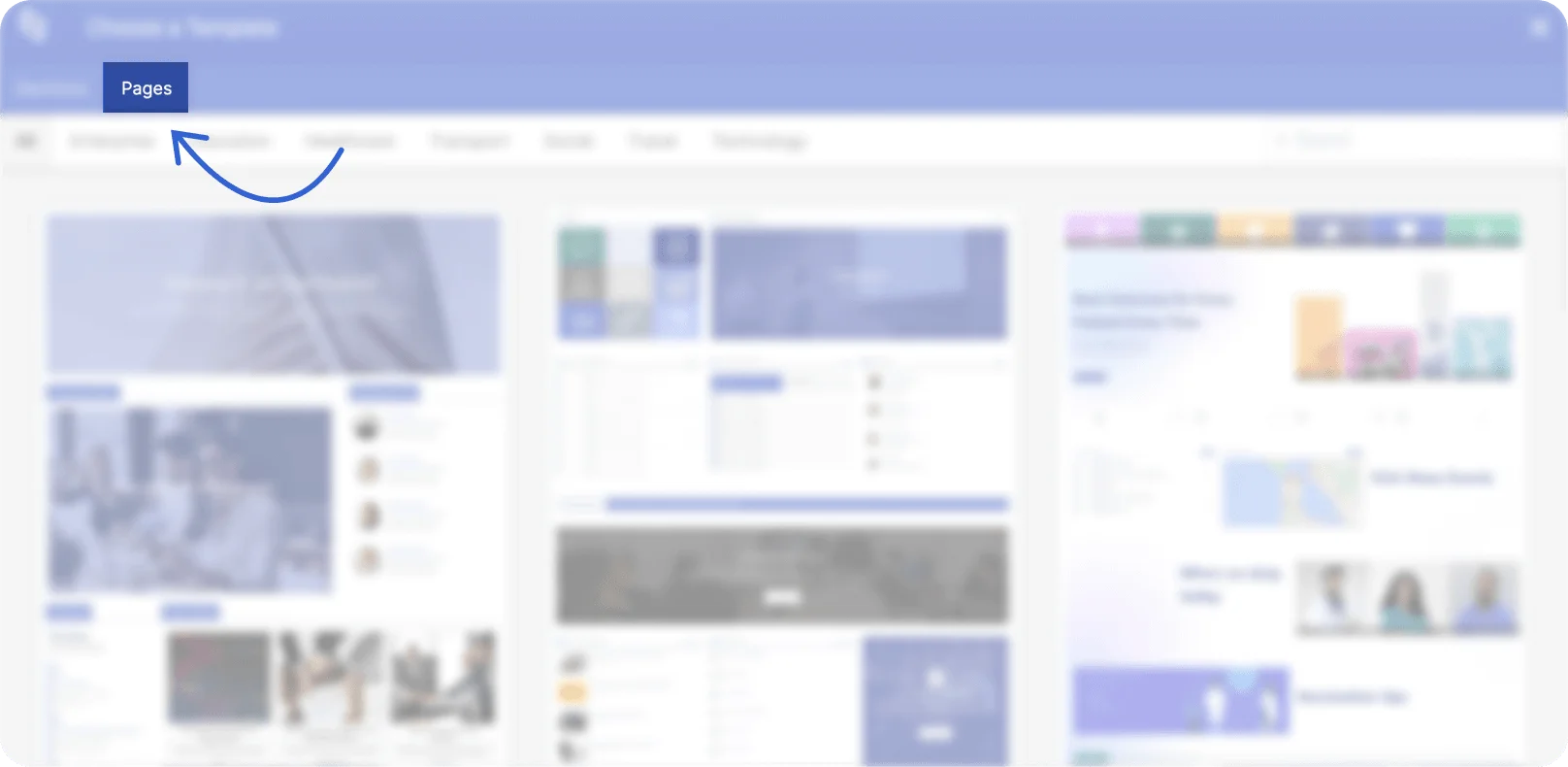
To get started, add a ShortPoint web part and click the Open Templates icon.
You will see two types of templates in our modular library. First are Section Templates. This type of template contains specific parts of a page that serve a purpose.
You can mix and match Sections to create your whole page. For example, you can add a News Section, a Social Section, or even a Corporate Section to complete your page.
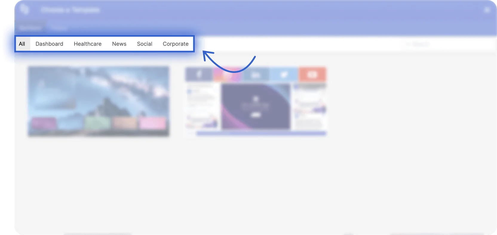
The second type is Page Template. This type of template contains a set of Sections that complete a whole intranet page.
They are designed to fit the most common use cases for intranets either in general or for a specific industry.
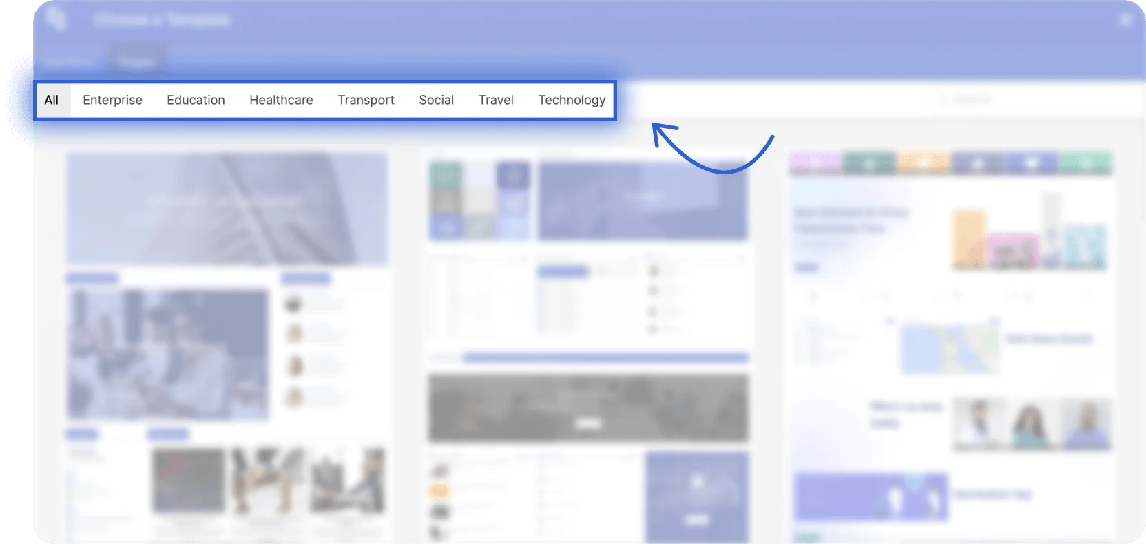
For this project, we will insert a Page Template. Simply click the black plus icon to instantly add the Page Template to your page.
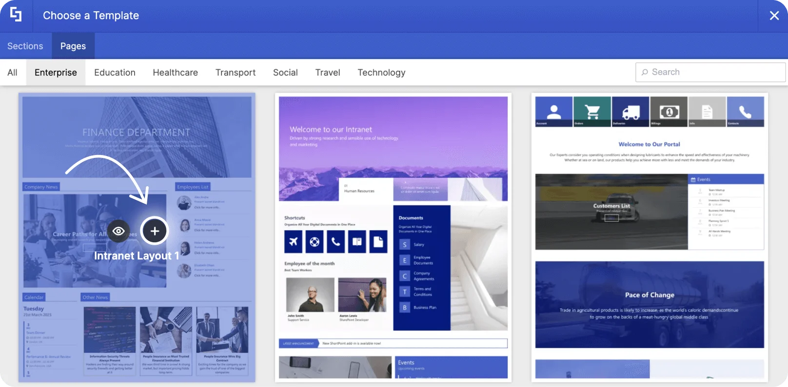
Once you have selected a page template, all the elements inside the template will be added to your page, including placeholder content. You will also notice that the inserted page automatically took on the existing theme and colors of your site. You can customize this later on using ShortPoint Theme Builder.
By hovering over the items on the page, you will find several blocks of content in different formats. These are the different kinds of Design Elements used to build and design the page.
Editing content
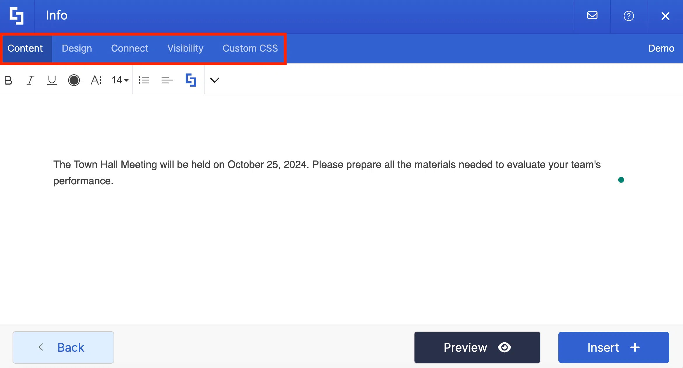
Now, let us replace placeholder content with our own content. To edit a text, double-click on the Text Design Element.

Doing so will allow you to modify the content, format, and style of the text using the text editor.

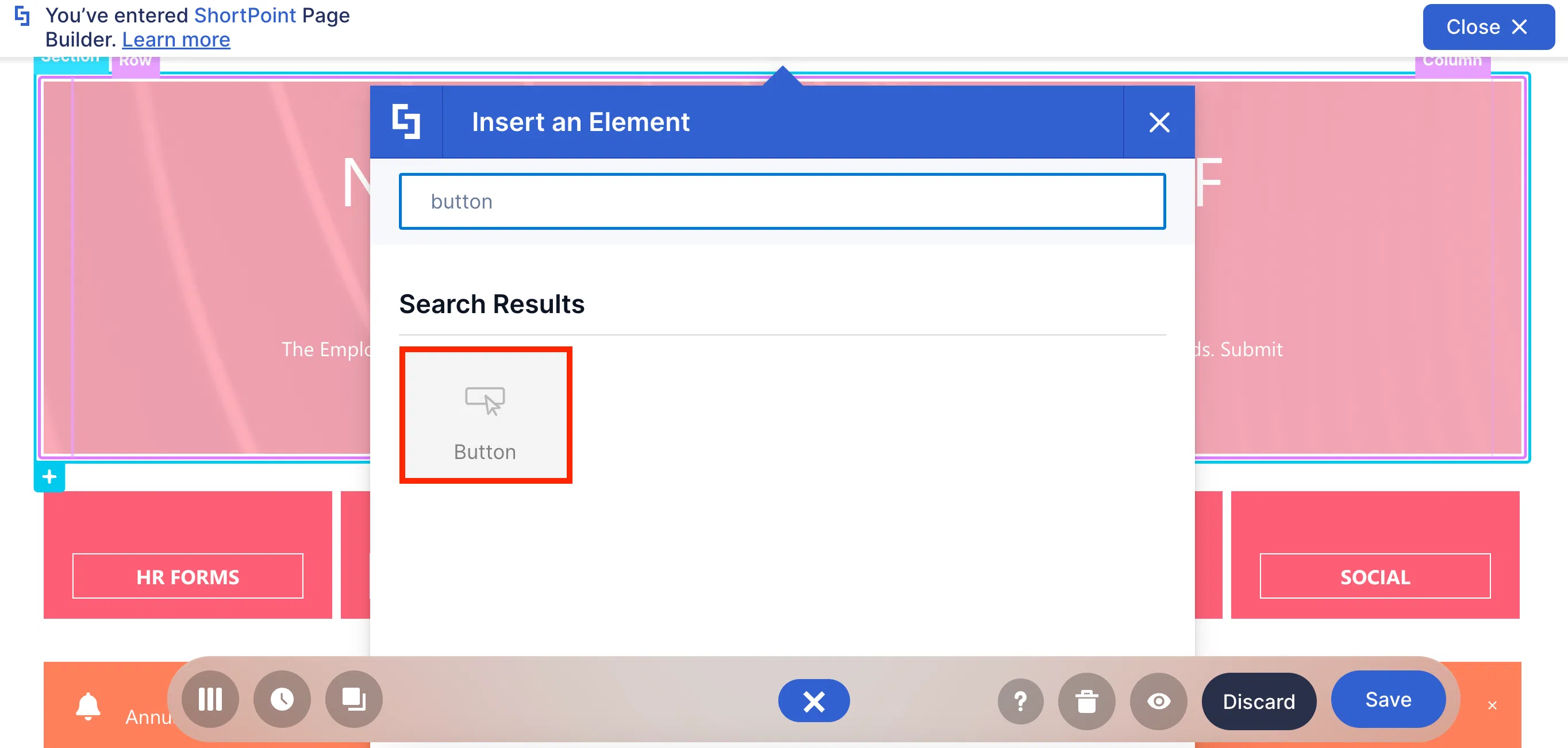
You can even add a button using the Inline text Design Element. To do this, click the ShortPoint icon inside the text editor.

Then, select the Show button icon.

A popup window will appear where you can add the necessary details for your button. Once you are satisfied with how your button looks, click Apply.

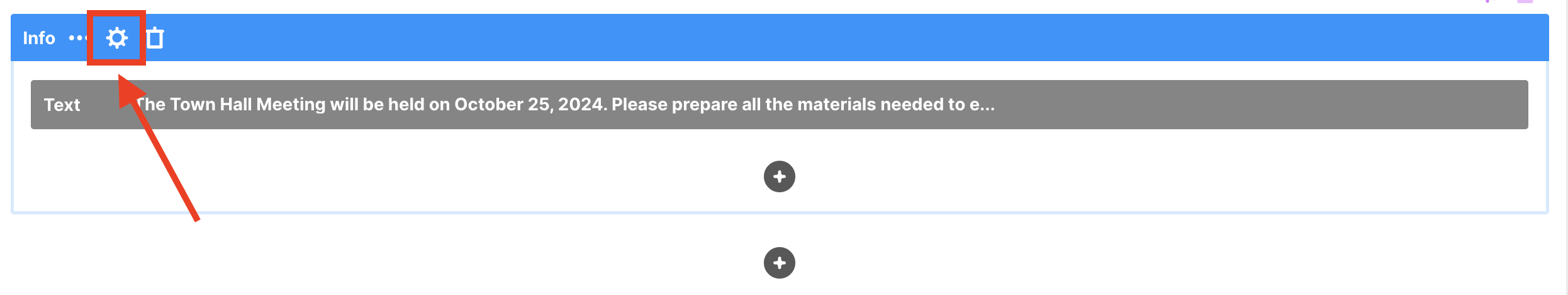
On the other hand, to edit the content of other Design Elements, you will need to open their settings window.
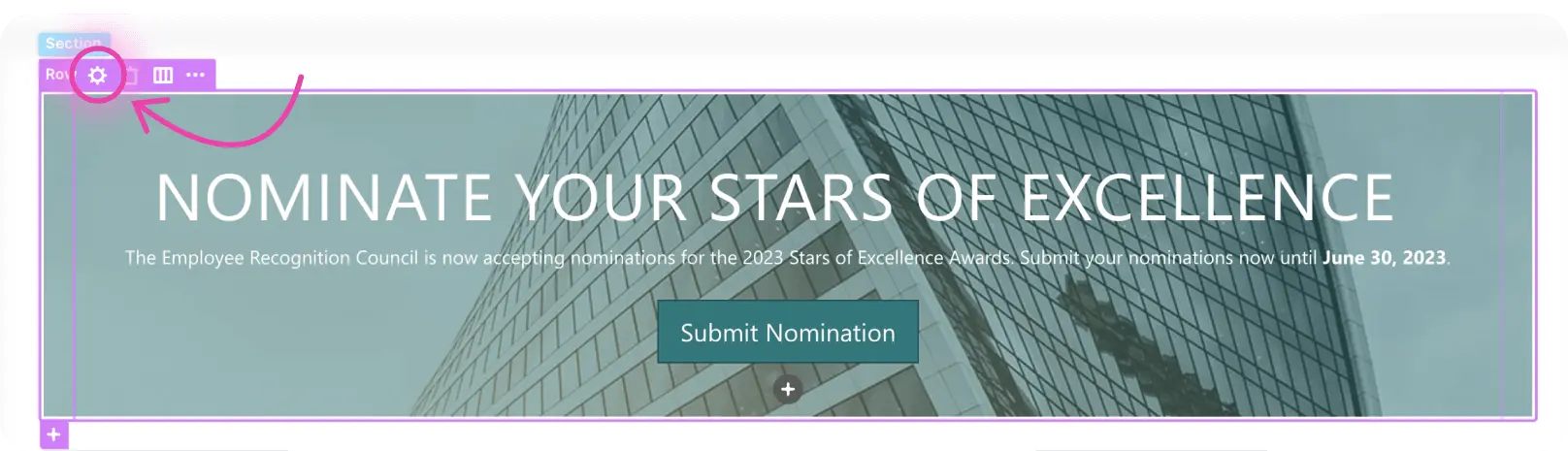
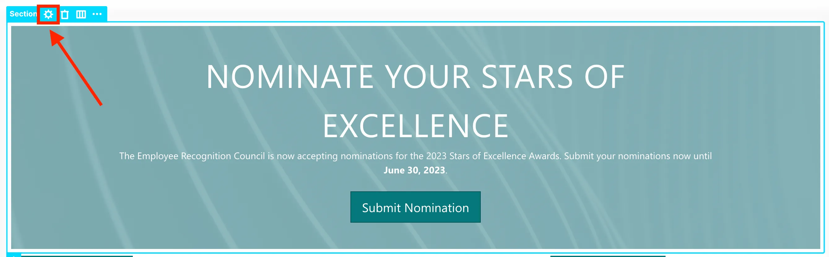
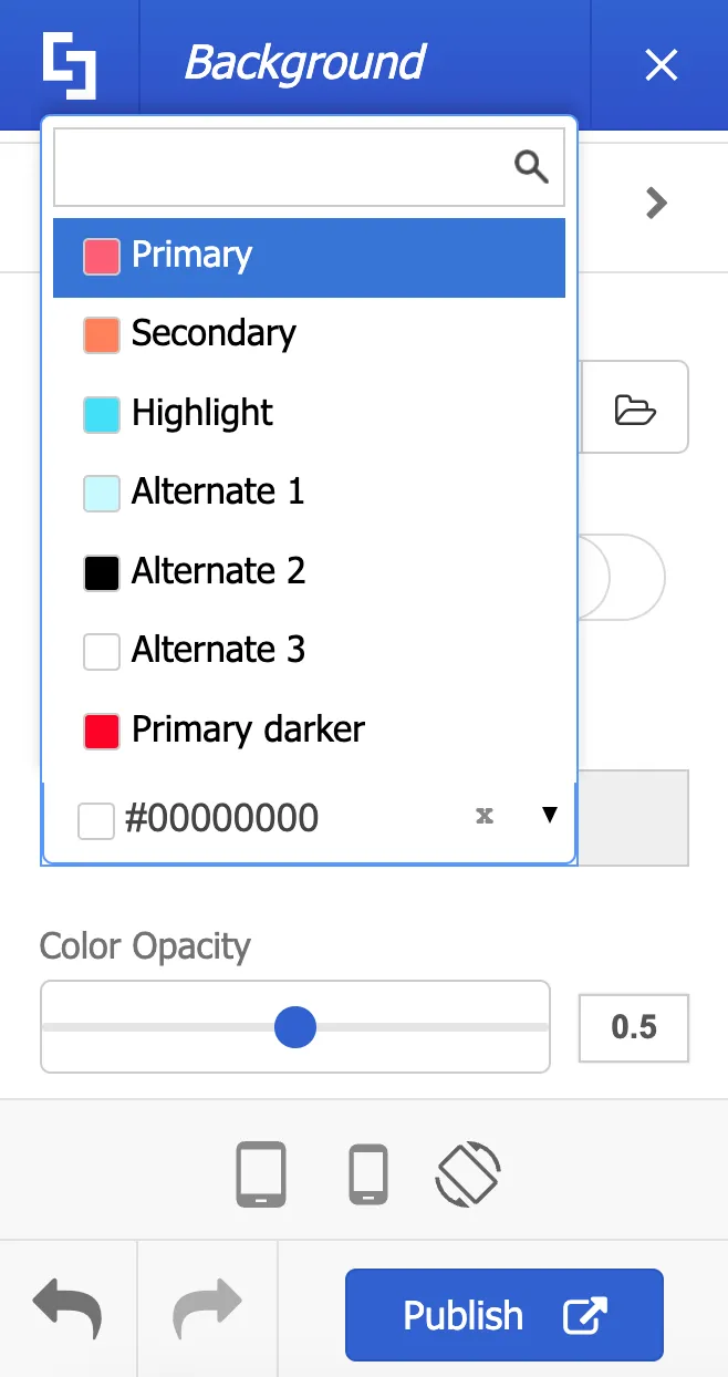
For example, to change the background image of this Row, click on its label and then select the cogwheel icon.
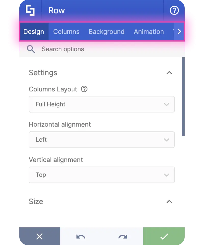
This is where you will find several tabs that show you what you can edit and customize.
To change the background image, go to the Background tab.
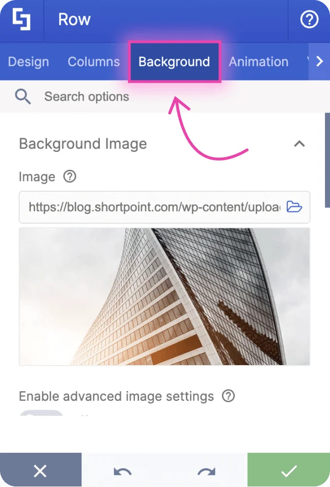
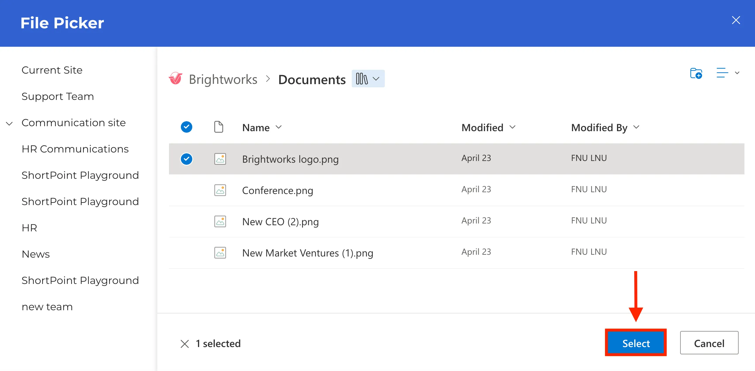
Then, on the Image field, select the Folder icon.
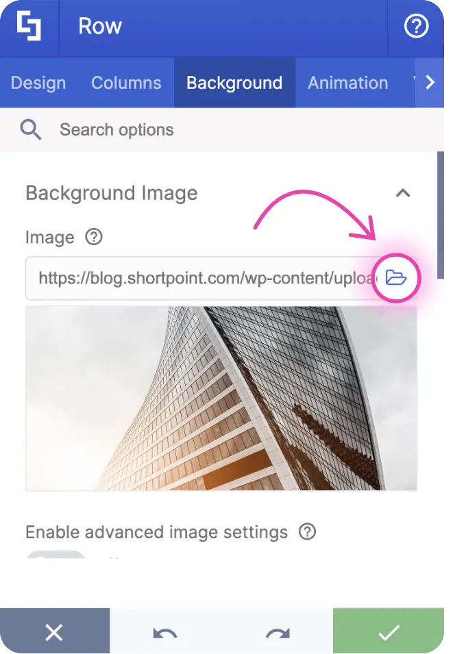
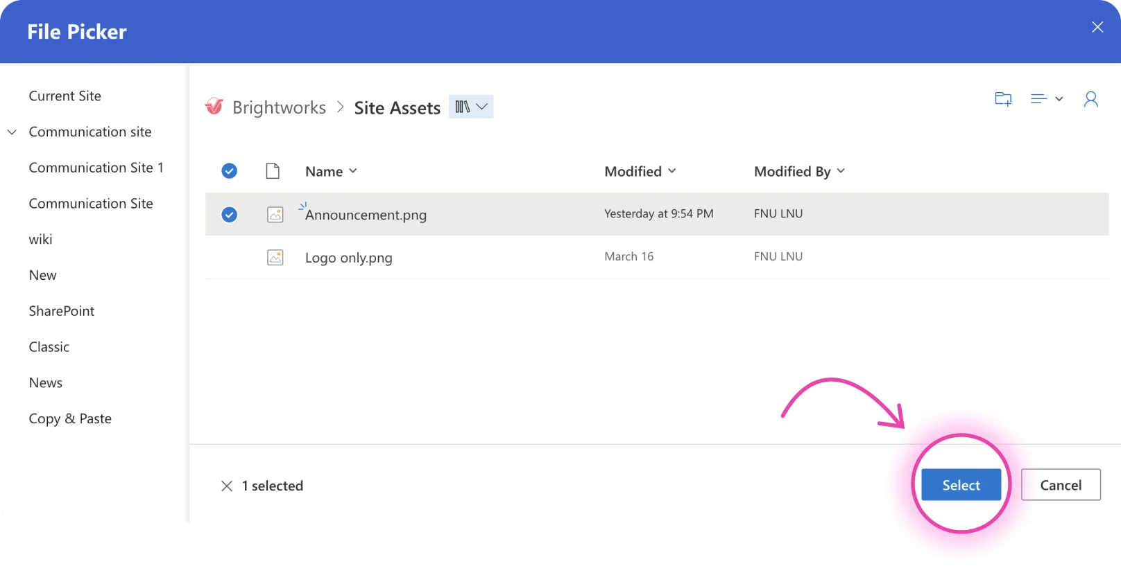
This will launch the File Picker where you can Select your preferred background image.
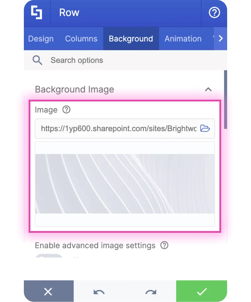
You have successfully changed your background image. If you want to explore other background options, simply scroll down and you will find the option to add a video background or a background color.
Modifying settings
Besides editing content, you can also make changes to the design of your Row in the Design tab. This is where you will find several design and style options.
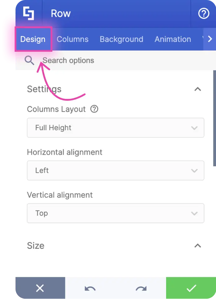
For example, you can change the height of your Row by dragging the blue slider under the Height field.
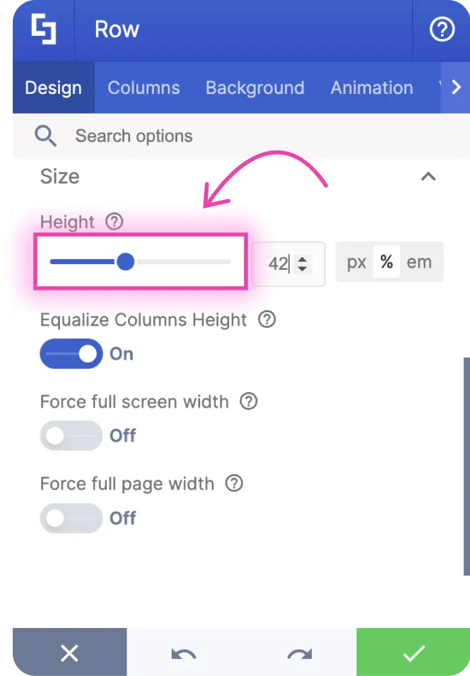
Take note that each Design Element has unique options that you can customize. This means that some settings that can be modified in Rows may not be modifiable for the Text Design Element.
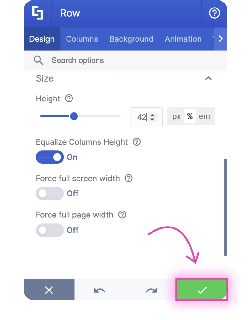
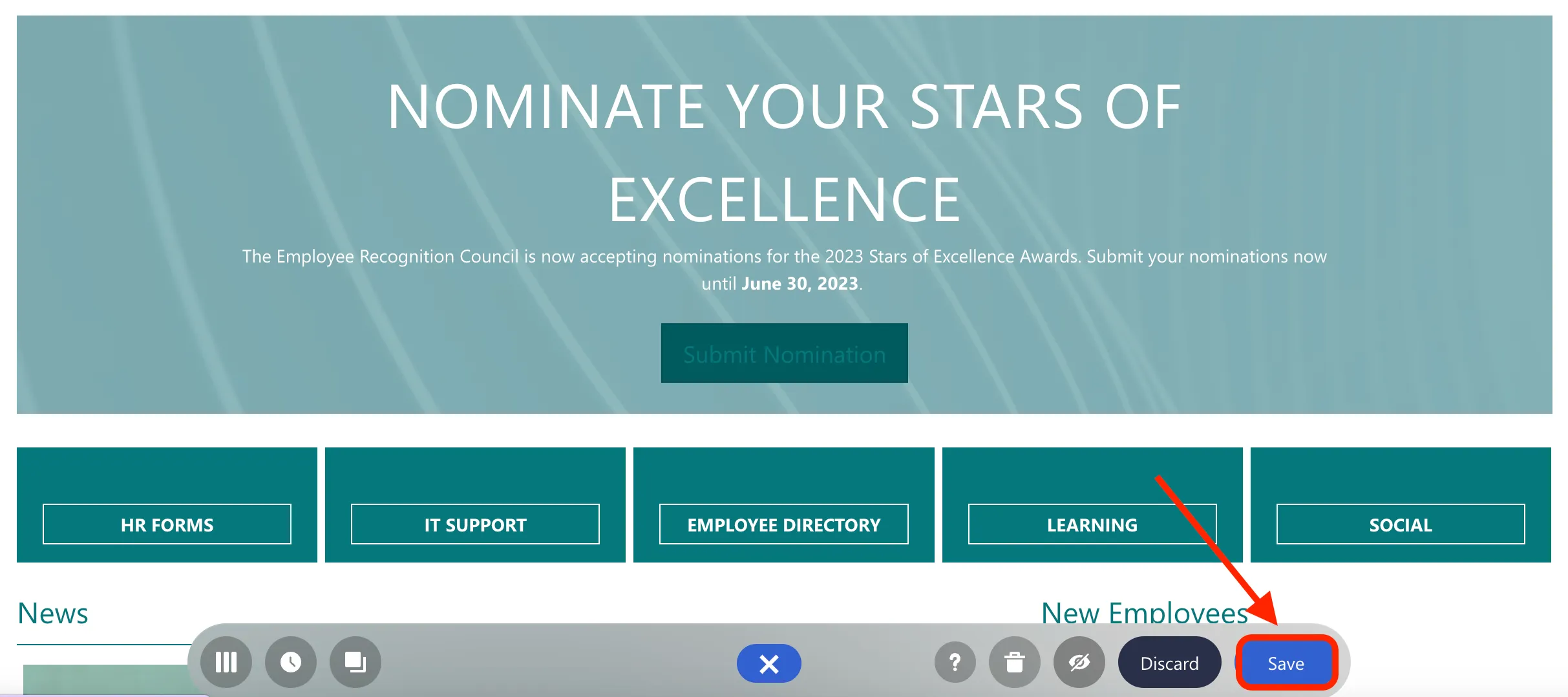
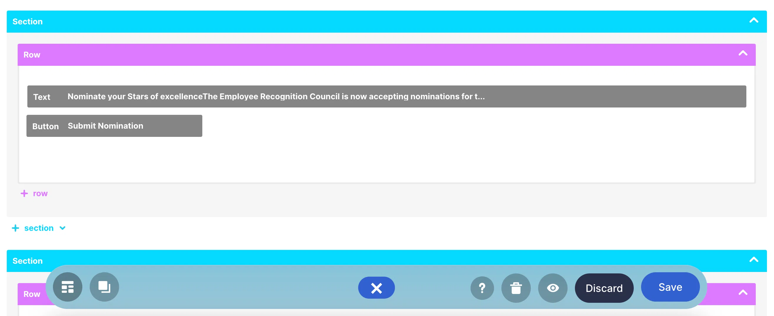
Once you are satisfied with how your Row looks, click the check mark icon to apply all your changes.
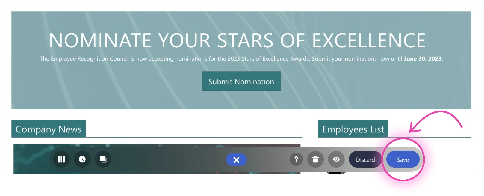
Then, make sure to hit Save to keep your progress.
Repeat these steps for the other Design Elements on the template to make each content your own.
Congratulations! You now have a working intranet page that showcases your own content. Go ahead and explore more templates and try out the other features of ShortPoint.
Customize page layouts
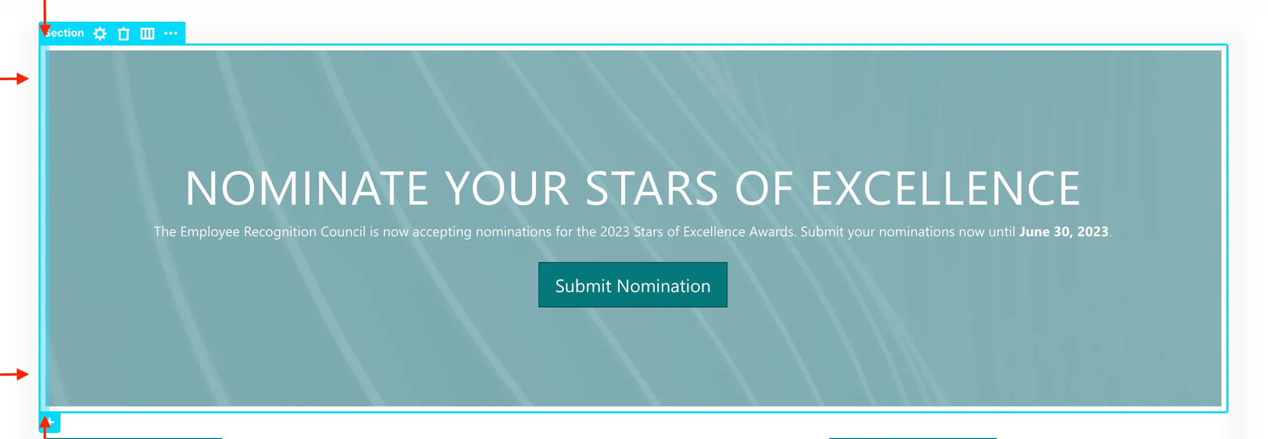
In this tutorial, you will learn how to access the Hot Actions feature and use it to edit the spaces within and between Design Elements. You will also learn how to add and edit layout options in Sections and Rows.
Accessing Hot Actions
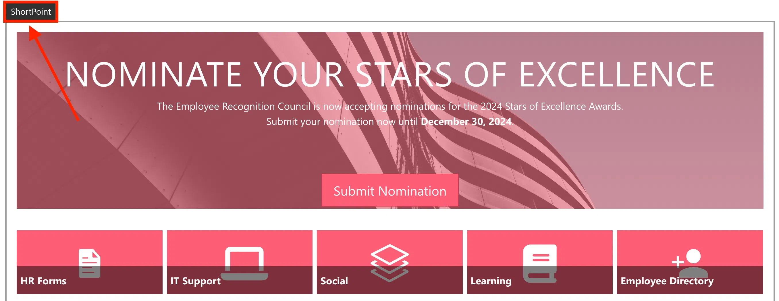
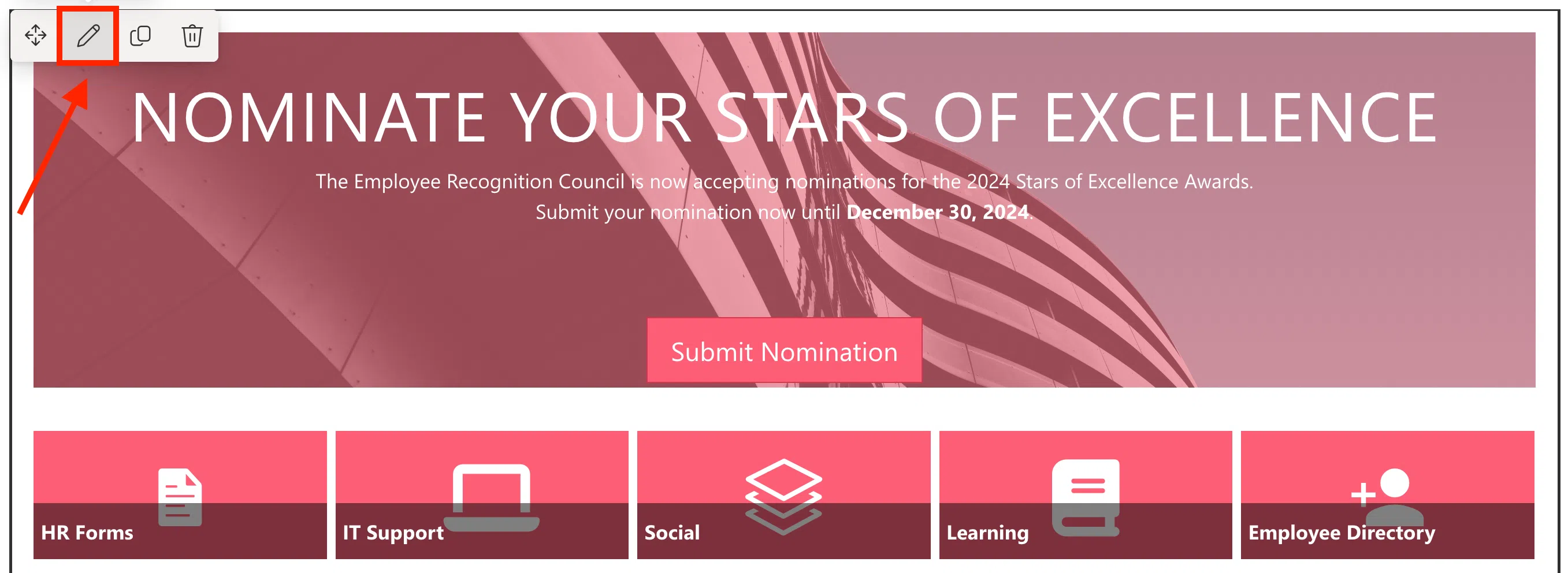
First, let’s edit the SharePoint page where we added the ShortPoint template.
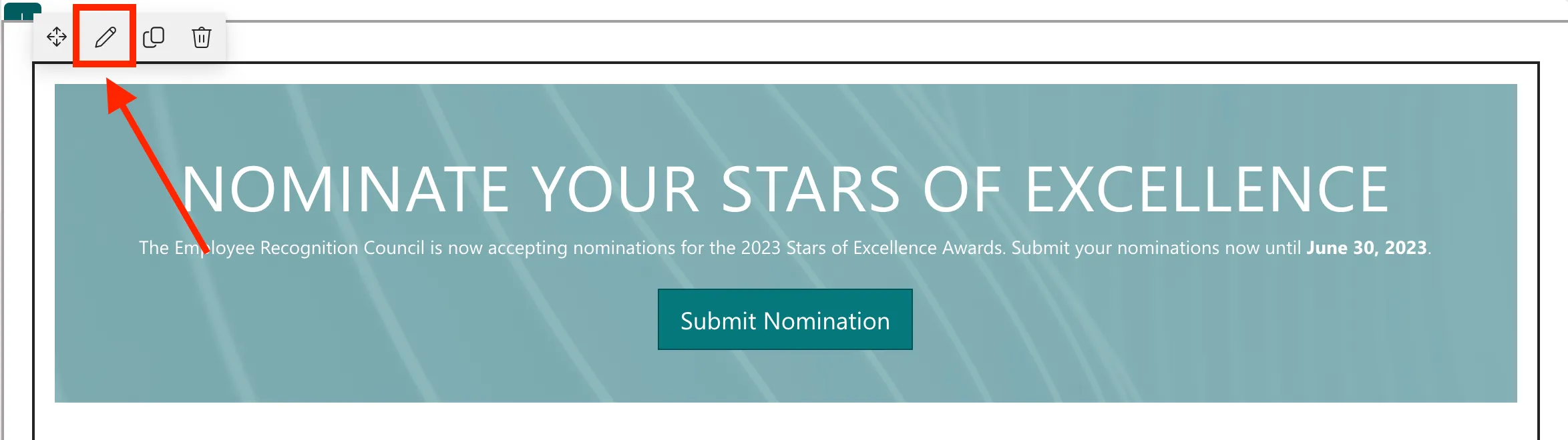
Then, click the ShortPoint web part and select the pencil icon.
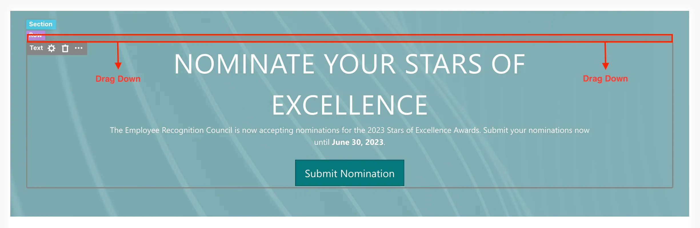
In ShortPoint Page Builder, there is a feature called Hot Actions. Hot Actions allows you to quickly adjust margins and paddings for each Design Element and see the changes in real-time.
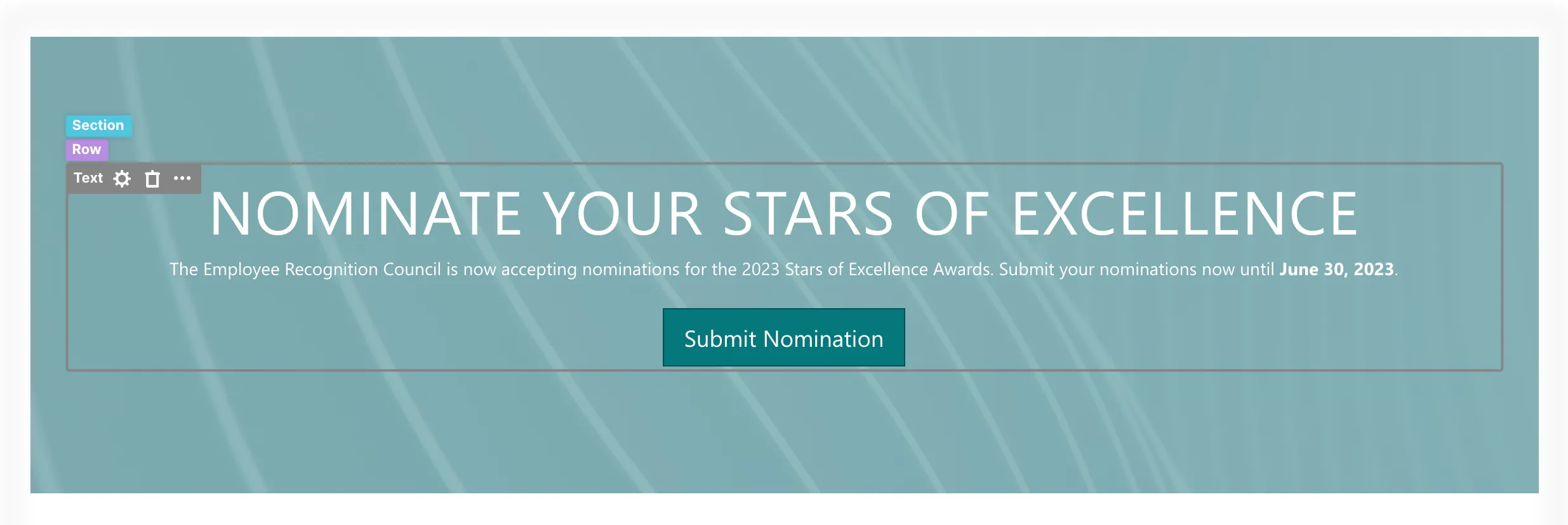
To access it, select the label of a Design Element and hover over its borders. You will notice highlighted spaces around the selected Design Element.
Margins are the spaces outside the border of the Design Element.
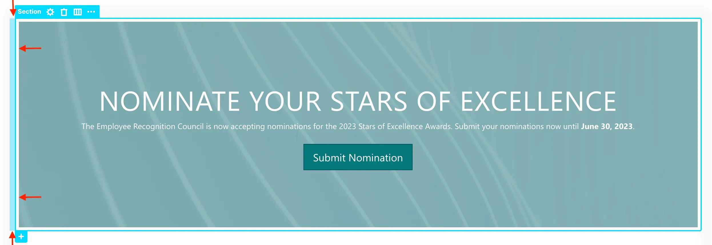
Paddings, on the other hand, are the spaces within the border that separate it from the content.
Editing spacing
You can modify margins and paddings by clicking and dragging.
For example, let's use Hot Actions to edit the spacing of this Text Design Element.
To adjust the padding, hover over the left padding and drag the mouse to the right.

This is how it will look after dragging the left padding:
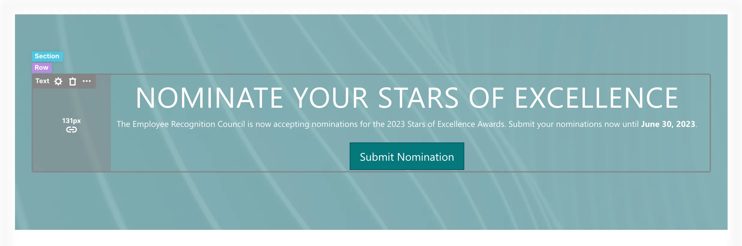
To add equal padding on the other side, click the link icon. This will lock the padding values, so changes made to the left will be mirrored on the right, ensuring perfect balance.
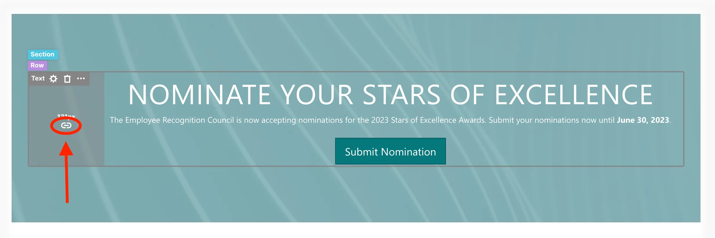
Now, both paddings have the same size.
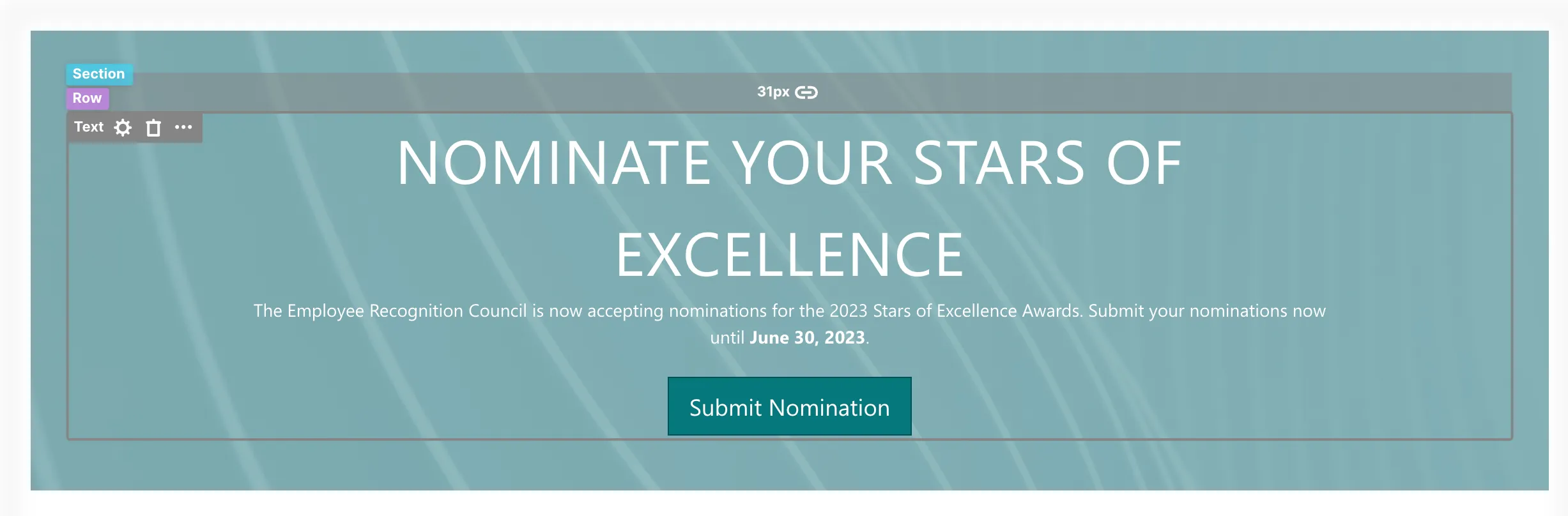
We can also increase the top margin of the Text Design Element. Let’s increase the top margin by hovering over the top margin and dragging it down.
Your page will now look like this:
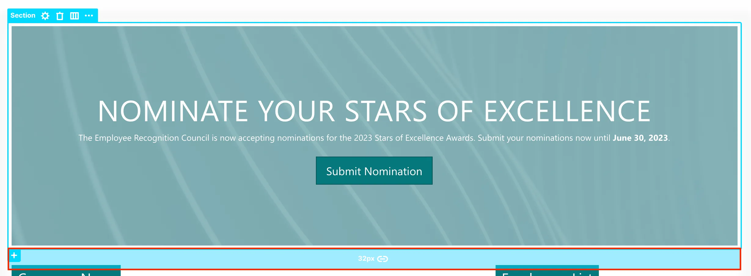
You can also use Hot Actions to add or reduce white spaces between Sections of your page. To do that, click a Section tag, hover over the bottom margin, and drag it up.
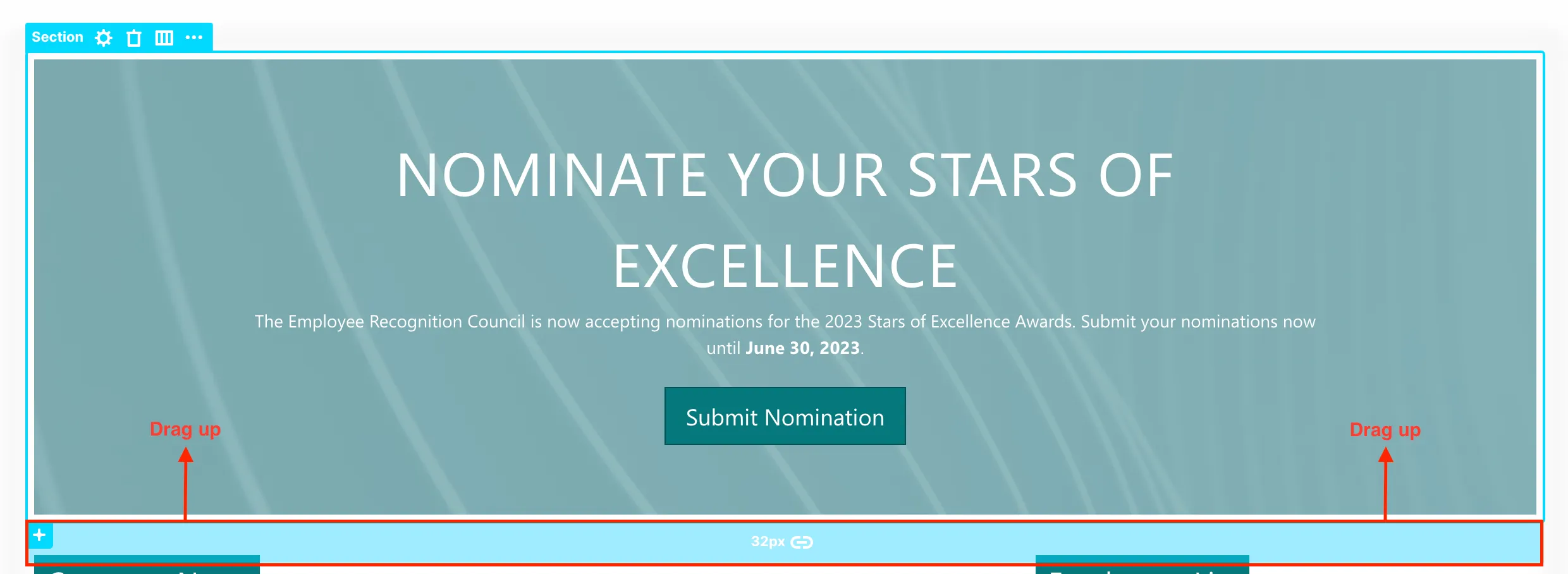
Your page will now look like this:

ShortPoint also offers more options to customize page layouts.
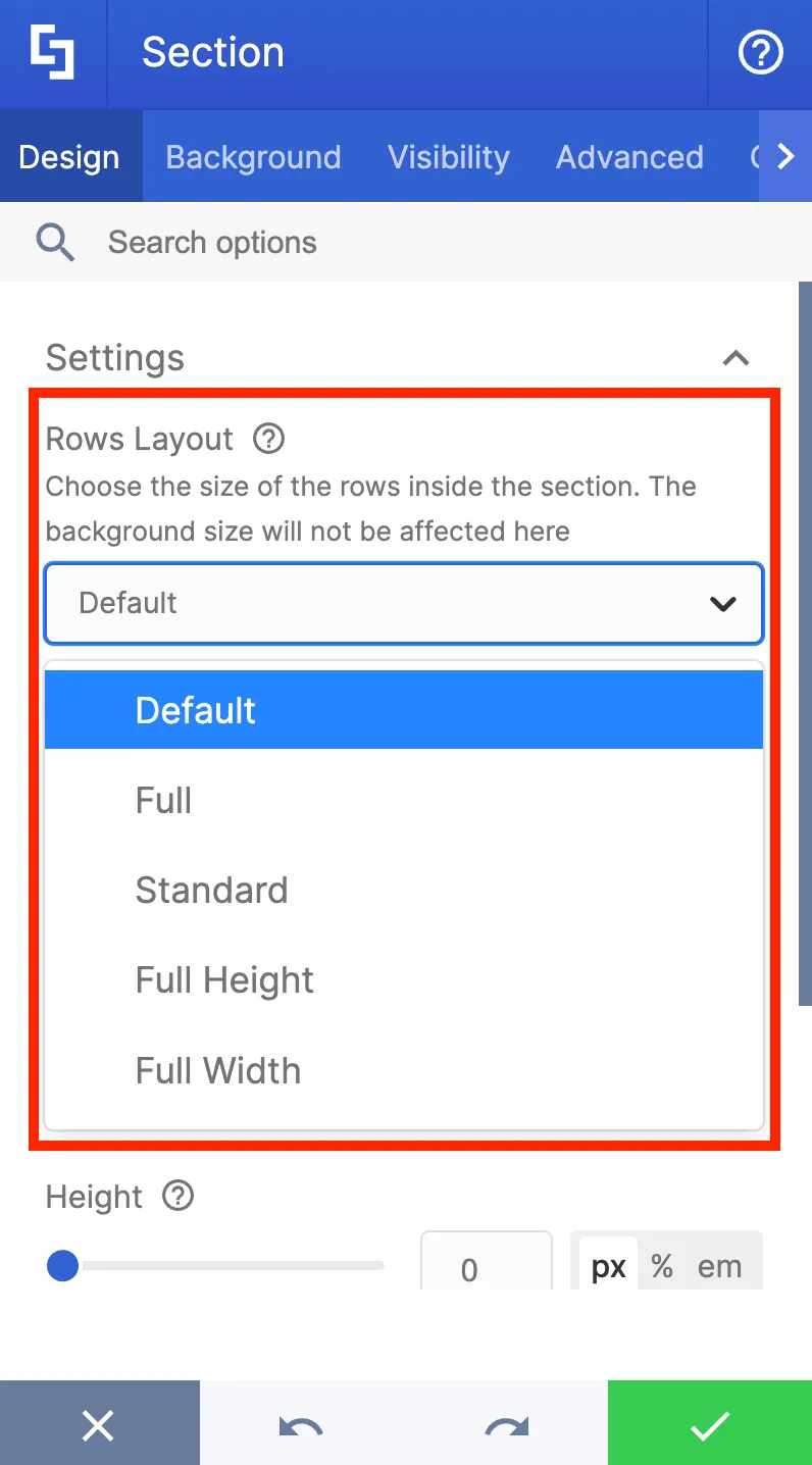
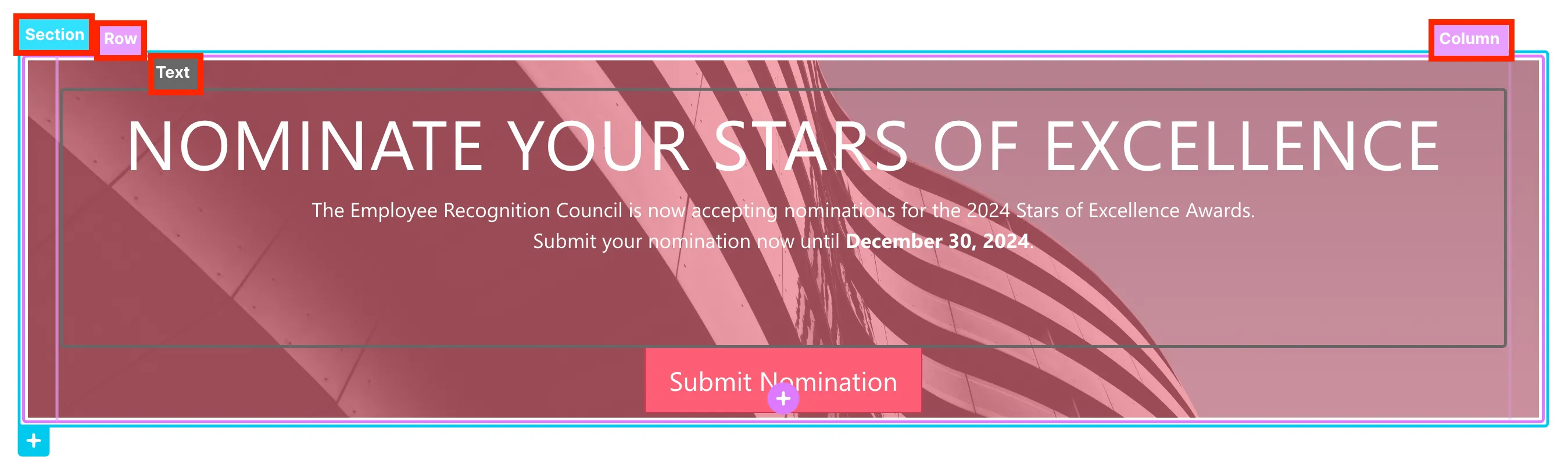
In the design settings for Section, Row, and Column, there are four layout options that are particularly important for determining how their contents will occupy the available space.
To see it, click a Section tag and select the cogwheel icon.
In the Design Tab, you will see the Rows Layout field where you will have the following choices:
- Full - allows you to use the full space of the Section
- Standard - allows you to add equal margins on all sides
- Full Height - allows you to use the full height of the Section
- Full Width - allows you to use the full width of the Section
Adding and editing layouts
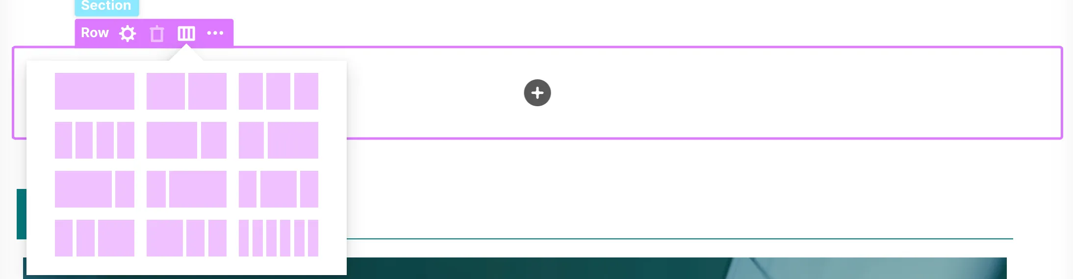
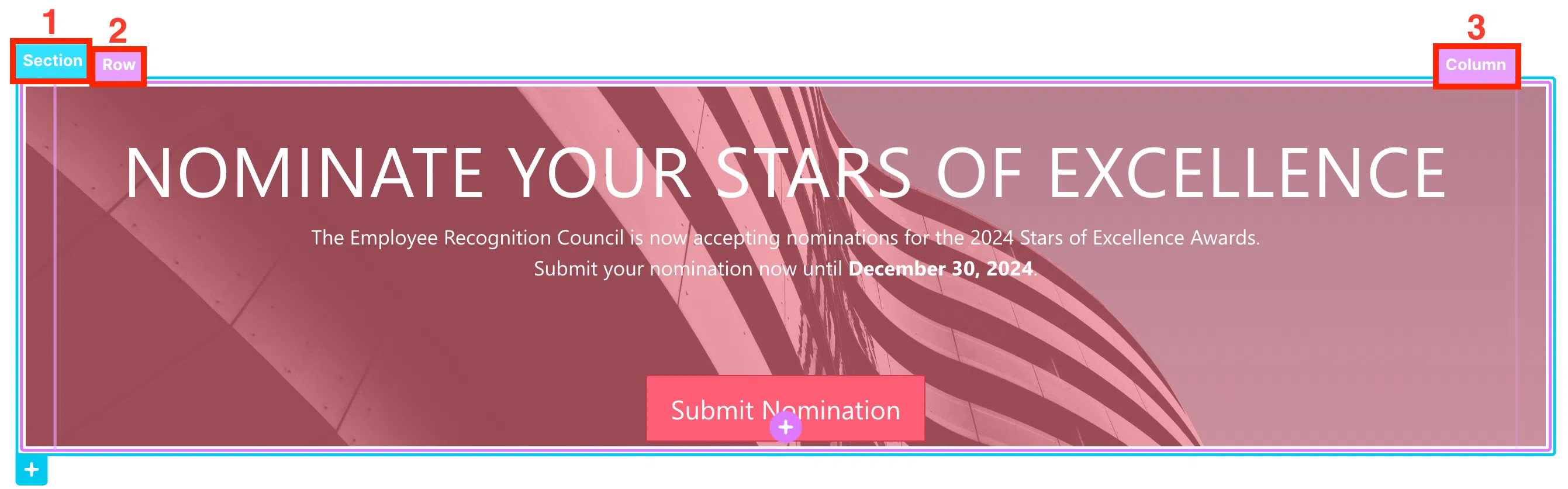
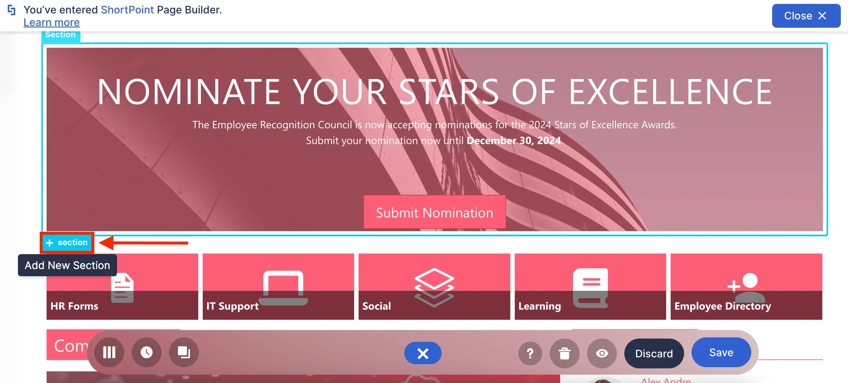
As you edit the page, you will also find blue and pink plus icons on your page. These plus icons are used to add new Sections, Rows, and Columns.
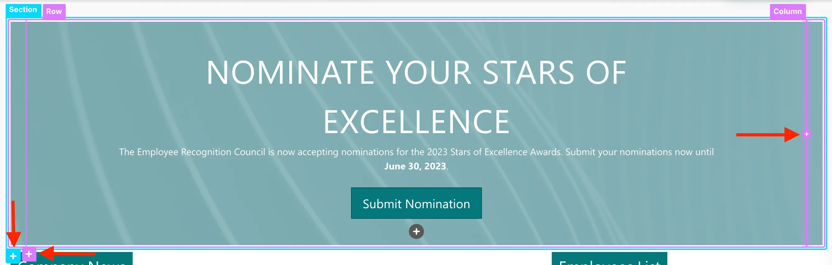
To add a new Column, Row, or Section, simply select its tag and click the plus icon.
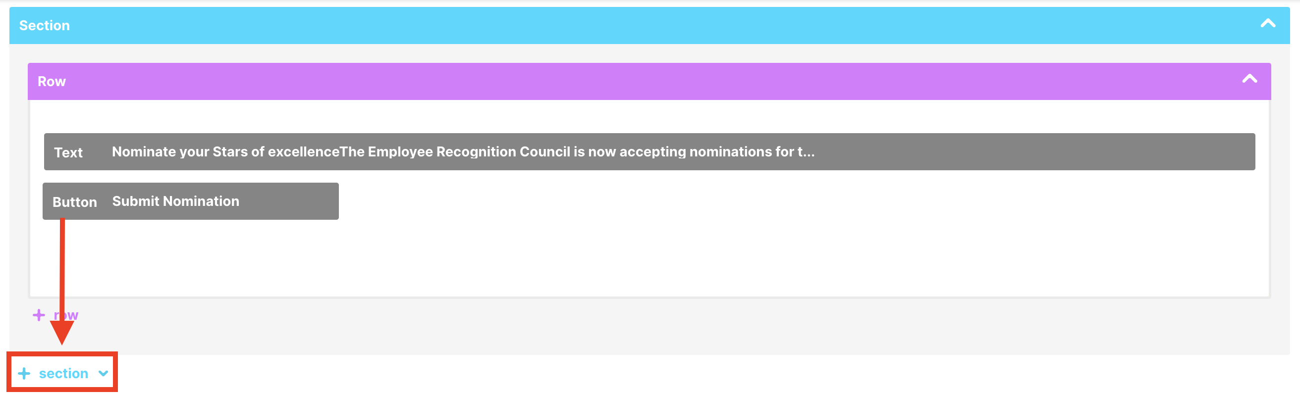
For example, let’s try to add a new Section. To do this, click the Section tag and select the plus icon.
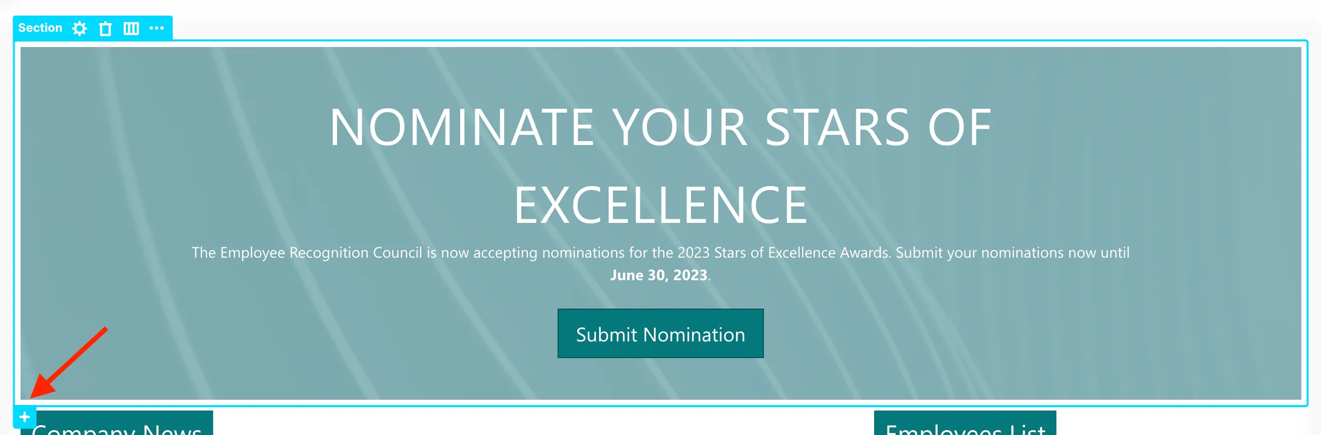
The new Section will appear below the original Section.
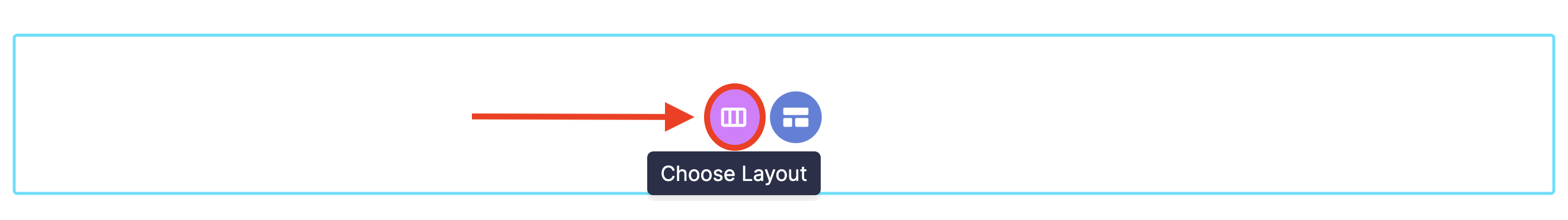
For every Section you add, you will find the familiar two-button options. Since we want to create our own layout, we will select the Choose Layout icon.
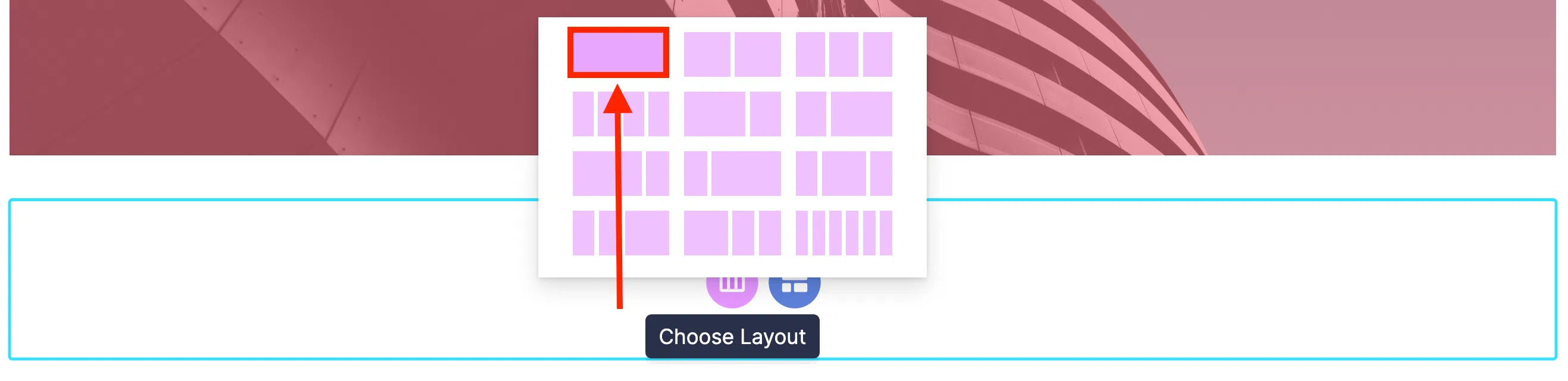
Upon clicking, you will be prompted to select the layout you prefer. For example, the option we will select will give you a single-column, single-row layout within the Section.
If you want to modify the layout you selected, you can go back to the layout selection by clicking the Row tag and selecting the Show Layouts icon.
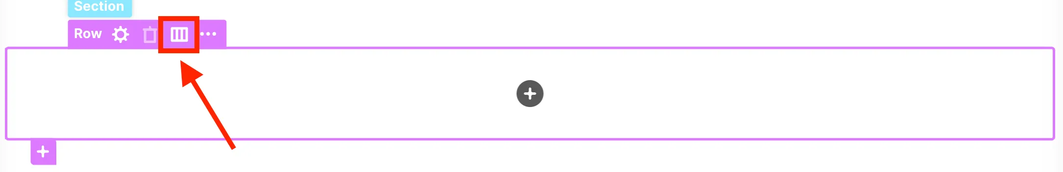
Then, choose the layout you prefer.
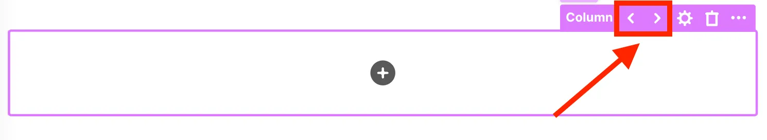
You can also change the width of the columns to fit your content. To do so, select the Column tag and click the left arrow to decrease the width of the Column or the right arrow to increase the width of the Column.
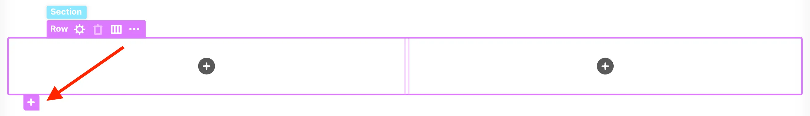
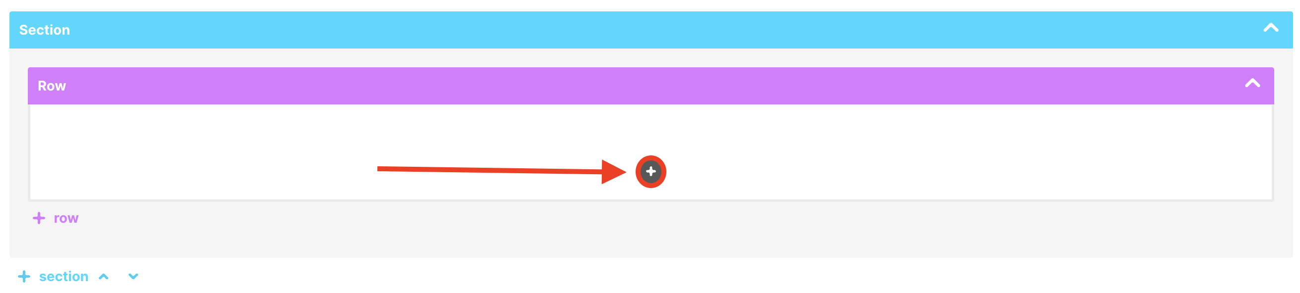
Adding new Rows inside Sections is also very easy. Simply click the pink plus icon.
All of these options provide you with more control and flexibility in designing your page.
Congratulations! You've now mastered the art of managing spaces and layouts on your intranet page. With this knowledge, you can seamlessly bring together different pieces of content to create a polished and professional-looking page.
Add and edit a Design Element
In this tutorial, you will learn how to add a new Design Element to your page and use it to display your content. You will also learn how to modify its settings to meet your design requirements.
Adding a Design Element
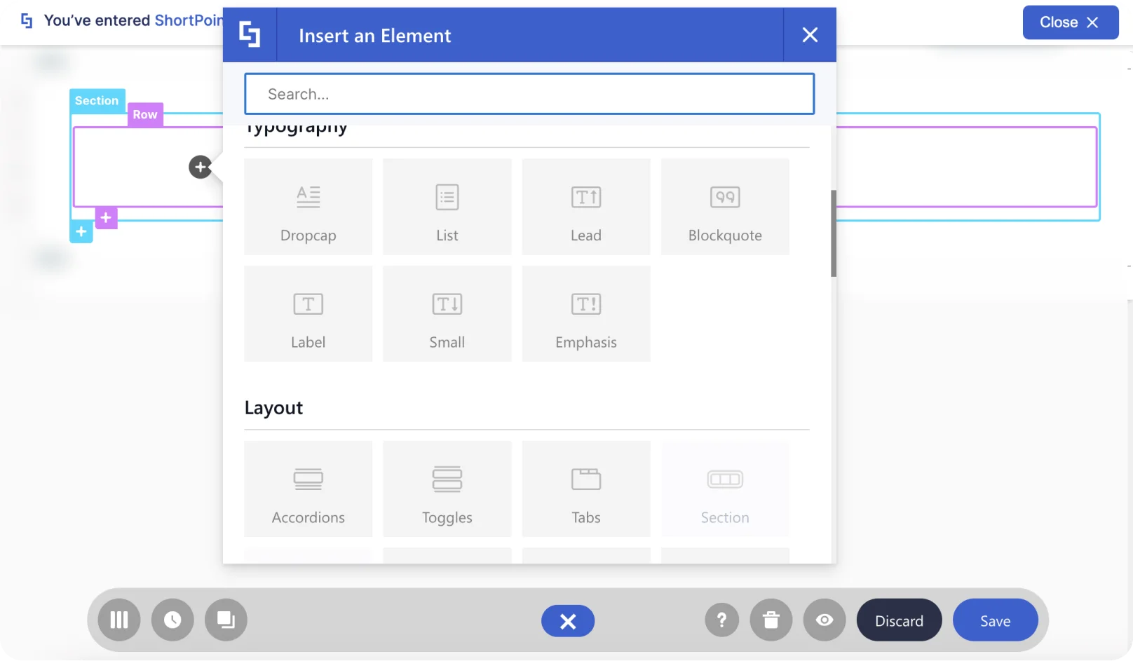
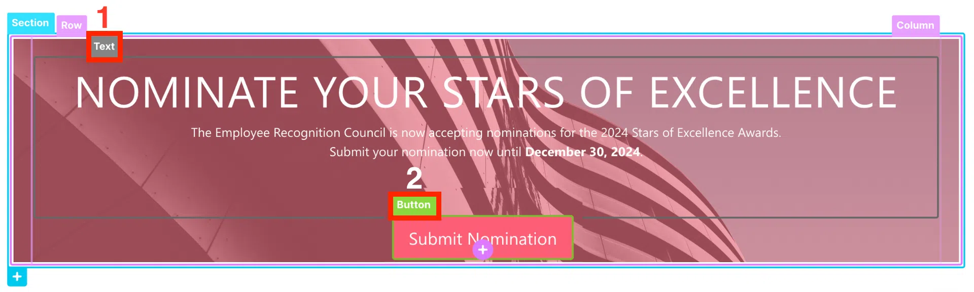
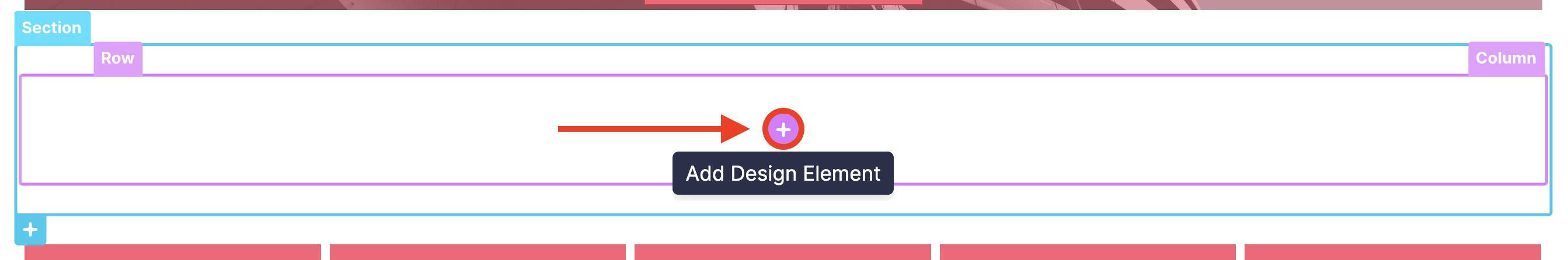
First, let’s go back to the SharePoint page we are editing. When you add a Section to your page and select the Choose Layout route, you will find a black plus icon. Click it to add a Design Element.
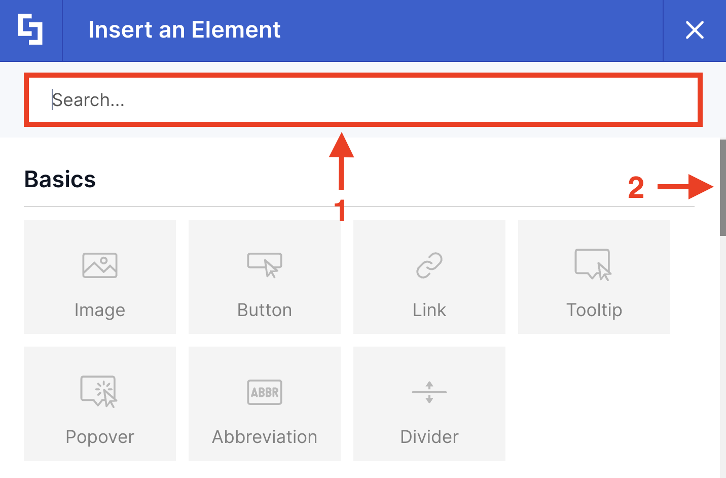
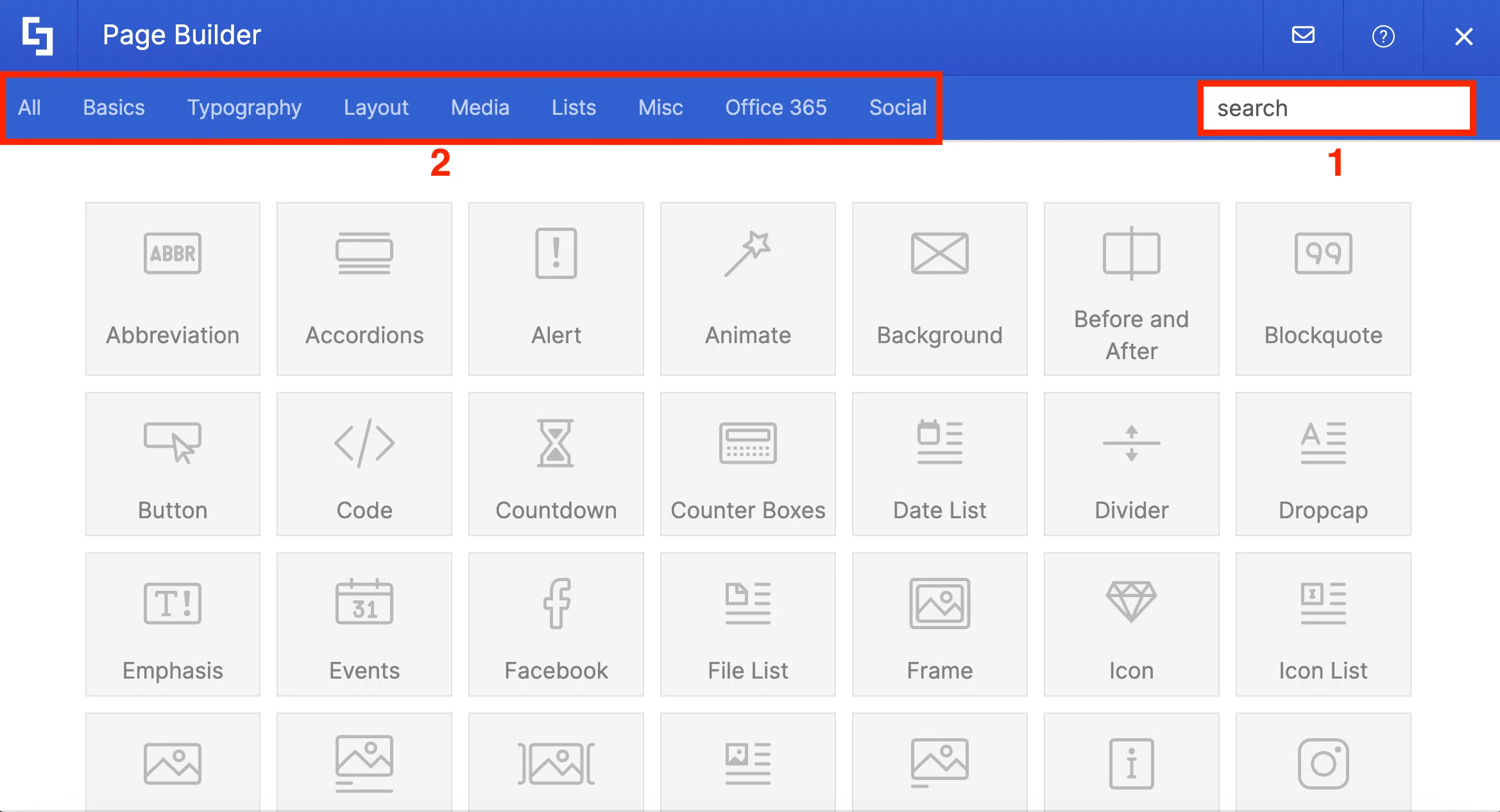
A popup window will appear where you will see a selection of Design Elements available for your use. They are divided into different categories from Basics to Lists and Socials.
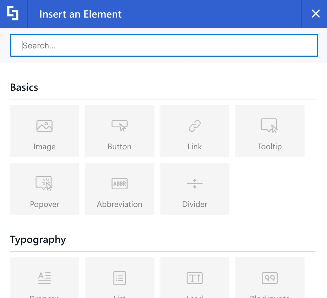
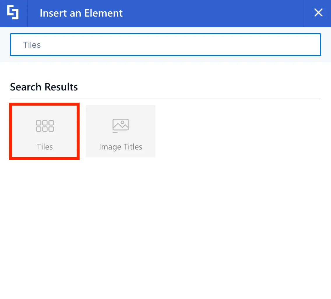
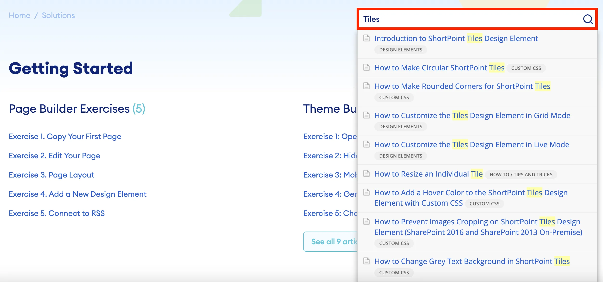
To look for the Design Element you want to use, you can either scroll down or use the search field. Let’s use the search field to find the Tiles Design Element. We will use it to create quick links to different resources in your organization.
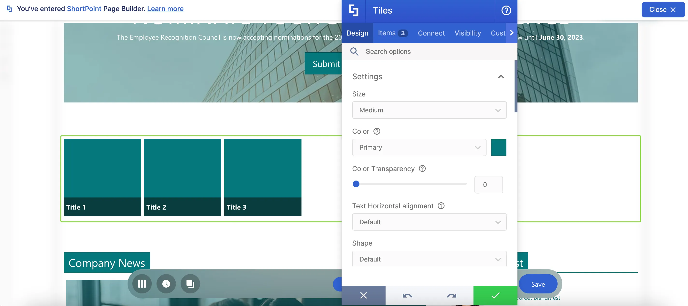
Once added, the most basic form of the Design Element will be inserted into your page, and it will have placeholder content.
Editing content
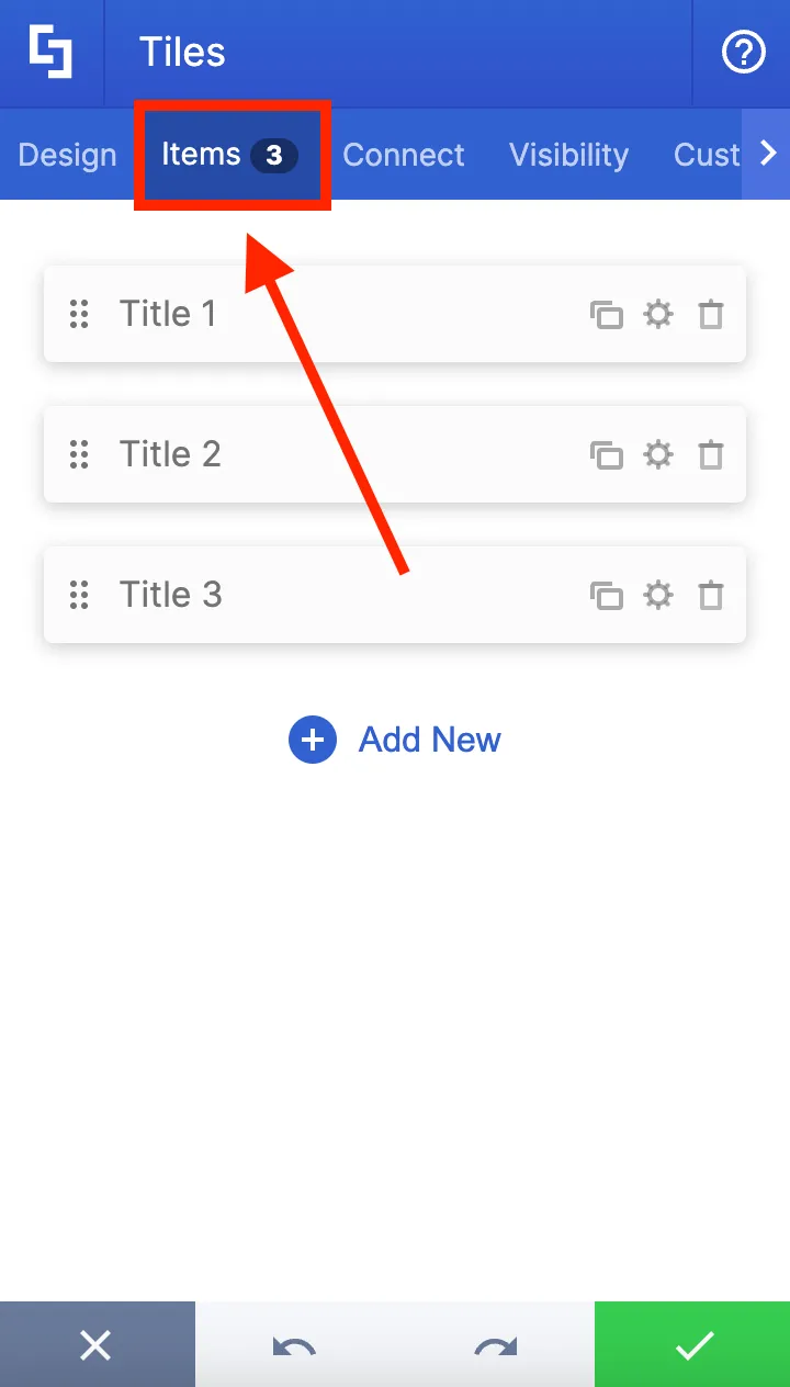
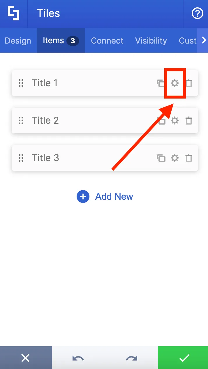
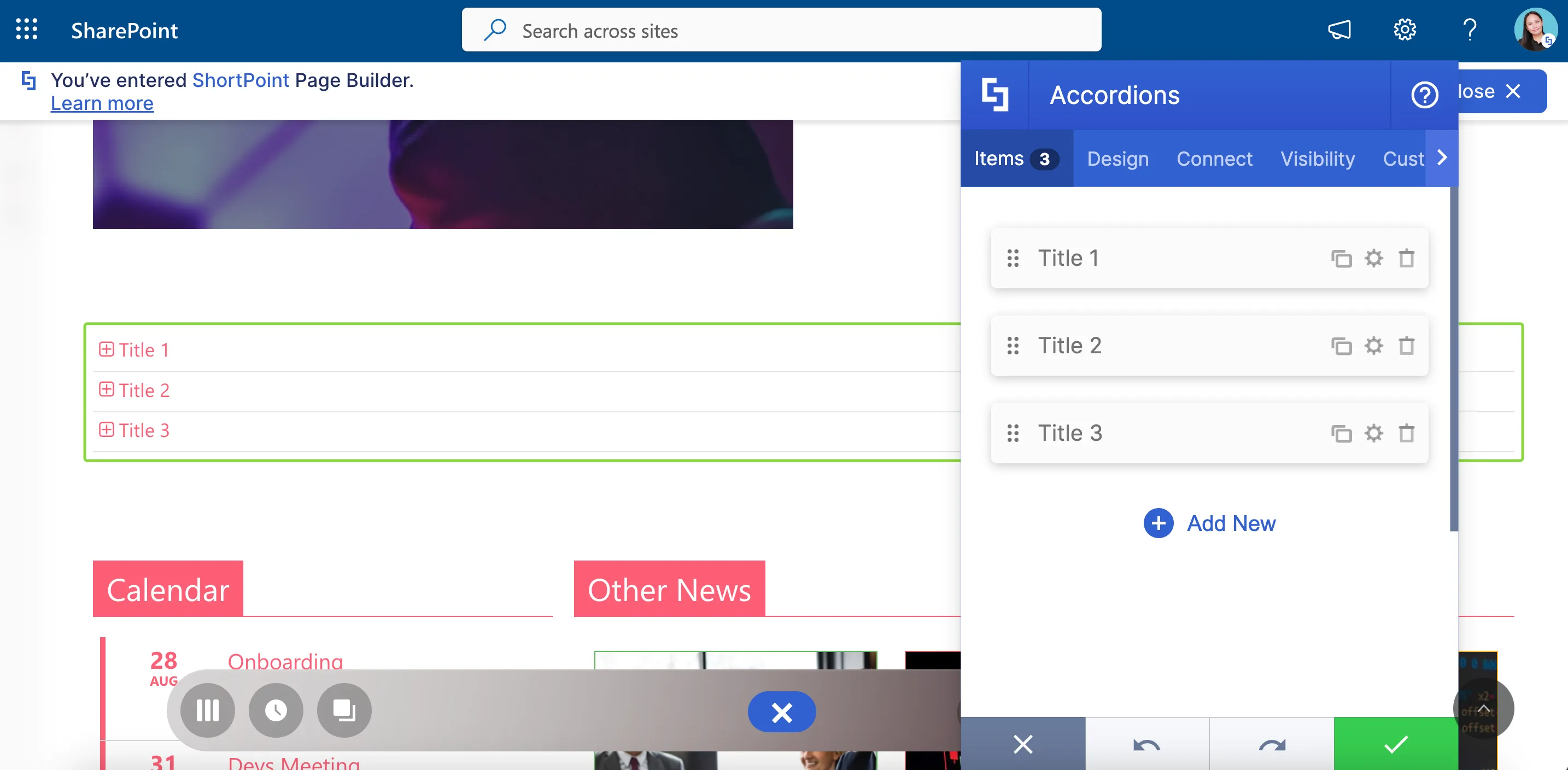
To edit the content, go to the Items tab. Here, you will find the three default tiles that you see on your page.
Press the cogwheel icon on the first item to edit the content of the first tile.
Change the name in the [1] Title field to show the first resource you want to add. You can also add a [2] description, [3] a link to where your users will be directed, and a [4] linking option.
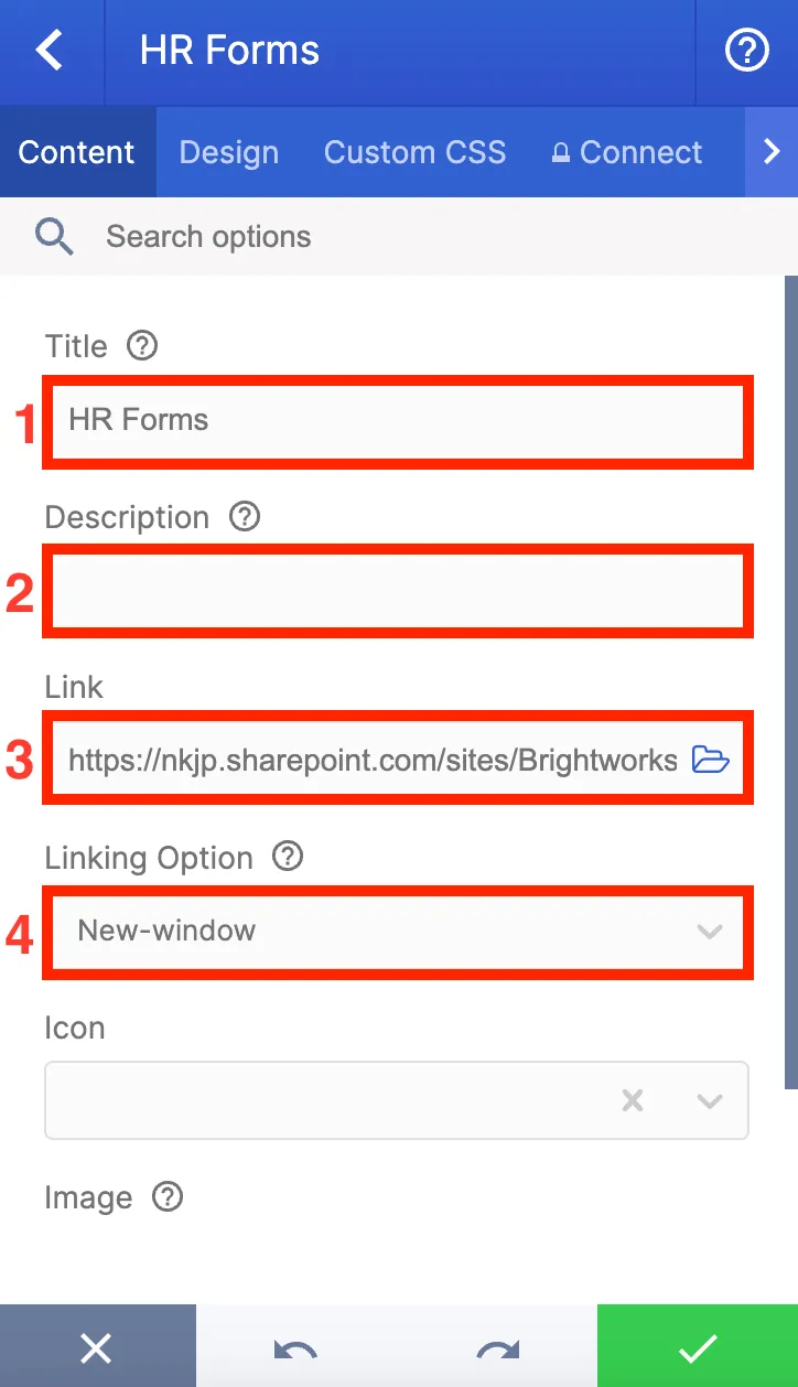
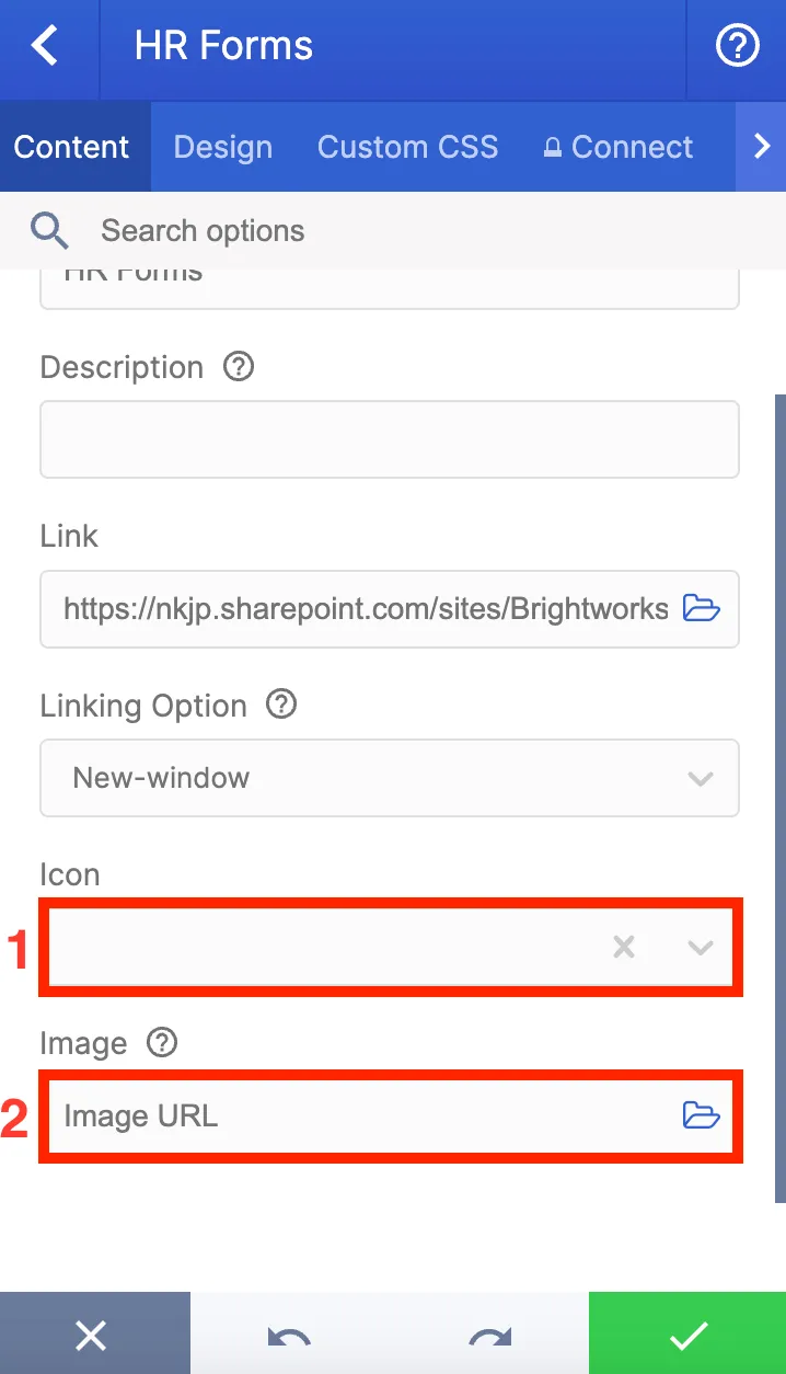
There are other items you can add to each tile, such as an [1] icon or an [2] image, but let's keep it simple for now.
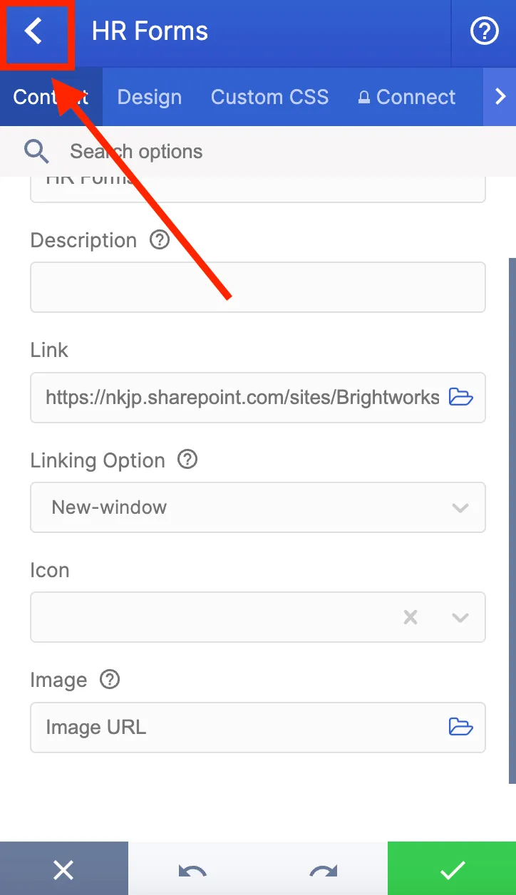
Once you are done editing the tile, click the back icon to do the same for the other tiles.
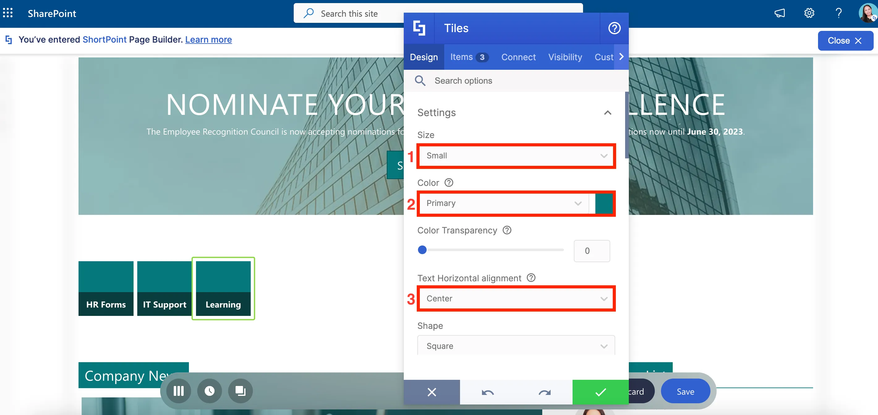
Modifying settings
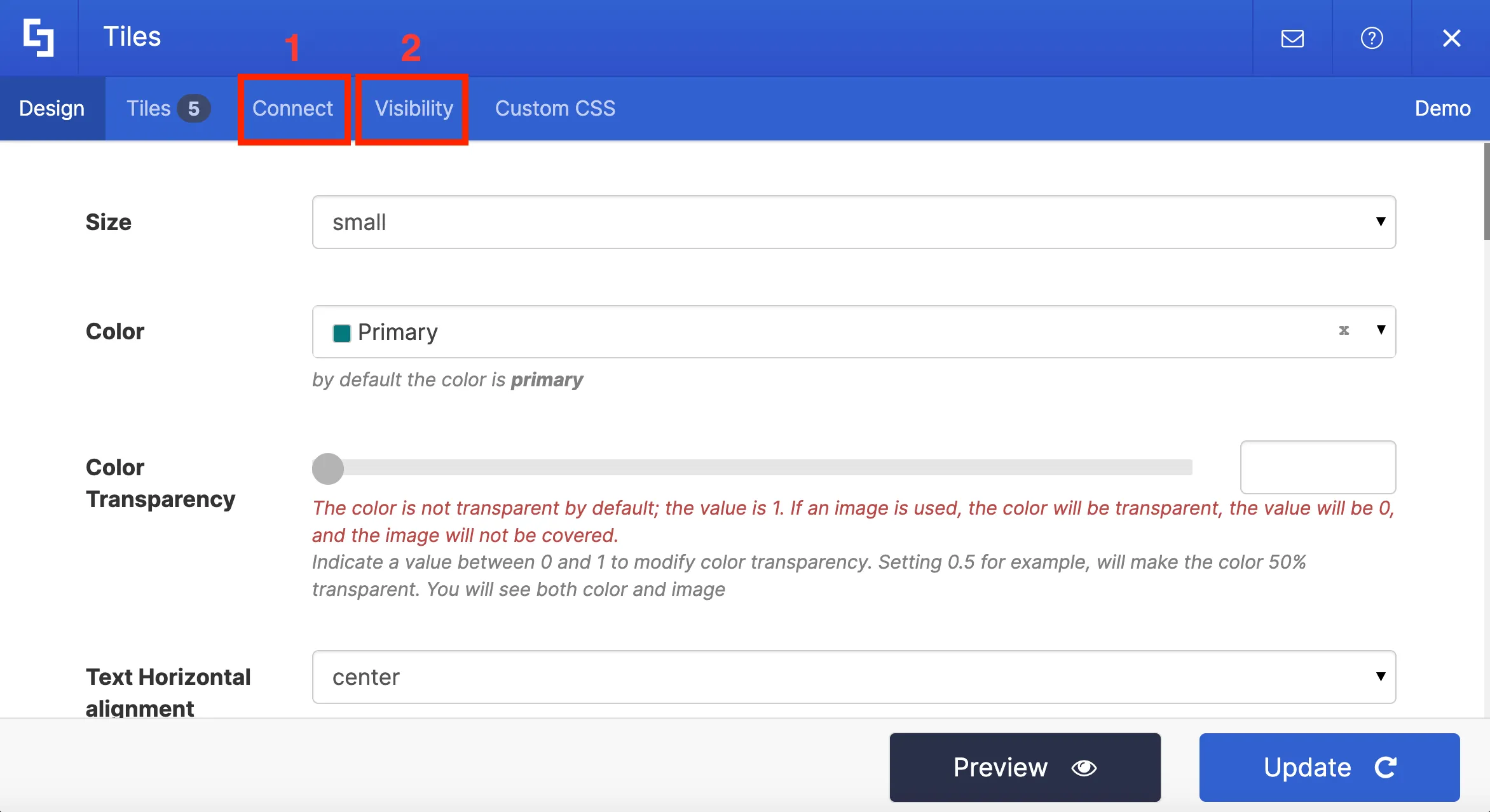
Now let's customize a few settings of the Tiles Design Element using the Design tab. Here, you will find different style options specific to Tiles that you can modify.
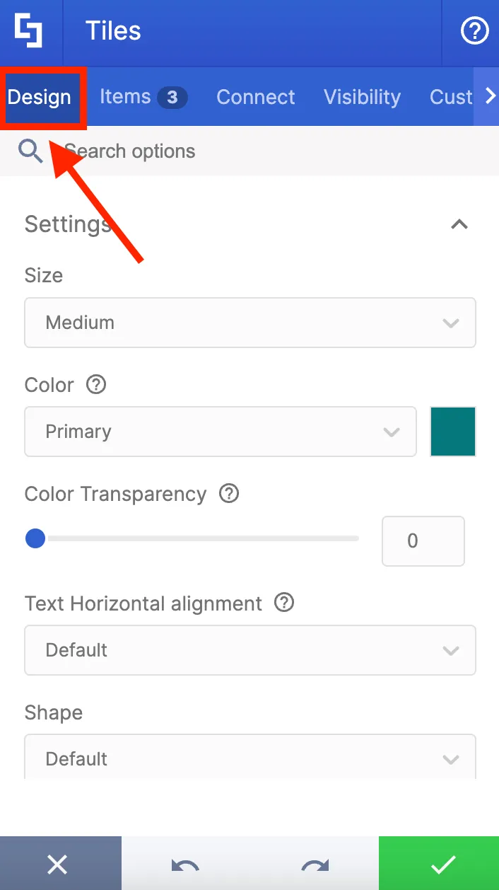
You can change the [1] size, [2] color, and [3] text alignment of your Tile.
Other design settings like [1] shape and [2] style can also be modified.

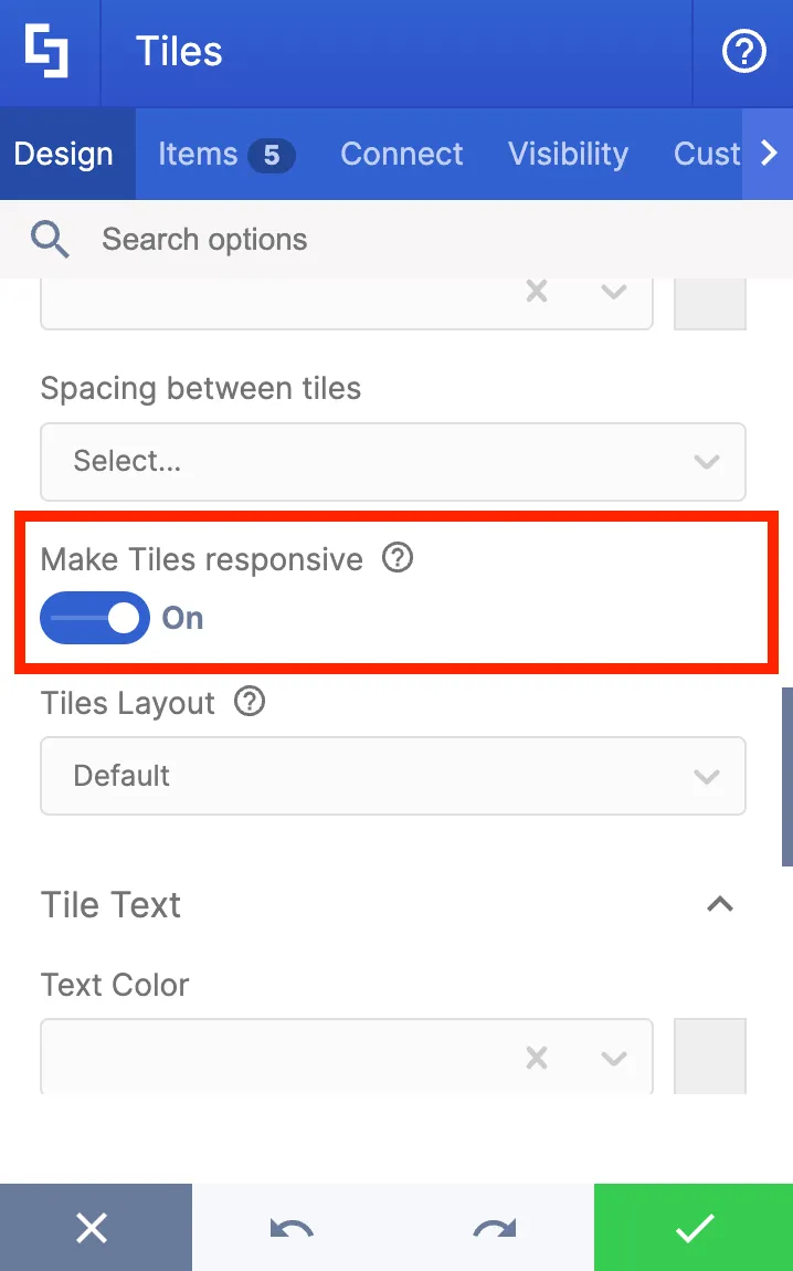
You can also scroll down to find more options like Make Tiles responsive which will automatically resize all tiles to fit the Section.
Now, let's go back to the Items tab to add more tiles since we have more resources to link to. You have the option to duplicate a tile using the duplicate icon.
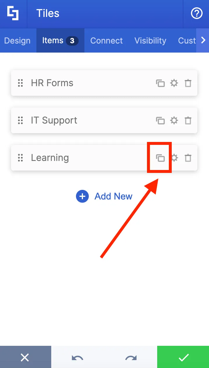
You will now see the duplicated tile. Click the cogwheel icon of the duplicated tile to change some details.
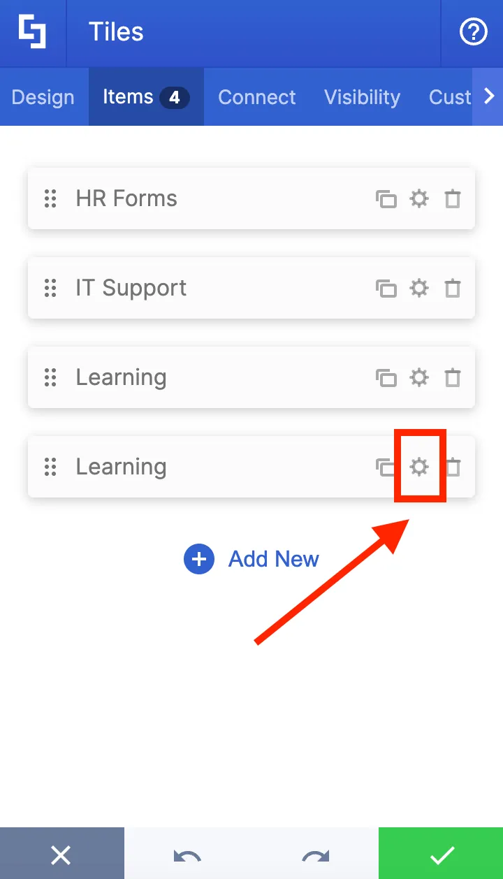
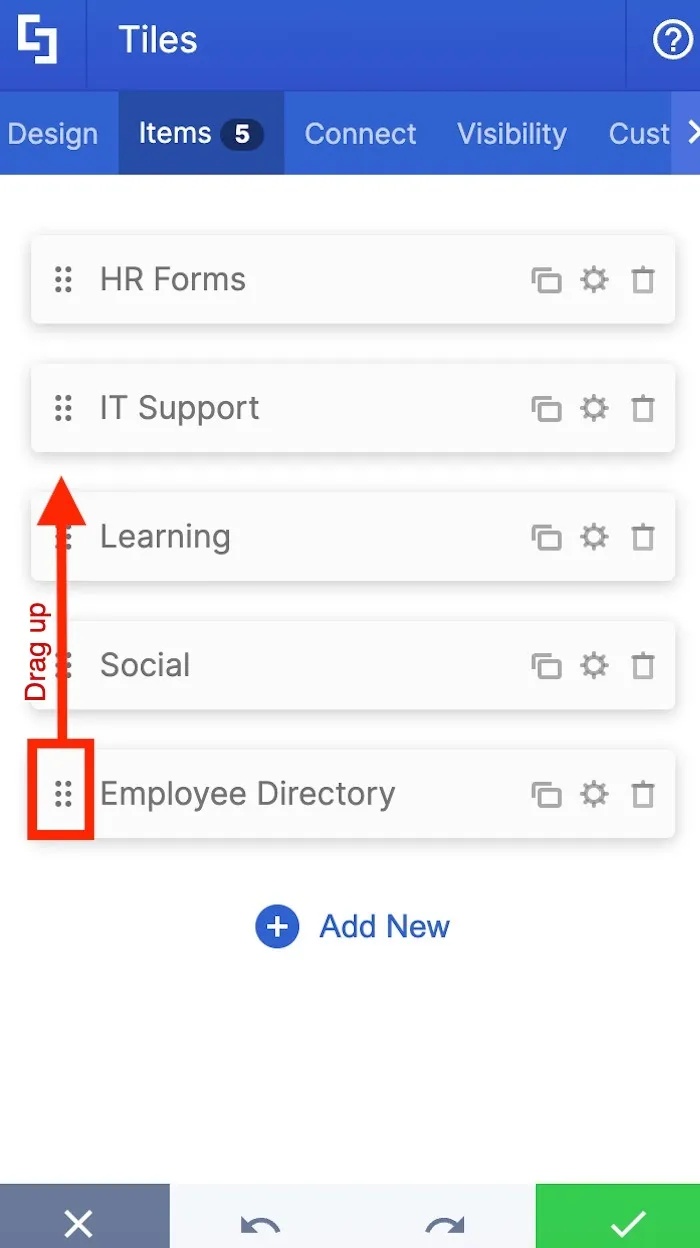
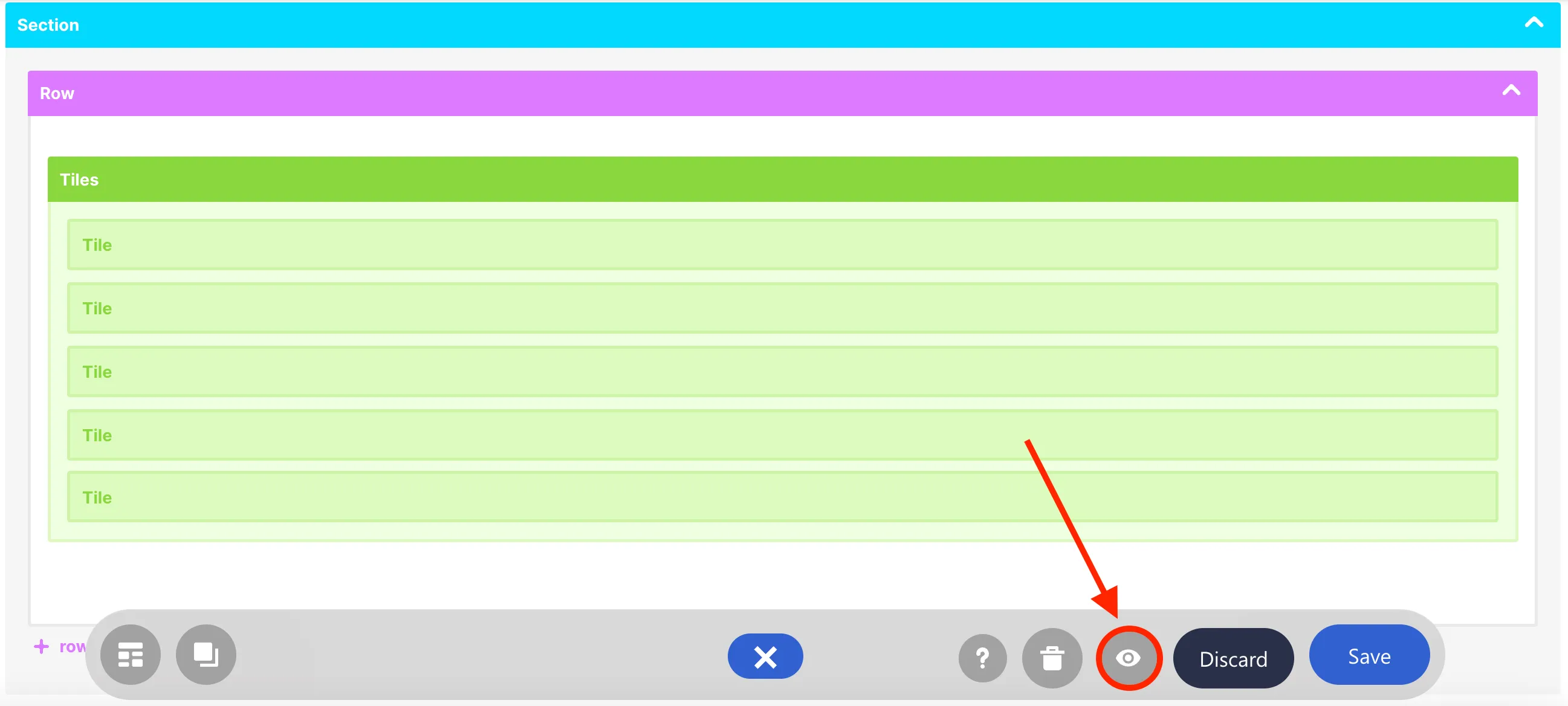
Now that we have all the tiles we need, let us rearrange the order of the Tiles. We want to place Employee Directory in between IT Support and Learning.
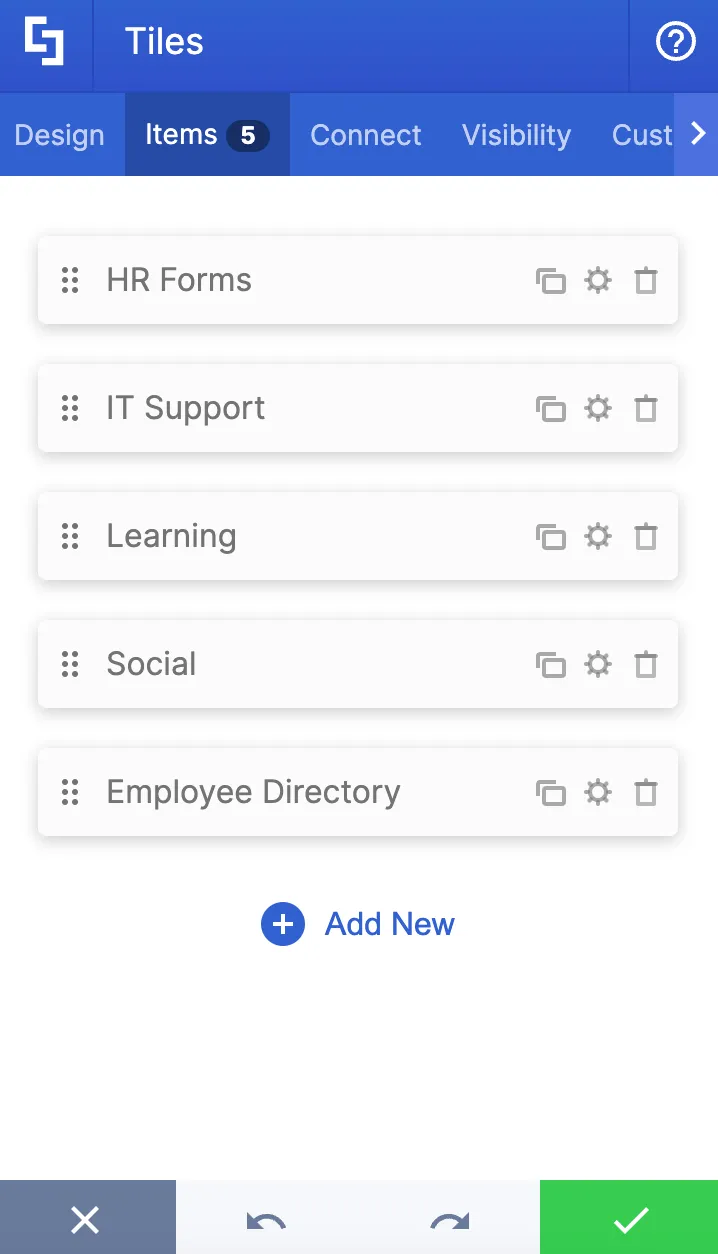
To do this, click the dots icon and drag it to your desired position.
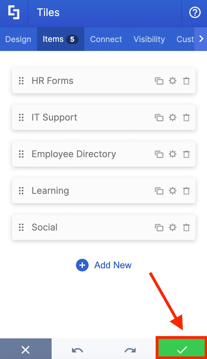
Once you're satisfied with your edits, hit the green checkmark.
You will now have the Design Element on your page. Click the eye icon to preview how the design will look on your site.
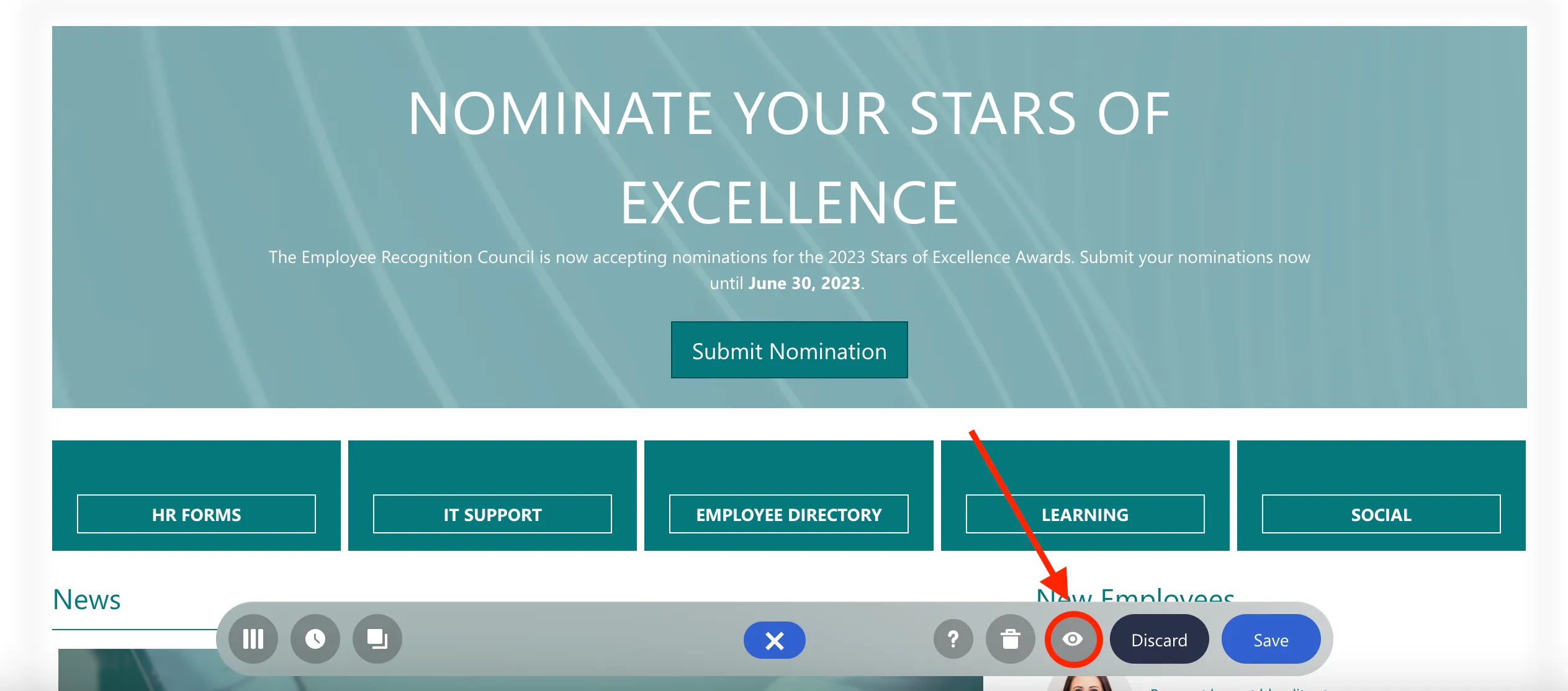
And click Save to keep all your changes.
Congratulations! You now know how to insert a new Design Element and how to customize its content. ShortPoint has over 60 Design Elements that you can explore to present all the different types of content useful for your Intranet visitors.
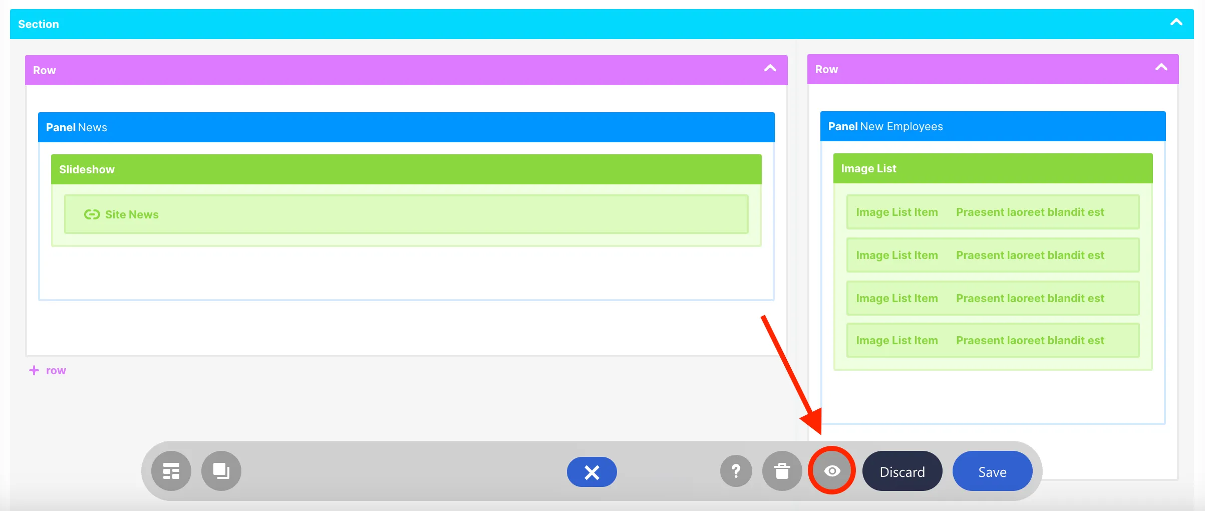
Explore Grid Mode
In this lesson, you'll discover how to switch to the Grid Mode editor, learn its interface for editing, and explore the ShortPoint features that are presently available only in Grid Mode.
Switching to Grid Mode
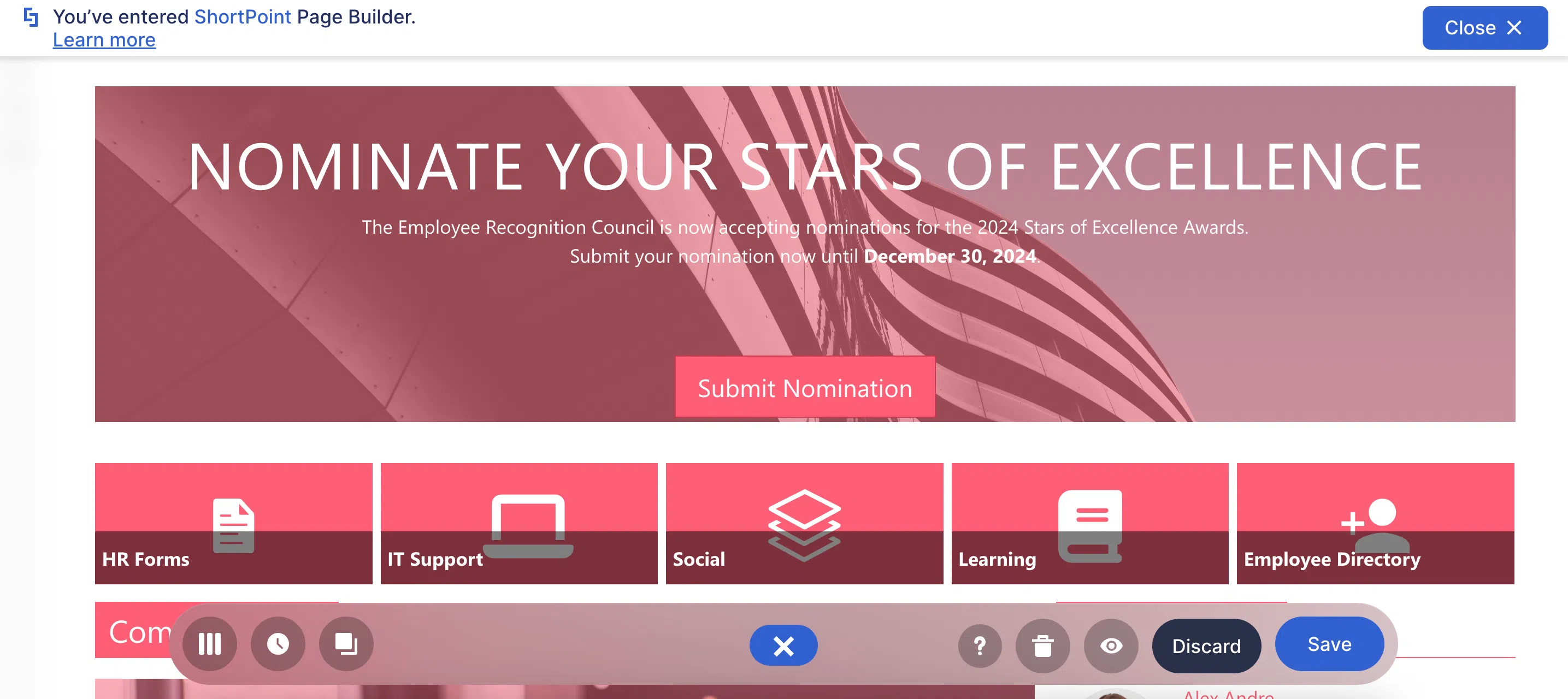
The Live Mode editor is the first interface you see when you start editing a page in ShortPoint. It provides a fully visual experience where you can see your changes in real-time.
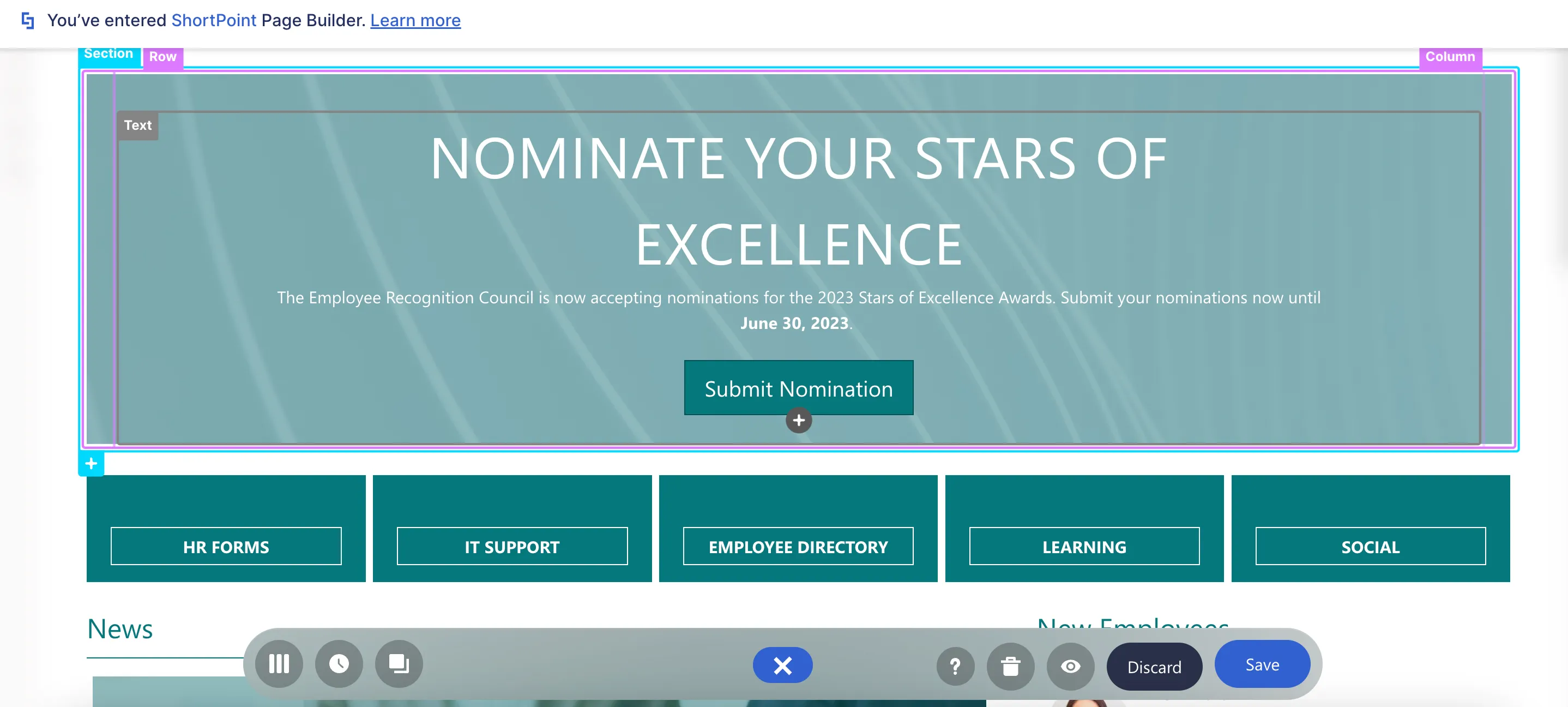
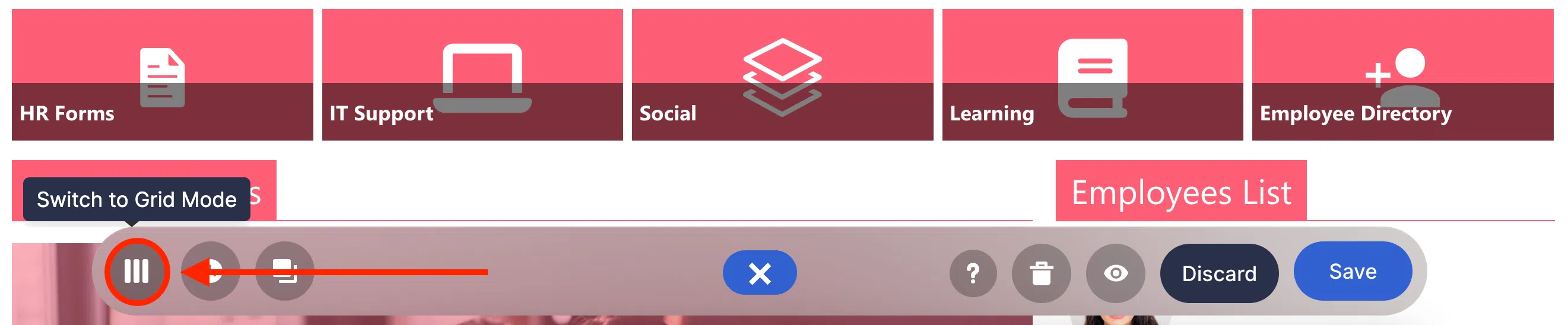
ShortPoint also offers a second editing interface called Grid Mode. To access it, simply click the Switch to Live Mode icon in the Action Toolbar.
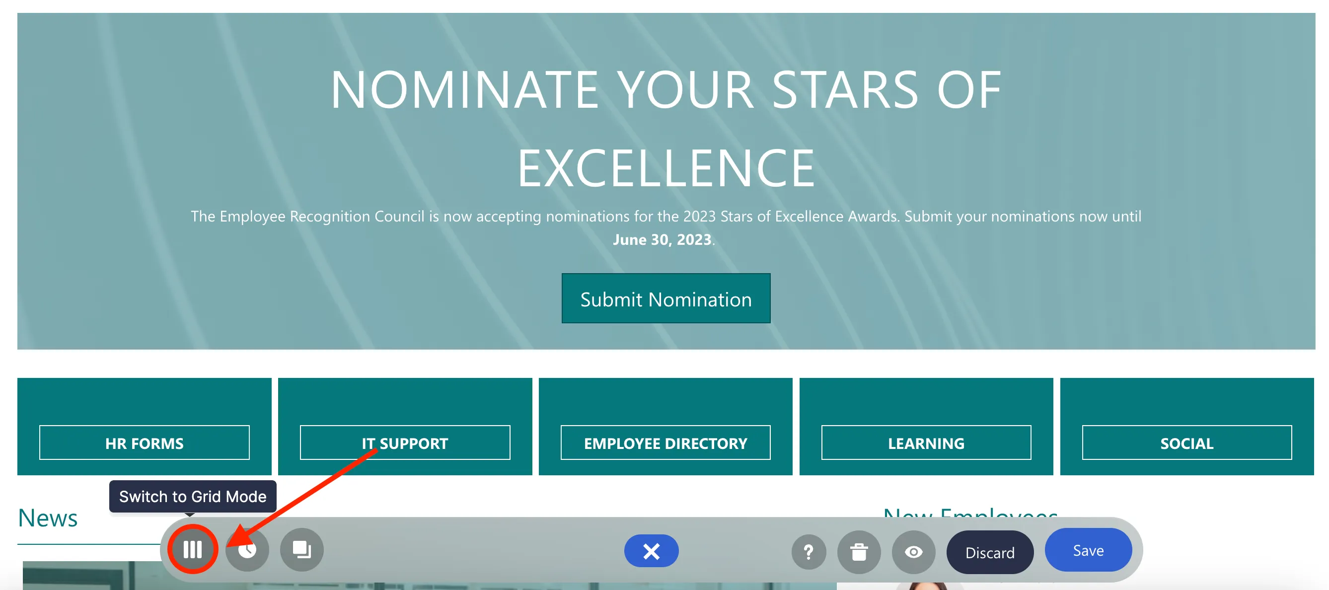
This will take you to Grid Mode. Grid Mode is a wireframe-based interface that shows the structure of your page in colorful blocks.
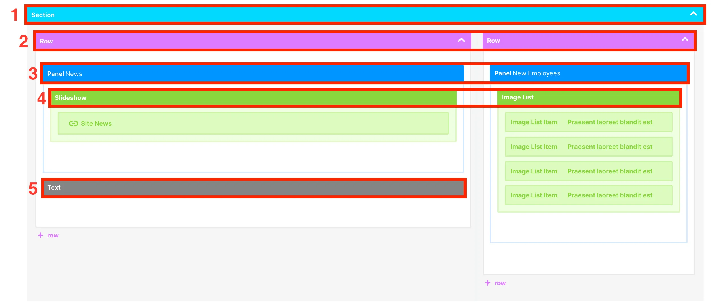
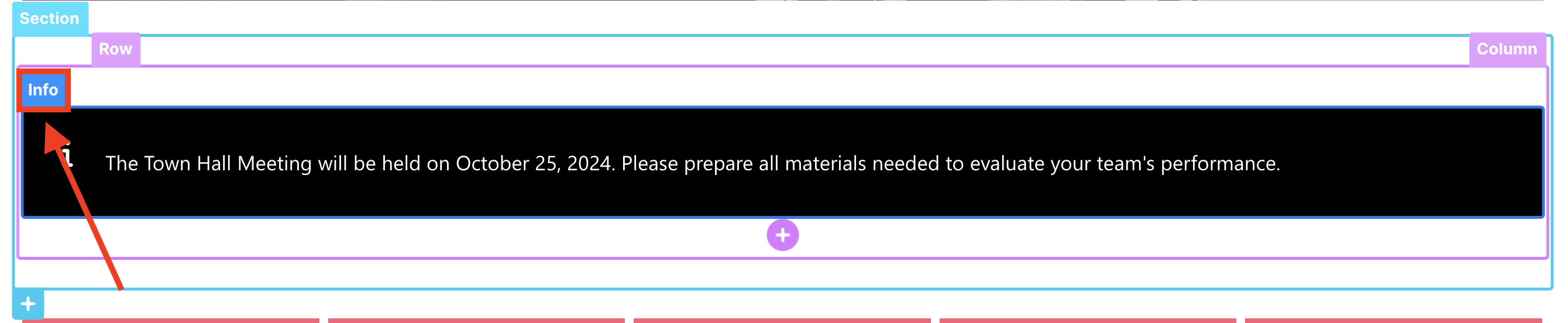
The color coding of the elements is similar to the one in Live Mode. [1] Sections are light-blue; [2] Rows are pink; [3] Content-holder Design Elements are dark blue; [4] Multiple-item Design Elements are green; and [5] Single-item Design Elements are gray.
You may also notice that there are elements that appear in Grid Mode but not in Live Mode. For example, this blank text element can only be seen in Grid Mode.
Editing in Grid Mode
While most editing functionalities are the same in both Live Mode and Grid Mode, the experience differs slightly between the two modes.
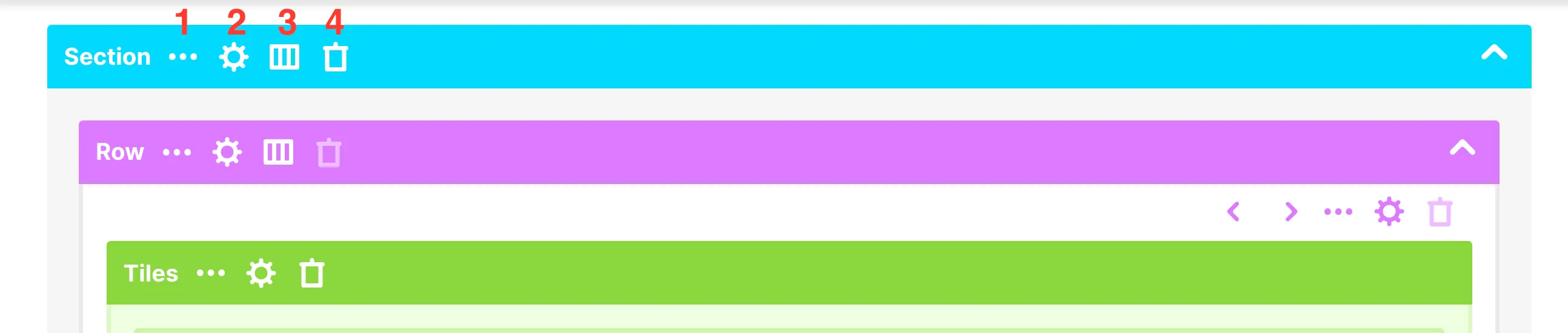
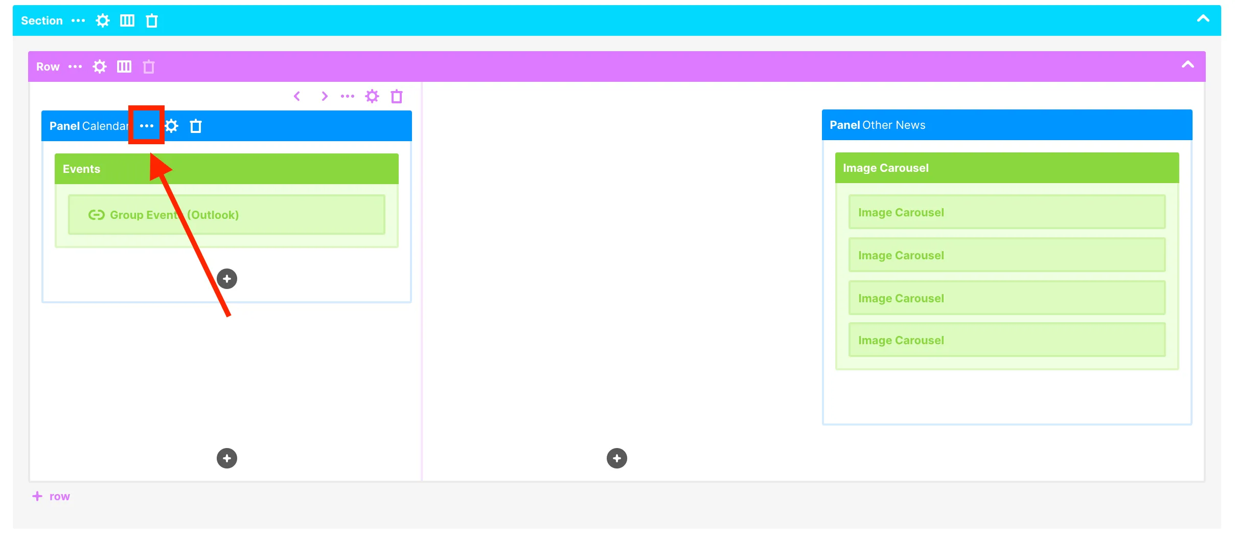
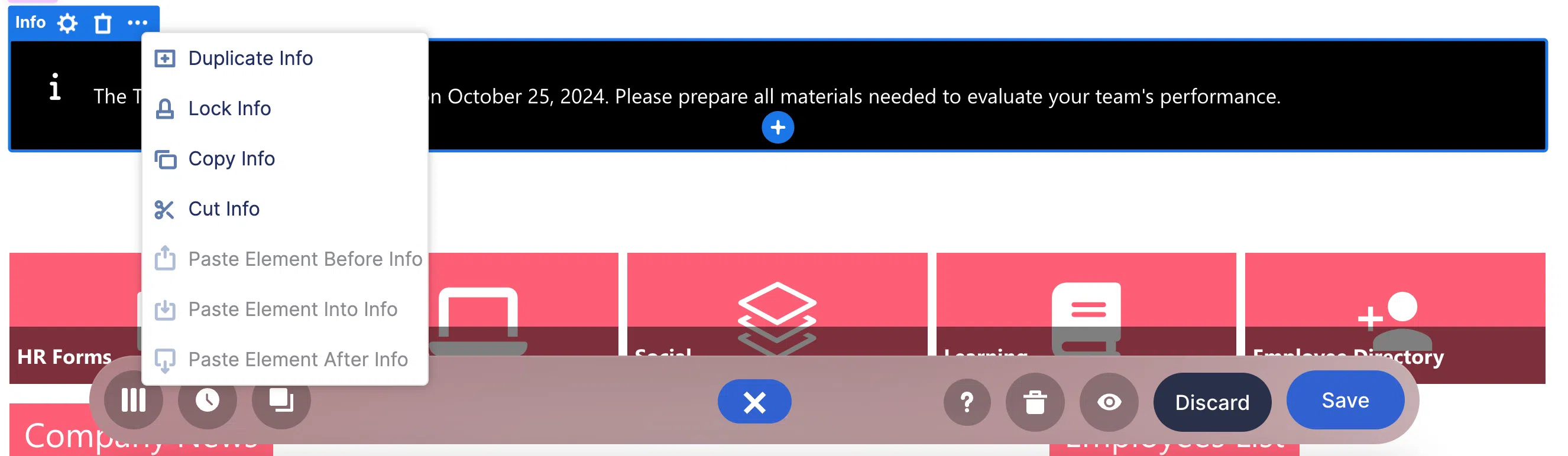
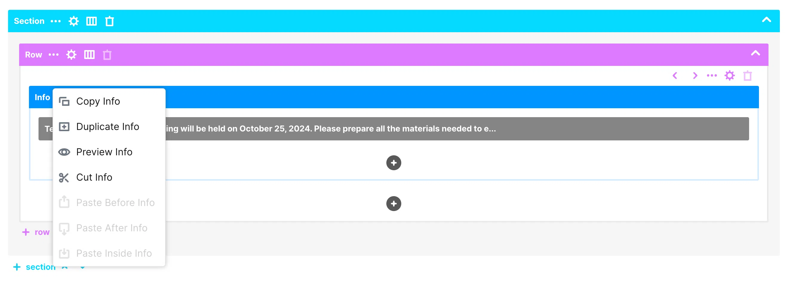
First, let’s access the action items of an element. To do this, hover over an element. The following action items will appear:
[1] Ellipsis icon - lists other actions that will allow you to either copy, duplicate, cut, preview, or paste an element.
[2] Cogwheel icon - allows you to open the Settings Window where you can further customize an element.
[3] Layout icon - allows you to change the layout of an element. (Only available for Sections and Rows).
[4] Trash icon - allows you to delete an element.
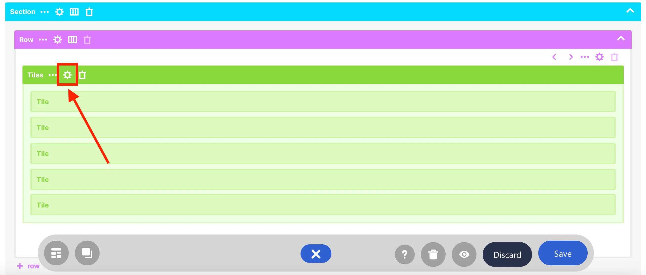
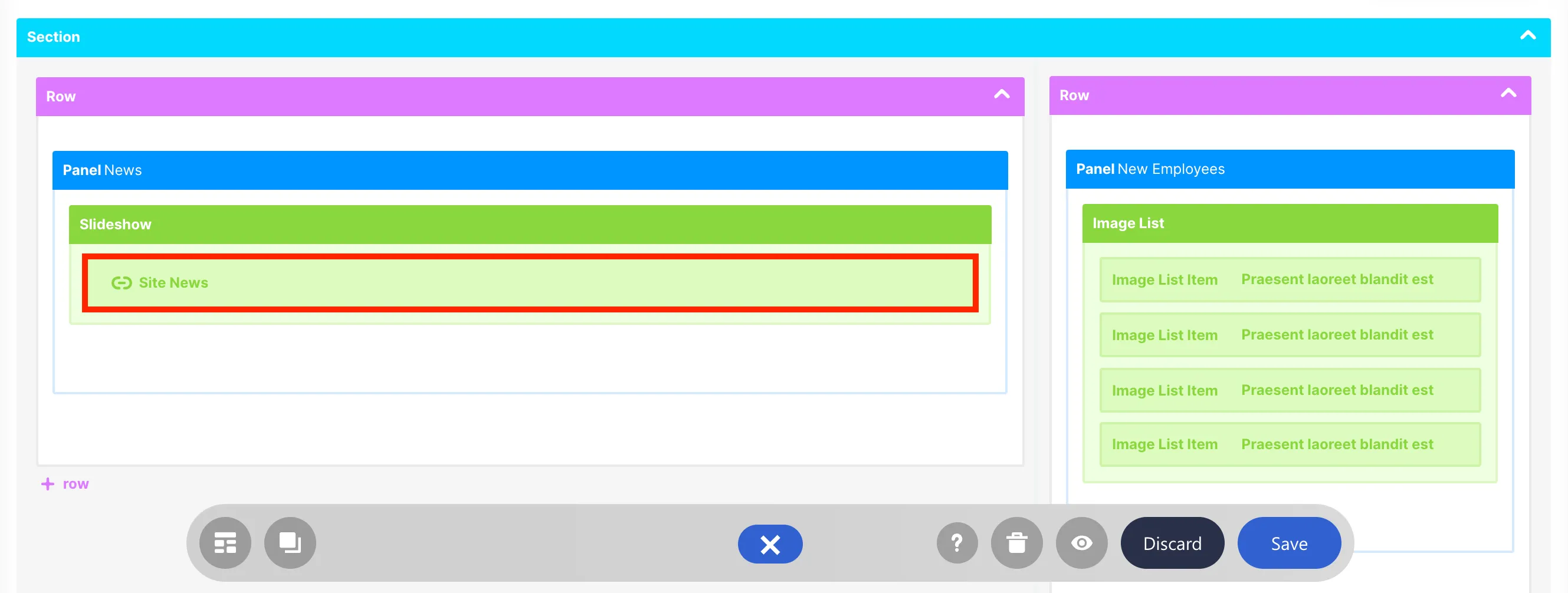
For example, let’s demonstrate how to copy and paste this Panel Design Element to the blank column beside it.
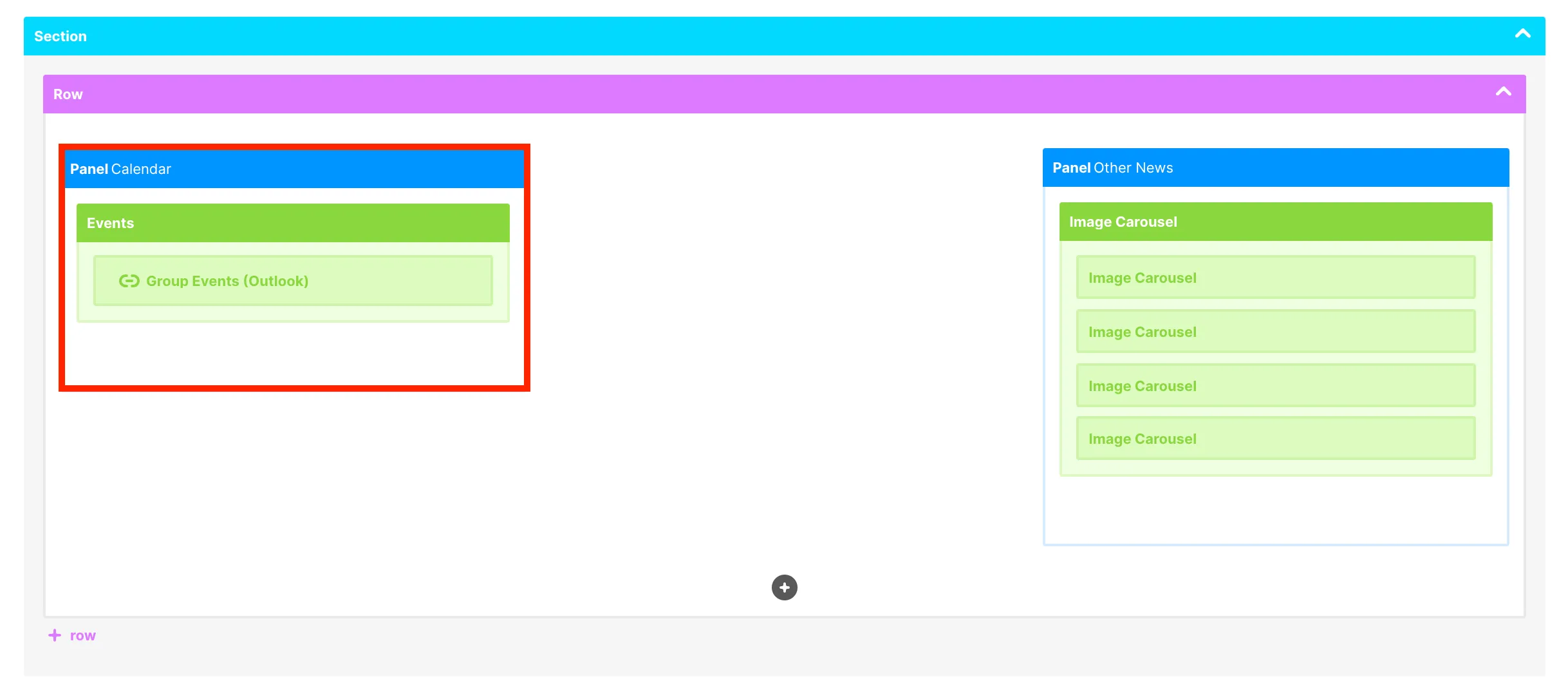
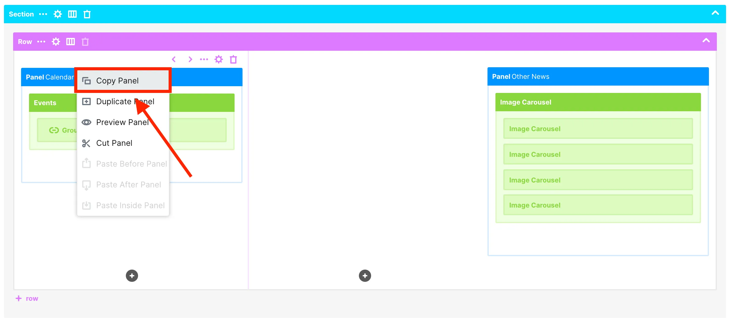
Hover over the Panel Design Elements until you see the action items. Then, click the ellipsis icon.
From the list of actions, select Copy Panel.
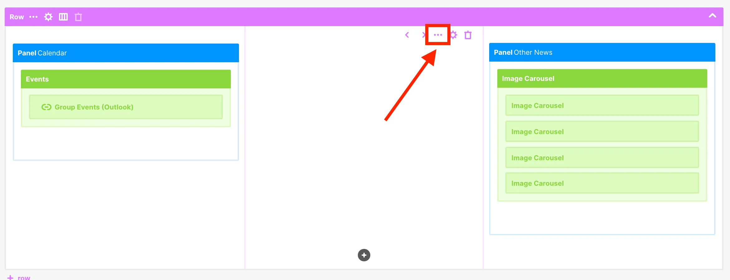
Then, hover over the blank Column until you see the action items. Click the ellipsis icon.
Then, from the list, select Paste Panel inside Column.
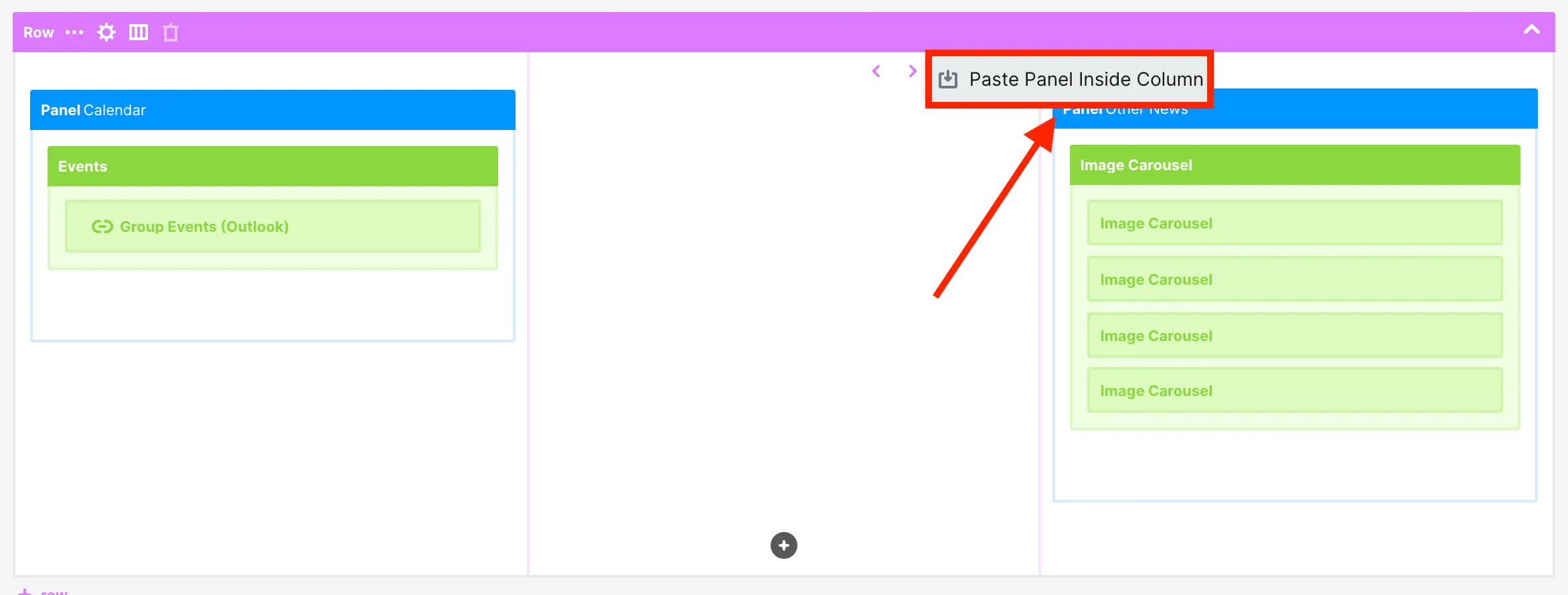
Alternatively, you can also right-click on the blank Column and click Paste Panel Inside Column.
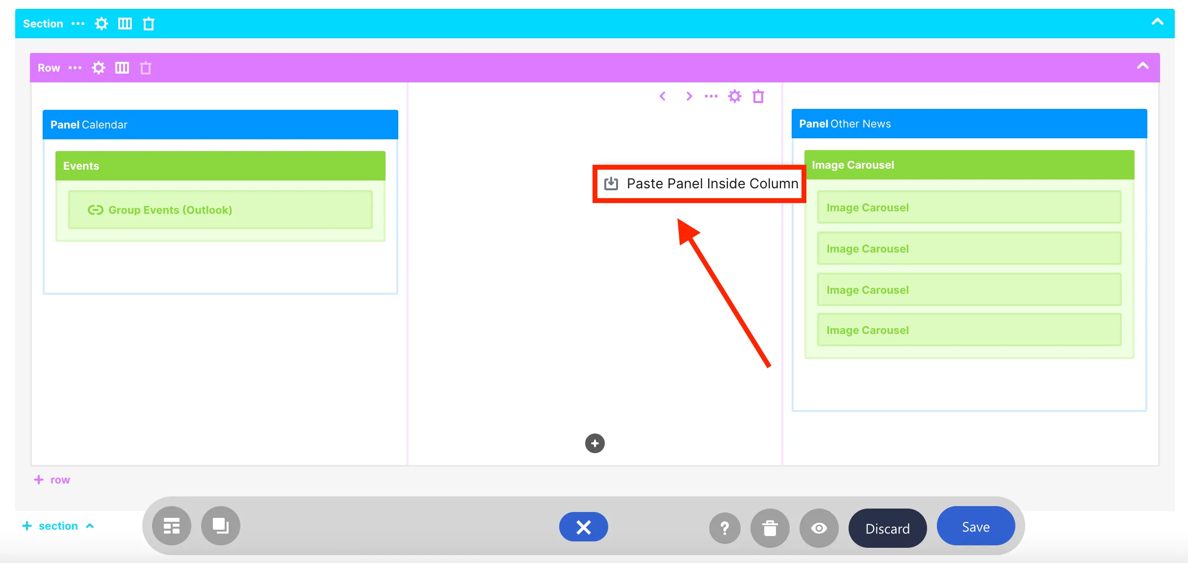
You will now see your copied Panel Design Element.

Accessing additional features in Grid Mode
There are also some actions that can only be done in Grid Mode.
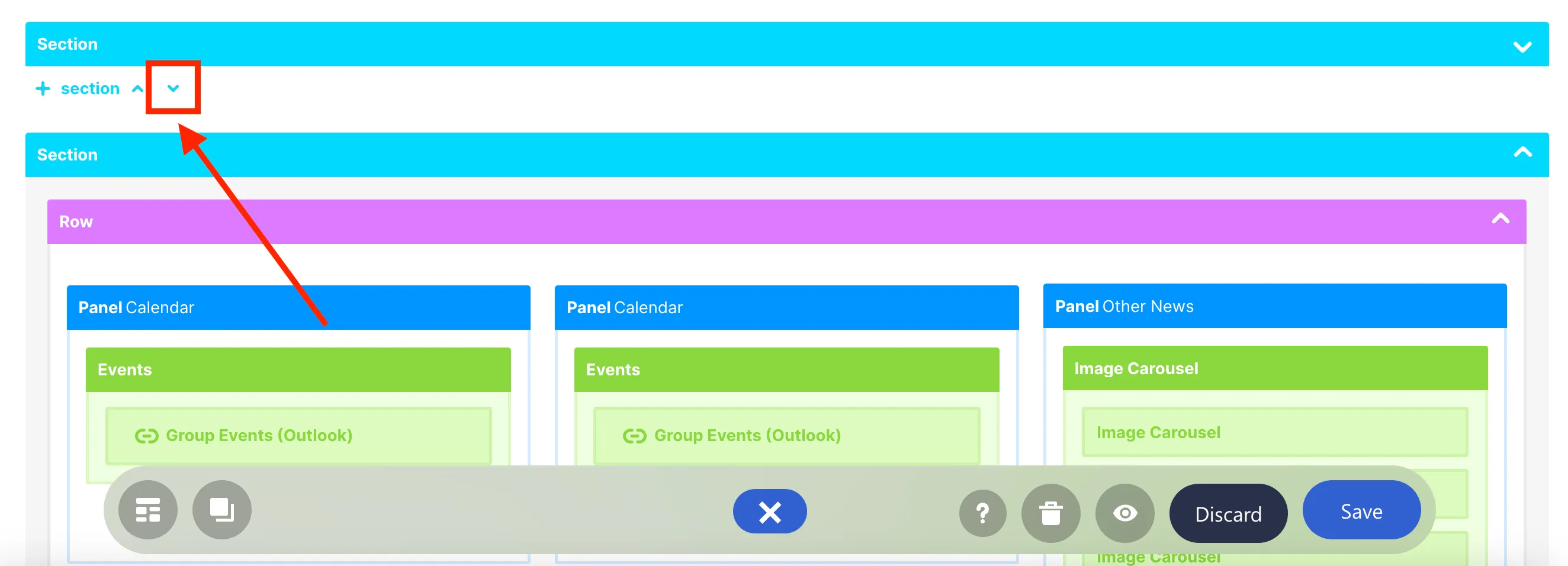
If you have a busy page, you can collapse and expand groups of design elements to focus on the ones you need to work on. To collapse elements, click the up icon.
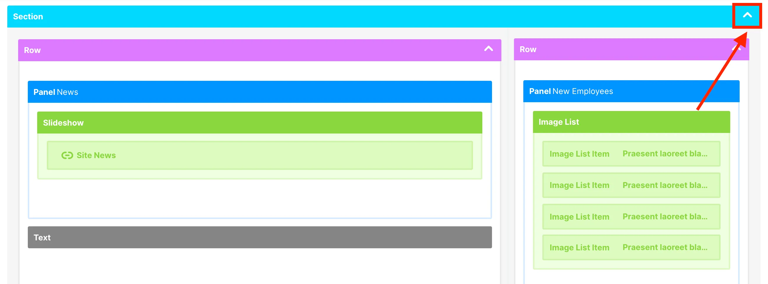
To expand it again, simply click the down icon.
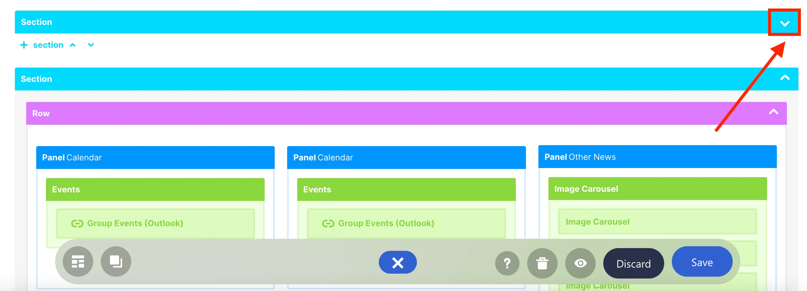
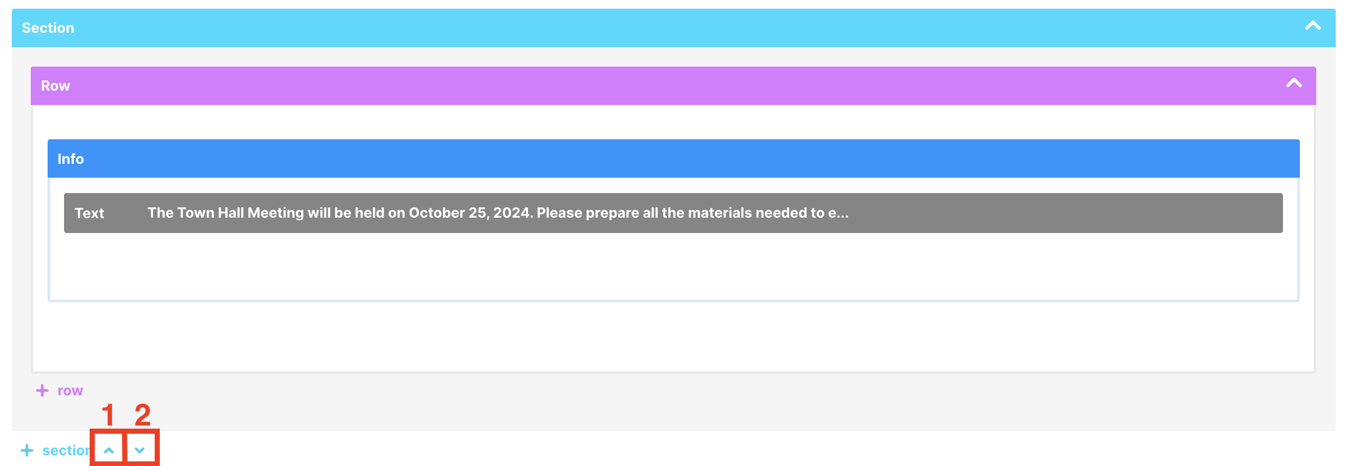
You can also arrange the order of Sections and Rows on your page. To do this, click the arrow icons found at the bottom.
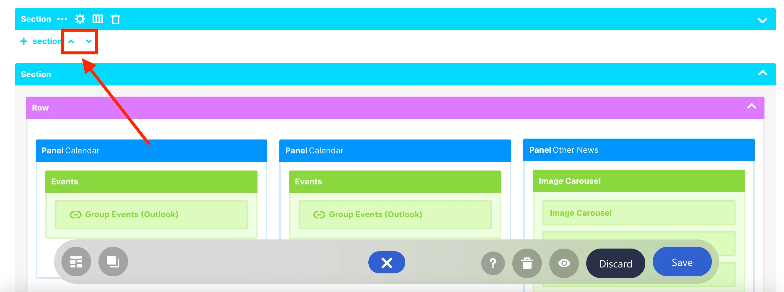
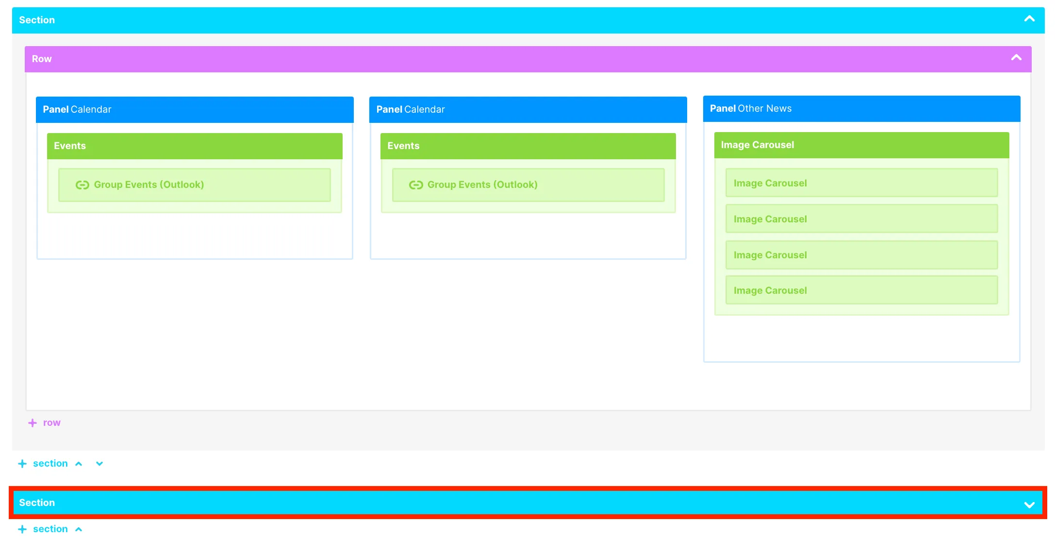
For example, let us move the collapsed Section below the Section with the Panel Calendars. To do this, click the down arrow icon.
You will now see the collapsed Section below the Section with the Panel Calendars.
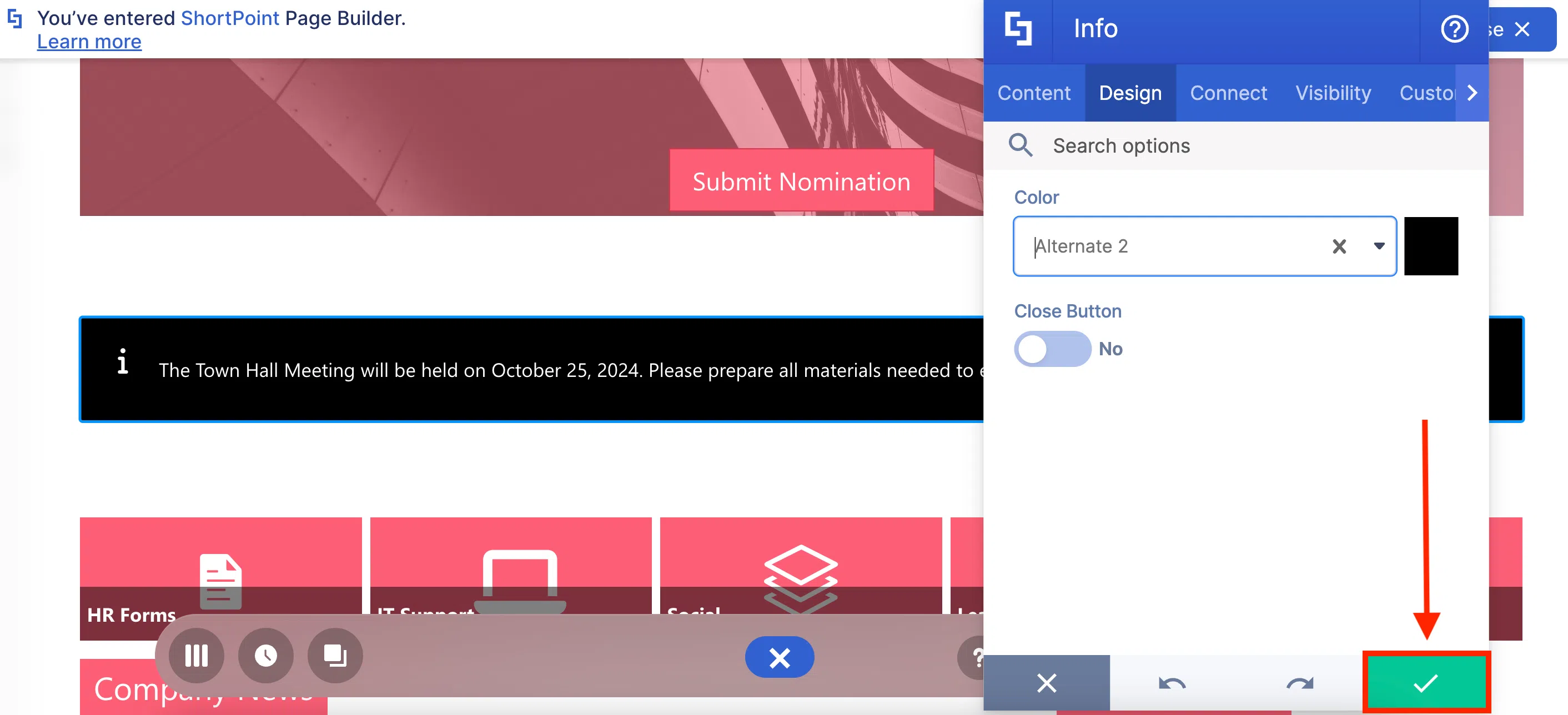
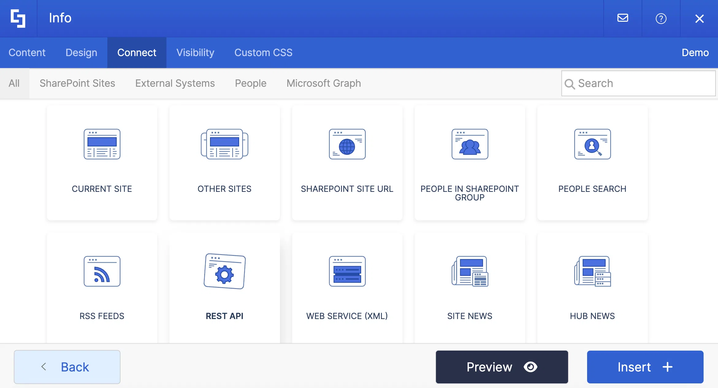
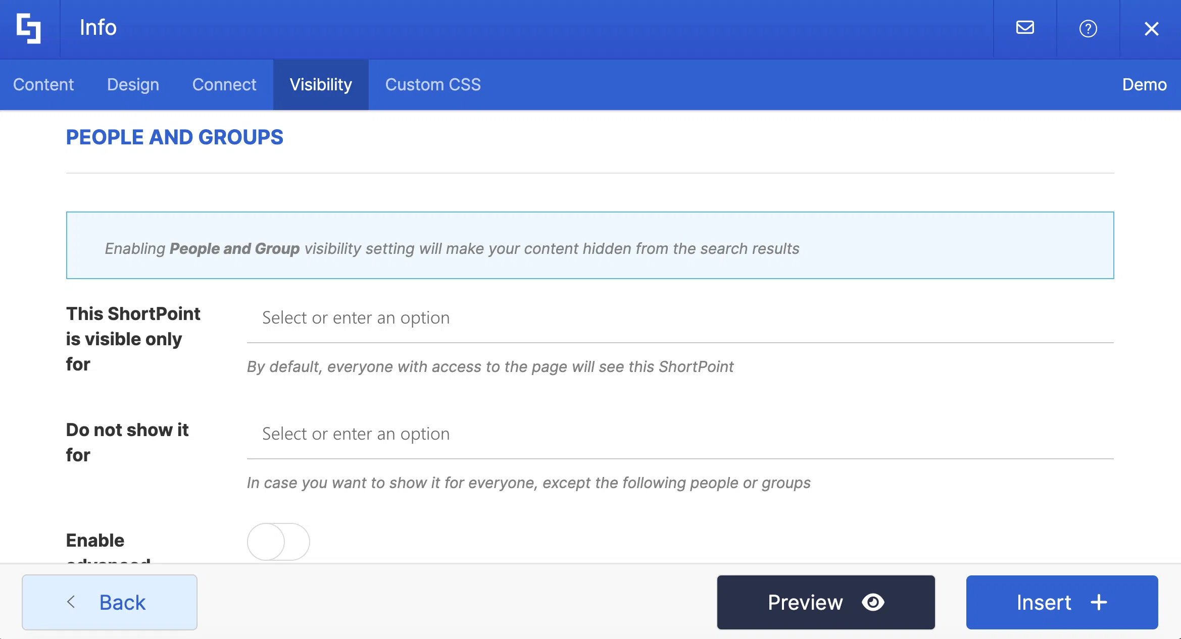
Additionally, there are two important ShortPoint features that are currently only available in Grid Mode. These are Connect and Visibility. To access them, simply hover over a Design Element and click the cogwheel icon.
This will open the Settings window. Here, you will find the [1] Connect and [2] Visibility tabs.
Connect enables you to automatically retrieve content from internal or external sources and display it on your page. This can include news from different SharePoint sites, content from a SharePoint list or library, calendar entries from Outlook, and more.
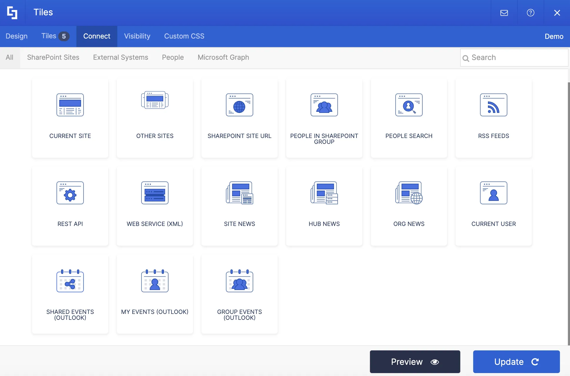
Visibility allows you to control which content on your page is visible or hidden to specific individuals or groups. You can even hide design elements on certain devices.

Then, click Preview to see how individual Design Elements will appear on your page.
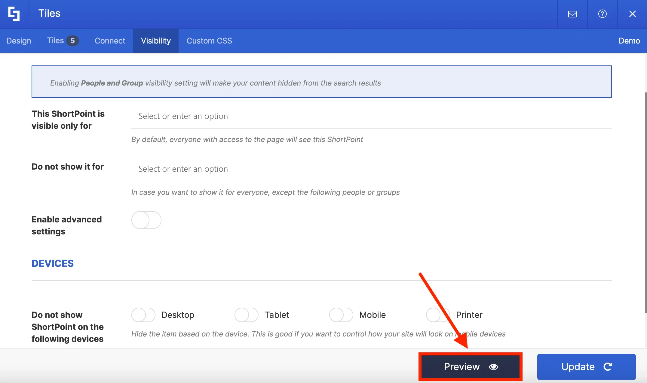
Once you are satisfied, click Update.
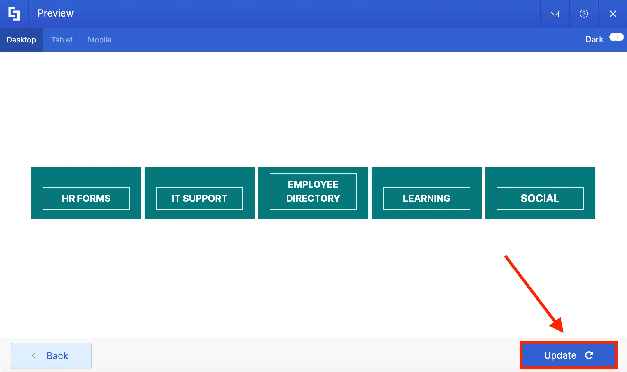
Finally, you can also preview your page after editing in Grid Mode. To do this, click the eye icon in the Action toolbar.
When you're done, just click the eye icon again to return to edit mode.
That’s it! Now that you're acquainted with the Grid Mode editor, it's time to take your intranet design to the next level. By familiarizing yourself with both interfaces, you can unlock even greater flexibility and creativity in crafting stunning intranet pages.
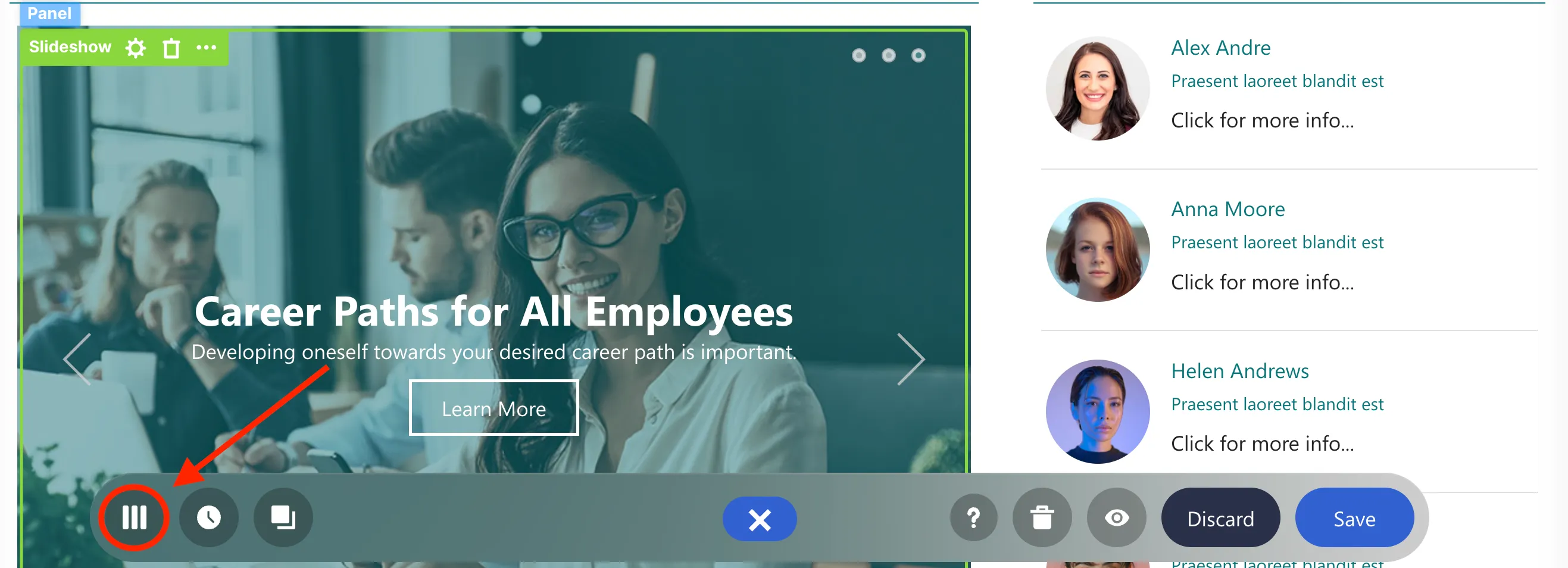
Connect to SharePoint news
In this lesson, you will learn how to dynamically display news posts on your SharePoint page using the ShortPoint Connect feature. The Connect feature automatically pulls the latest news from the source you selected and displays it on your page.
Choosing a connection type
With SharePoint, you may have news posts and news links that are important to highlight on your intranet. Through ShortPoint Connect, you can display these news items on your page, enabling you to easily incorporate content into your intranet page.
ShortPoint Connect is available for almost all Design Elements, including this Slideshow Design Element in our template.
To get started, you must first Switch to the Grid Mode editor by clicking the Switch to Grid Mode icon in the floating bar. Grid Mode is an outline-based interface where you will see a basic structural view of your page. This is the interface that supports the Connect feature.
Once you are in Grid Mode, scroll down to look for the Slideshow Design Element and select the cogwheel icon.
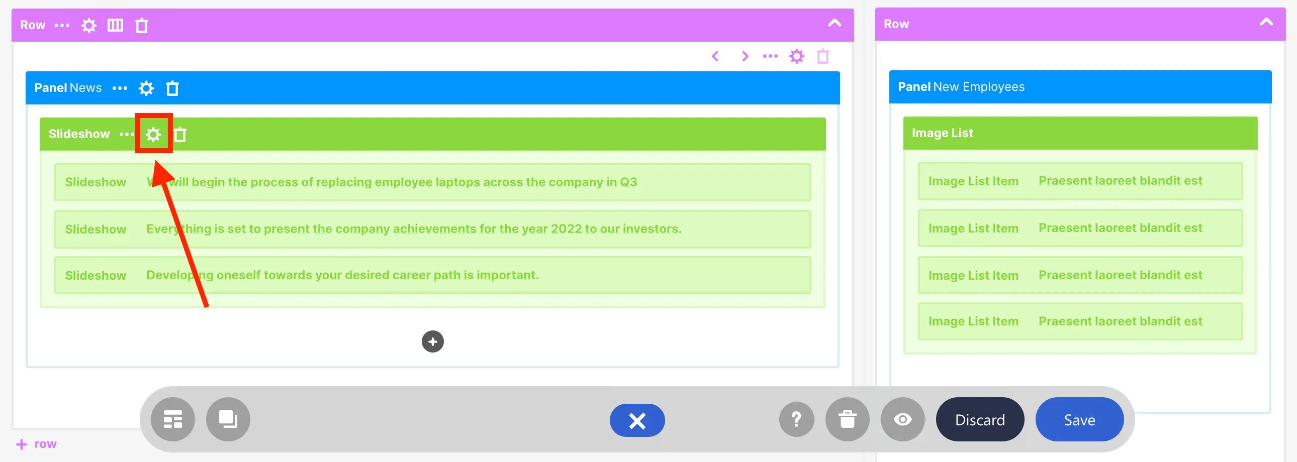
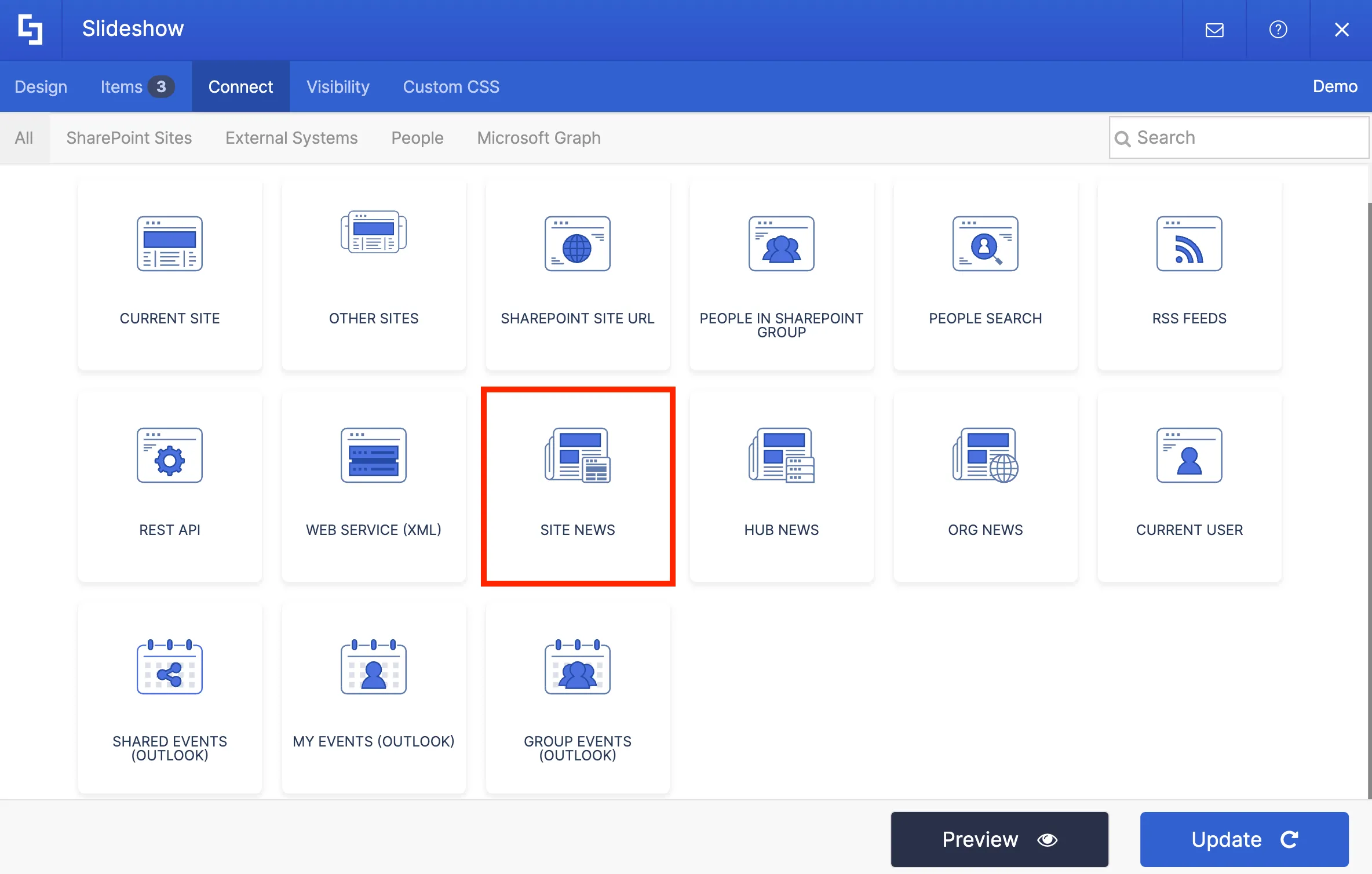
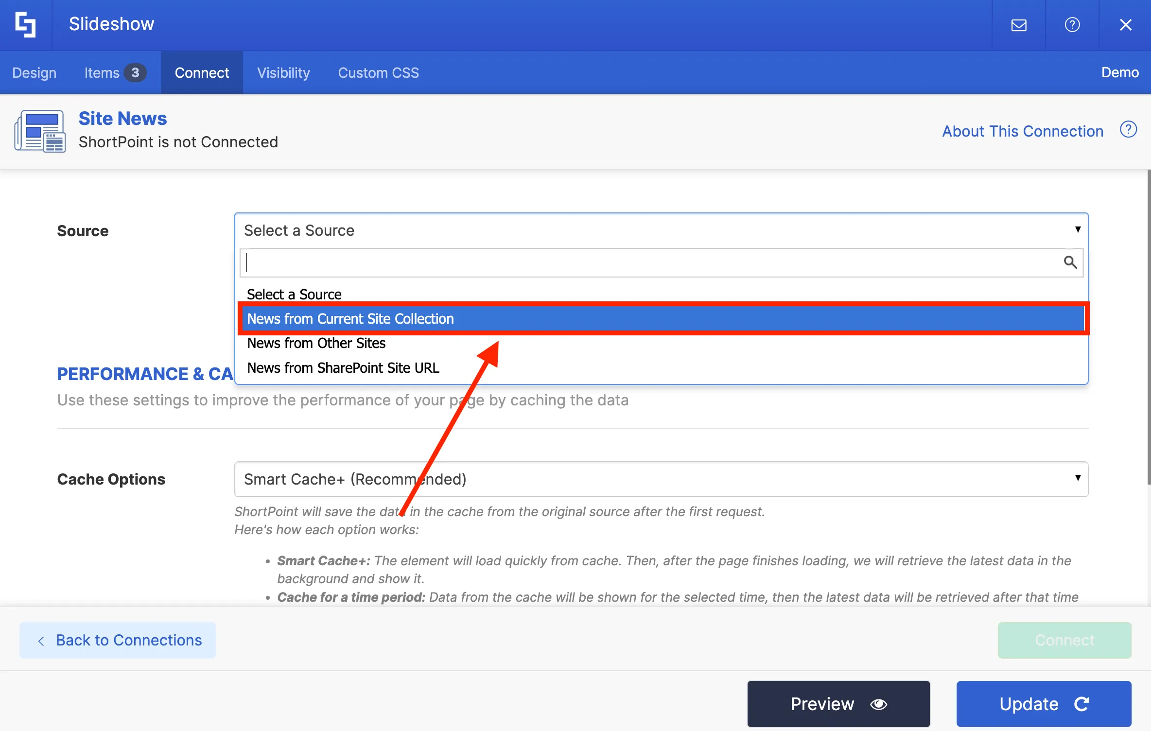
The settings window for the Slideshow Design Element will appear. Go to the Connect tab to select a connection type.
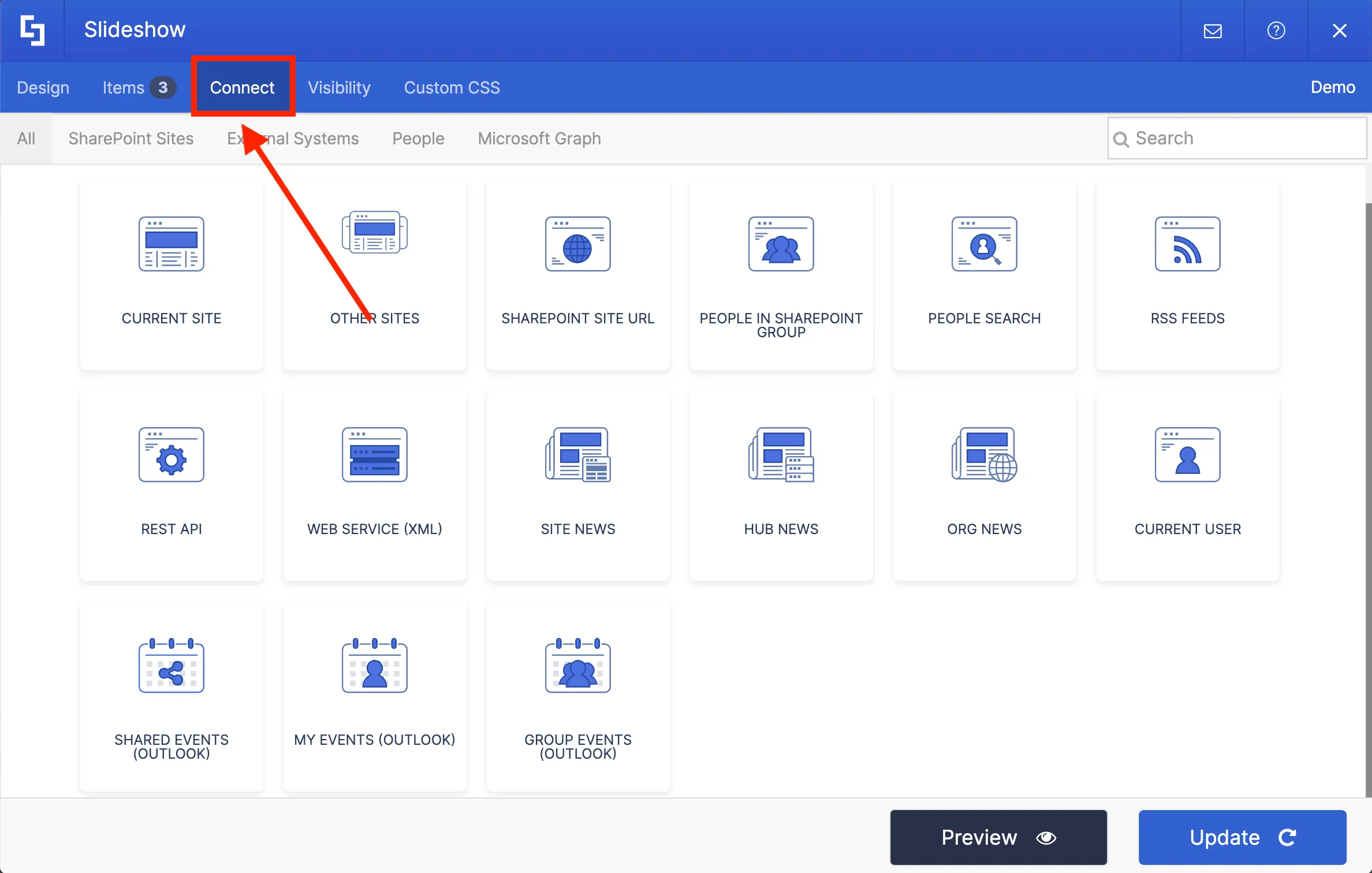
There are 3 connection types that you can use to establish news connection:
- Site News - allows you to pull news from your current site.
- Hub News - allows you to pull news from a specific Hub site.
- Org News - allows you to pull news from all sites across your SharePoint tenancy.

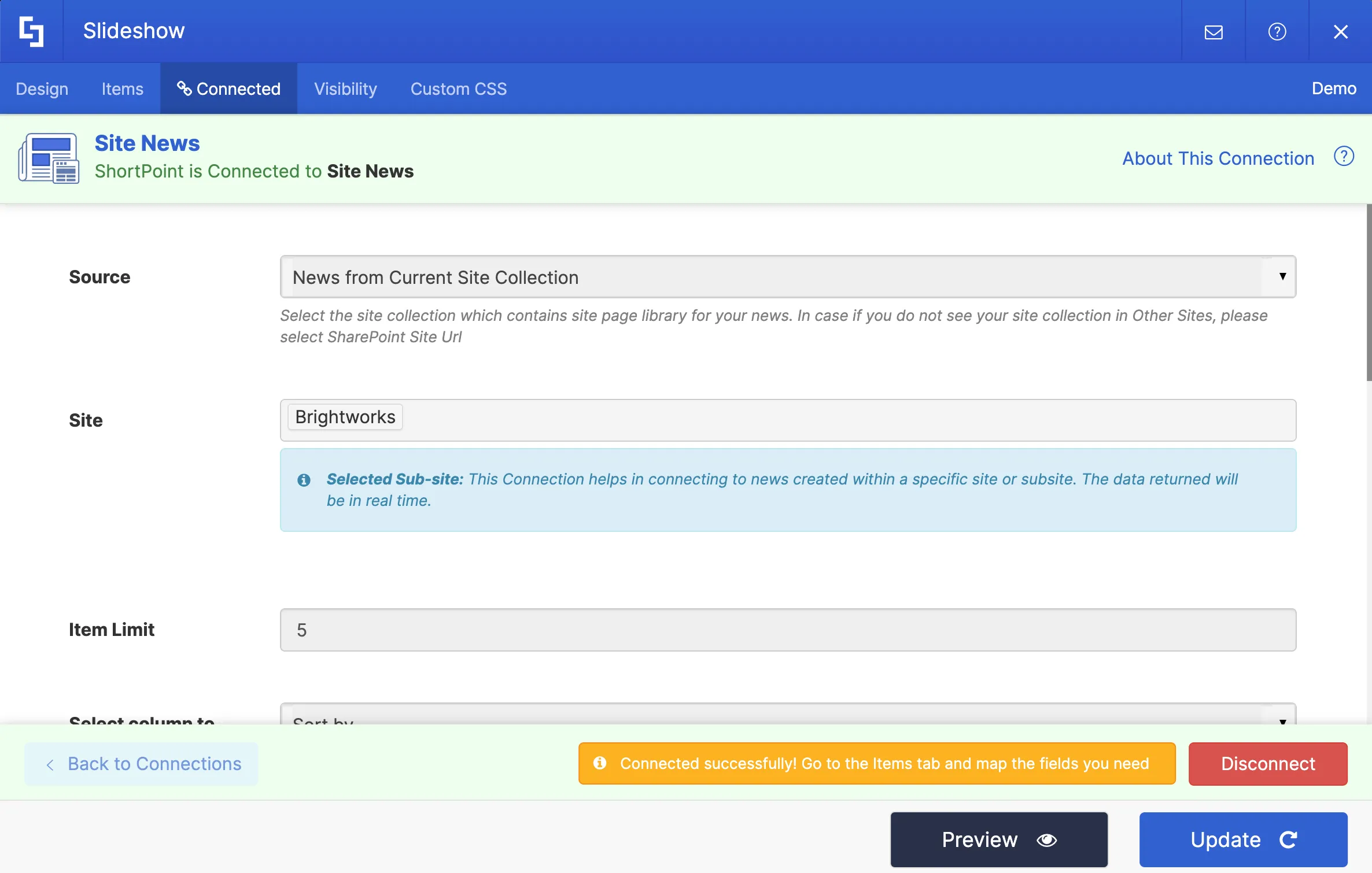
For our intranet project, we will be using Site News.
Setting up connection
Now, you need to provide some information to set up the connection.
First, select the Source of your news. You can choose to pull news from the Current Site Collection, Other Sites, or a specific SharePoint Site URL. Depending on your selection, additional fields may be required.

In our case, we will select News from Current Site Collection.
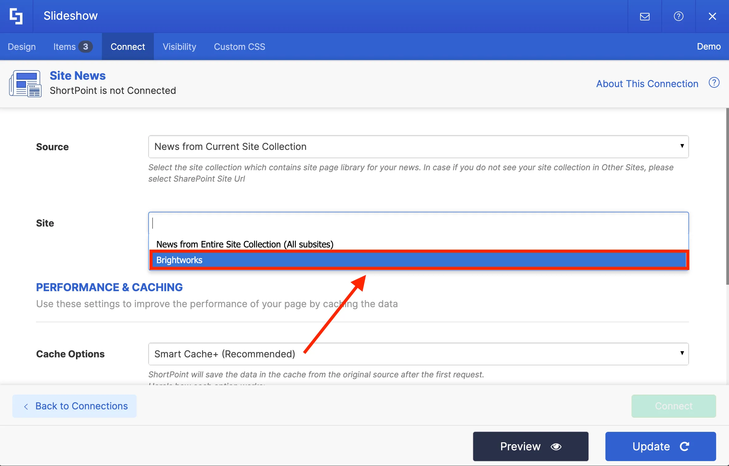
Then, select the Site from where you want to pull the news. For the purpose of this project, we will only pull news from our current site.
In the Item Limit field, you can set the number of items to display. We will set the number of news displayed to 5.
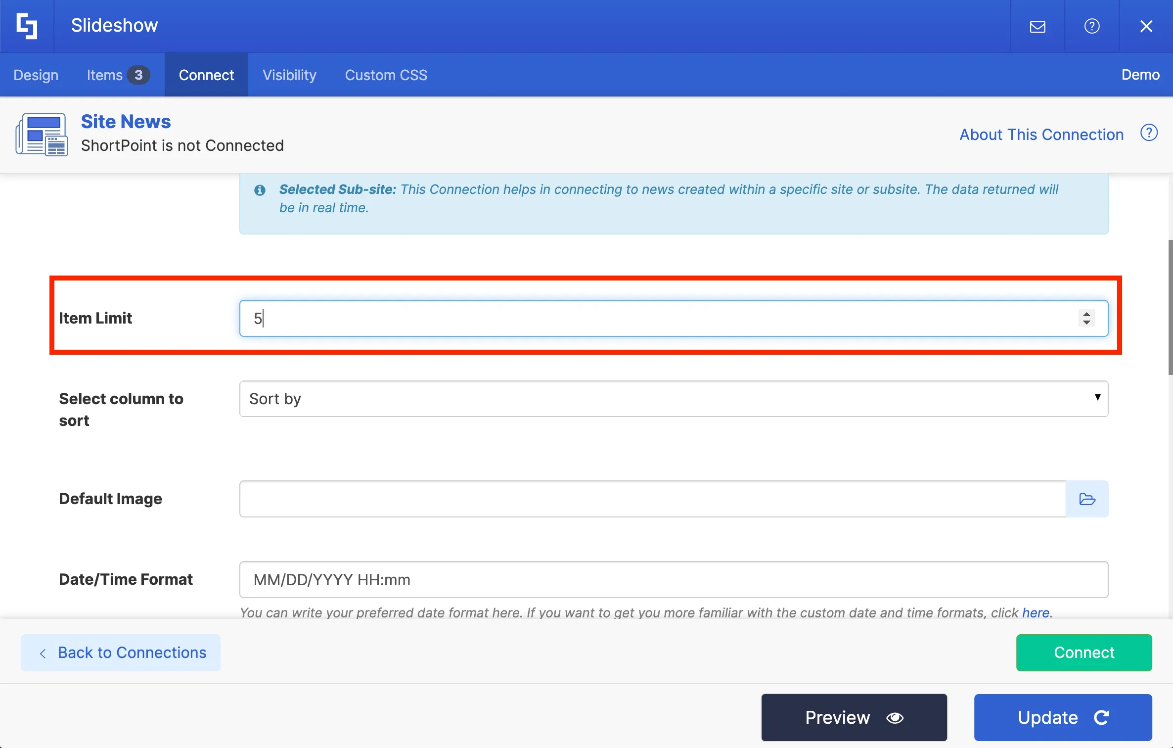
There are other connection settings that you can configure, but for now, we can keep them at their default values.
Once you have provided the required information, you can hit Connect to establish the connection.
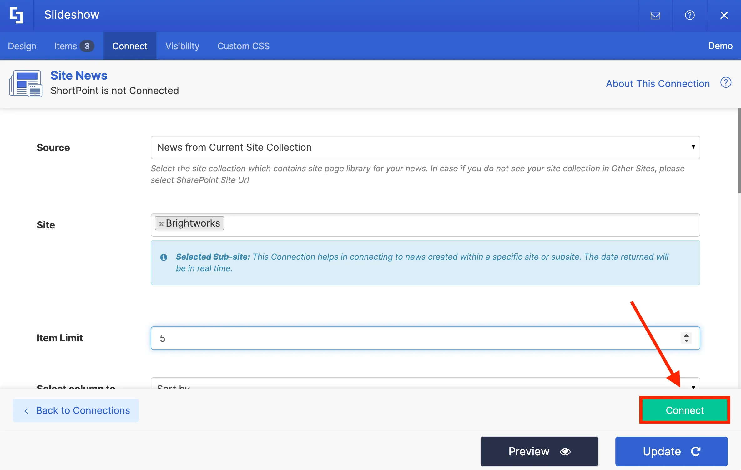
Once you hit Connect, you will see green banners at the top and bottom of your Settings window. This means that you have successfully connected to your news source page.
Mapping news content
To indicate what types of information you want to display on the Slideshow, you need to go to the Items tab.
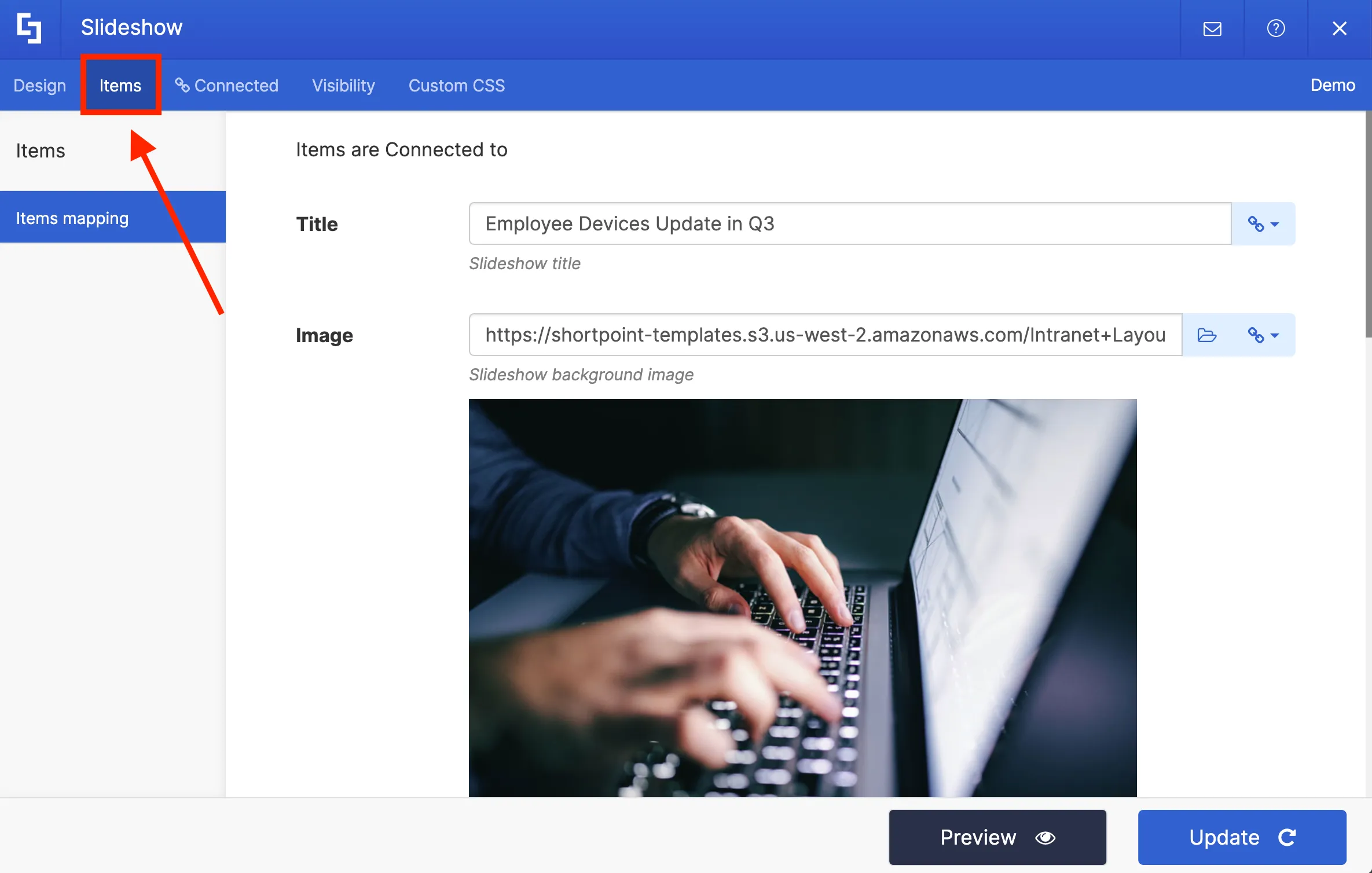
You will notice that some item fields already have existing content. Delete all placeholder content so you can customize the items according to your preference.

For each item field, there are link icons. These link icons contain several property options you can choose from. The property you select for each field will automatically be displayed on your page.
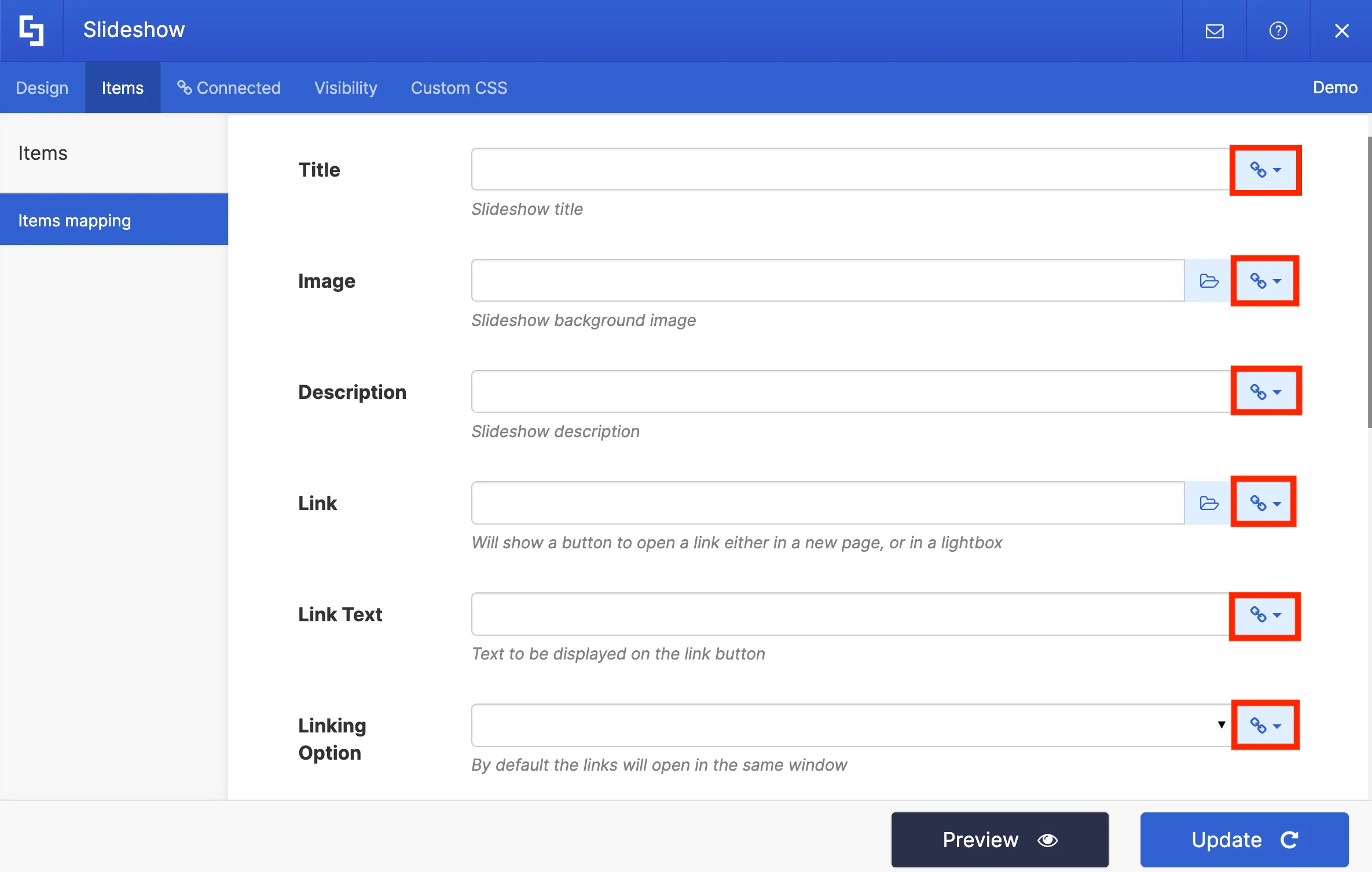
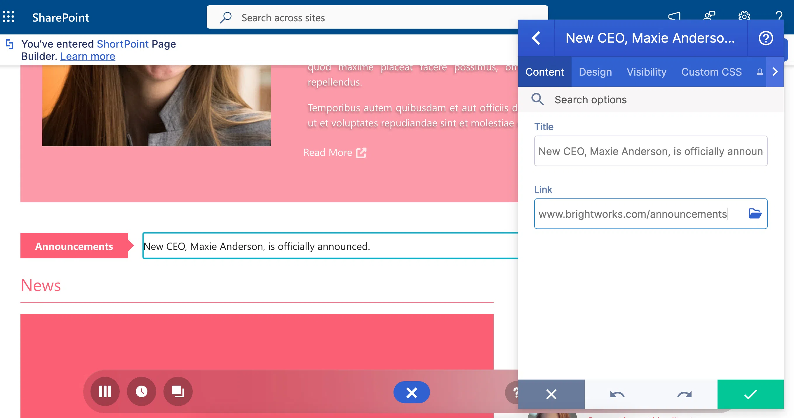
For this project, we want to display the [1] Title of the news and the [2] header image we used for the news. We also want to include a button that site viewers can click to redirect them to the article.
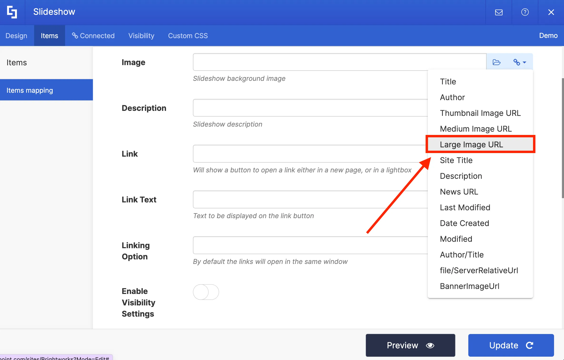
To do this, click the link icon in the Titles field. From the drop-down, select the Title property to pull up all news titles on your site.
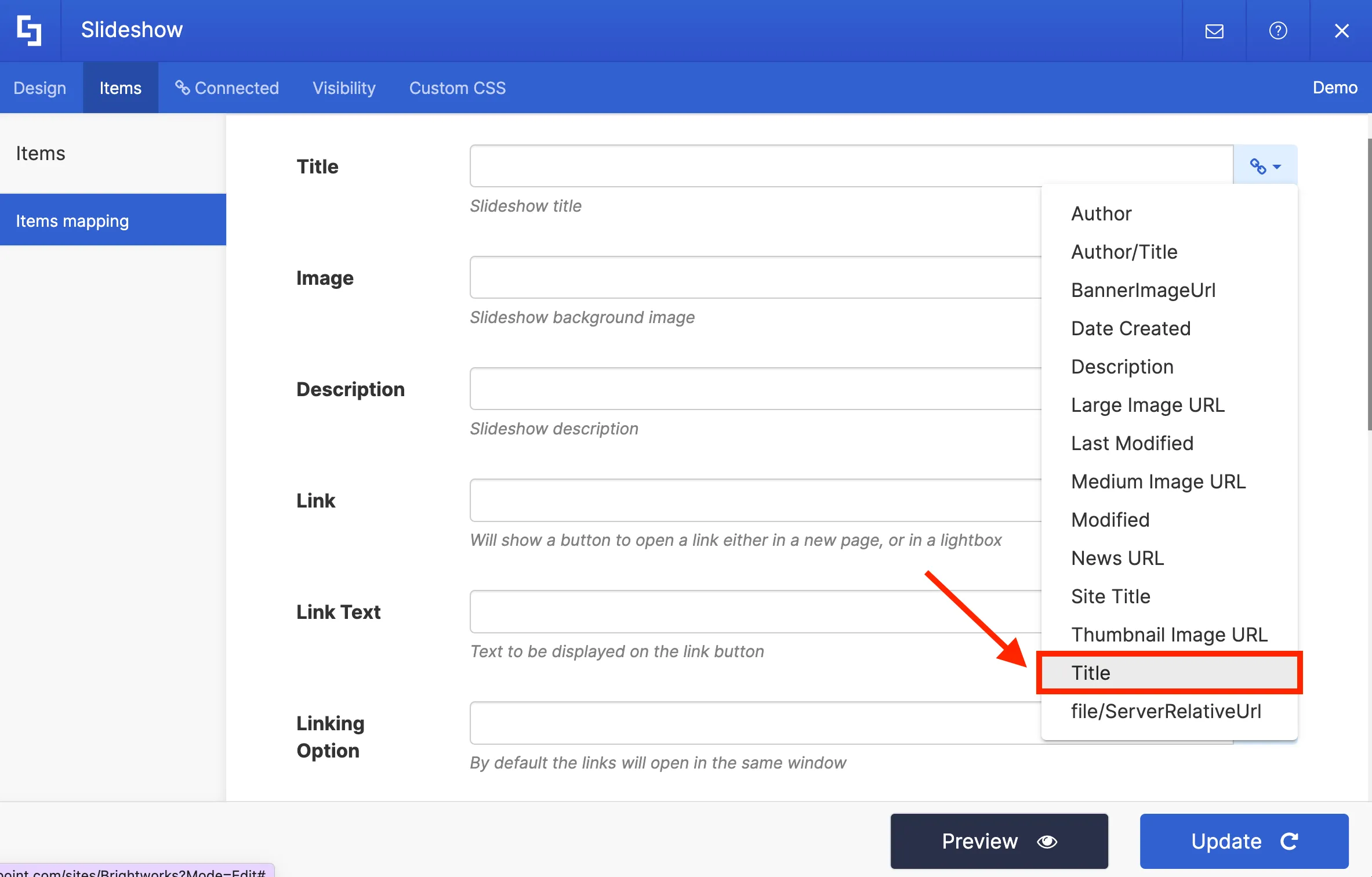
Then in the Image field, select the Large Image URL property to showcase the largest image resolution on our slideshow.
In the link field, we will select the News URL property to redirect viewers to the actual article when they click it.
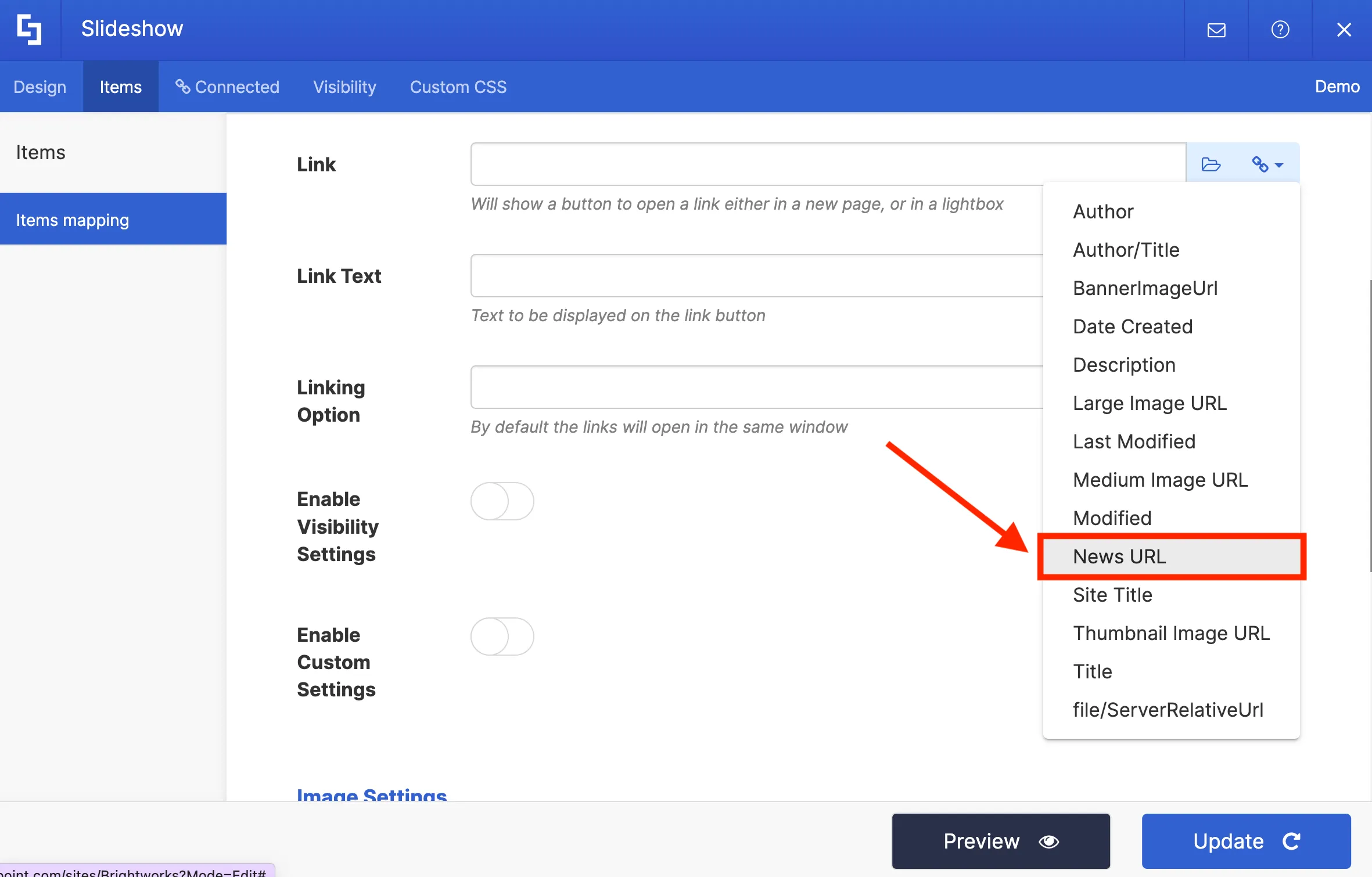
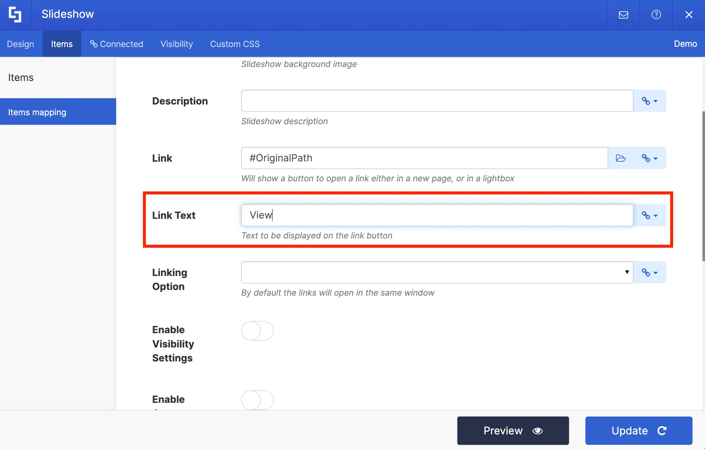
Then in the Link Text field, we will write the text we want to be displayed inside the button.
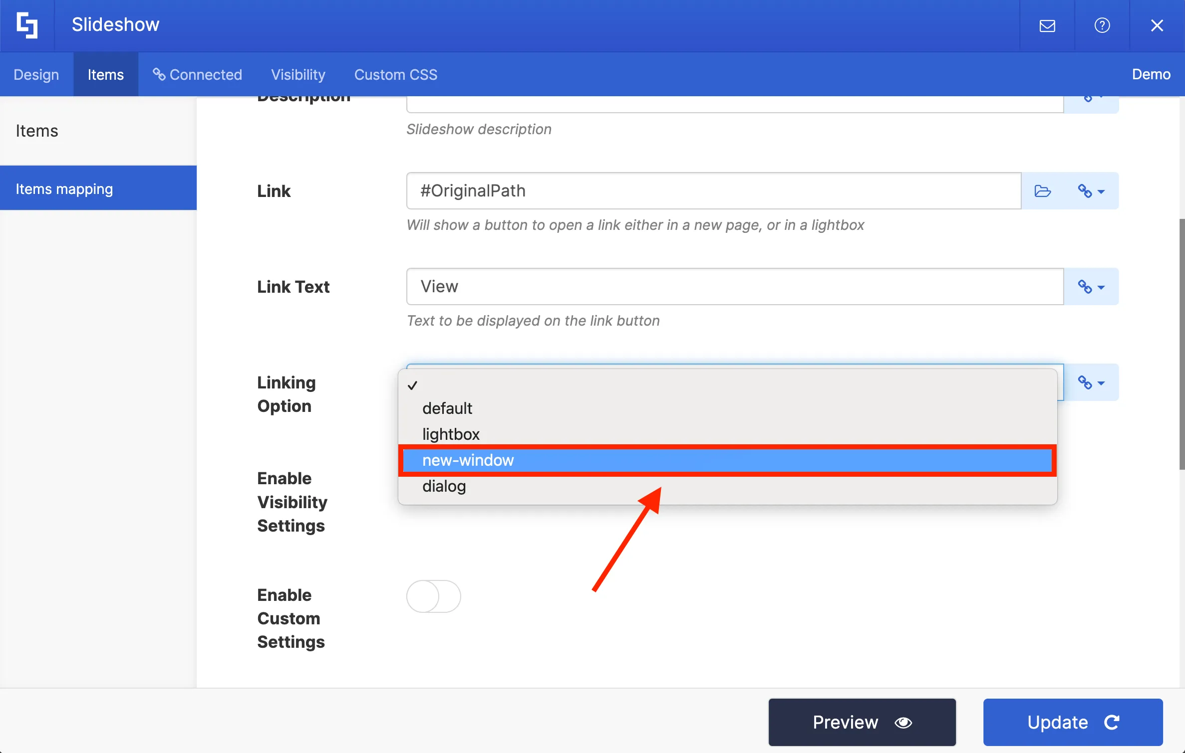
In the Linking Option field, you can choose how your link will open:
- Default - allows you to open the link in the same window.
- Lightbox - allows you to open the link in a lightbox.
- New Window - allows you to open the link in a new window.
- Dialog - allows you to open the link in a dialog box.
For this project, we want to open the link in a new window.
Once you have selected the desired properties, you can Preview how your content will look on the Slideshow.
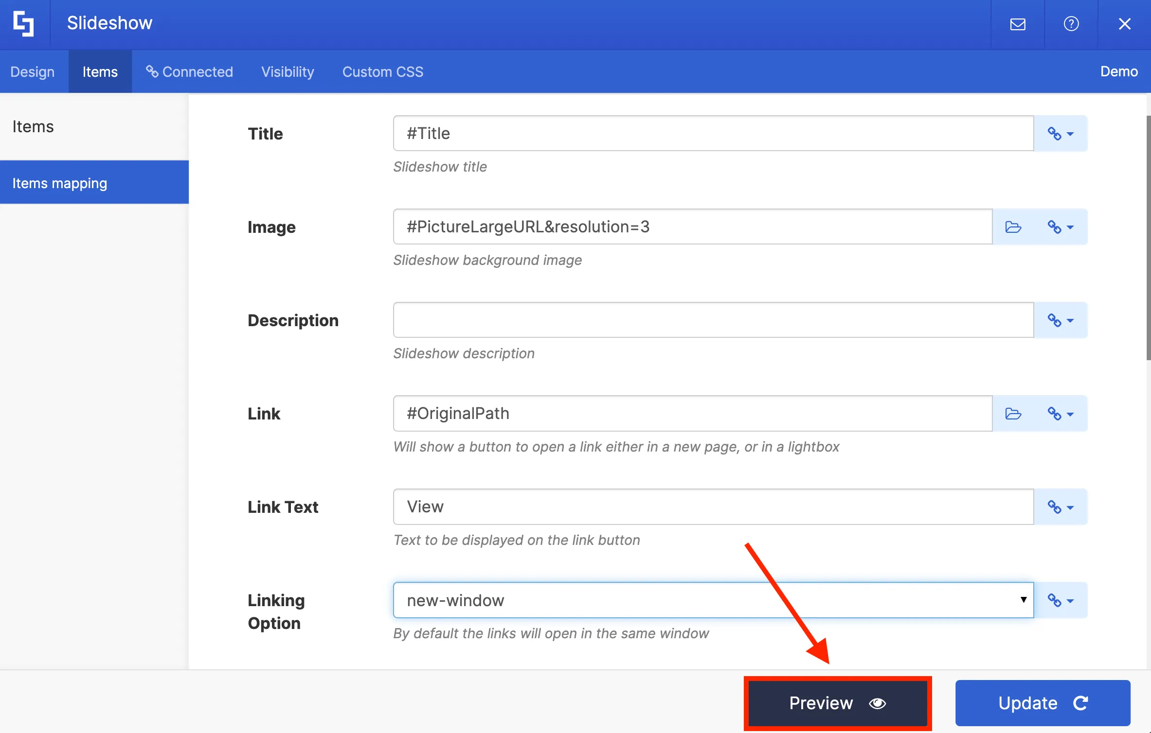
Finally, you can hit Update to apply your changes.
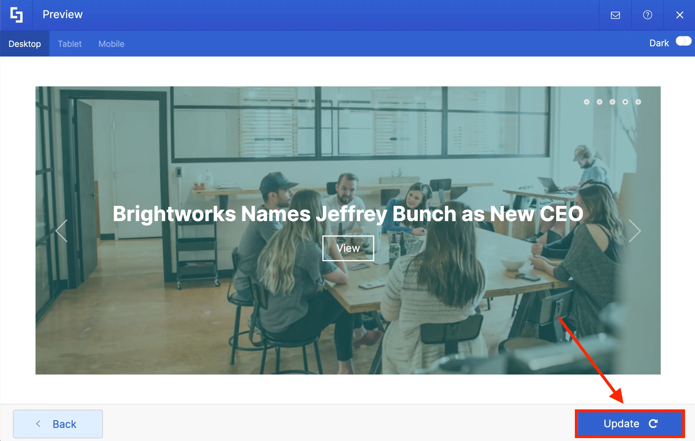
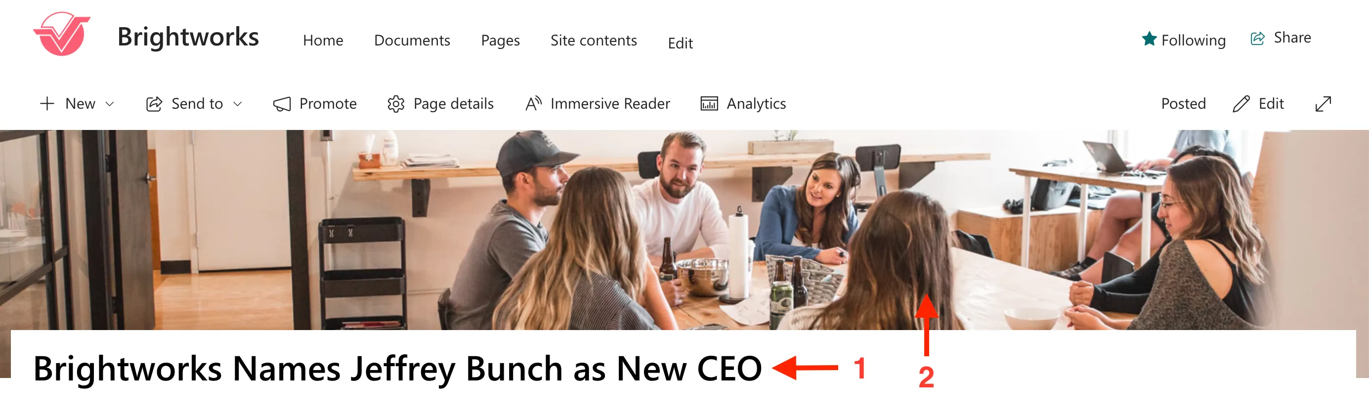
Once you click Update, you will notice that Site News connection is now inside your SlideShow Design Element. Take note that you do not need to repeat this process again once you add new news posts or links. ShortPoint will automatically retrieve and update any new news posts or links added to your site in the background.
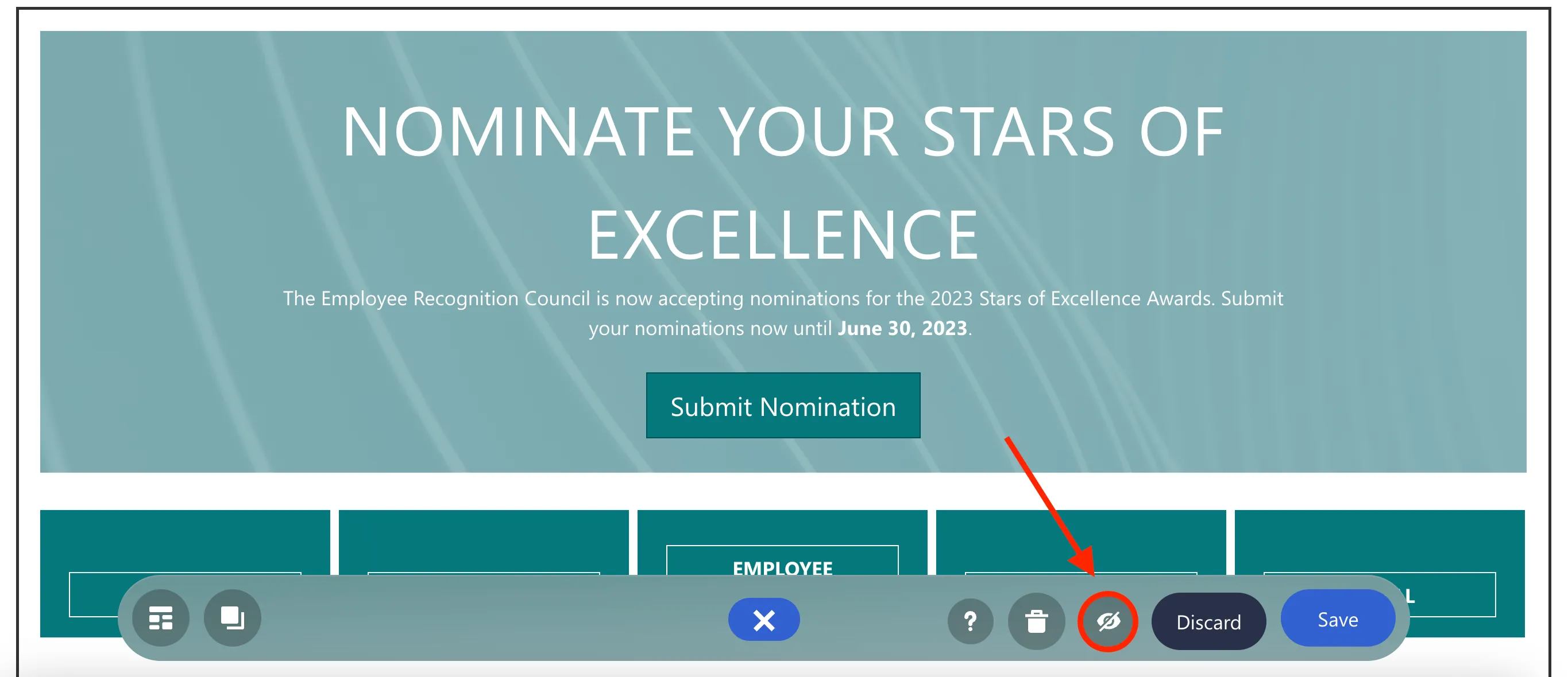
To see your slideshow in real-time, click the eye icon.
You will now see your slideshow. Click Save to keep your progress.
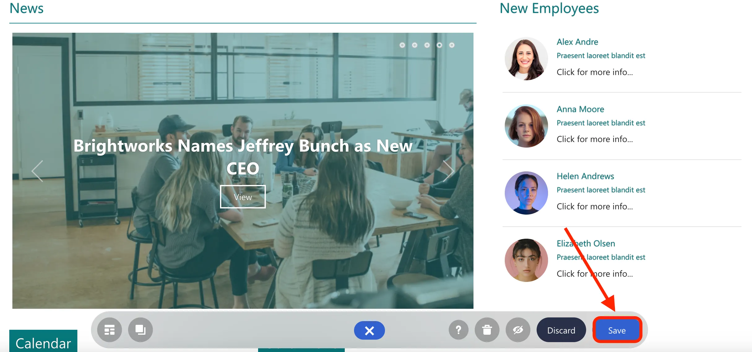
Congratulations! You have just learned how to use ShortPoint Connect to pull and display updated news content from your SharePoint site on your intranet page.
Connect to an Outlook calendar
In this tutorial, you will learn how to set up connection to an Outlook calendar and how to select the event details you want to feature on your page.
Choosing a connection type
Organizing events and scheduling them using an Outlook calendar is common for teams and individuals at an organization. And displaying these events on your intranet page is important to keep everyone up to date. Fortunately, with ShortPoint Connect, it's easy to do.
First, let's go back to the SharePoint page we were using.
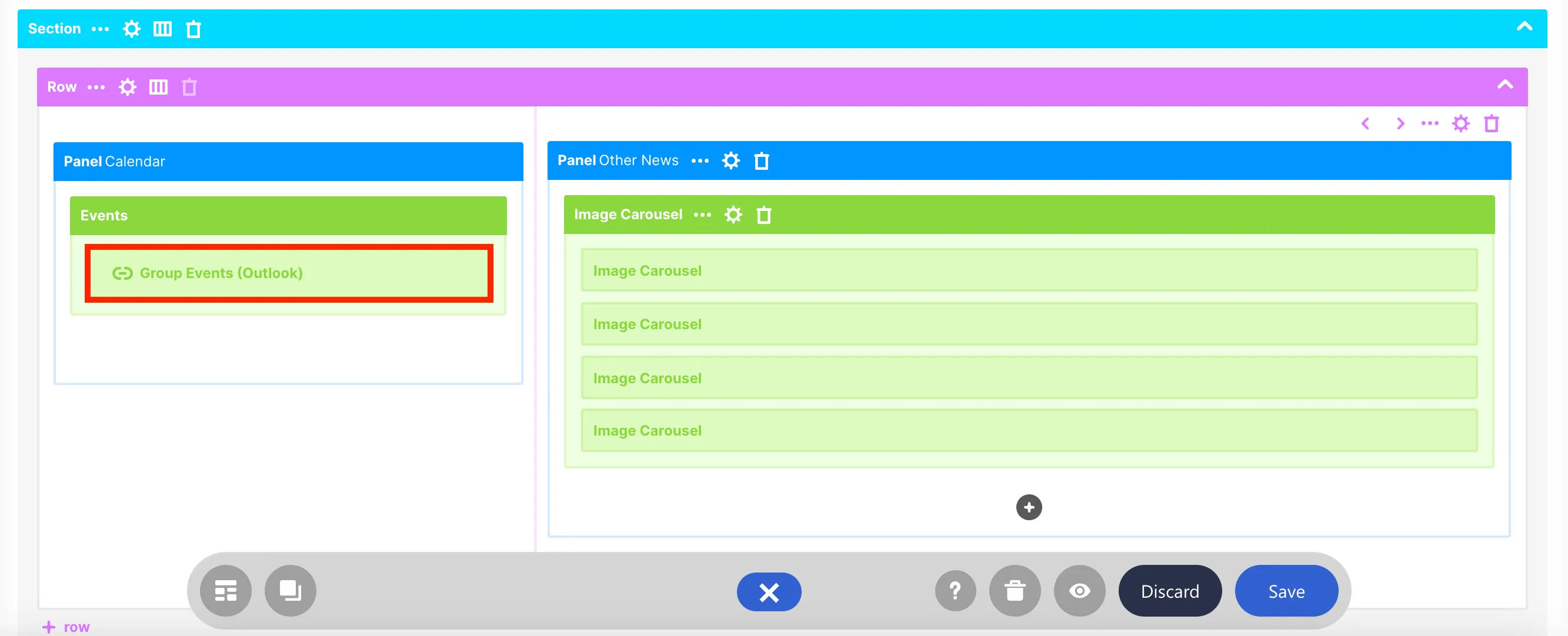
When you scroll down, you will notice that an Events Design Element came with our template. You can edit this Design Element so that it shows events from your Outlook calendar.

To establish the connection, you must open the page in the Grid Mode editor. You can do this by clicking the Switch to Grid Mode icon in the floating bar.
Once you are in Grid Mode, scroll down until you see the Events Design Element. Then, click the cogwheel icon to open the Settings window.
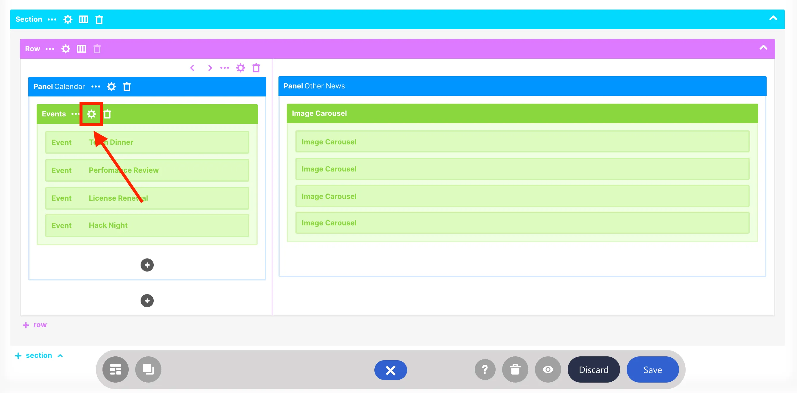
Go to the Connect tab to select a connection type.
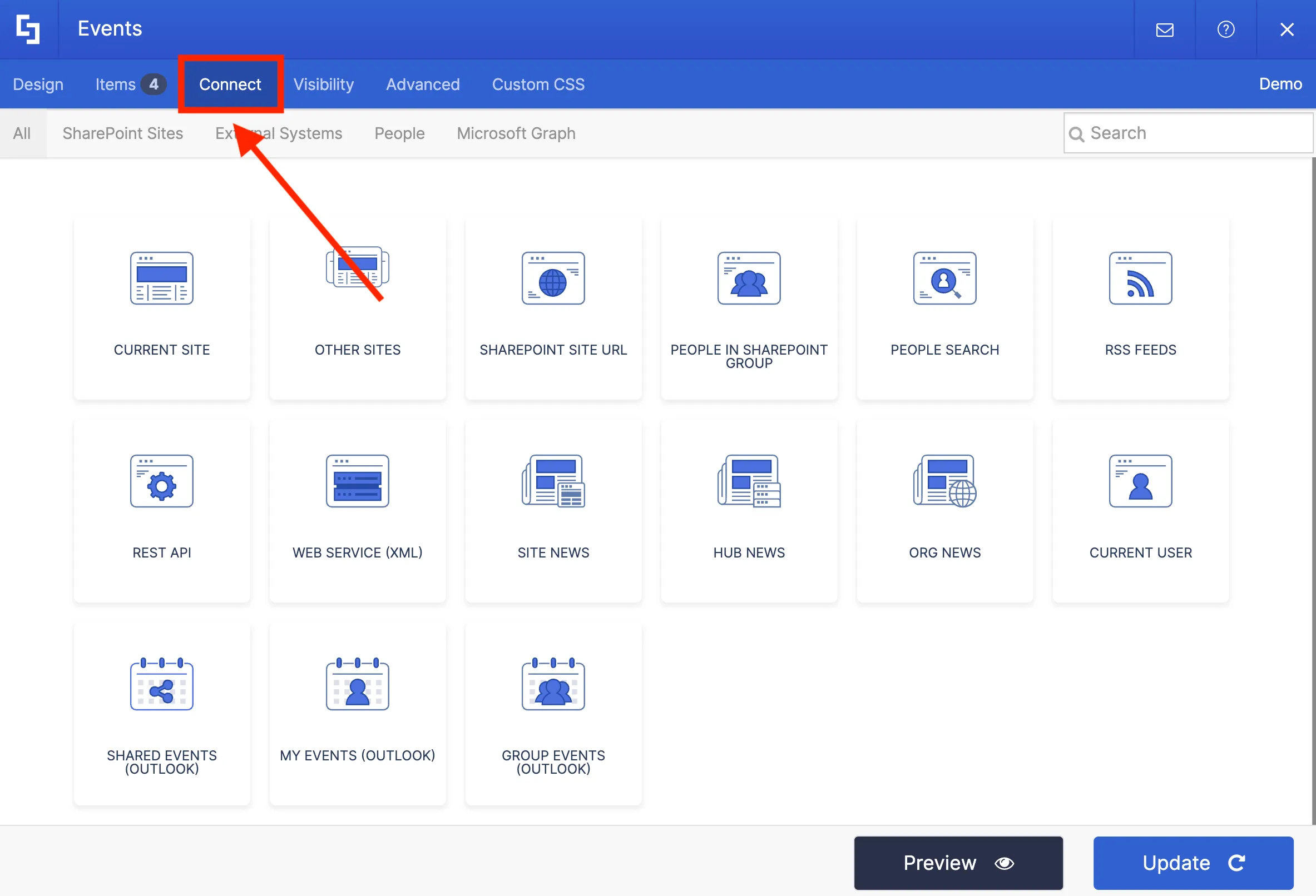
Here, you'll find three options to connect to an Outlook calendar:
- Shared Events (Outlook) - allows you to show events from a shared calendar.
- My Events (Outlook) - allows you to show events from your own calendar.
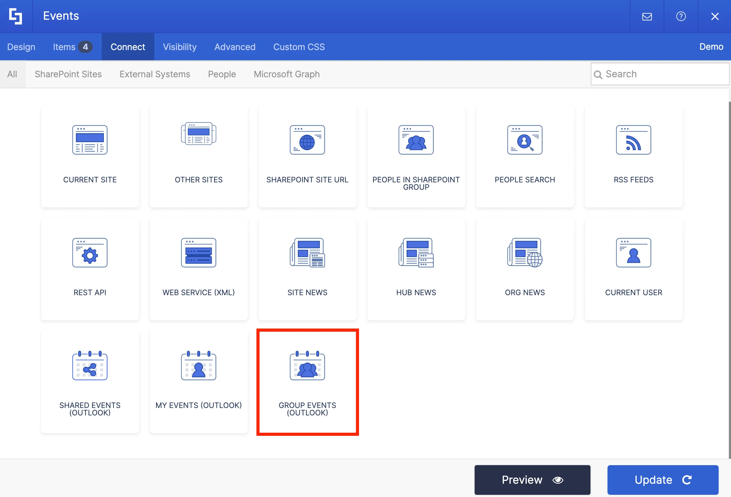
- Group Events (Outlook) - allows you to show events from a group calendar.
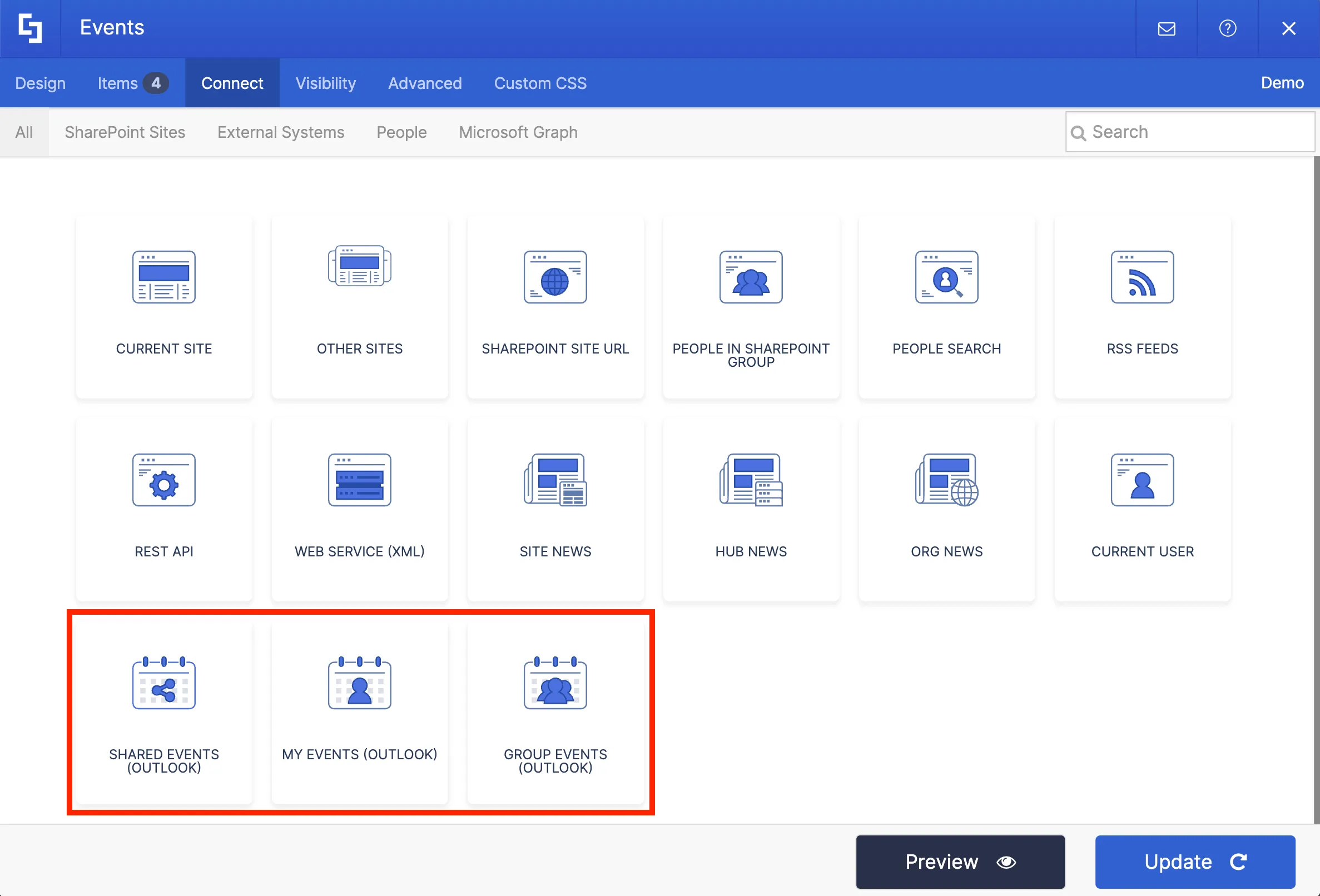
For this project, we want to show events from a group calendar.
Setting up connection
Once you select your preferred connection type, you will be asked to provide additional information.
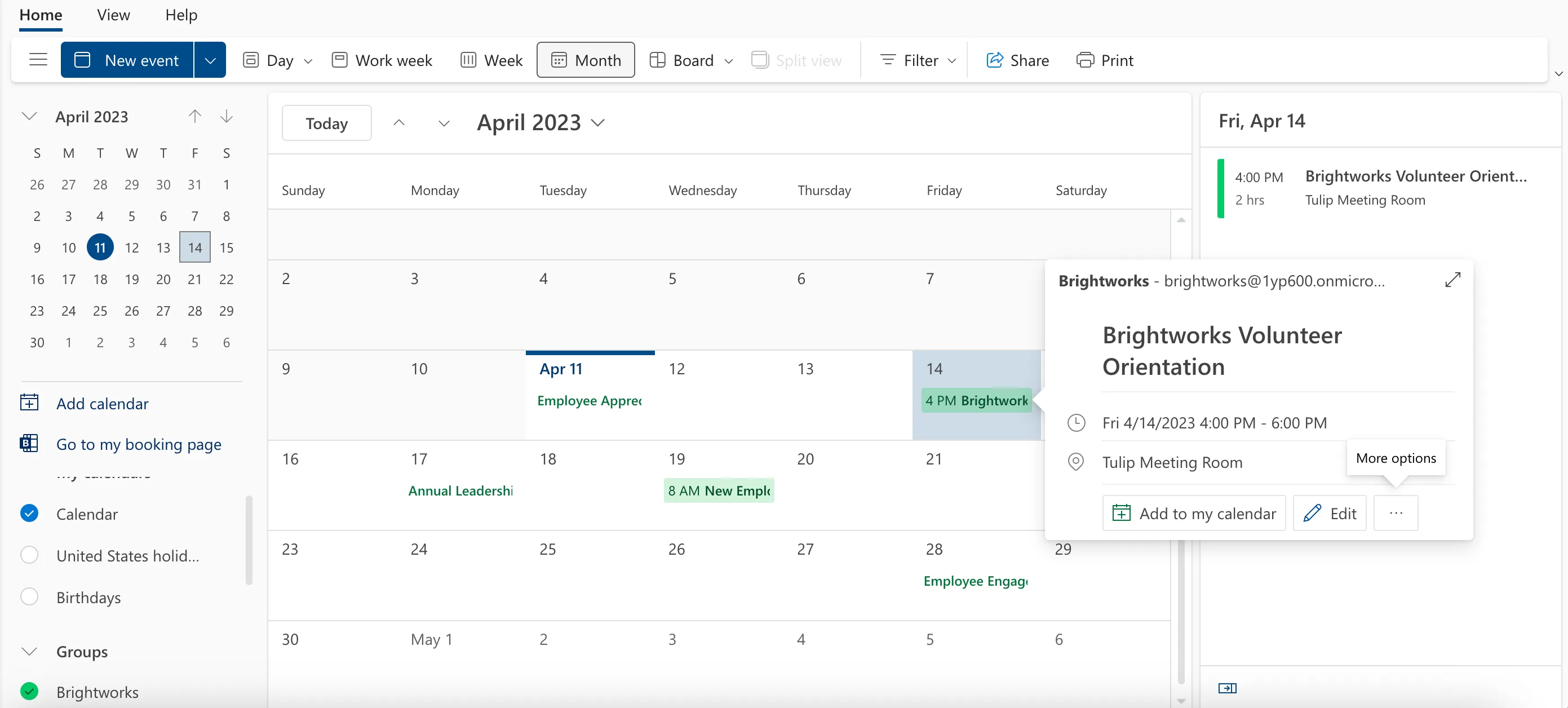
For the Group Events connection type, you must first choose the group that owns the calendar you wish to connect to. In our case, our group name is Brightworks.
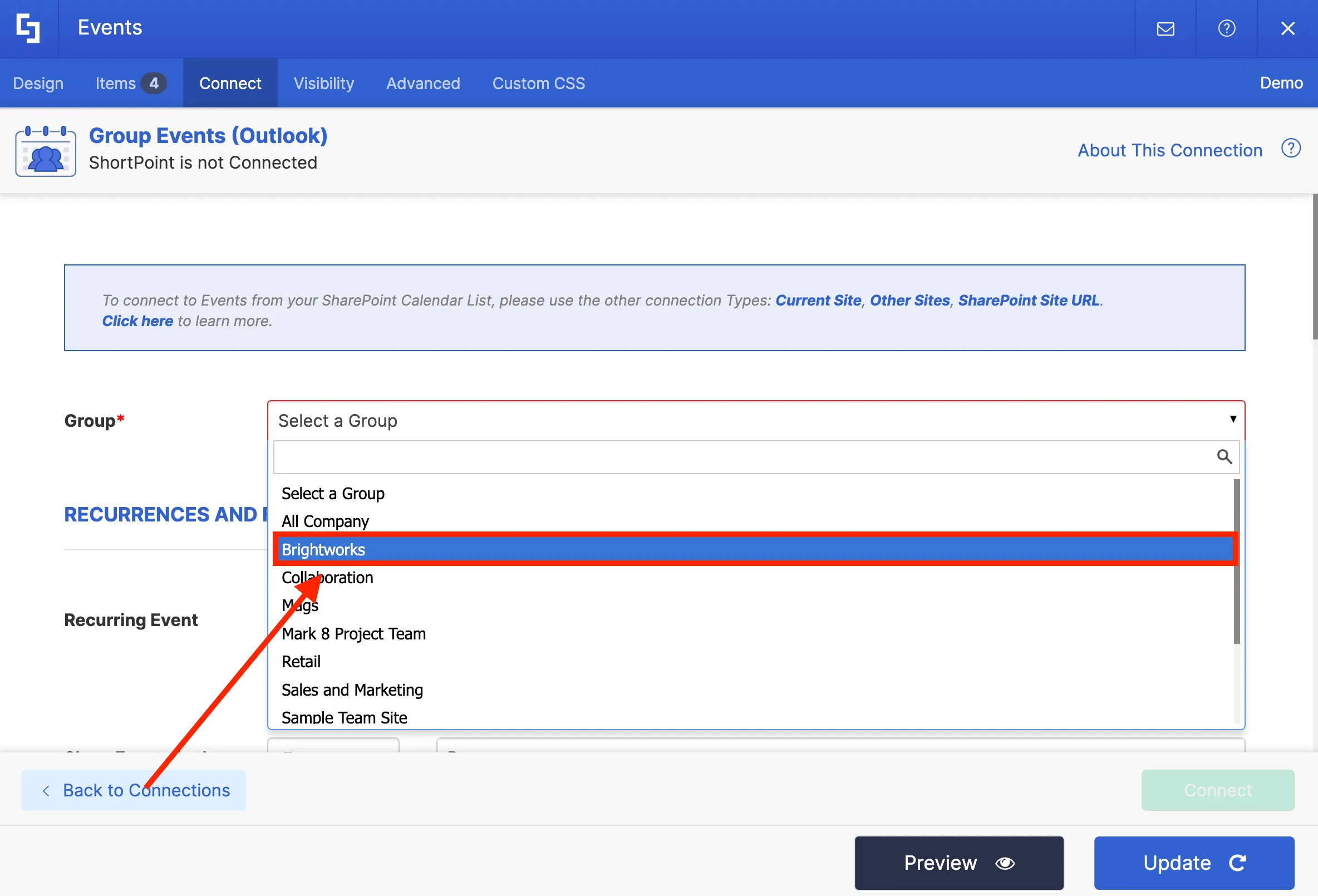
Next, you can configure other connection settings such as the date range of events and the number of items you want to display on your page.
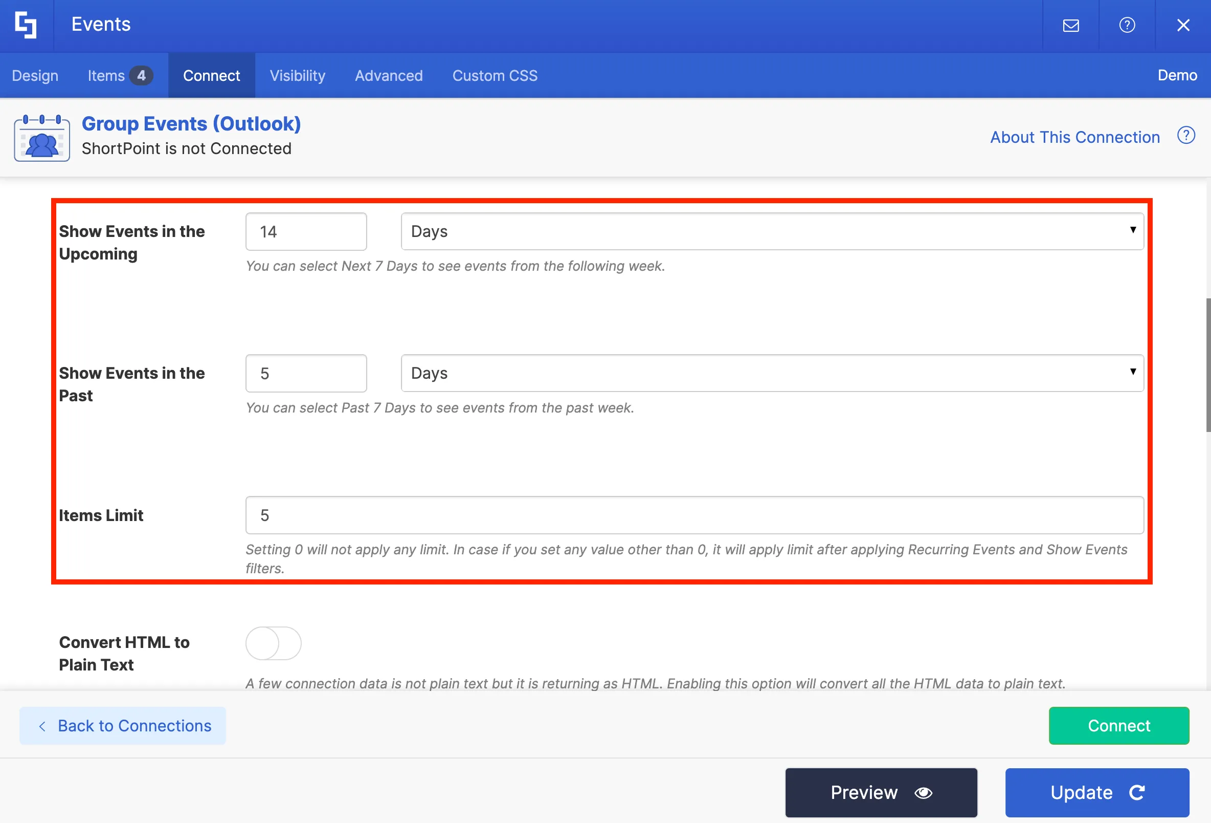
Finally, click the Connect button.

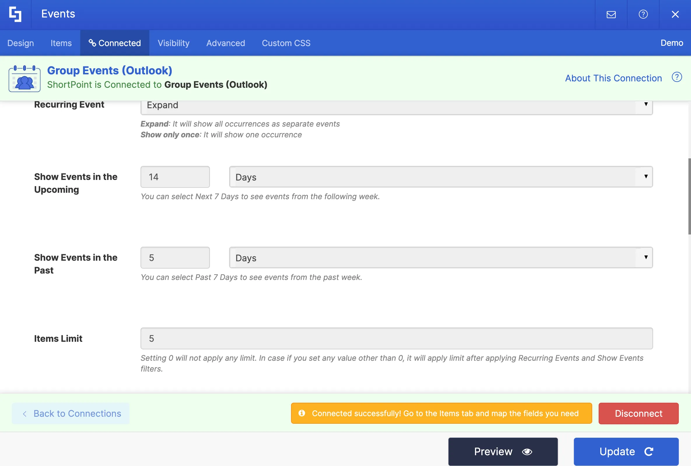
You have now successfully connected to an Outlook calendar.
Mapping event details to display
To customize the event details that you want to display on your page, you need to go to the Items tab.

You will notice that some item fields already have existing content. Delete all placeholder content so you can customize the items according to your preference.
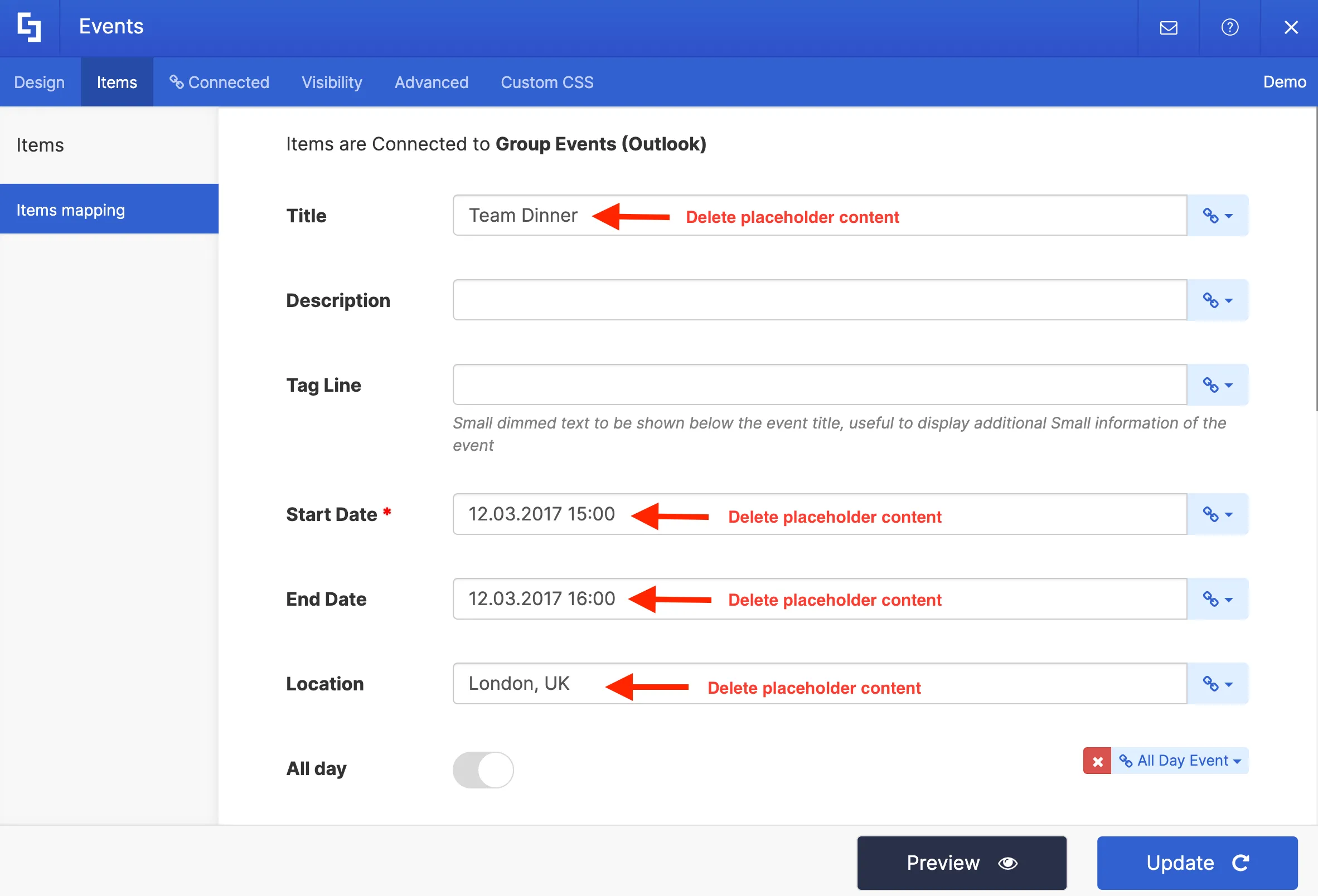
For each item field, there are link icons. These link icons contain several property options you can choose from. The property you select for each field will automatically be displayed on your page.
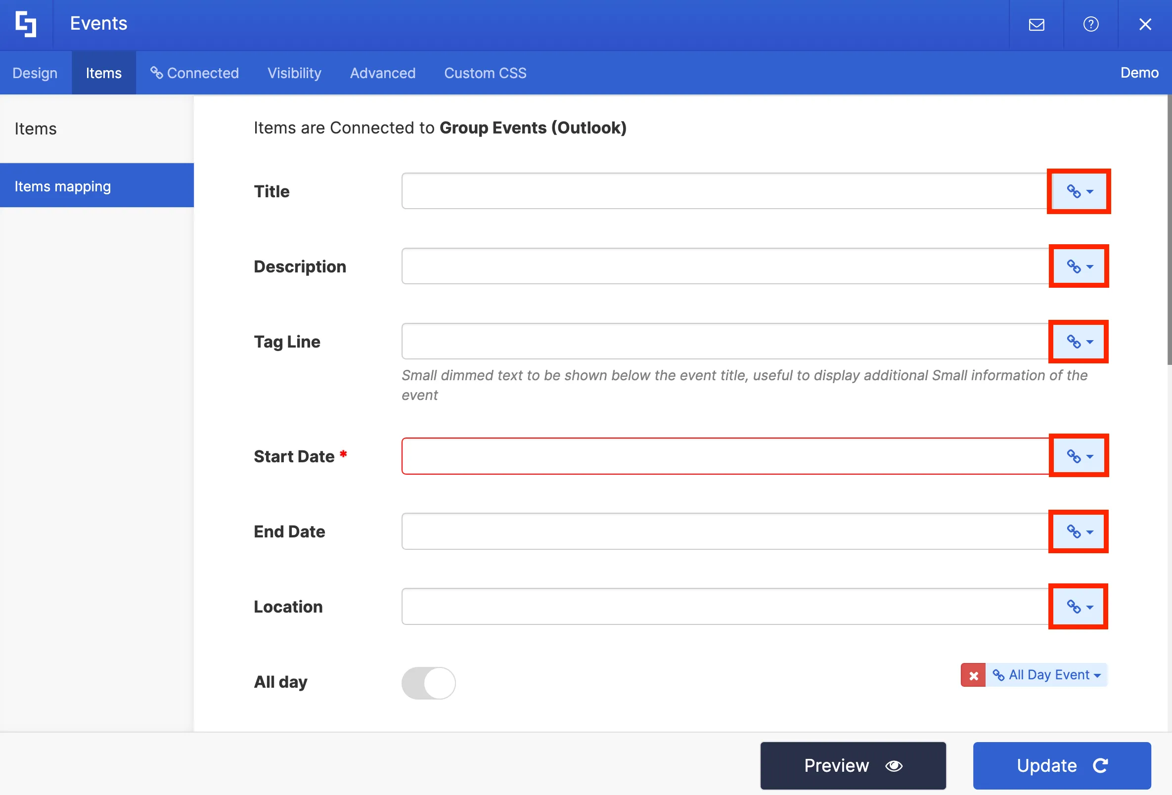
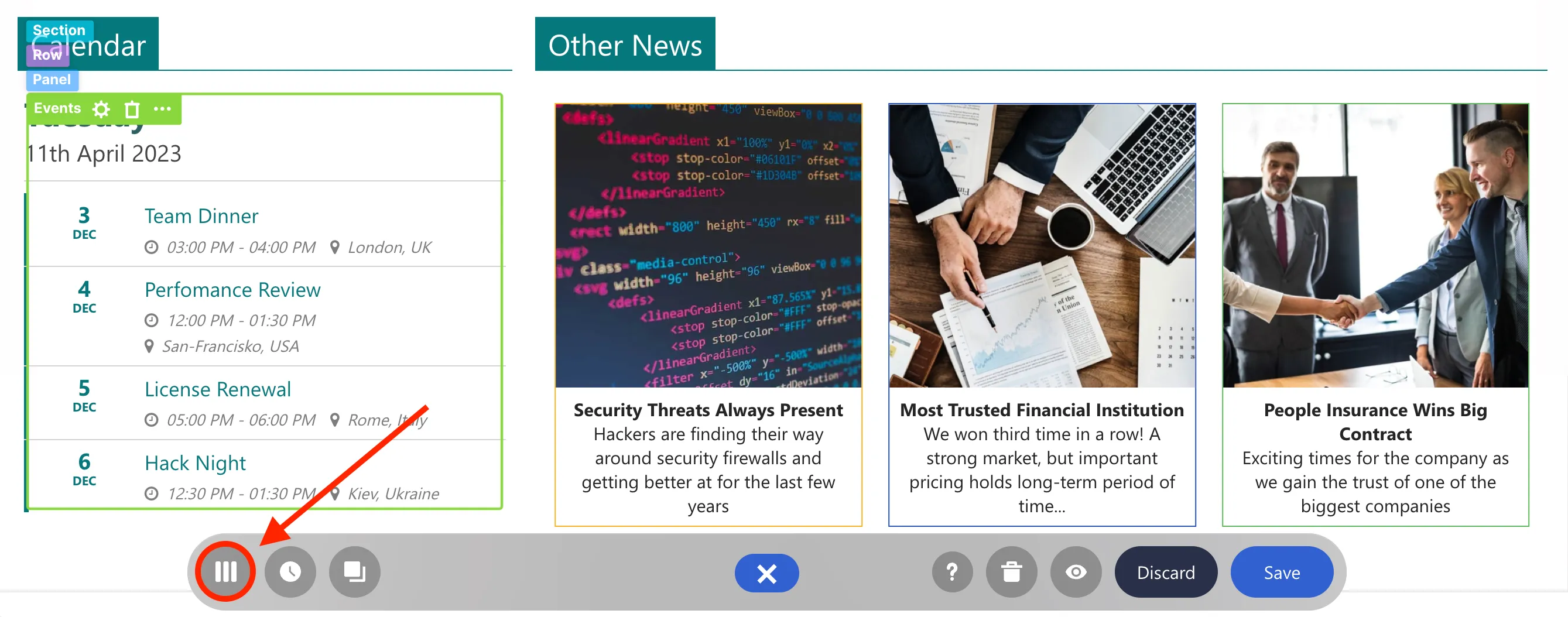
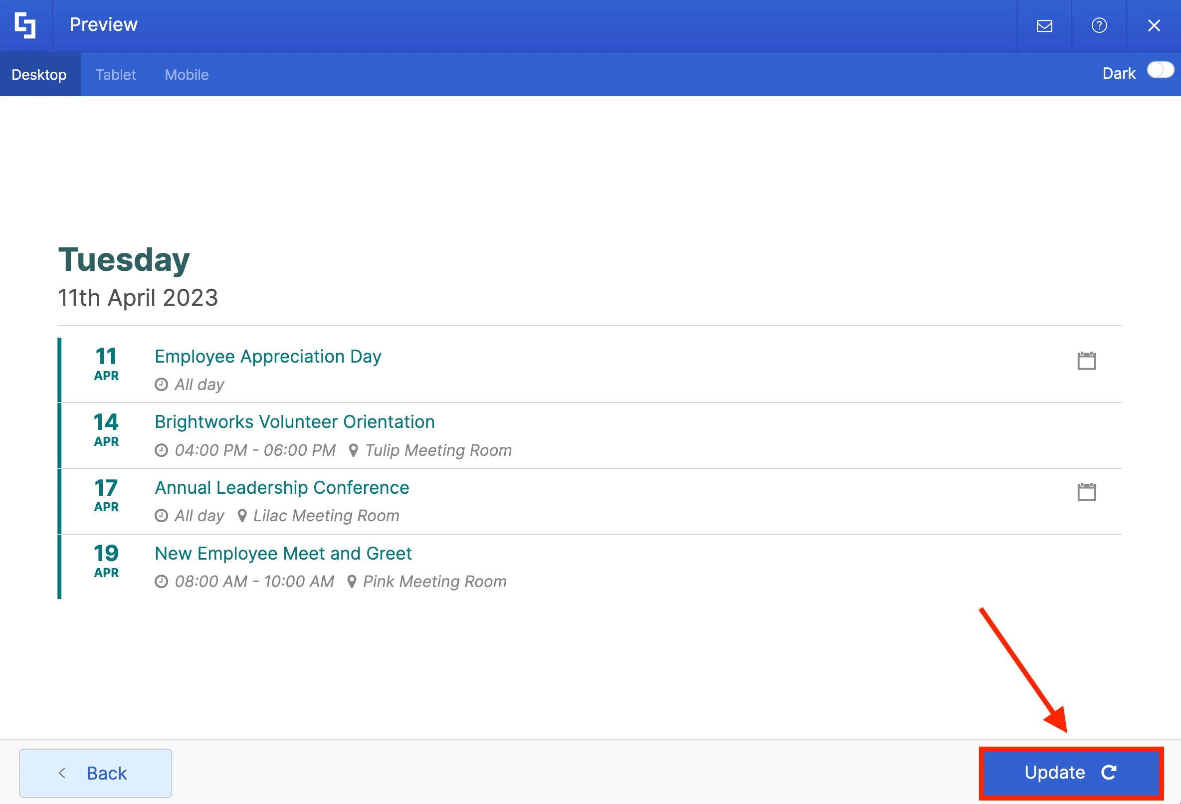
For our project, we want to display the [1] event title, [2] date and time, and [3] location of the events on our calendar.
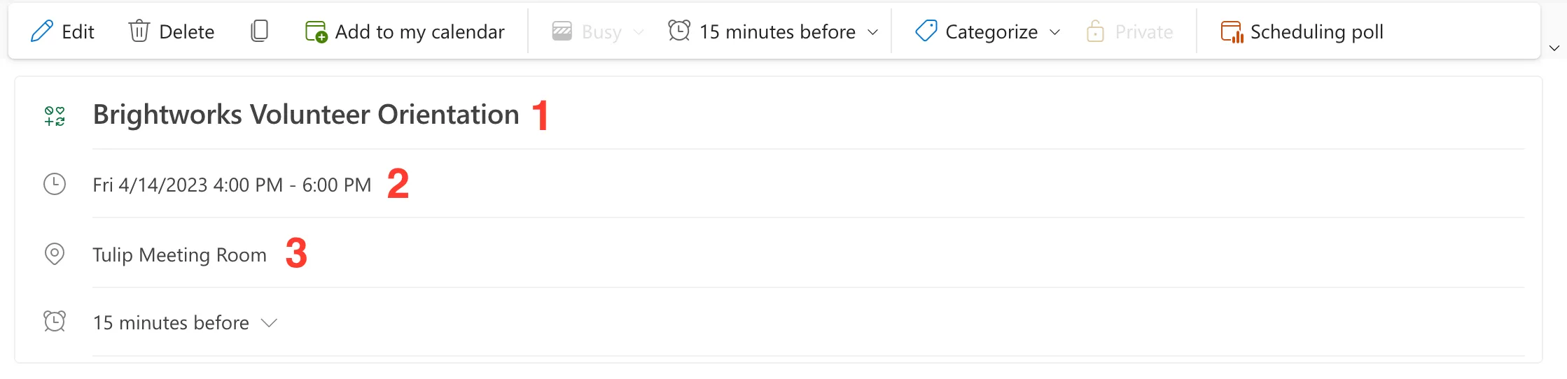
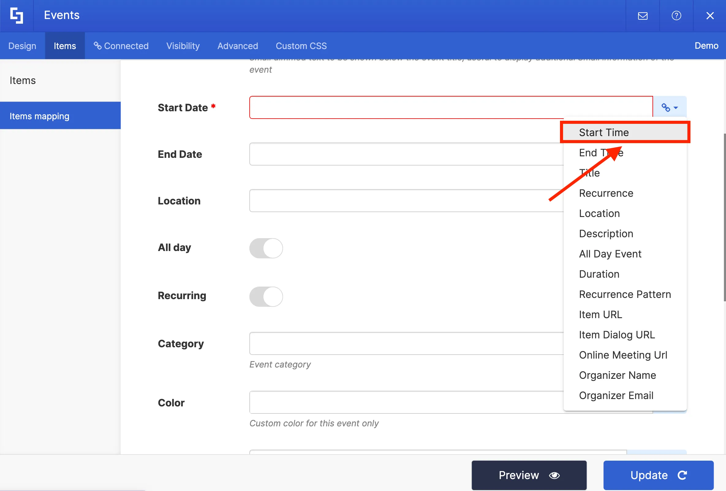
To do this, in the Title field, select the Title property to display all event titles from the Calendar.
Then, on the Start Date field, select the Start Time property to showcase the starting time of events on your calendar.
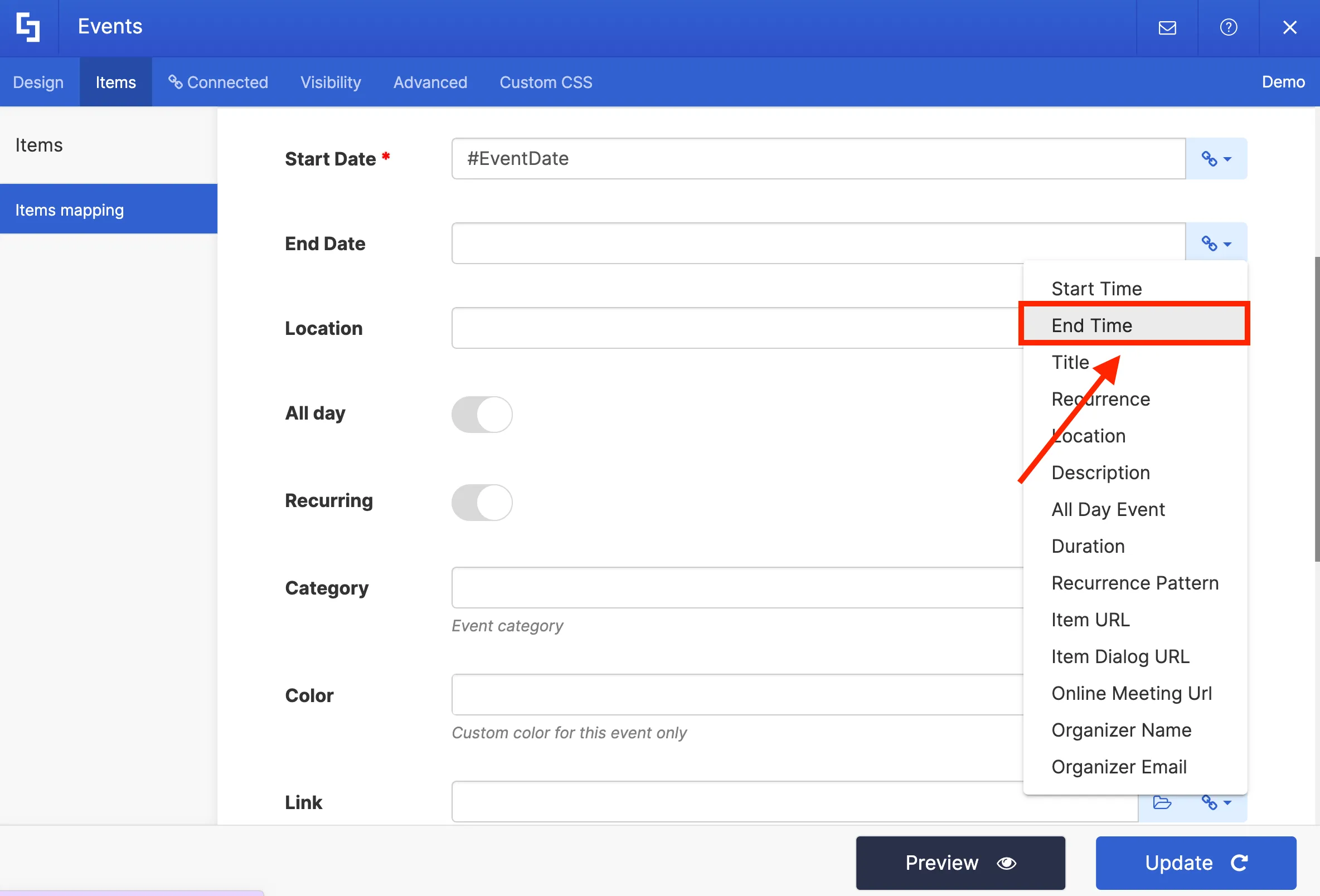
Next, on the End Date field, select the End Time property to showcase the ending time of events on your calendar.
To showcase the location of your events, select the Location property on the location field.
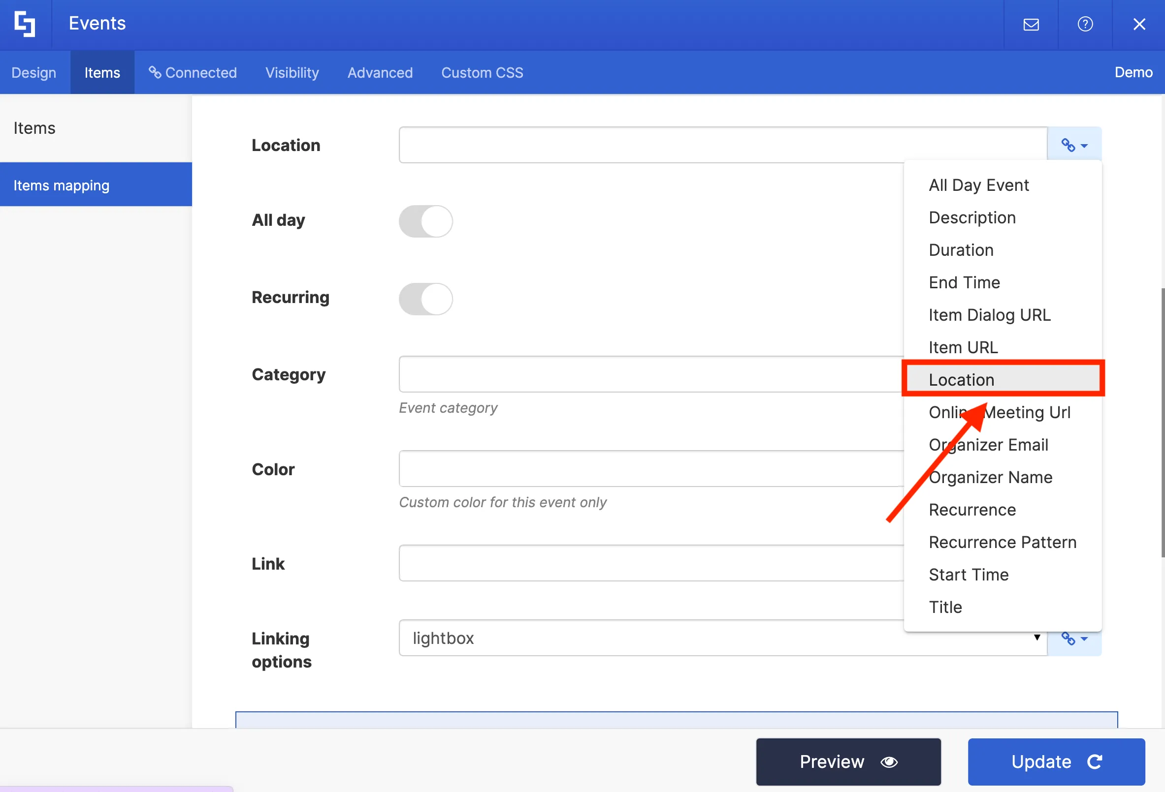
You can also add a link to your events in the Link field using the Item URL property.
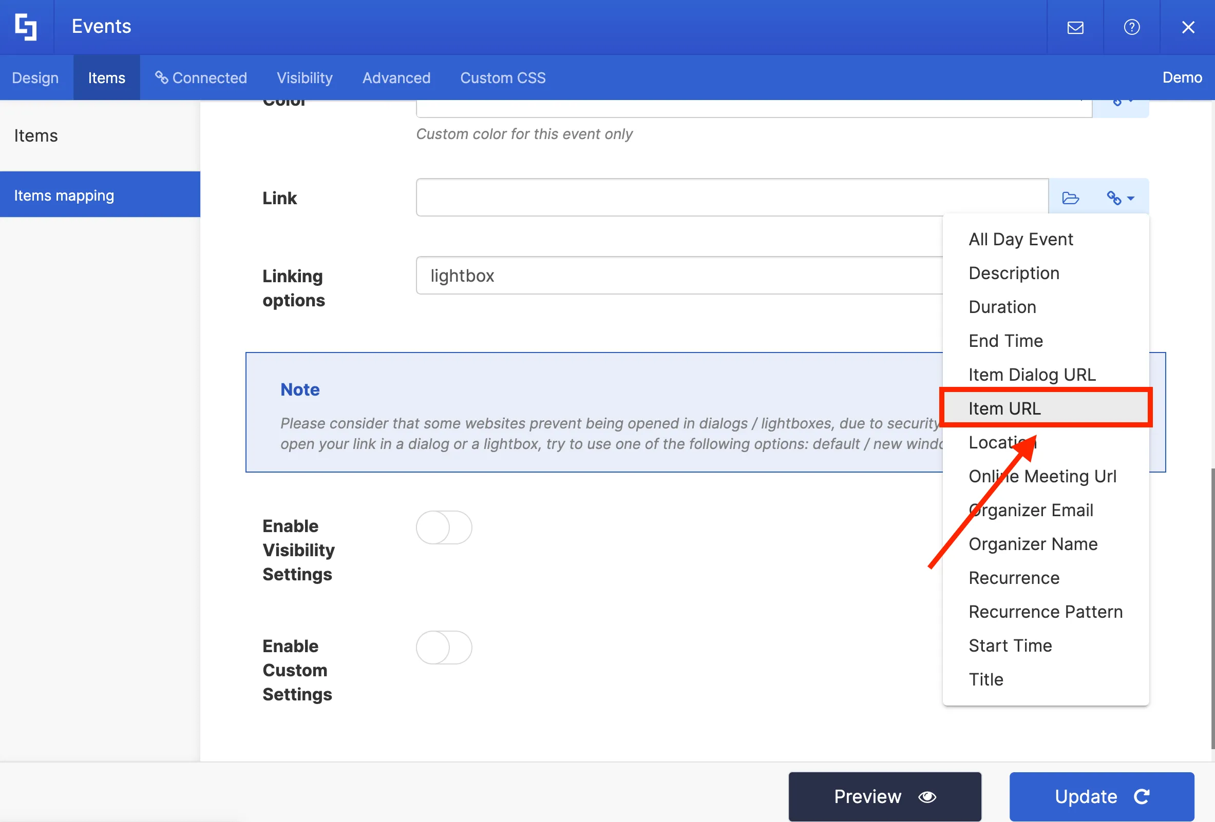
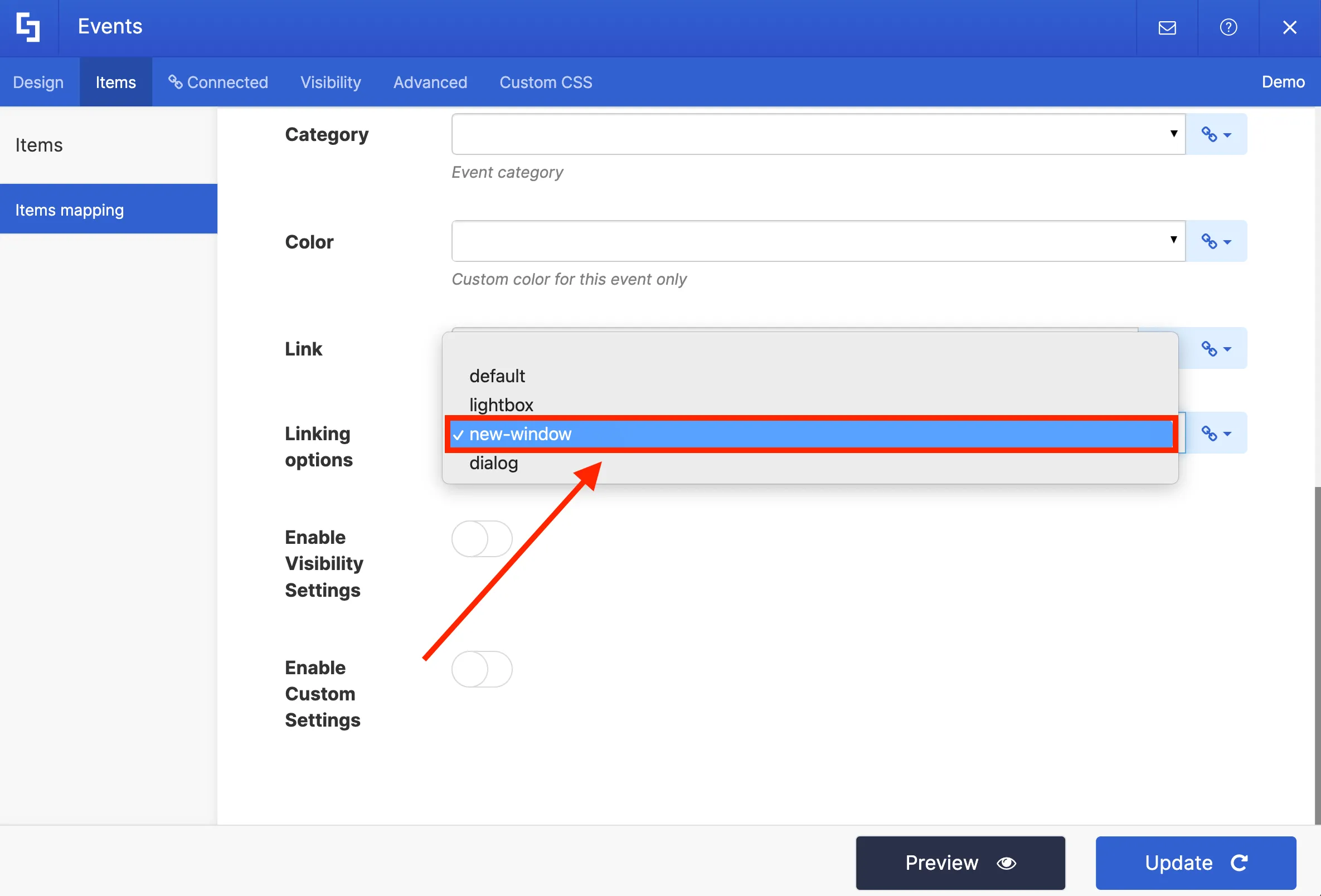
Finally, in the Linking Option field, you can choose how your link will open:
- Default - allows you to open the link in the same window.
- Lightbox - allows you to open the link in a lightbox.
- New Window - allows you to open the link in a new window.
- Dialog - allows you to open the link in a dialog box.
For this project, we want to open the link in a new window.
Once you have selected the desired properties, you can Preview how your content will look.
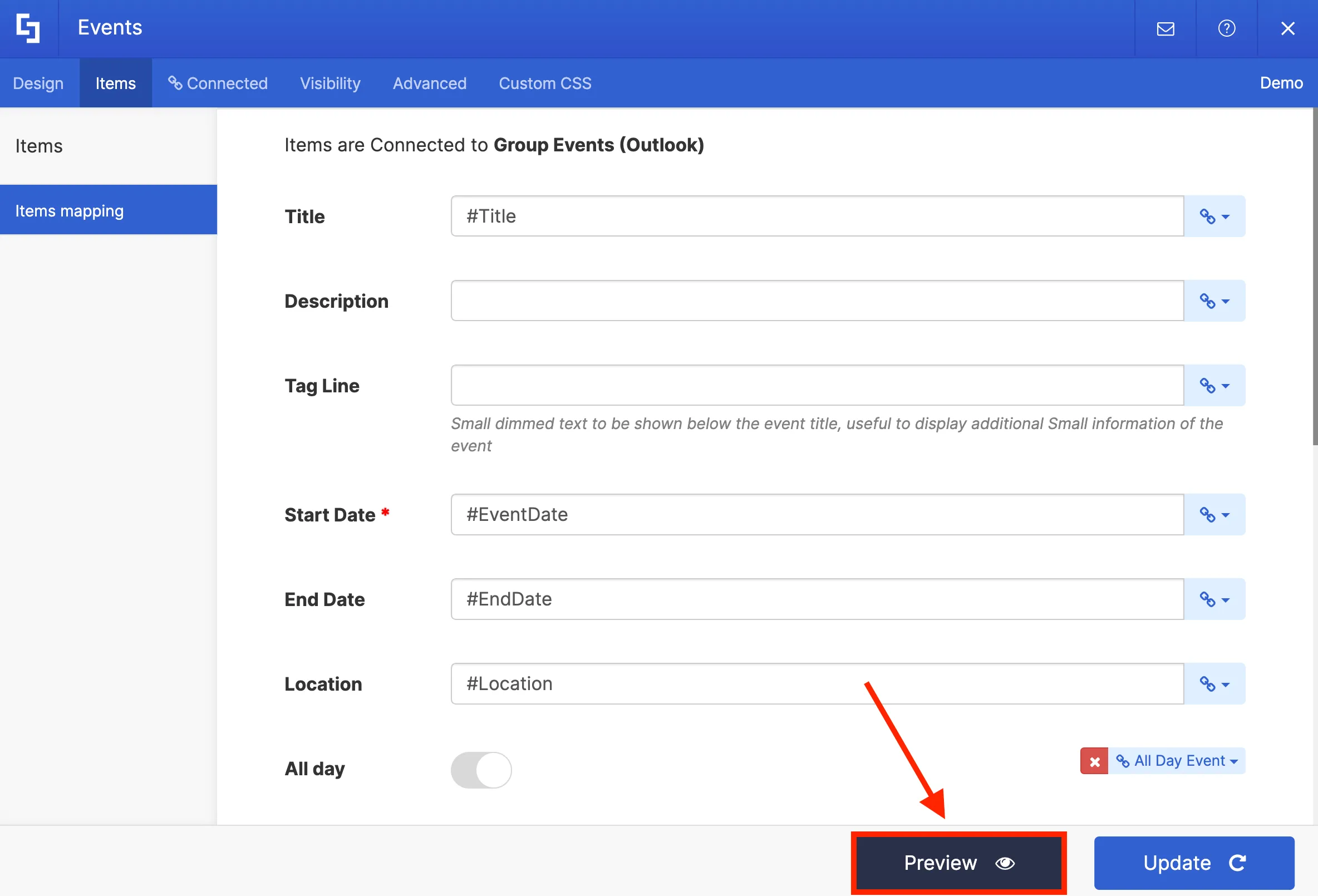
Then, click Update to apply the changes.
Once you click Update, you will notice that the Group Events (Outlook) connection is now inside your Events Design Element. Take note that you do not need to repeat this process again once you add a new event to your calendar. ShortPoint will automatically retrieve and update any new events added to your calendar in the background.
To see your events in real-time, click the eye icon.
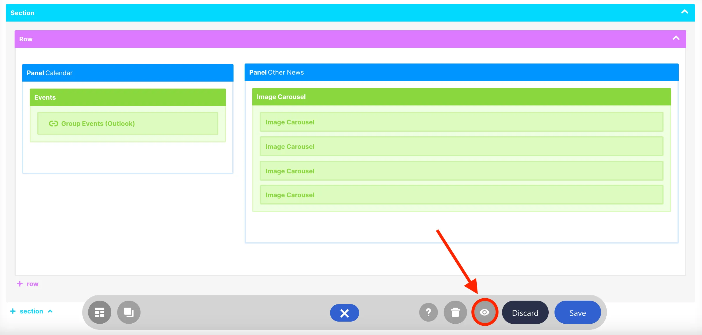
You will now see your events. Click Save to keep your progress.
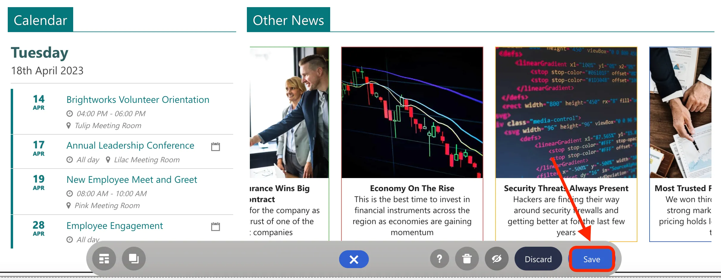
You have now successfully set up a connection between your Outlook Calendar and your intranet using ShortPoint Connect. Enjoy using this feature on your own SharePoint sites!
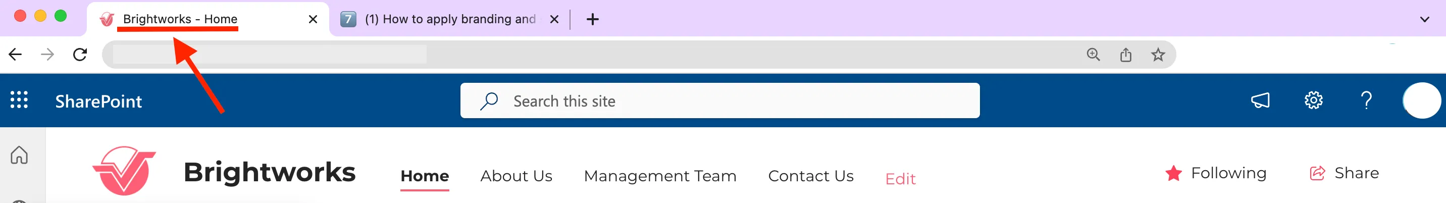
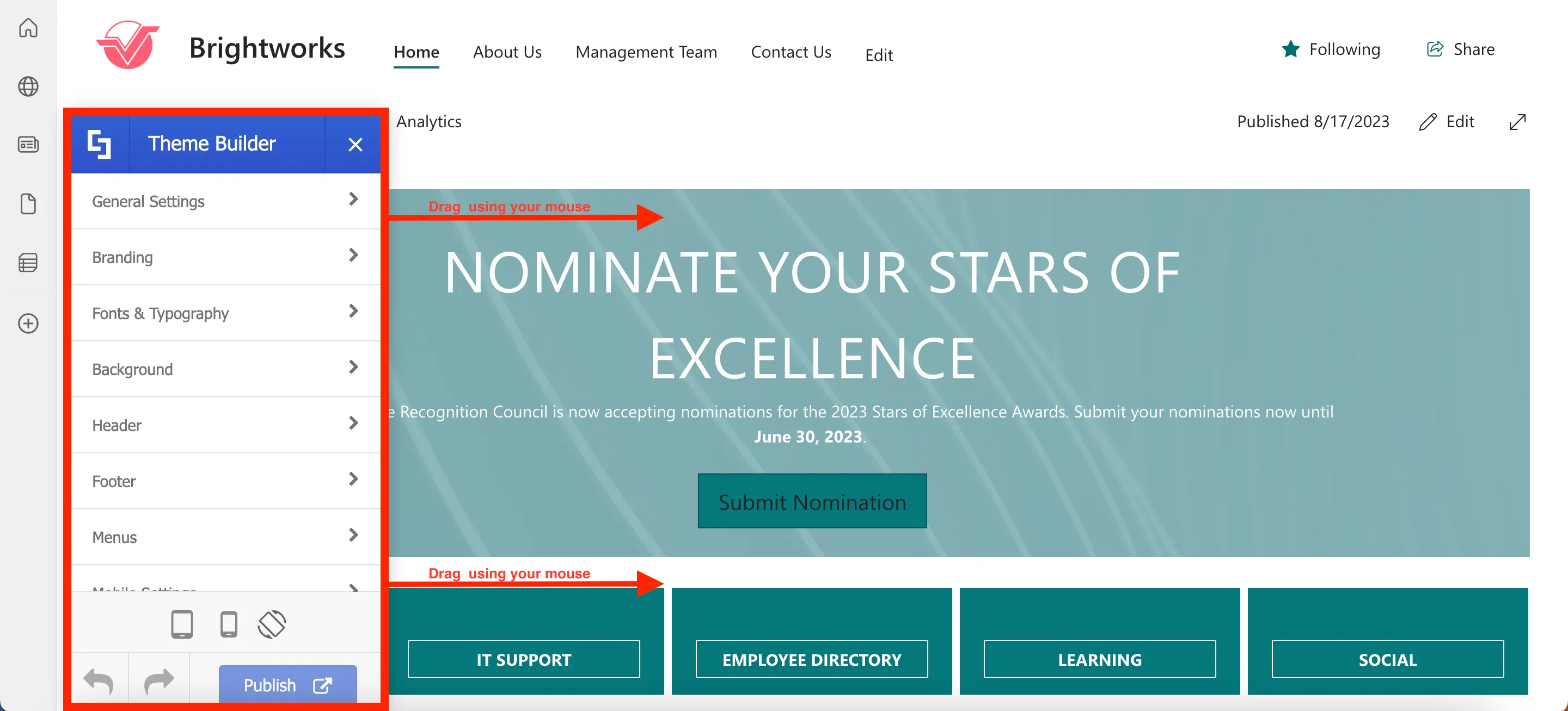
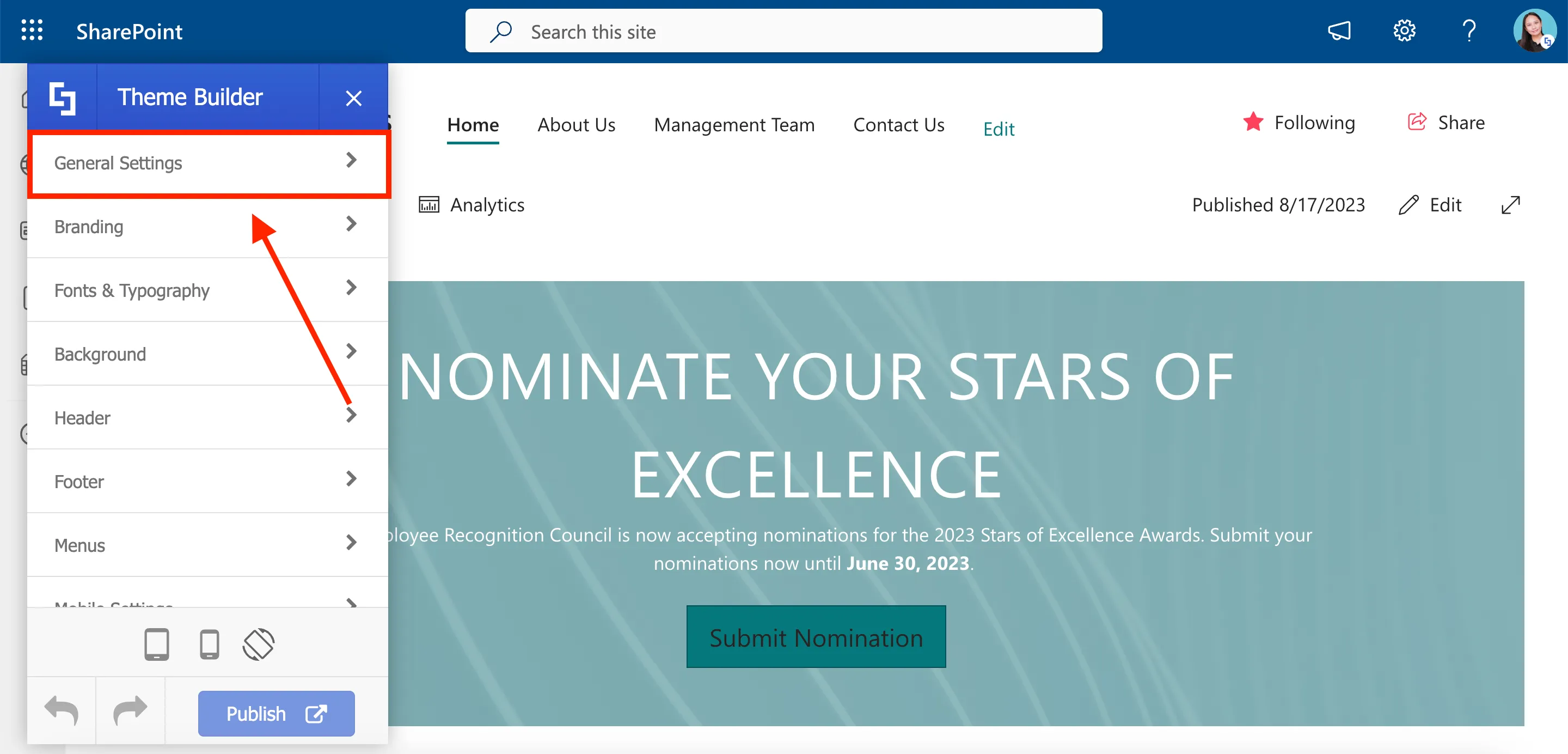
Apply branding and site customizations with Theme Builder
In this lesson, you will learn how to apply company branding colors and typography to all pages in your SharePoint site using ShortPoint Theme Builder.
Launching ShortPoint Theme Builder
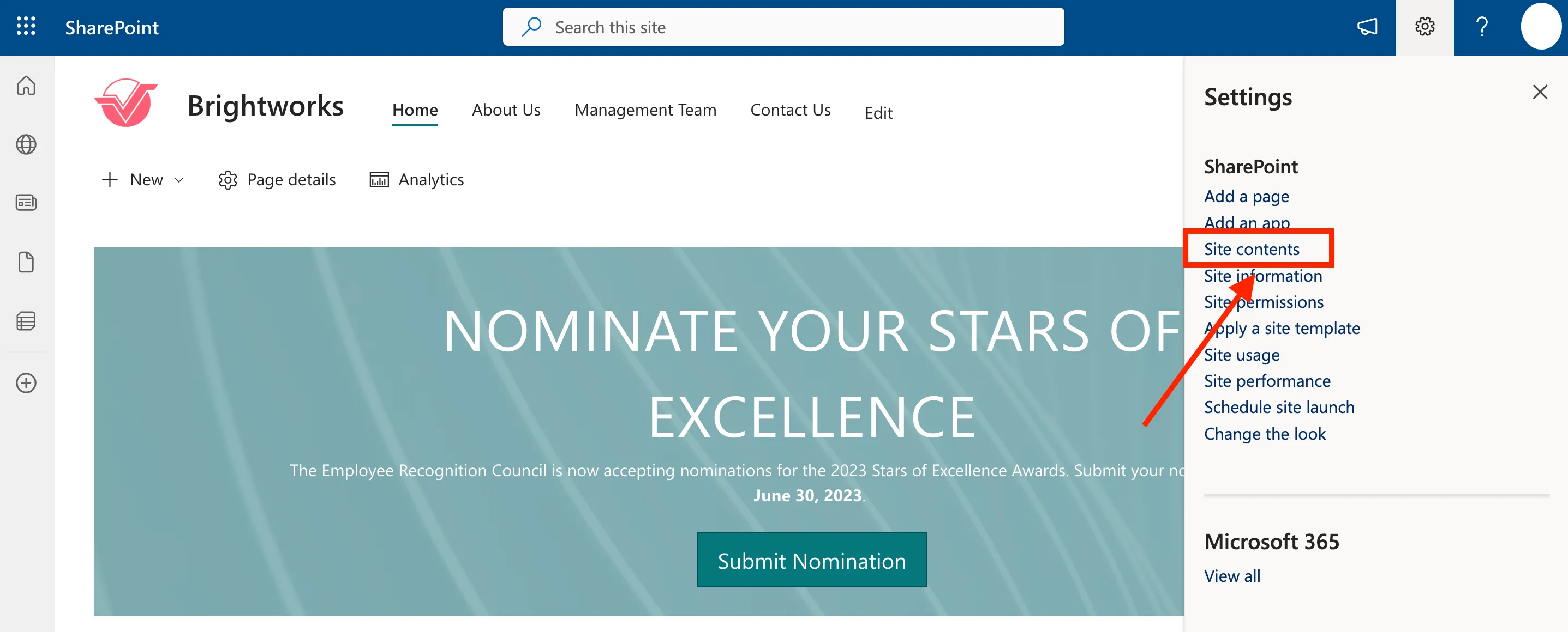
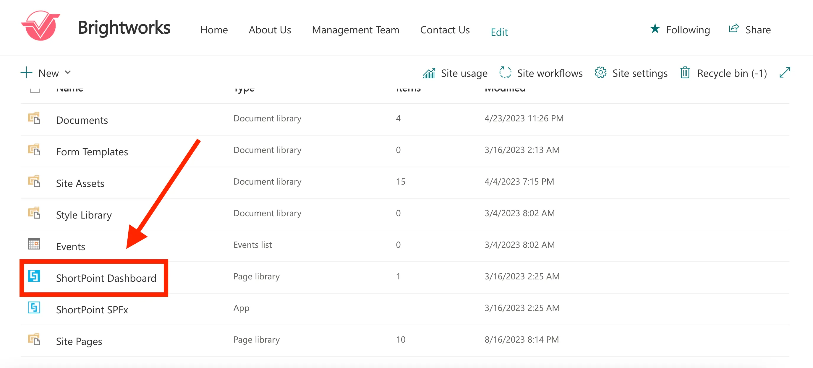
To start, go back to the page we were editing and click the cogwheel icon.
Then, select Site Contents from the list.
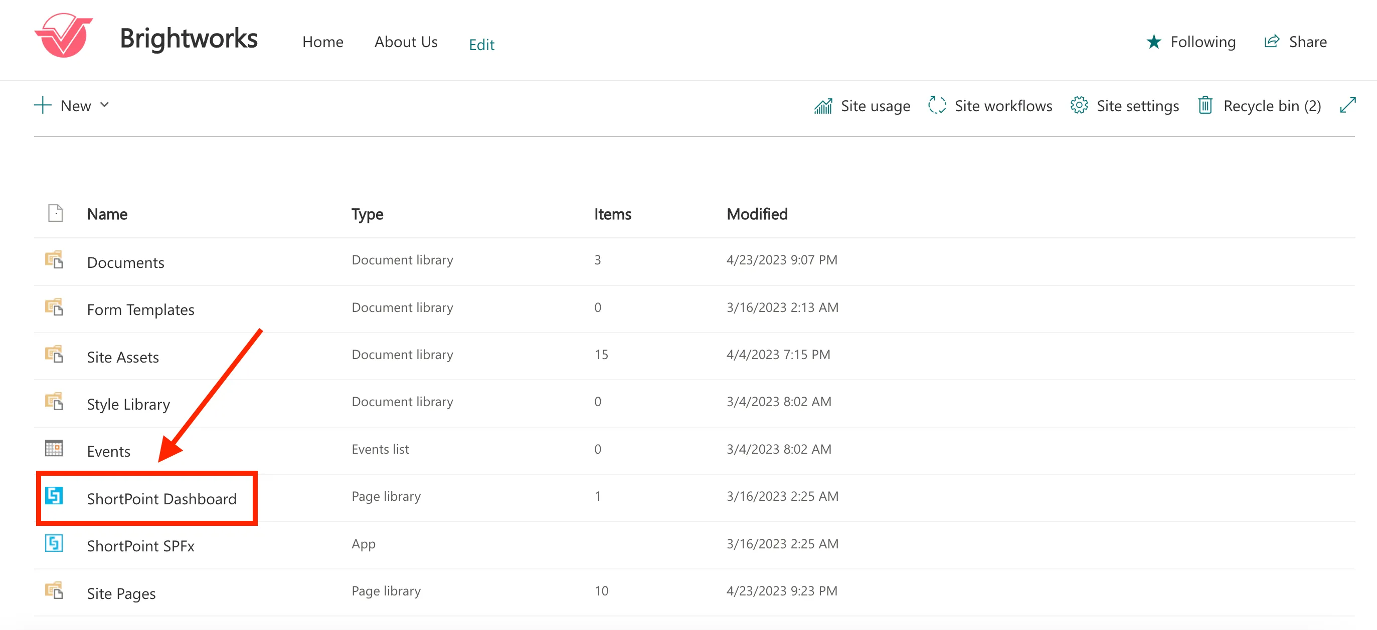
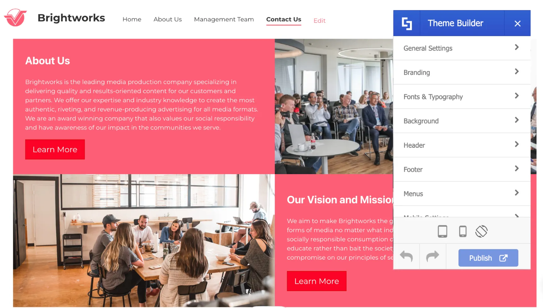
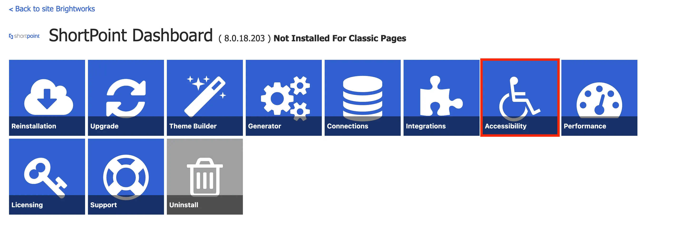
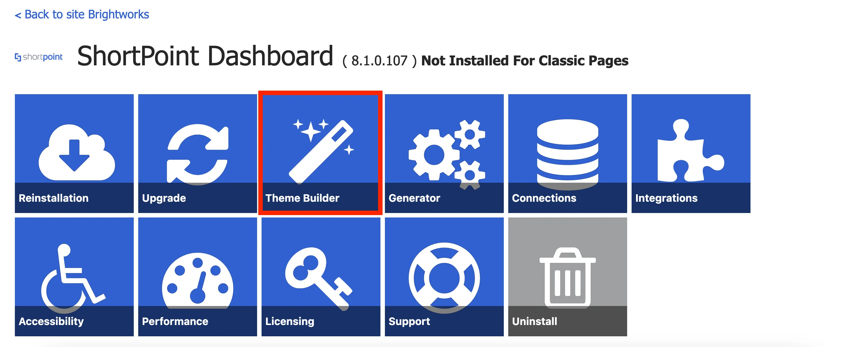
Here, you will see the ShortPoint Dashboard. The ShortPoint Dashboard contains additional tools to design your sites as well as manage ShortPoint on your site. Click it to see the customizing options.
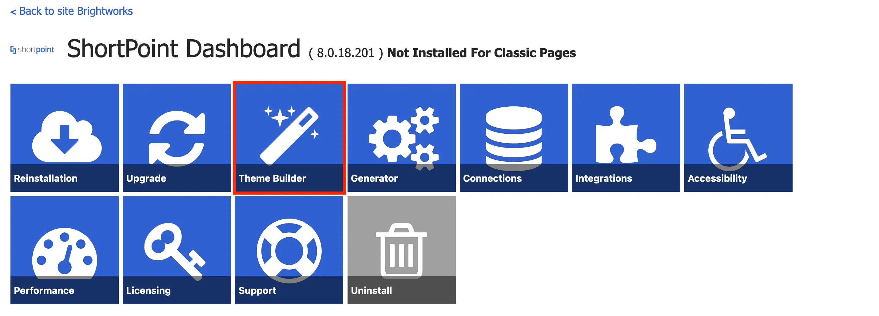
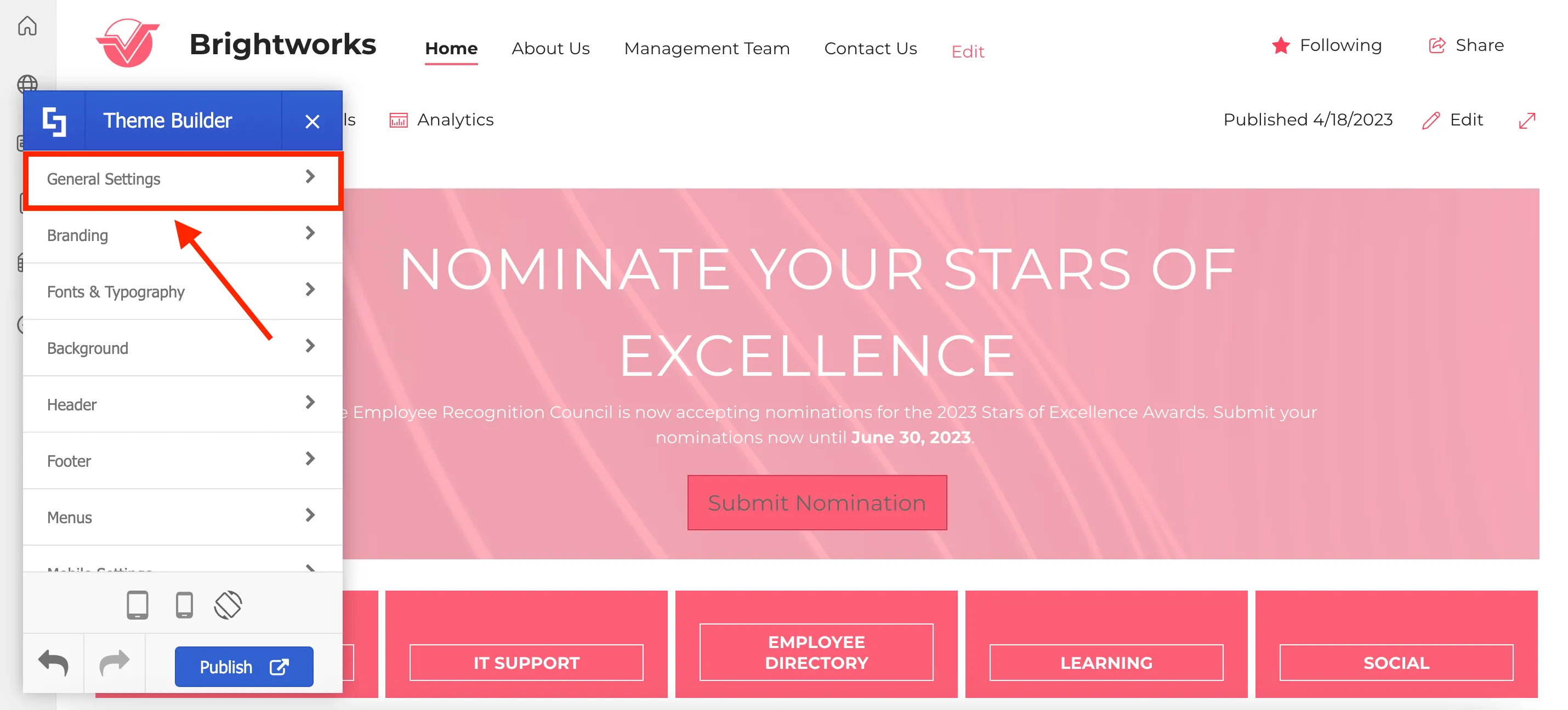
In the ShortPoint Dashboard, you will see tools that can help customize your page further. One of these tools is the ShortPoint Theme Builder, which allows you to customize your site's theme and apply branding. Click on Theme Builder.
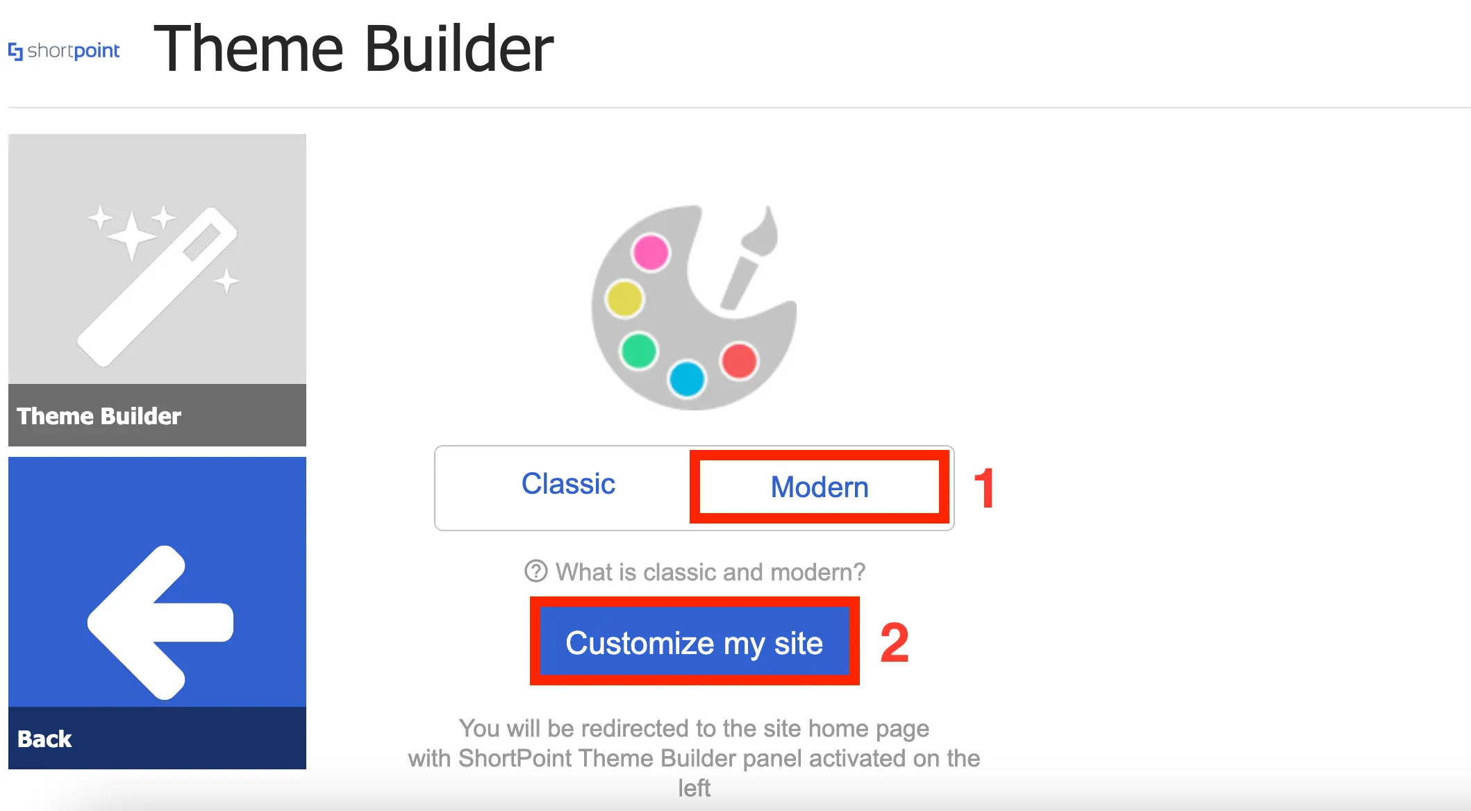
In Theme Builder, select [1] Modern and click [2] Customize my site.
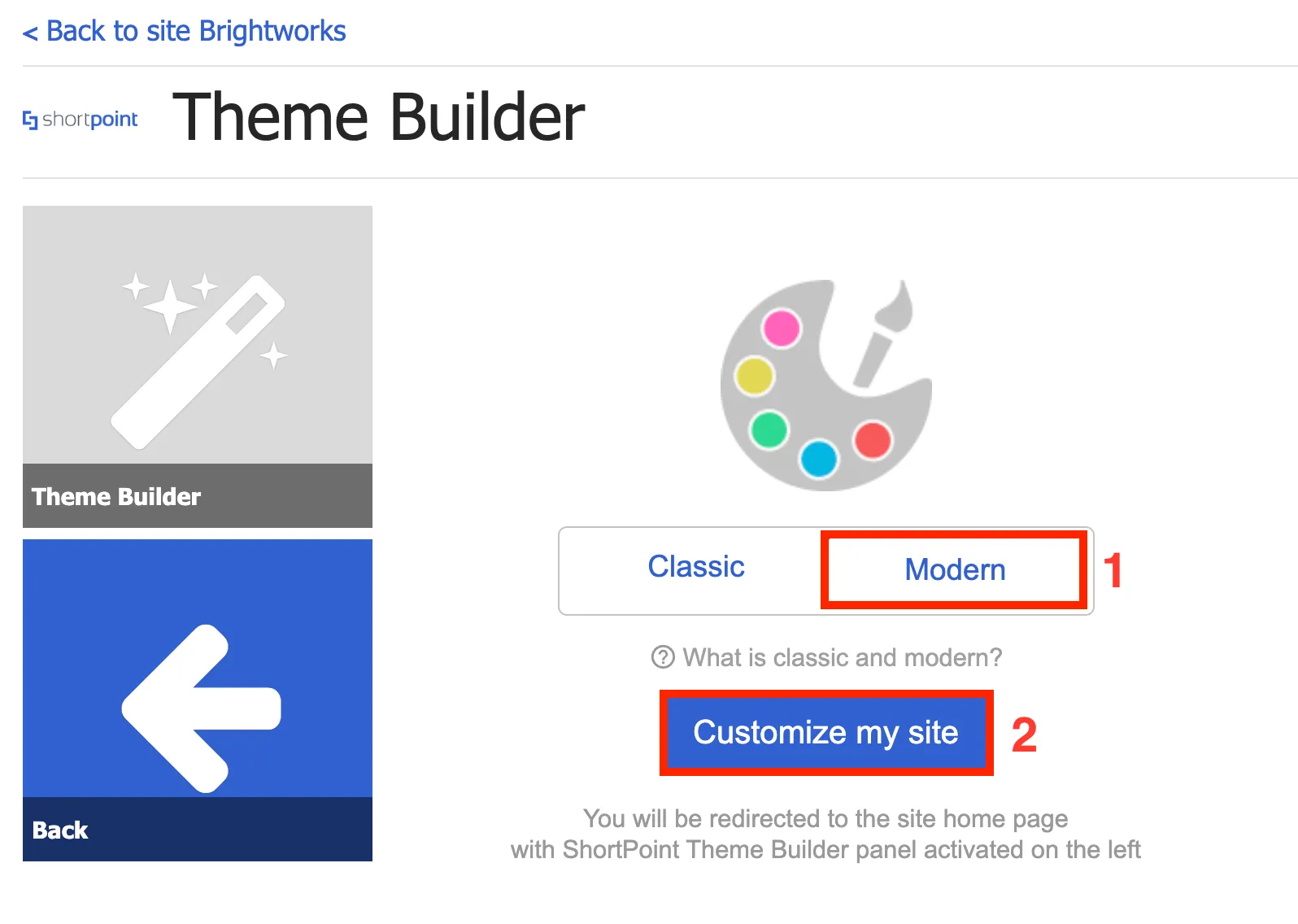
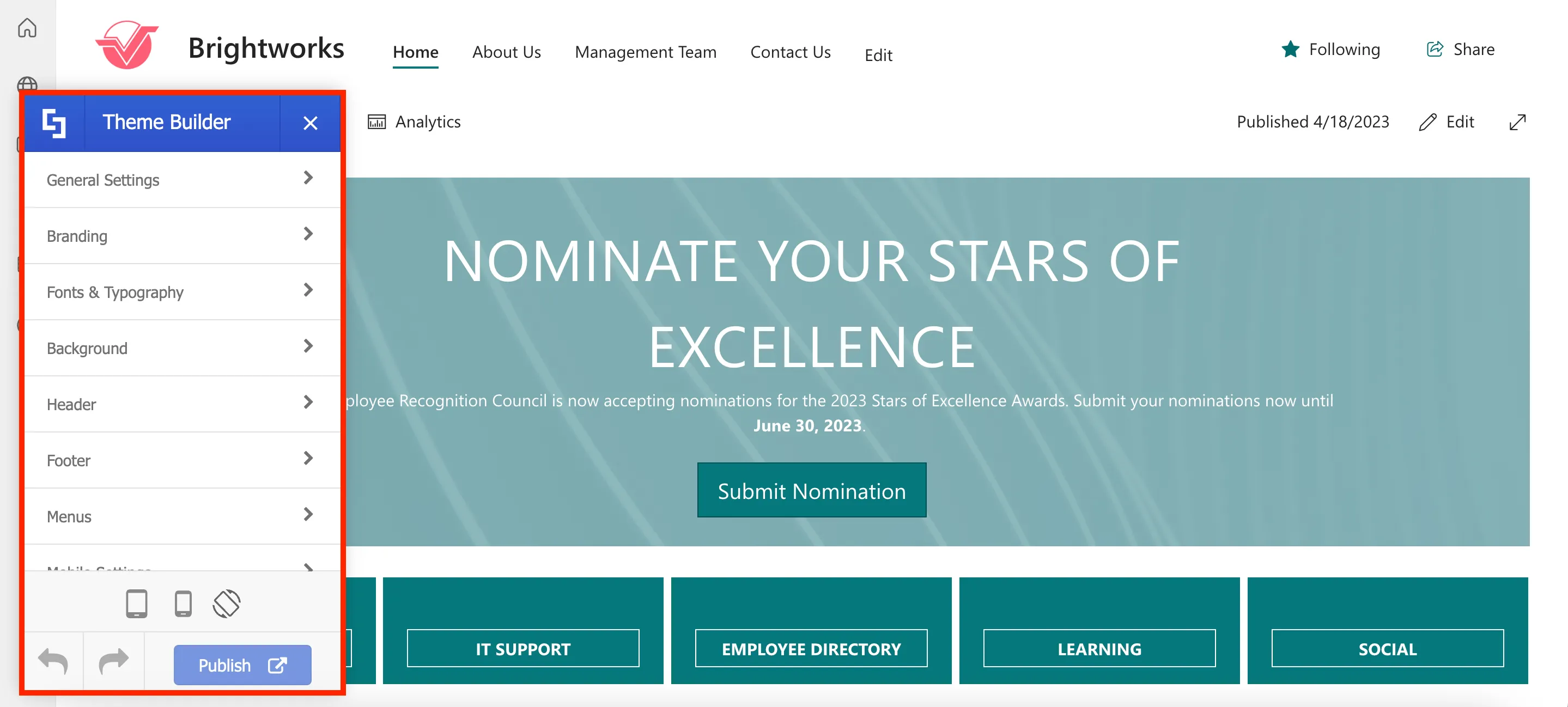
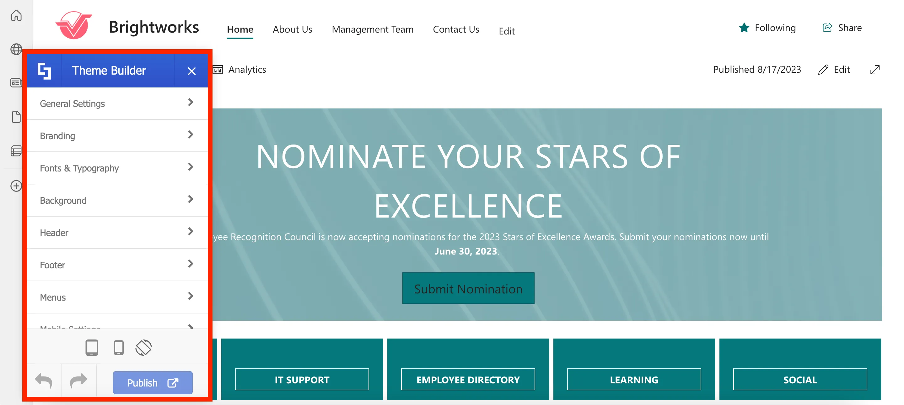
You have now launched ShortPoint Theme Builder. This will give you access to various styles and design options to customize your site's general layout, branding, fonts, header, footer, and more.
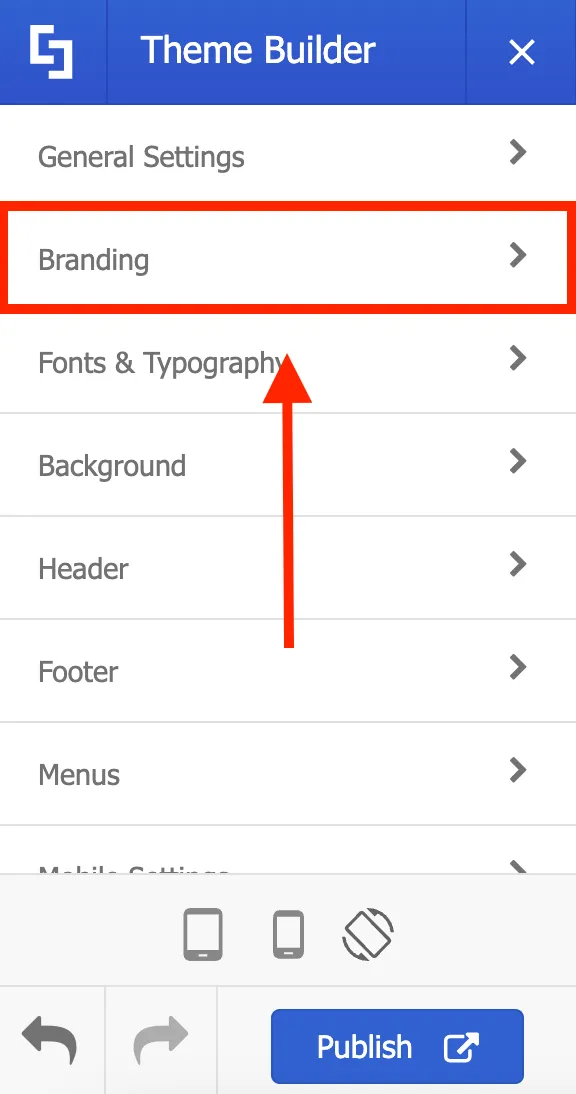
Applying branding colors, fonts, and logo
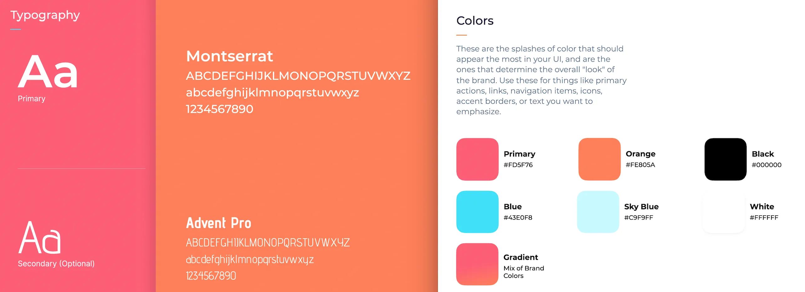
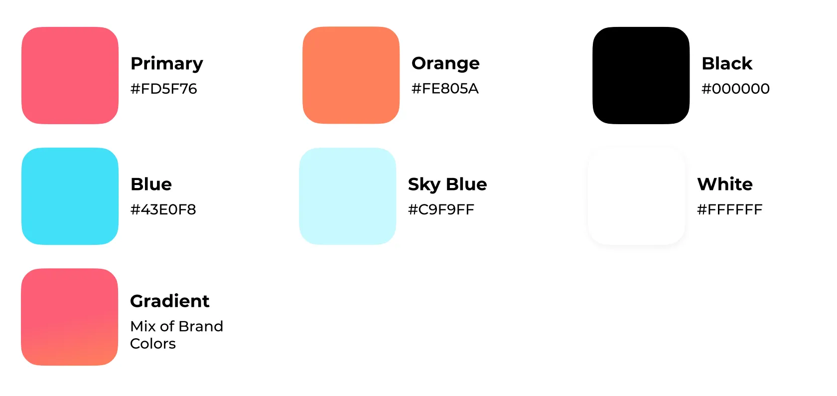
First, let us show you Brightworks' brand guidelines. Using ShortPoint Theme Builder, we want to apply Brightworks’ font and branding colors to the site.
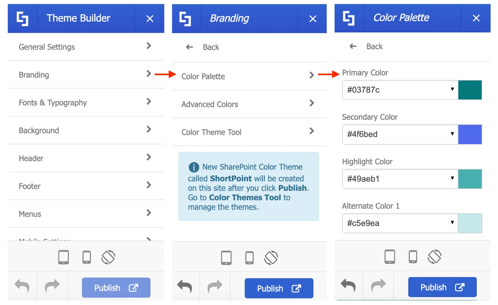
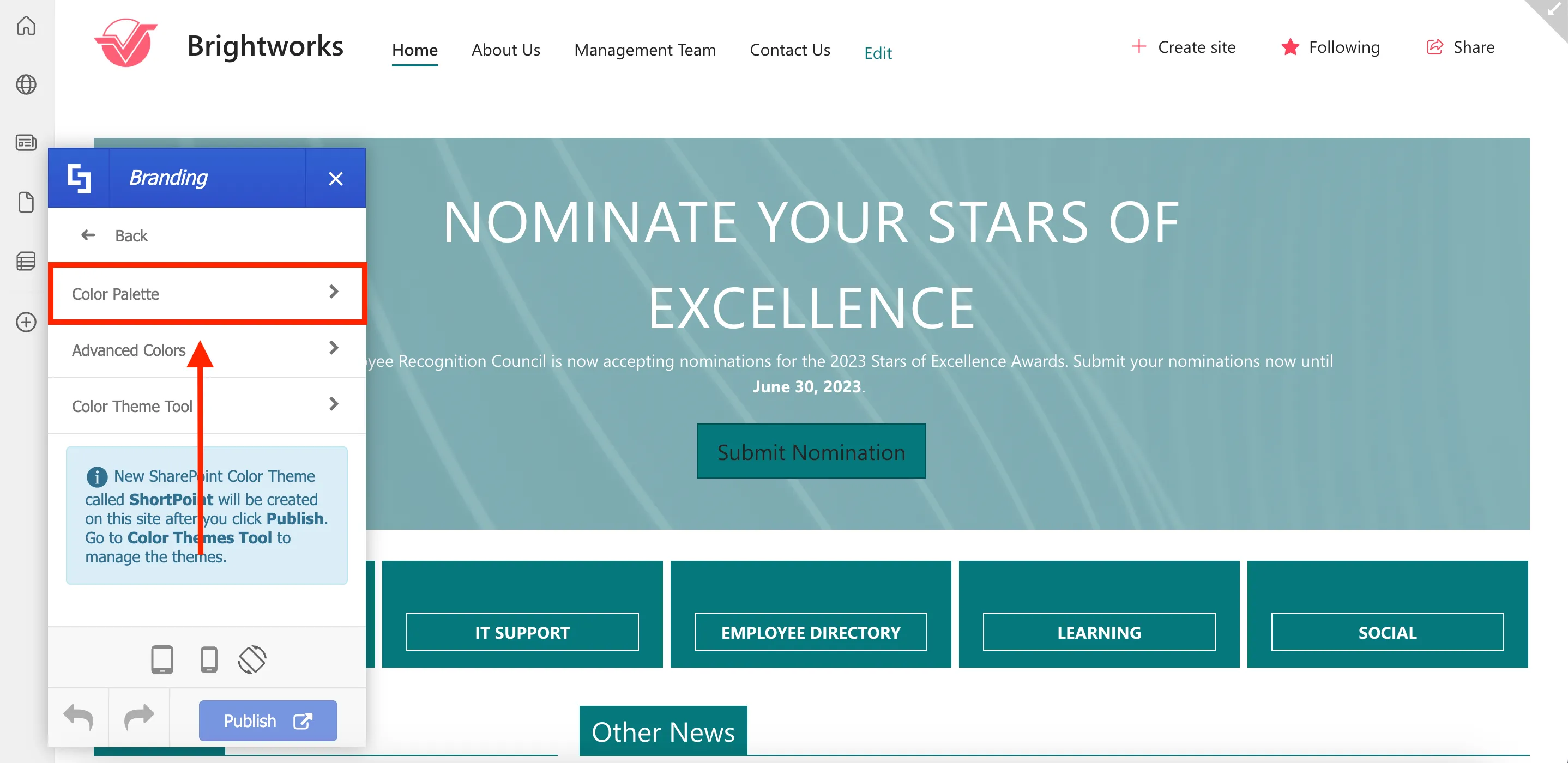
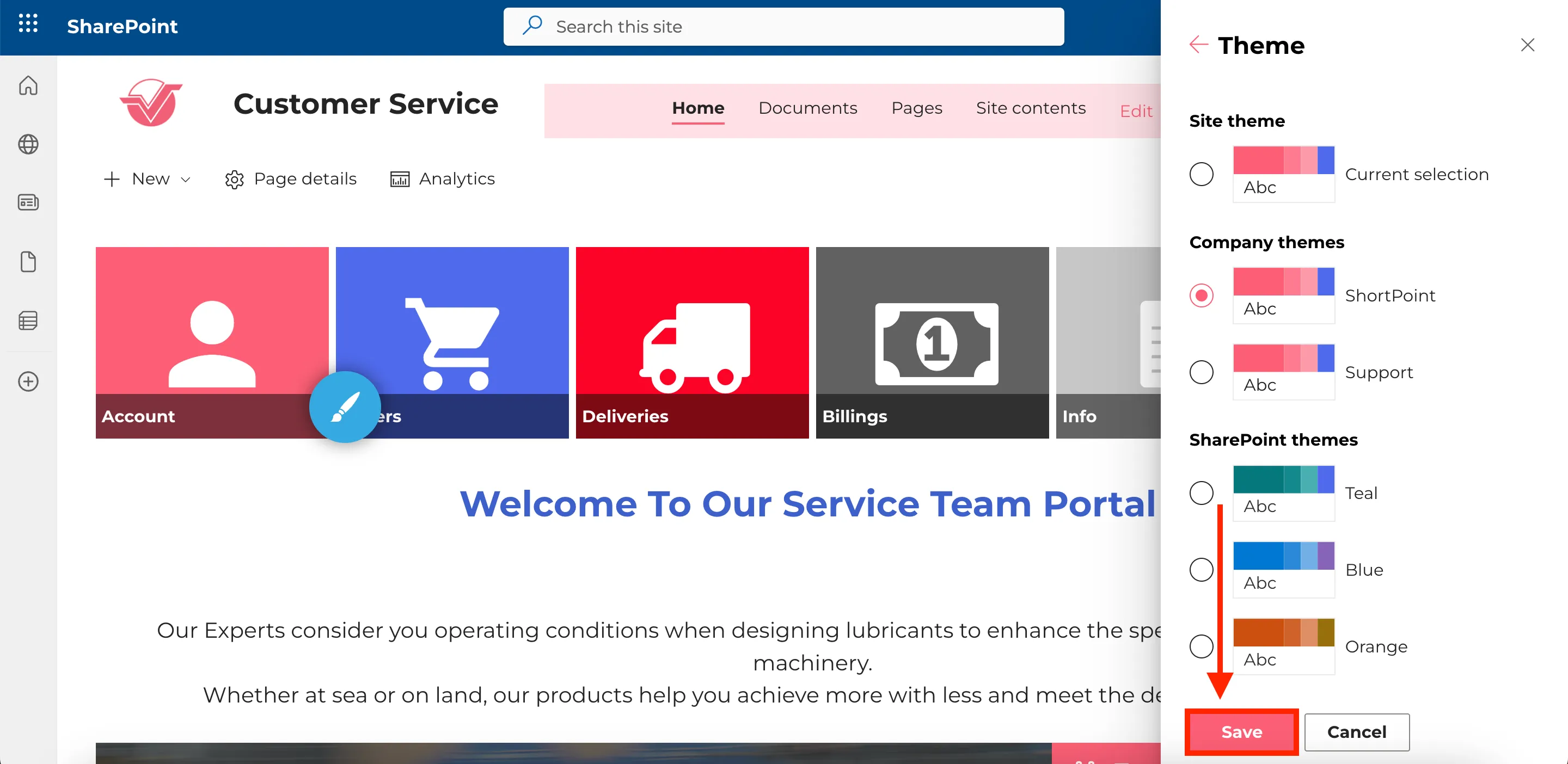
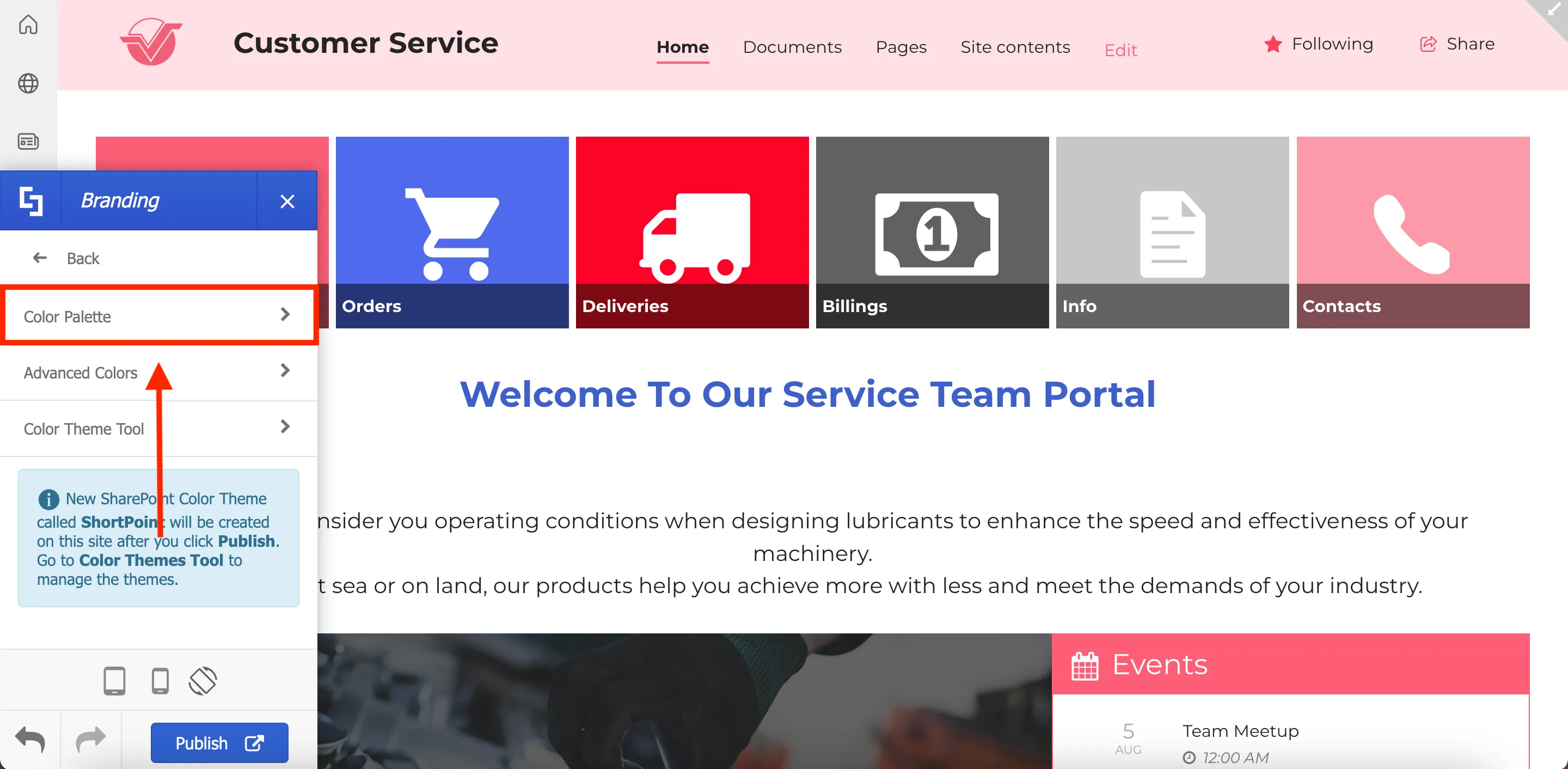
To apply branding colors, go to Branding.

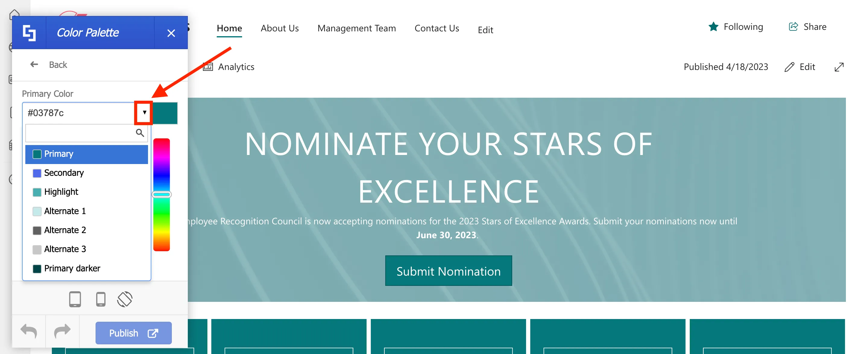
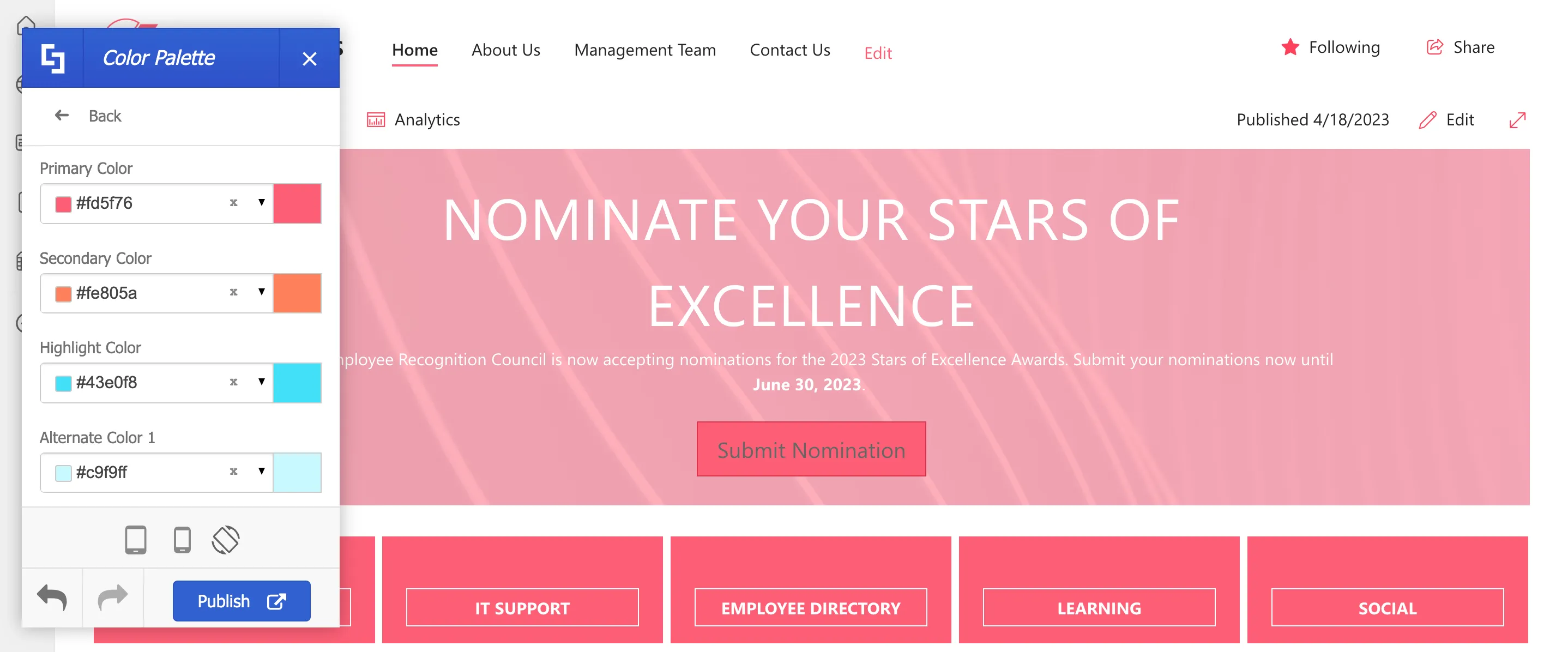
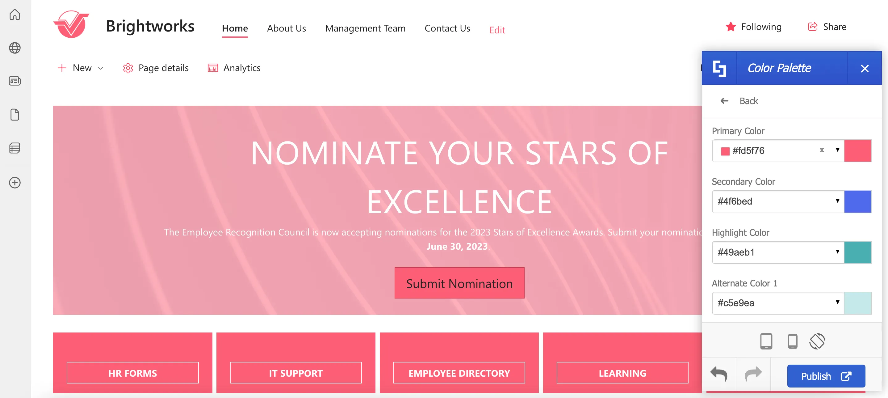
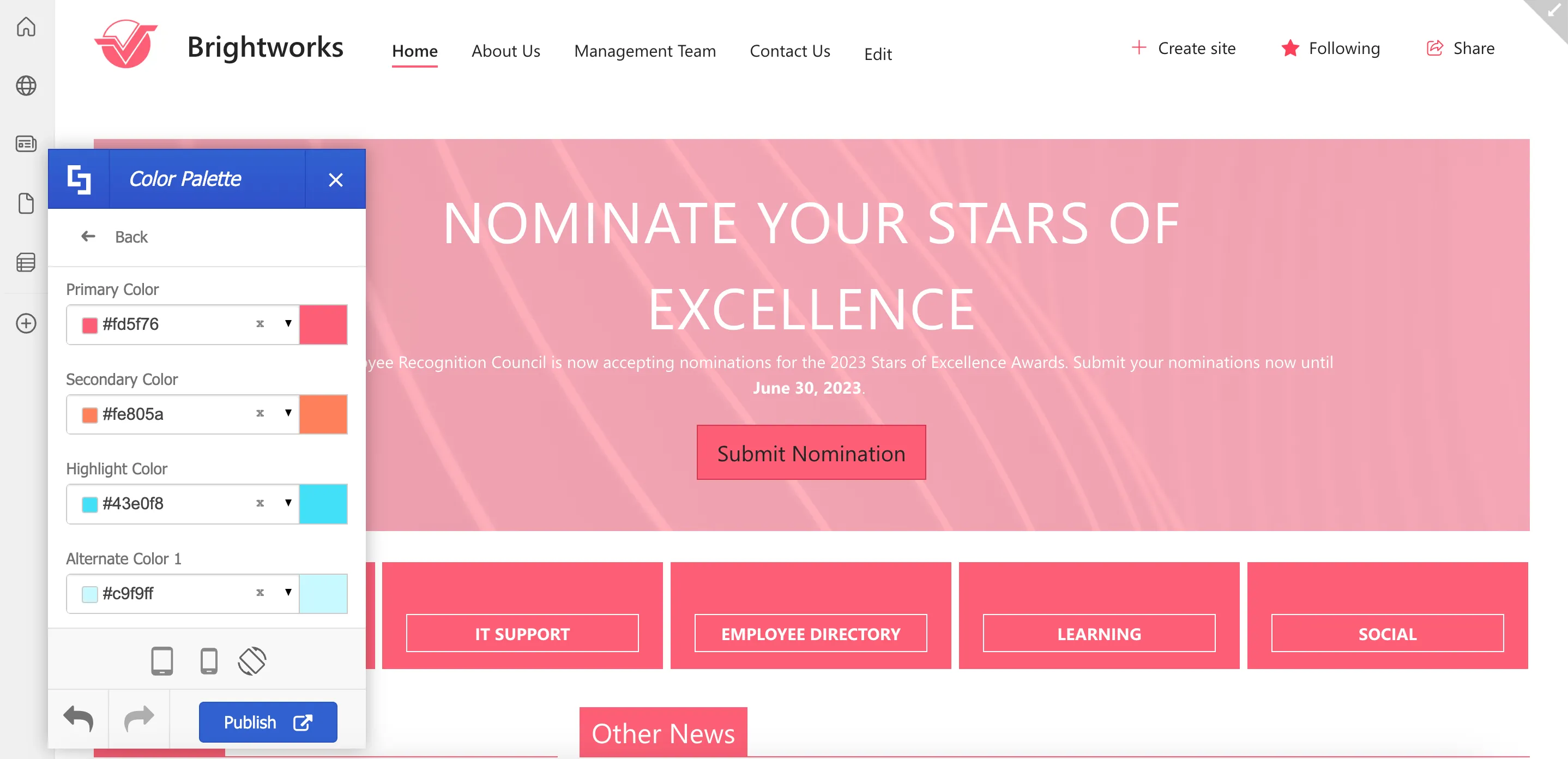
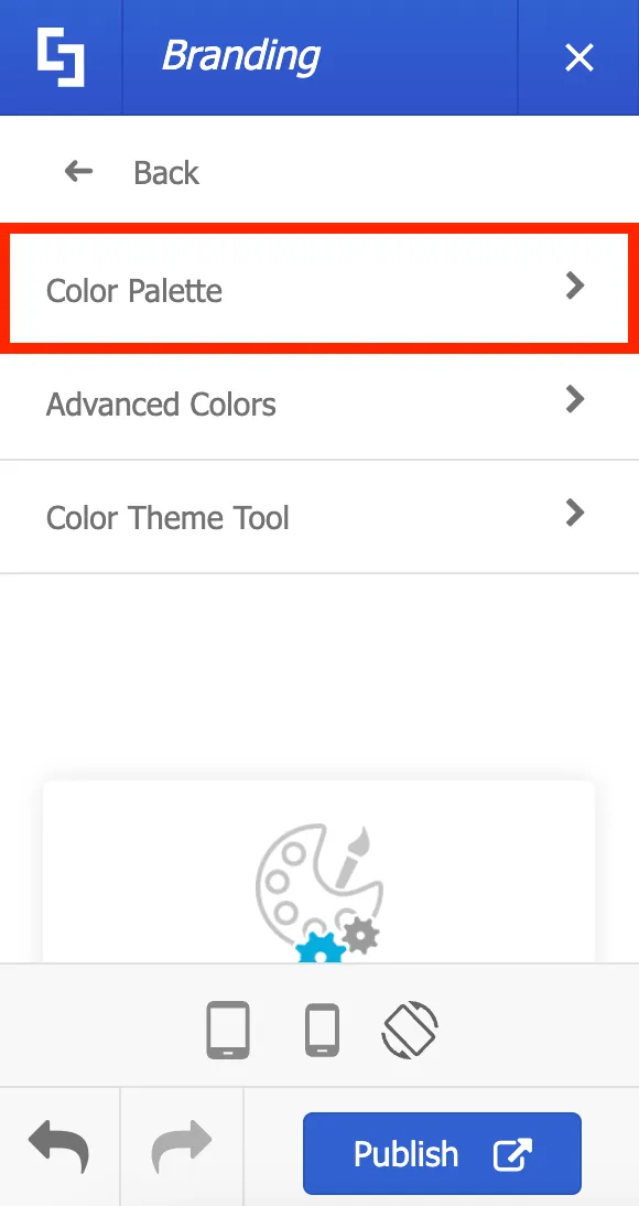
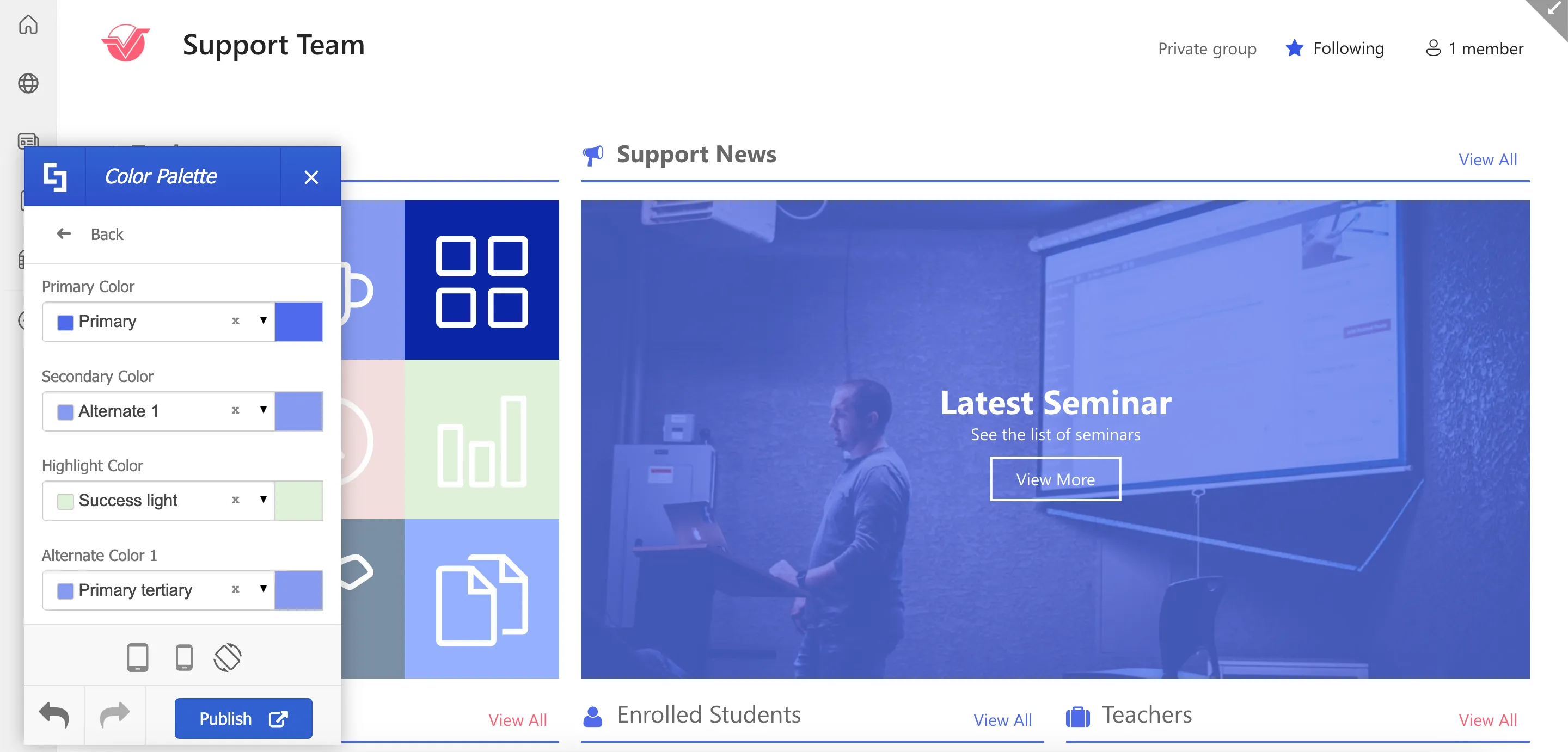
Then, select Color Palette.

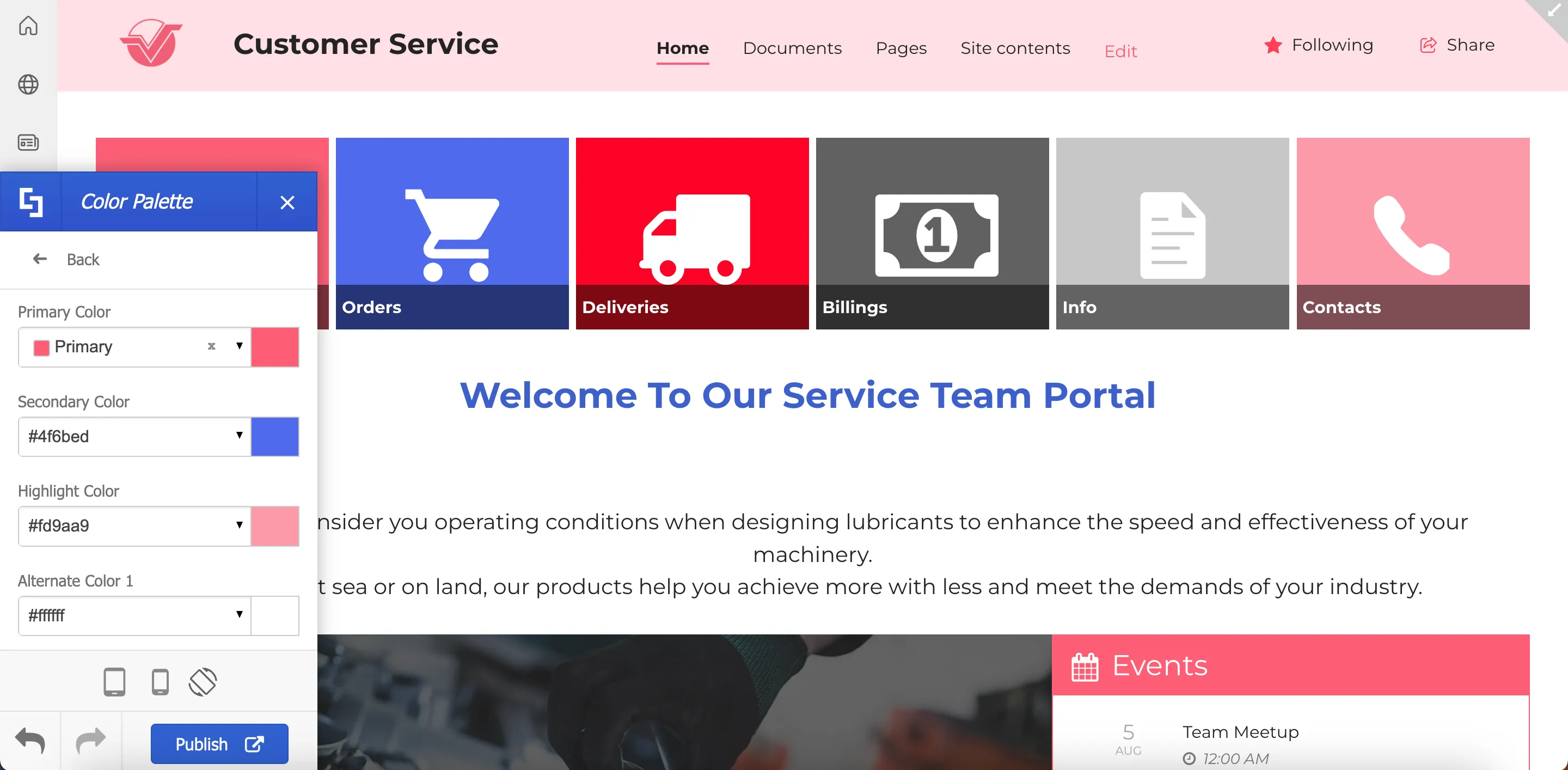
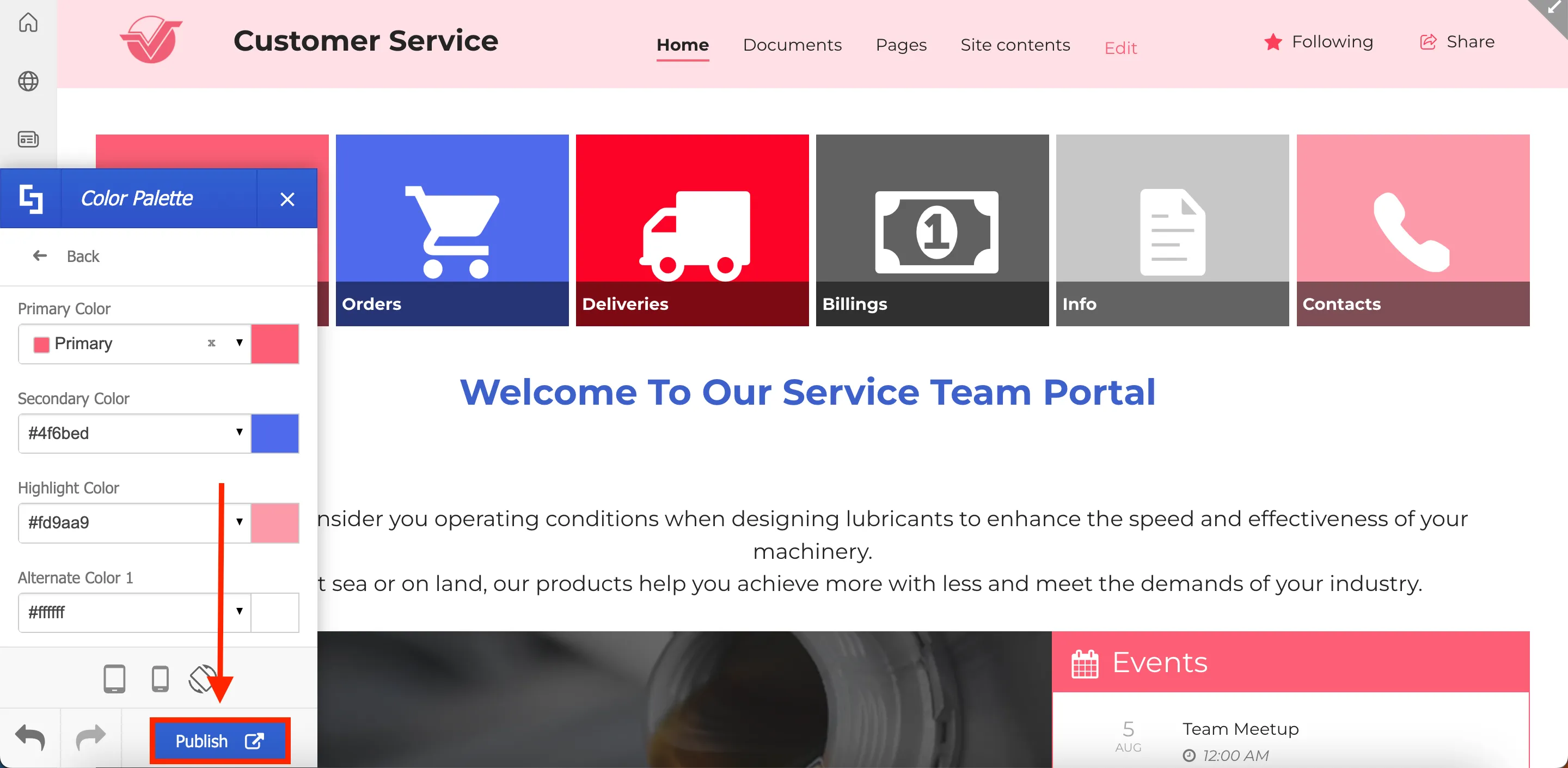
Here, you can set the default color themes for your site. These default color themes will then appear as the main color option when customizing Design Elements and other site components.
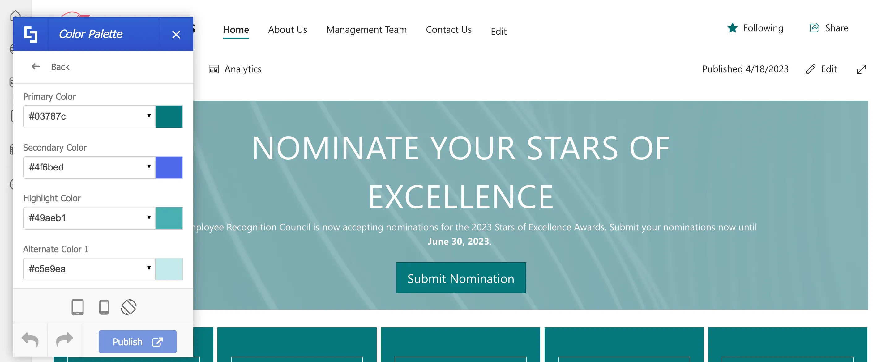
There are several ways to change the default color themes. One is to use the color picker.
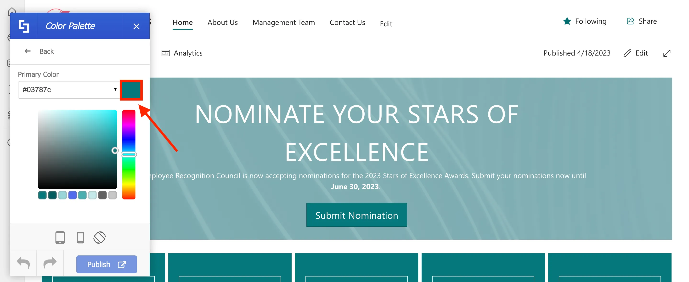
Another is to use the dropdown to choose from a list of ShortPoint preset colors.
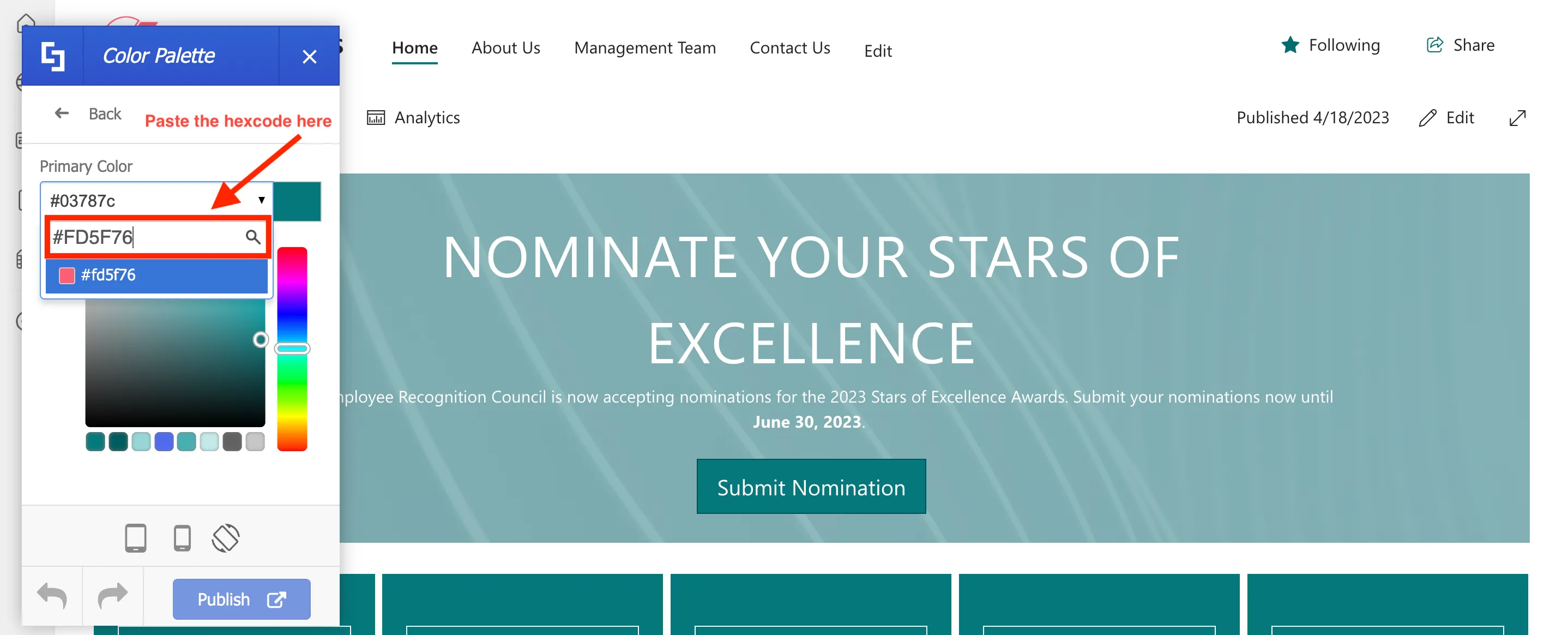
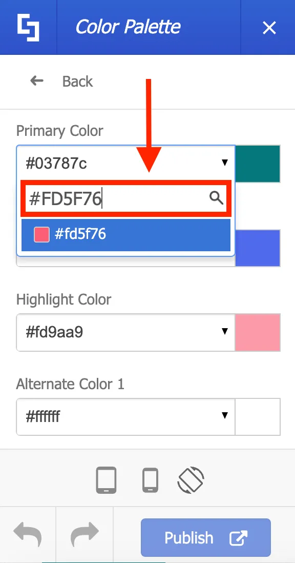
But for this project, we will copy the hex codes from Brightworks branding guidelines.
And paste it into the appropriate color fields.
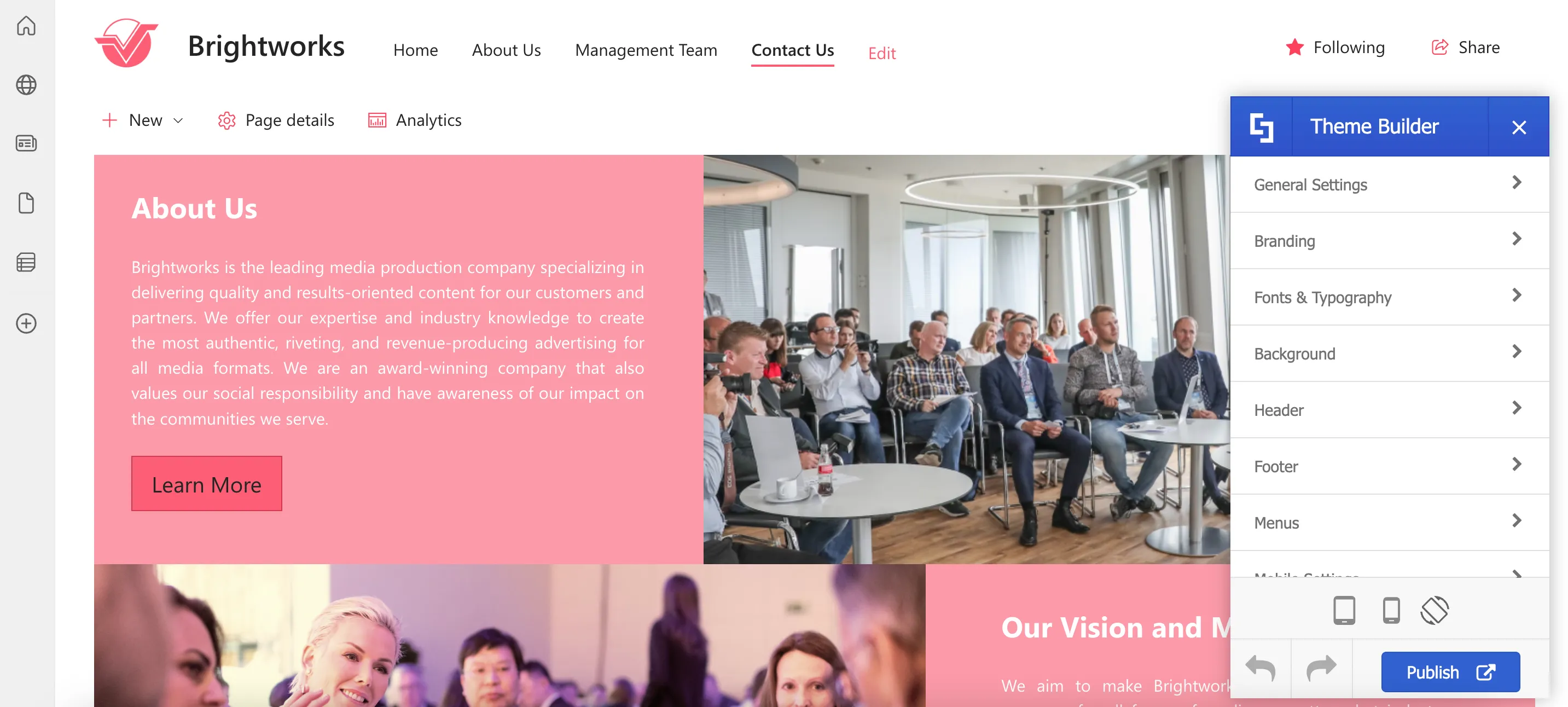
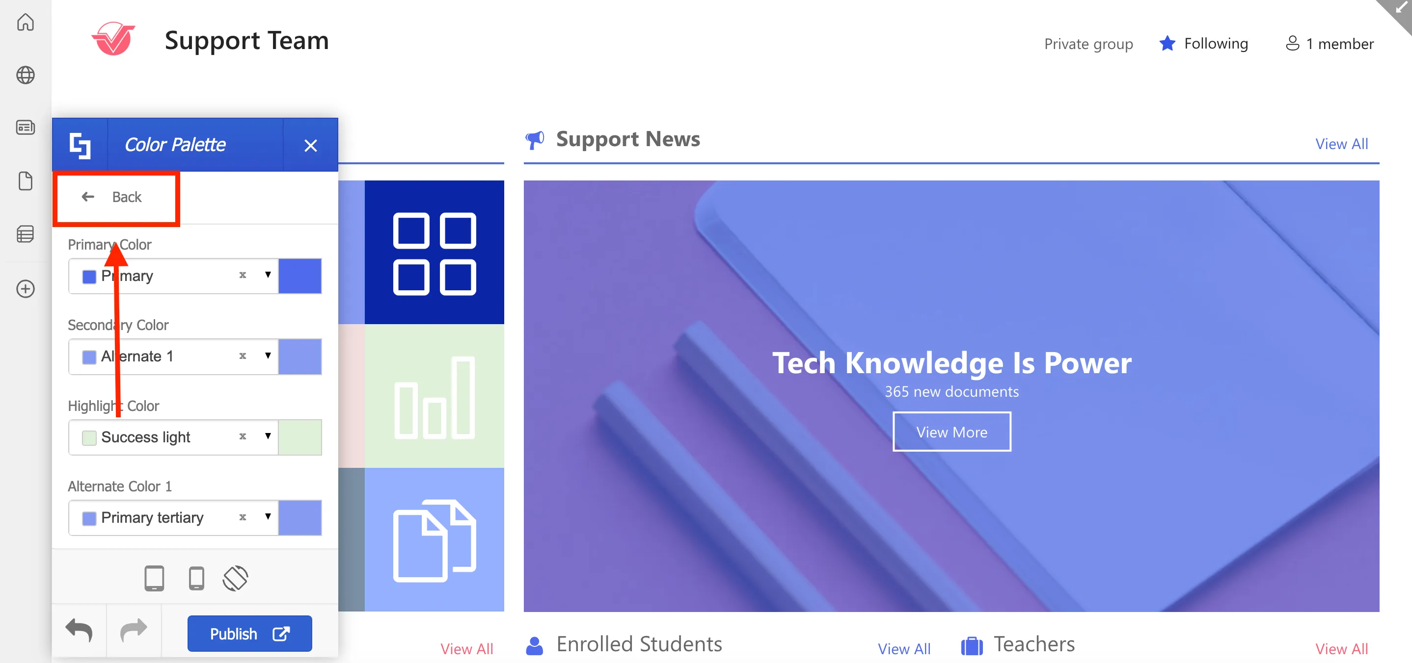
As you make your selections, your page will instantly update with the new colors, making it easy to see the changes you're making in real-time.
You can also check other pages while Theme Builder is active. Feel free to customize your site theme to your desired look as these changes will not be available to anyone else in your organization until you click Publish.
Next, let's apply the official typography of the company.
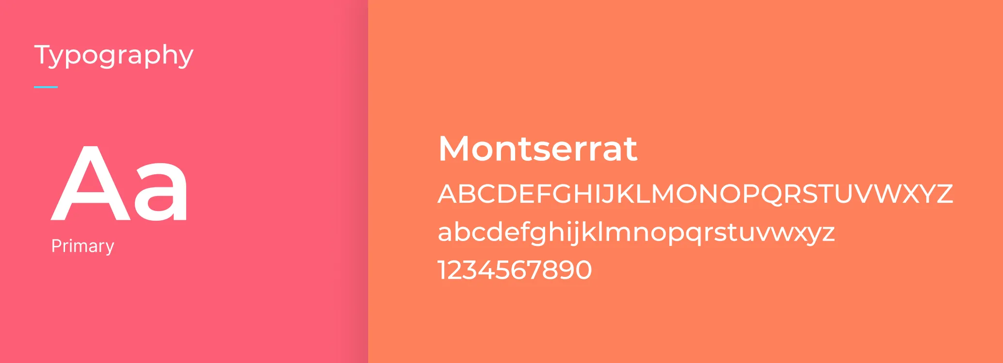
To do this, select Fonts & Typography.
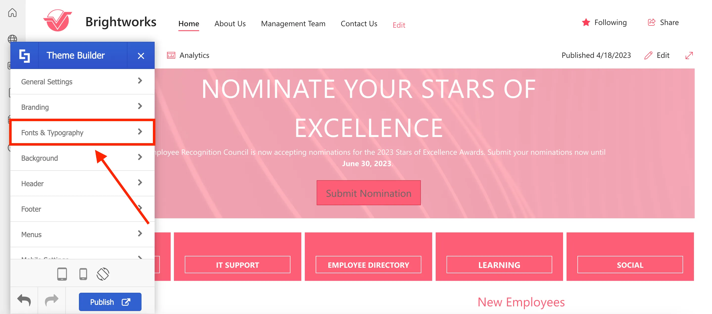
In Fonts & Typography, you can choose to apply different fonts for various components on your site. But for now, we will select the Base font of your site.
Use the search field to look for your desired font.
If you cannot find your company's official font in the available options, use the back arrow to go back to the main Theme Builder menu.
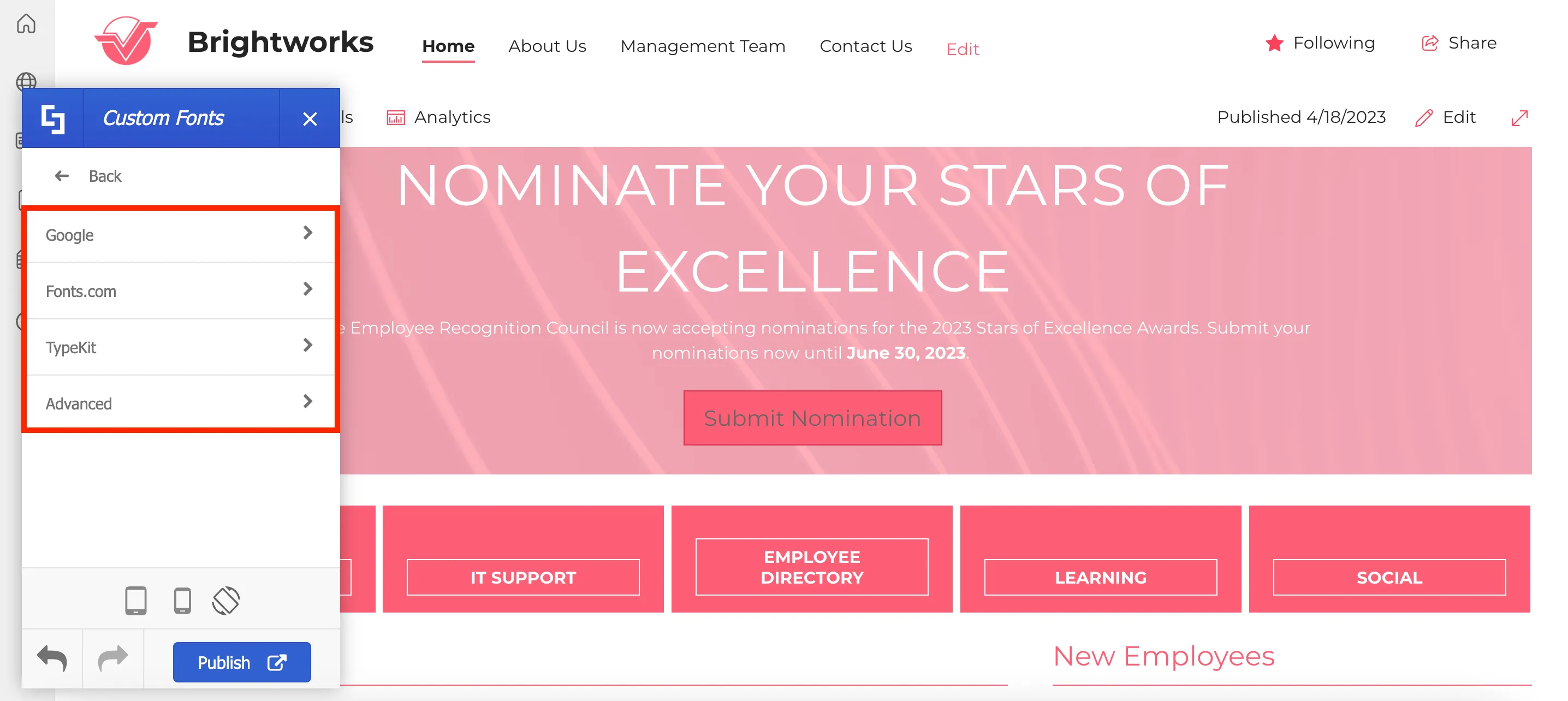
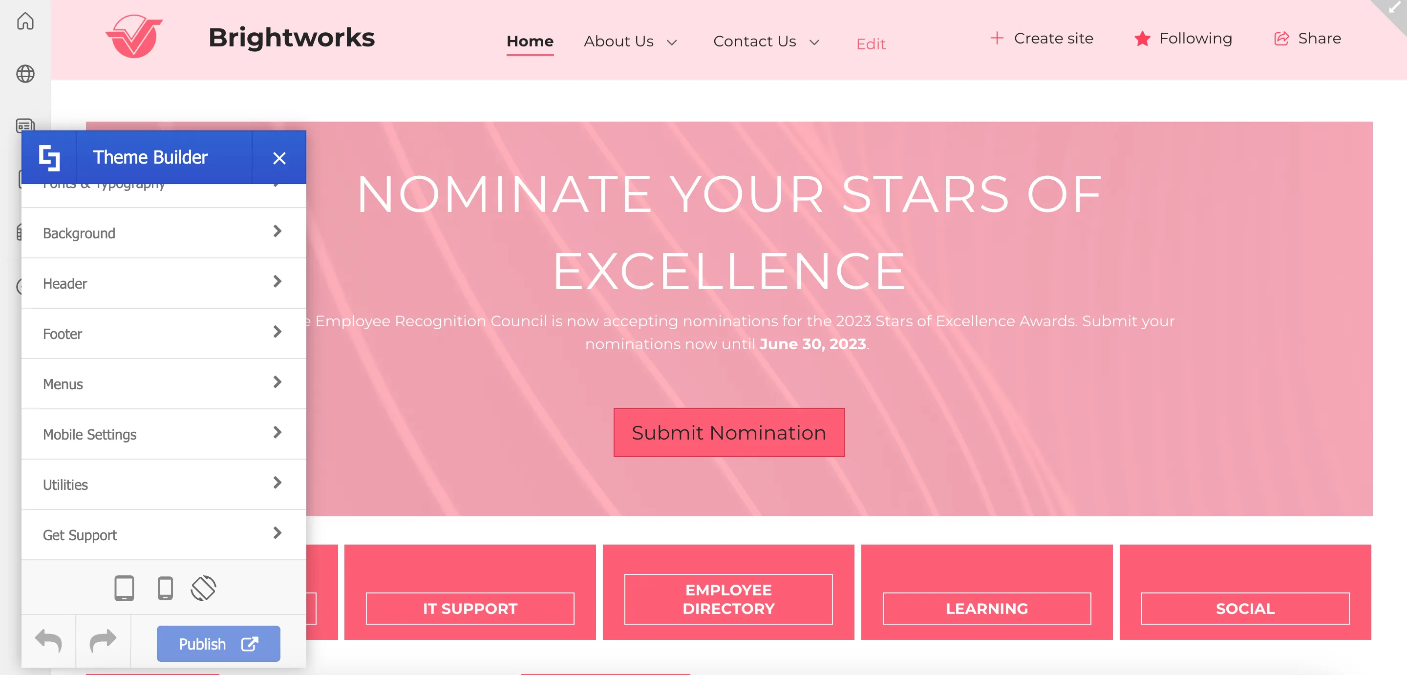
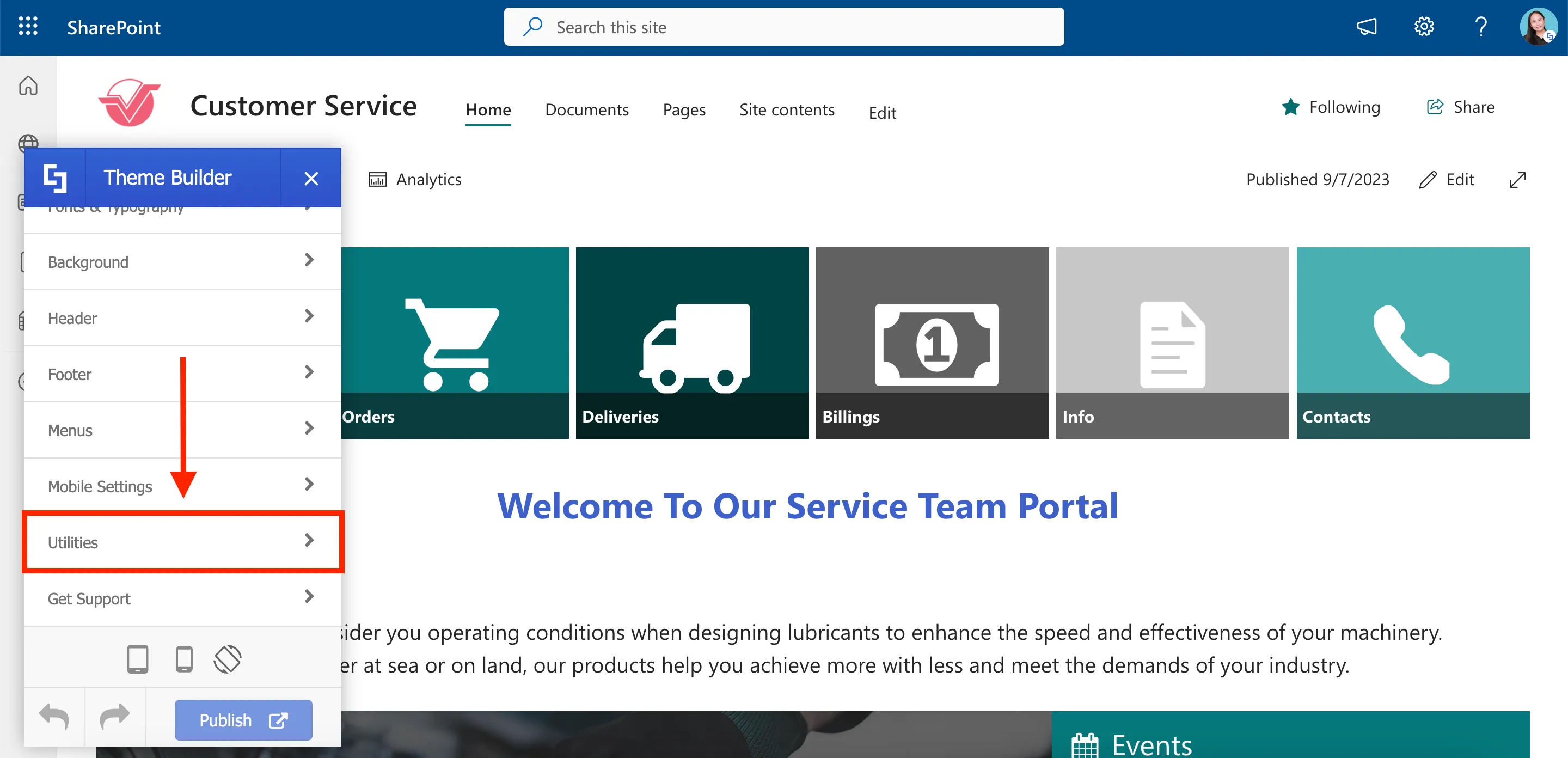
On the main menu, scroll down until you see Utilities.
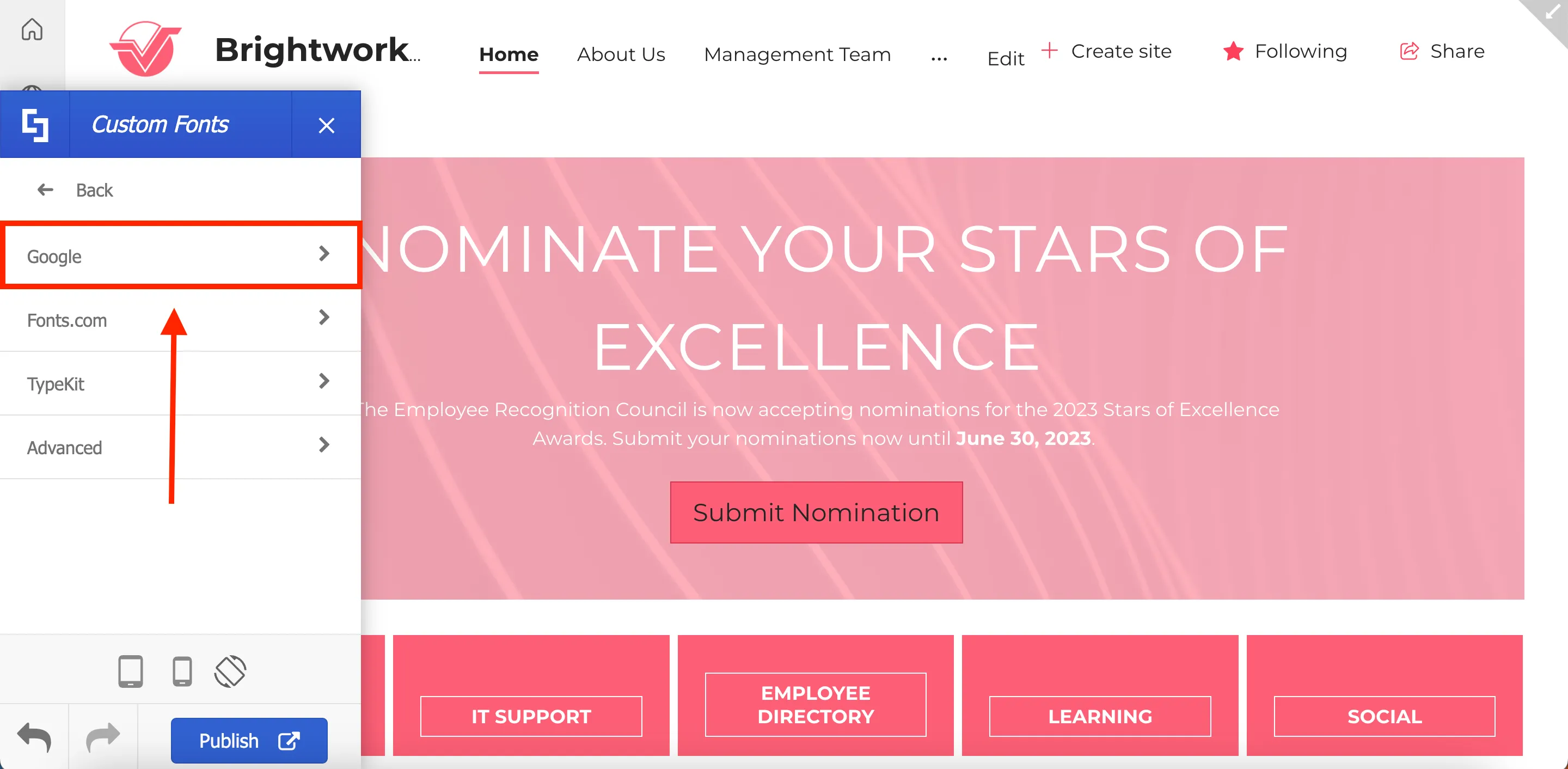
Then, click Custom Fonts.
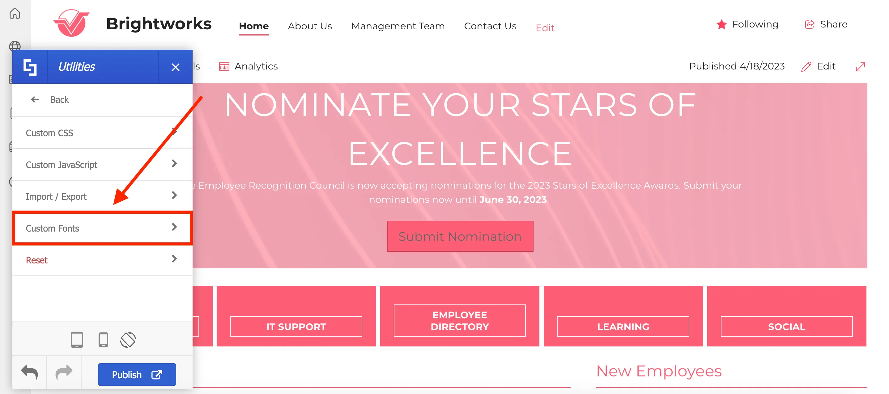
From there, you can select the source of your font and upload it.
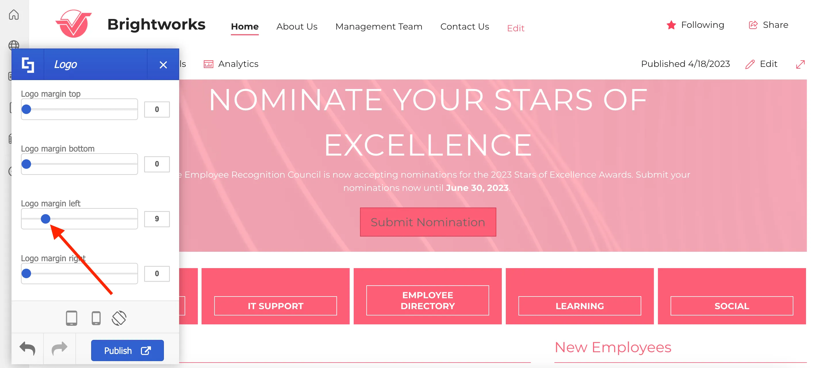
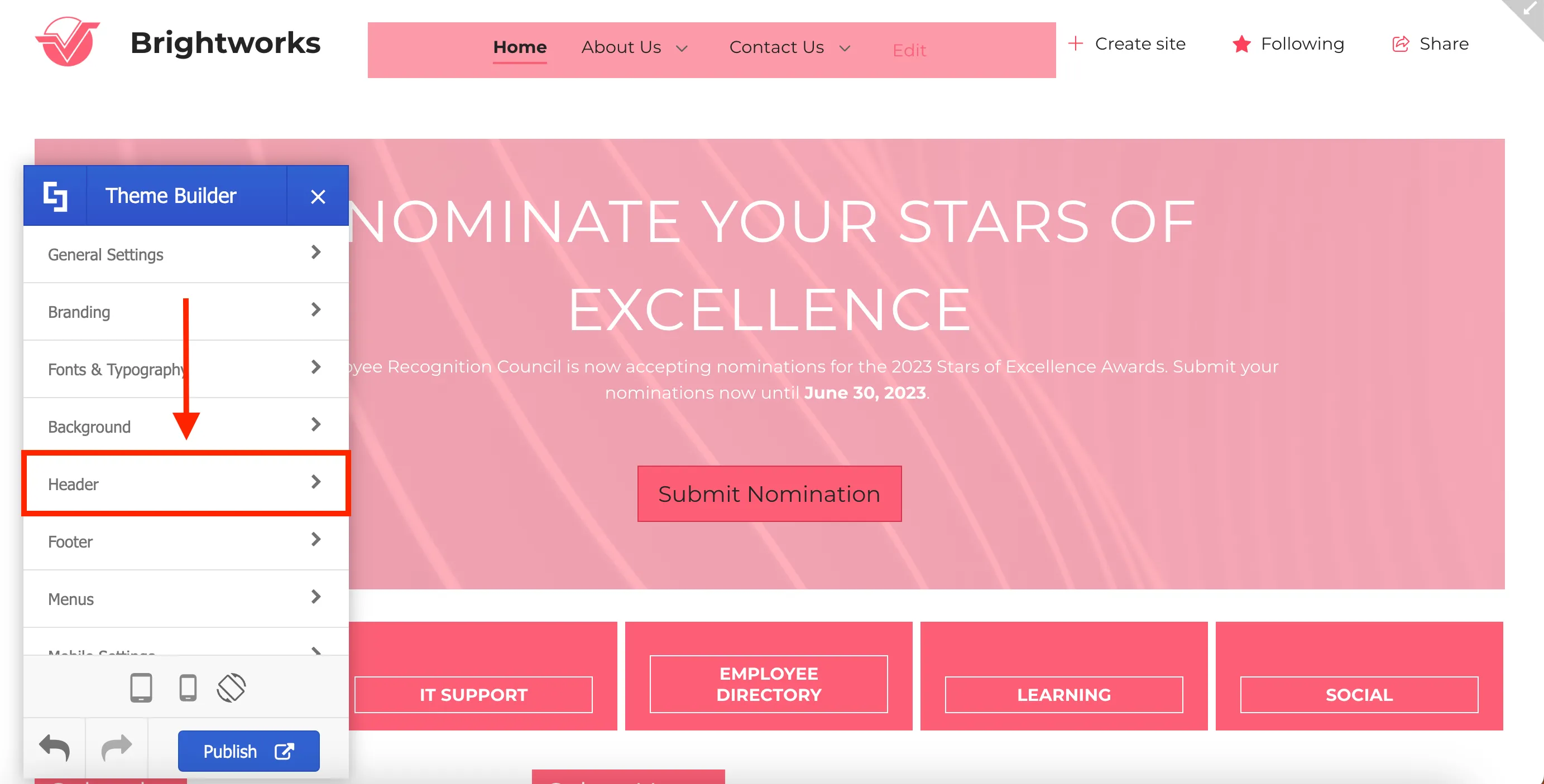
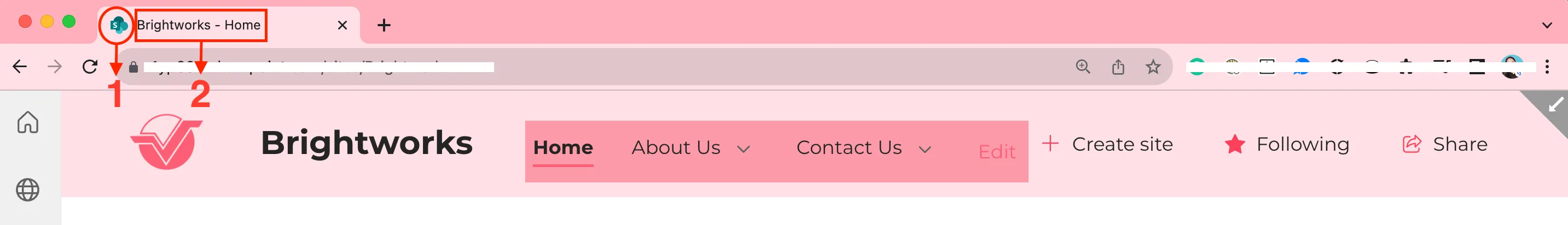
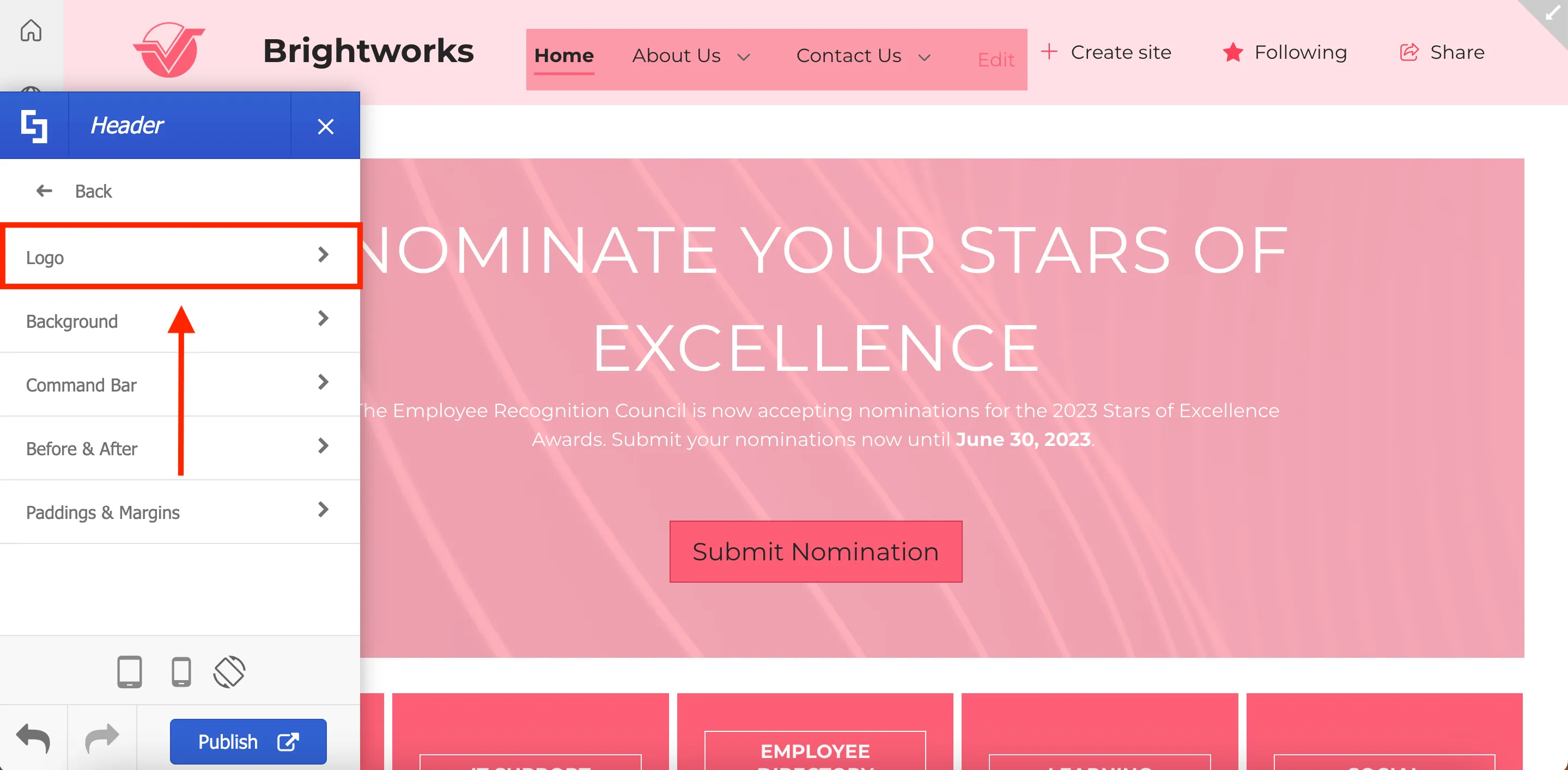
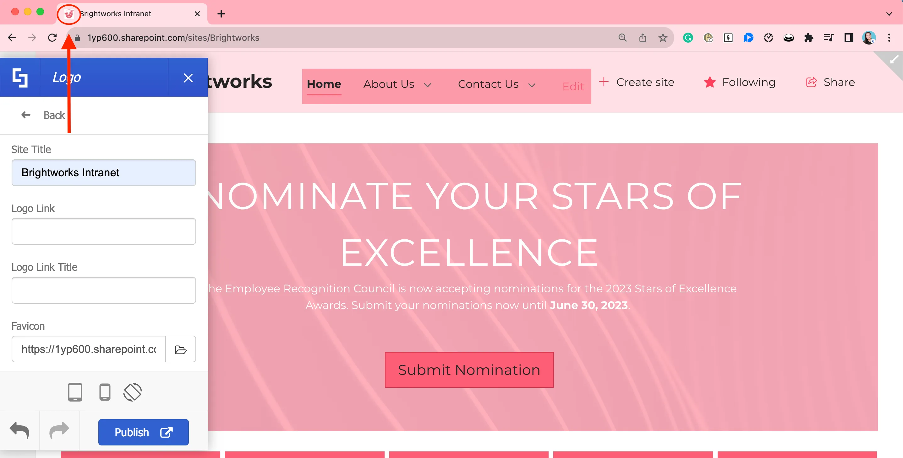
Now, let's make some changes to the logo. To do this, select Header on the main menu.
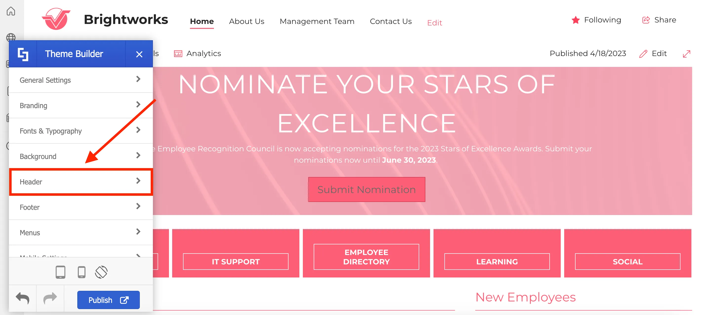
Then, select Logo.
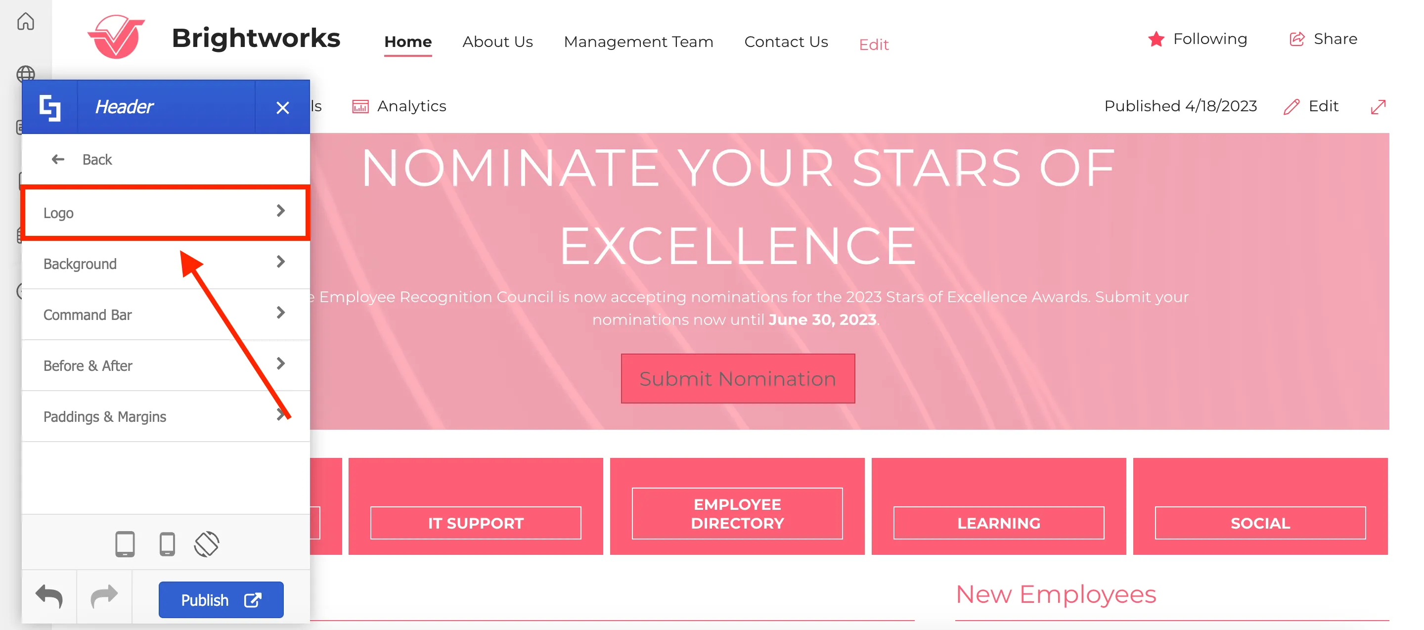
Here, you can modify the logo’s width and height, as well as increase or decrease margins around it. For this project, we will customize the Logo Margin left to 9 by using the blue slider.
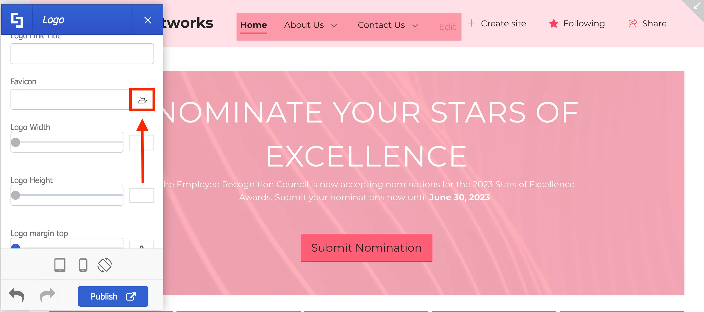
Next, we will customize the Favicon. The Favicon is the icon associated with your site. This is displayed in the browser's address bar.
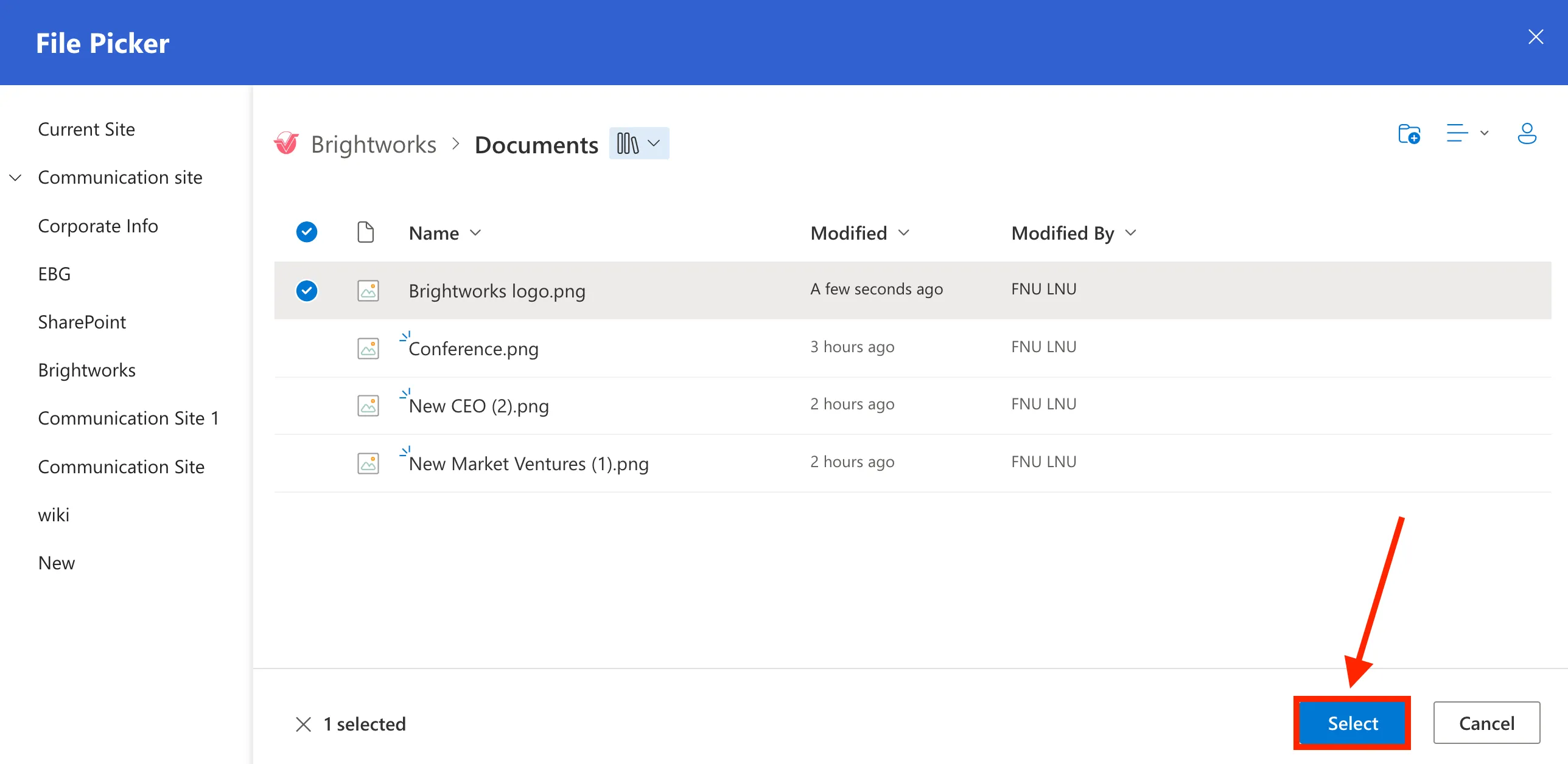
To do so, click the folder icon under the Favicon field.

From the File Picker, select your desired image.
Now, you will be able to see the image you selected as the Favicon.
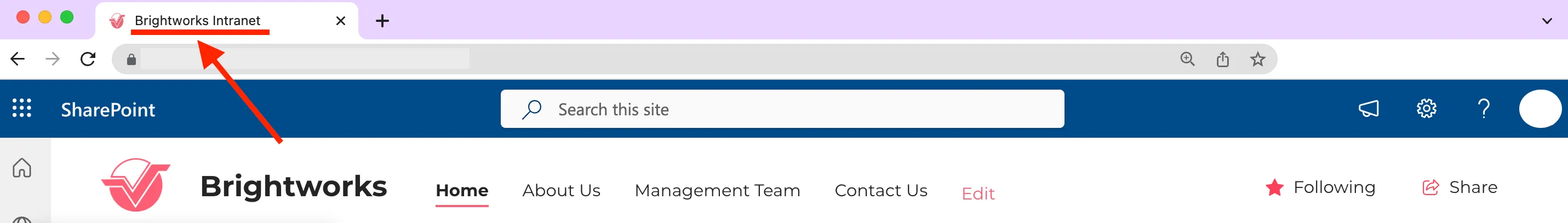
You can also customize the text that users will see on the browser tab.
To do this, enter the text you desire in the Site Title field.

You will now be able to see the text you entered on the browser tab.
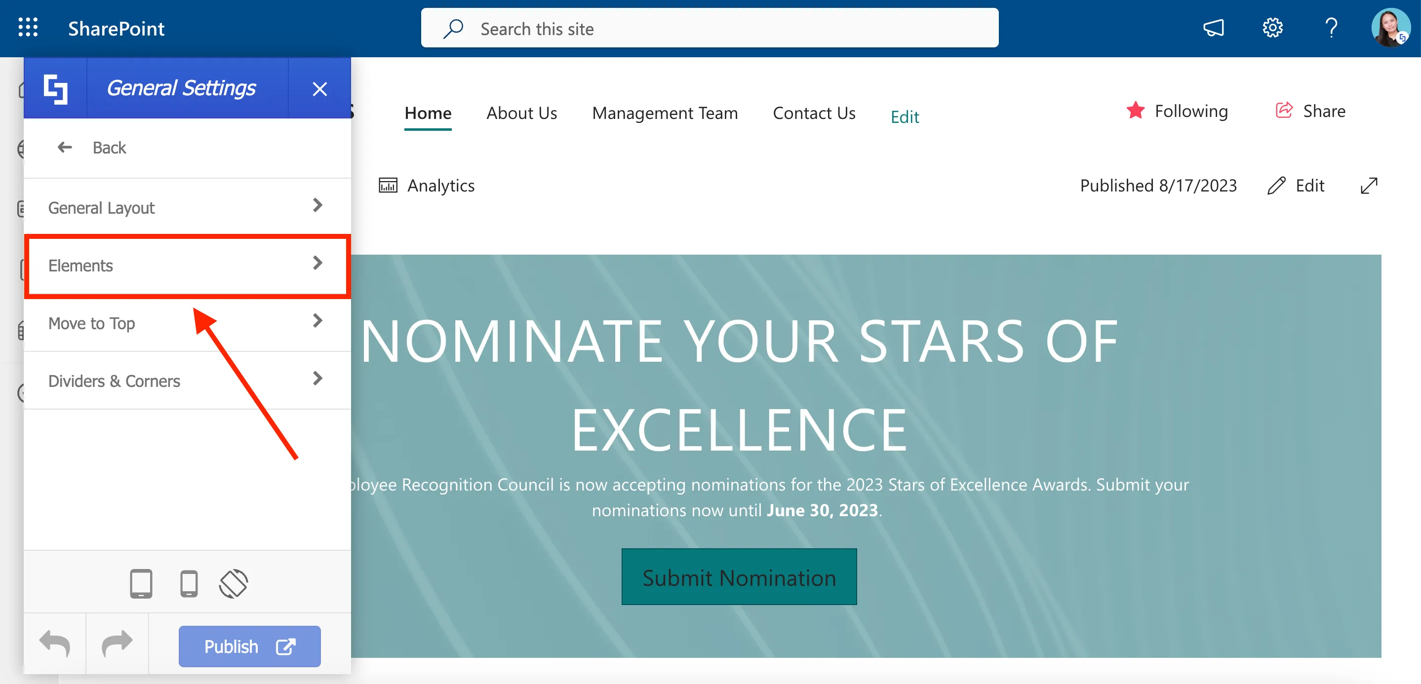
Customizing SharePoint page elements
Let us now customize the SharePoint elements present on your pages. The elements you can modify include the header, main menu, search field, site actions, and many more.
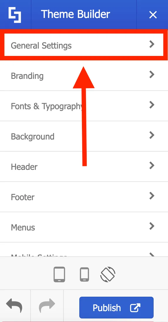
To do this, go back to the main menu and click General Settings.
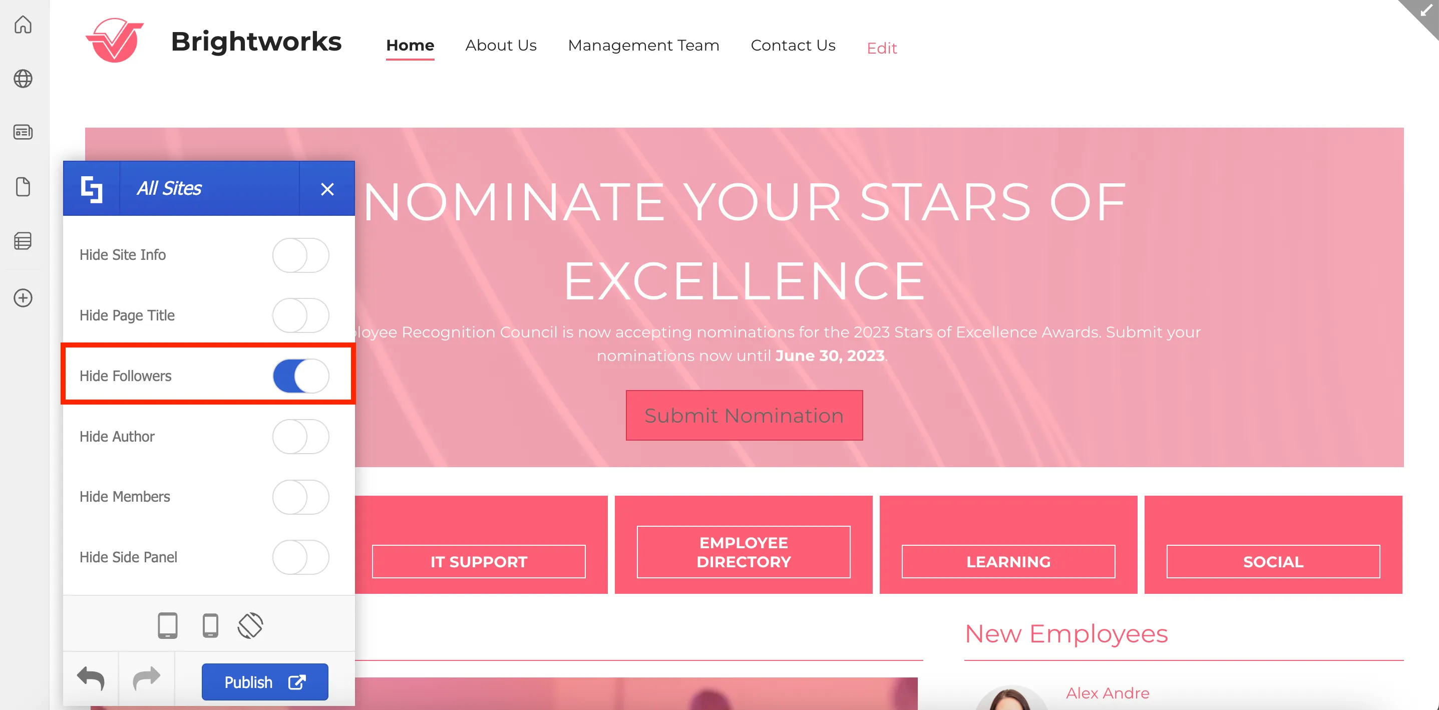
Then, select Elements.
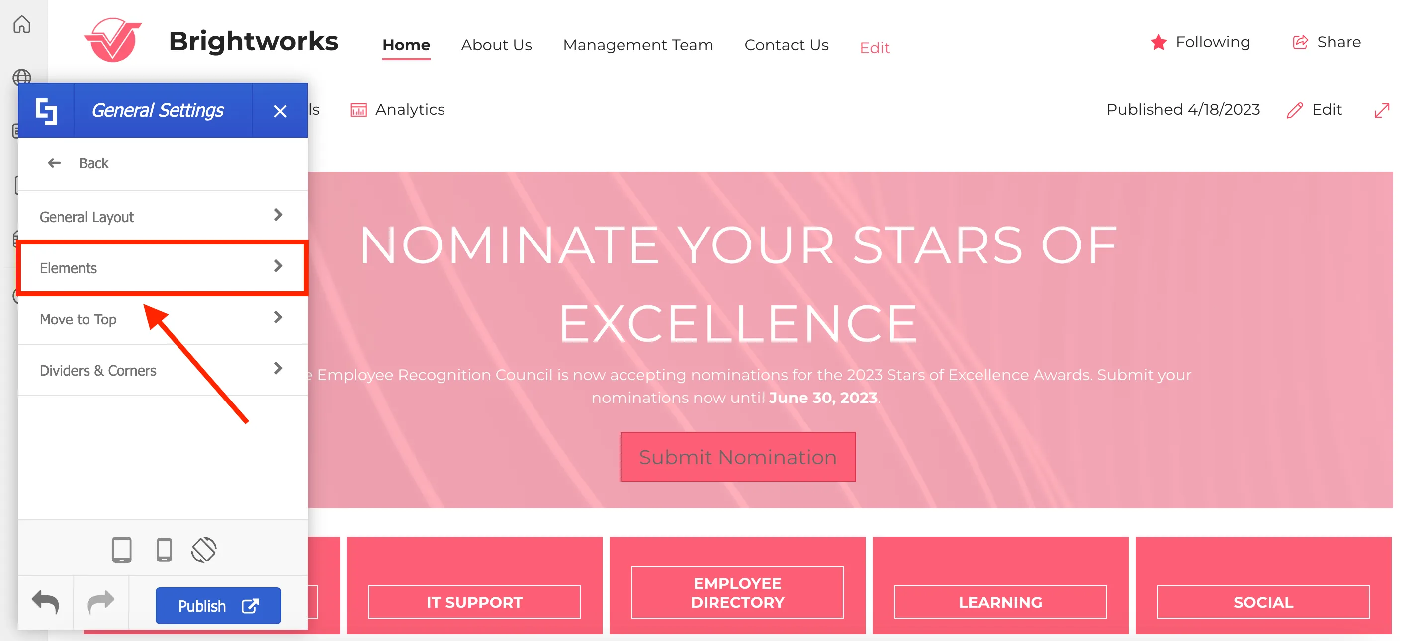
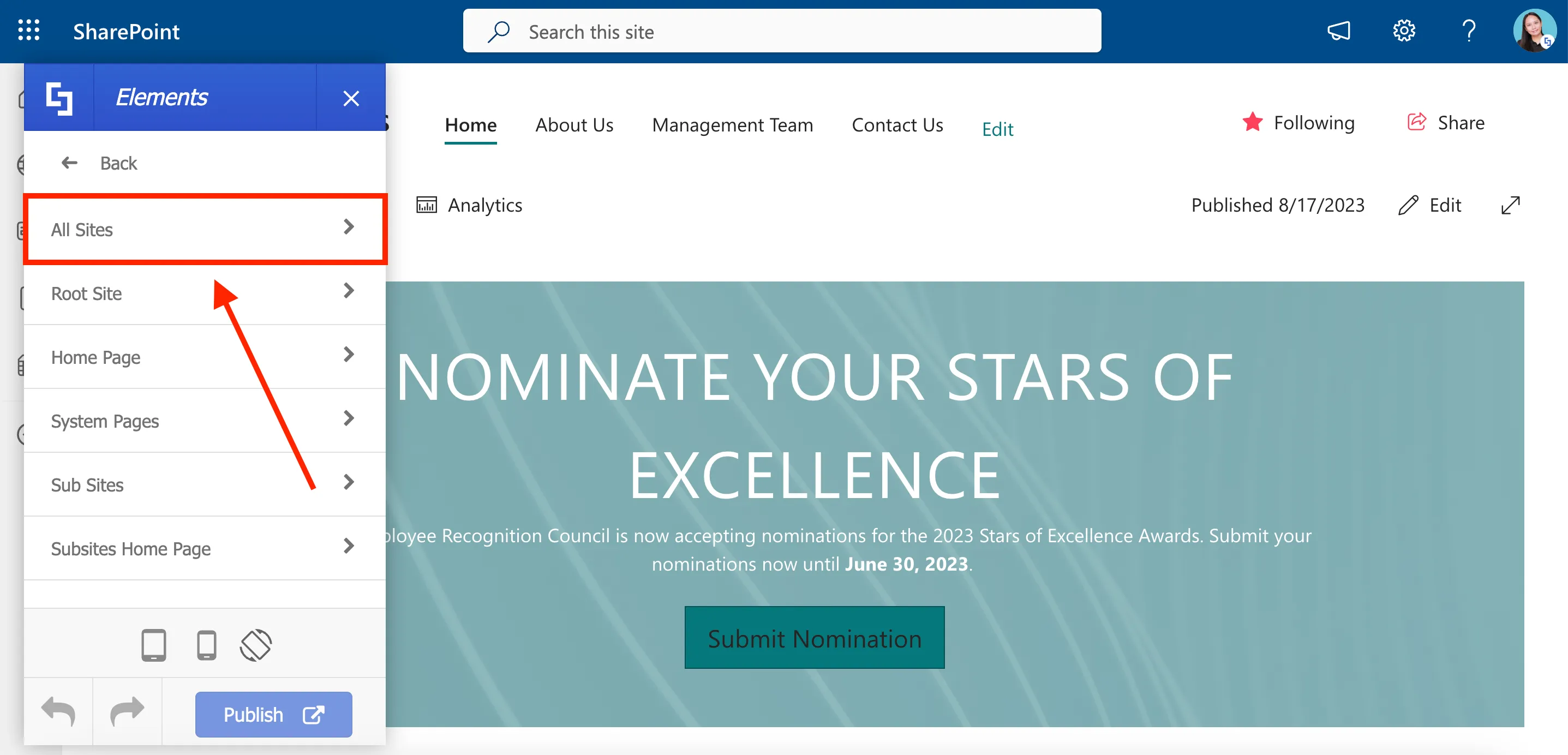
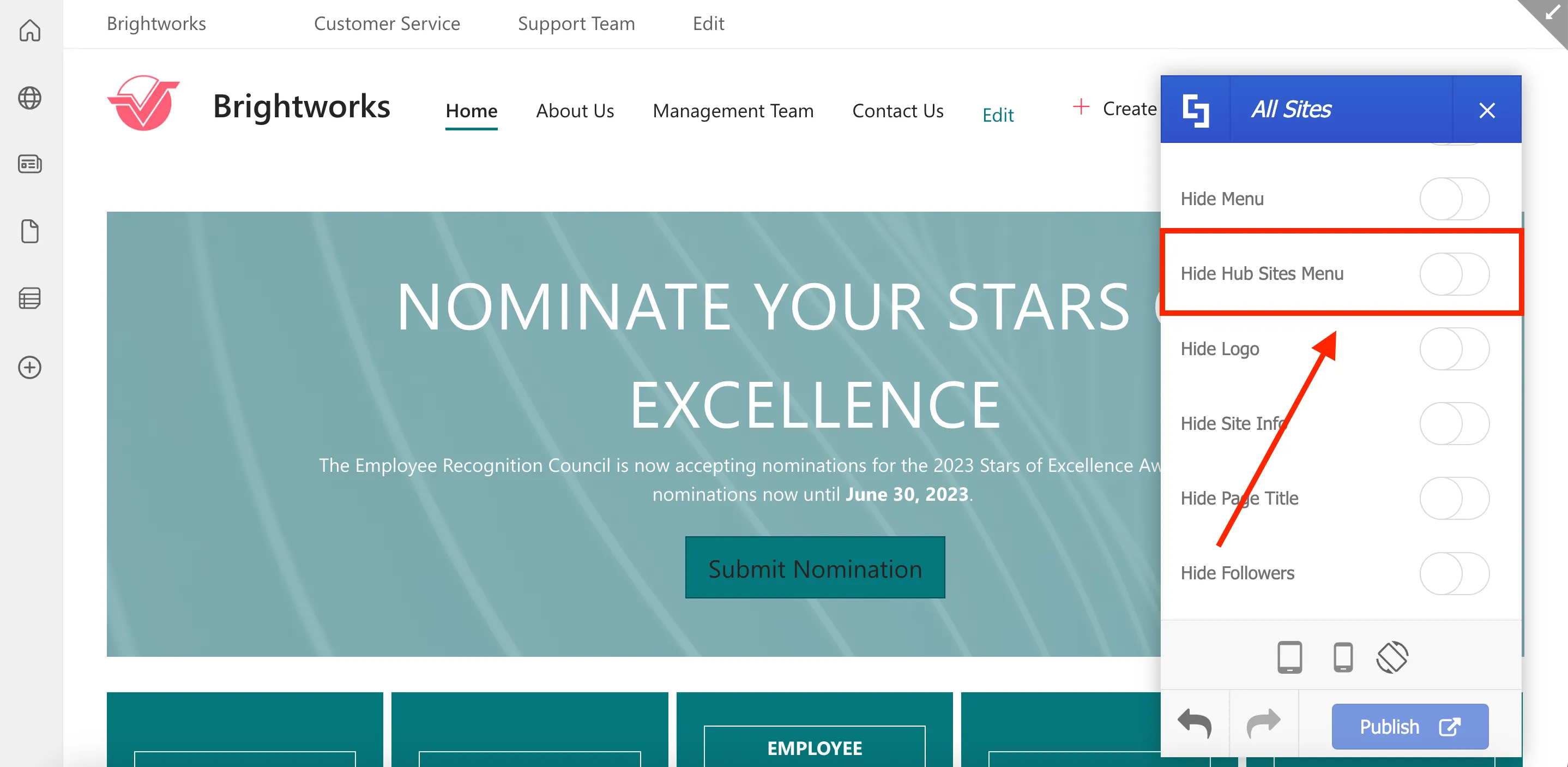
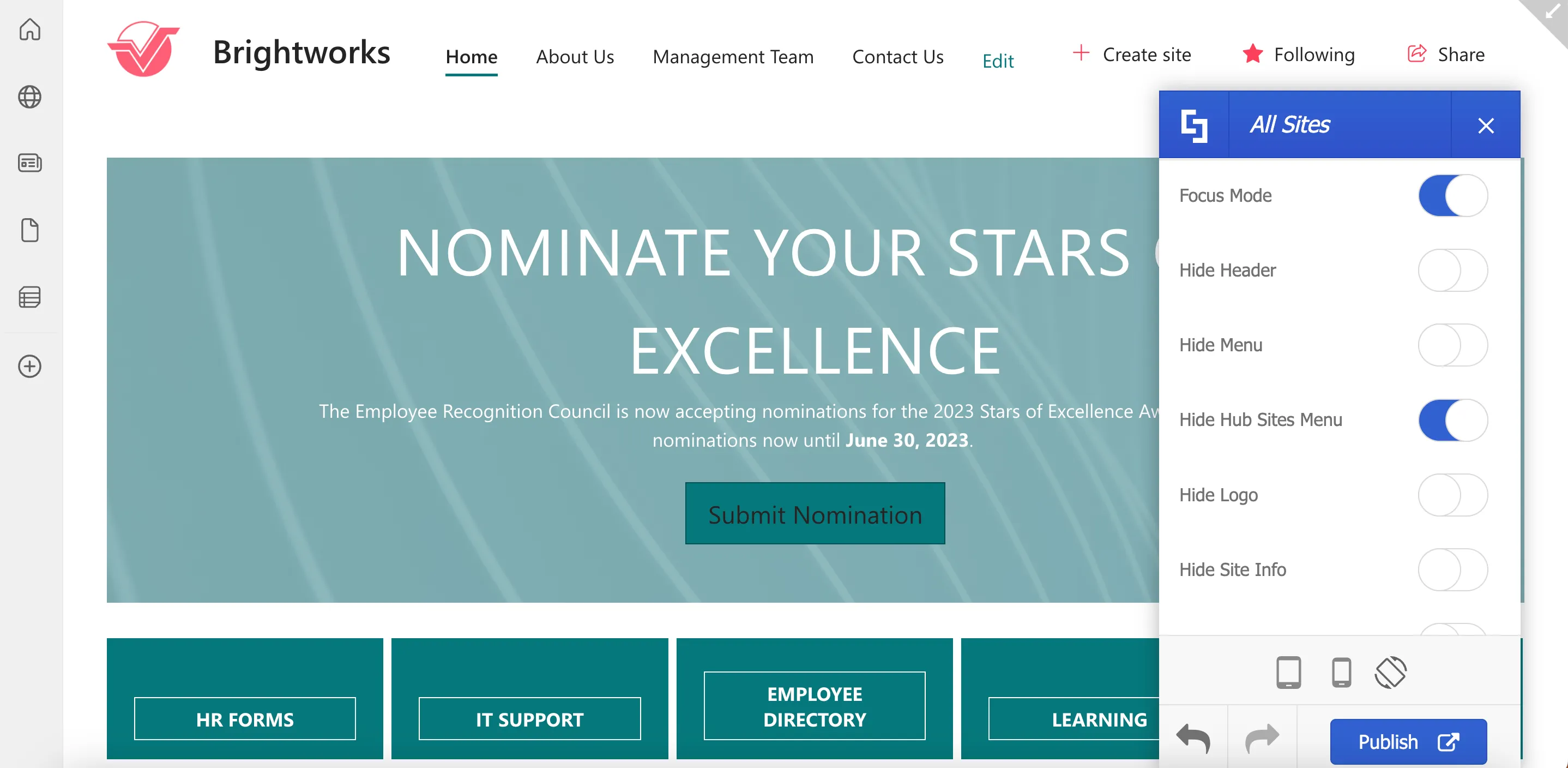
Here, you can choose to apply changes to specific types of pages or to all sites. For this project, we will make changes to All Sites.
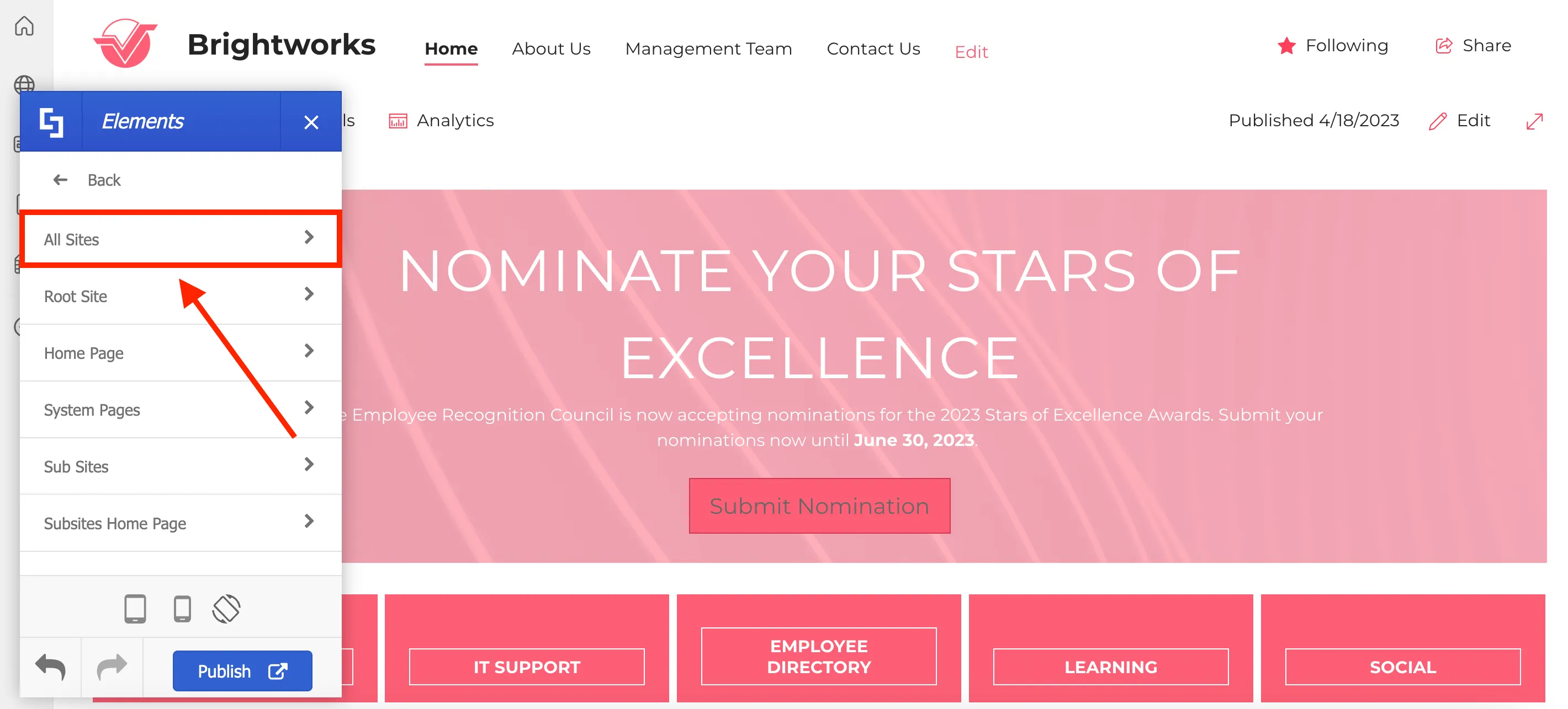
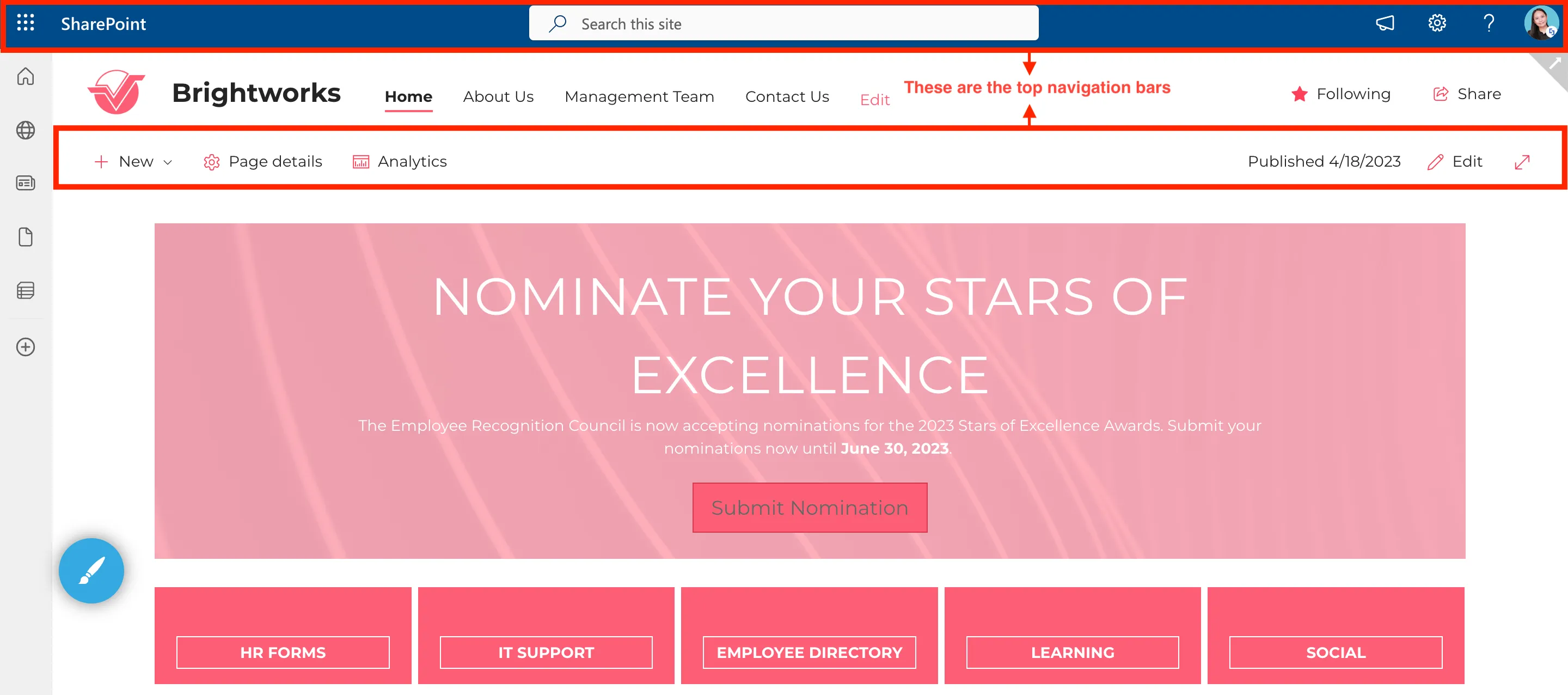
Here, you will be able to hide specific SharePoint elements on your page. First, let us hide the top navigation bars on your page.
To hide the top navigation bars, enable Focus Mode.
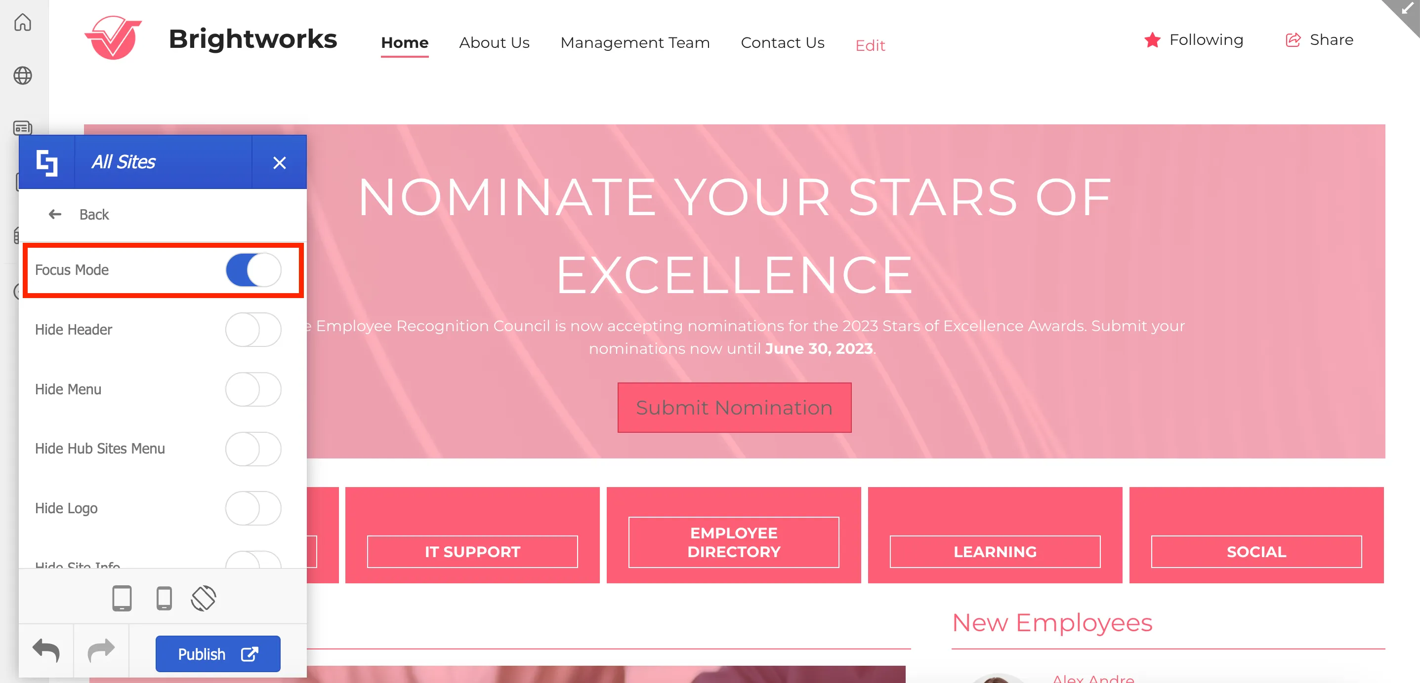
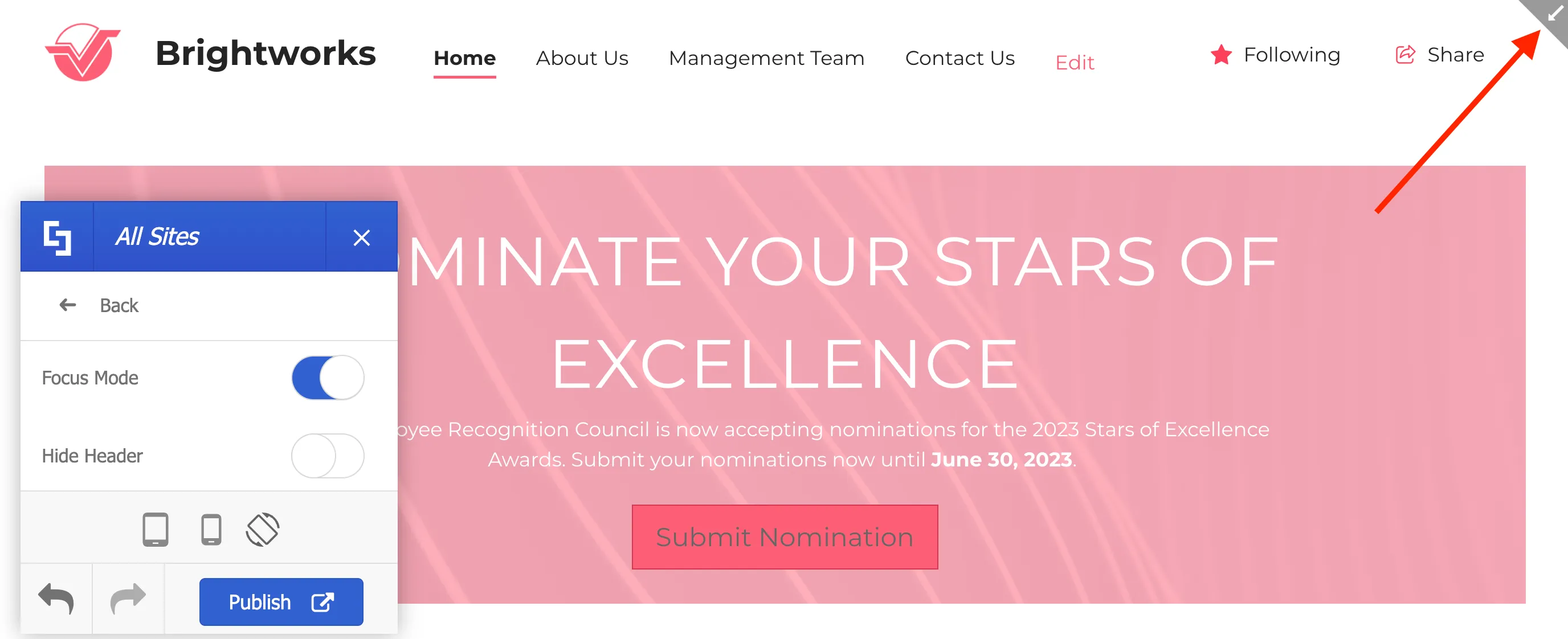
Enabling Focus Mode will not only hide the navigation bars but also showcase an arrow on the right side of your page. Clicking this arrow will allow you to access the top navigation bar again.
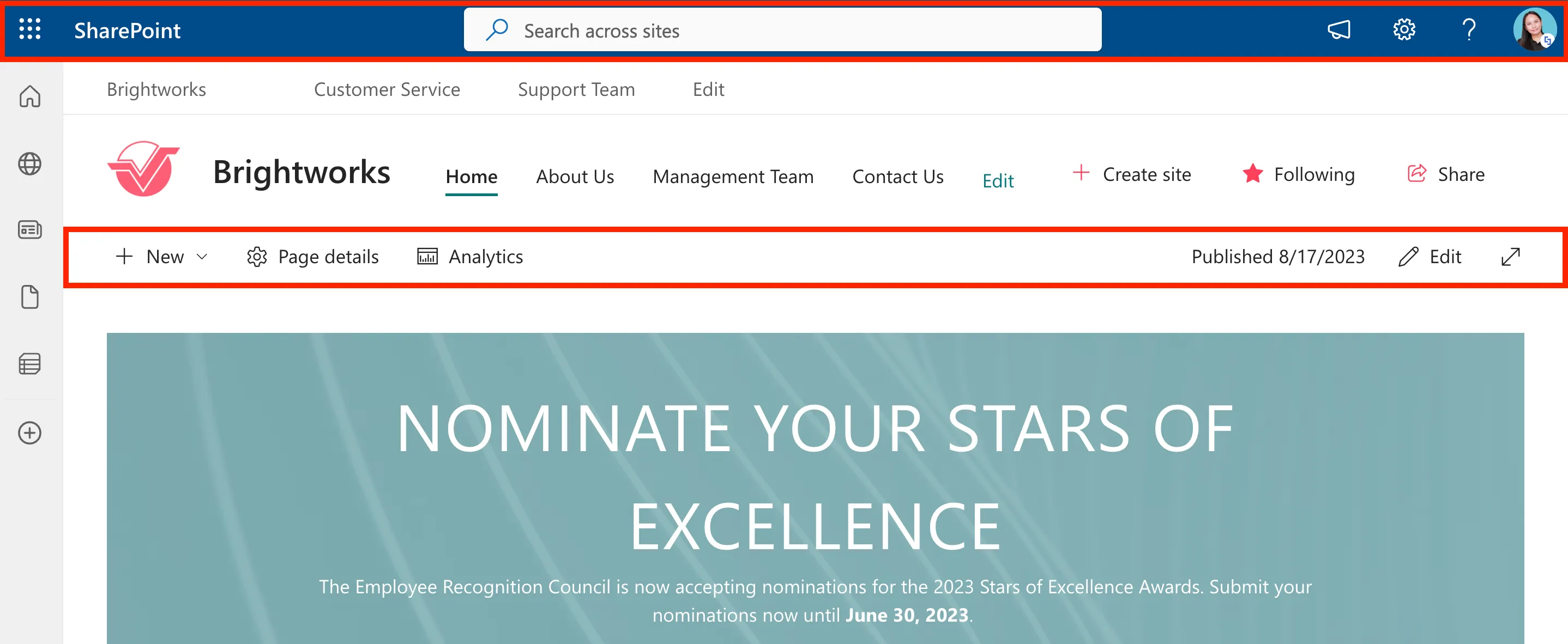
You can also hide the Following and Share buttons.
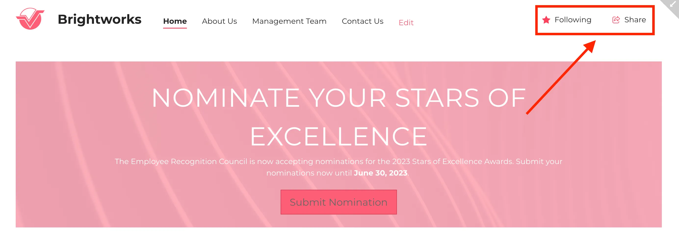
To do so, scroll down until you see Hide Followers and enable it. You will notice that the Following and Share buttons have now been hidden.
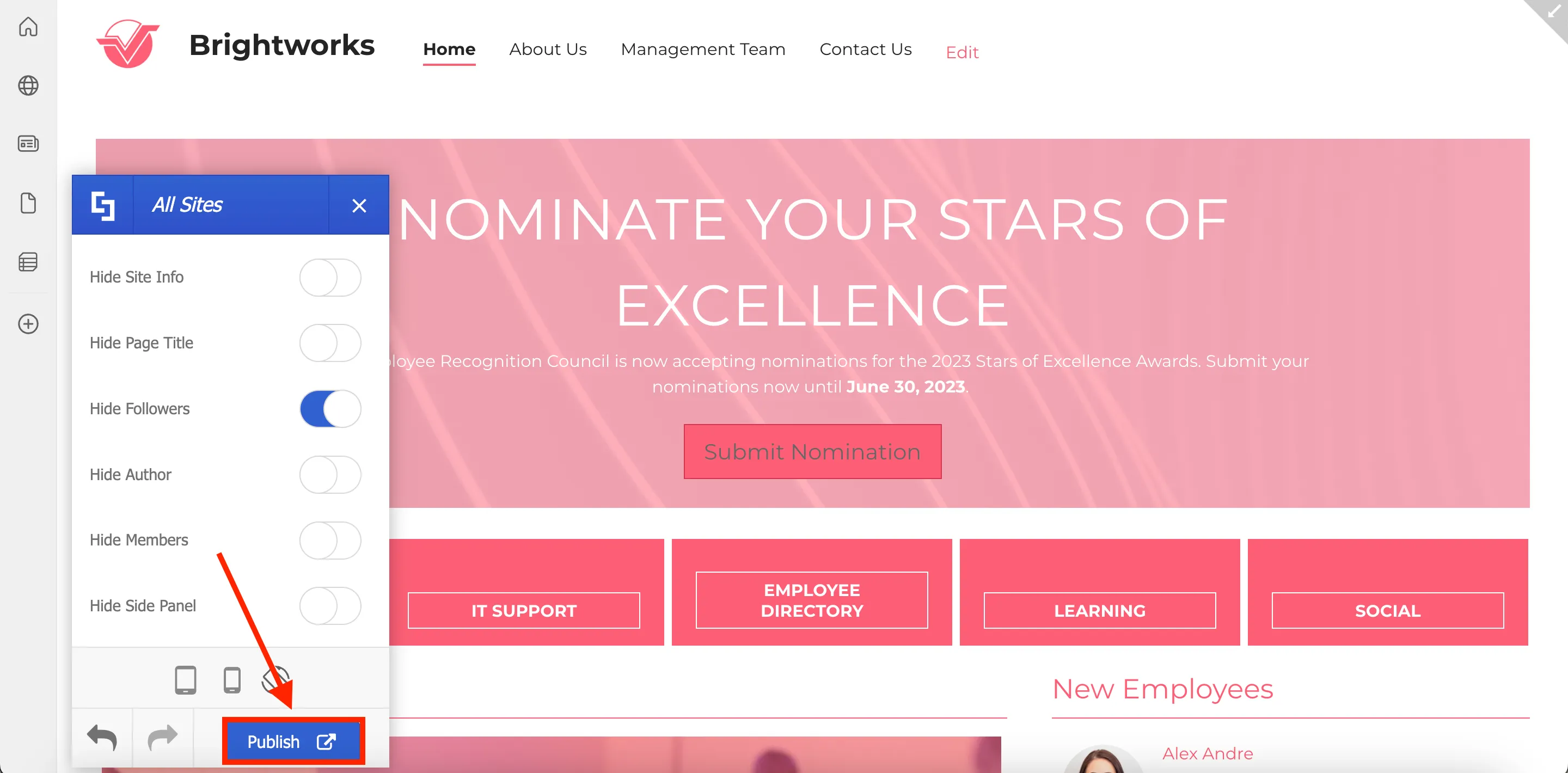
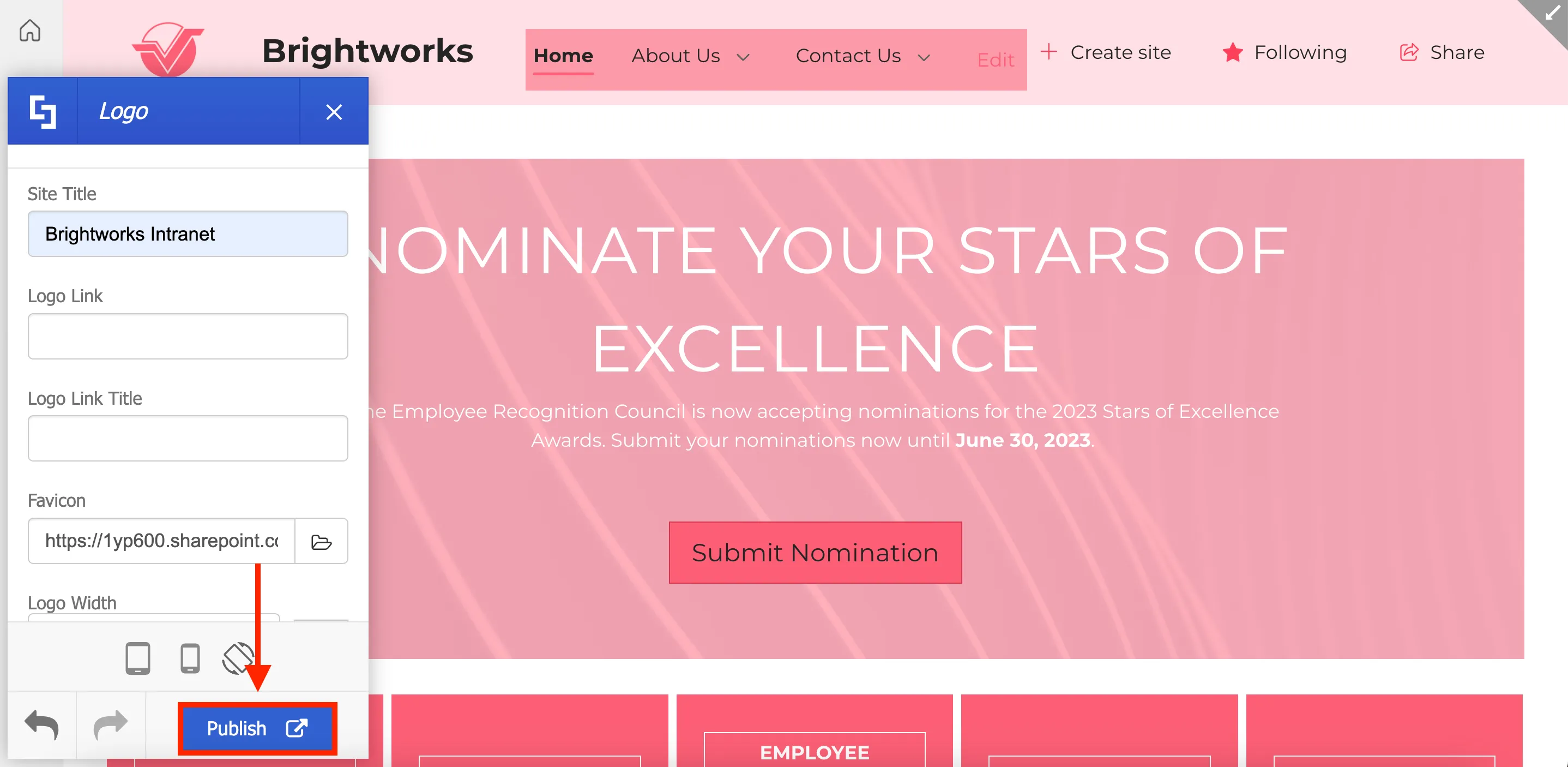
Once you've made all your changes, click Publish to apply them to your site.
Upon clicking publish, you will see the notification below:
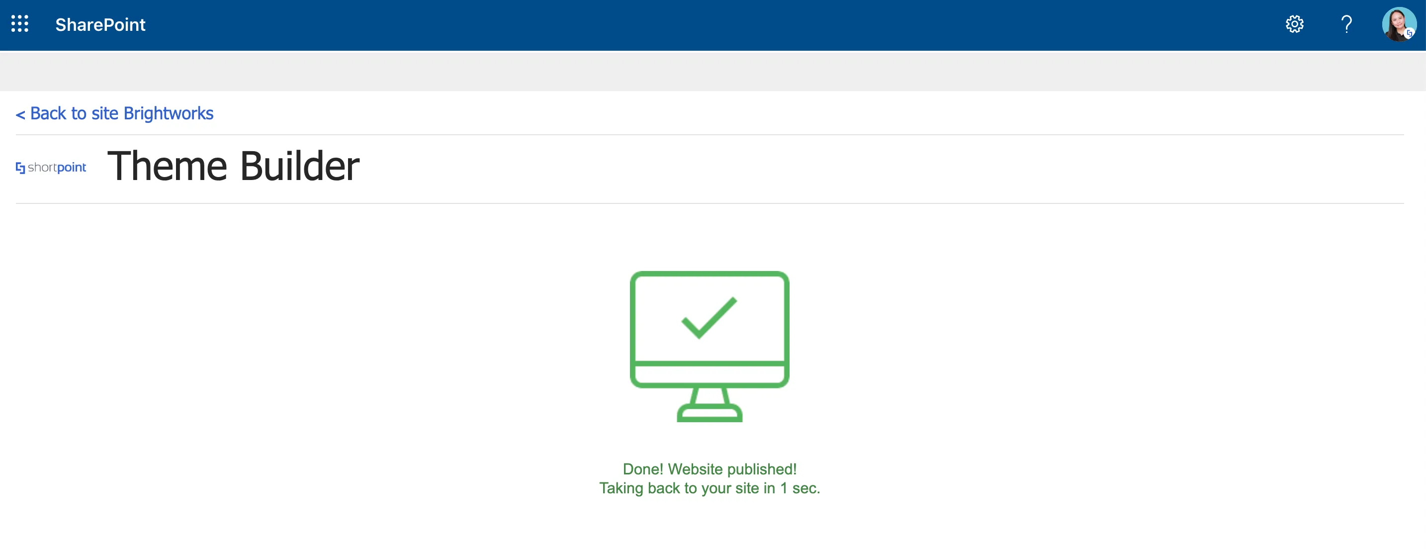
And you will be taken back to your SharePoint site, with all the changes you have made applied.

Congratulations, you have now applied your branding to your site! Continue exploring the many customizations you can make using ShortPoint Theme Builder to enhance your site's look and promote your company's branding.
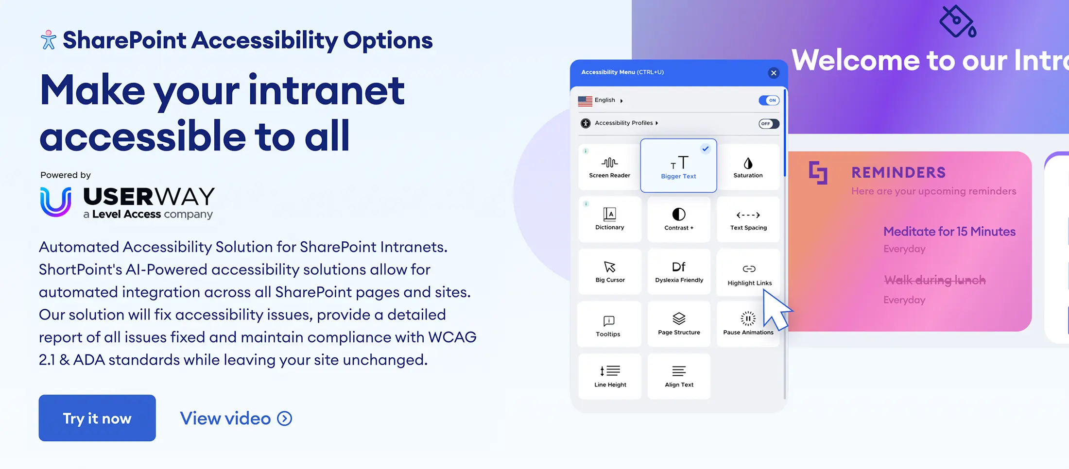
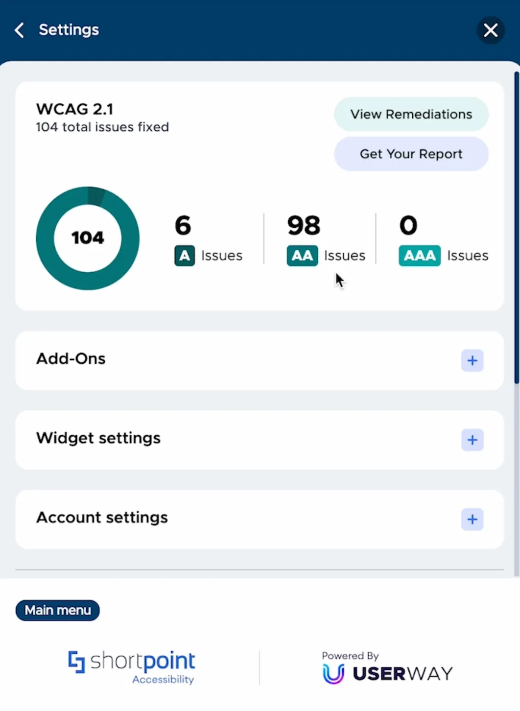
Enable ShortPoint Accessibility
In this lesson, you will learn how to enable ShortPoint Accessibility. Then, you will get introduced to the different accessibility functions that comes with the feature including AI-powered remediation and its user-triggered accessibility widget. You will also know how to generate your accessibility statement featuring a report which you can show on your site.
Enabling ShortPoint Accessibility
Ensuring that your intranet is fully accessible is crucial in providing a positive user experience and satisfaction for all users, including those with disabilities. It offers a chance for everyone to access information and interactions that might otherwise be challenging for them. It's so important that in most countries, including the US, compliance with international accessibility standards is a legal requirement.
However, many intranet platforms lack built-in accessibility features. To make your intranet fully accessible, a significant investment of time, effort, and resources is required to ensure everything is in place.
For example, in SharePoint, you must individually configure each site, its pages, and its contents, then test for accessibility. If you already have many sites and pages published, going through each one-by-one is an inefficient process.

To address this issue, ShortPoint has partnered with UserWay, a leader in web accessibility, to offer an AI-powered solution that detects and remediates accessibility issues automatically without the need for any coding.
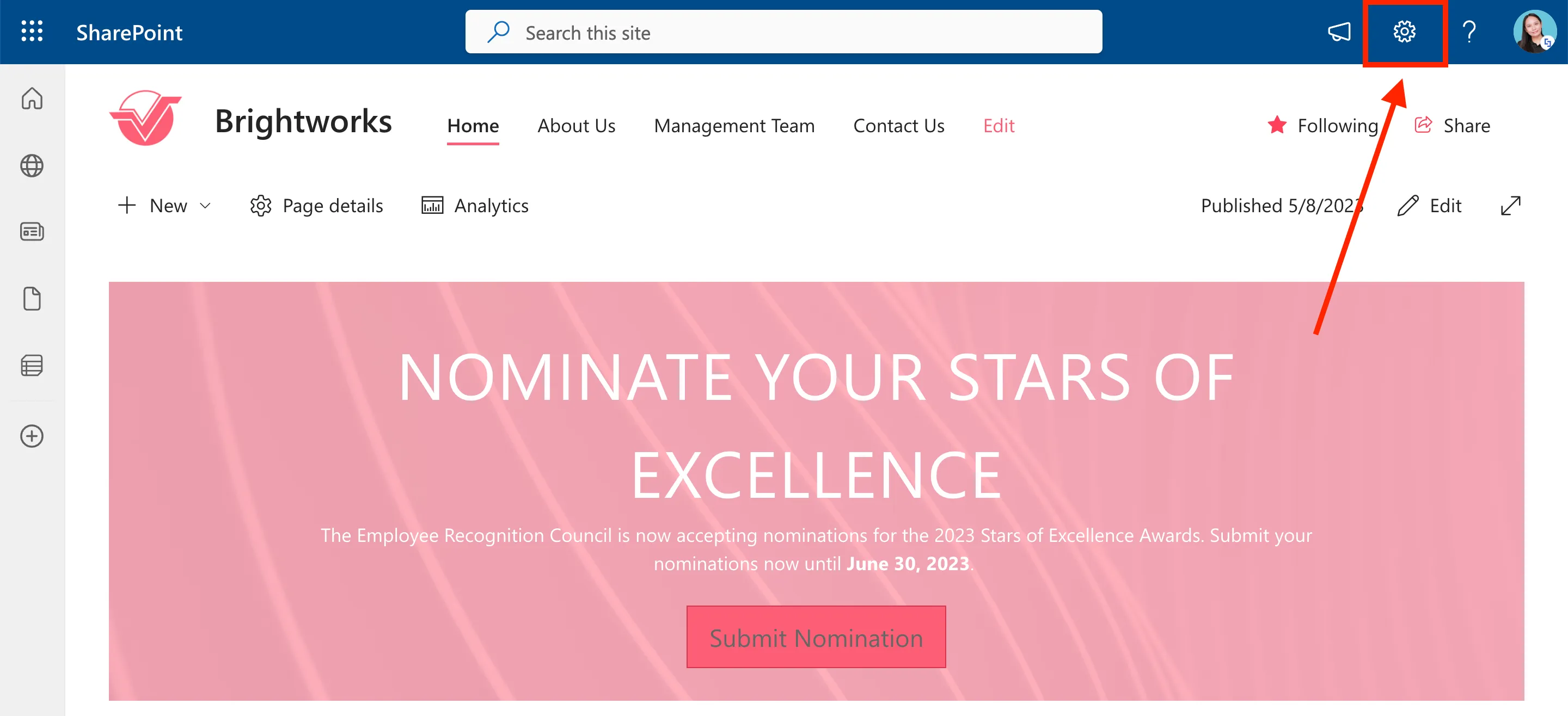
To activate the ShortPoint Accessibility feature, go to the SharePoint page you were editing and click the cogwheel icon.
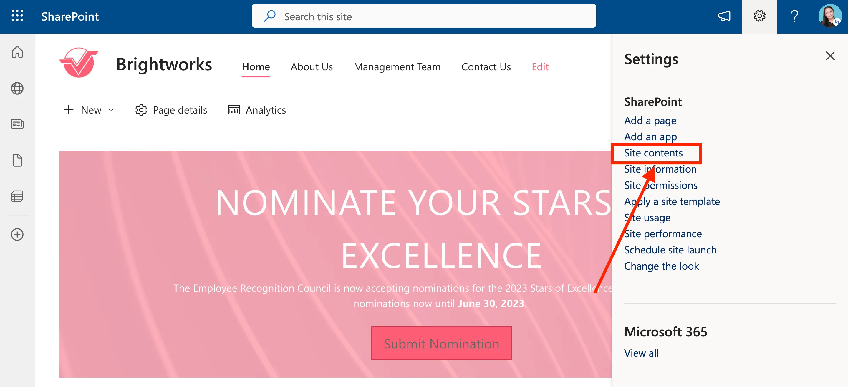
Then, select Site Contents from the list.
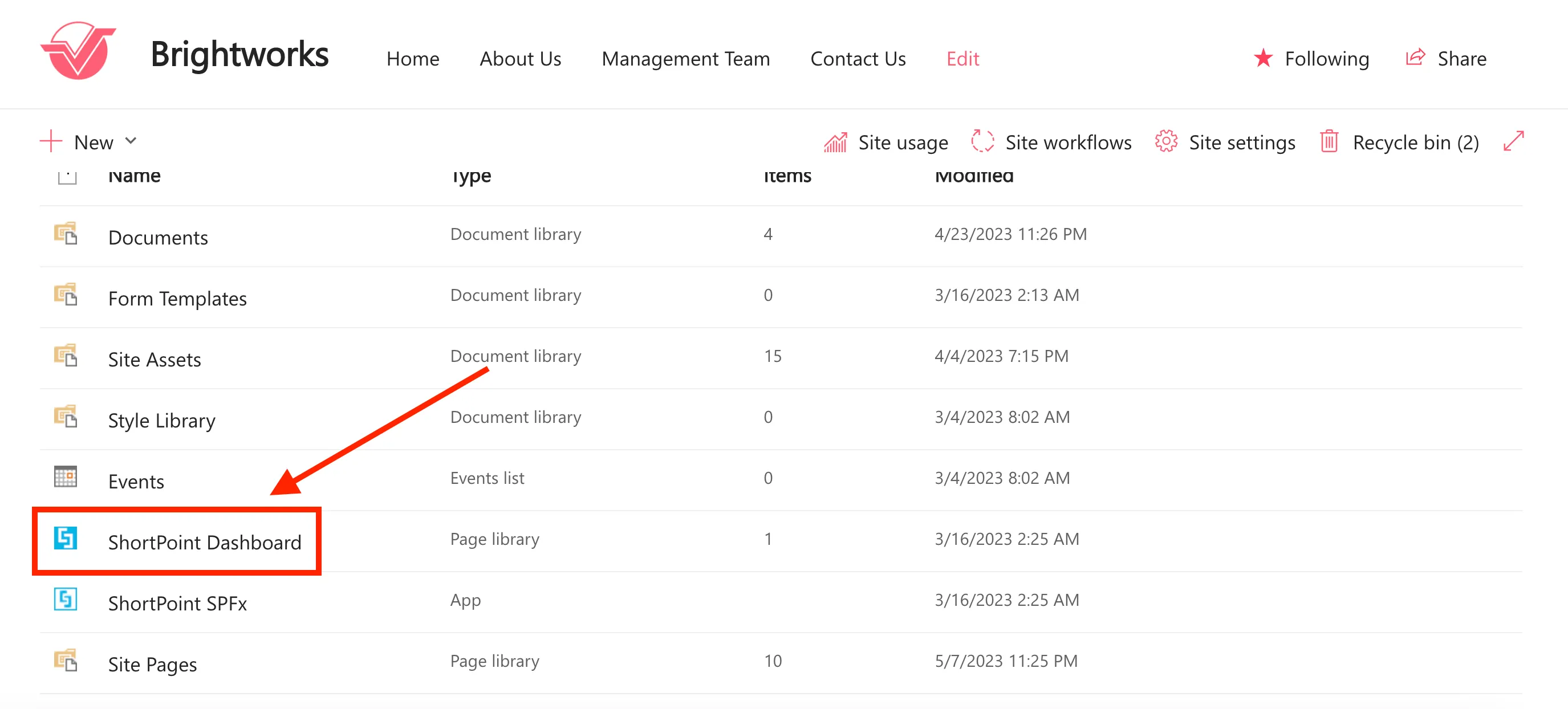
Click ShortPoint Dashboard.
On the ShortPoint Dashboard, select Accessibility to open the ShortPoint Accessibility window.
Then, slide the toggle to enable ShortPoint Accessibility.
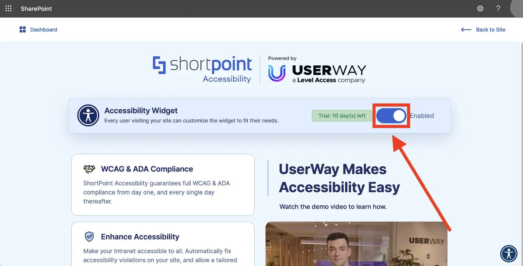
By enabling it, you will get a 10-day free trial during which you will get the full benefit of having an AI-powered accessibility solution running in the background on all your sites to detect and automatically remediate accessibility issues.
After the free trial period, you can choose to purchase a paid plan or continue using the feature with limited functionality.
Exploring ShortPoint Accessibility functions
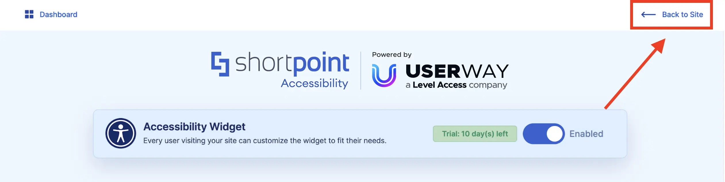
Now, let’s go back to your site. Simply click Back to site.
You will notice a small widget on the right side of your screen. This is the Accessibility widget.
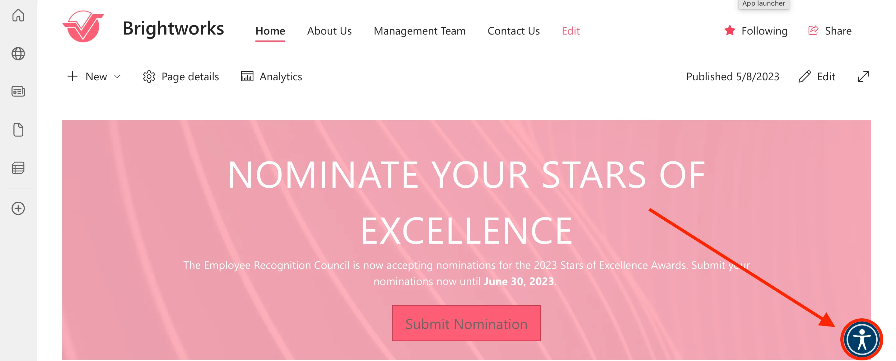
When you click it, you will see several controls that you can use to make your site accessible to all.
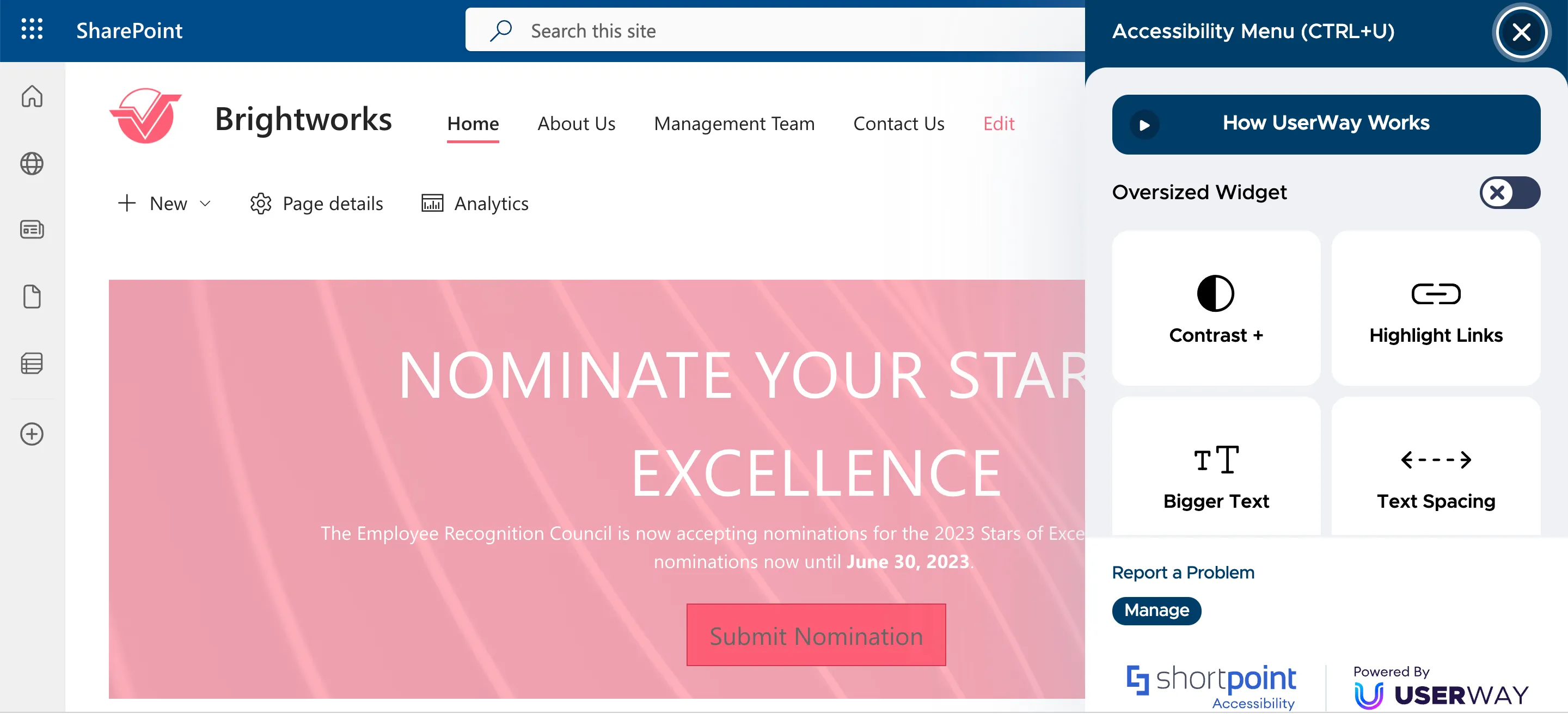
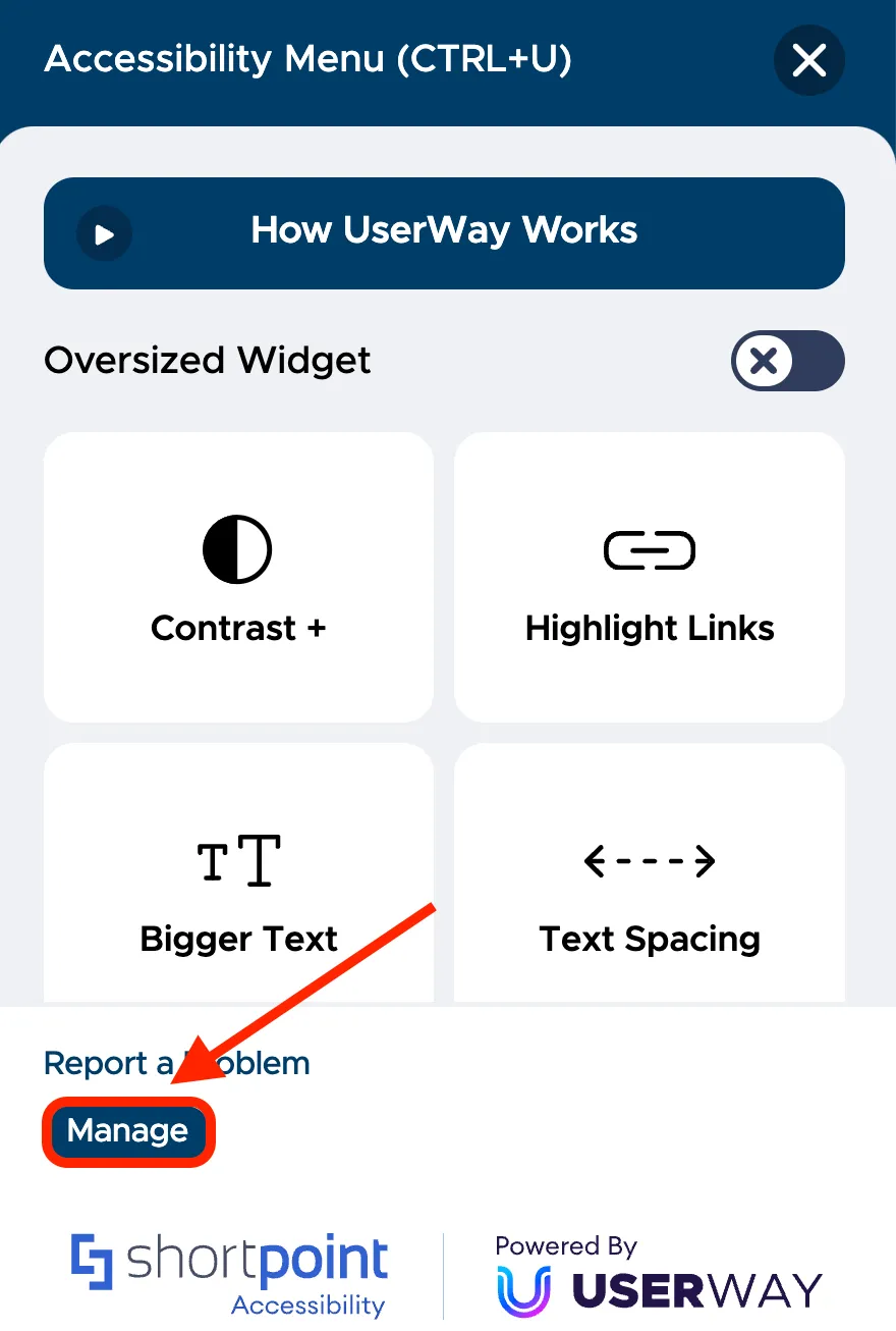
First, let us show you how you can check your site’s overall accessibility. Click Manage to open the management console.
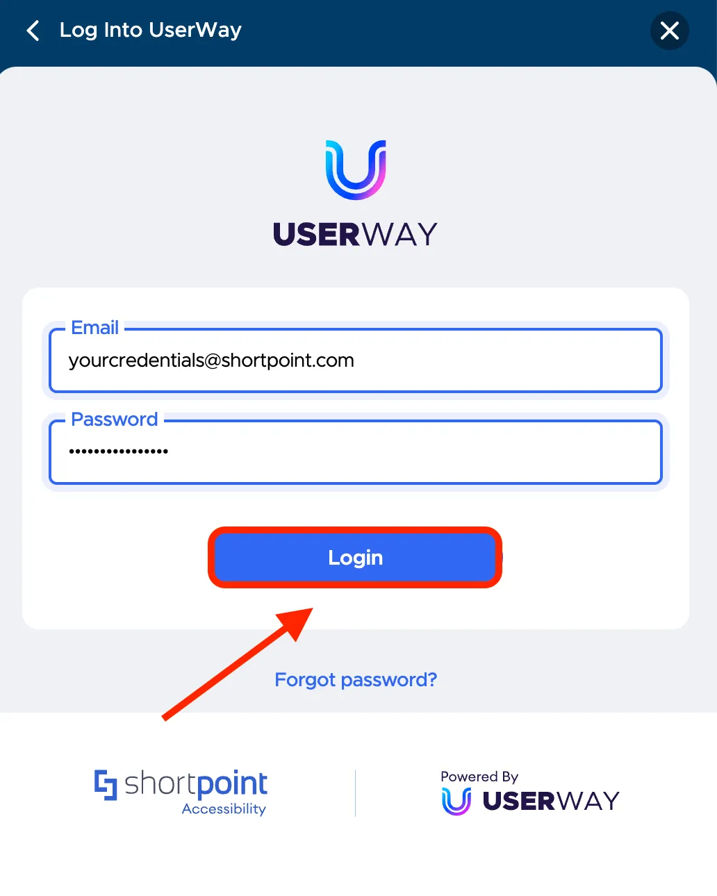
Then, enter the credentials you received via email upon activation and click Login.
In the management console, you will find a dashboard where all the accessibility violations detected by the AI-powered solution will be listed. At first, you will notice that your dashboard only showcases a few issues.
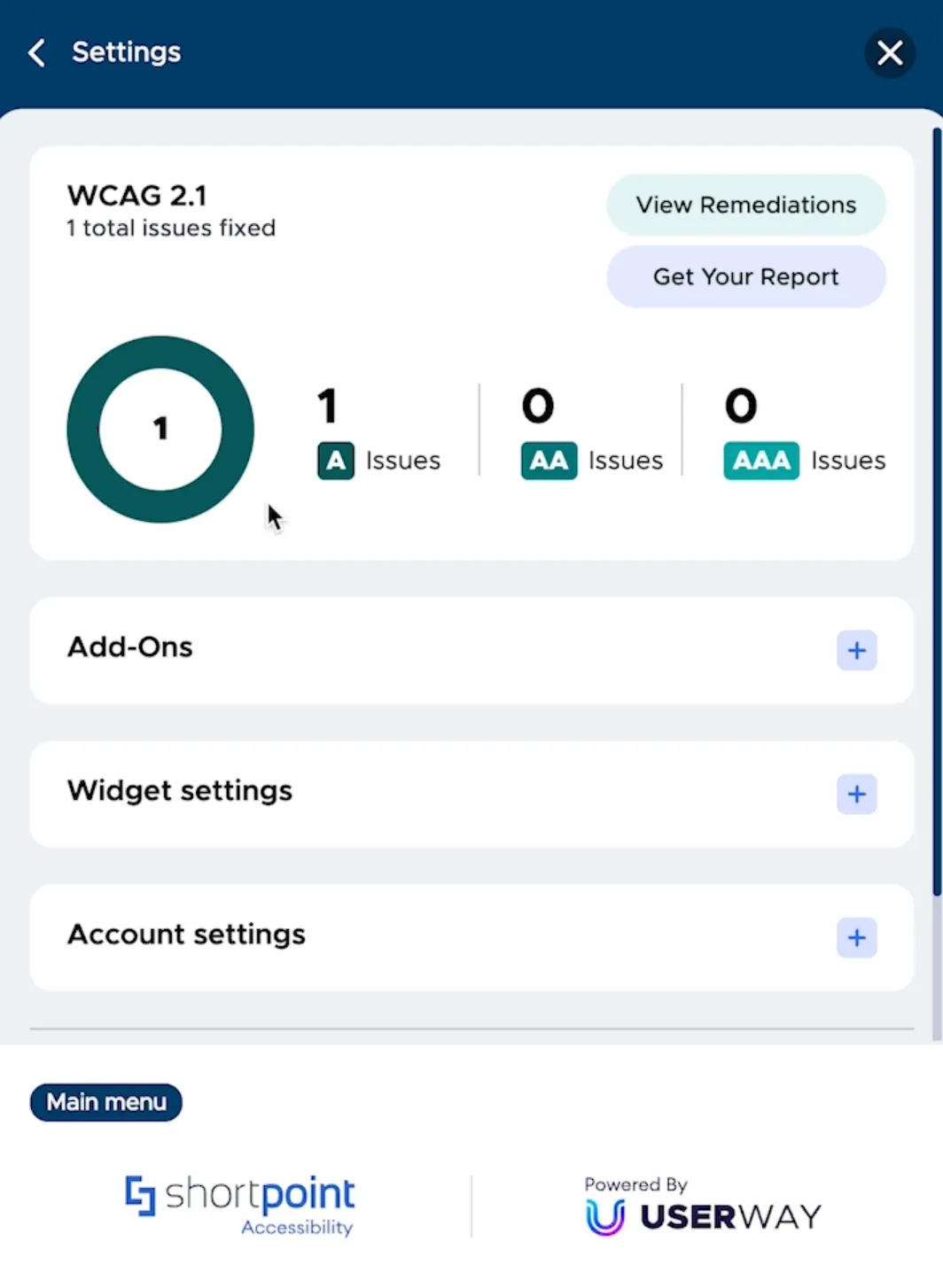
But, within 24 hours of activation, you will receive a full report of the accessibility issues detected.
To check remediated issues, select View Remediations.
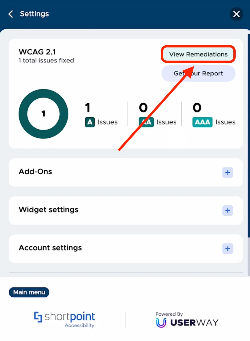
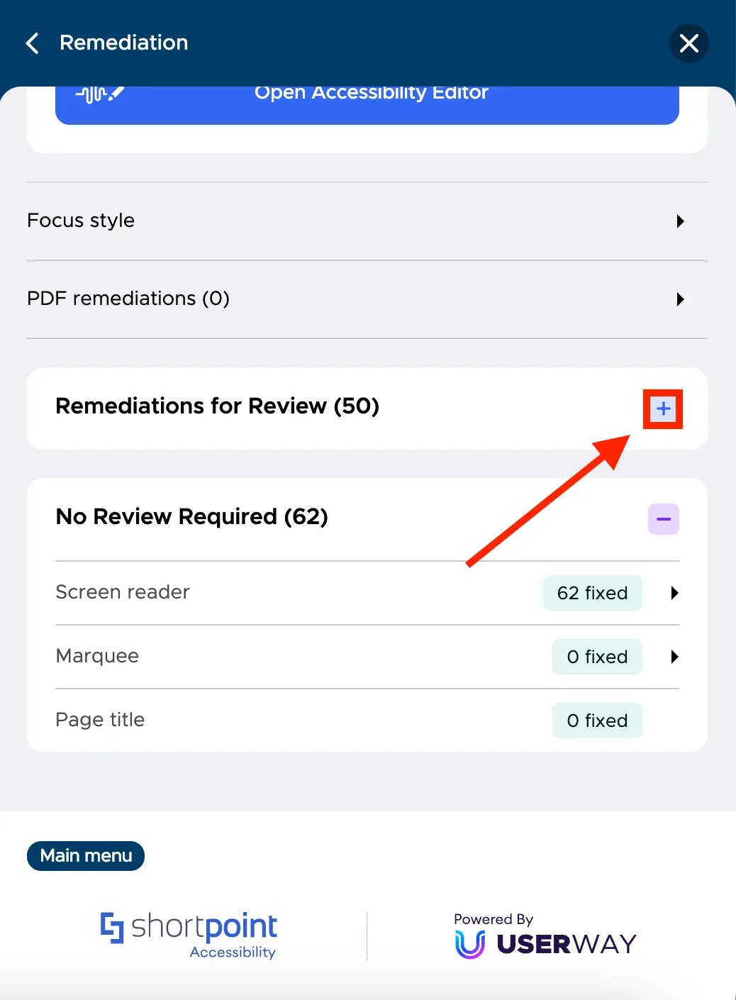
Here, you will see all remediated issues. You will notice two categories under Remediation. One is No Review Required. These are the issues that were automatically remediated and require no other actions from you. To check it, select the plus icon.
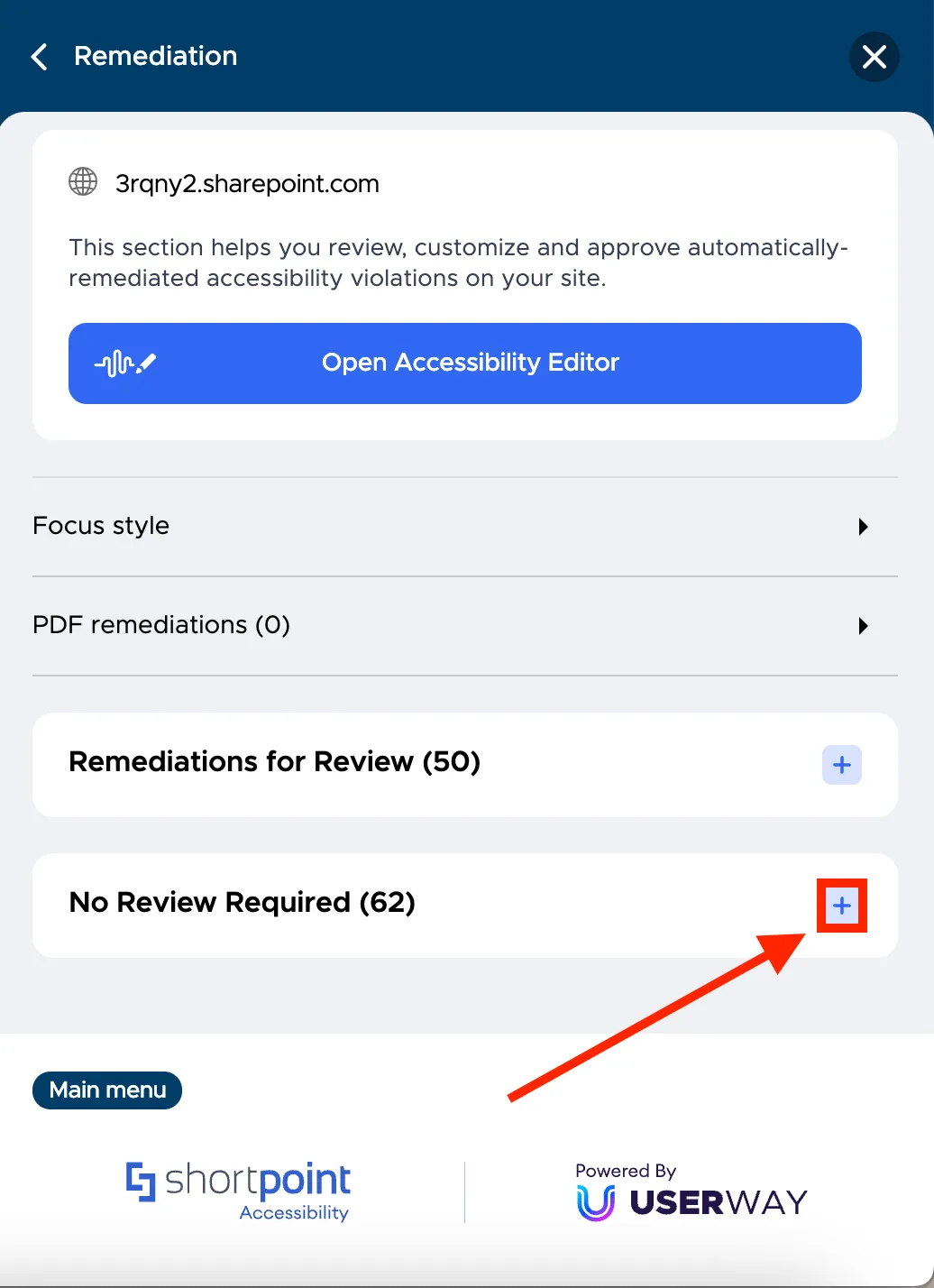
Upon clicking, you will see a list of issues that were automatically remediated. Most issues detected by ShortPoint Accessibility will fall under this category.

Next is Remediations for Review. These are the issues that need further checking. To see it, click the plus icon.
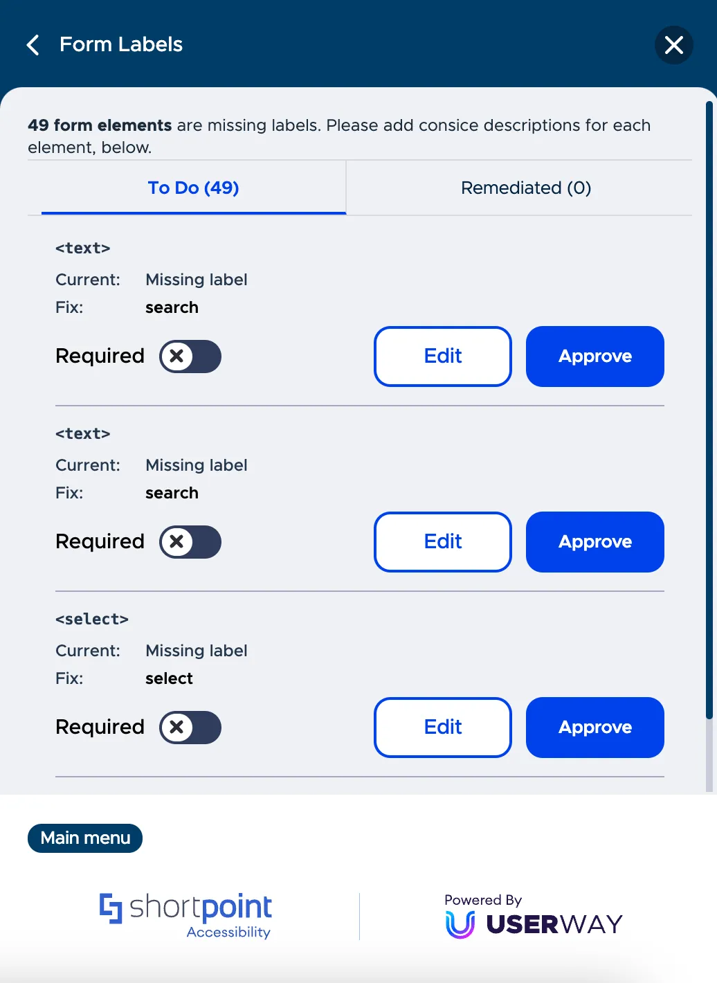
From the list, you can select a specific issue to learn more details. For example, let us check Form labels.
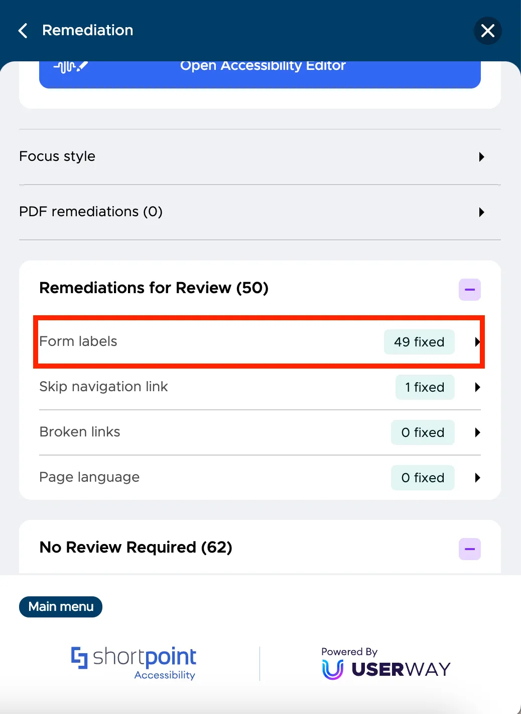
You will be taken to a new screen with a list of items to check. You can either edit or approve each item.
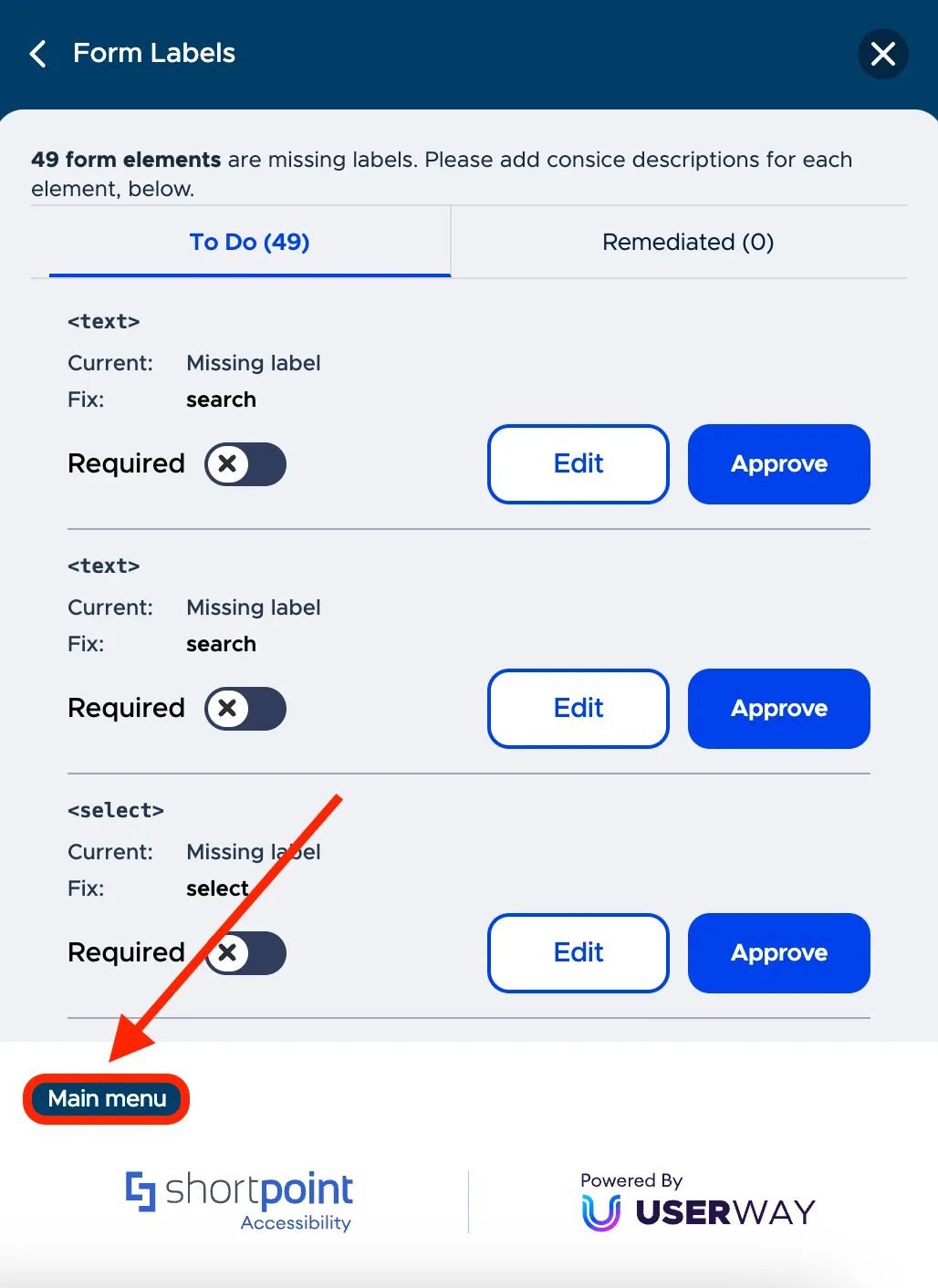
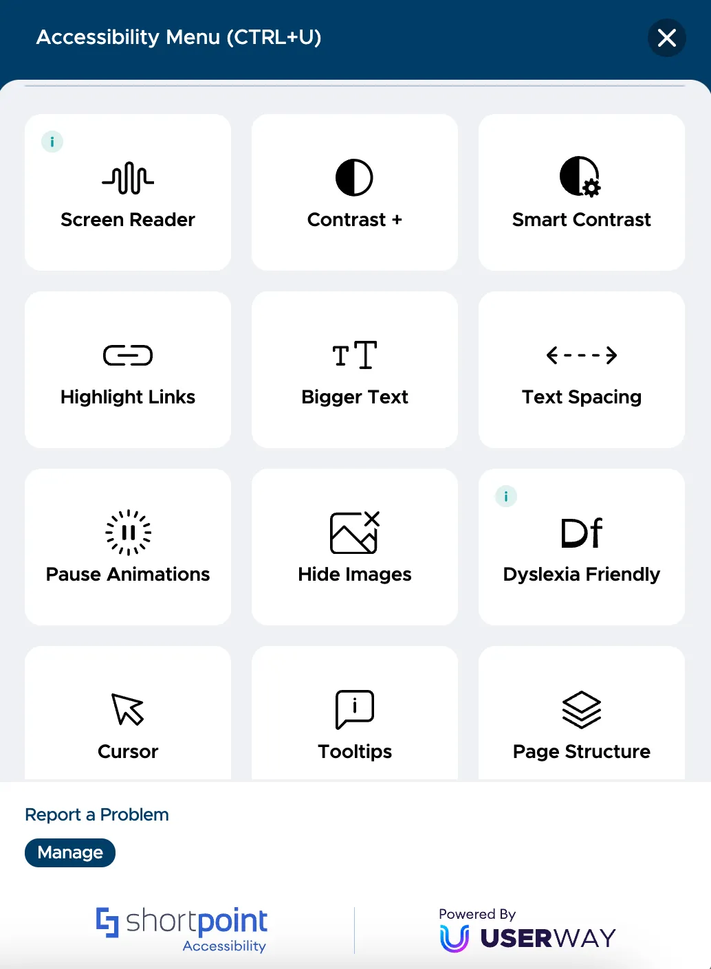
Now, let us now take a look at the functions that will be available to your users. Click Main Menu to see all the functions.
You will now see a list of tools that will allow you to enhance the accessibility of your site. Users can personalize their experience according to their needs and even enable specific functions that cater to an accessibility profile. For example, you want to make your site accessible to the color blind. Simply click Accessibility Profiles.
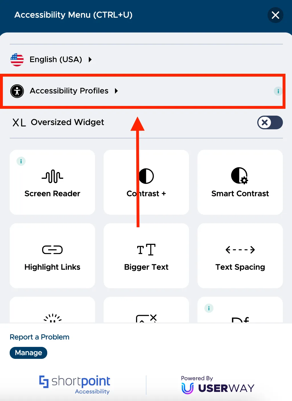
You will see a list of accessibility profiles that you can cater to. Click Color Blind and your page will automatically apply the changes.
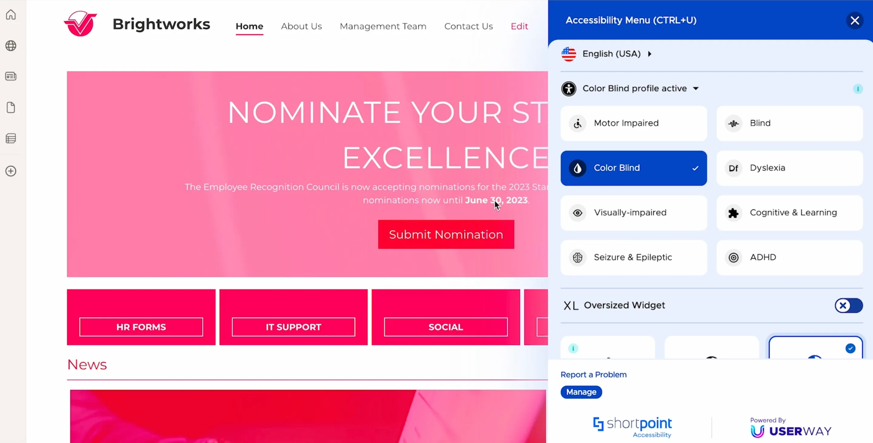
Other available accessibility functions include activating a screen reader, using voice navigation, applying contrast, making the text on the site bigger, and more. By making these options available to your users, you can ensure that your site is accessible to everyone, regardless of their individual needs.
Showing compliance to accessibility standards
ShortPoint Accessibility can also help you provide proof of compliance with accessibility standards and promote your commitment to creating an inclusive workplace.
To download a detailed accessibility report, click Manage.

This will take you to the management console. Click Get Your Report.
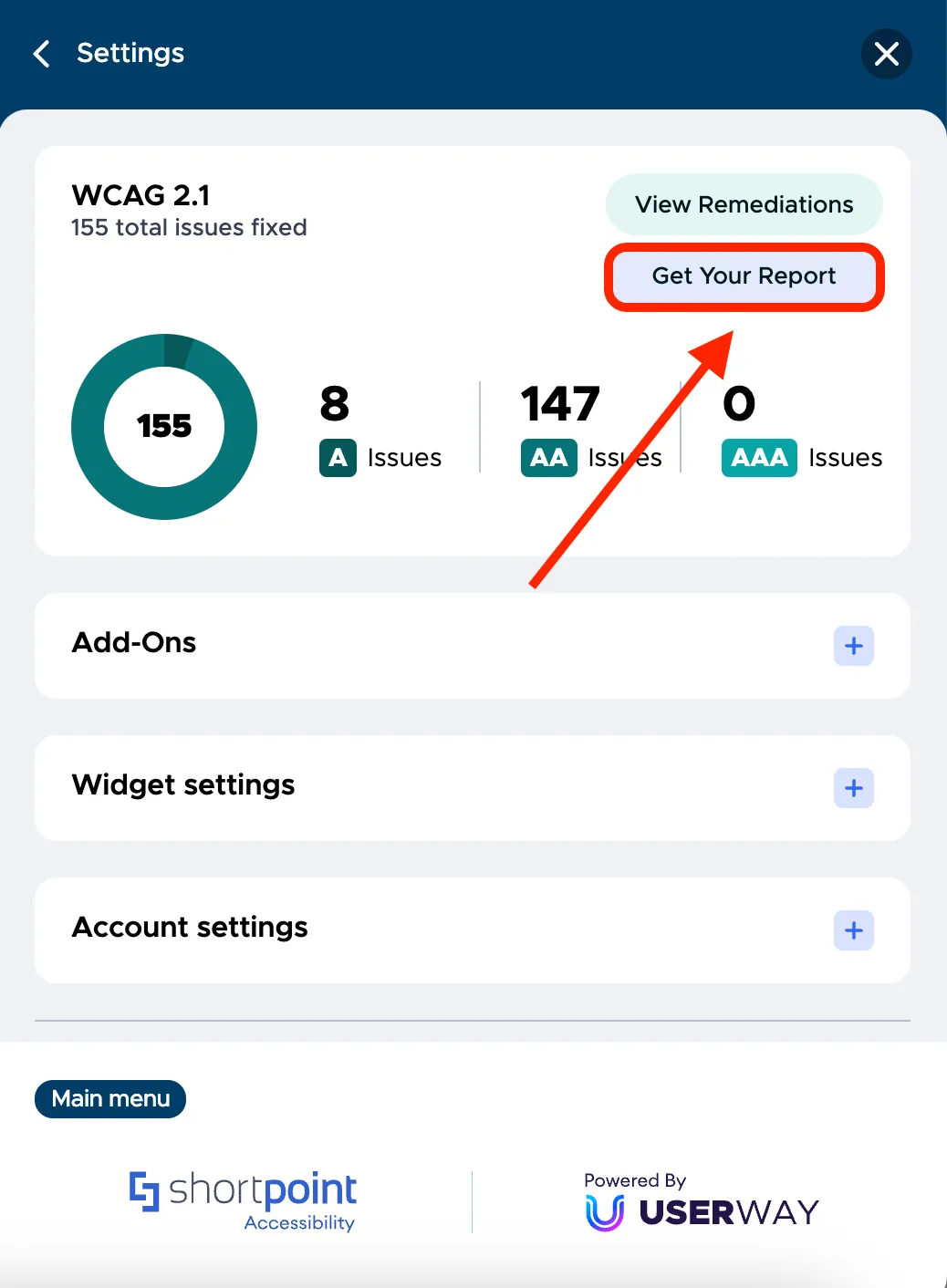
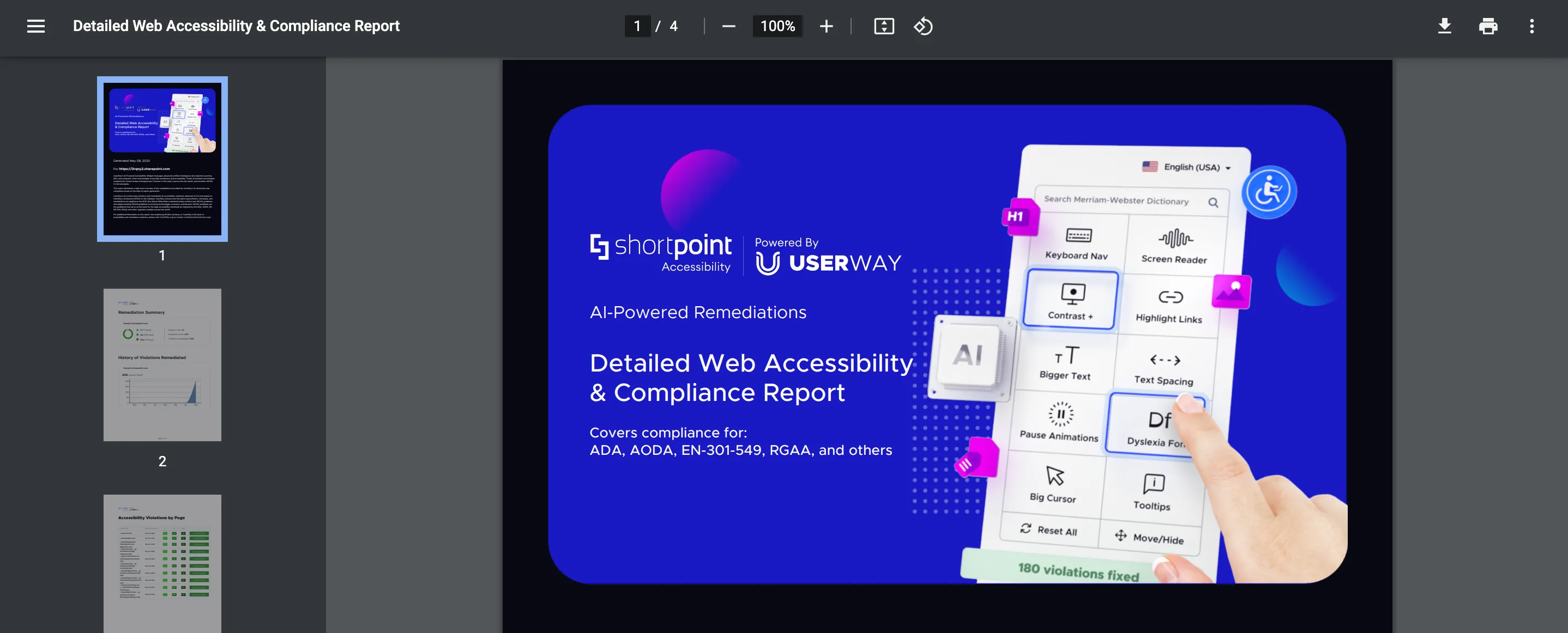
The report will be downloaded as a PDF file that you can use as evidence of compliance with the required standards.
Additionally, you can generate a custom Accessibility Statement for your organization by visiting userway.org/generate.
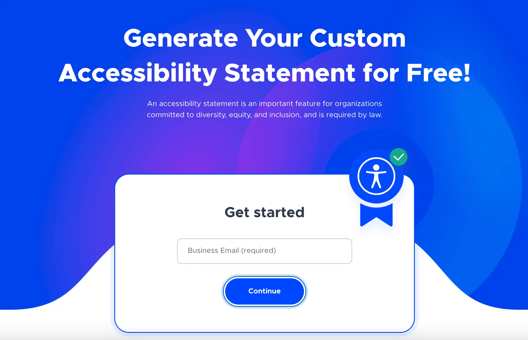
Simply fill in the necessary details and an Accessibility statement will be generated for you. This statement will indicate that you are compliant with the WCAG 2.1 standards and the measures taken to make this happen.
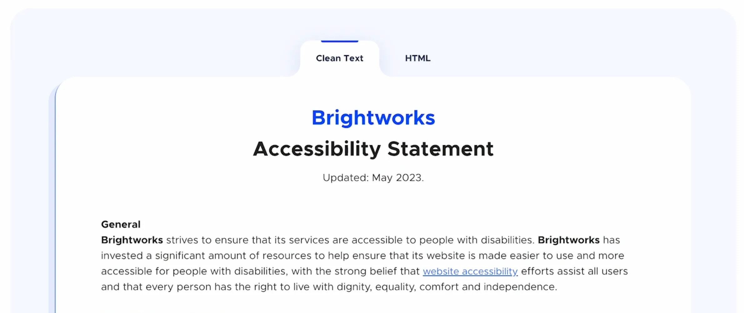
You can add this statement to your SharePoint sites.

By implementing ShortPoint Accessibility, you've made your intranets accessible to all users in your organization and comply with web accessibility standards. ShortPoint Accessibility will continue to run in the background, reviewing any changes made to your existing sites and pages, as well as any new ones created.
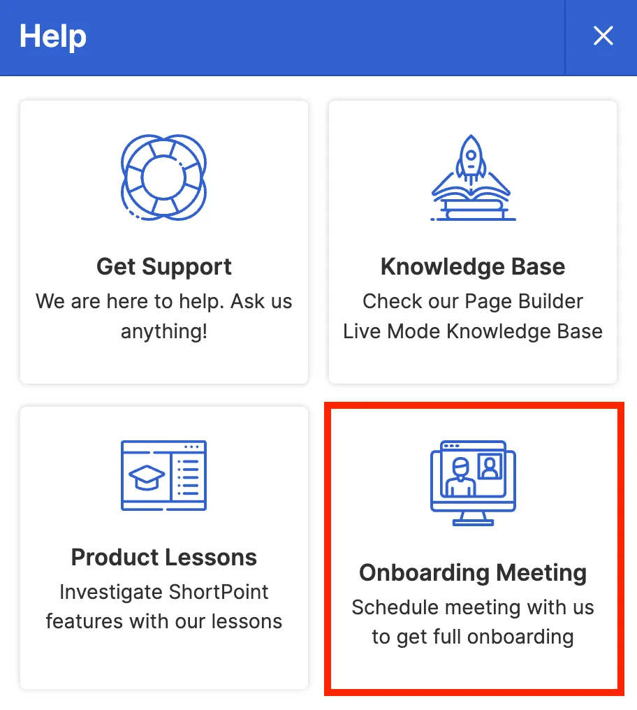
Access ShortPoint resources and support
As you begin using ShortPoint to design your intranet, you may have questions that are best answered by an expert. In this lesson, you will learn how to request a demo of the product and its features, how to search for step-by-step resources on what you want to accomplish, and how to find support when you encounter an issue.
Scheduling a demo
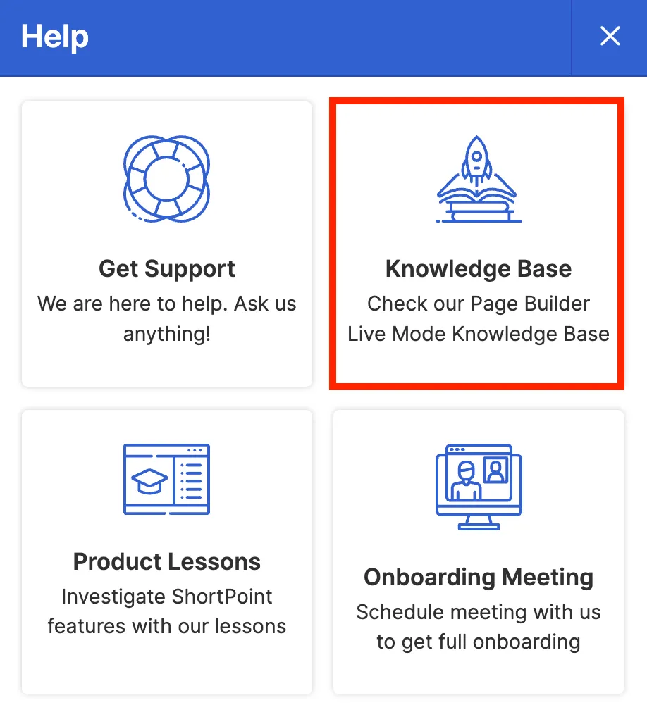
First, let us go back to the SharePoint site we were editing and click the question mark icon in the Action toolbar.
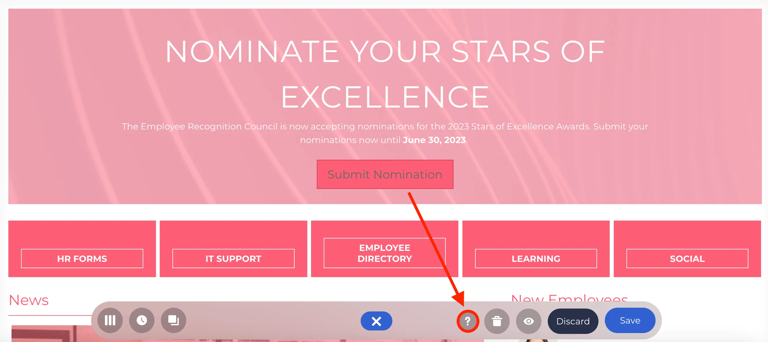
This will open our Help Center where you can find several resources and options that you can use to get the assistance you need as you begin exploring ShortPoint.
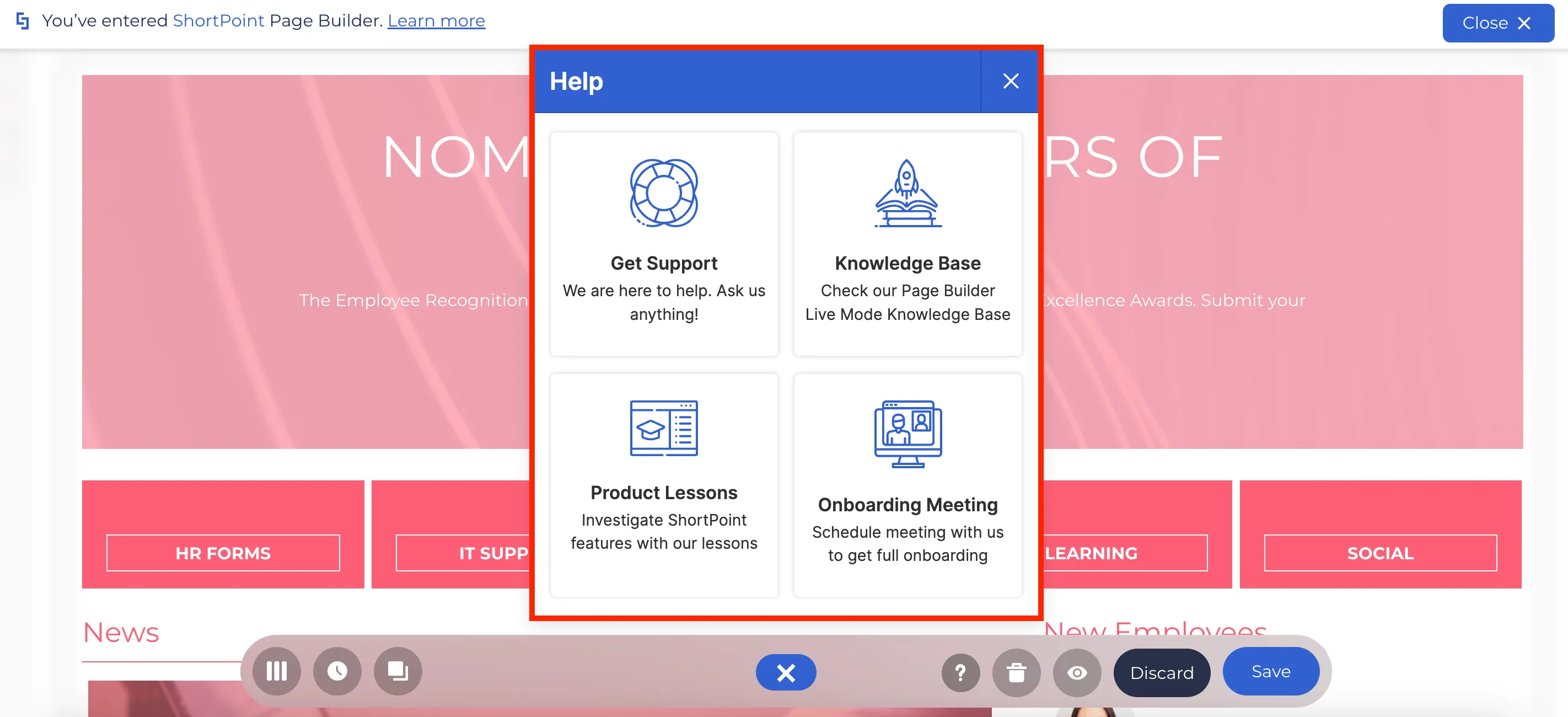
If you want a ShortPoint expert to walk you through the product or learn more about specific applications of ShortPoint features, you can schedule a demo with us.
To schedule a demo, click on the Onboarding Meeting option.
You will be redirected to a new Calendly window. Select the date that you prefer for the scheduled demo.
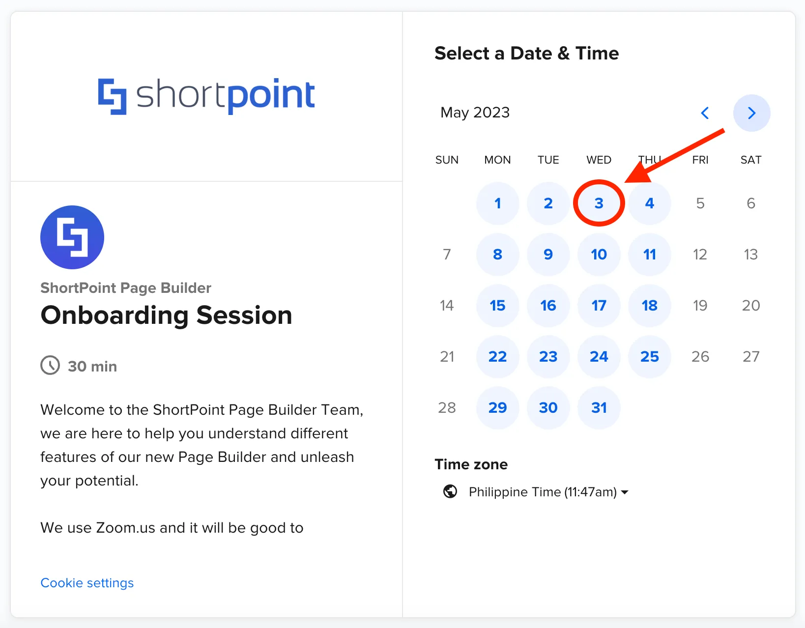
Then, choose the most convenient time for you.
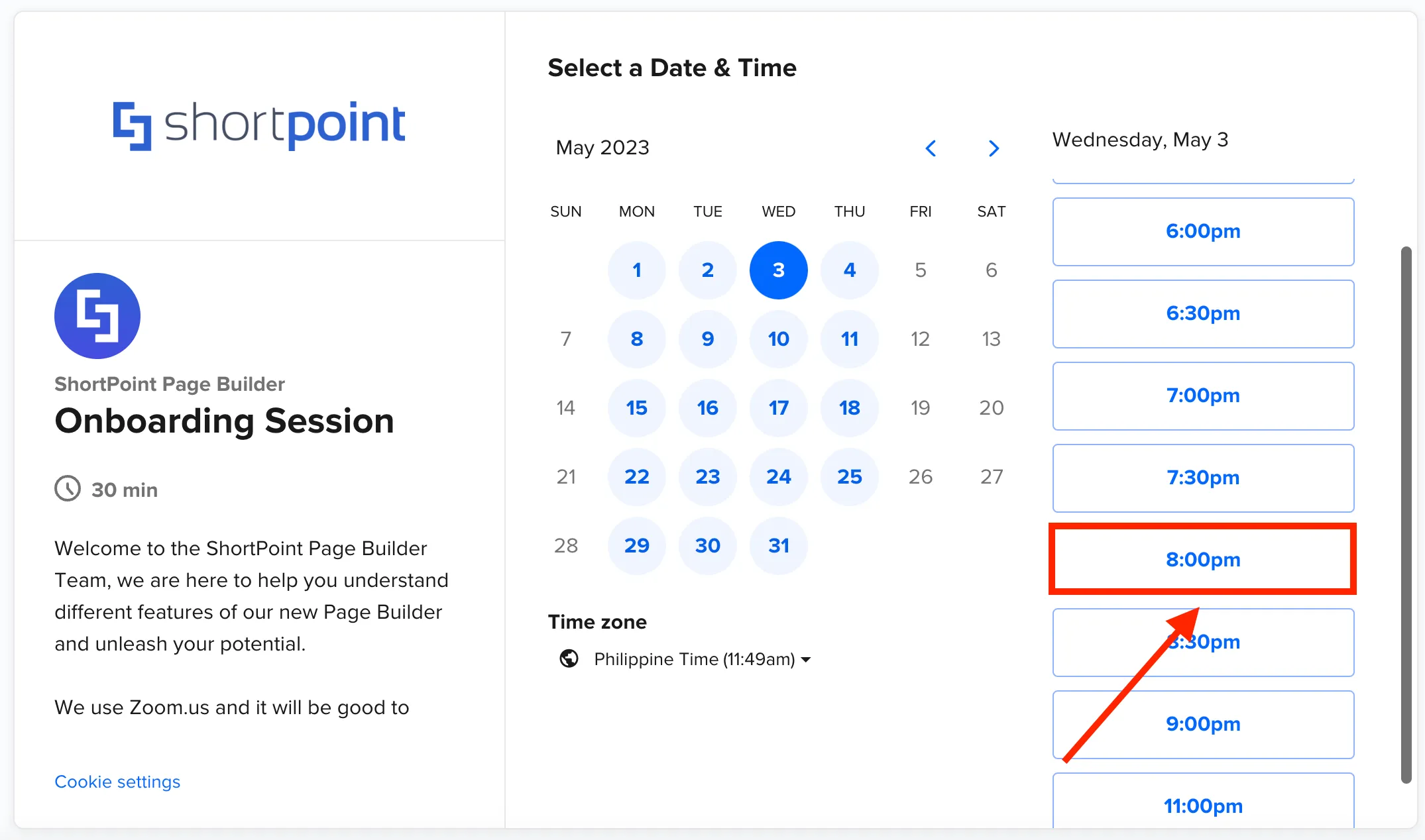
Once you select your preferred date and time, click Next.
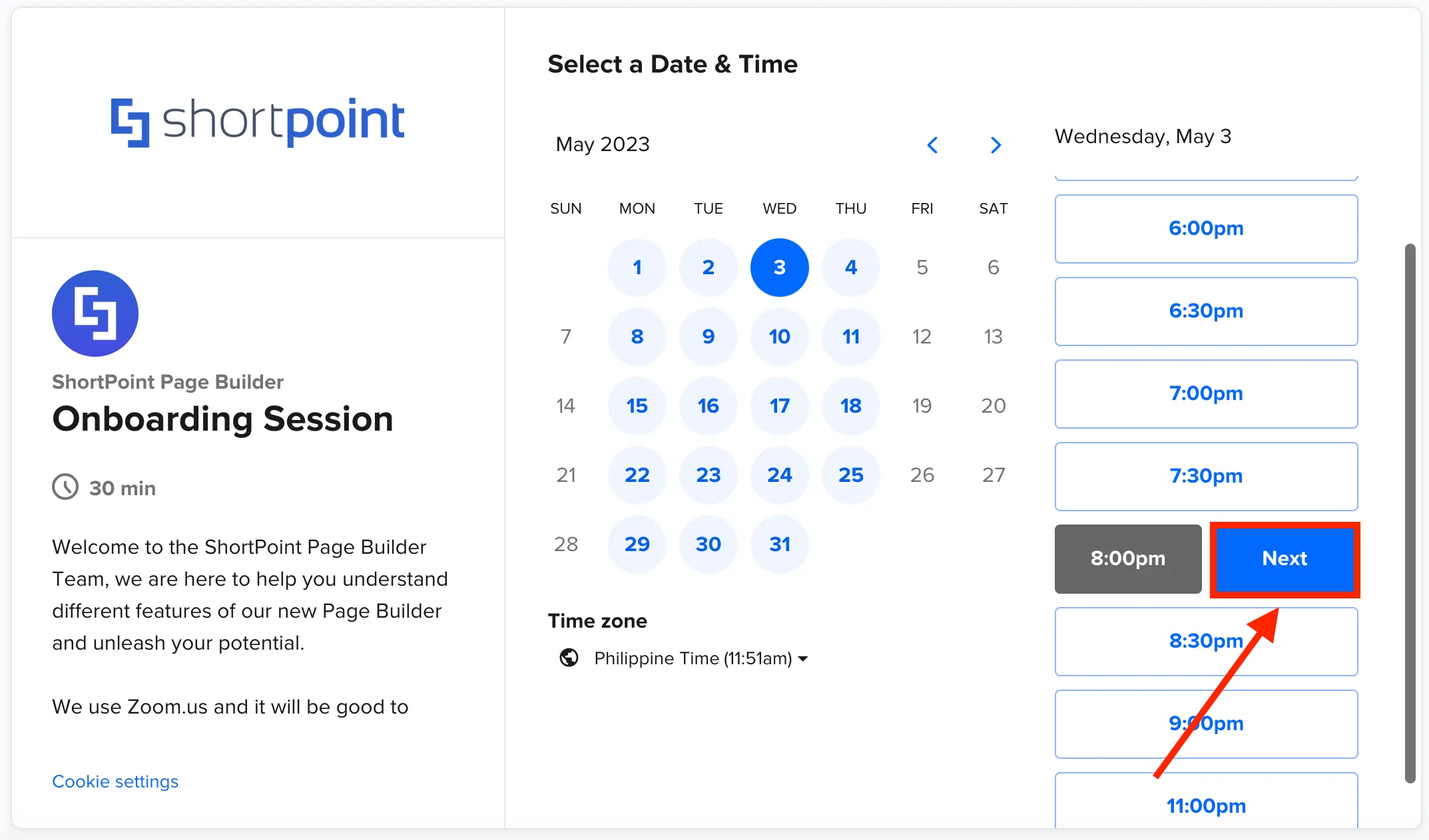
Complete the scheduling form with your information and include any additional information or specific requirements you may have for the meeting.
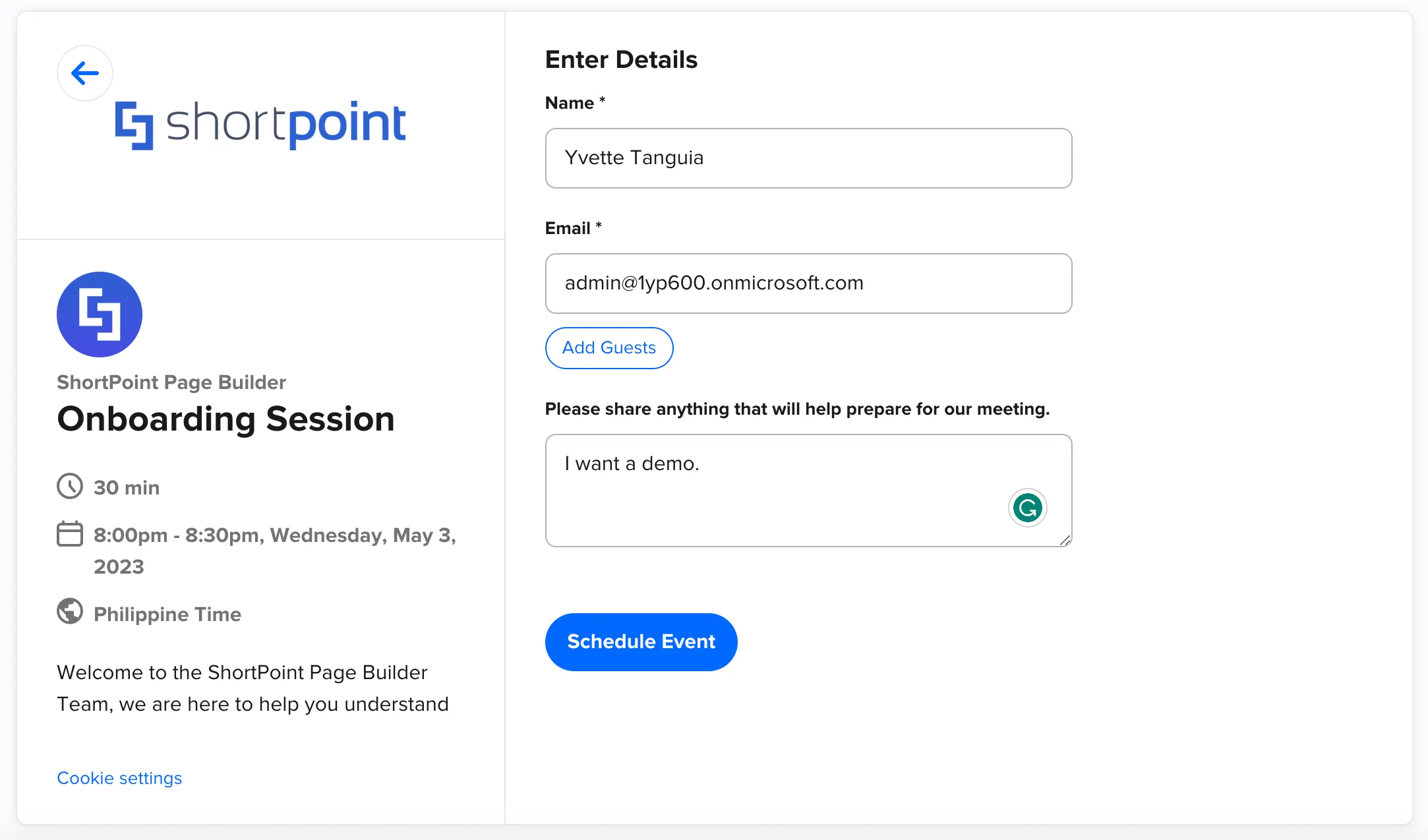
You can also invite guests whom you want to join the session. To do so, simply click Add Guests.
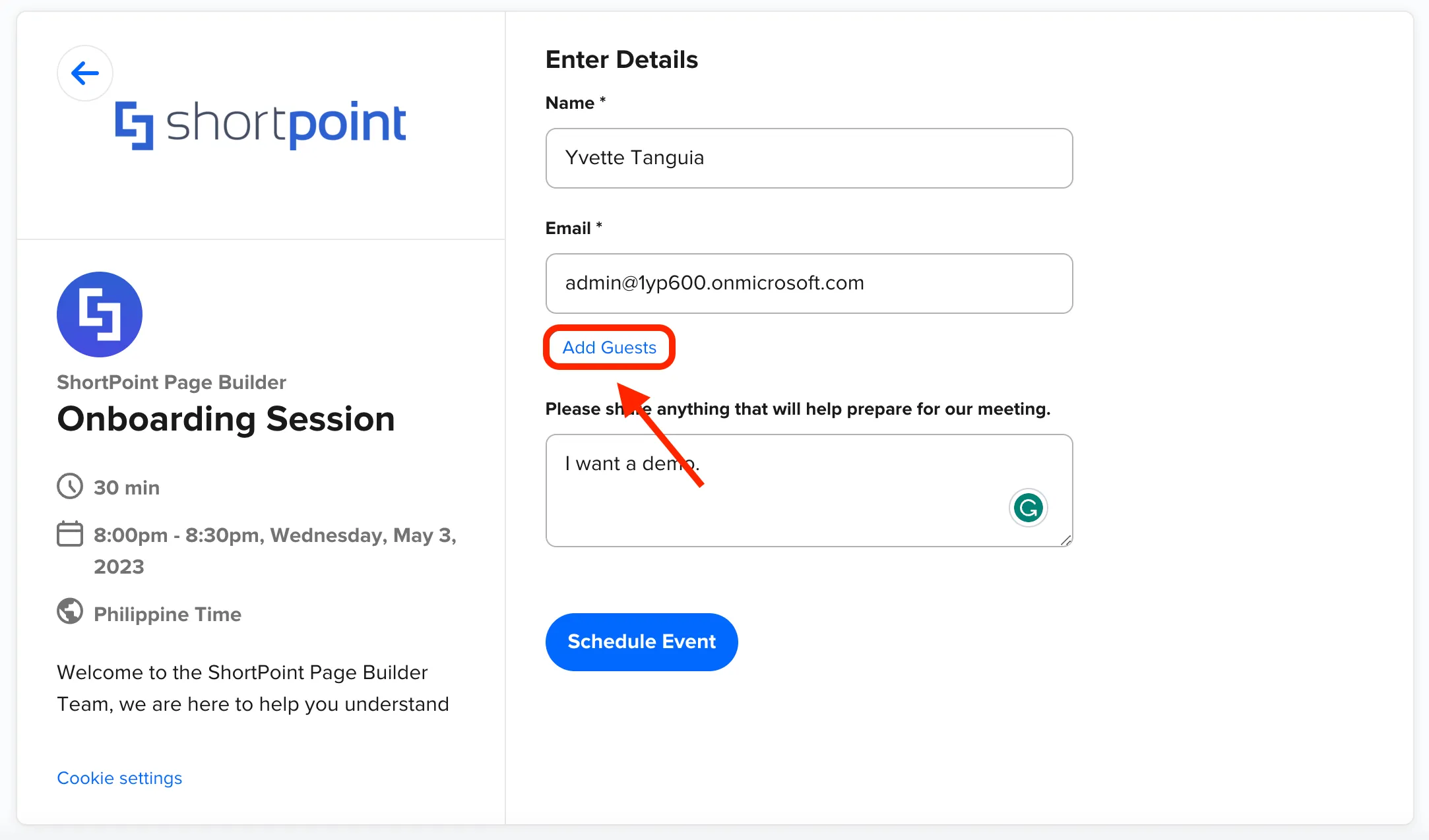
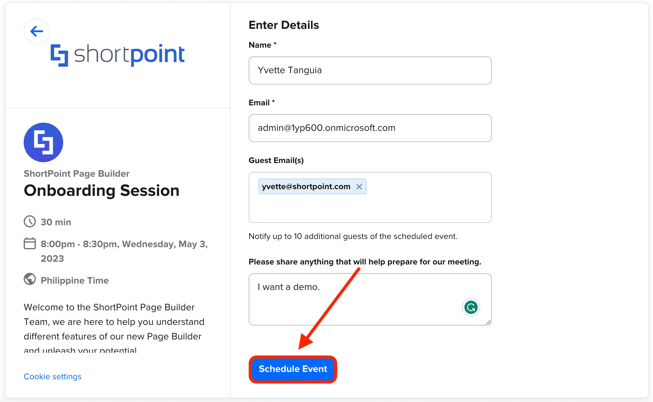
Then, type your co-worker’s email address under the Guest Email(s) field. You can invite up to 10 guests to your scheduled demo.
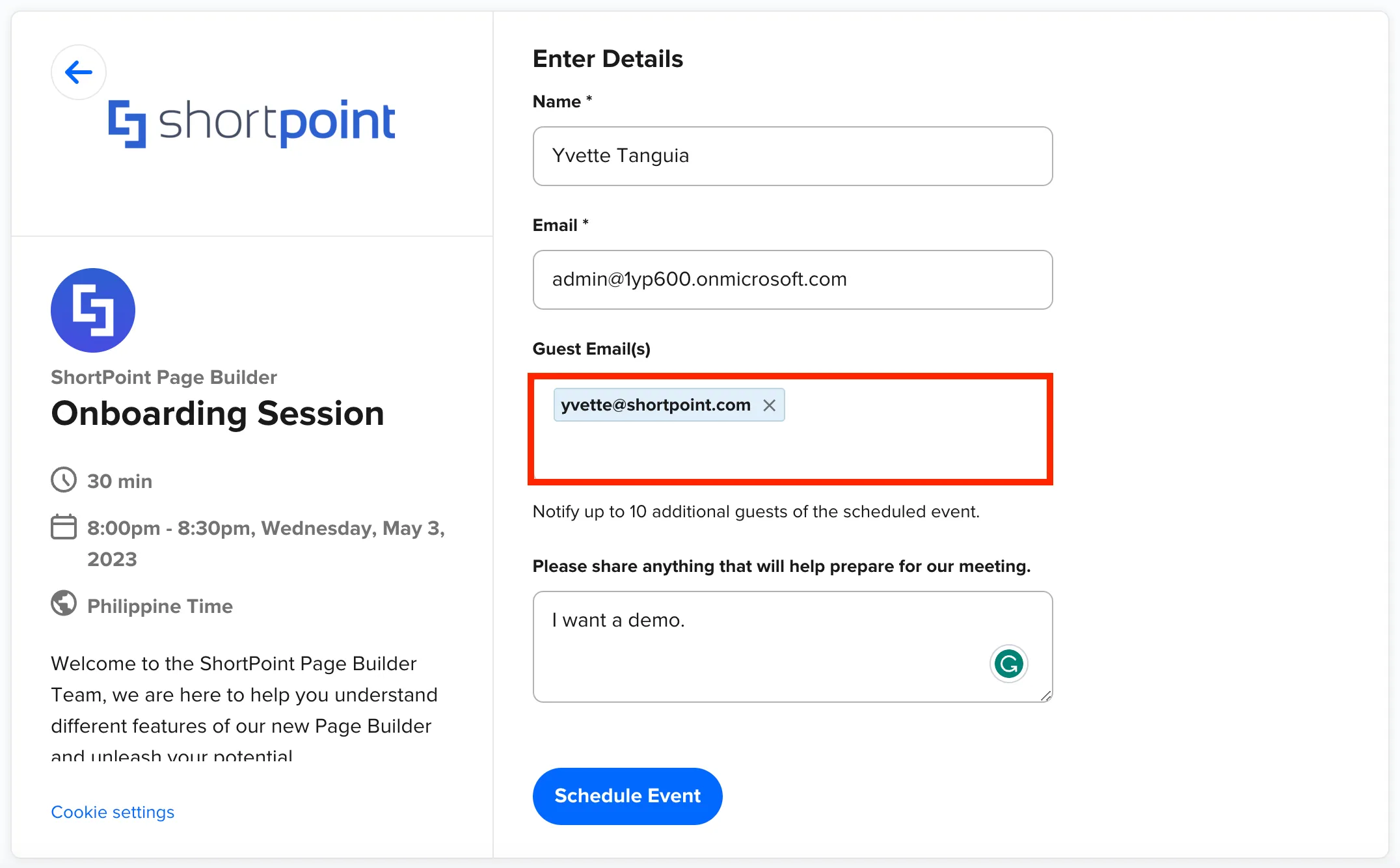
Once you are done, click Schedule Event.
Your session is now confirmed. Additional information including the name of the ShortPoint expert who will assist you will also be shown.
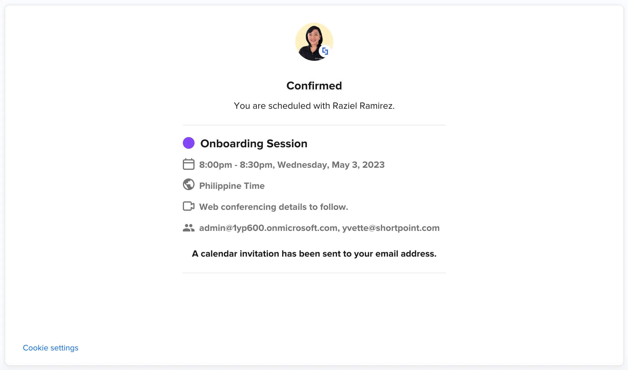
You will also receive an email with all the details you need to join the meeting.

Accessing support page
If you are looking for a specific step-by-step guide on how to accomplish a certain action using ShortPoint, you can access our vast library of support content.
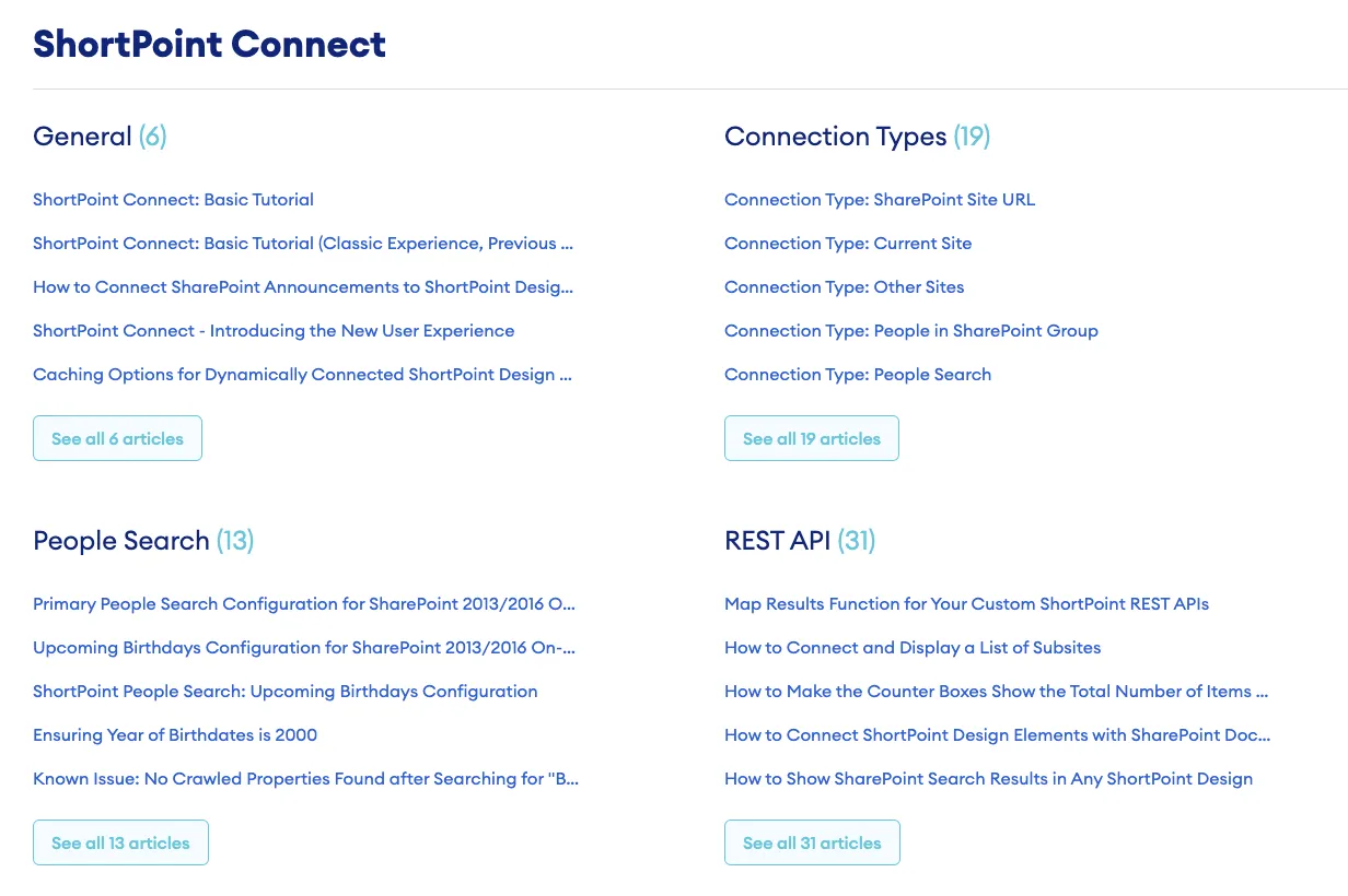
To access our support site, go back to your SharePoint site and click Knowledge Base.
You will be redirected to our Knowledge Base, where you will find several articles that provide all the information you need to learn more about a ShortPoint feature or achieve your goal.
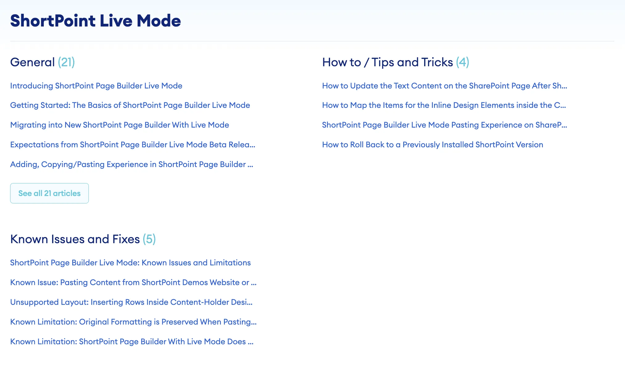
There are several ways to look for the topic you want to learn more about. One is to click Solutions at the upper-left corner of the page.

Here, you will see different categories that cover various topics, ranging from basic how-to articles and FAQs to advanced solutions that provide custom codes. From there, you can select the category that is most relevant to your needs.
Another way is to enter keywords into the search field. This will return a list of resources about the topic that you want to explore.
If you are not currently editing your intranet and want to access the Knowledge Base, you can visit our website, click [1] Resources, and select [2] Knowledge Base from the list.

Alternatively, you can enter support.shortpoint.com directly into your browser.

Submitting a support ticket
If you encounter specific concerns that require assistance, our Customer Support Experts are ready to help.
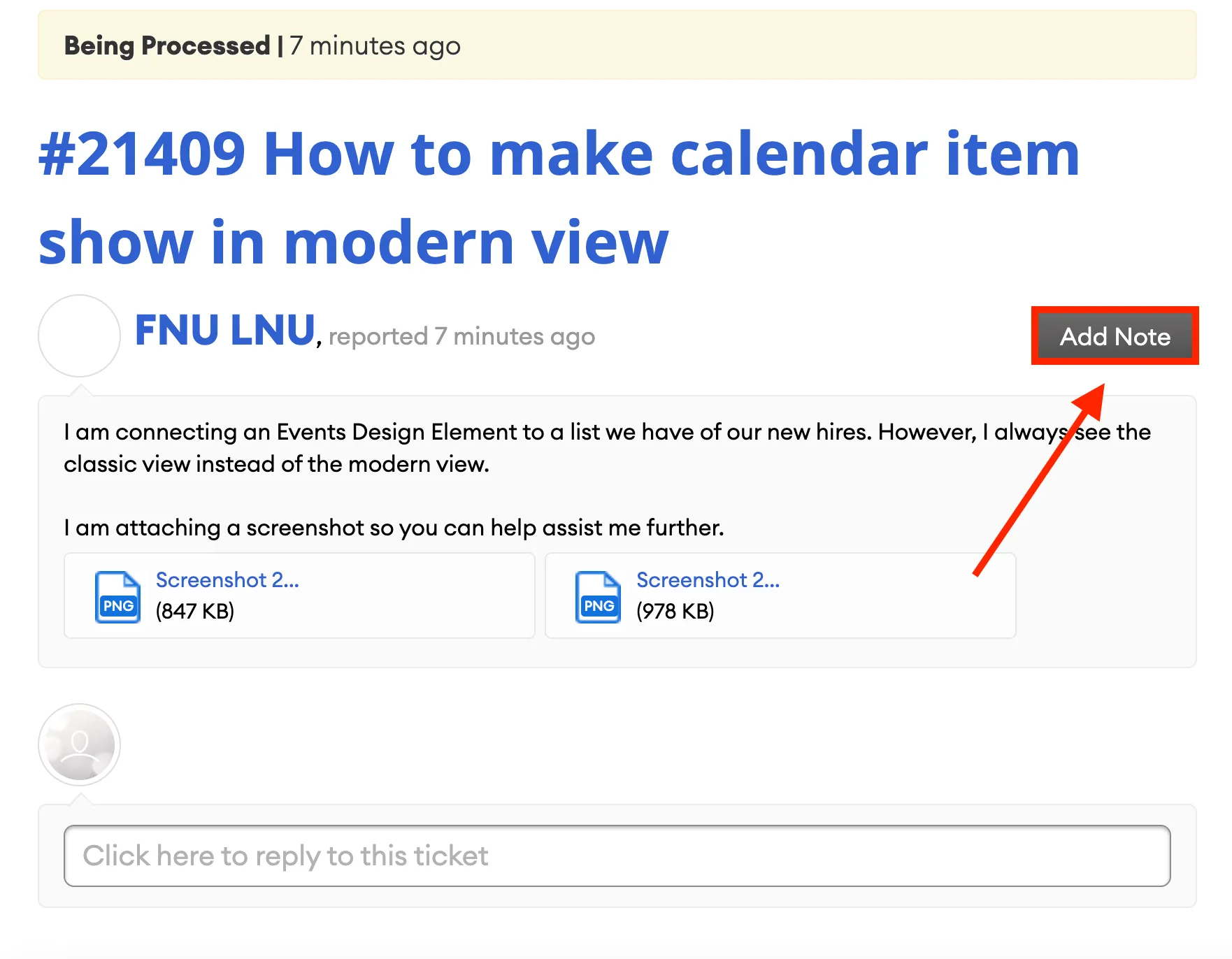
To submit a support ticket, go back to your SharePoint page and click Get Support.

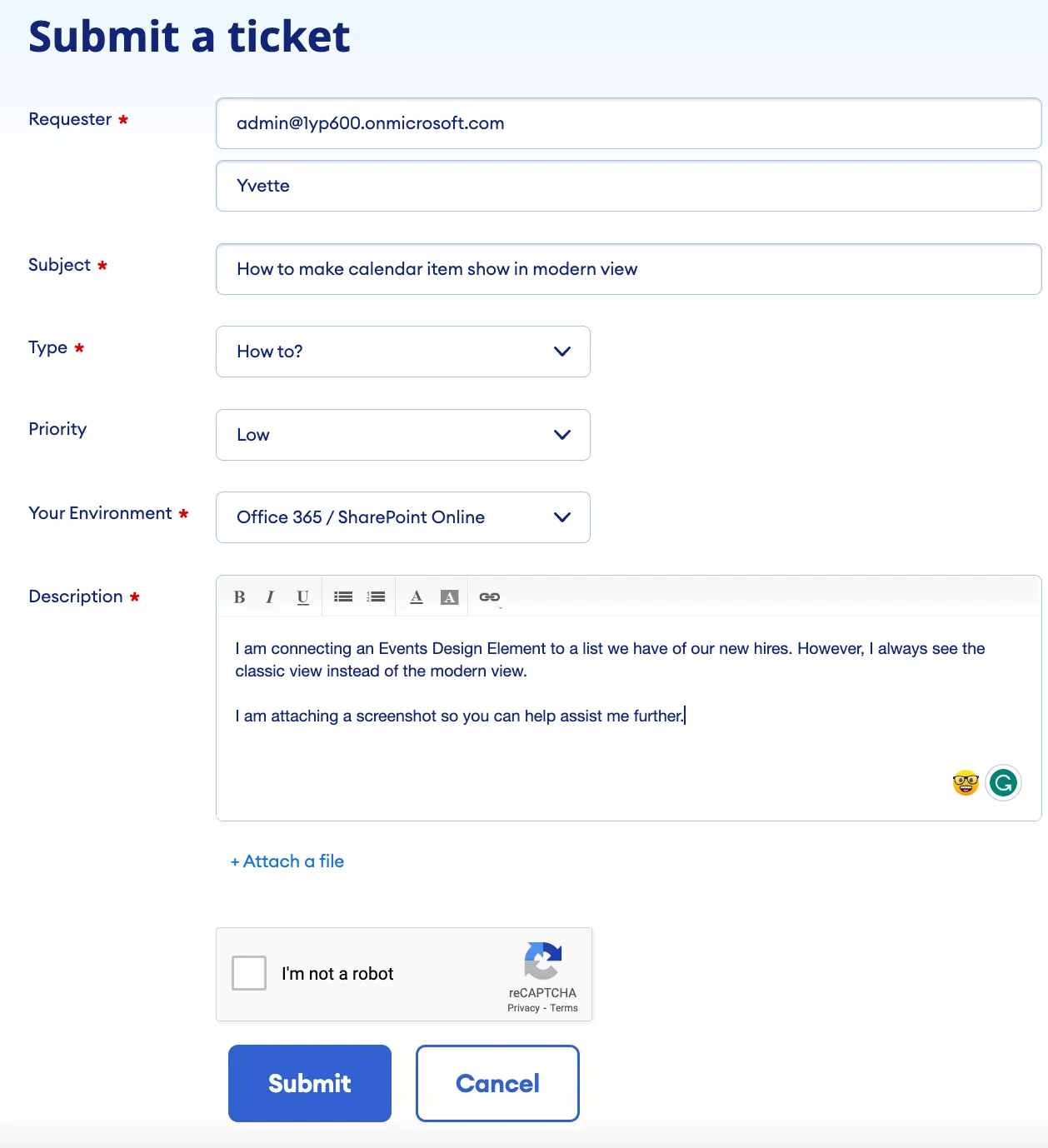
This will take you to a new ticket form where you will enter the required information and a detailed description of your inquiry or issue.
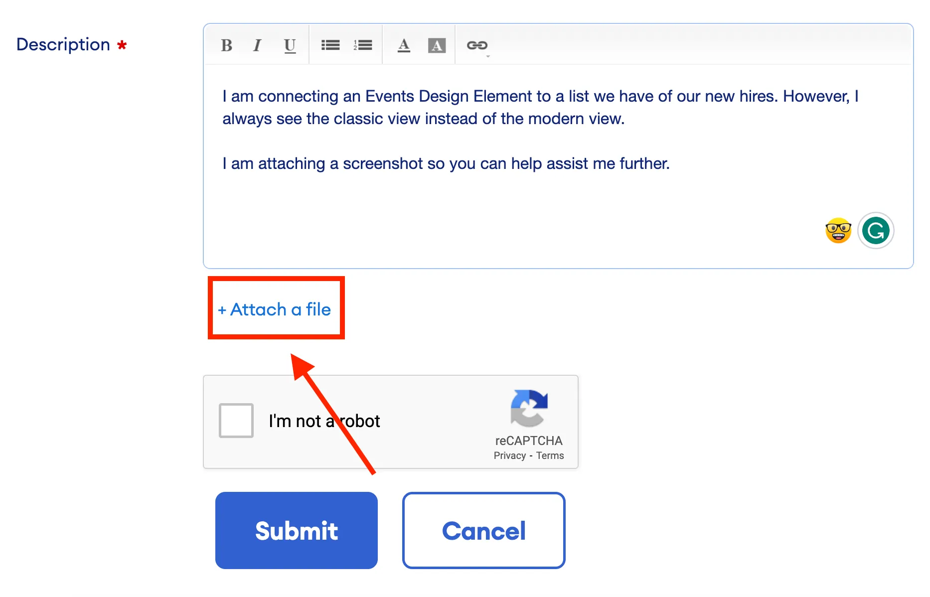
To minimize back-and-forth communication with our support team, ensure that you provide as much detail as possible. If applicable, you can attach screenshots or recordings. Simply click Attach a file and upload the necessary files.
Once you are done, click Submit.

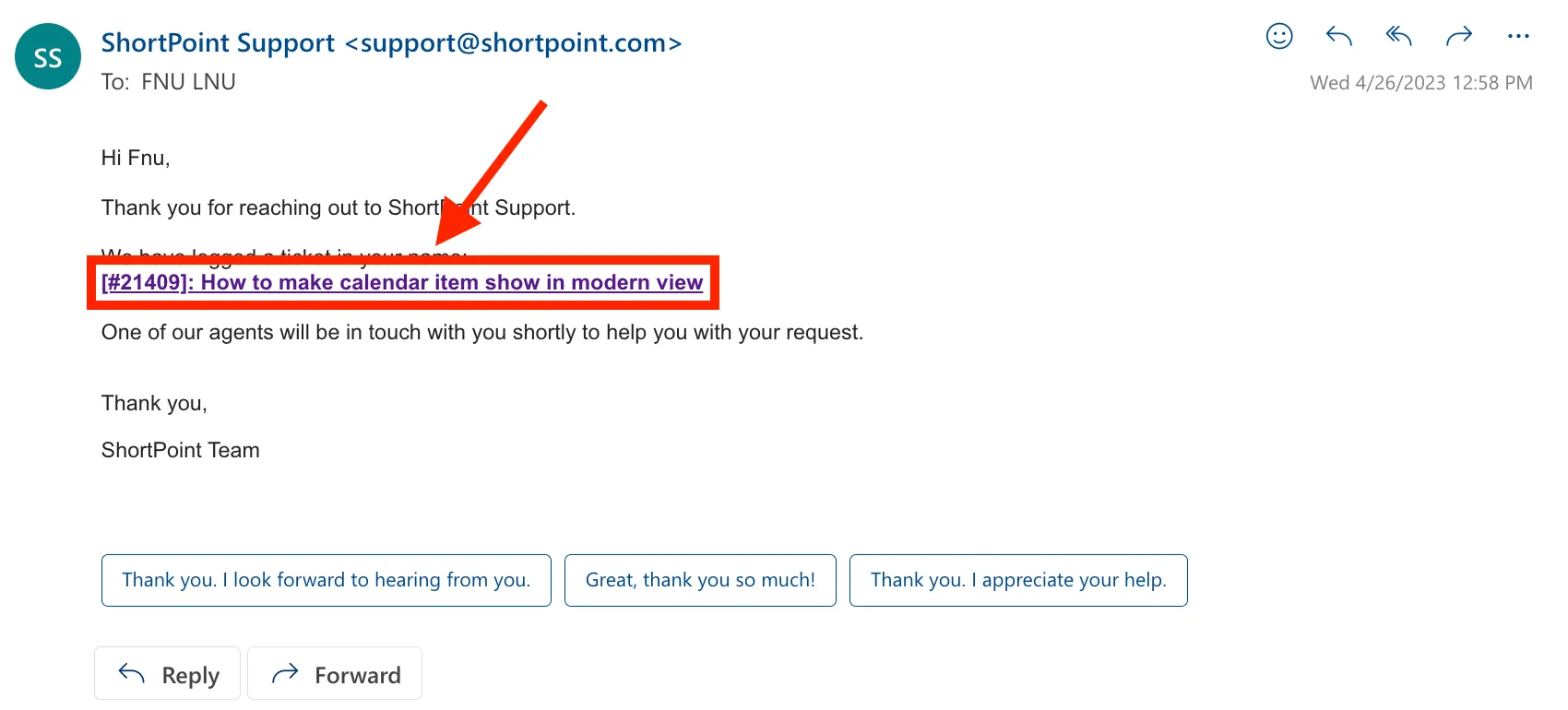
You will receive an email confirming that your ticket has been received. The email will contain your ticket number and a link where you can check the progress of your ticket.

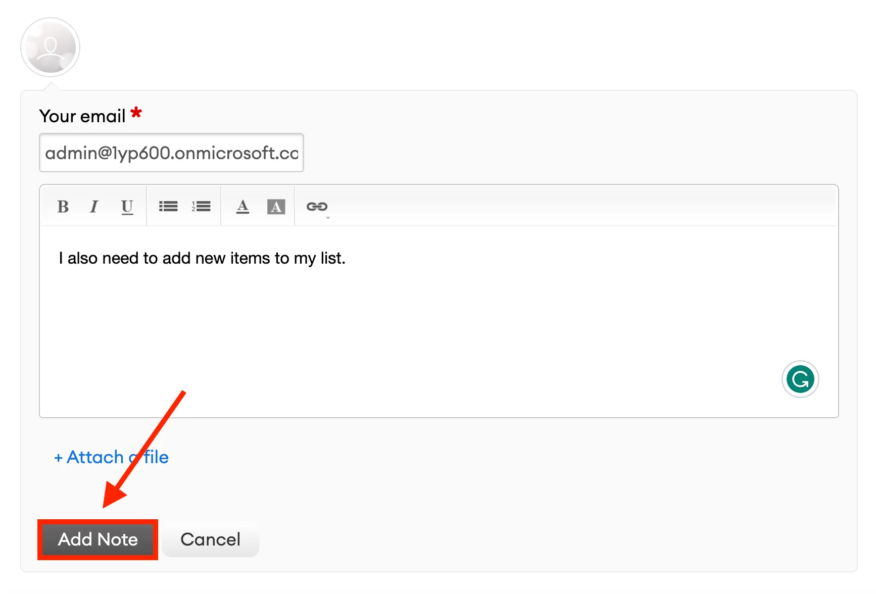
If you want to add more information to your ticket, click the link sent to your email.
You will be redirected to our support page. Click Add Note.
Fill in the necessary details and click Add Note.
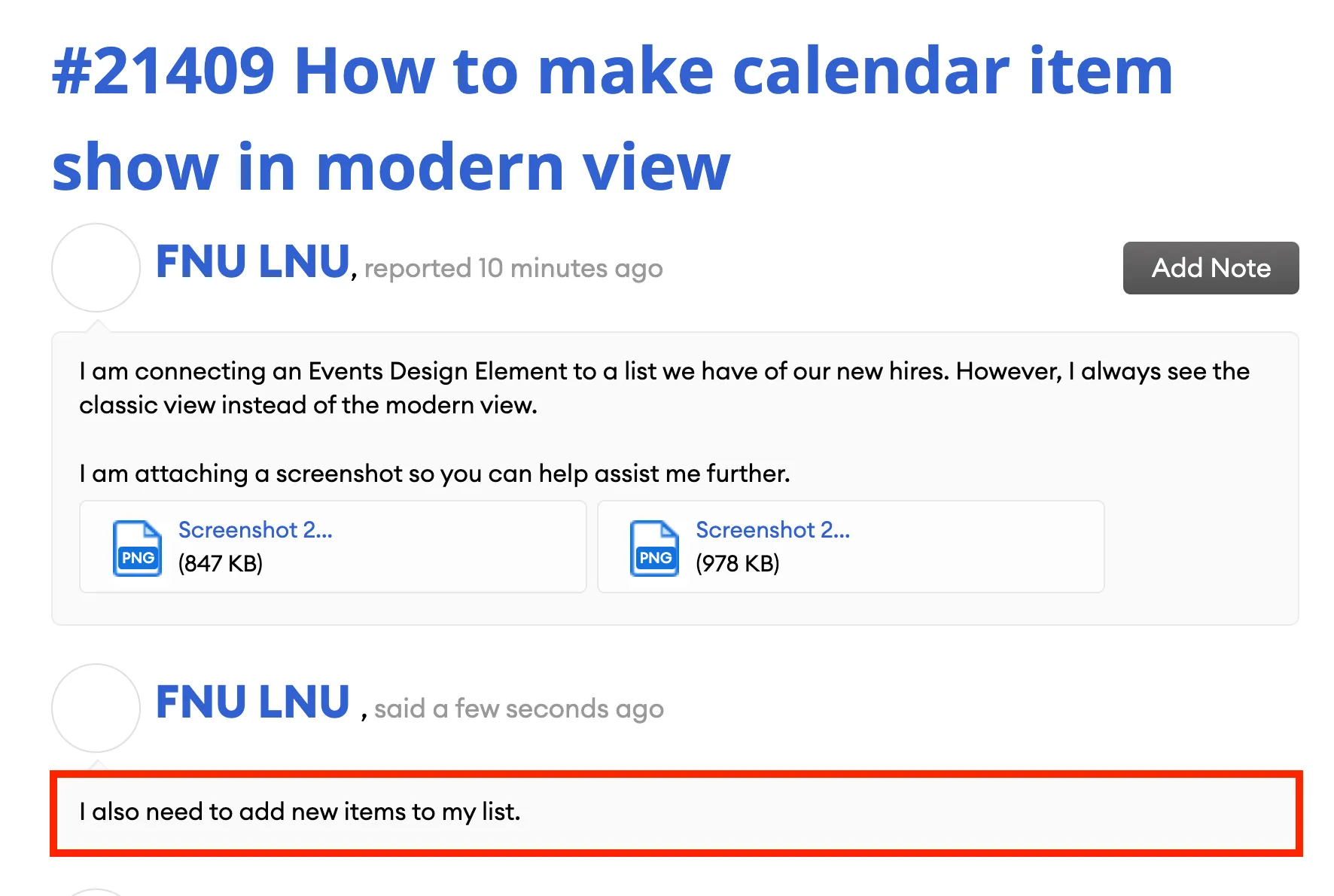
You will now see the new details added to your ticket.
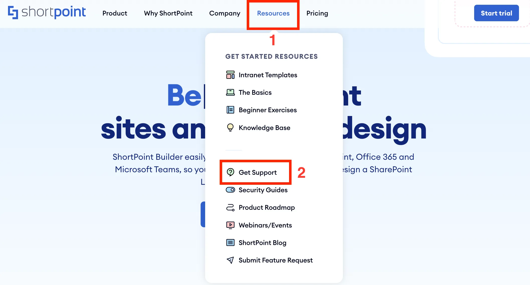
If you are not editing your SharePoint site and want to submit a ticket, you can go to our website, click [1] Resources, and select [2] Get Support from the list.
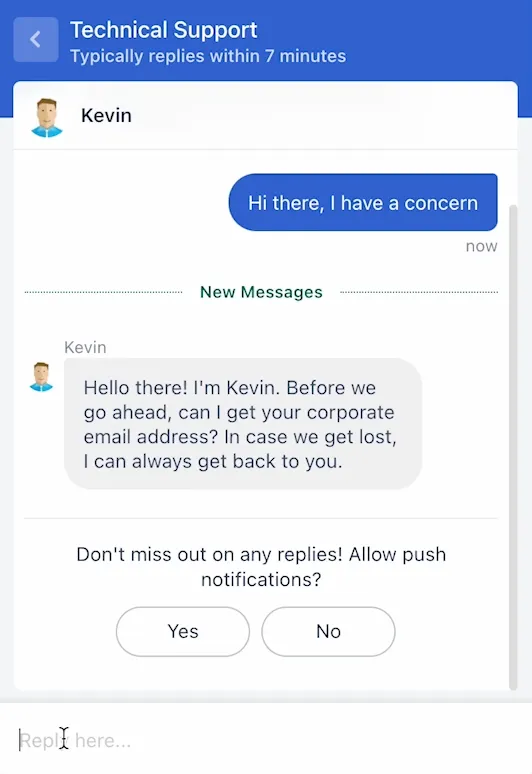
Another quick way to contact our Customer Support Experts is through the chat option on our support site. Simply open the chat widget.
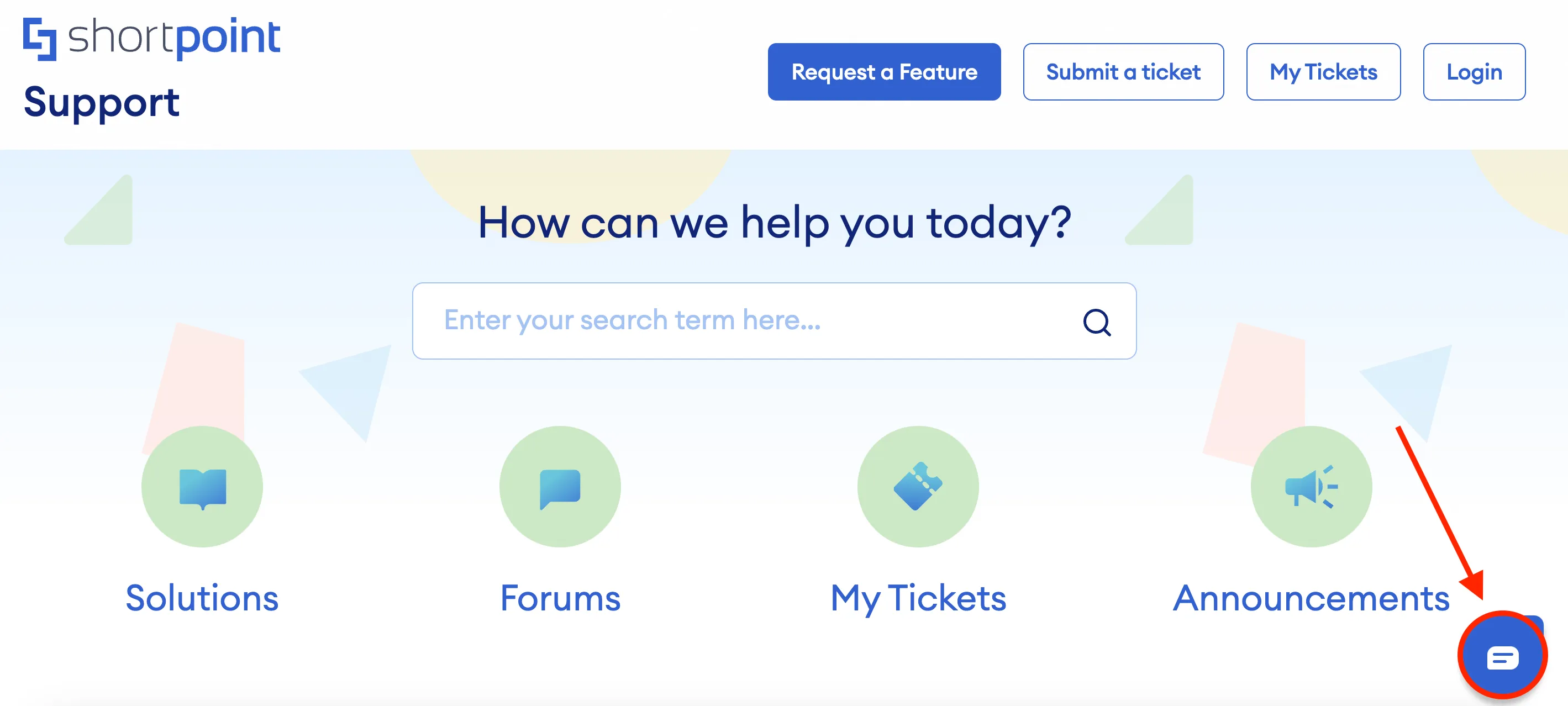
Select the type of support you need.
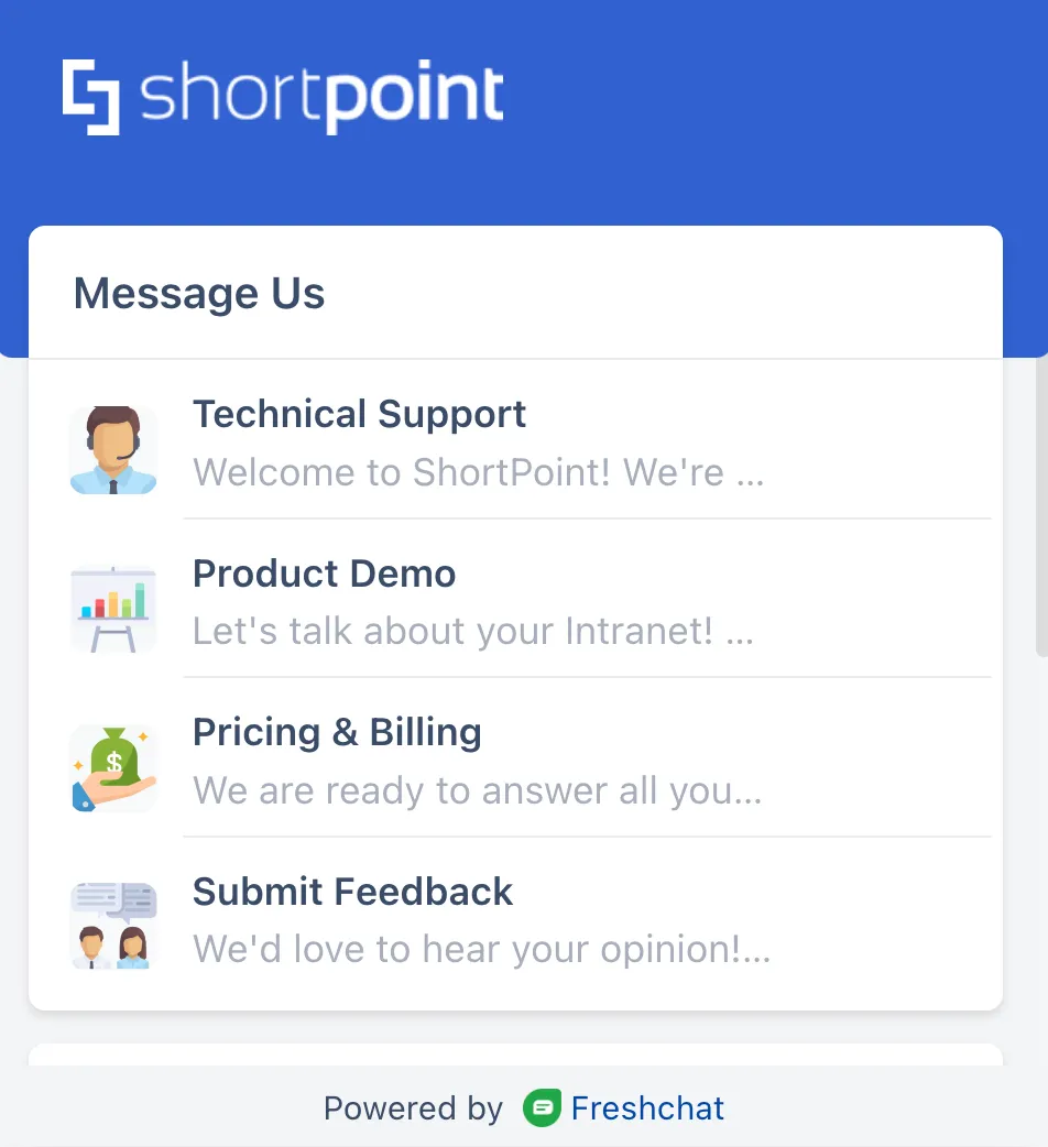
And start the conversation.
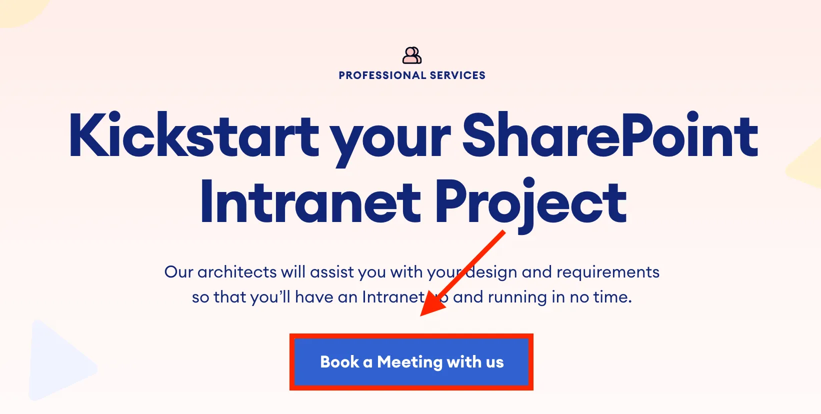
Finally, if you need expert designers to help design your intranet for you, simply go to our website, click [1] Pricing, and select [2] Professional Services from the list.
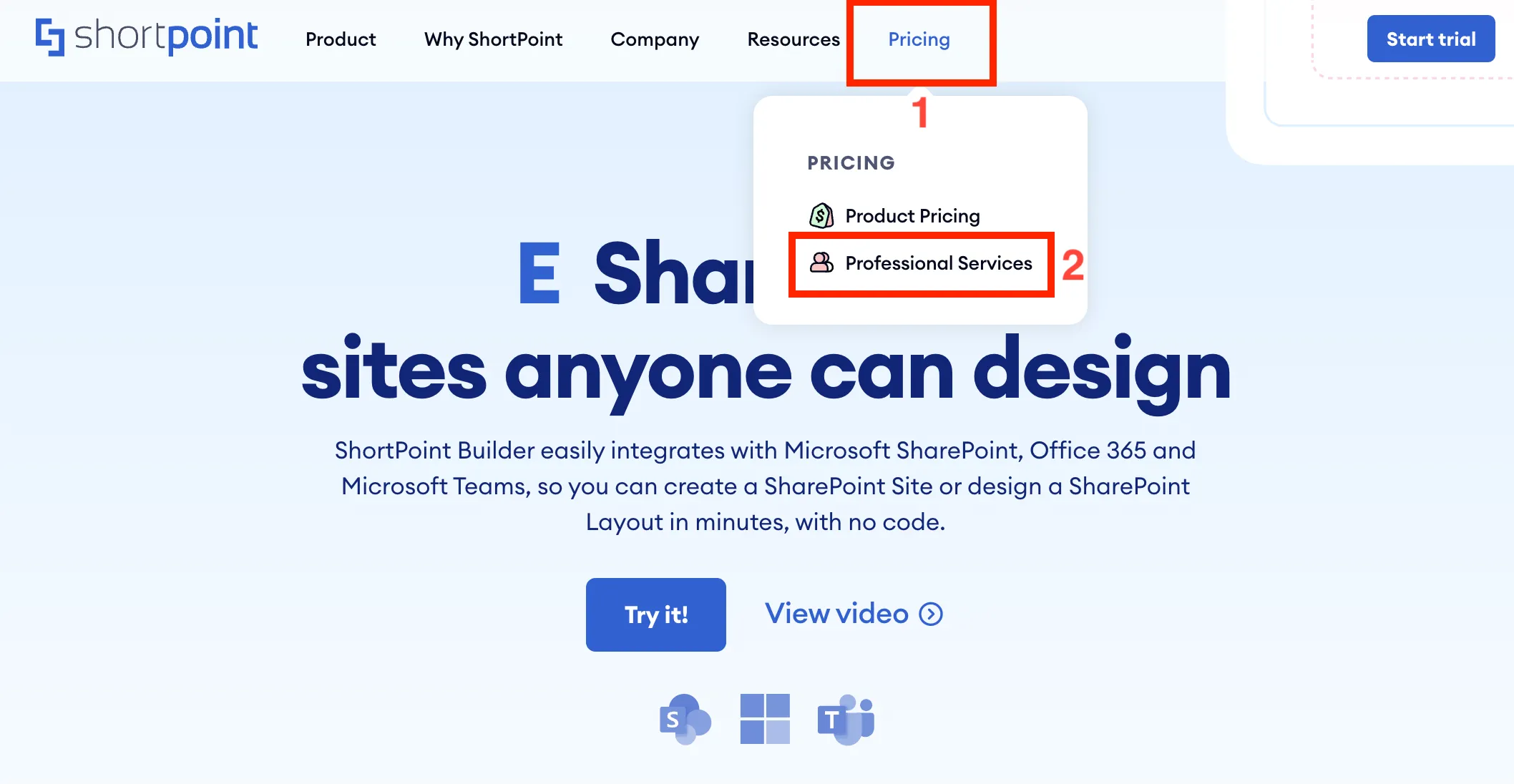
From there, you can Book a meeting with us.
That’s it! You now have all the resources you need to connect with us. We hope you have a great time learning more about ShortPoint, its features, and how it can help you build your intranet.
ShortPoint Theme Builder Basics
Introduction to ShortPoint Theme Builder
3:09
Modify SharePoint site page elements
3:46
Apply brand colors
5:19
Apply brand fonts and typography
3:25
Customize menus and headers
3:34
Export and Import custom site themes
3:41
Introduction to ShortPoint Theme Builder
It is important to ensure that the look and feel of your SharePoint site accurately represent your organization's branding. In this lesson, you will learn about ShortPoint Theme Builder, a powerful tool that allows you to customize your site's color theme, layout, style, and more. You will learn how to access it, navigate its interface, and learn about the general page layout options that you can apply across your SharePoint Site Collection.
Launching ShortPoint Theme Builder
To launch ShortPoint Theme Builder, go to the SharePoint page you want to use and click the cogwheel icon at the right-hand corner of your screen.
Then, select Site Contents.

Select ShortPoint Dashboard.
In the ShortPoint Dashboard, select Theme Builder.
Choose [1] Modern and click [2] Customize my site.
You will be taken to the main page of your site where you will be able to see the Theme Builder window.
Navigating the ShortPoint Theme Builder interface
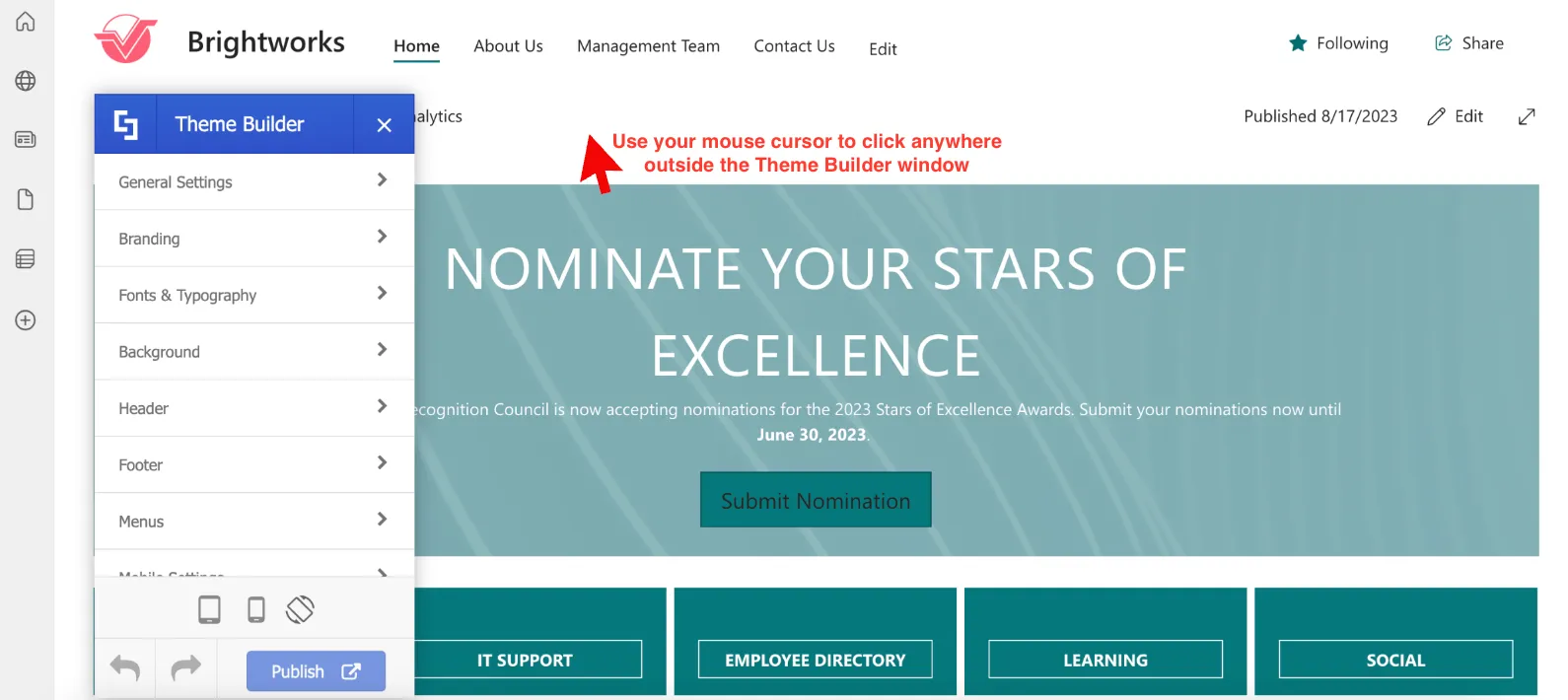
The Theme Builder window is collapsible. Simply click anywhere outside the Theme Builder window to minimize it.
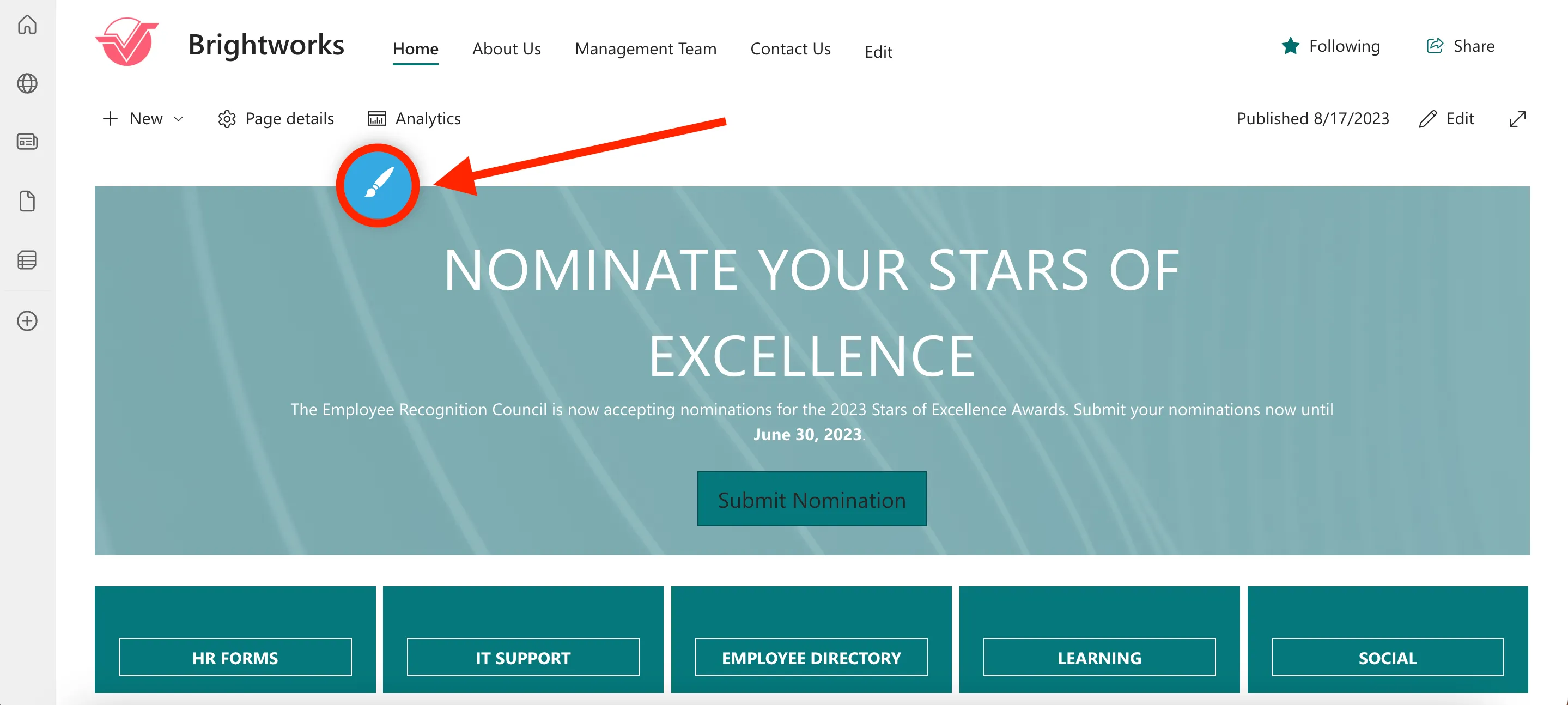
Once you do so, you will see a blue circle icon. To see Theme Builder and its options again, click the blue circle icon.
The Theme Builder window is also movable. All you have to do is drag the window using your mouse. For example, let us drag the Theme Builder window to the left side of the screen.
Here is what it will look like:

The Theme Builder also provides you with different options for customization. It is organized into different categories including General Settings, Branding, Fonts & Typography, and many more. Each category contains settings that you can adjust according to your specific requirements.
Once you start customizing options in the Theme Builder, you will notice that all changes made will immediately reflect on your page. For example, when we change the color of the site, you will readily see the color change.
You will also observe that your choices will impact other pages. For example, this Contact Us page followed the color we set for the main site.
It's important to note, however, that the changes you make are only visible to you until you decide to publish them. This allows you the freedom to experiment and try out different settings on your site before finalizing the perfect design.
Modifying the general page layout
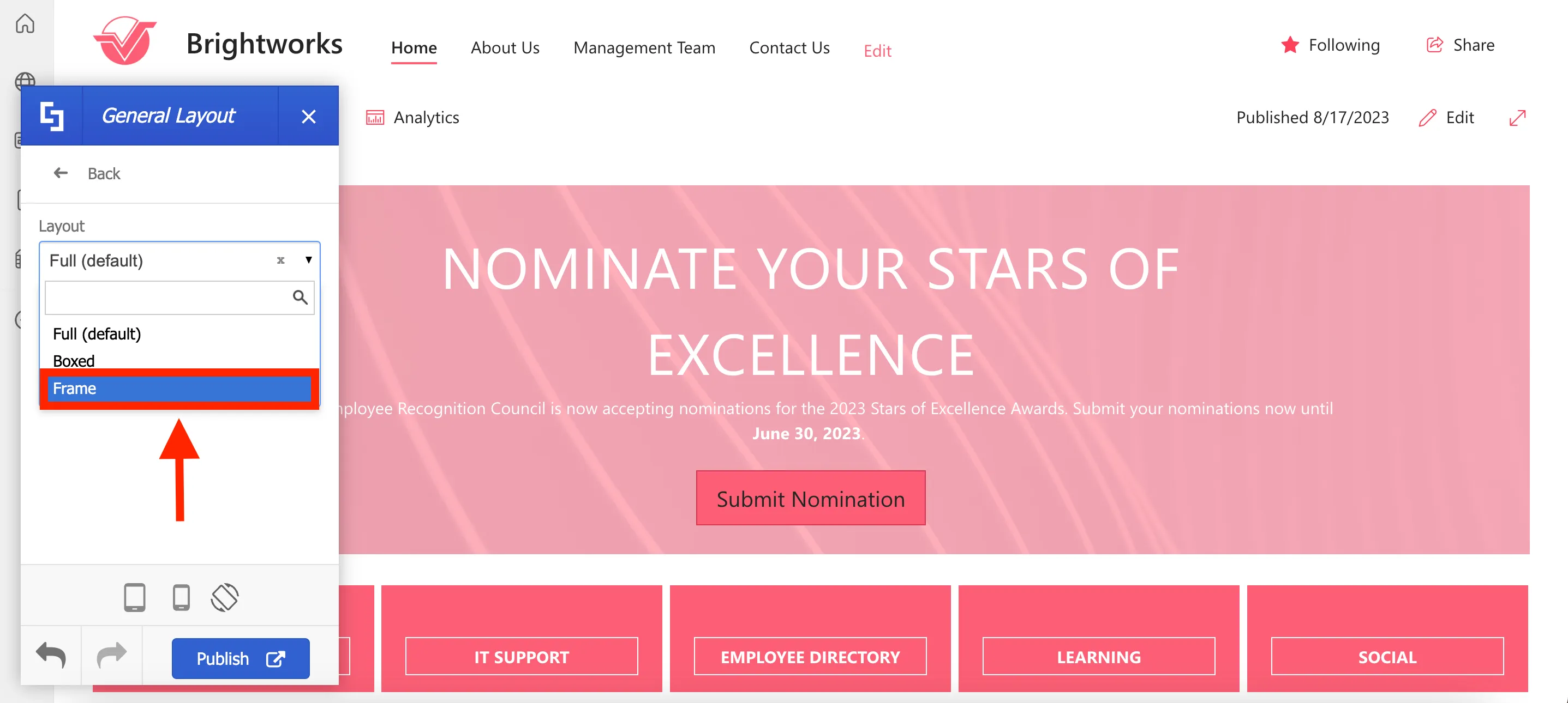
Let’s show you how to apply a simple change to the look of your site. In the main Theme Builder menu, choose General Settings.
Then select General Layout from the available options.

Here, you will see three page layout options to choose from:
- Full - this is the default layout of your page.
- Boxed - this layout allows you to add a border on the left and right sides of your page.
- Frame - this layout allows you to add a border on all sides of your page.
For this guide, we will choose the Frame layout.
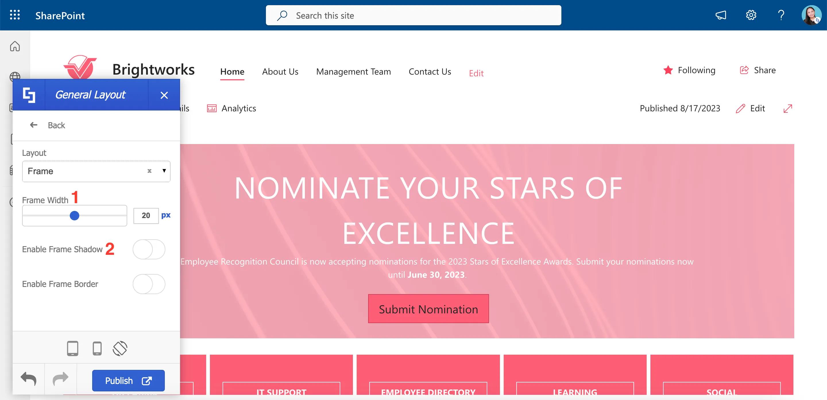
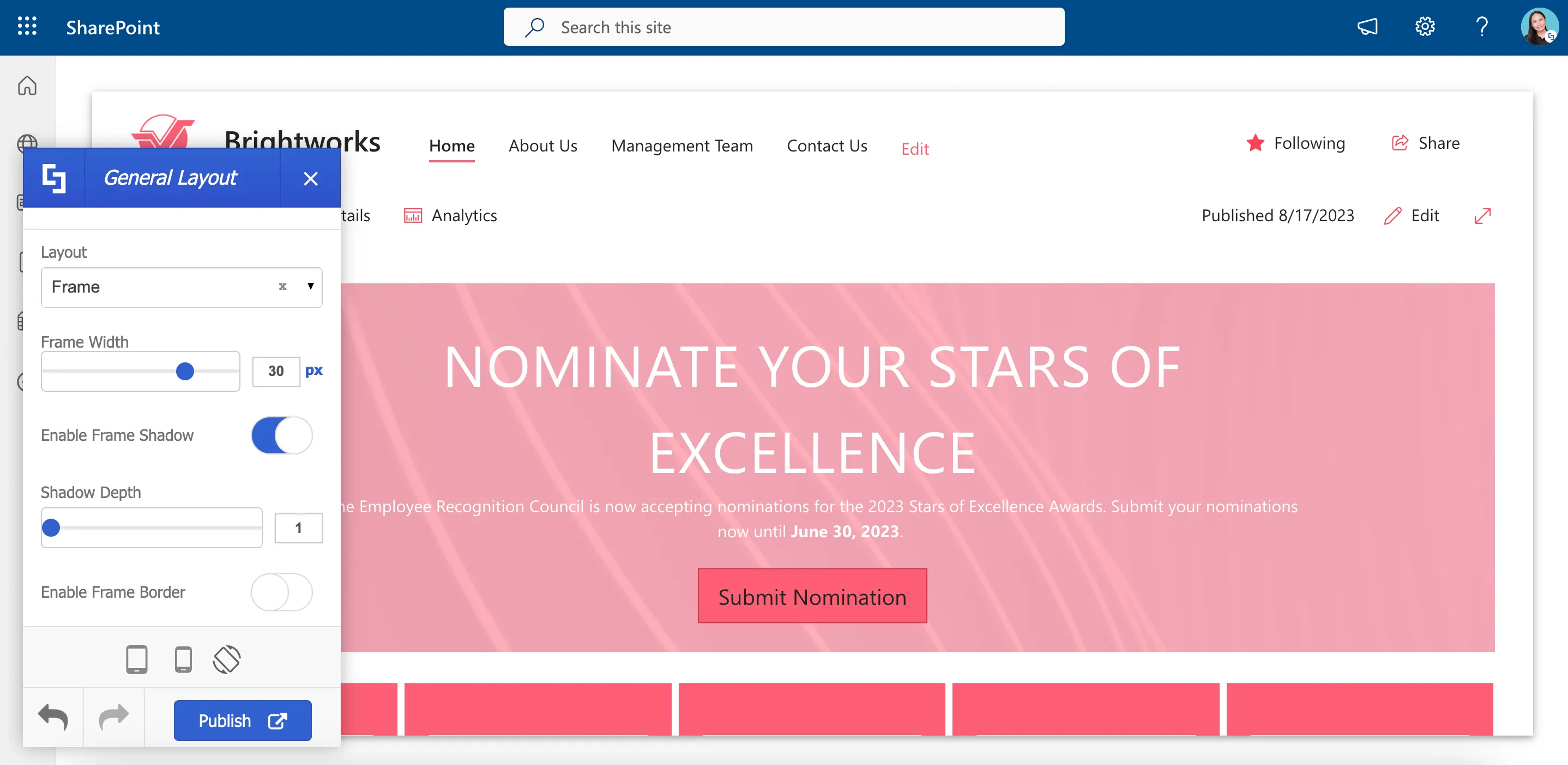
Each of the layout options provides additional settings that you can customize according to your preferences. For example, let us change the [1] Frame width to 30 px and toggle on [2] Enable Frame Shadow.
Your page will now look like this:
Once you have made the desired changes to the page layout, click Publish.

After publishing, the new page layout will be visible to all your site users.
Congratulations! You now know the basics of ShortPoint Theme Builder. You can start creating a stunning intranet site with minimal customizations. Enjoy exploring more features and unleashing your creativity.
Modify SharePoint site page elements
In this lesson, you will learn how to apply Focus Mode for a cleaner and modern-looking SharePoint page. You will also learn how to hide SharePoint site page elements and enable other features for a more user-friendly site.
Applying Focus Mode
Every SharePoint site has a set of page elements that can be consistently found on your site. These elements include the SharePoint suite bar, page actions, hub sites menu, additional details, and more. You may wish to hide these page elements either to achieve a cleaner page design or to limit their visibility and accessibility to your users.
To accomplish this, launch the ShortPoint Theme Builder and navigate to the General Settings category.
From there, select Elements.
In the Elements section, you'll find a list of pages where you can apply your changes. If you want to modify page elements on the home page only, you can select Home Page and make your changes. For this guide, however, we want to apply changes to all sites, so we will select All Sites.
First, we want to hide our page’s SharePoint suite bar and action options:
To do this, you must enable Focus Mode.

With Focus Mode enabled, your page’s SharePoint suite bar and action options will be hidden and you will notice an arrow-down icon on the right-hand corner of your screen. To access the hidden SharePoint suitebar again, simply click the arrow-down icon.

Hiding SharePoint page elements
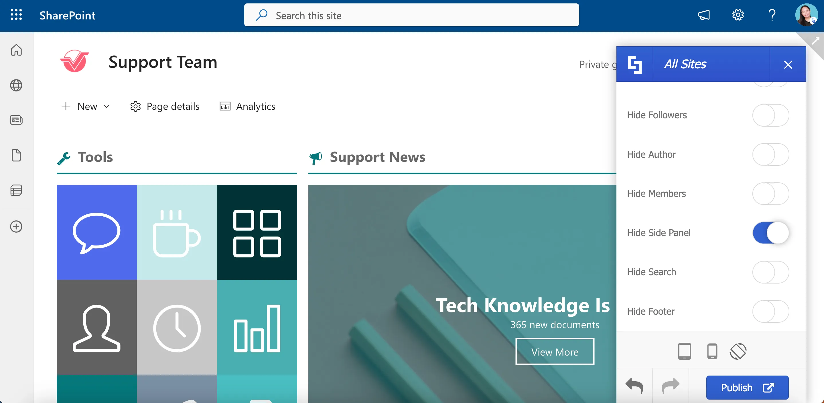
In addition to Focus Mode, the Theme Builder offers the ability to hide specific page elements based on your needs.
For instance, if you have Teams sites, it typically comes with a side panel navigation.
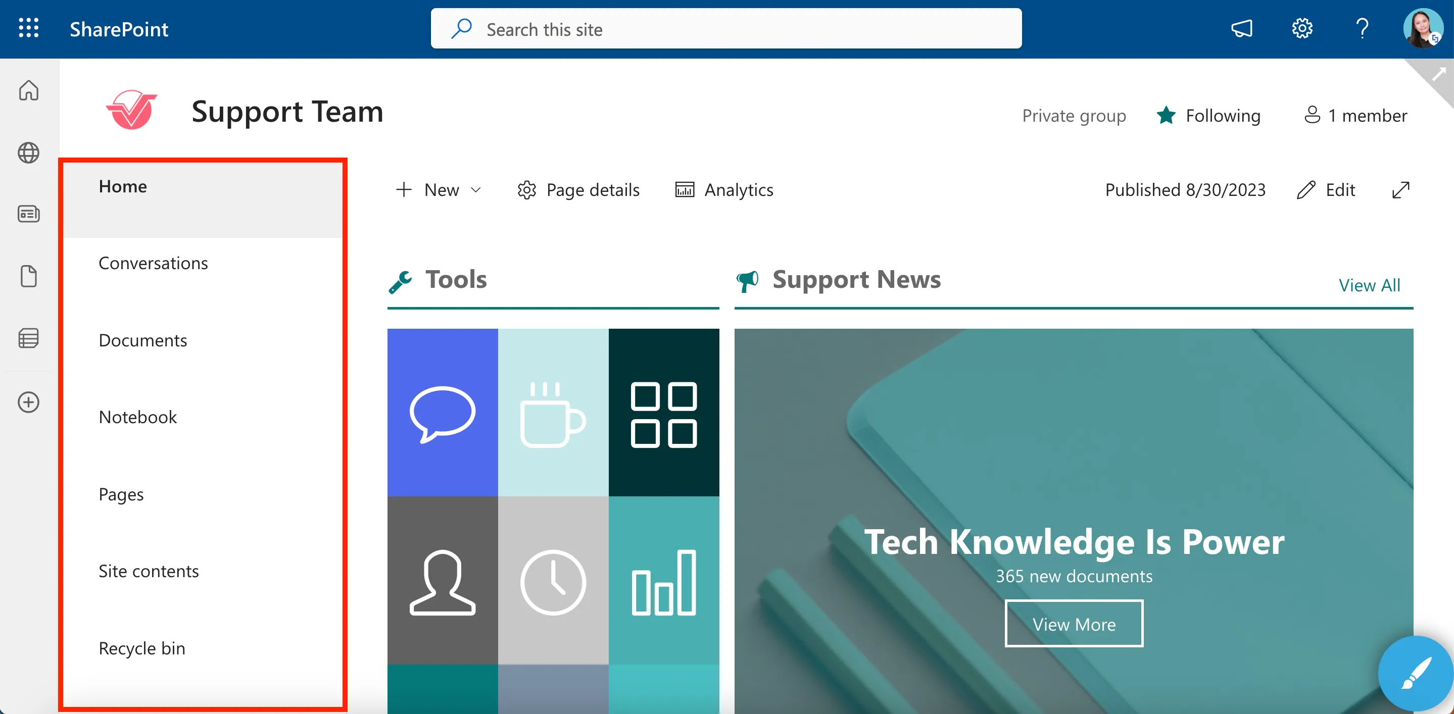
You can easily hide this side panel by enabling the Hide Side Panel option.

Your Teams site will now look like this:
Additionally, if your site is connected to a Hub Site, you will see a Hub Sites Menu:
To hide it, simply enable the Hide Hub Sites Menu option.
The Hub Sites Menu will now be hidden on your page:
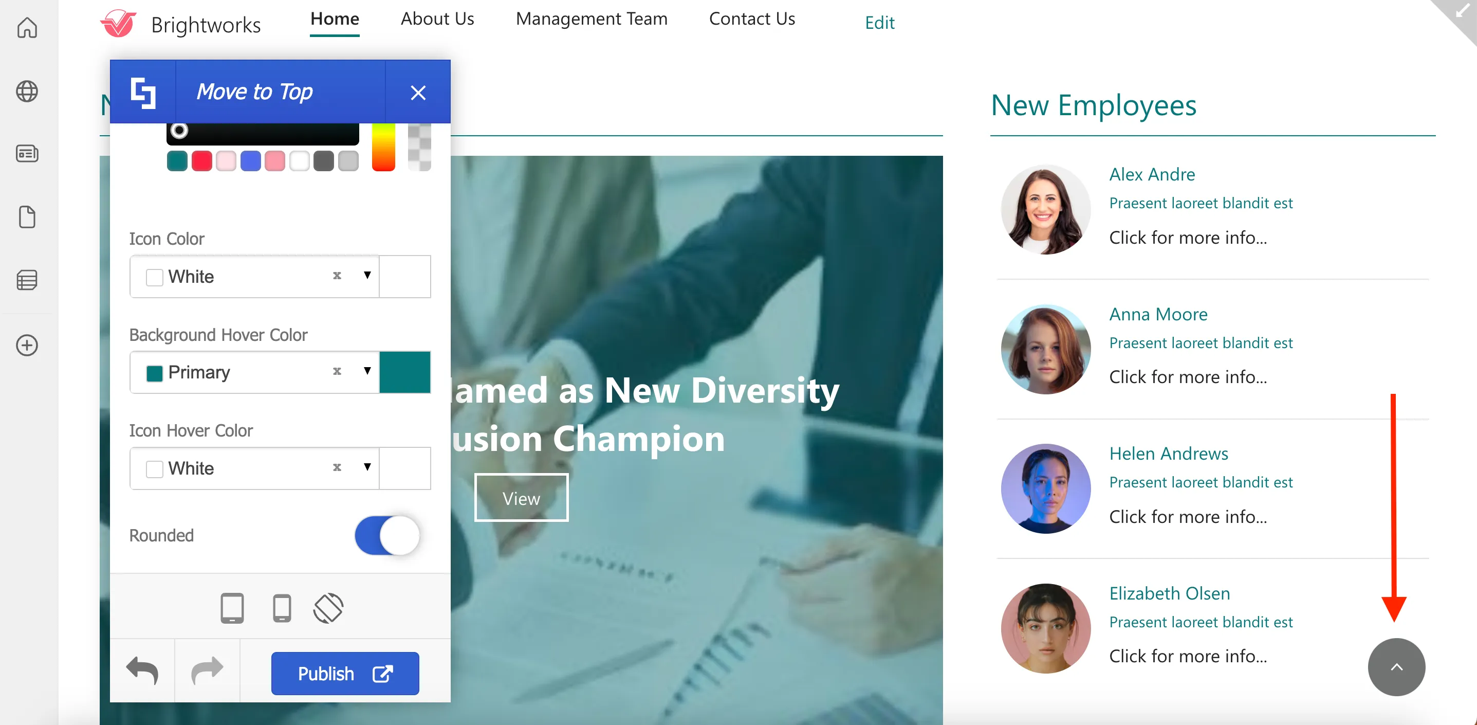
Enabling Move to top
Now, let's revisit the General Settings category in the Theme Builder. Here, you will see the Move to Top option, which allows you to add a small widget that enables users to easily move to the top of the page, removing the need to manually scroll back up.
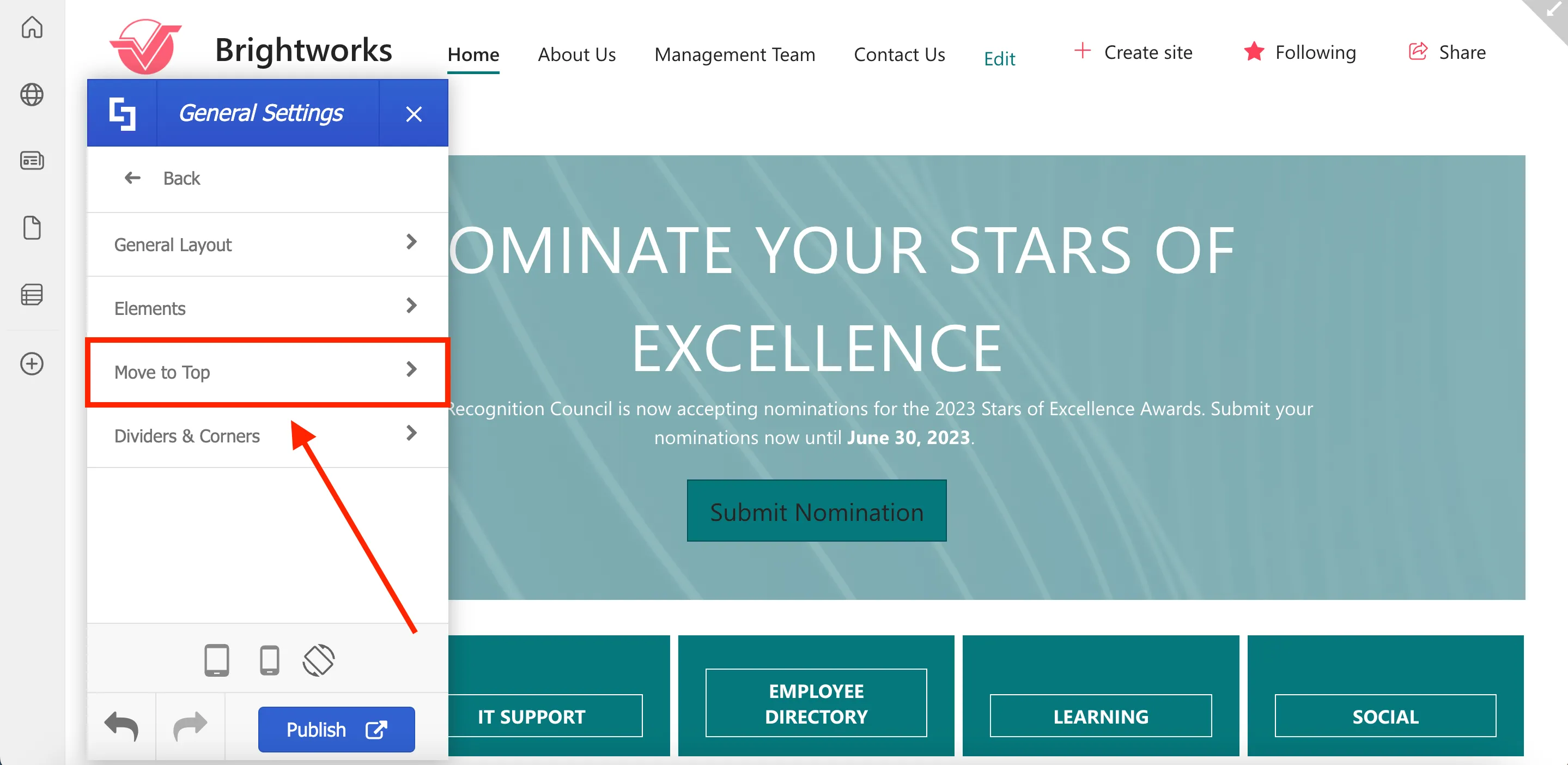
To enable Move to Top, simply toggle on the button.
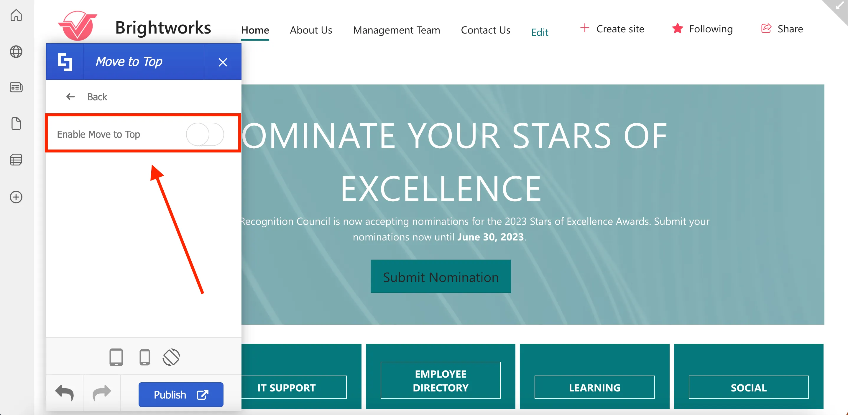
You will now see a small widget at the bottom right corner of the page. When users click on this widget, they will be brought back to the top of the page instantly.
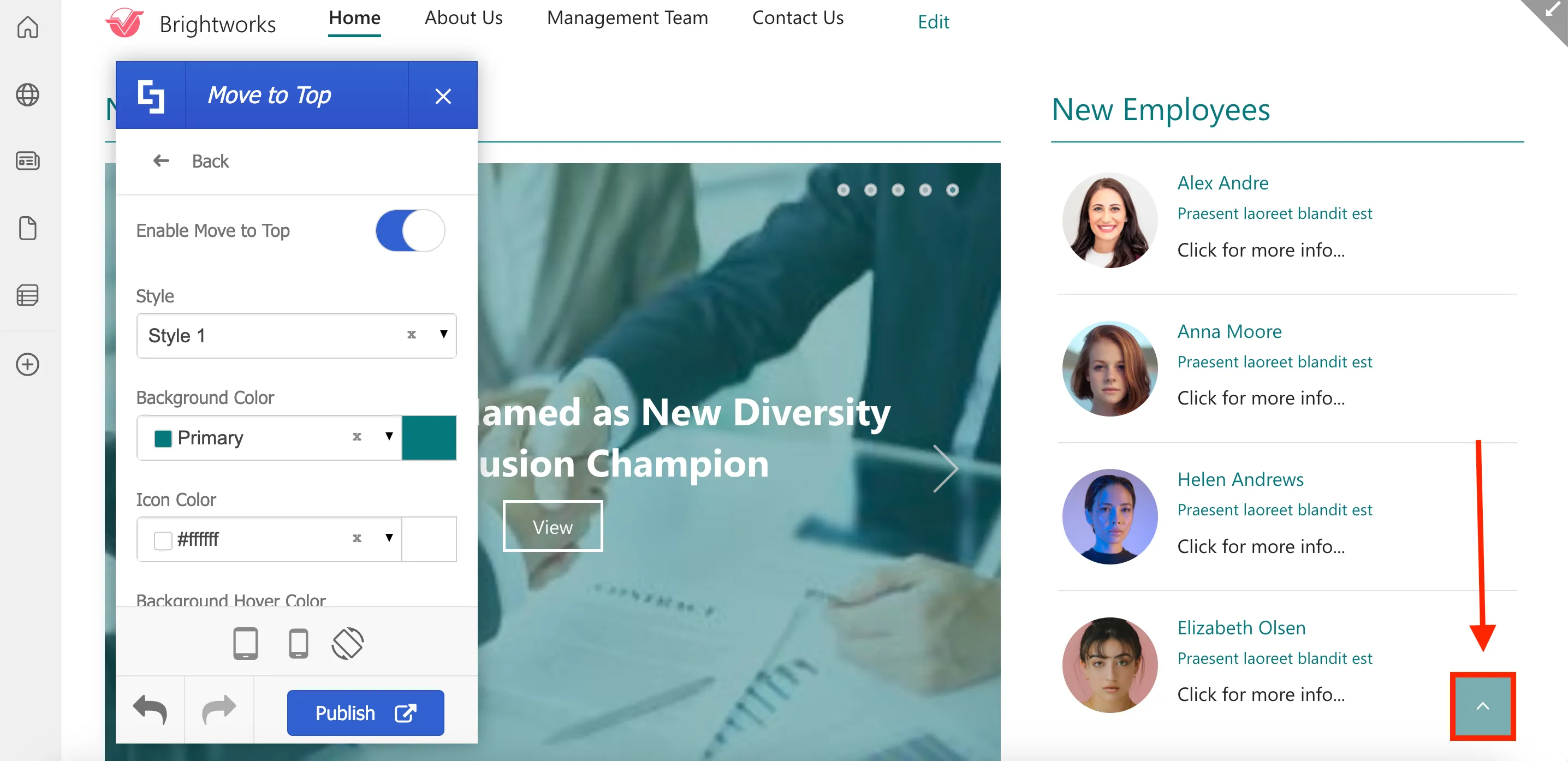
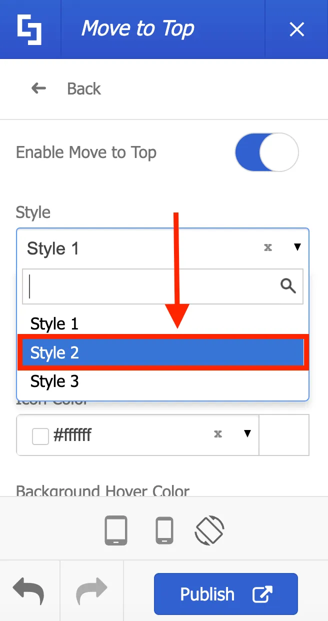
You can easily customize your widget to match your site's design. For example, let us change the style, color, and shape of the widget.
To change the widget style, simply select the Style you prefer from the drop-down. Let’s choose Style 2 for this guide.
Next, let’s customize the widget color. To do this, select a Background Color from the color picker.
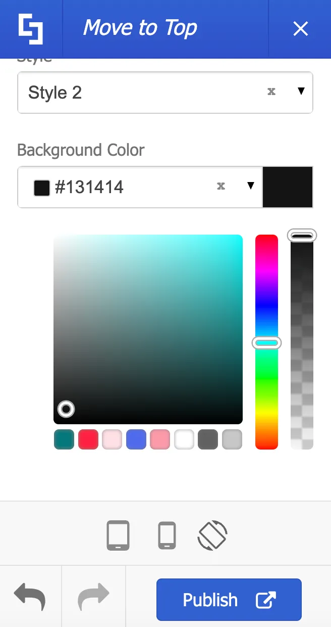
Lastly, to change the shape of the widget, simply enable the Rounded option.
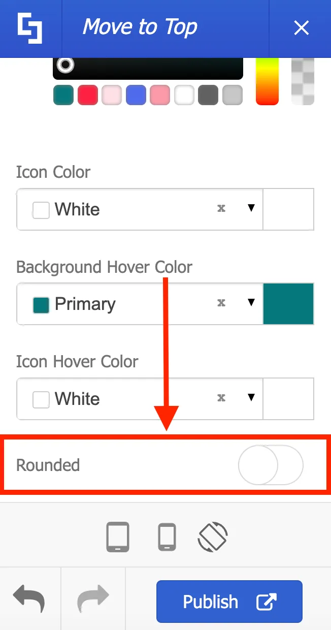
Your widget will now look like this:
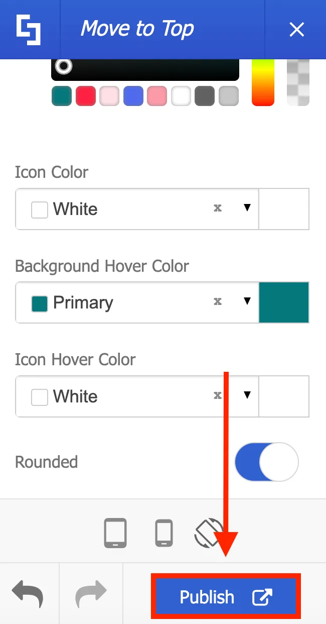
Once you are satisfied with all your edits, click Publish.
That’s it! You now know how to apply Focus Mode, hide SharePoint page elements, and enable Move to top. These simple yet impactful customizations will allow you to create a truly engaging intranet experience. Enjoy exploring these options on your own page.
Apply brand colors
When it comes to intranet design, colors play a vital role. They greatly impact how users perceive your site's content and your company's branding as a whole. In this lesson, you will learn how to update your site collection's color palette, how to save color themes, and how to apply brand colors to individual Design Element settings.
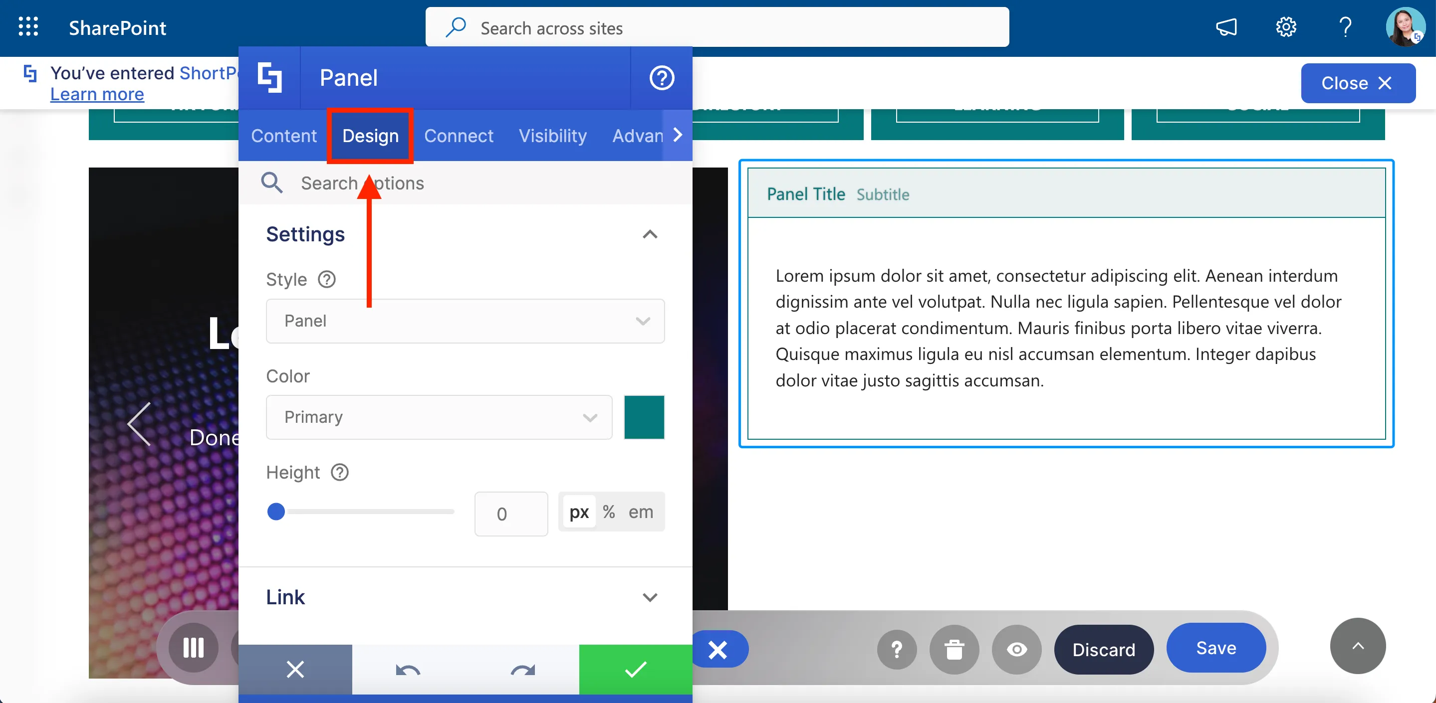
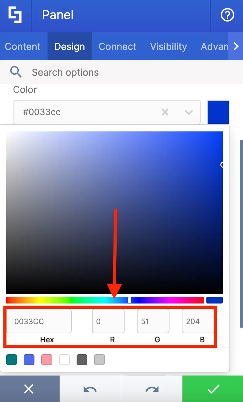
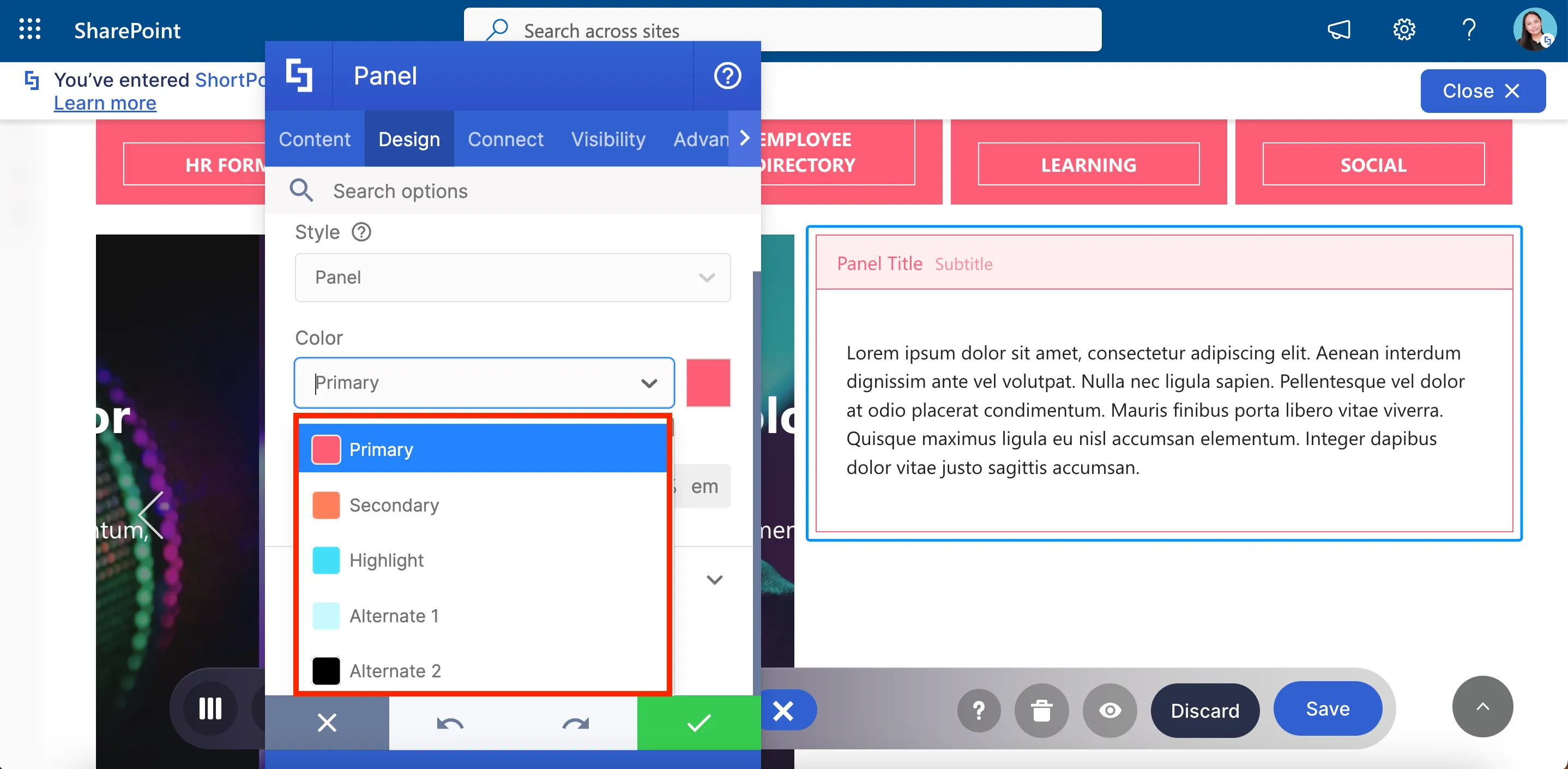
ShortPoint gives designers the flexibility to select colors for every Design Element and their components. For example, when you add a Panel Design Element to your page, you will be able to select the color you prefer in the Design tab.
You have several ways to customize the color. One way is to select a color from a dropdown menu.
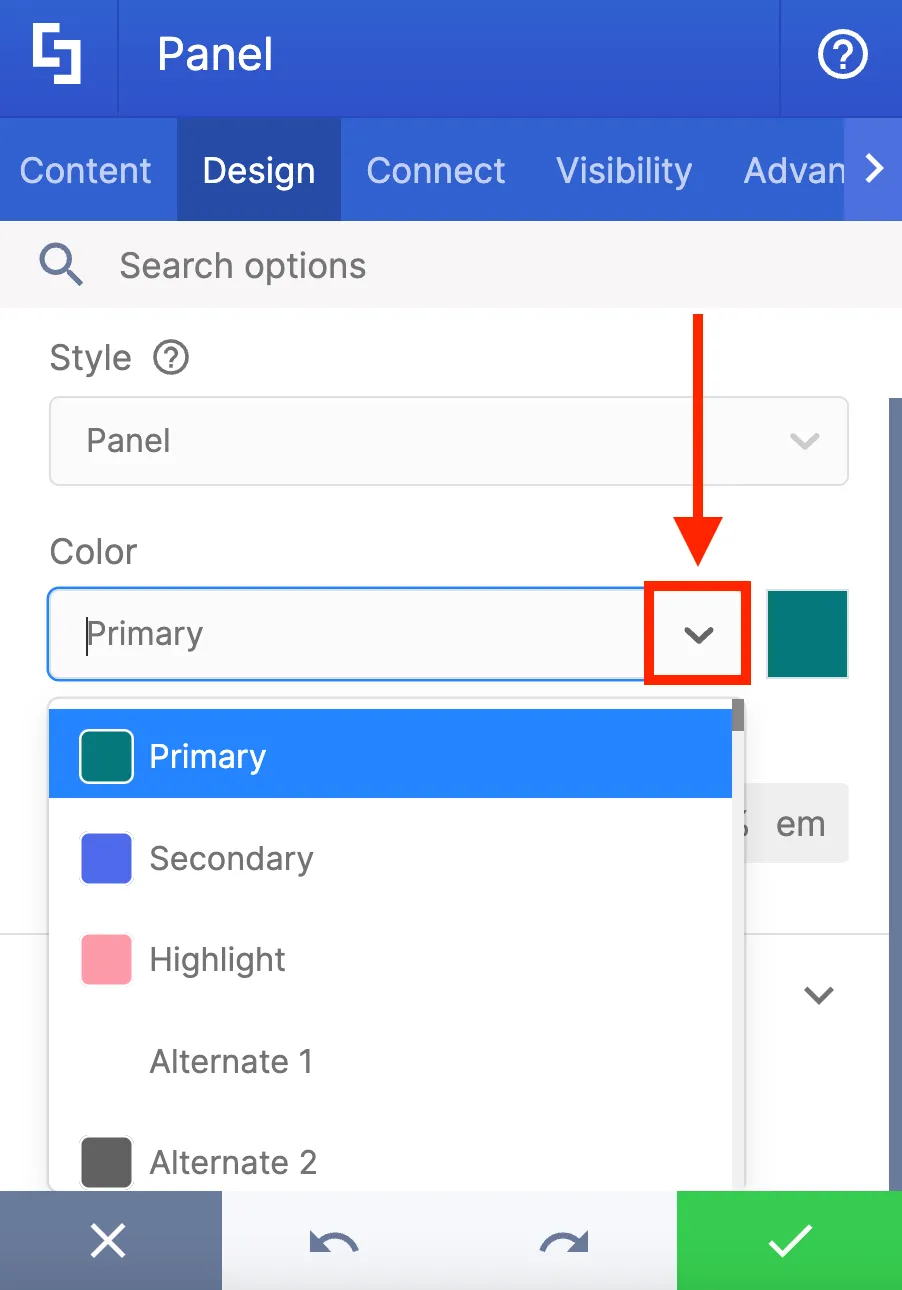
Another is to use the color picker to choose a specific shade.
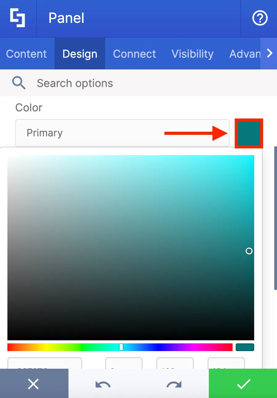
Or you can directly paste a hex code or an RGB code.
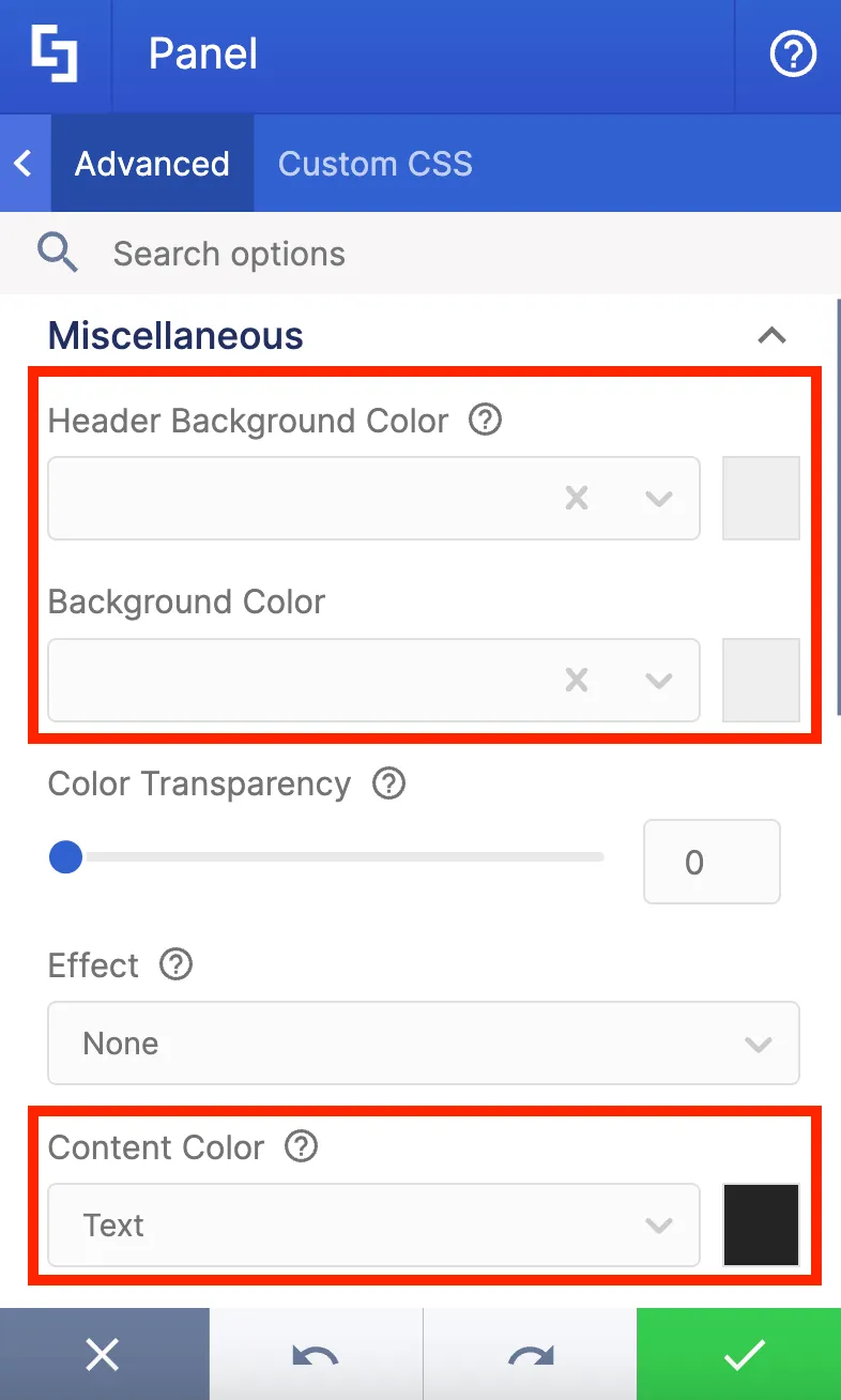
Furthermore, if you navigate to the Advanced tab, you can customize the color of each individual component within the Panel. For example, you can change the header background color, background color, content color, and many more.
However, if you're aiming for a consistent appearance throughout your site, it can be time-consuming to manually input the appropriate branding color for each Design Element. That's where the ShortPoint Theme Builder comes in handy. You can set your company's brand colors as the default color theme of your site in just a few clicks.
Updating the site’s color palette
To change your site’s color scheme, launch Theme Builder and select Branding.

From there, select Color Palette.
Here, you'll find six fields where you can enter the specific colors for your company's brand.
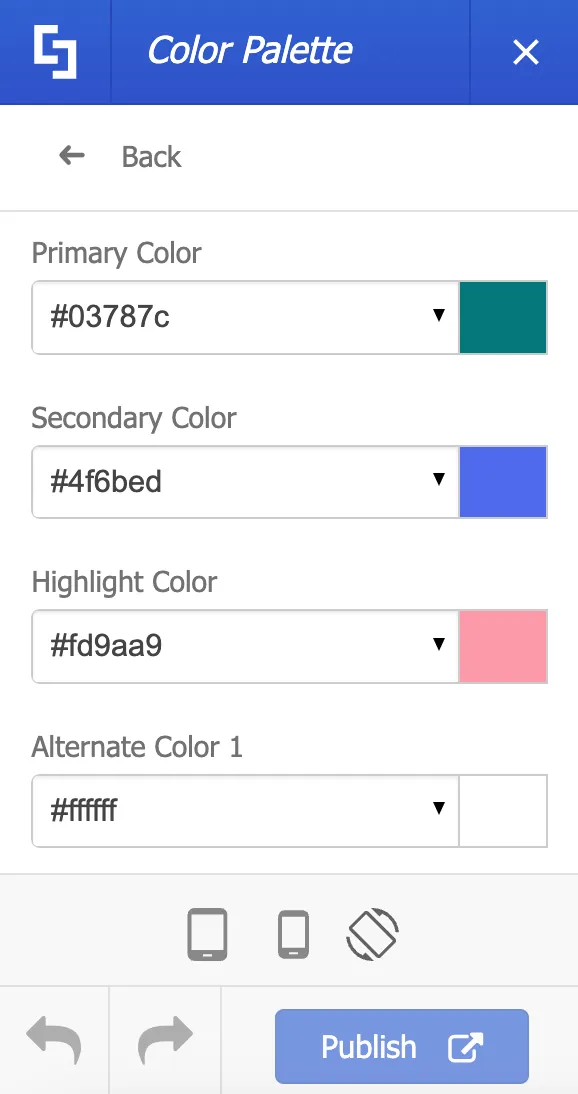
Let's take Brightwork's brand guidelines as an example and assign the prescribed color scheme to our site.
To add your desired color, simply paste the HEX code in the appropriate field.
You will notice that whenever you make a change in the Color Palette, it will be instantly applied to the page you're currently viewing. It's important to note that these modifications won't be visible to other users until you hit the Publish button.
You will also notice that all other color fields within the Theme Builder will now display your brand colors as convenient options in dropdown menus. For example, in the background color drop-down, you can now see the colors we have set up in the Color Palette.
Once you are satisfied with your changes to the Color Palette, click Publish.
Customizing Design Element colors
Now, let’s go back to the Panel Design Element we used at the start of this lesson. You will notice that the colors you’ve set up in the Color Palette will now appear in the Panel’s color drop-down menu. You can now conveniently use these colors to customize all the Design Elements you add to your page.
Additionally, when you add a Design Element, its default color will match your new color scheme.
You'll also notice that when you add any of the Section and Page templates from the Templates Library, their colors will automatically match the color theme you've already set up.
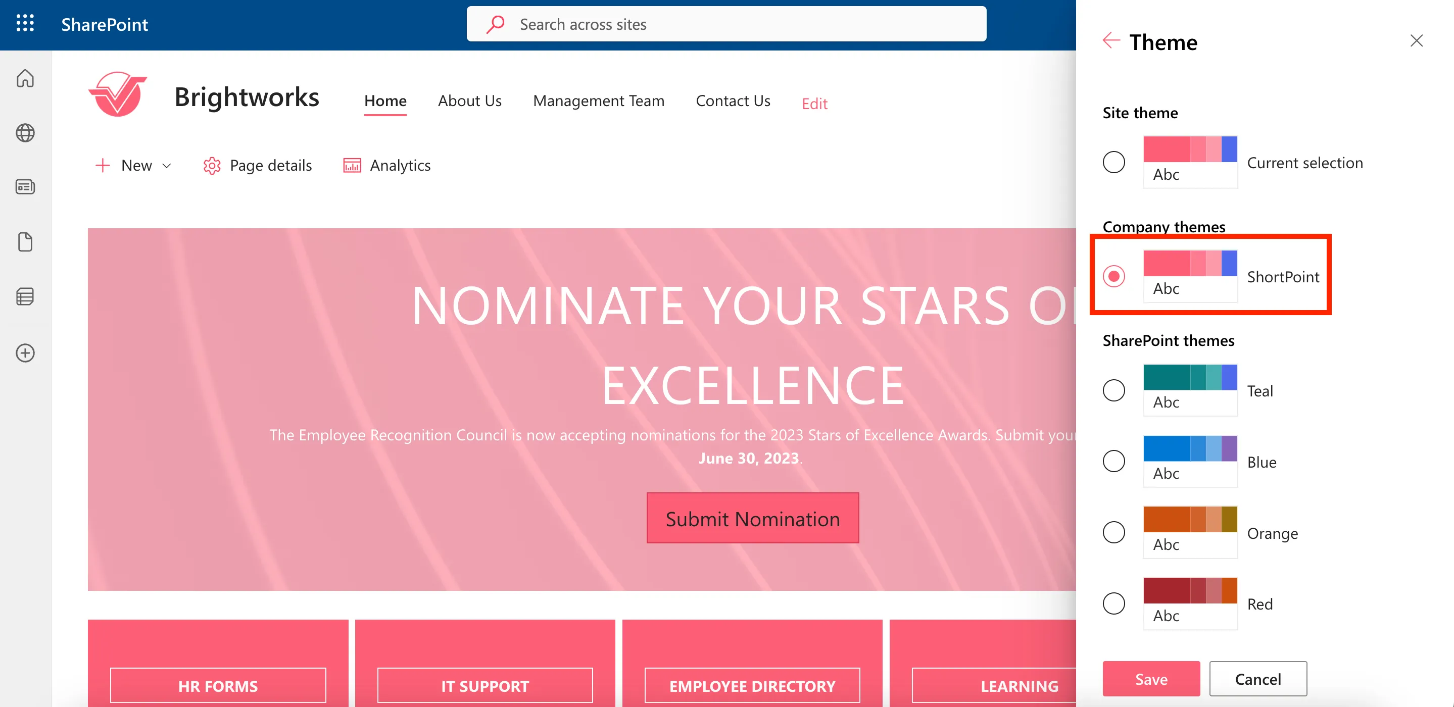
Saving color themes
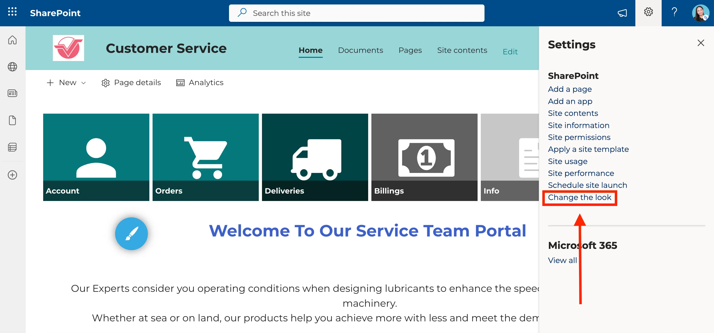
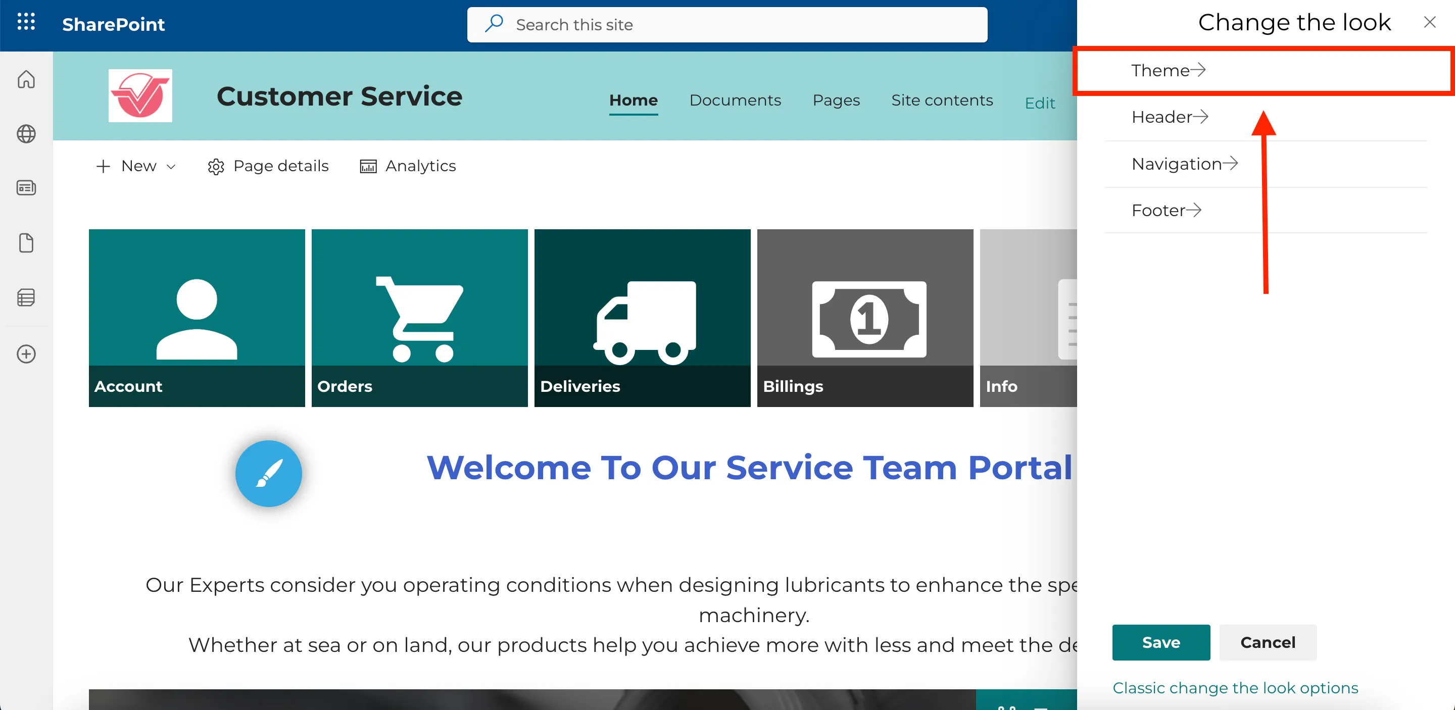
Now, let’s explore creating and saving color themes. In SharePoint, you can change the theme of your site by clicking Change the look.
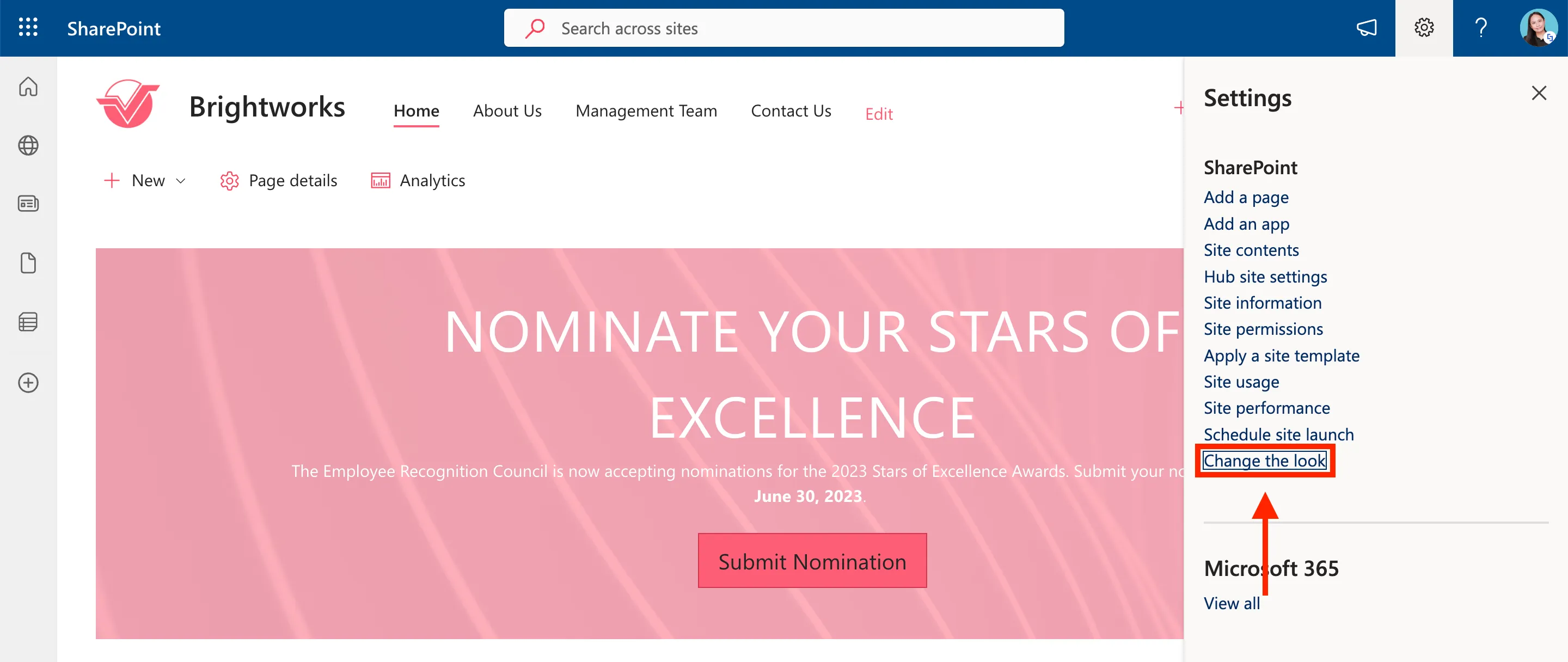
Then, select Theme.
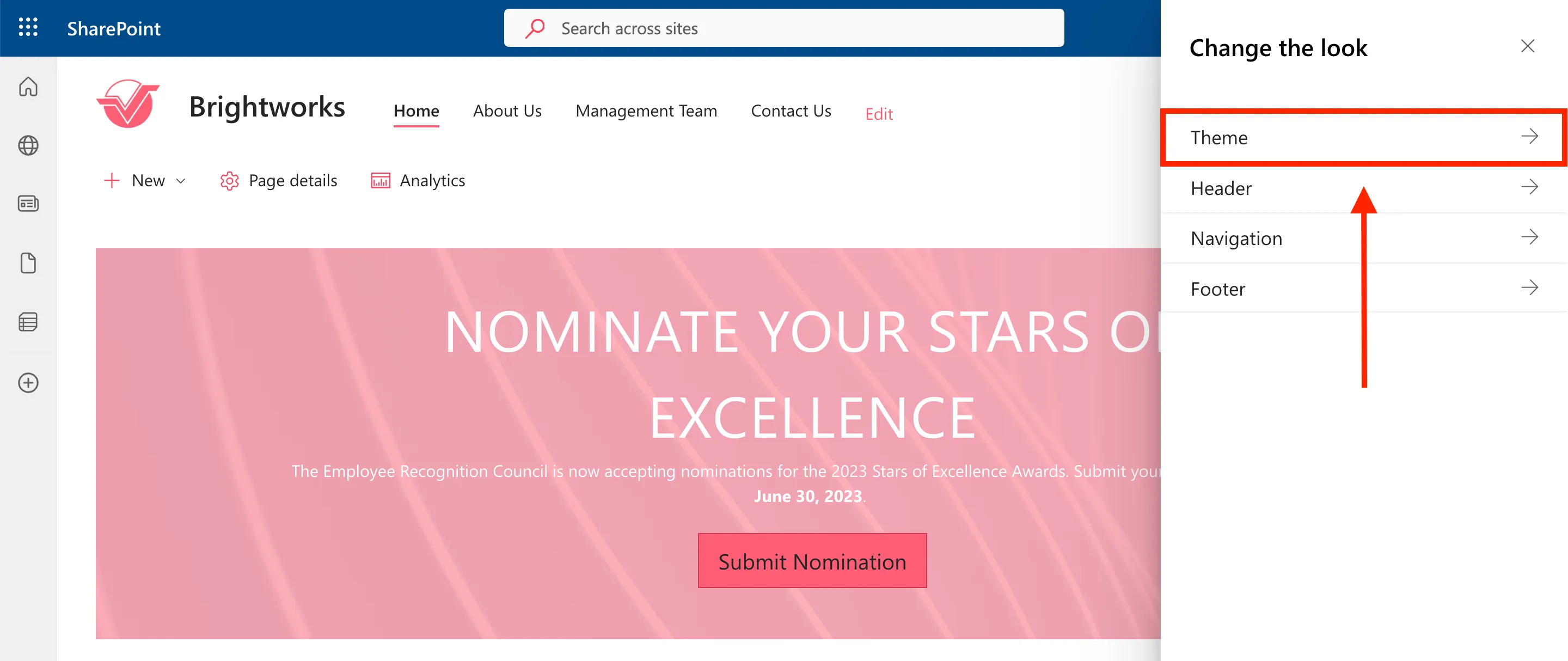
You will notice that ShortPoint Theme Builder automatically created a theme called “ShortPoint” from the colors you added to the Color Palette. ShortPoint Theme Builder allows you to create and save color themes. Once you save your color themes, you will also see them in this side panel.
To do this, launch the Theme Builder of the page you want to use to create a color theme.
Then, select Branding.
Click Color Palette.
And update the colors you want to use.
Then, click Back.
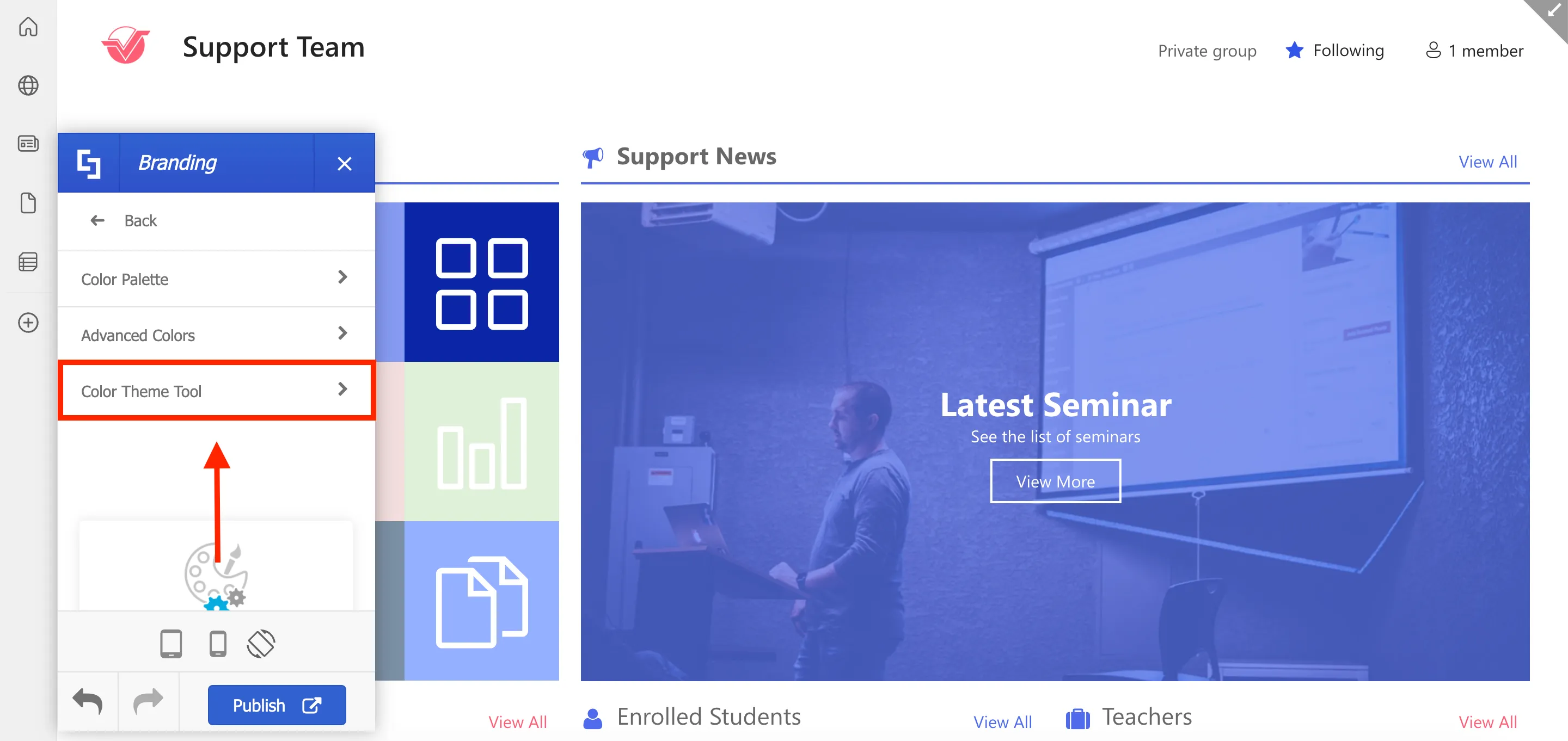
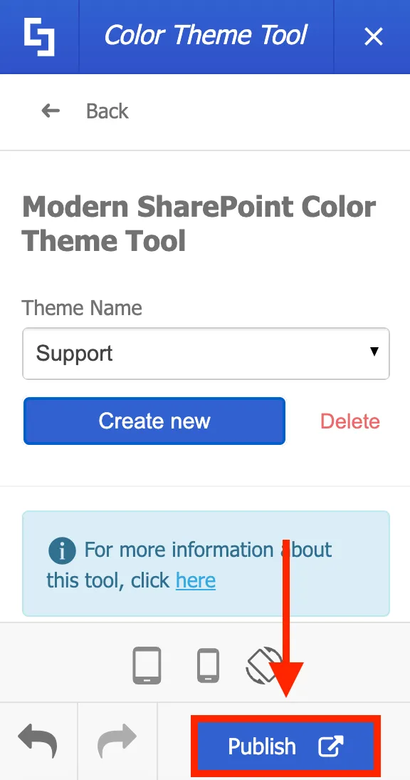
Select Color Theme Tool.
Give your color theme a [1] Theme Name and click [2] Create New.
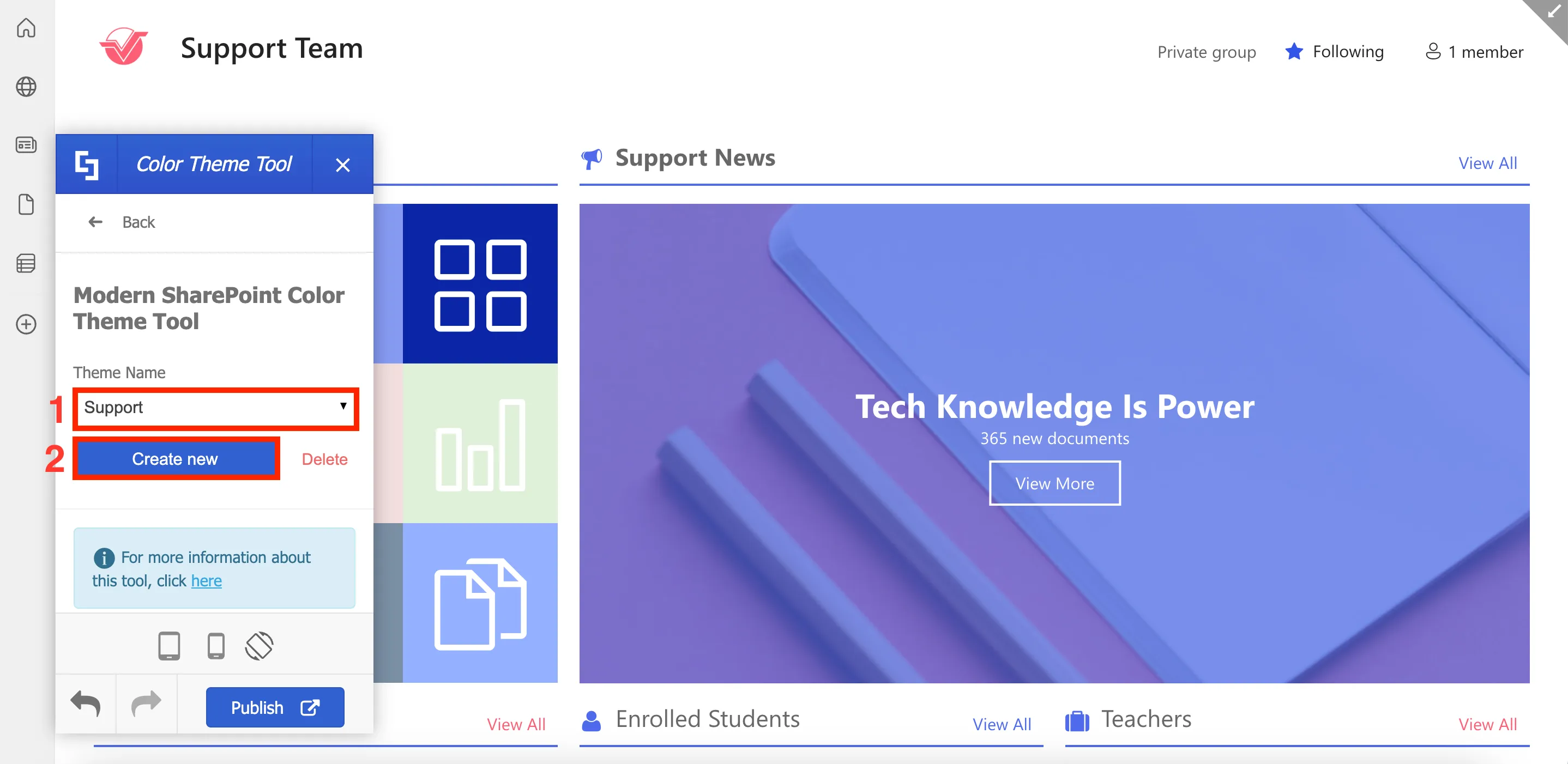
Then, click Publish to save all changes.
These newly created company themes will be available to you and other editors across multiple sites within your SharePoint tenancy.

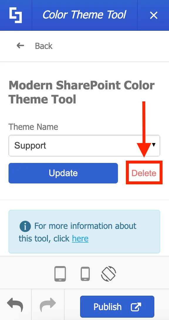
If you want to delete any ShortPoint-created color themes, go back to the Color Theme Tool, look for the theme you want to remove, and click Delete.
That's how simple it is to apply your company's brand colors using ShortPoint Theme Builder! Now, you can concentrate on how your colors can enhance the user's experience while they engage with your content.
Apply brand fonts and typography
Applying your brand's font and text style enhances the readability of your site, keeps your users interested, and, most importantly, enables your site to accurately reflect your brand. In this lesson, you will learn how to update the font used on your SharePoint site using ShortPoint Theme Builder. You will also learn how to upload custom fonts and apply different fonts for different elements on your site.
Selecting a base font
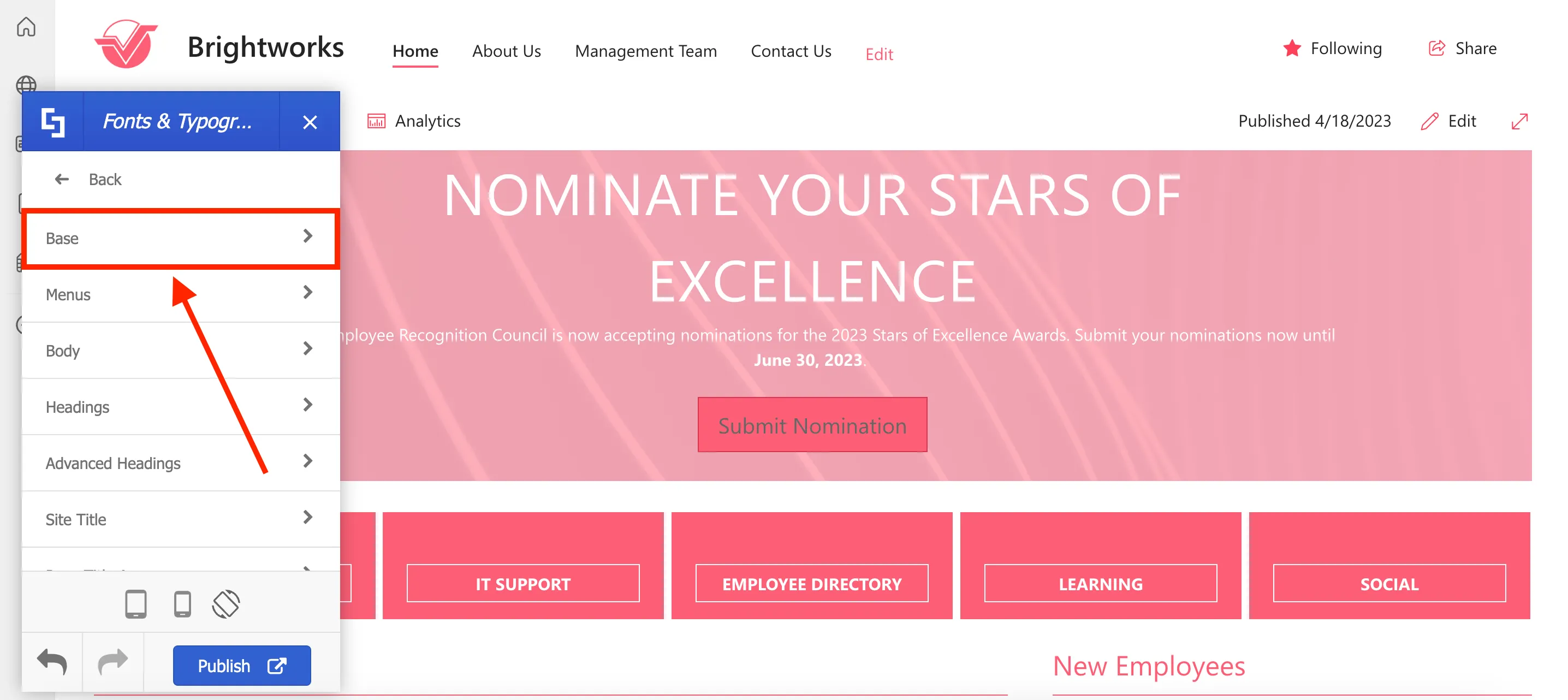
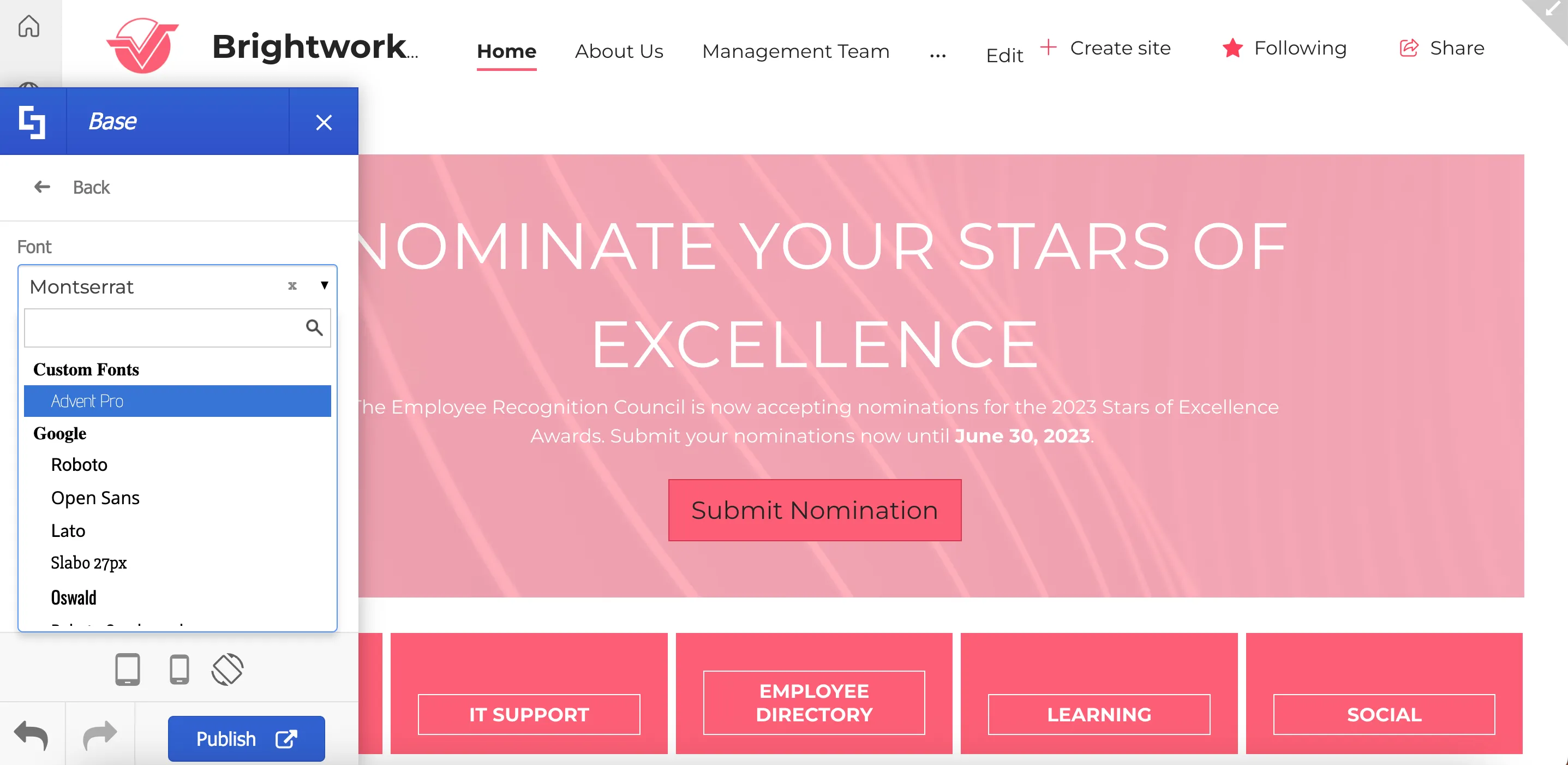
ShortPoint Theme Builder includes a dedicated section for customizing fonts and typography on your site. To begin, launch Theme Builder and select Fonts & Typography.
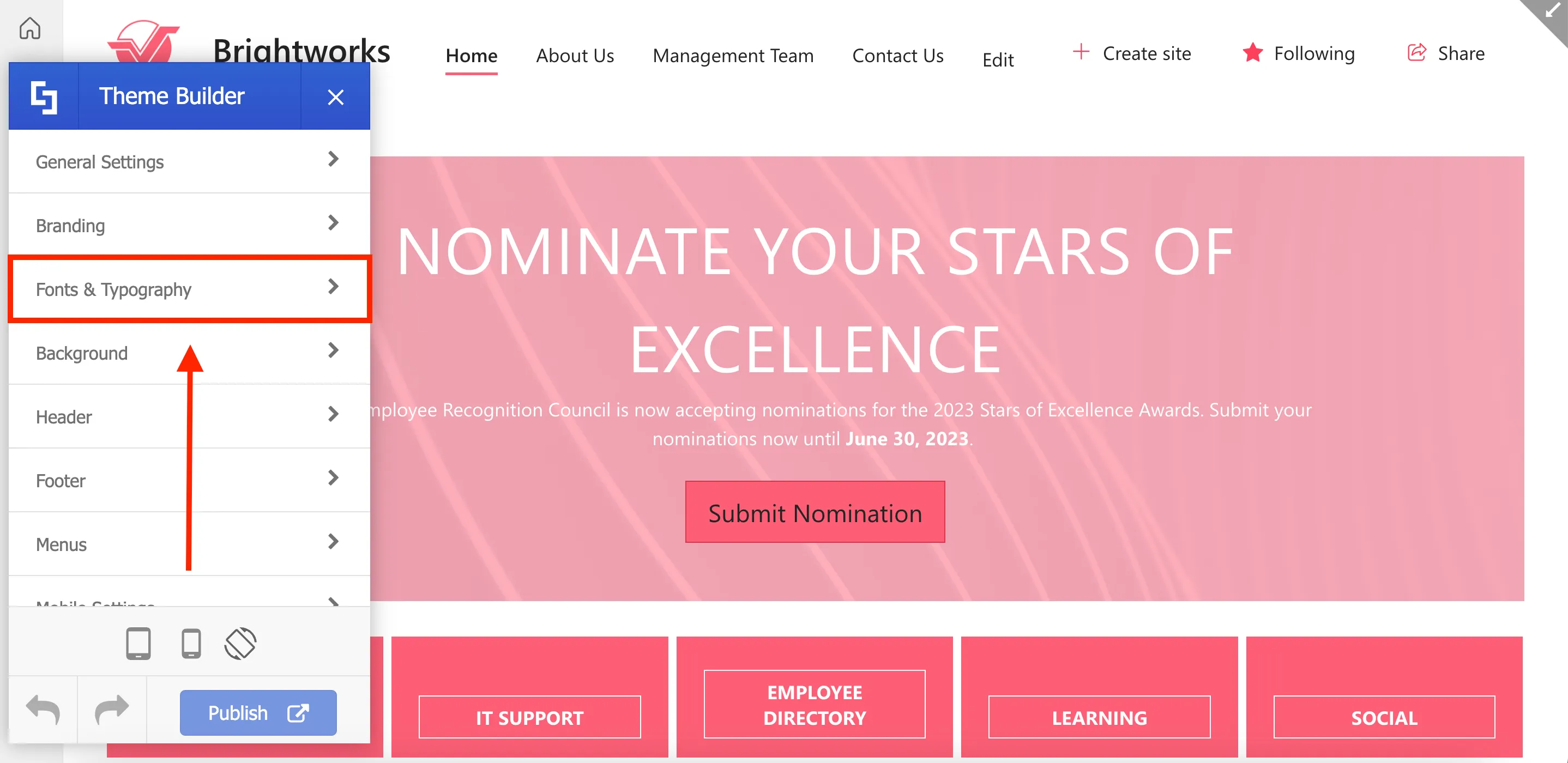
Then, select Base.
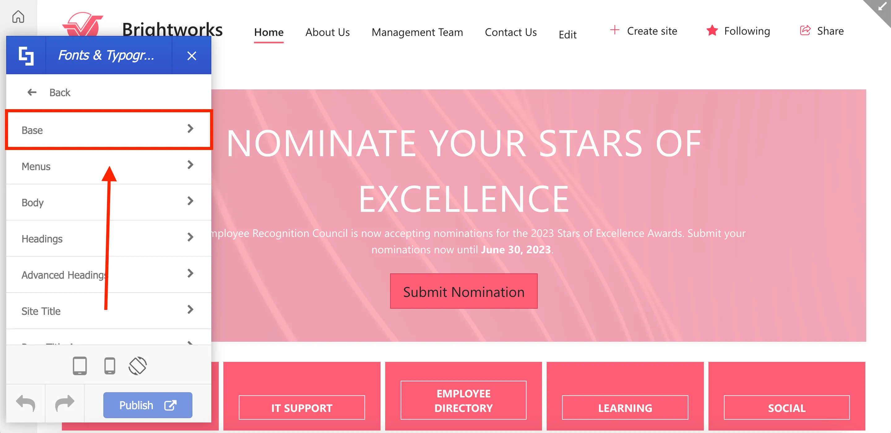
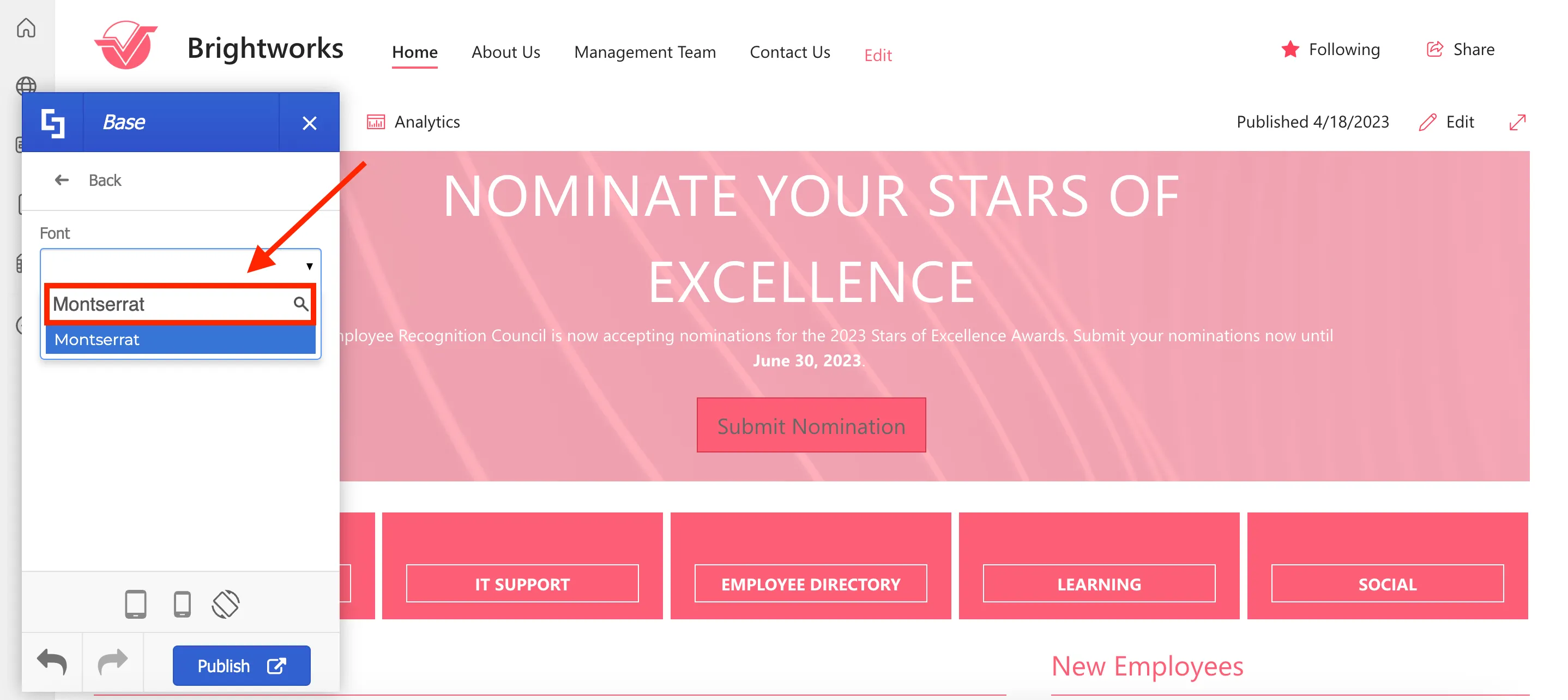
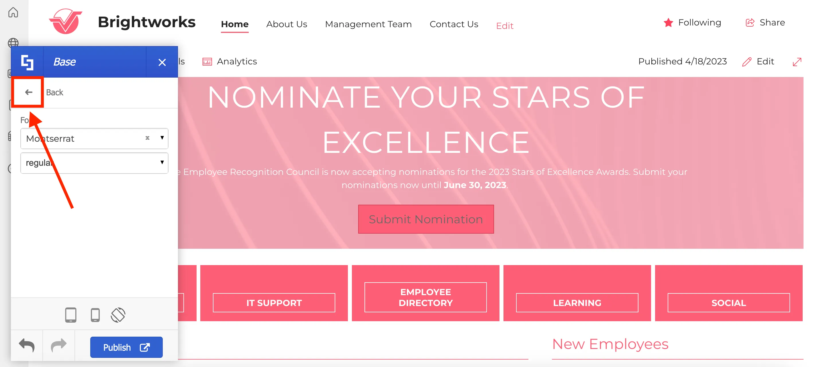
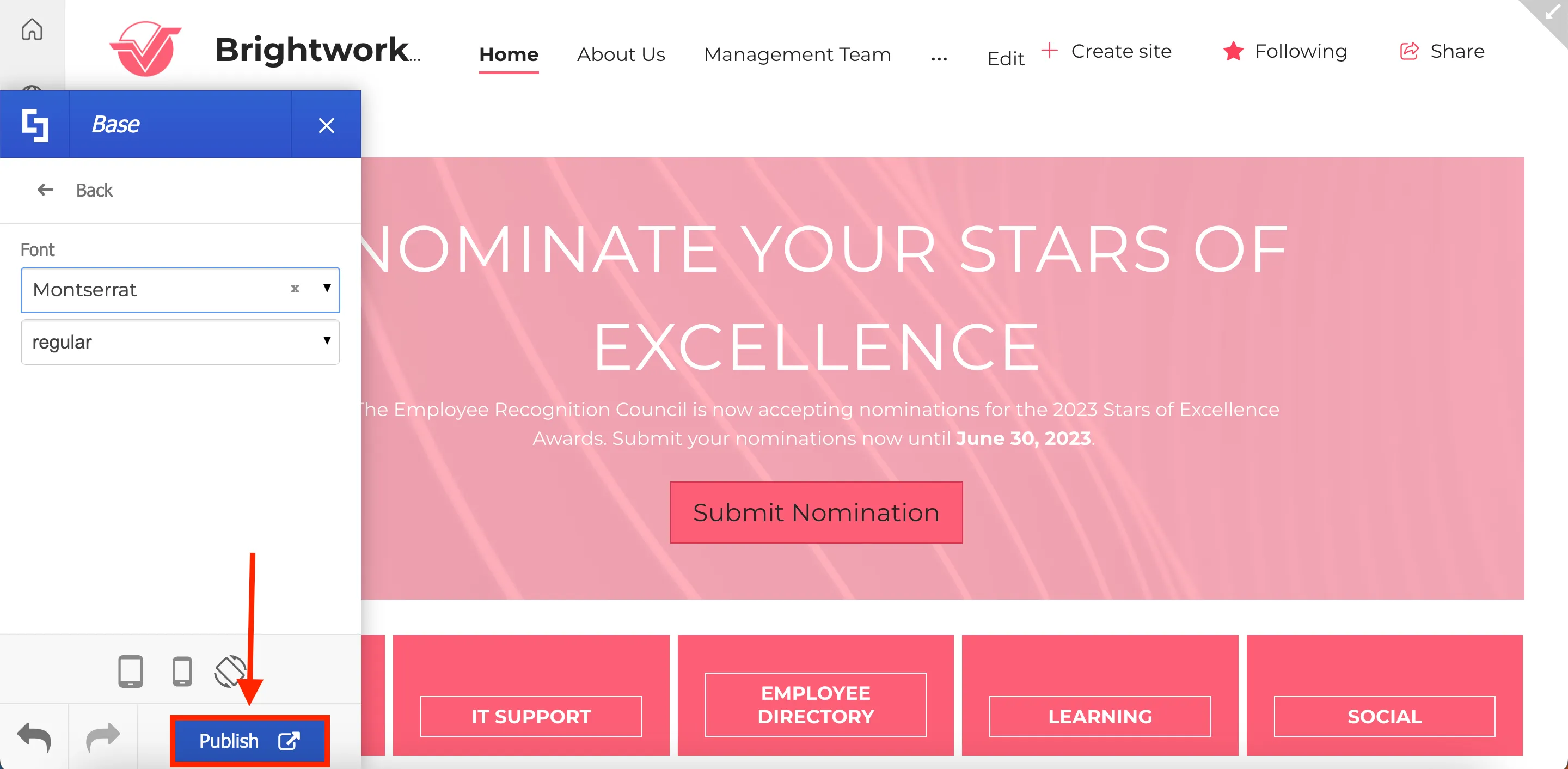
In the Font dropdown, you'll find a range of available fonts to select from. The font you choose will serve as the default font for all text. For this guide, we will select Montserrat.
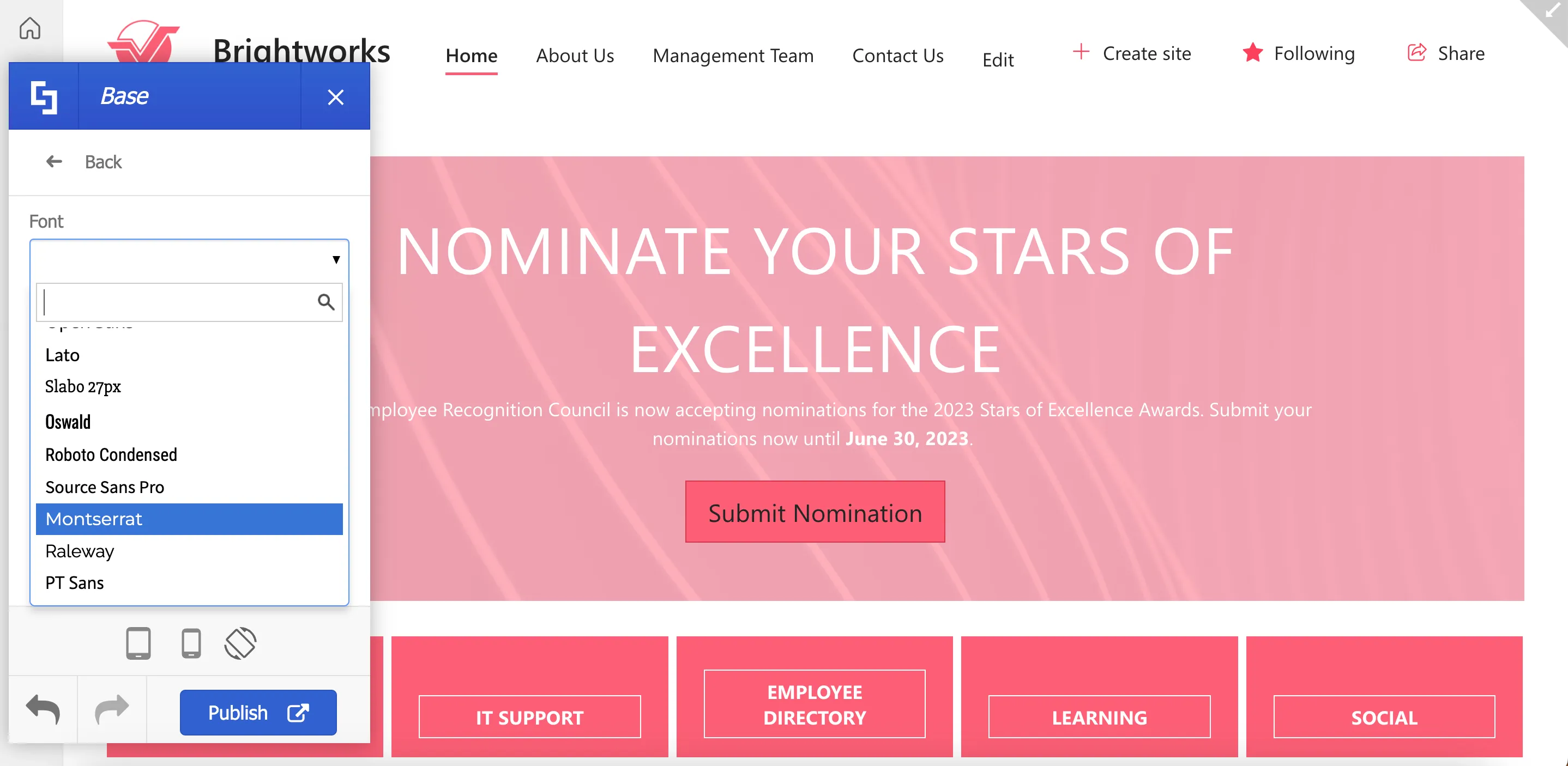
Once you've chosen a font, additional options for font styles will become accessible. Choose any option you prefer.
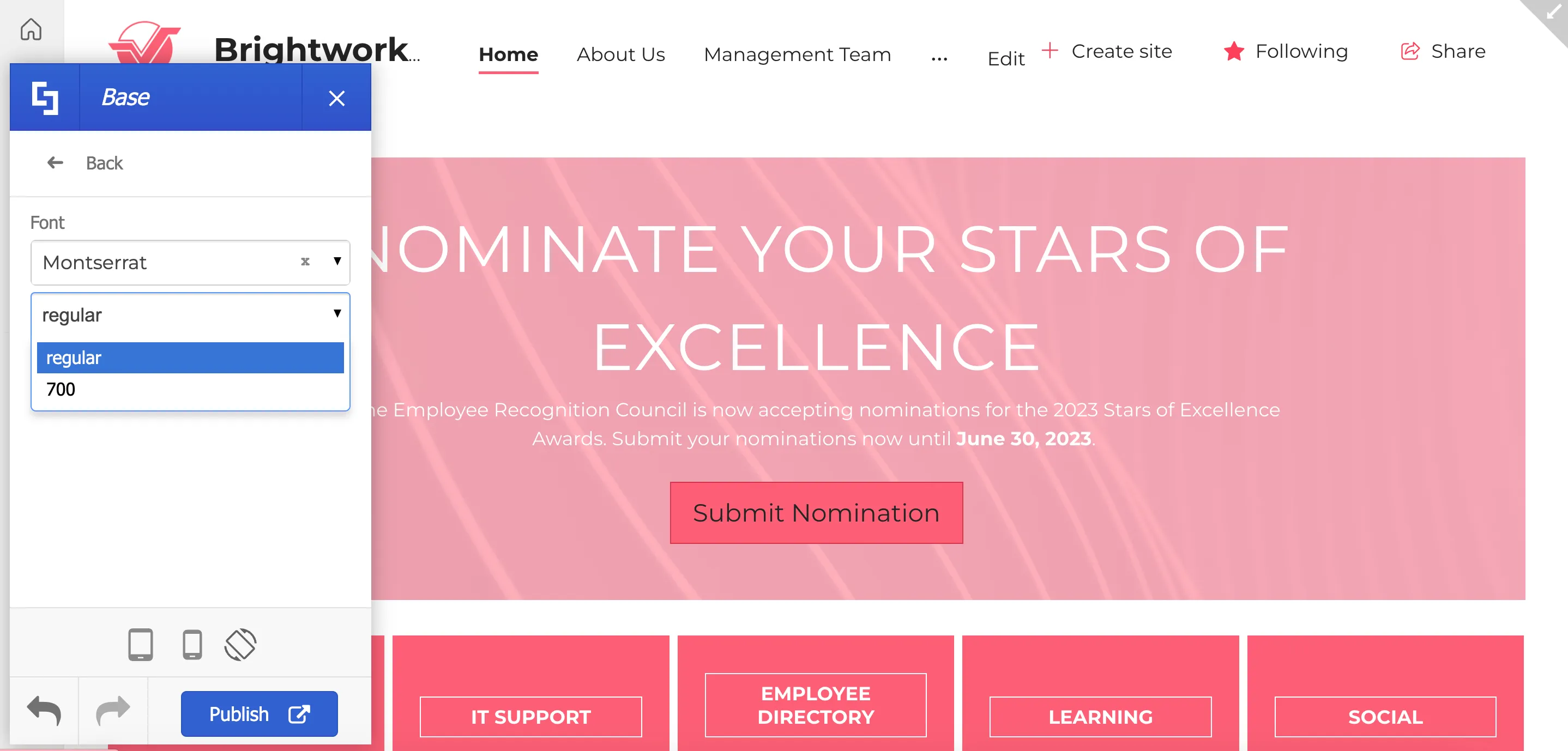
You will notice that the changes you make will be applied in real-time. Keep in mind that these customizations won't be visible to other users until you click Publish. This gives you the freedom to experiment with different fonts until you discover the perfect match for your requirements.
Setting font and typography for text elements
In addition to the Base font, you have the option to assign distinct fonts, font styles, and font settings, to specific page elements on your site.
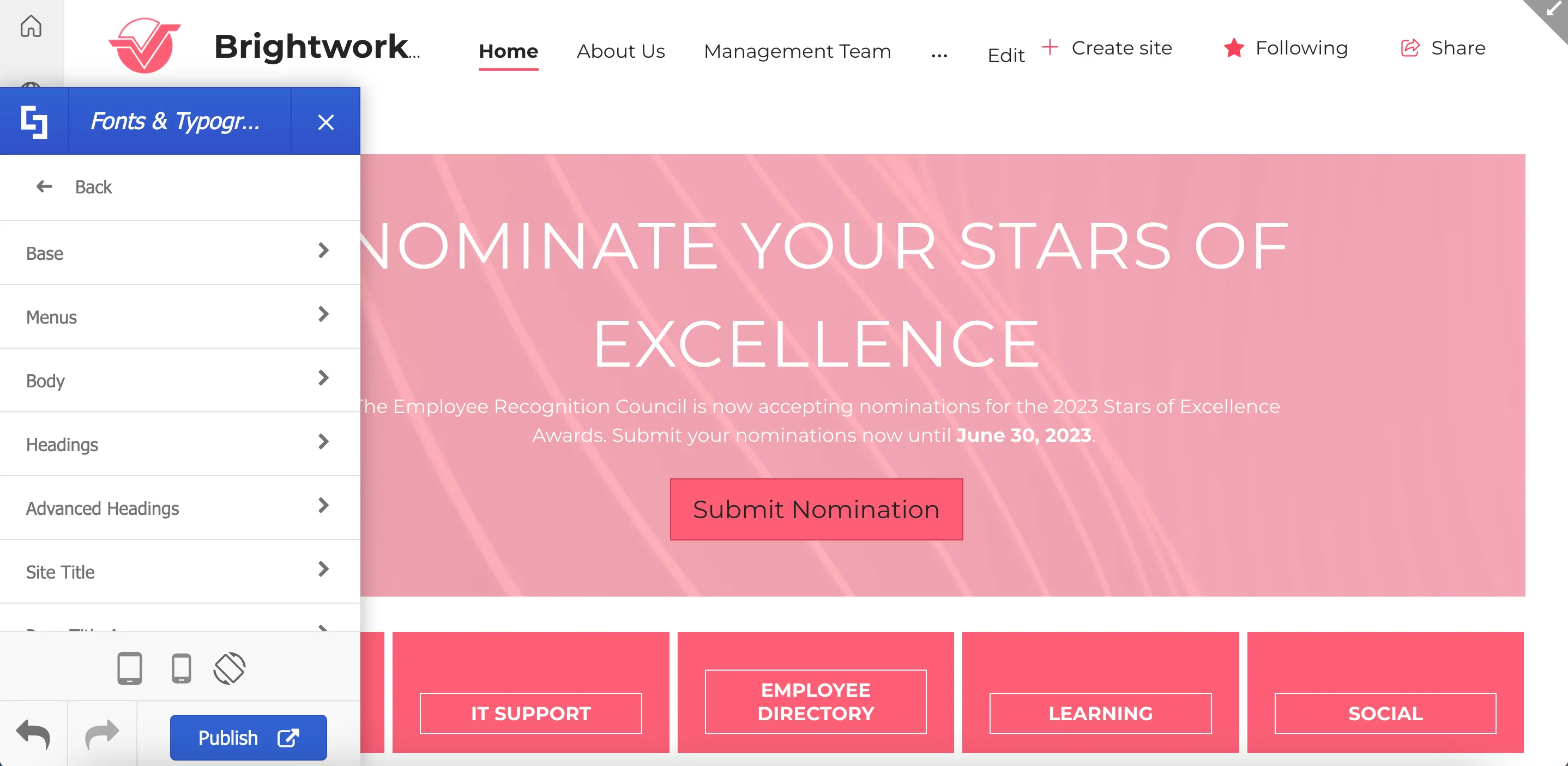
For example, if you want to apply headings specifications from your brand guidelines, select Headings.

Here, you can specify and customize different aspects of your heading font.
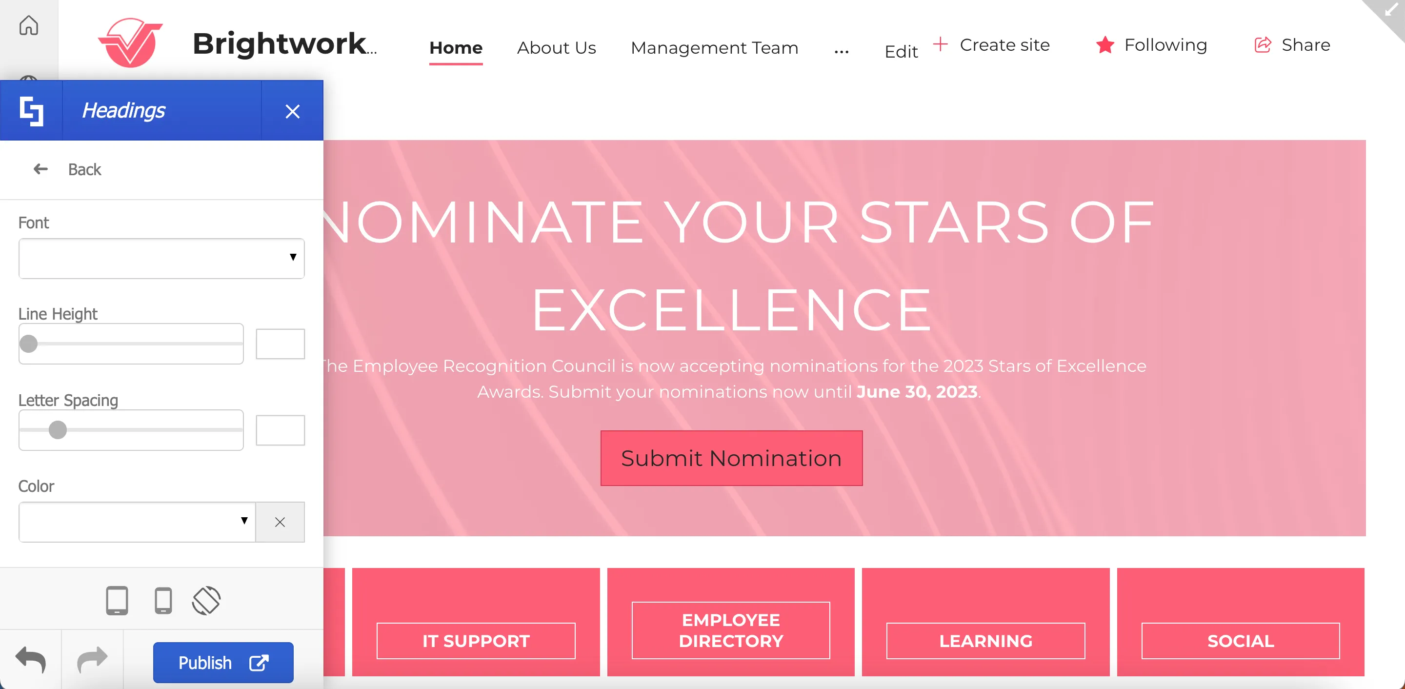
You can also go to Advanced Headings to apply brand specifications for each heading style.
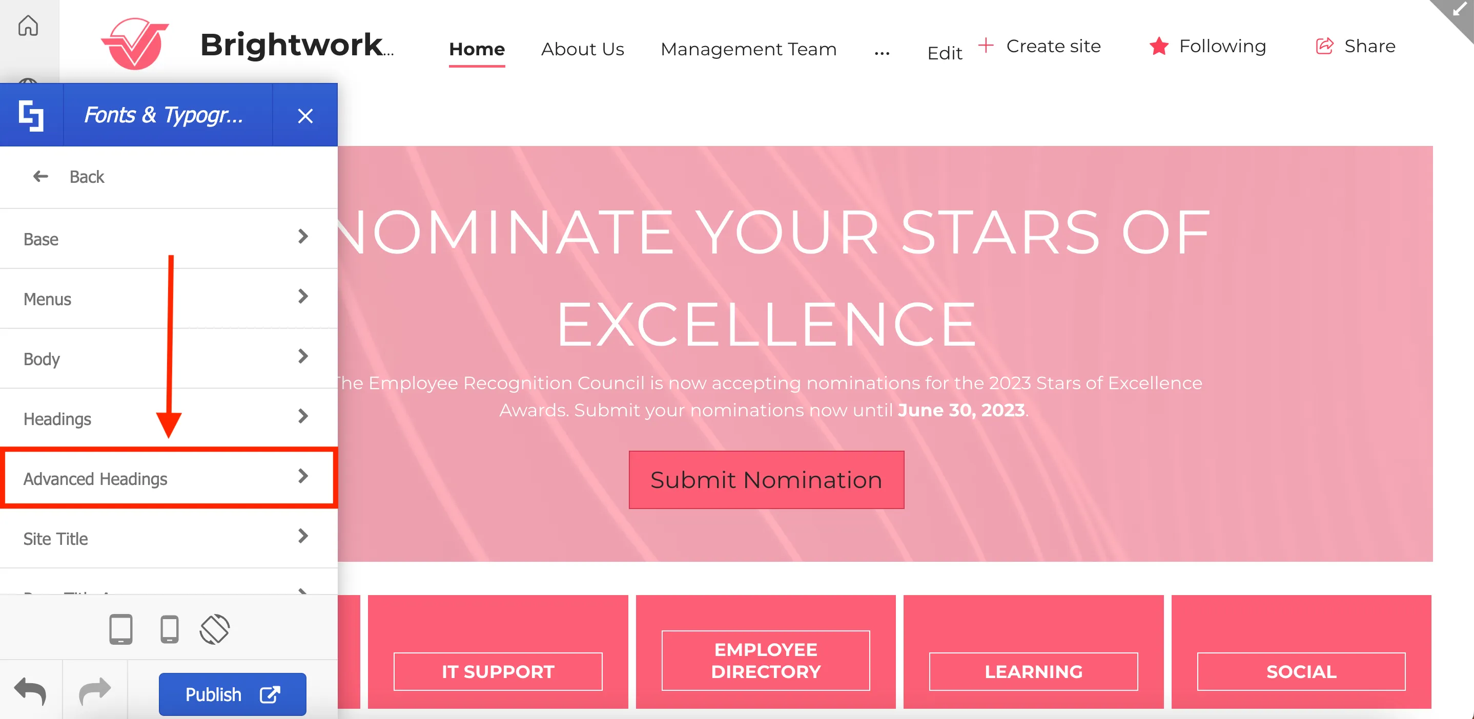
This will allow you to further customize each heading font & style.

Uploading custom fonts
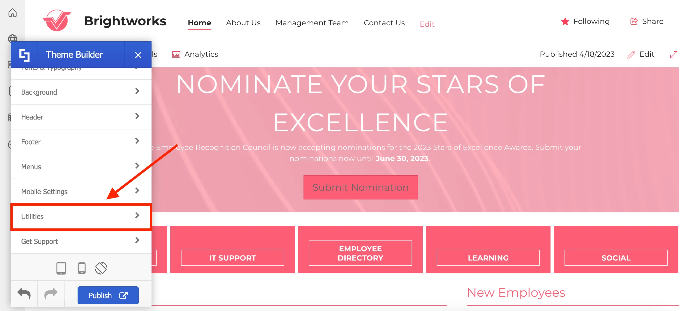
Now, let’s explore custom fonts. If your brand utilizes a font that is not in the list of fonts available, you can upload them using ShortPoint Theme Builder.
To do so, go to the main menu and select Utilities.
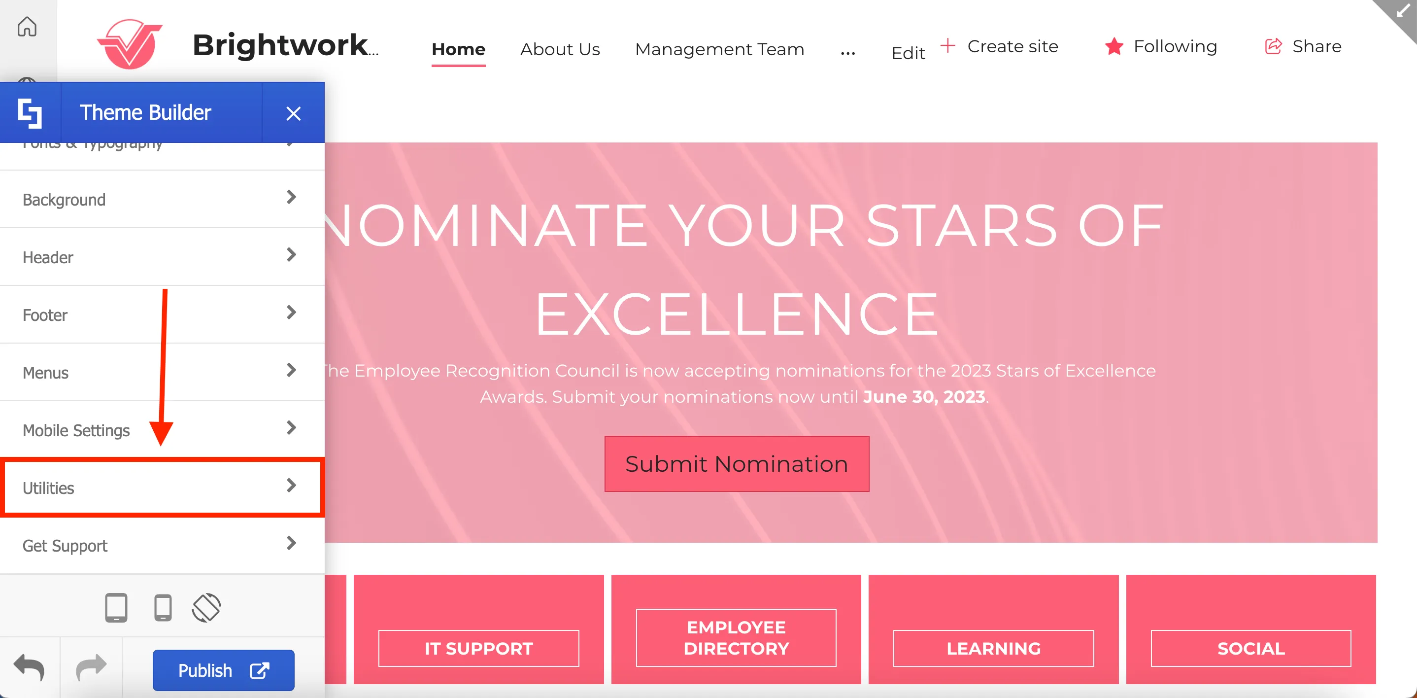
From there, select Custom Fonts.
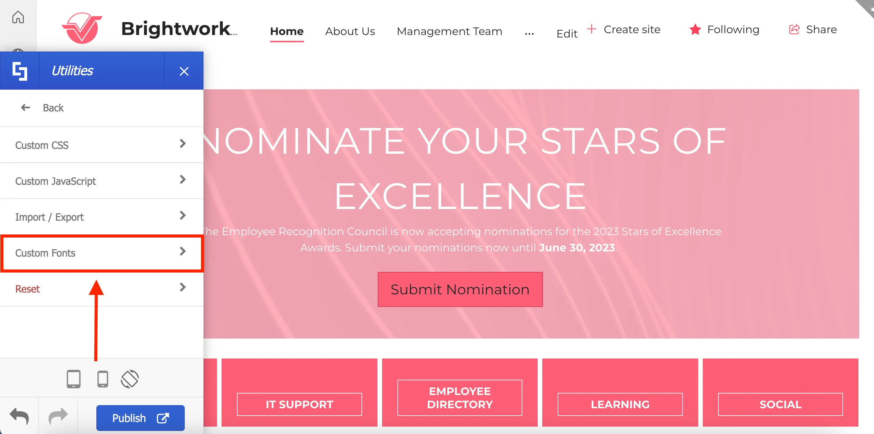
Here, you will find a collection of commonly used font sources including Google, Fonts.com, TypeKit, and Advanced. For this guide, we will add a new Google font.
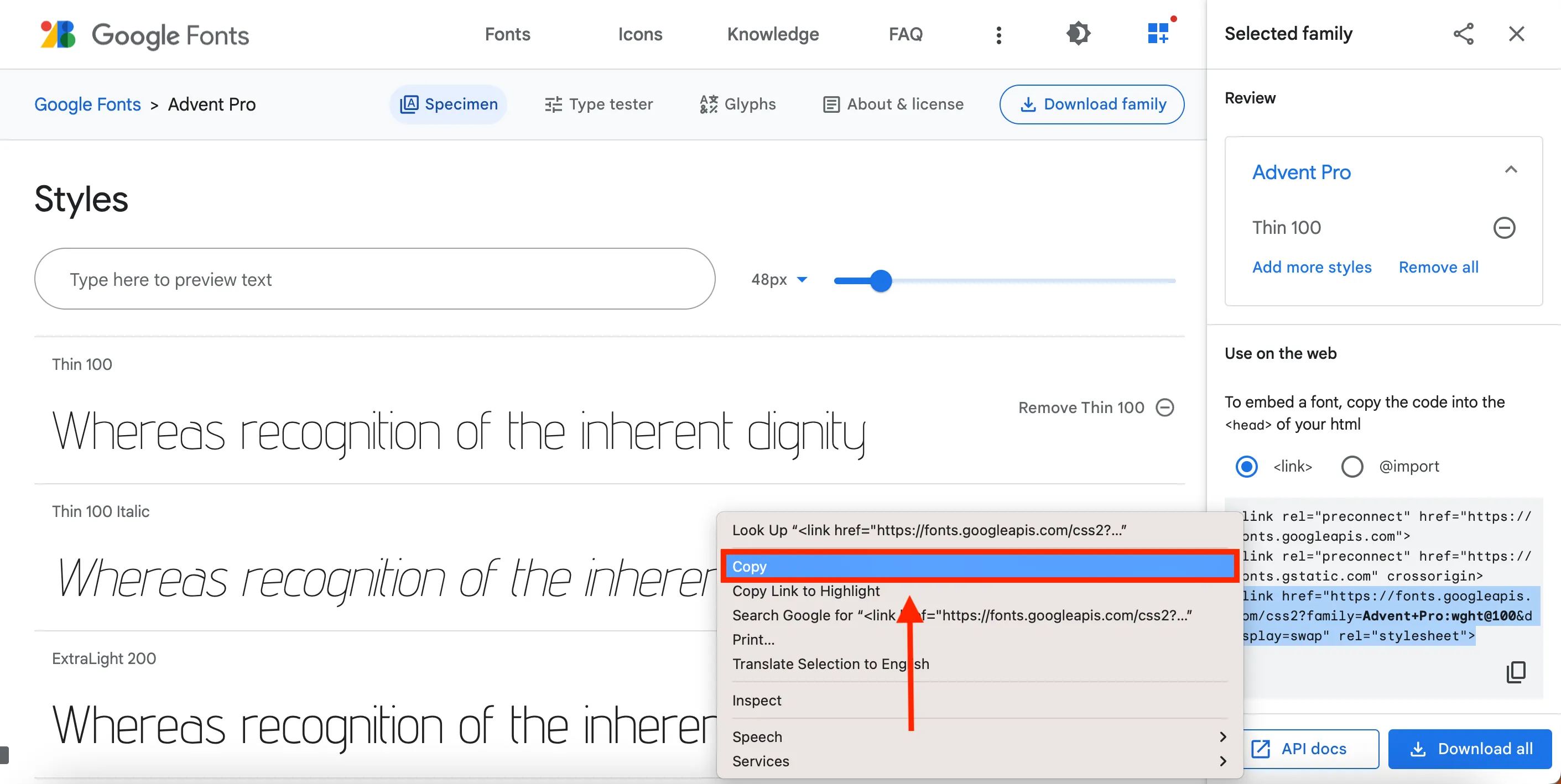
Then, look for the embed code of the font you want to use in Google Fonts and copy it.
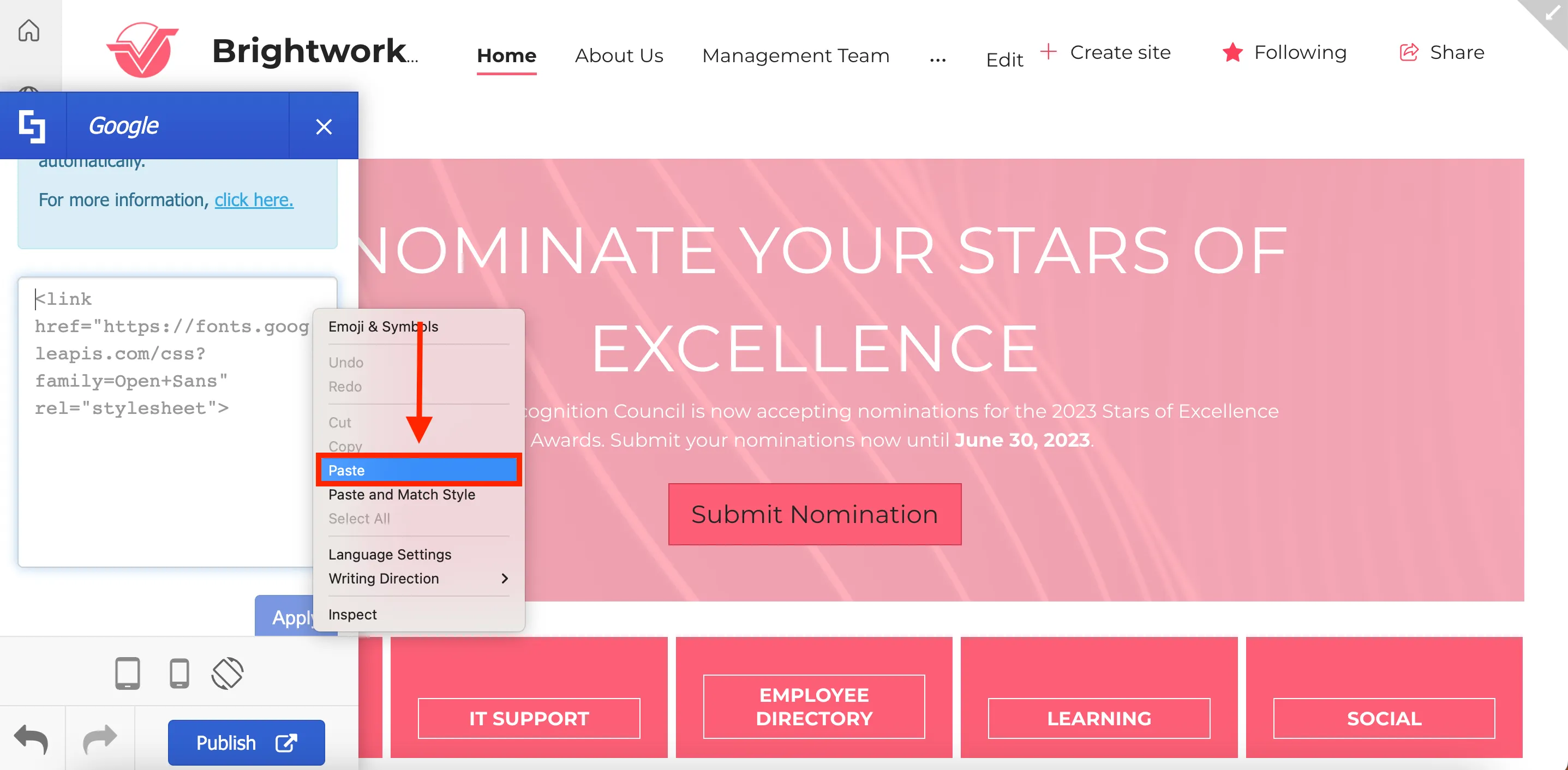
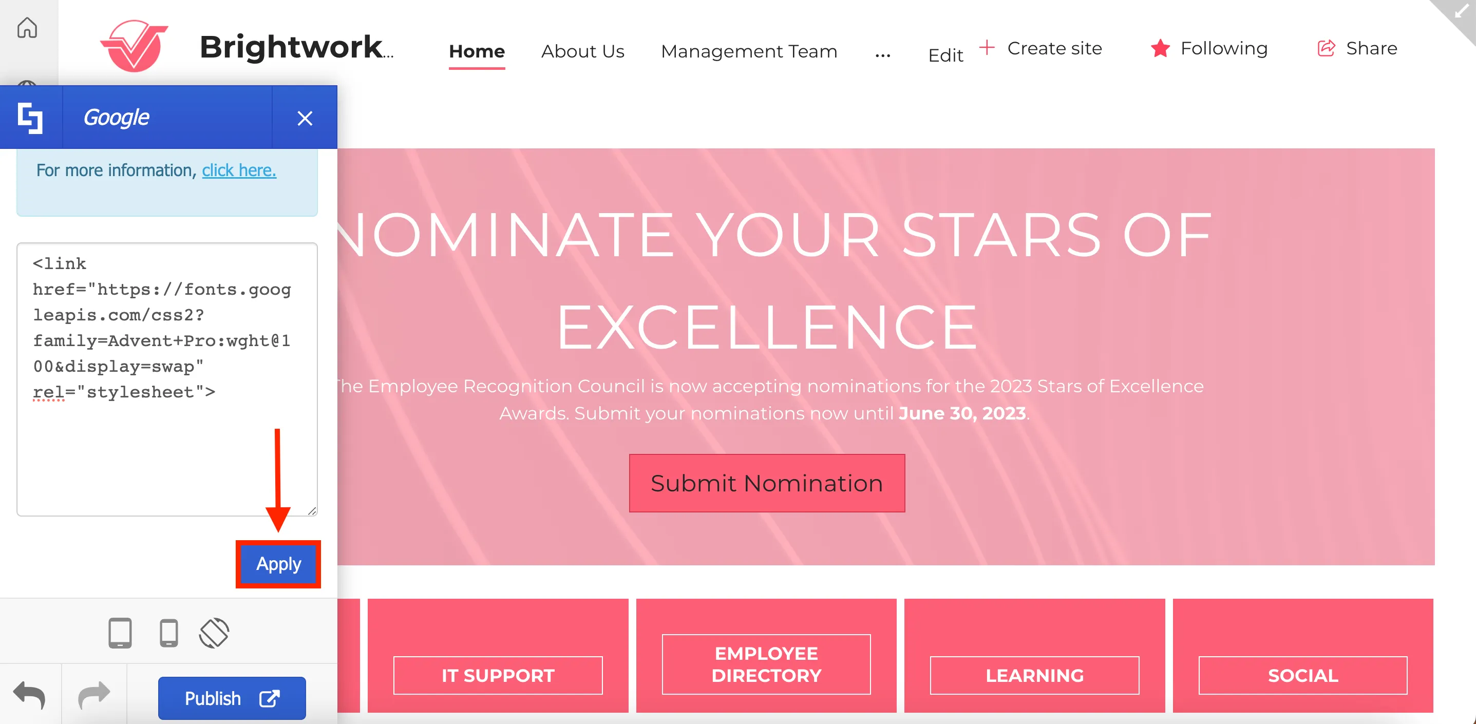
Paste the embed code into the designated field in Theme Builder.
Click Apply.
Once completed, you'll be able to select your newly uploaded custom font from the font selection dropdown.
After you've finished updating your site's fonts and typography, remember to click Publish to save your changes.
It's also worth noting that the custom font you uploaded will be available as an option for the Text Design Element.

Congratulations! You now have the ability to construct your intranet site using fonts that align with your brand identity. Enjoy incorporating your own custom font and style into your SharePoint sites.
Customize menus and headers
Headers and menus are essential components of any intranet site. ShortPoint Theme Builder gives you the freedom to customize the design of your headers and menus to reflect your brand identity. In this lesson, you will learn how to customize your primary menu, hub, and side menus, as well as your site's header. You'll also learn how to modify the site title and the favicon that appears on browser tabs.
Modifying menus
ShortPoint Theme Builder can help you customize the style of your [1] primary menu, [2] hub menu, and [3] side menu.
To do this, launch Theme Builder and select Menus.
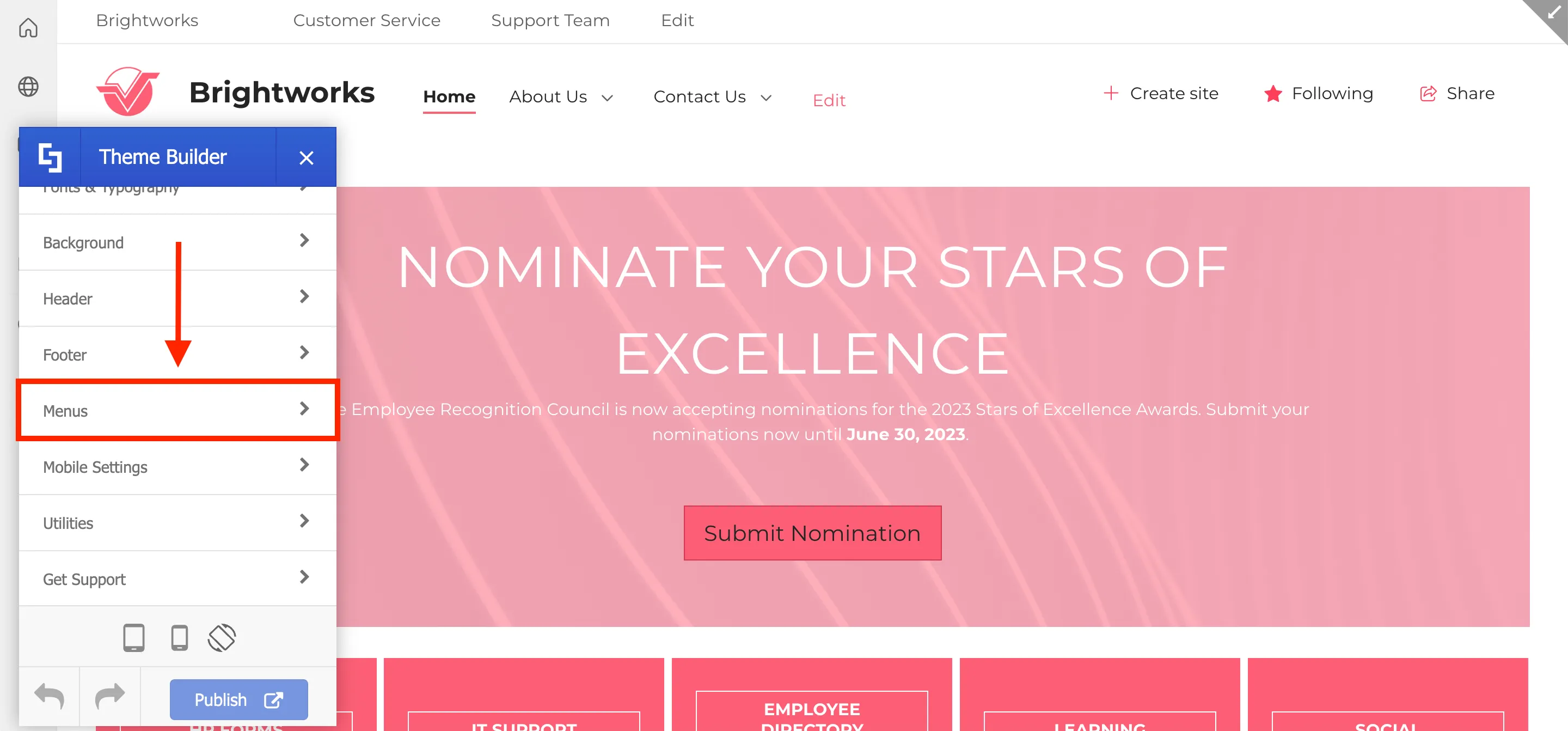
Here, you can choose which menu to modify and it will display various settings for customization. For this guide, let’s customize the Primary Menu.
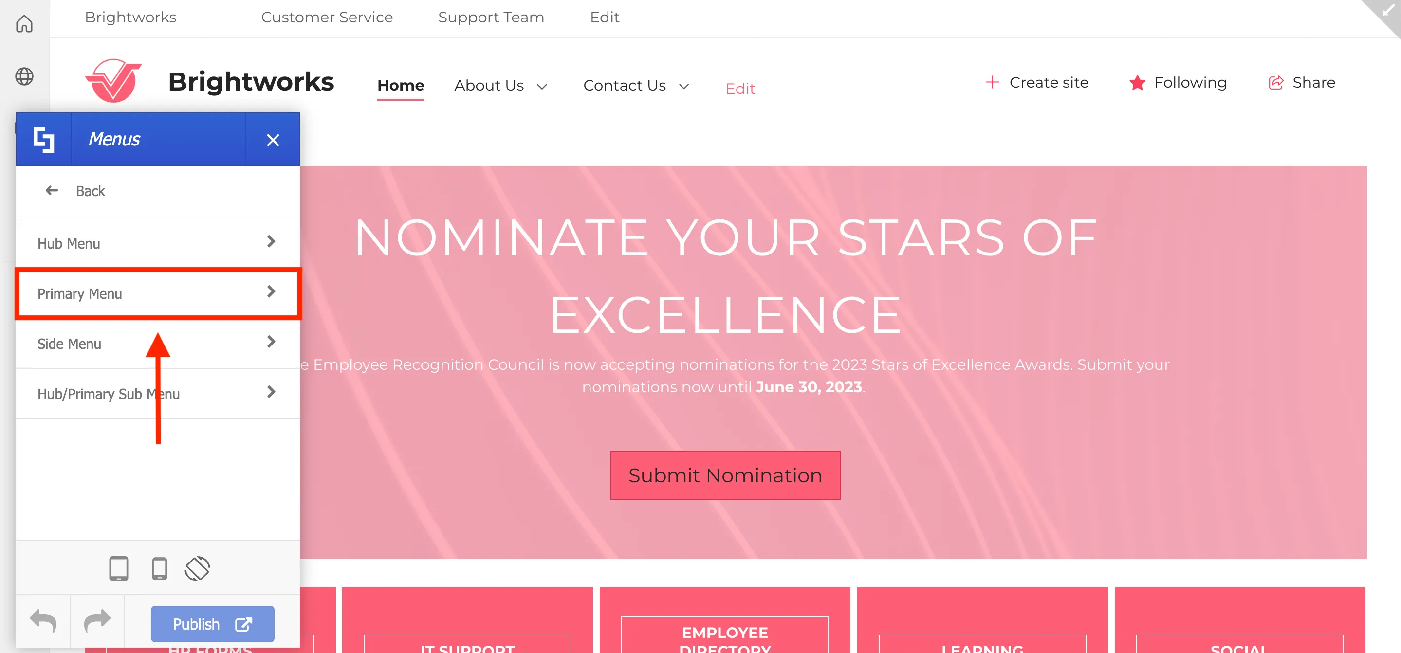
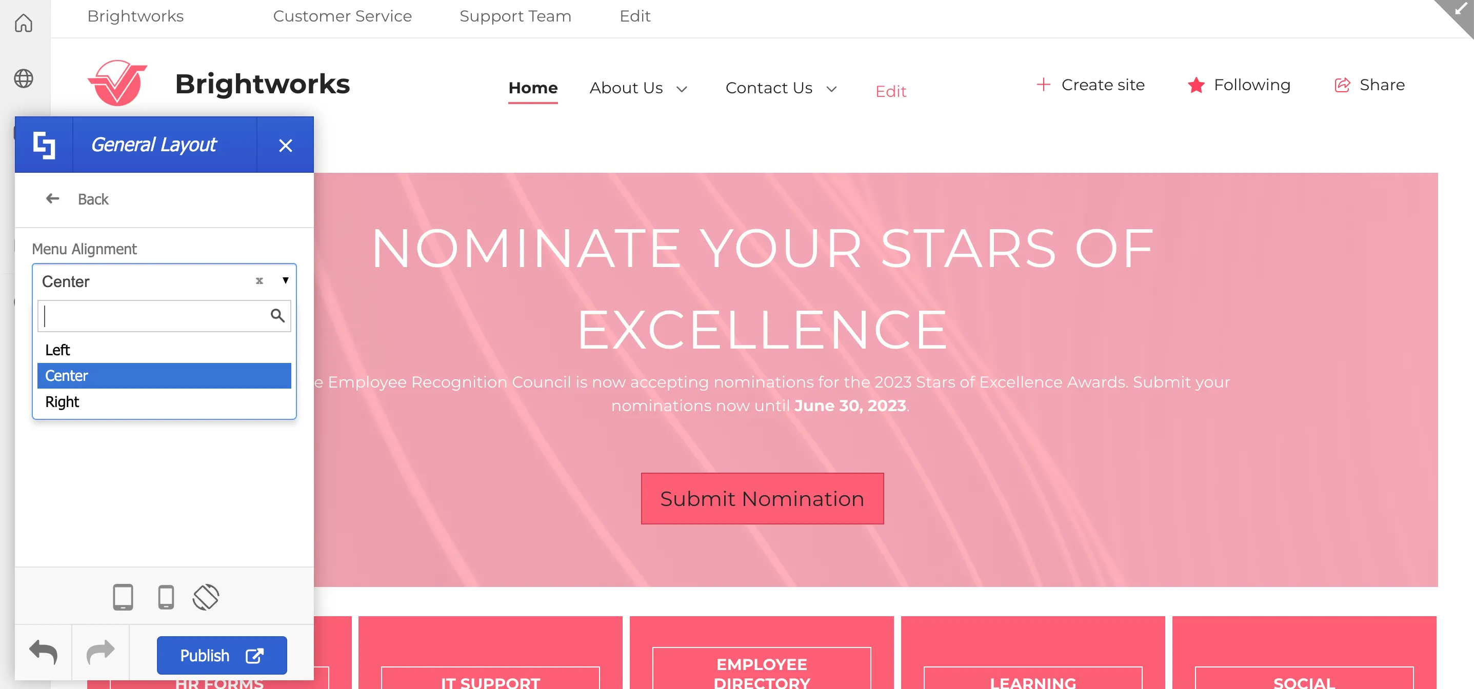
You will have the option to change the menu alignment, add a background color, and modify the padding & margins of the primary menu. Let’s change the menu alignment first. To do this, select General Layout.

Then, choose the menu alignment you prefer from the drop-down.
Now, let’s change the color of the menu. Click Back to see the options for the Primary Menu again.
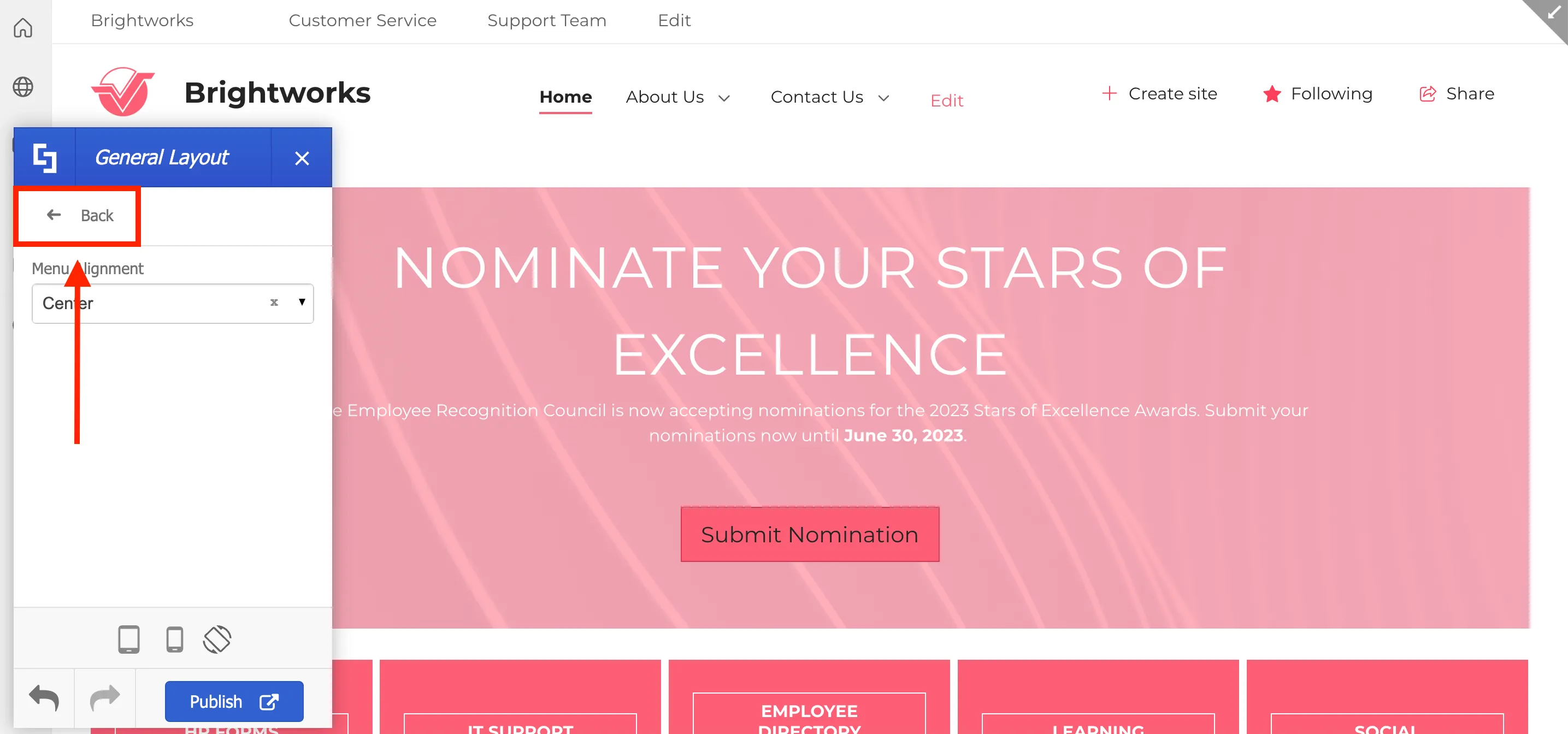
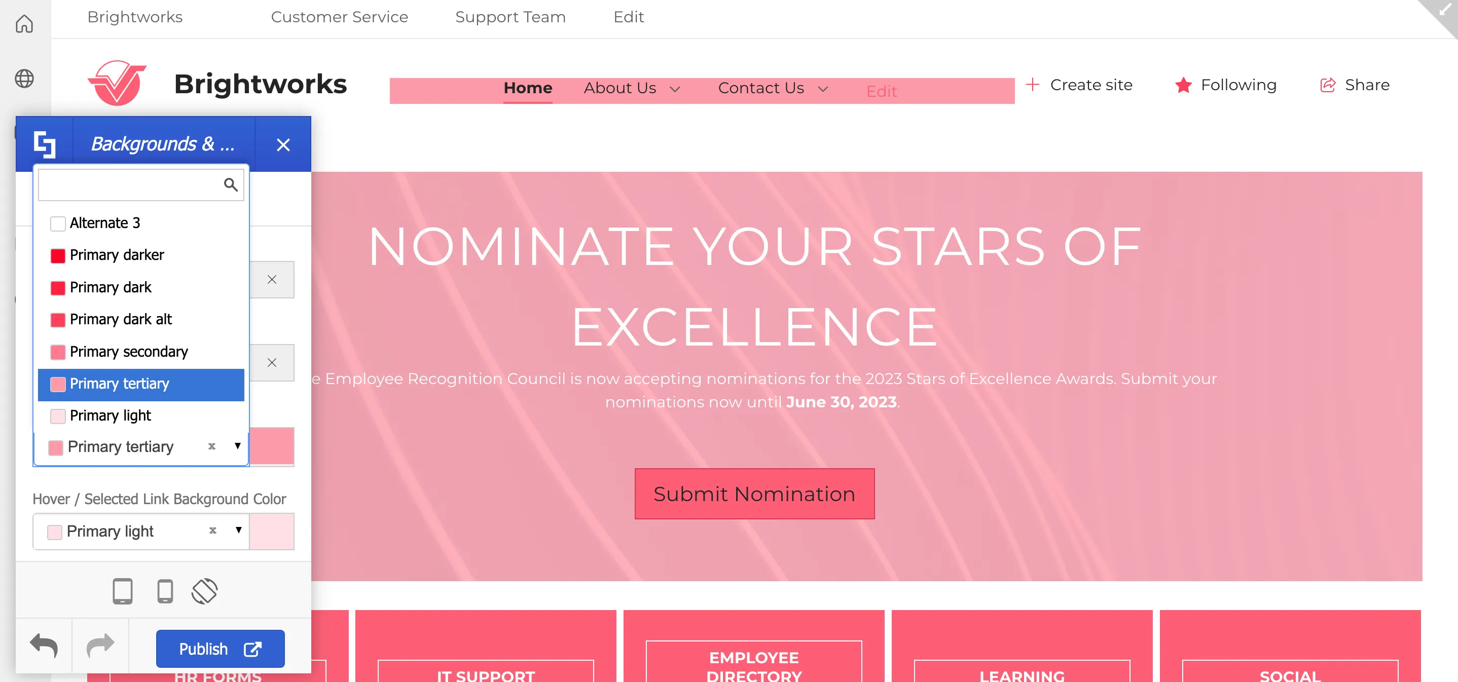
Select Backgrounds & Color.
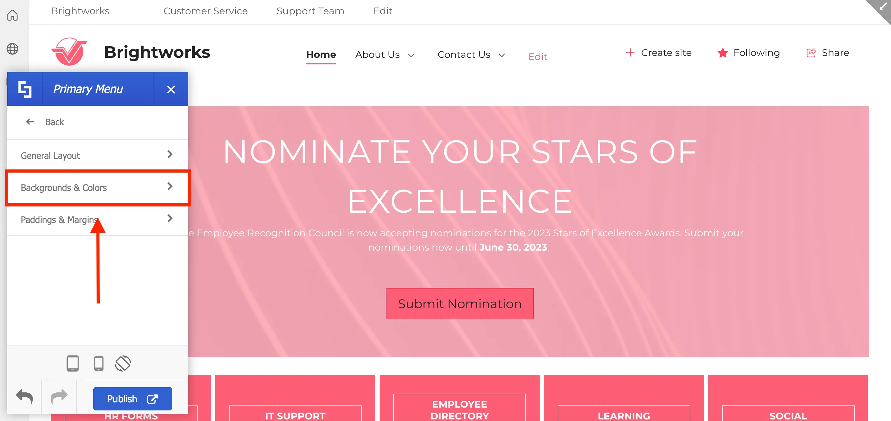
Here, you can assign a link color, a background color, and a hover color. Simply use the drop-down and select the color you prefer to start customizing.
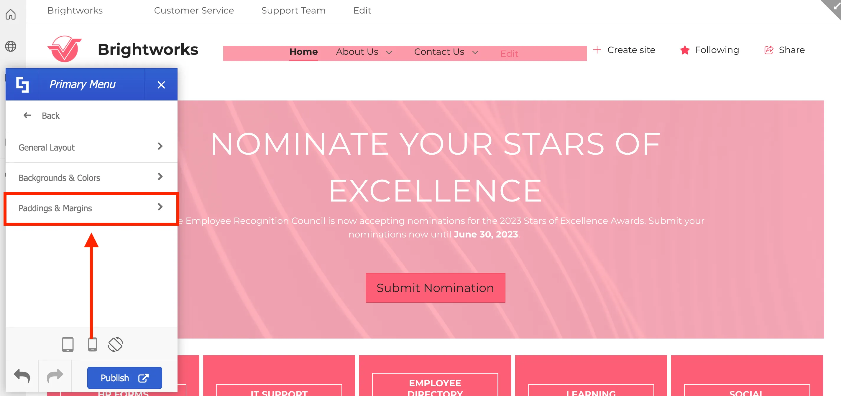
Finally, let’s customize the paddings and margins of the primary menu. Click Back.
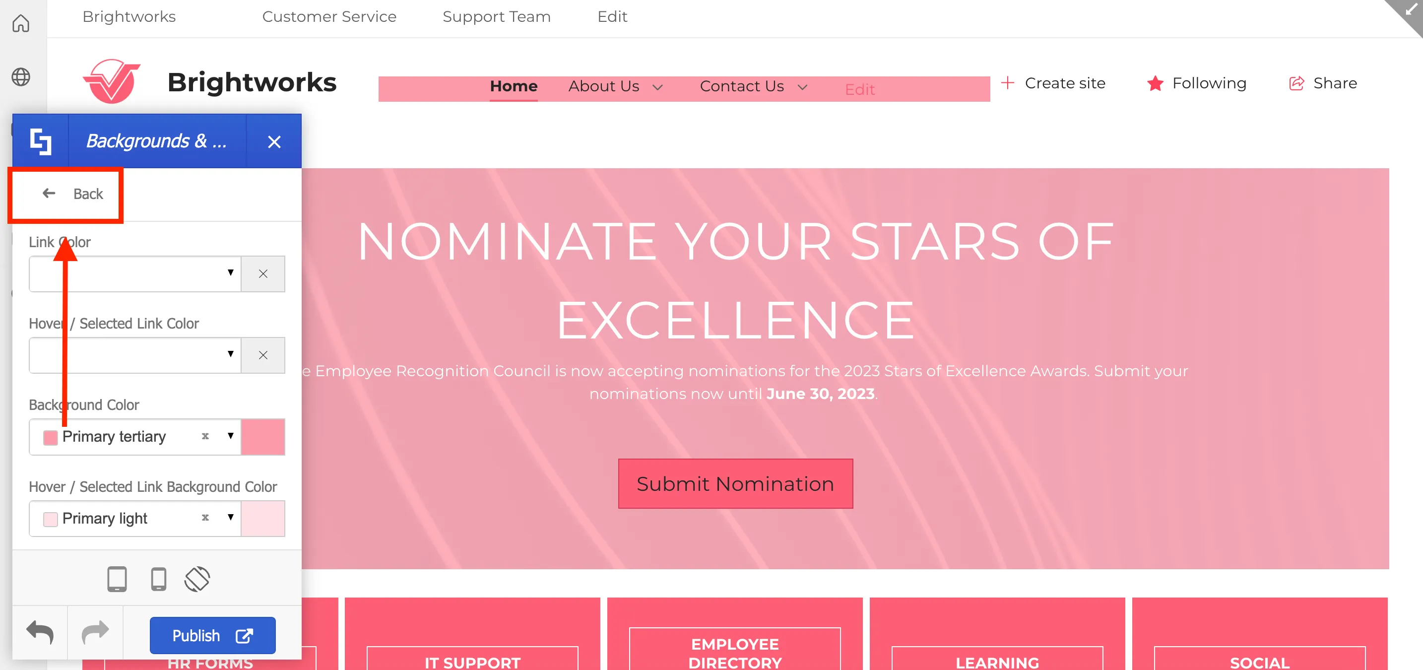
Select Paddings & Margins.
Here, you will see padding and margin size options. Simply use the blue slider to adjust the size of the paddings and the margins according to your preference.

Additionally, you can also customize the color of your primary sub-menu.
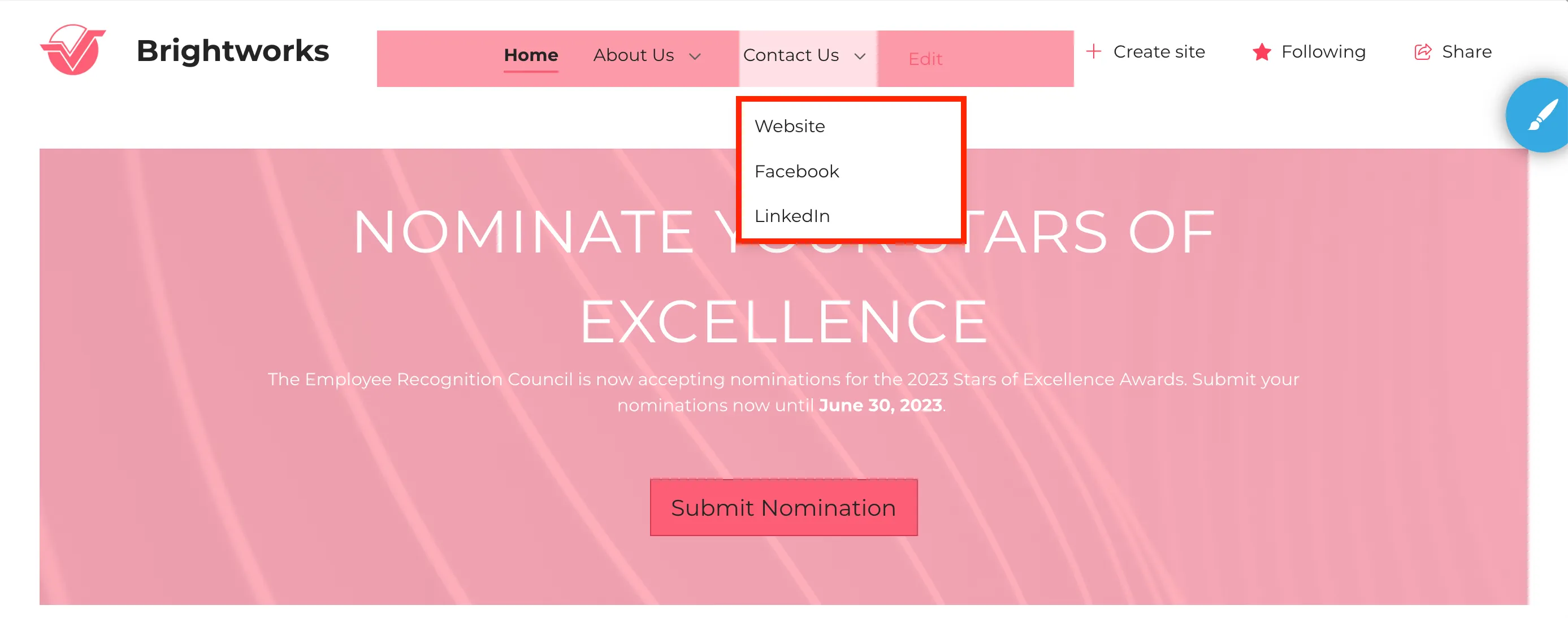
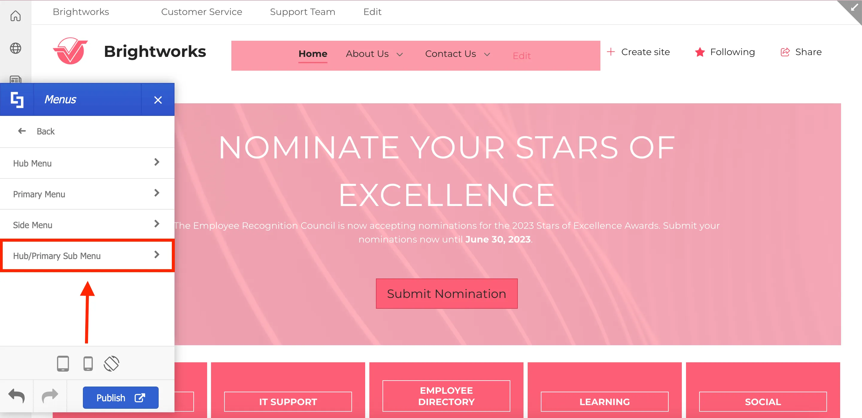
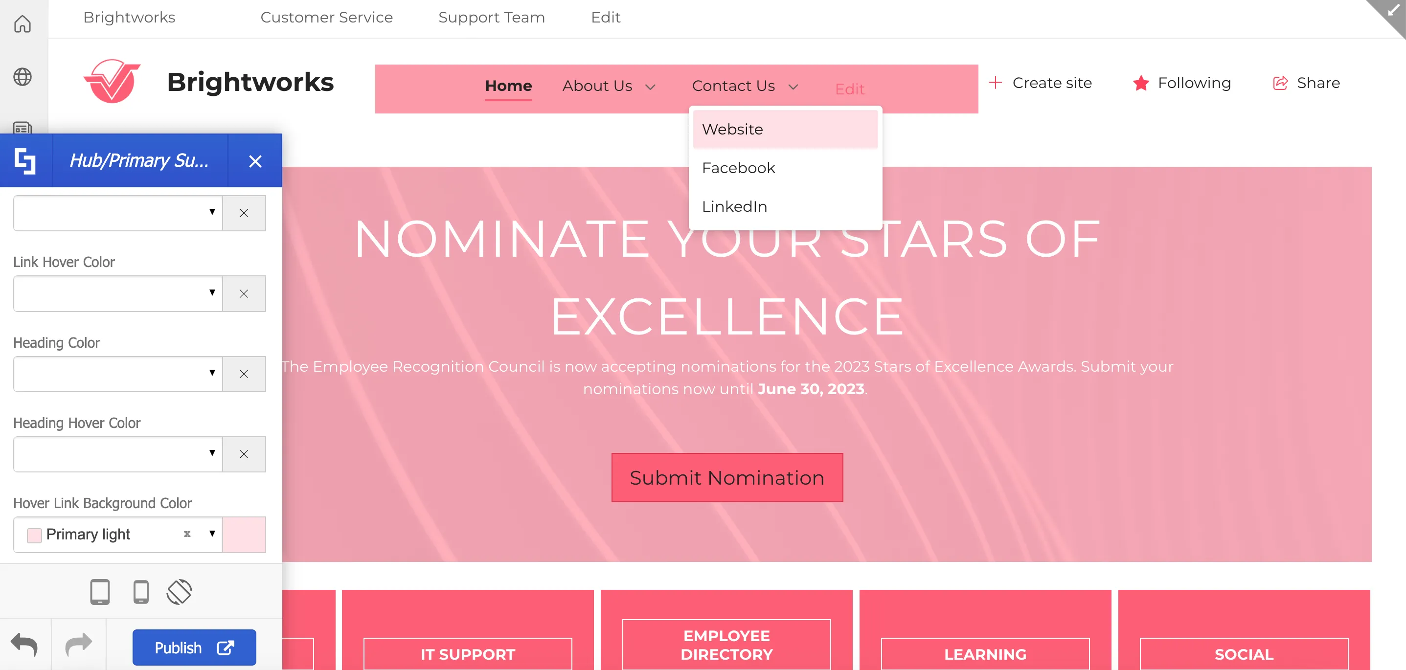
To do this, go back to the Menus section and select Hub/Primary Sub Menu.
Here, you will find different color customizations for your primary sub-menu. Simply use the drop-down to select the color you want to use.
Similar customization choices are also available for [1] hub menus and [2] side menus.

Customizing headers
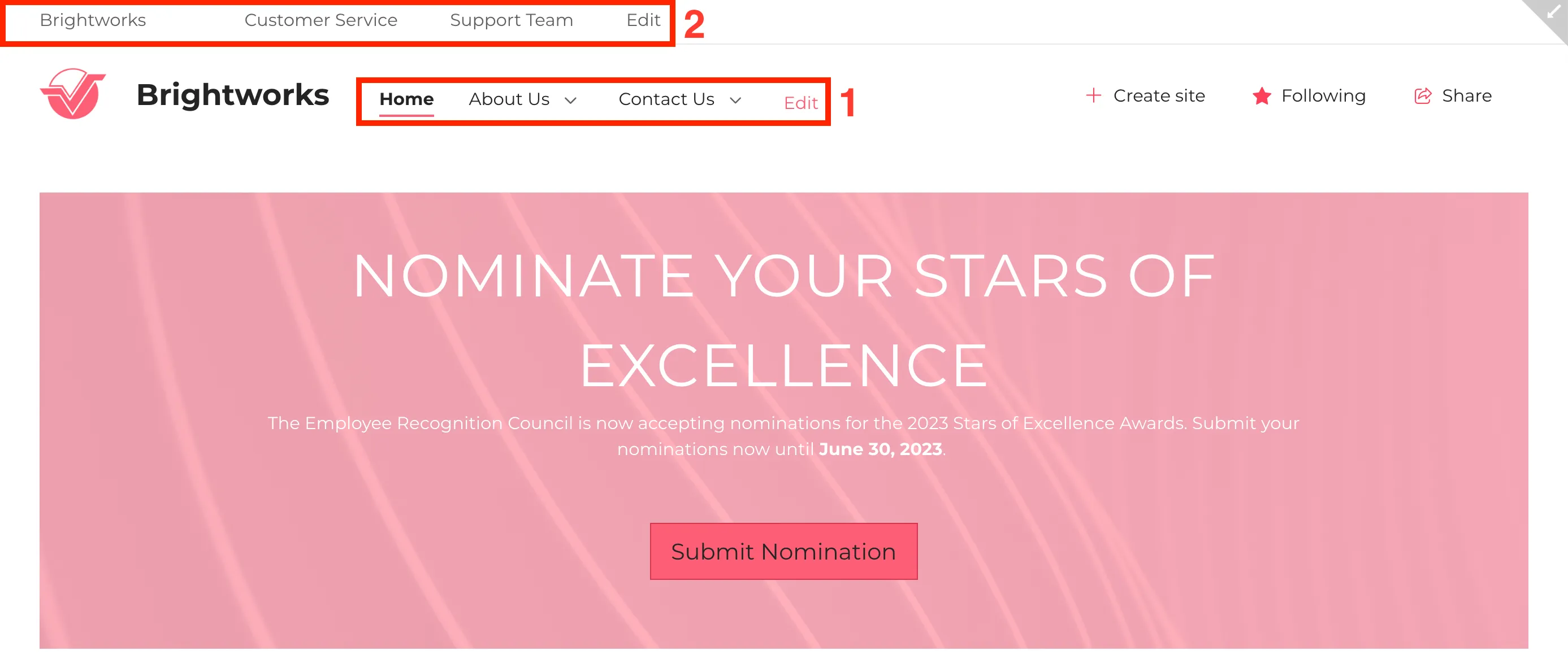
Now, let’s talk about headers. To update your site header, return to the main Theme Builder menu and select Header.
Here, you'll find a range of options for customization. For this guide, we will explore [1] Logo and [2] Background, and [3] Command Bar.
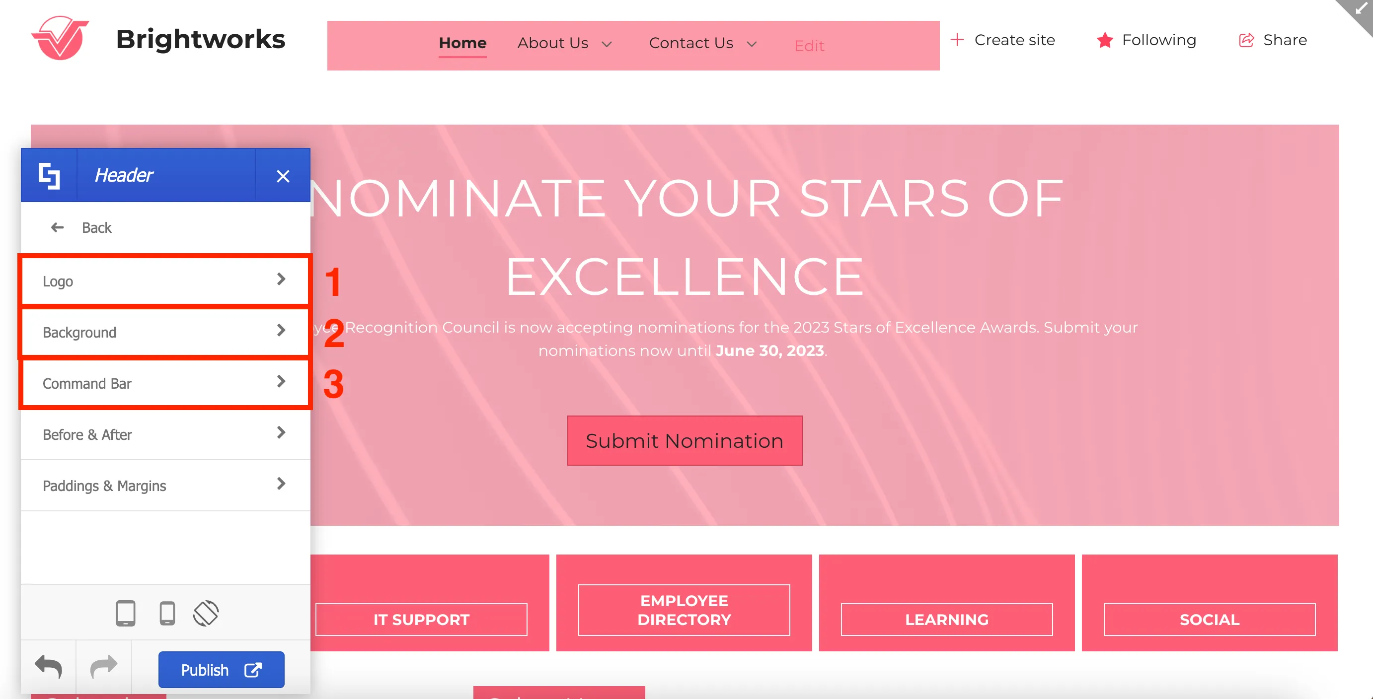
The Logo option allows you to make changes to its appearance, adjust its size by altering the height and width, and customize its margins to add spaces around it.
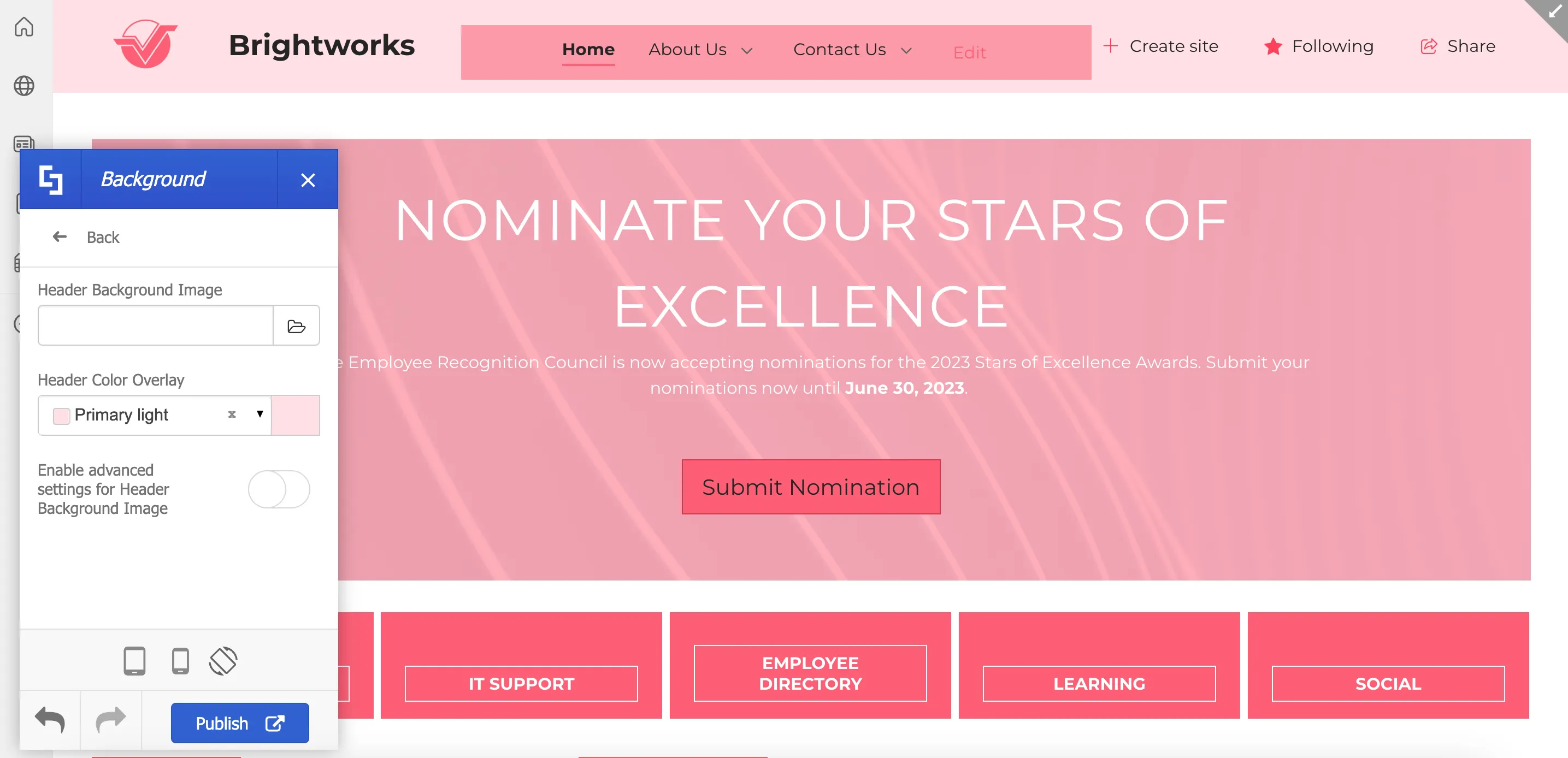
The Background option allows you to add a Header Background Image and a Header Color.
Lastly, the Command Bar option allows you to customize the colors of the different elements in the command bar.

These are only some of the Header options you can explore. You can also adjust the paddings & margins of the headers, as well as, enable dividers before and after headers.
Updating the site title and adding a favicon
Another important aspect of your page that you might want to customize is the [1] favicon and [2] site title visible on your browser's page tab. By default, the favicon will be SharePoint’s logo and the site title will be the name of your page.
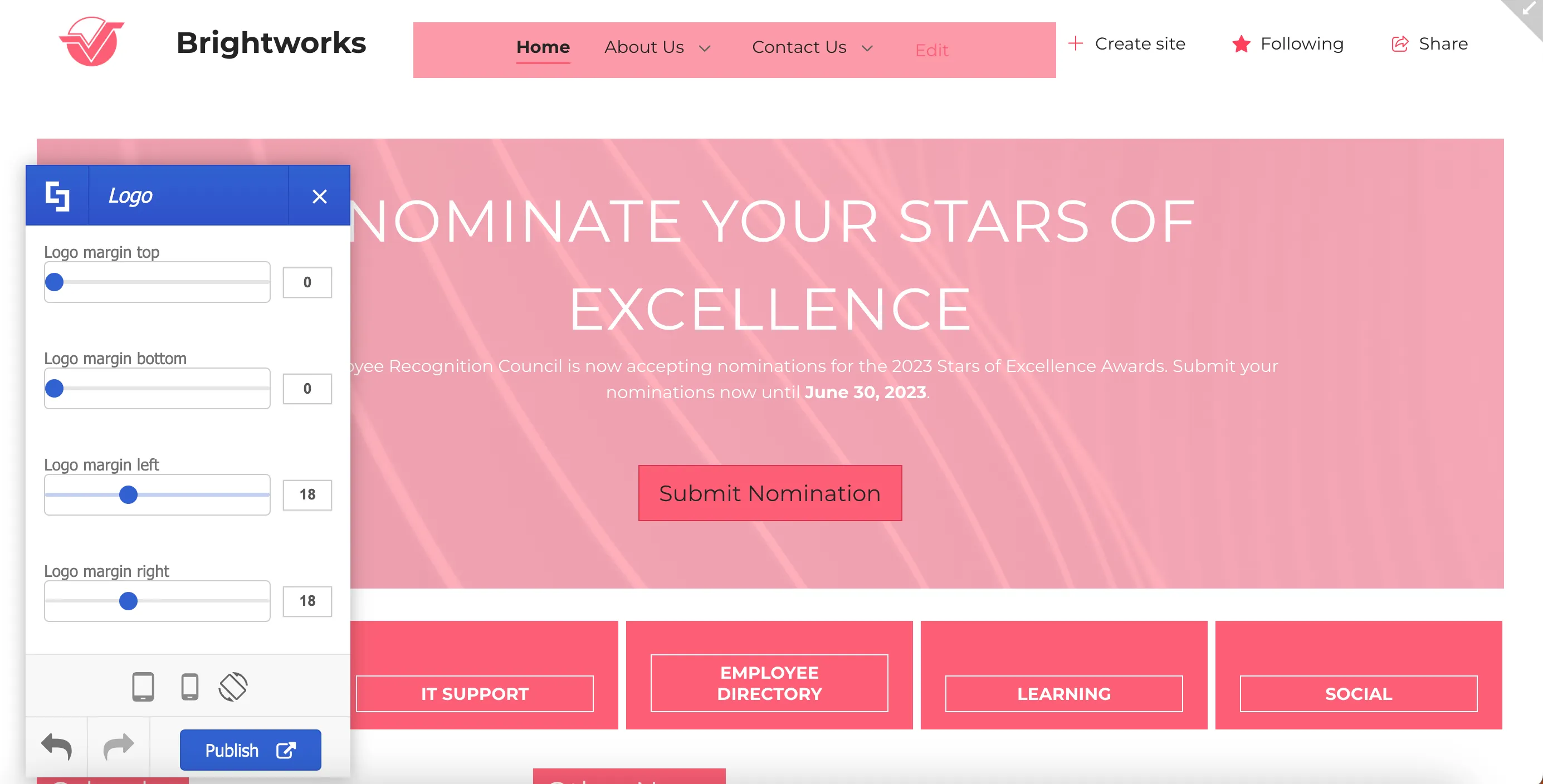
To add a site title and a favicon, go back to the main menu of the Theme Builder and select Header.
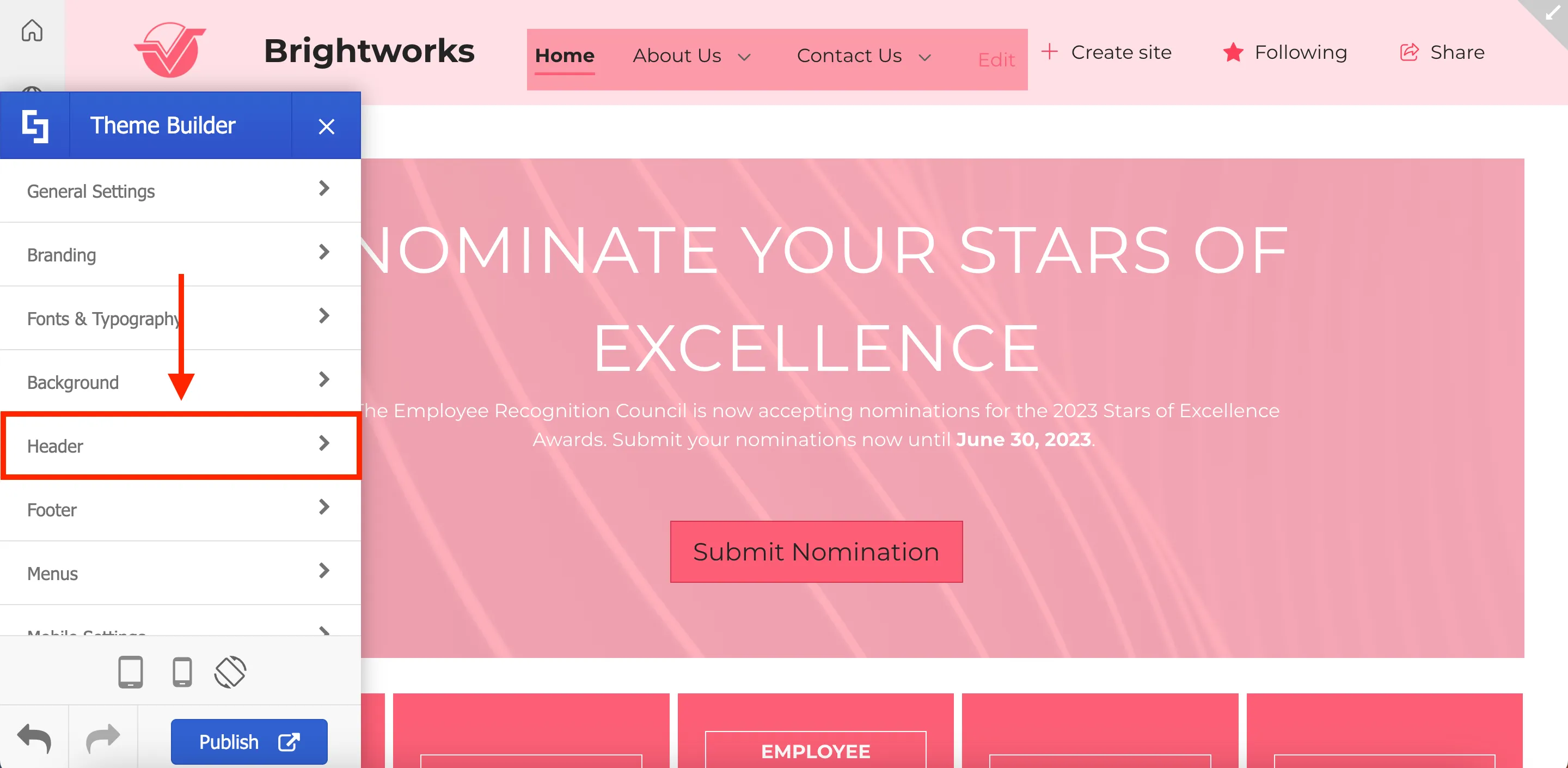
Then, select Logo.
Add a Site Title. You will now see your new site title on your browser's page tab.

Then, click the folder icon to add a new favicon.
Select the image you prefer from the file picker.
You will now see your new favicon on your browser’s page tab.
After making all your modifications, remember to click Publish to apply them to your site.
That’s it! You now know how to customize menus and headers using ShortPoint Theme Builder. With just a few clicks, your intranet now boasts a fresh, modern, and practical look. Leverage these features to craft a well-designed and visually appealing intranet site that leaves a positive impact on your users.
Export and import custom site themes
Redoing the same design for multiple sites is overwhelming and time-consuming. Fortunately, ShortPoint Theme Builder has the perfect solution. In this lesson, you will learn how to export an existing site theme into a new Site Collection. This will allow you to apply a uniform look and feel across all sites within your SharePoint tenancy.
Exporting site customization
To begin, open ShortPoint Theme Builder on the site from where you have already implemented your custom site design.
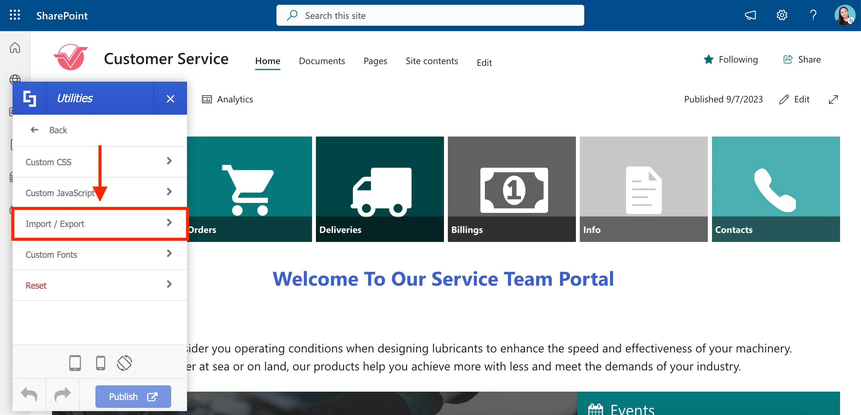
In the Theme Builder menu, scroll down and select Utilities.
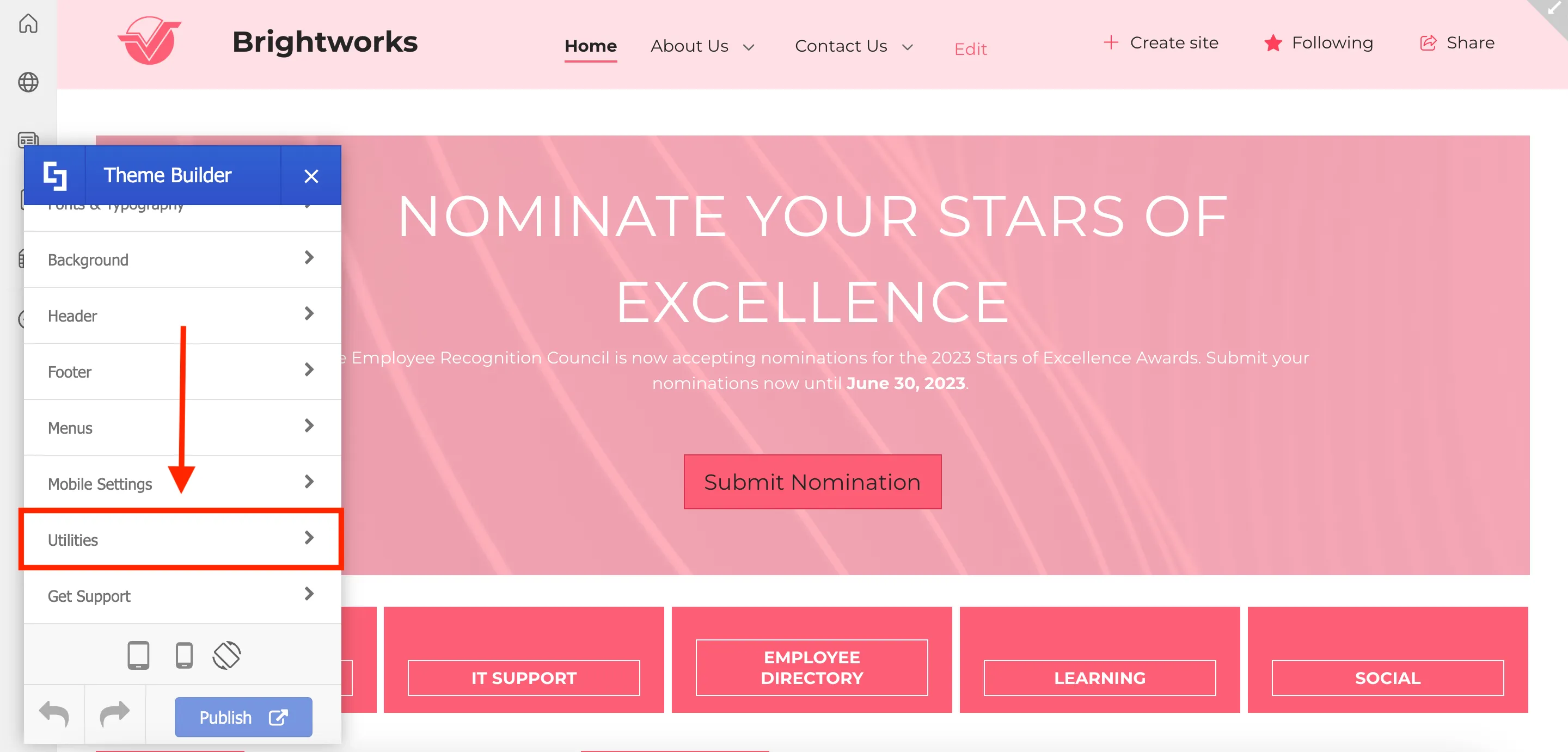
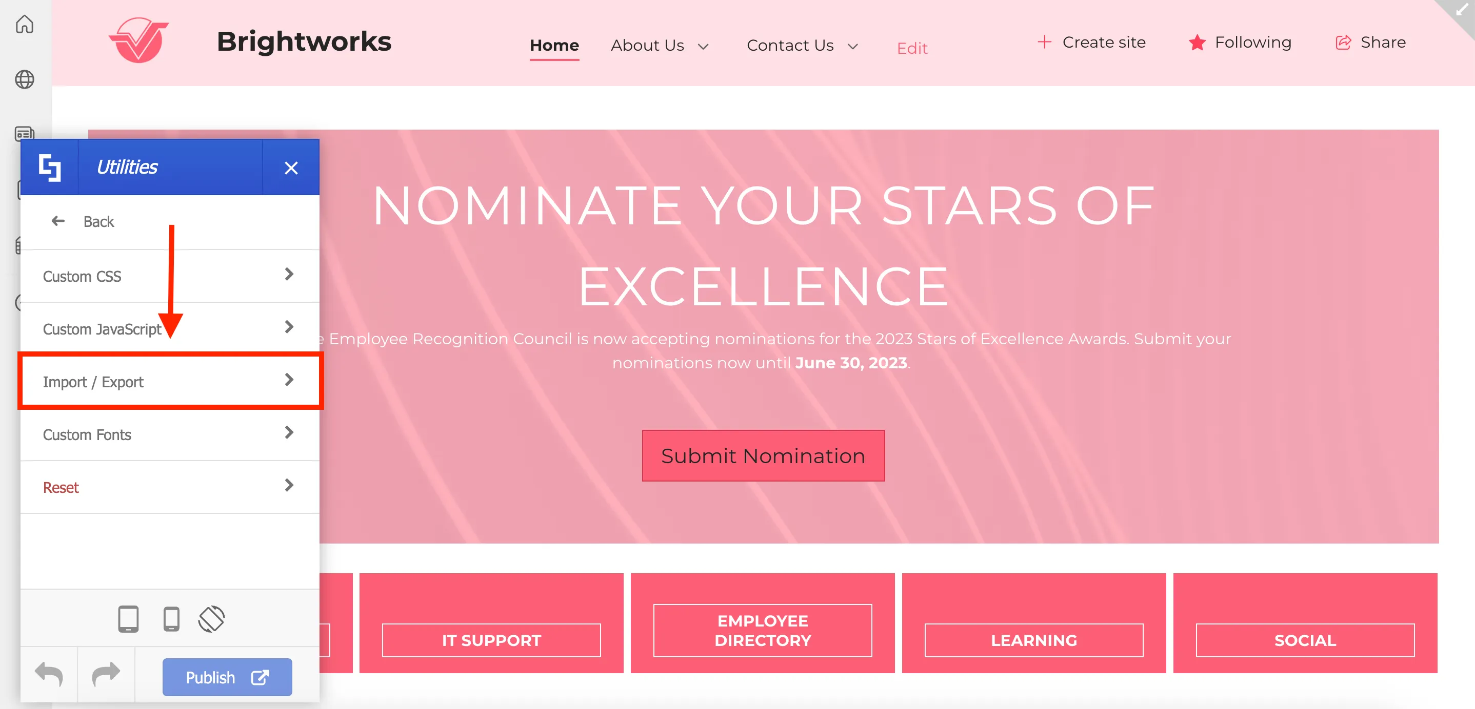
Then, select Import / Export.
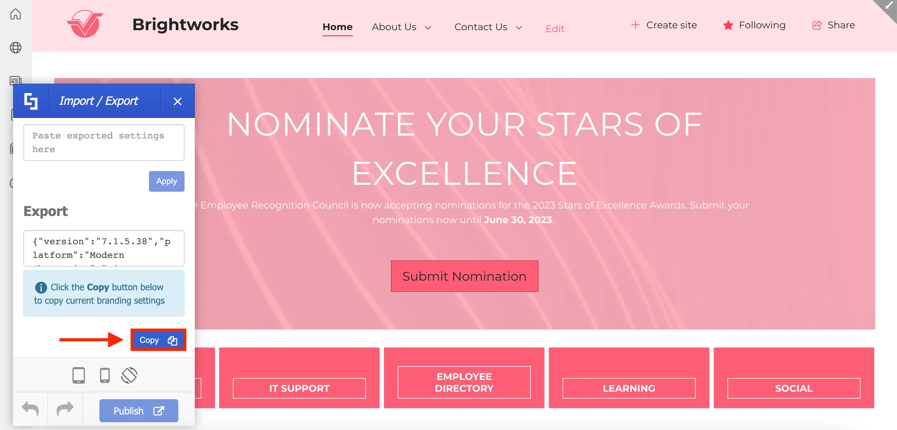
In the Export field, you will see a copy of the ShortPoint code that is currently applied to the site. To export this code, simply click Copy.
Importing to a new site collection
After copying the code, open the Site Collection where you want to apply your custom site design and launch ShortPoint Theme Builder.
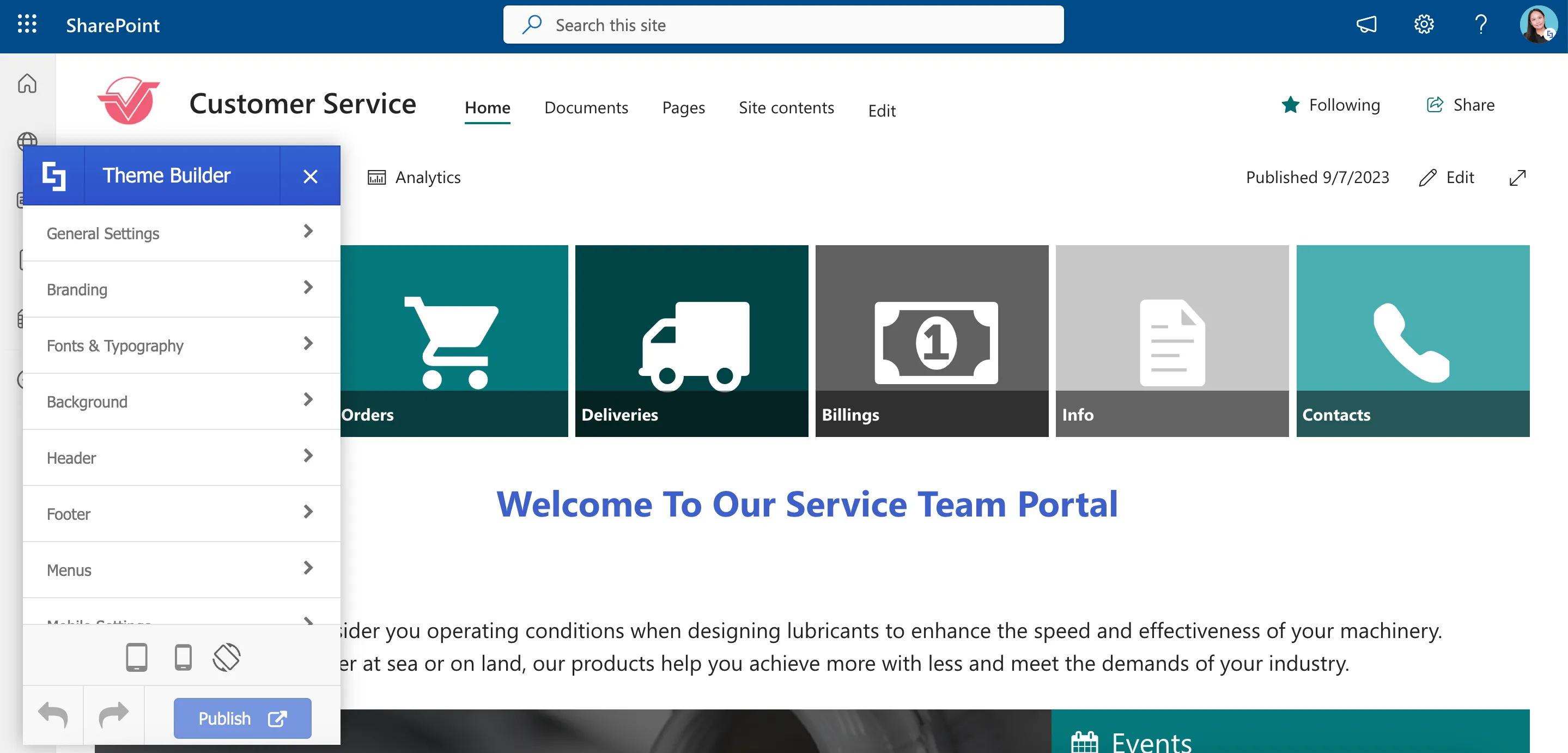
Once inside Theme Builder, we will repeat the same steps from the previous Site Collection and select Utilities.
Then, click Import / Export.
This time, we will use the Import field. Paste the ShortPoint code that you copied from the previous site and click Apply.
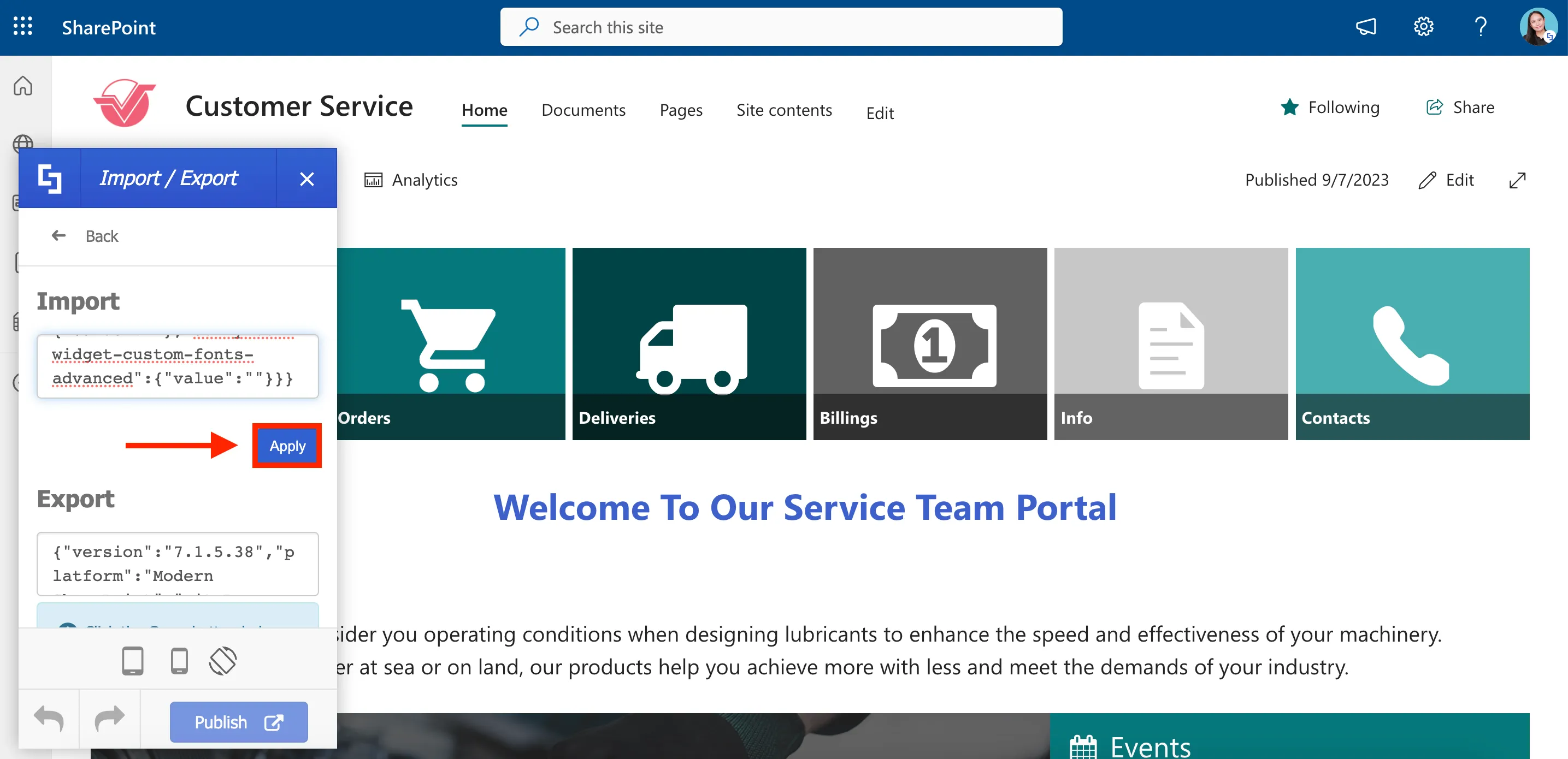
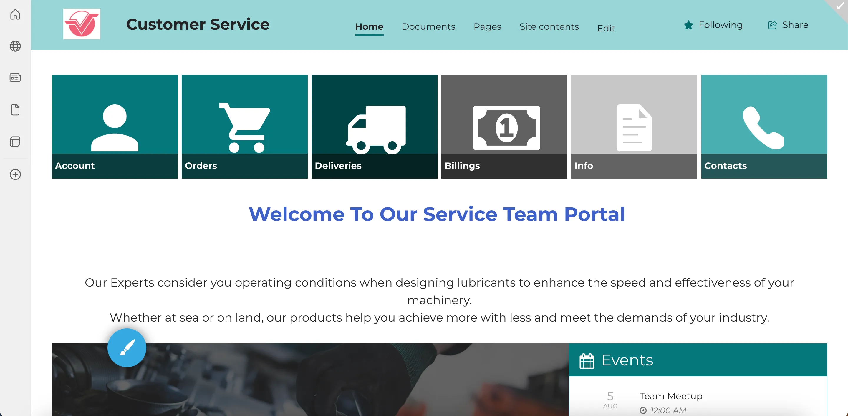
As soon as you click Apply, ShortPoint Theme Builder will work its magic, and you'll notice the changes from your custom design being automatically applied to the new site.
Applying finishing touches
You will notice that the branding colors are not automatically copied over from the previous site. This means you'll need to set your branding colors separately.
You can easily do this by using our saved company theme. Simply select the cogwheel icon in the upper-right corner of the screen.
Then, select Change the look.
Navigate to Theme.
Select the company theme you used on the previous site.
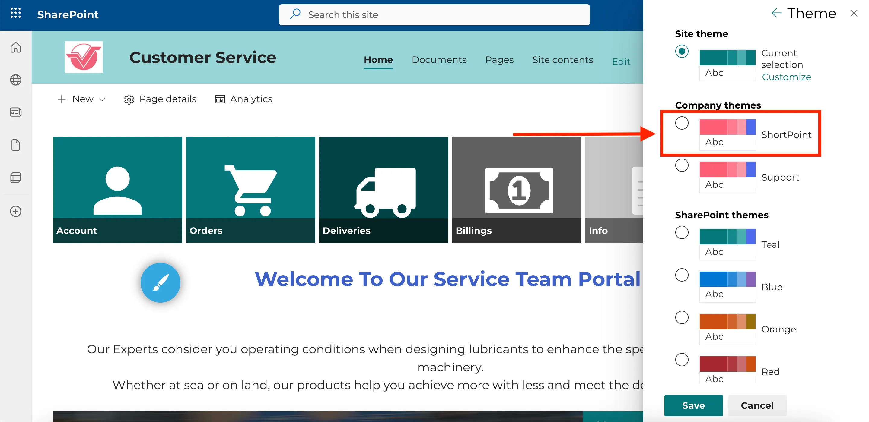
Click Save.
You will now see the brand colors you applied on the previous site on your current site.

Alternatively, if you want to apply a new color theme go to the Theme Builder’s main menu and select Branding.

Select Color Palette.
Then, specify your desired branding colors.
You can also make further adjustments using the ShortPoint Theme Builder to match the requirements of your current site. Once you are satisfied with the changes, hit Publish. This action will save all the modifications and officially apply your custom design to the site collection.
That's it! You have just completed the process of exporting and importing your site customizations using ShortPoint Theme Builder. With this seamless and efficient approach, you can now save time and effort in implementing your design across multiple sites, allowing you to concentrate on building your intranets and achieving your goals.
ShortPoint Design Elements
Introduction to ShortPoint Design Elements
4:44
Best Design Elements for Text
8:54
Best Design Elements for Images
8:09
Best Design Elements for Lists
7:05
Best Design Elements for Videos and Social Media
6:12
Design Elements for App Integration
5:25
How to Use Content Holder Design Elements
6:16
Introduction to ShortPoint Design Elements
Have you ever used Design Elements on your SharePoint page? Whether it’s your first time or your hundredth time using it, this is the perfect course for you!
Let’s start with giving you a quick overview of Design Elements and how it works.
What are ShortPoint Design Elements?
In Live Mode, you will find colorful EasyPass tags that display the Design Elements used to create the page.
While using the EasyPass tags, you will notice [1] Sections, [2] Rows, and [3] Columns all over your page. They serve as the building blocks of the ShortPoint web part. They support the layout and structure of the page. And, within them, you can add any Design Element that best fits your content.
ShortPoint Design Elements are pre-built and pre-designed page elements. They are used to present information in many ways. For example, we have a [1] Text Design Element that captures the user's attention and a [2] Button Design Element that asks them to take action.
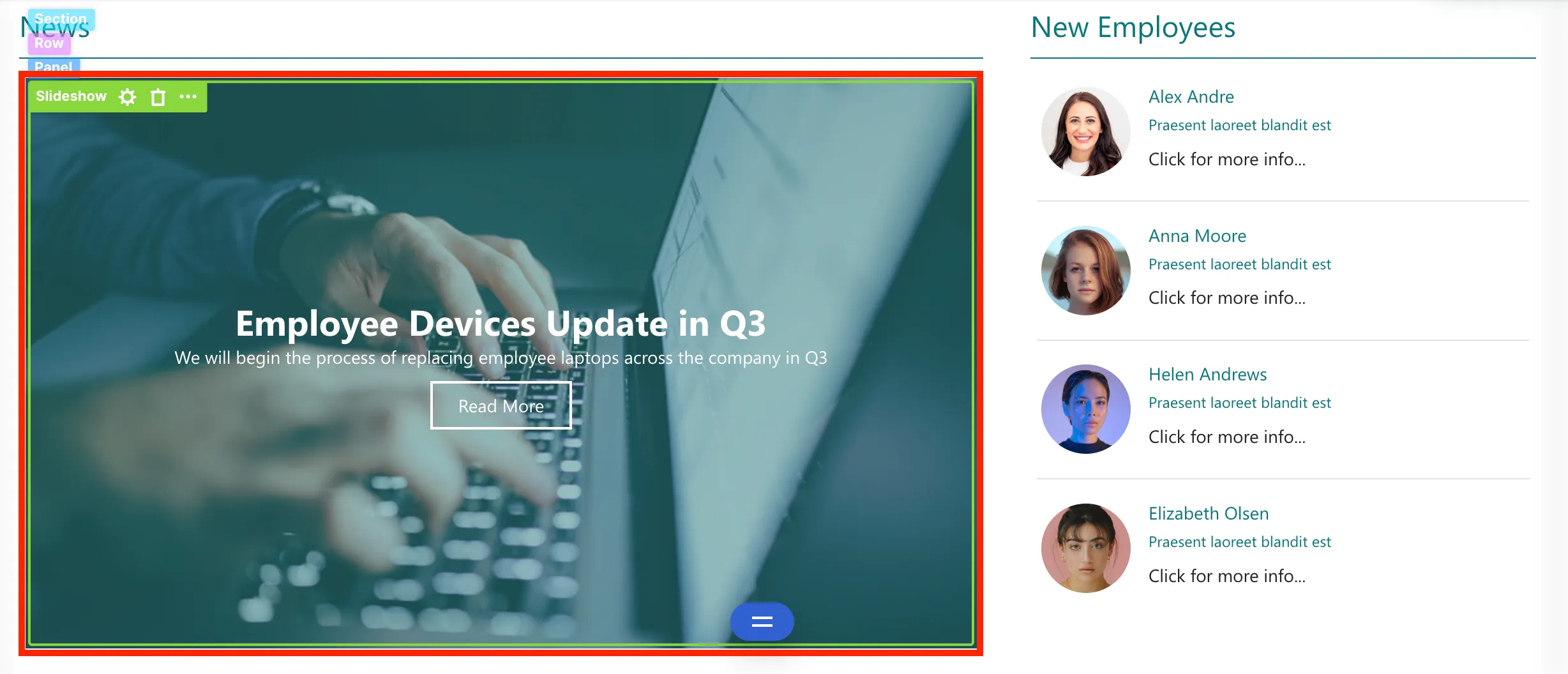
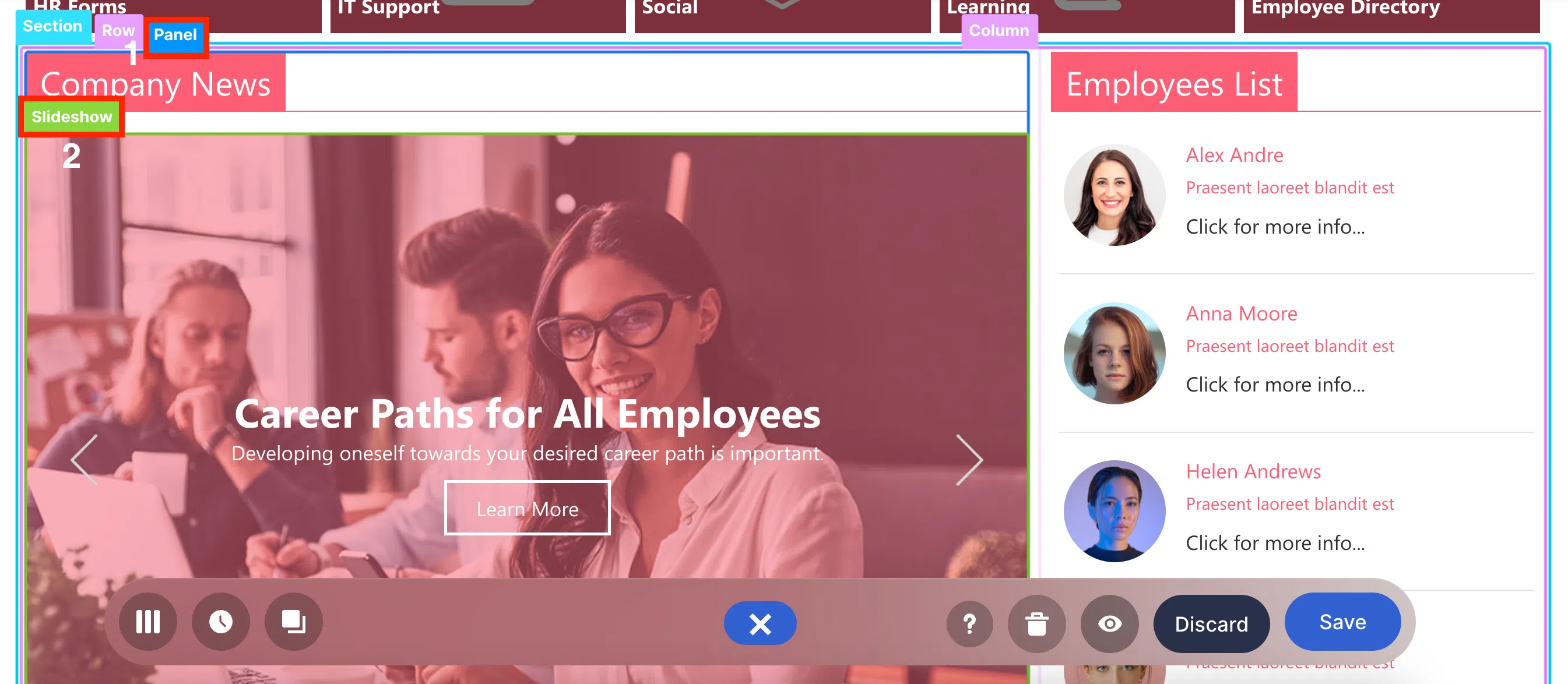
Another example is this [1] Panel Design Element which serves as a container for the [2] Slideshow Design Element that showcases news and other relevant company updates.
These are just a few of the Design Elements you can use to build your SharePoint site pages. You will learn more about them in the next tutorials. For now, let’s dive into ShortPoint’s two editing interfaces.
Add and edit Design Elements in Live Mode
To access the editing interfaces, you must first edit the ShortPoint web part. To do this, click Edit in the upper-right corner of your page:
Select the ShortPoint tag:
And click the pencil icon:
You will now be able to see Live Mode, which is the main editing interface of ShortPoint. Here, you will have a fully visual design experience. You will be able to see the changes you make in real-time.
To add Design Elements in Live Mode, click + section:
Then, select the Choose Layout icon:
From the list of layouts available, select the one you prefer:
Click the plus icon to open the vast selection of Design Elements you can use:
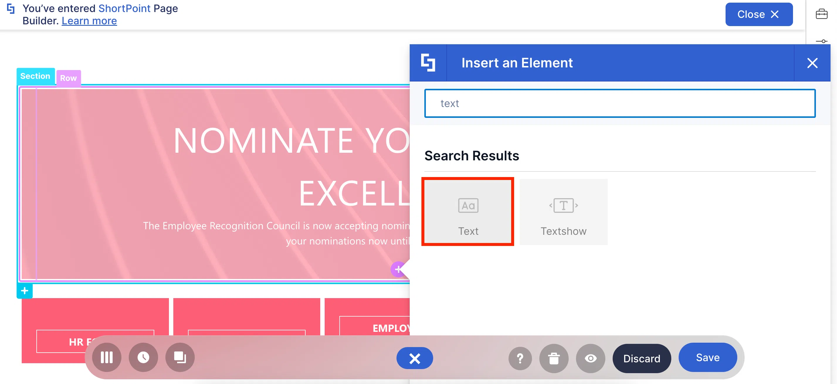
You can [1] use the search bar to look for the Design Element you want to add or [2] scroll down until you see the Design Element you want to insert:
Once selected, the Design Element settings window will open. The default contents and view of the Design Element will be inserted into your page.
Using the tabs inside the settings window, you can customize how the selected Design Element will appear on the page. Each tab contains specific controls for the features and functionality of the Design Element.
For example, the Design tab allows you to customize the look of your Design Element (including changing the style, color, and more):
After editing the Design Element, click the green check mark to apply your changes:
In case you want to edit the Design Element further, simply click the EasyPass tag of the Design Element:
And click the cogwheel icon:

Clicking the EasyPass tag also allows you to delete the Design Element, copy it, duplicate it, and more in the other actions dropdown.
Add and edit Design Elements in Grid Mode
Now, let’s move on to Grid Mode. To access it, click the Switch to Grid Mode icon:
Grid Mode is an outline-based interface. It is most useful when accessing features that are not yet available in Live Mode.
The experience in adding and editing Design Elements is pretty much the same as in Live Mode. Click + section:
Then, click the plus icon to see the library of Design Elements:
You can [1] use the search bar to look for the Design Element you want to add or [2] select the category of the Design Element you want to insert:
Like Live Mode, there are tabs that you can use to customize how the selected Design Element will appear on the page:
In Grid Mode, however, you can use two tabs that are currently not yet available in Live Mode. The first one is the Connect tab which allows you to create dynamic content for internal and external data sources.
And the second one is the Visibility tab which allows you to control the people and the devices authorized to see the Design Element:
Unlike Live Mode, you cannot see a live view of your changes. To see how a Design Element will look on your page, click Preview:
Then, select Insert to apply your changes

To edit Design Elements, in case of a mistake, simply click the cogwheel icon. Then, repeat the process above:
You also have the option to delete Design Elements, copy it, duplicate it, and more
Grid Mode also allows you to move Sections and Row. To do this, click the [1] up arrow to move the Section above or click the [2] down arrow to move the Section below:
There you have it! That’s how easy it is to add, edit, and customize Design Elements in ShortPoint.
Best Design Elements for Text
So, you’re told to design your company’s intranet BUT you don’t know where to start? There’s just TOO MUCH text—announcements, product information, company bio, forms, blog posts, and all that important “stuff” (that your manager told you to add). Now, you’re out here thinking, “How exactly will it all fit on a single SharePoint page?!”
Honestly, we get you! We get that problem too. You can’t exactly put a big block of text in the middle of your SharePoint page. (Well, you can…just don’t expect your users to stick around and read that novel.)
From YEARS of helping ShortPoint Designers, like you, we found that how you display and arrange text on your page can impact how your users engage with your content. That’s why ShortPoint has a library of Design Elements that allows you to present different text types in unique ways.
What exactly are those Design Elements? Let’s go through each one right now!
Text Design Element
In ShortPoint, the Text Design Element is the go-to Design Element for adding text content to your page. Why? Well, that’s because its basic function is literally to add text. Think of it like a notepad that you can insert into any part of your page.
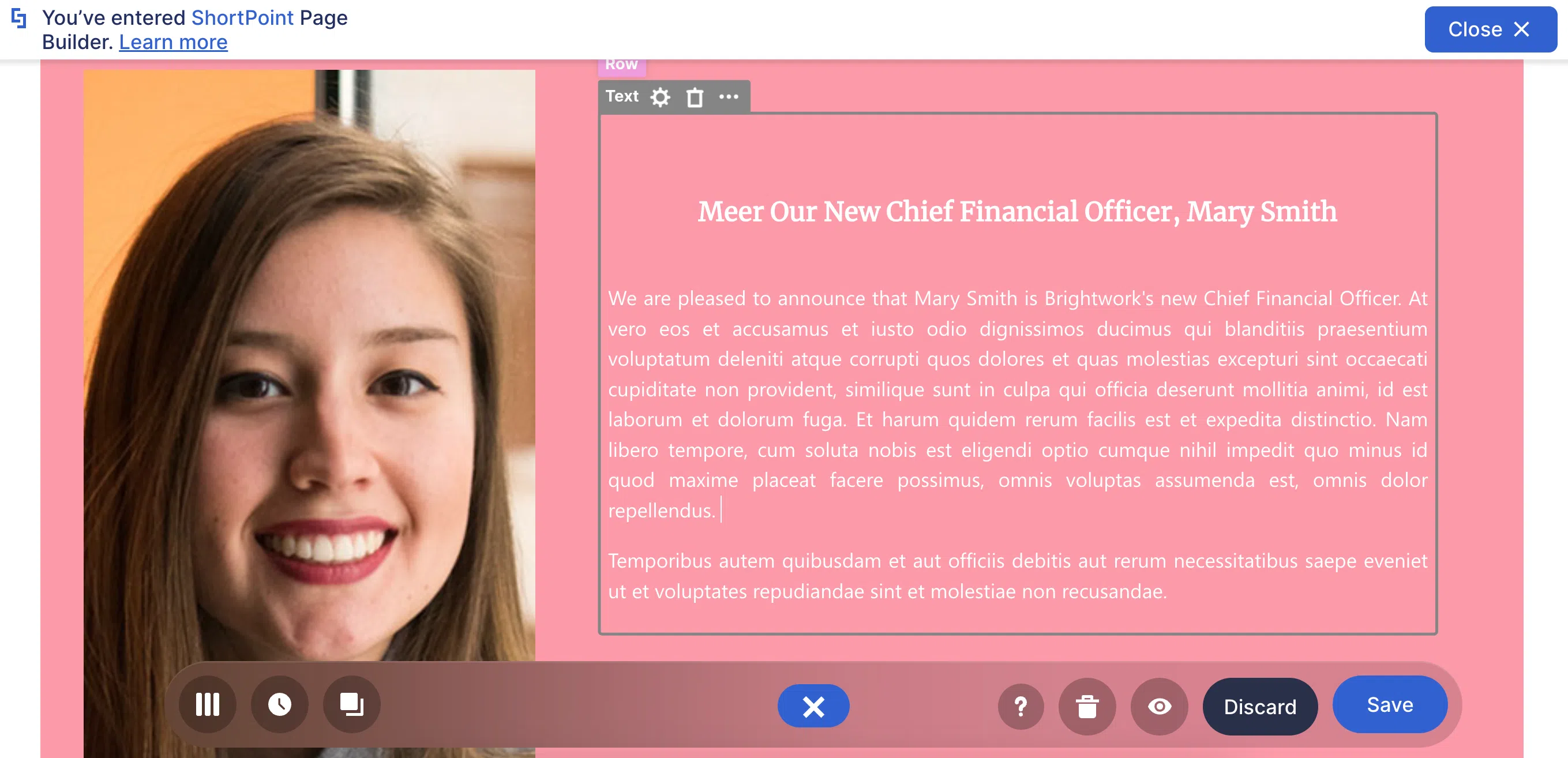
But what makes it special is the Rich Text Editor. With the Rich Text Editor, you can turn this BORING block of text from this:
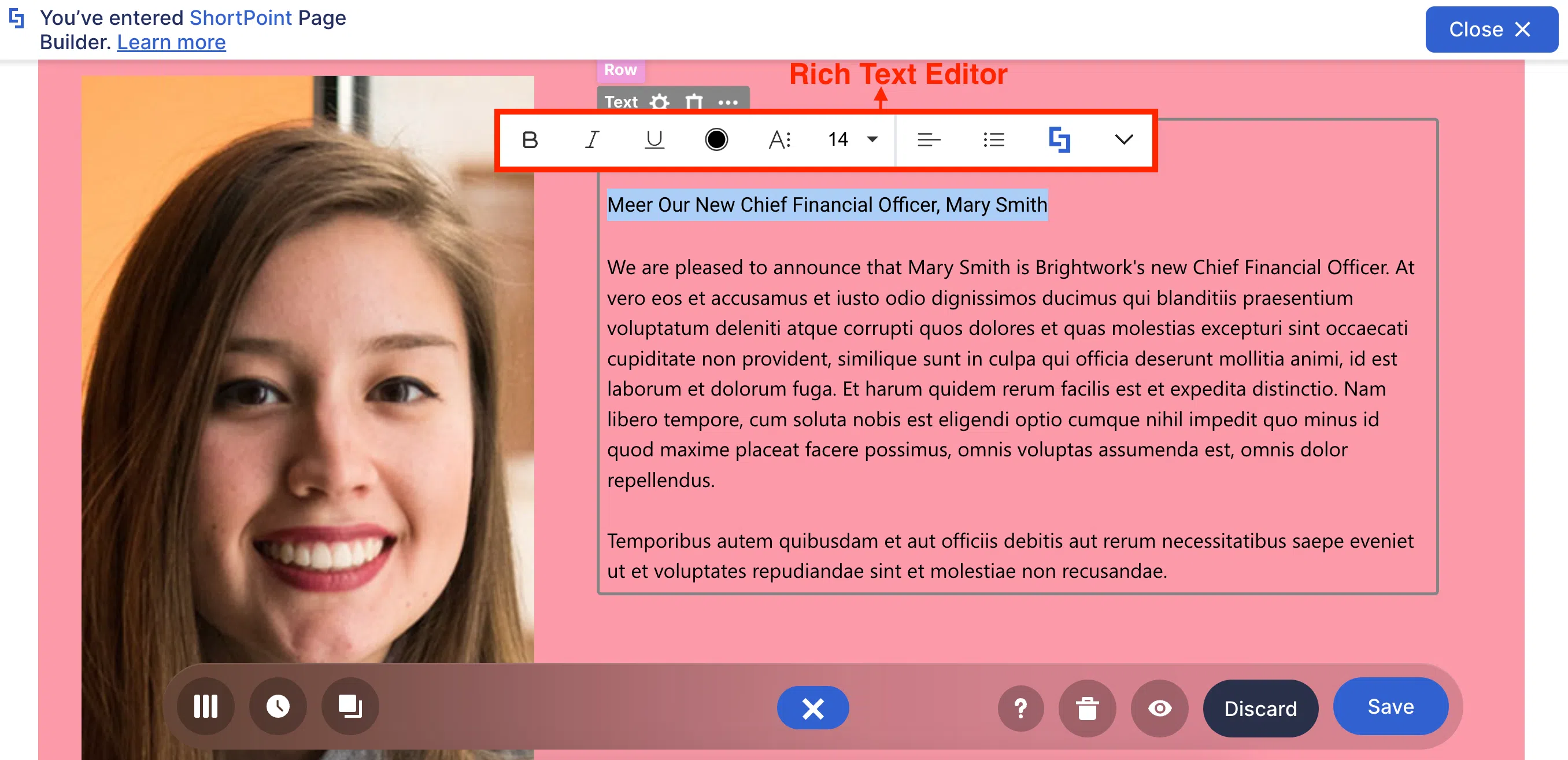
Into this! See how the font, font size, font color, and alignment are transformed? That’s all done using the Rich Text Editor. Now, you’ll probably agree that the text is easier to read and look at.
There’s more, though! The Rich Text Editor also gives you access to a wider range of Design Elements, called Inline Design Elements. With it, you can turn any text into a button, a link, an abbreviation, and so MUCH MORE.
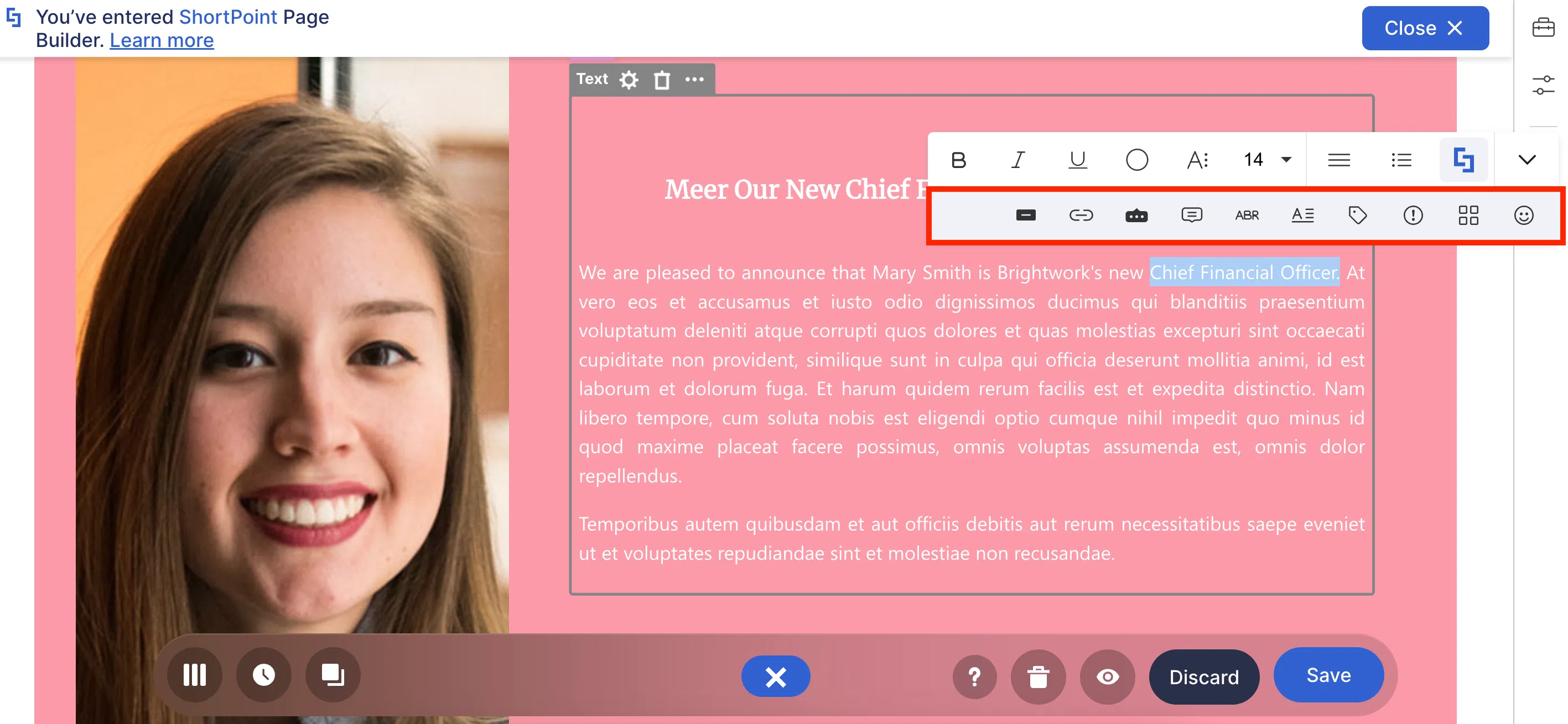
Need proof? Notice how “Chief Financial Officer” changed into “CFO”. MAGIC?! No, just the amazing work of the Rich Text Editor and how it allows you to create interactive text content.

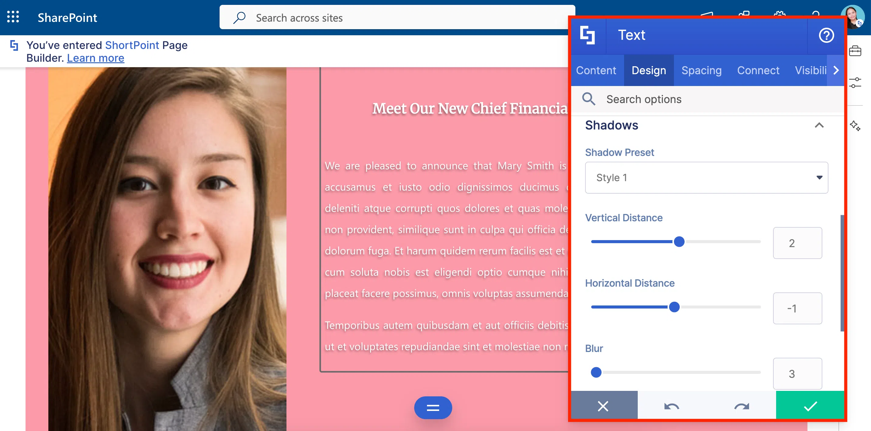
Wait…don’t go yet! There’s more to the Text Design Element. It has a Settings window with many useful tabs. Here, you can customize EVEN MORE how your text will look—like adding a shadow to make your text POP OUT.
We know we keep saying it…but there is REALLY more to discover! You can check all of it in How to Customize the Text Design Element.
Button Design Element
Who says all your text content should be on a single page?! Certainly, not the Button Design Element! With it, you can redirect your users to the other important “stuff” your manager told you to add—like the submission form or the questionnaire they need employees to answer.
You can easily change the title of the button, add a subtitle, change the redirection link, and even add an icon.
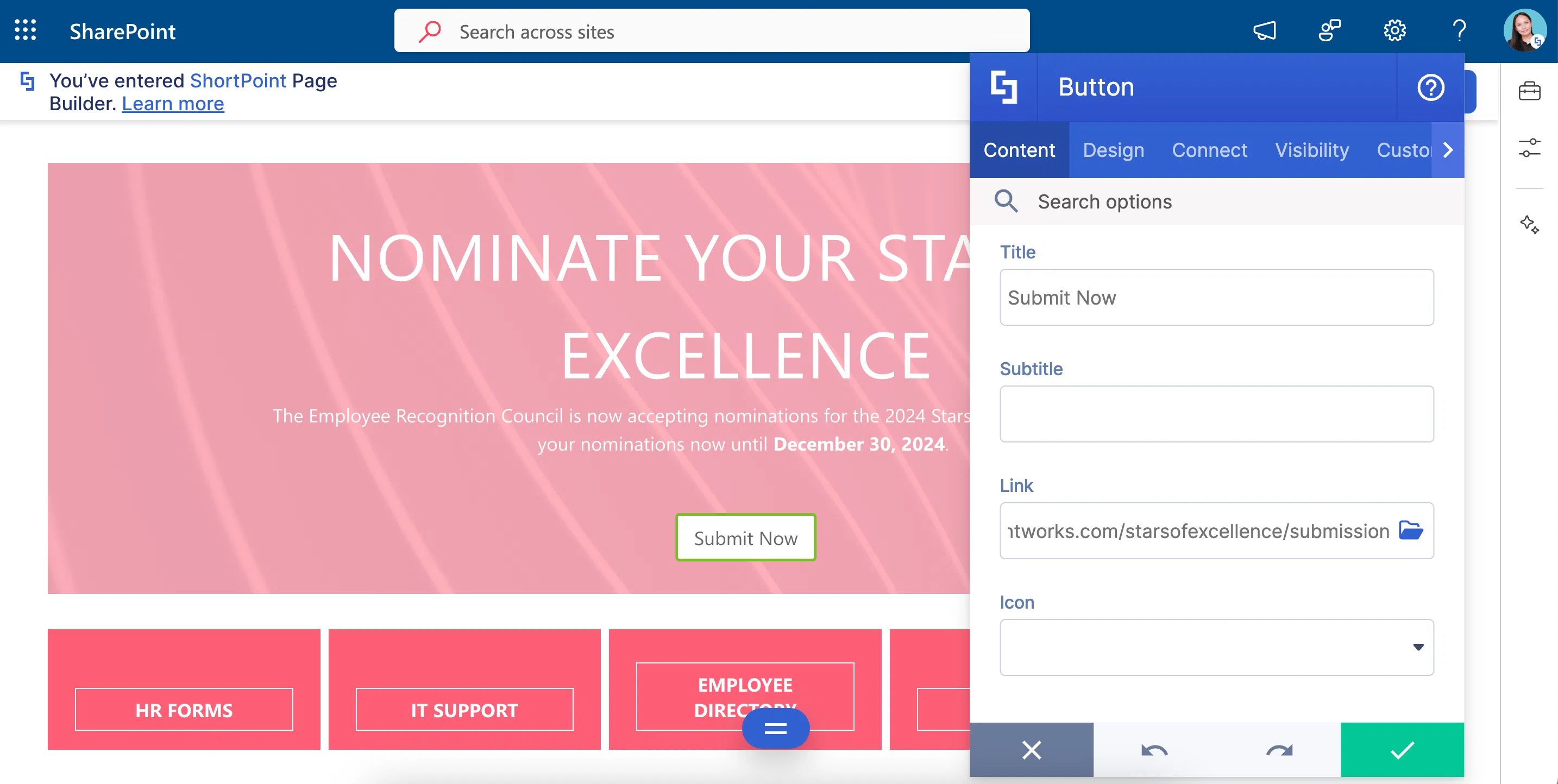
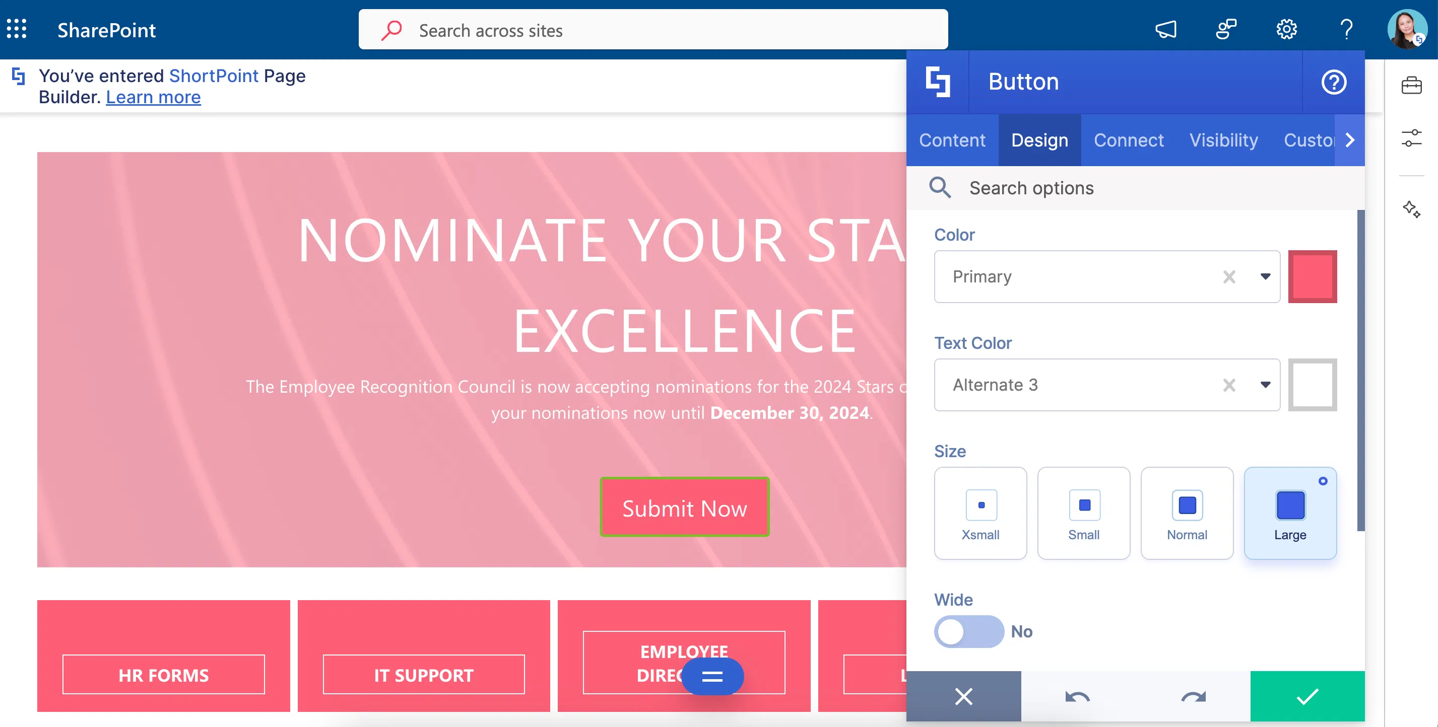
And to make it more interesting, the Button’s design is also up to you! You can change the color, the size, and even how the page linked to the Button will be opened.
Eager to see more of the Button’s features? You can check out How to Customize the Button Design Element for a detailed guide on all the customizable features.
Link Design Element
Think the Button Design Element is too IN YOUR FACE? The Link Design Element is here to save your day!
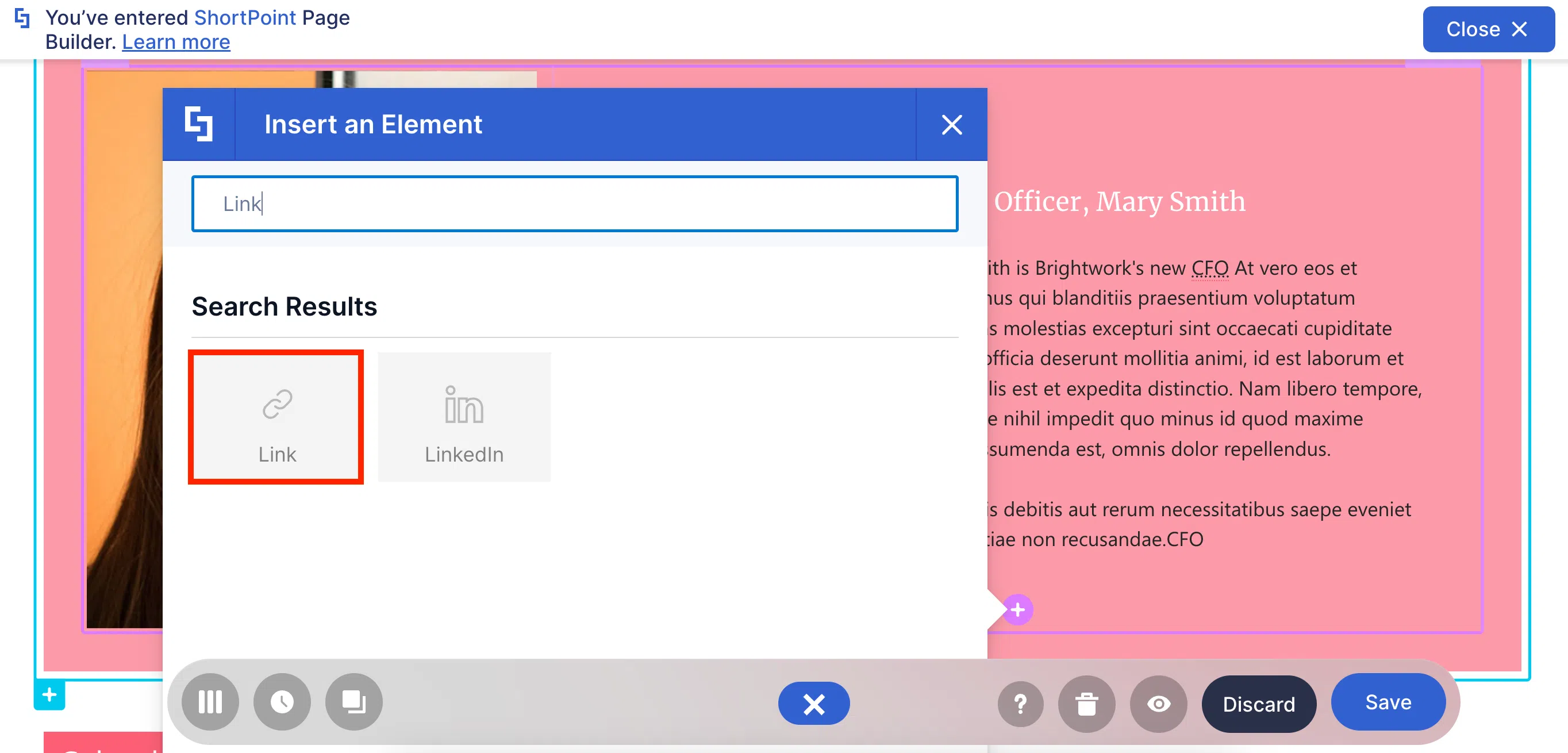
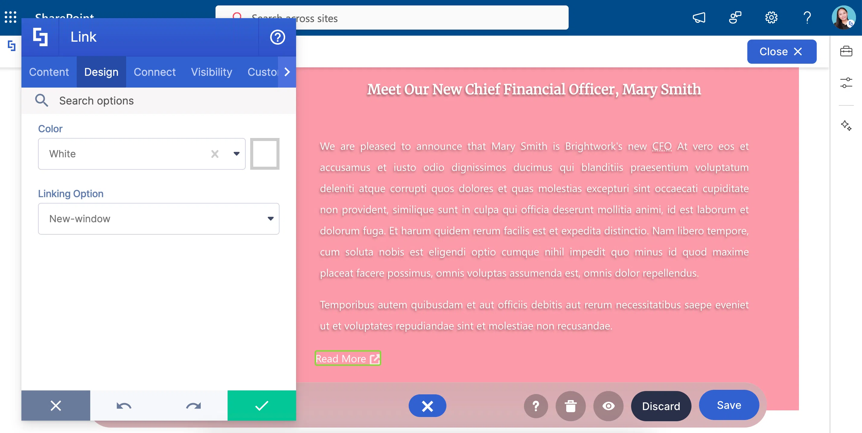
The Link Design Element works like the Button Design Element. It redirects your viewers to another page. Even its customizable features are mostly the same. What makes it different is its subtle look. While the Button screams, “NOTICE ME”, the Link says “I’m here if you need me.”
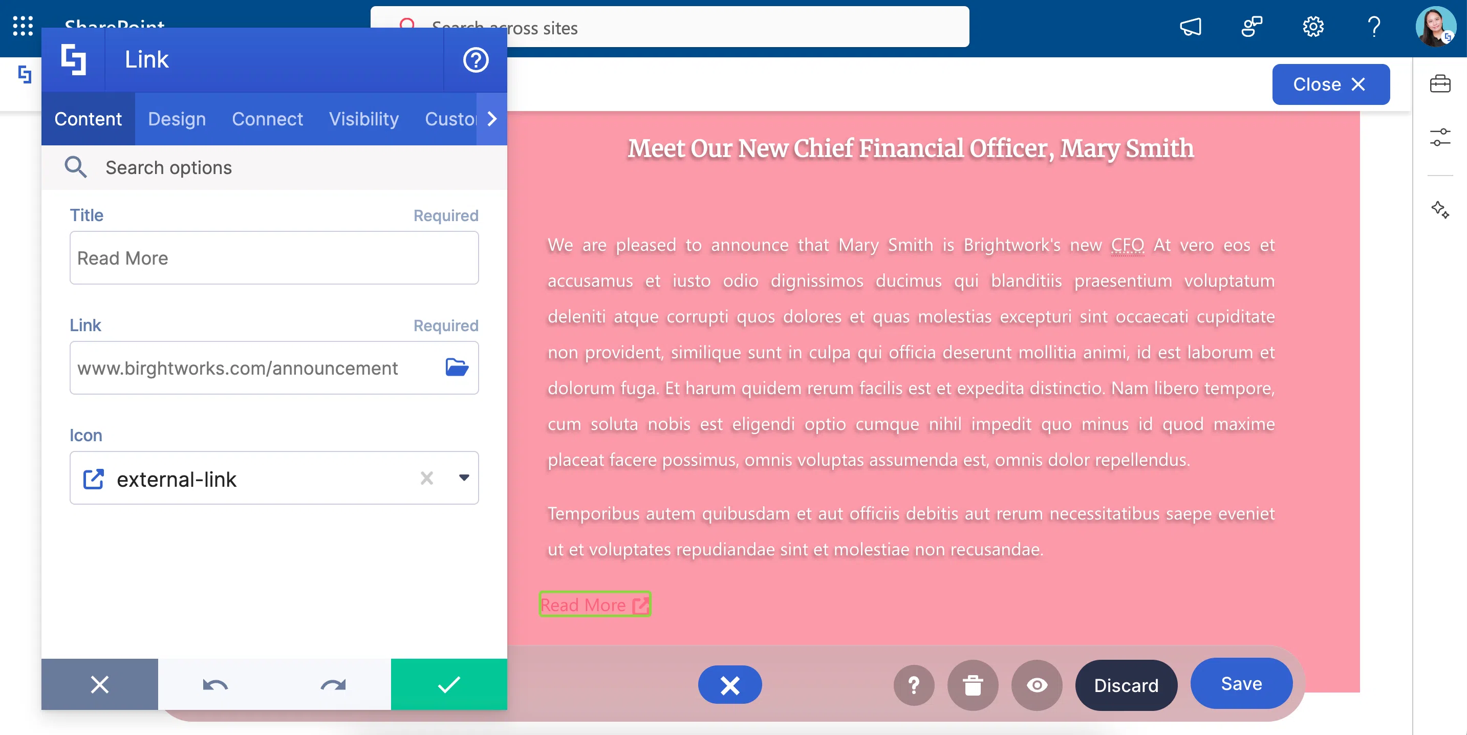
The Link’s design is also your choice! You can change the color and how the link will be opened.
Care to know more? To get more details, check out How to Customize the Link Design Element.
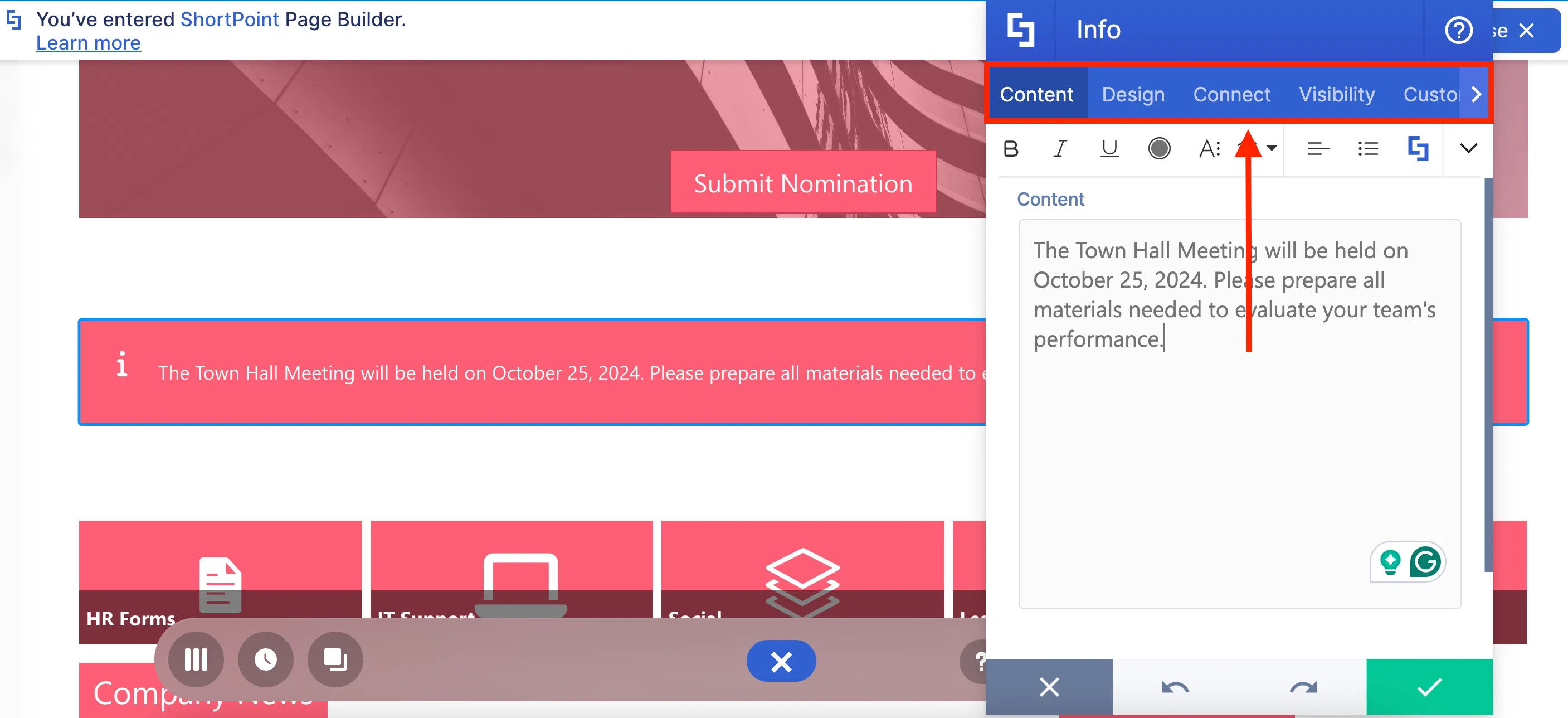
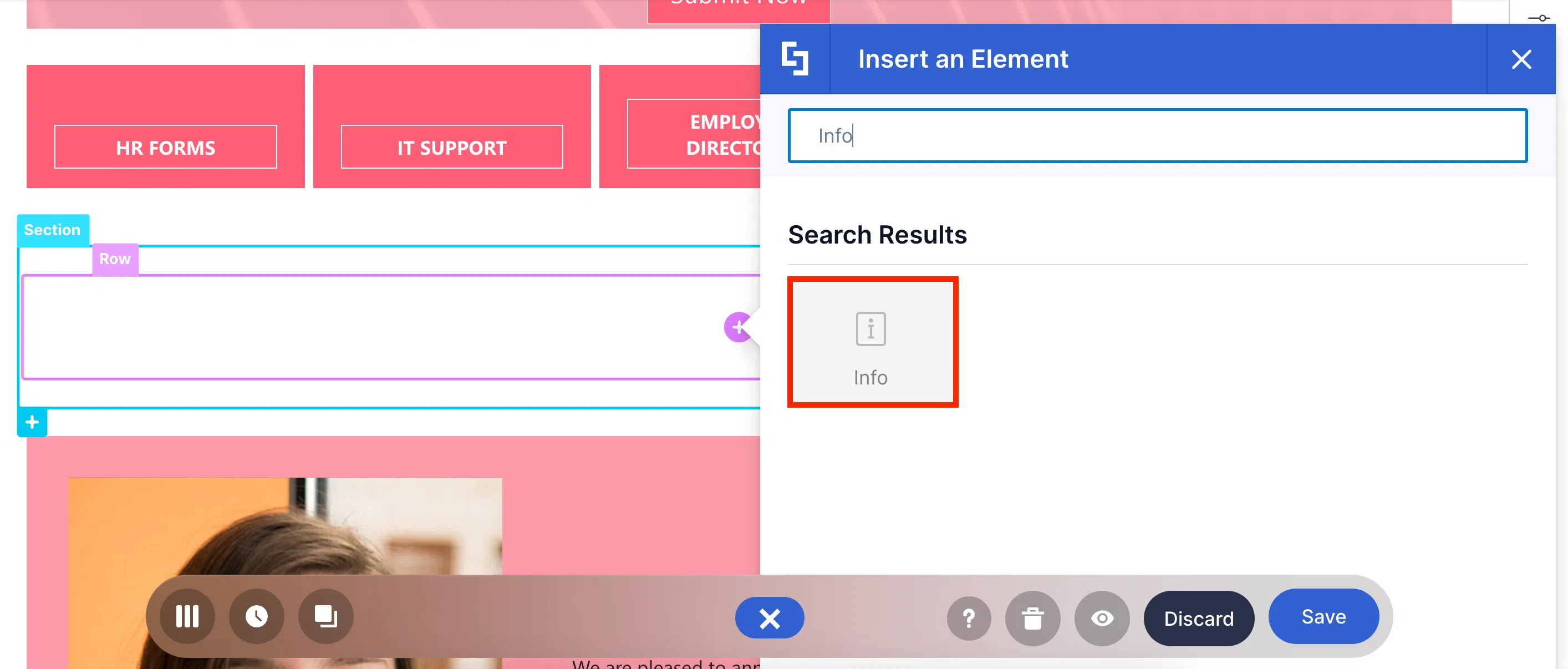
Info Design Element
Imagine going to a meeting and right after, you suddenly have a BUNCH of announcements you need to deliver to all your employees. Now, how will you do that? The Info Design Element, of course!
With it, you can craft any announcement you want—whether it's about the Annual Compliance Certification or about your upcoming Vacation Leave (if you still have any).
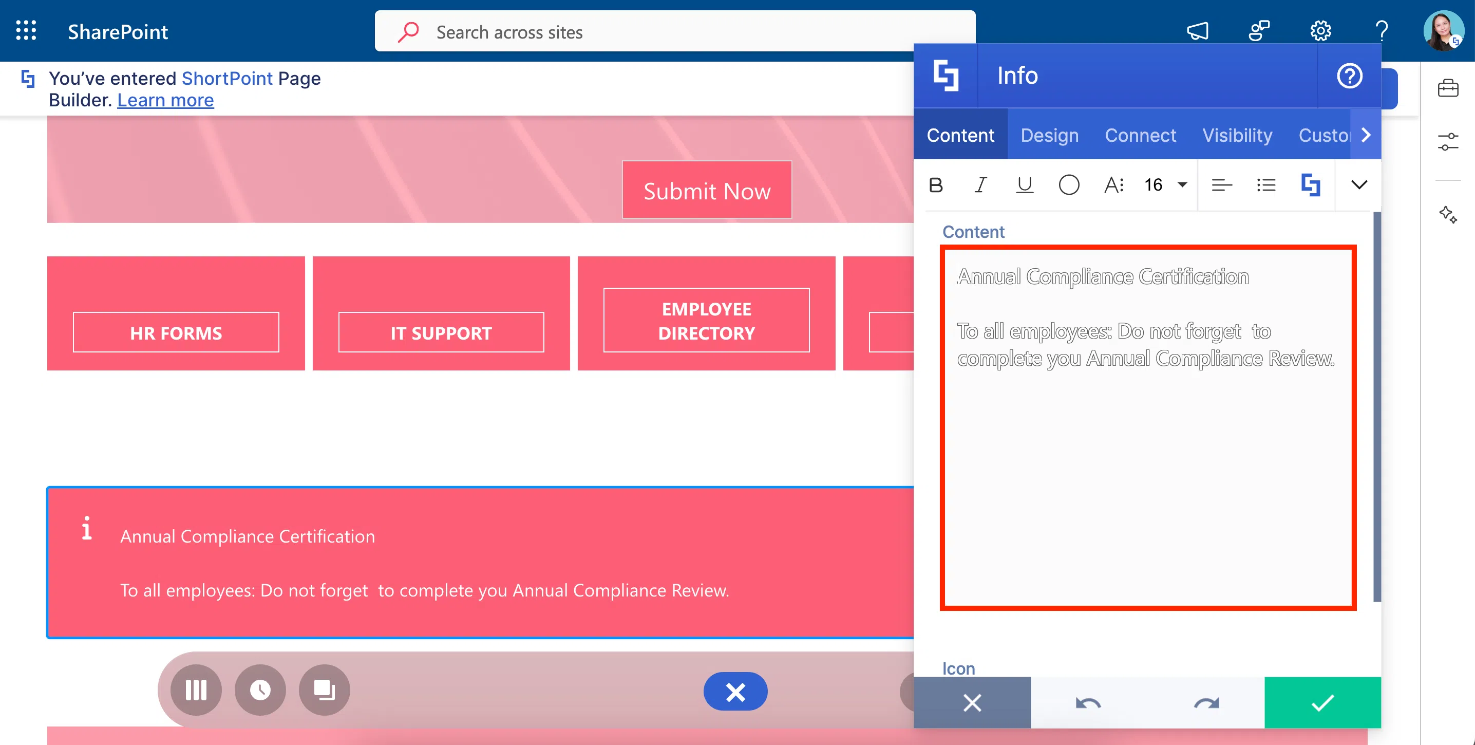
You will also notice that it has a Rich Text Editor. It works just like the one we used in the Text Design Element.

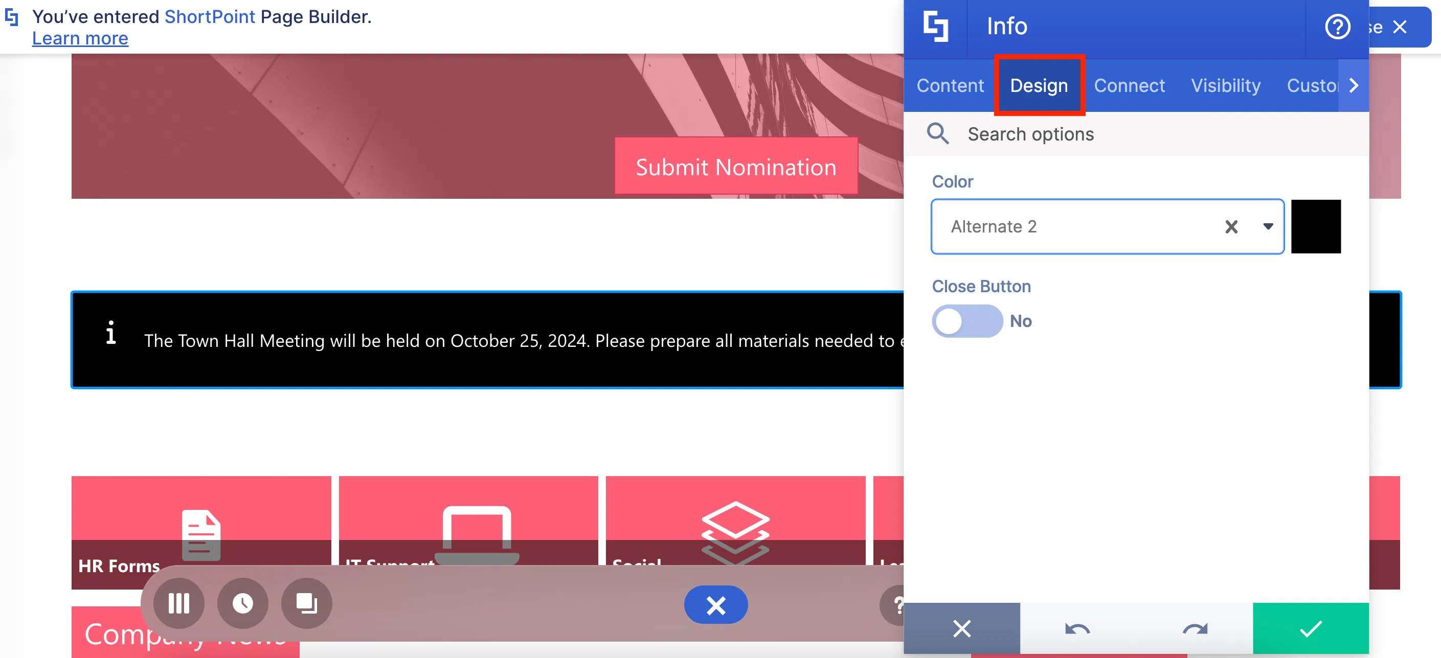
And of course, the look of the Info is your own adventure! Choose whatever color you like. You can even add a close button to have the option to dismiss the Info.
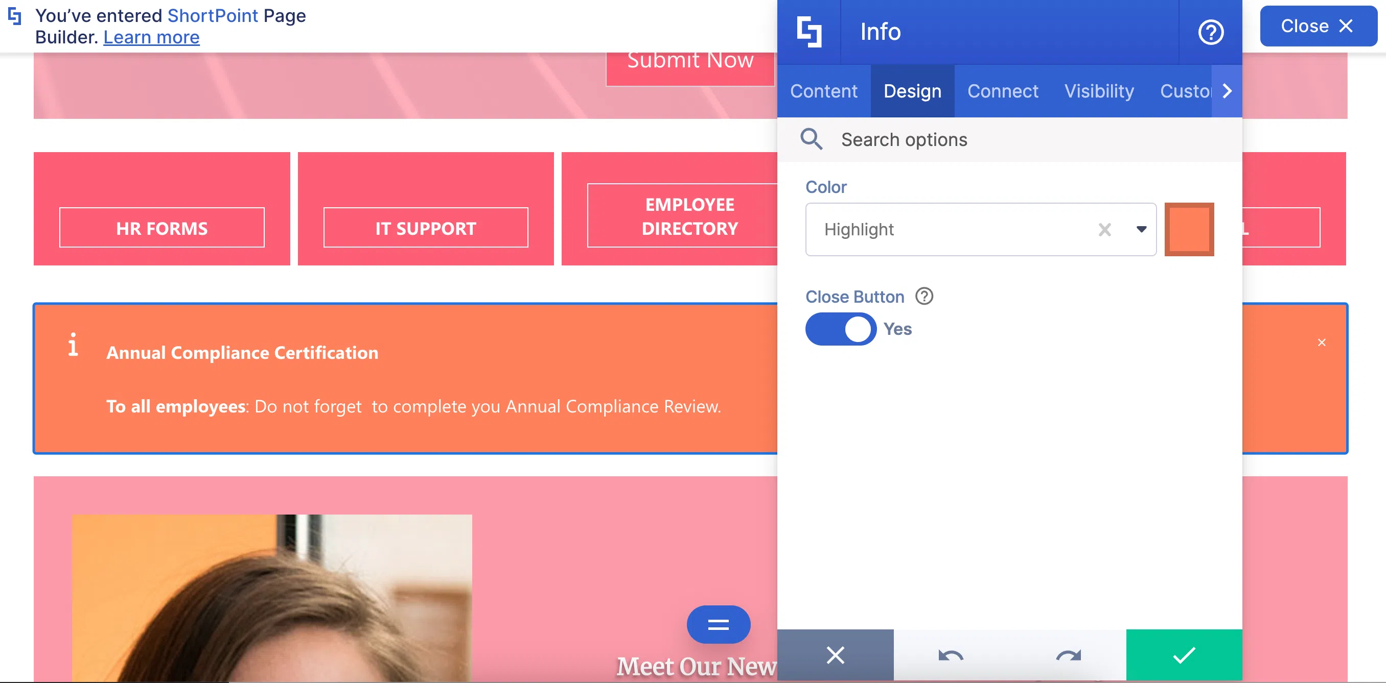
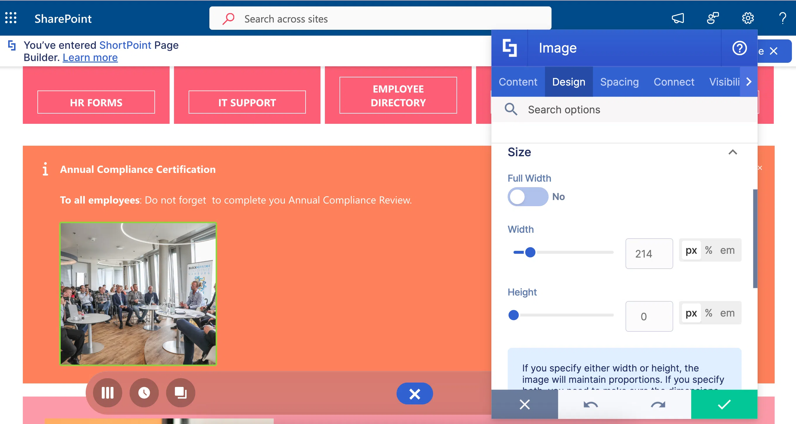
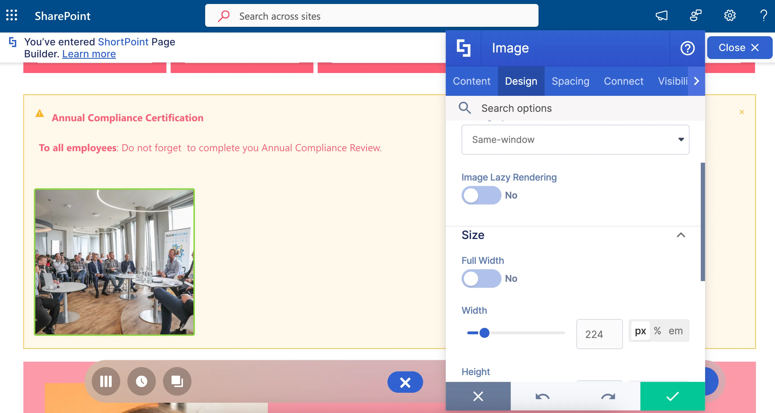
Want to know something EVEN MORE impressive? You can add other Design Elements inside Info. This is because Info is a Content-holder Design Element. All it means is you can add Images, Links, Buttons, and more inside if you want to.
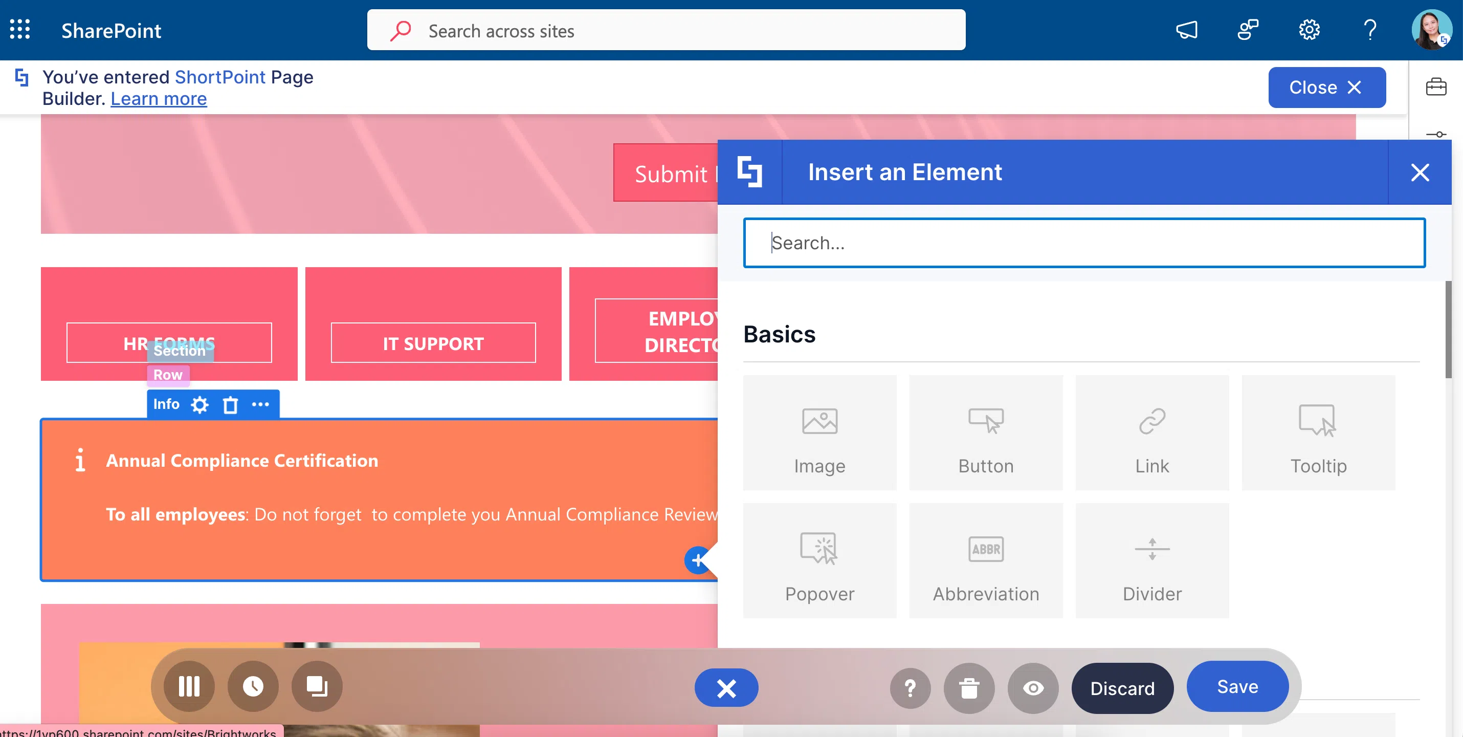
Here’s how it looks with an image inside:
Ready to make an announcement? Check out How to Customize the Info Design Element before you do to learn more about the features you can tweak.
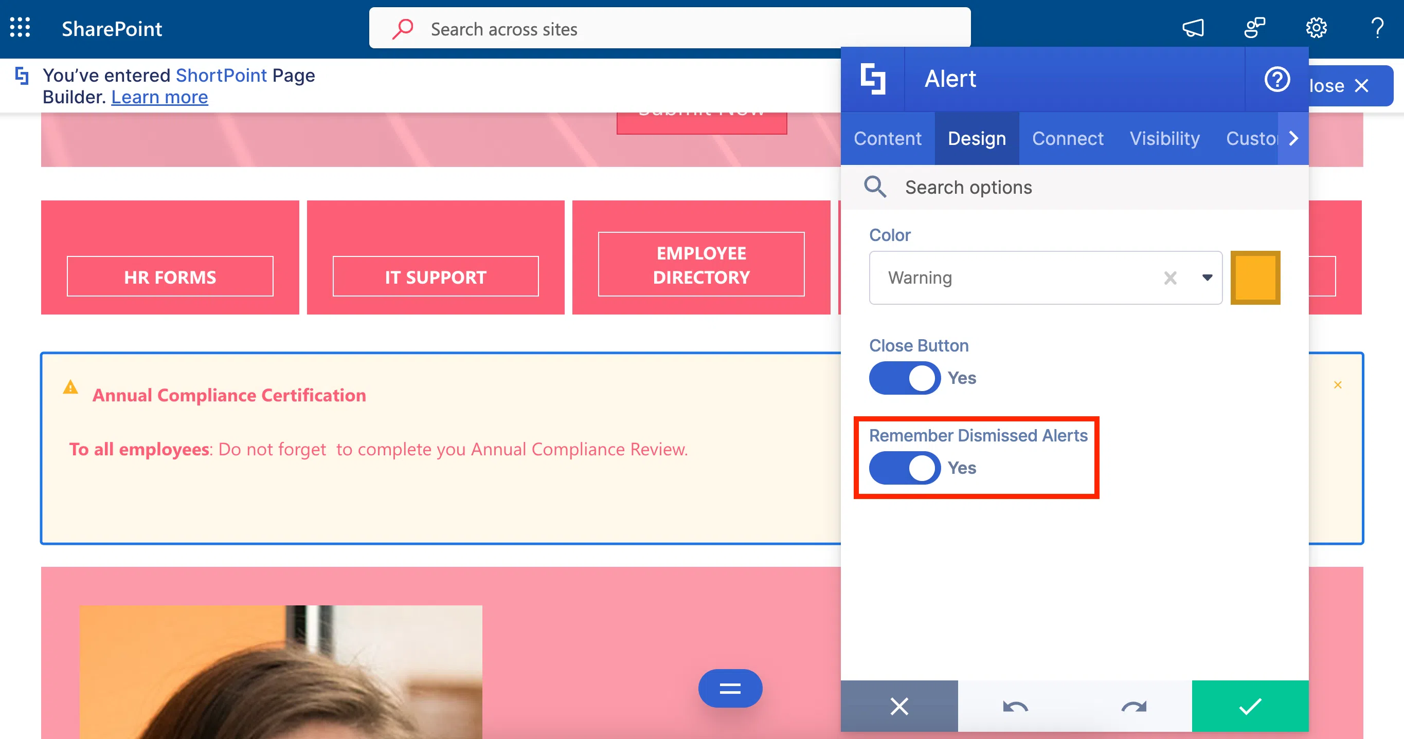
Alert Design Element
What if you don’t want your announcements to be repetitive? Use the Alert Design Element, instead!
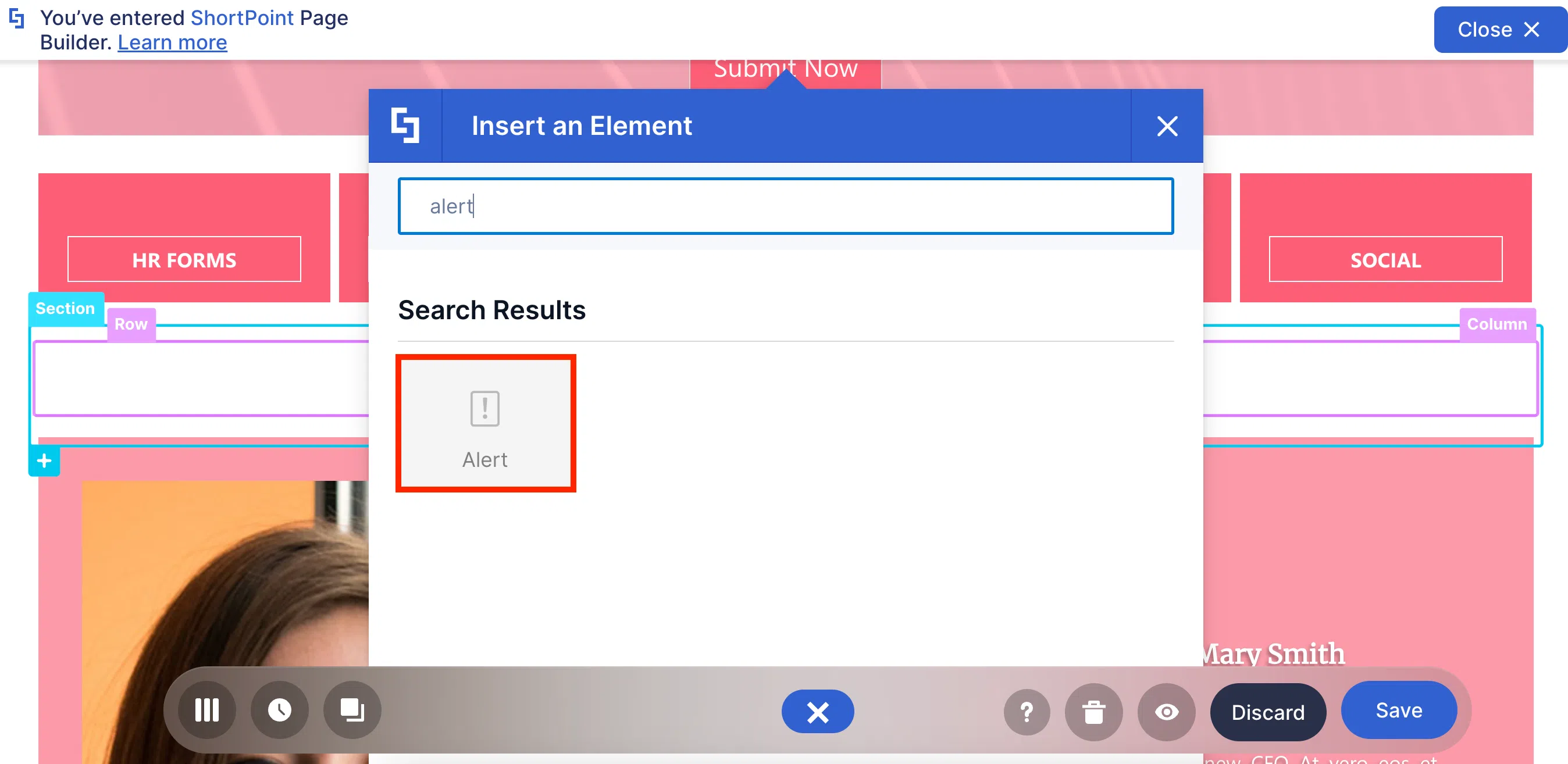
Like the Info Design Element, it is mainly used to announce important company information. It also has the Rich Text Editor which you can use to format the text inside the Alert.
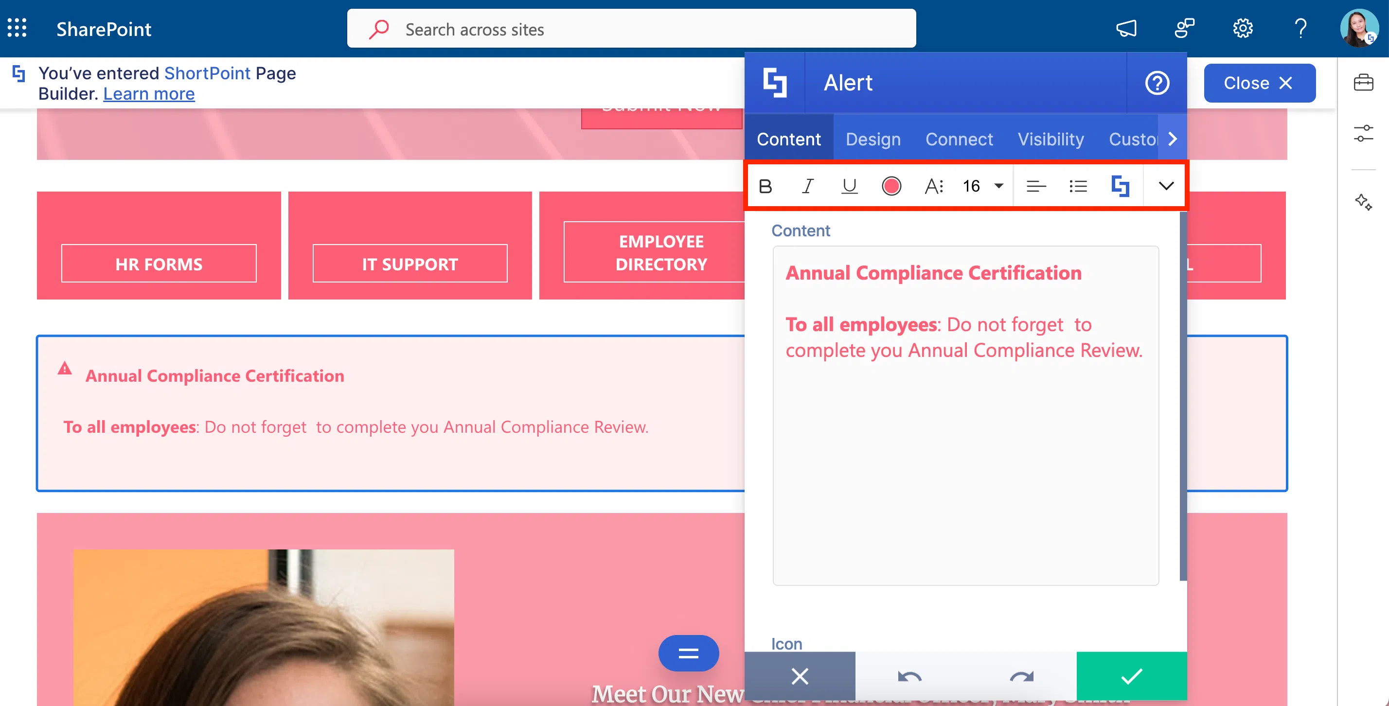
You can also change the background color and add a close button. But then, if it’s SO similar to Info, why should you even bother to use the Alert? Easy, to make announcements less repetitive! After all, no one likes seeing things over and over and over and over (see what we did there) again.
Unlike the Info Design Element, Alert has the Remember Dismissed Alerts option. This option remembers when your users dismiss an alert and prevent it from reappearing when the page reloads.
Alert is also a Content-holder Design Element. You can choose to add other Design Elements inside to make it look more eye-catching.
To start creating Alerts, check out How to Customize the Alert Design Element.
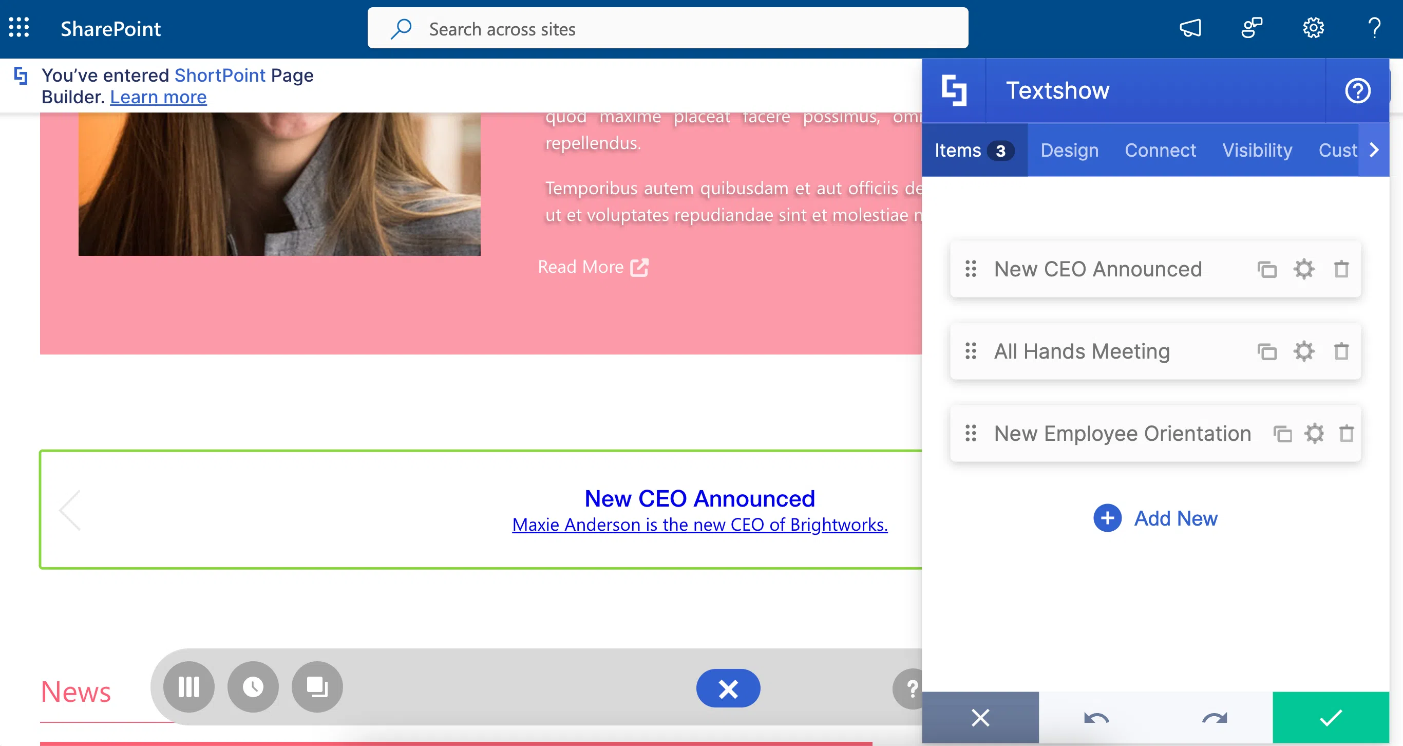
Textshow Design Element
Worried about that LOONGGGG blog or news post you need to add to your page? The Textshow Design Element is your saving grace!
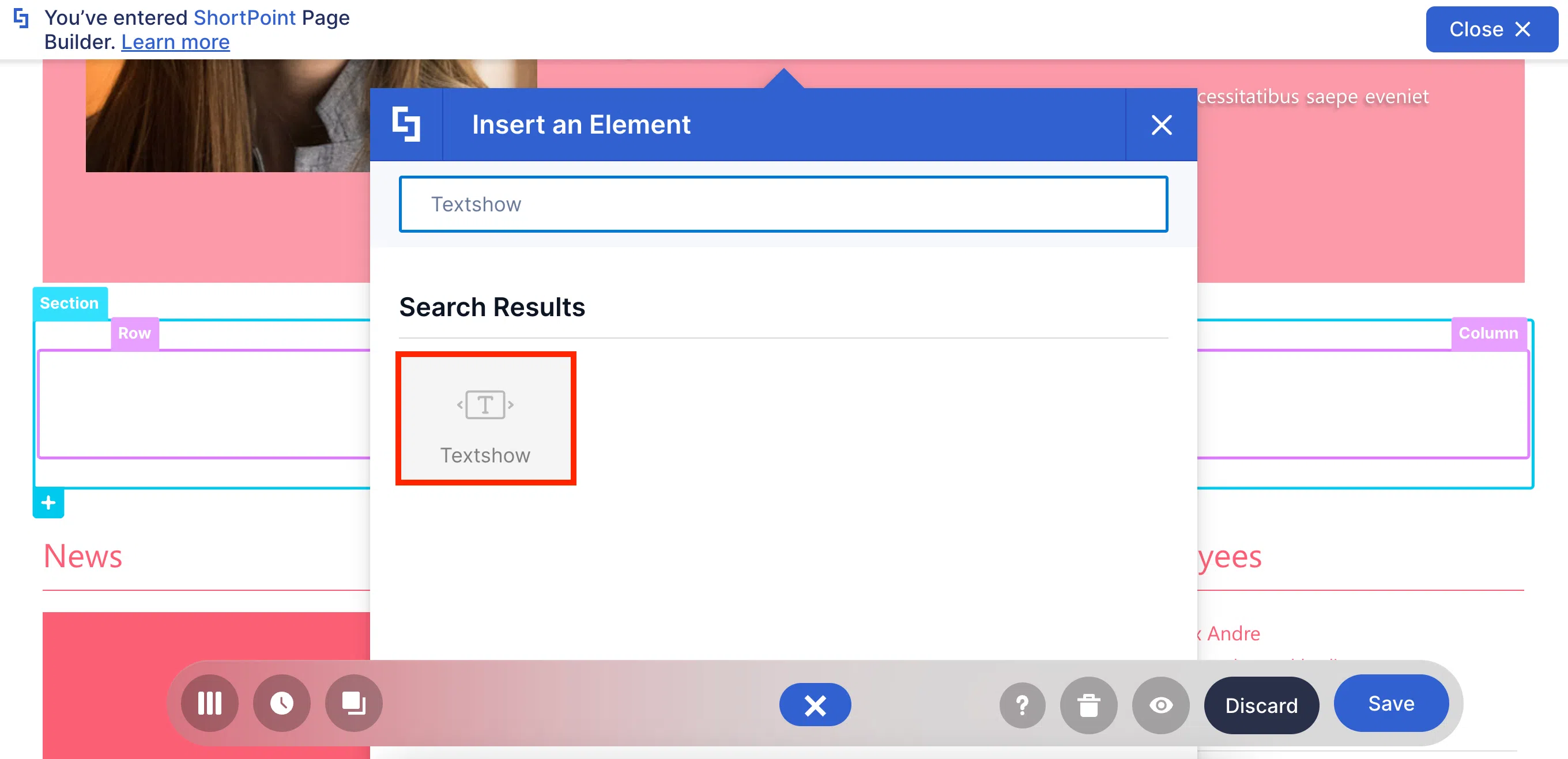
With the Textshow Design Element, you can simply link that LOONGGGG blog post to your main page. All you need is a title, a brief description, and a link.
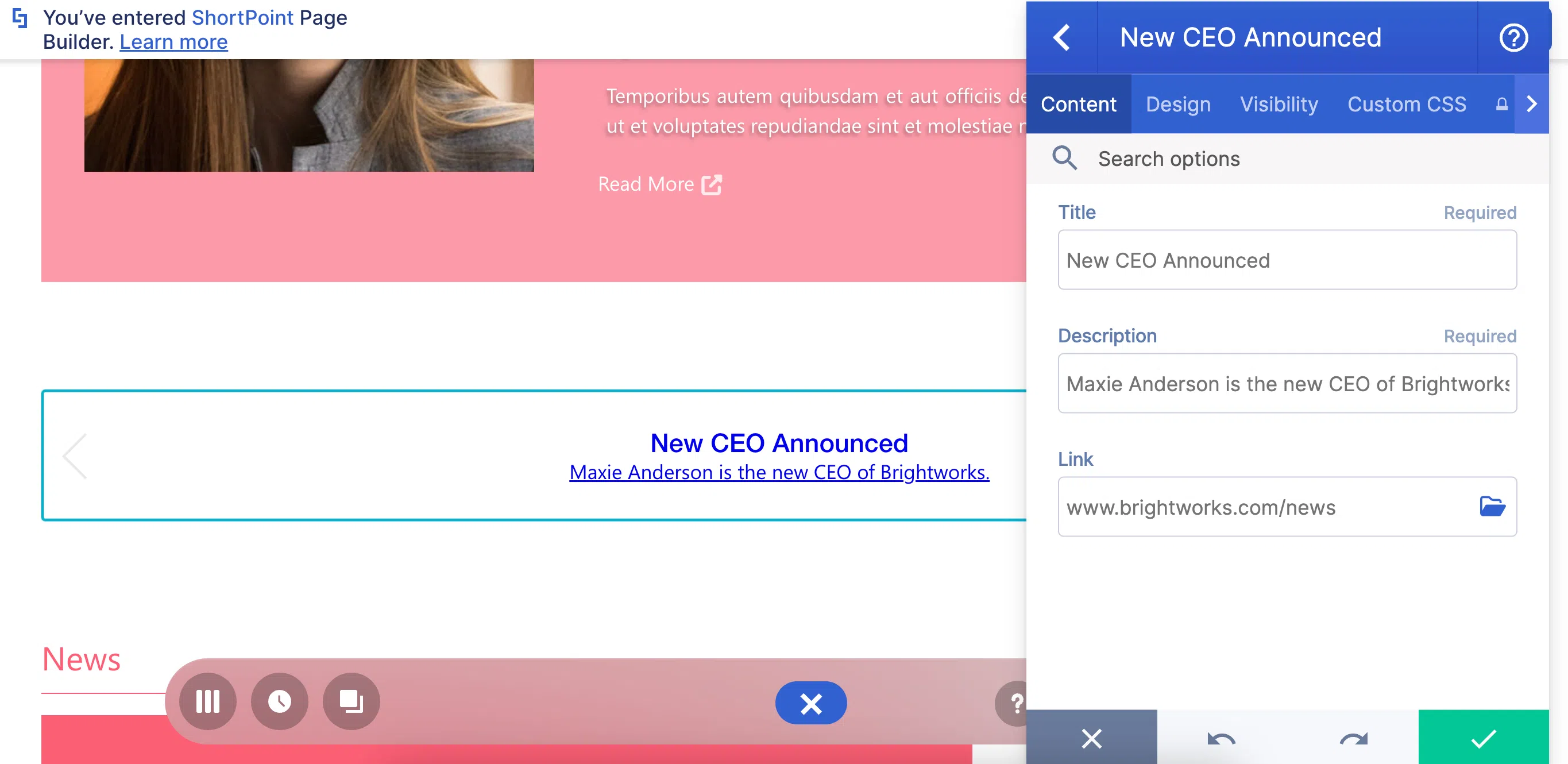
The best part is you can link multiple posts! With this, your users won’t have to go through a novel just to stay updated. And if they REALLY need to read that post, all they need to do is click on the Textshow.
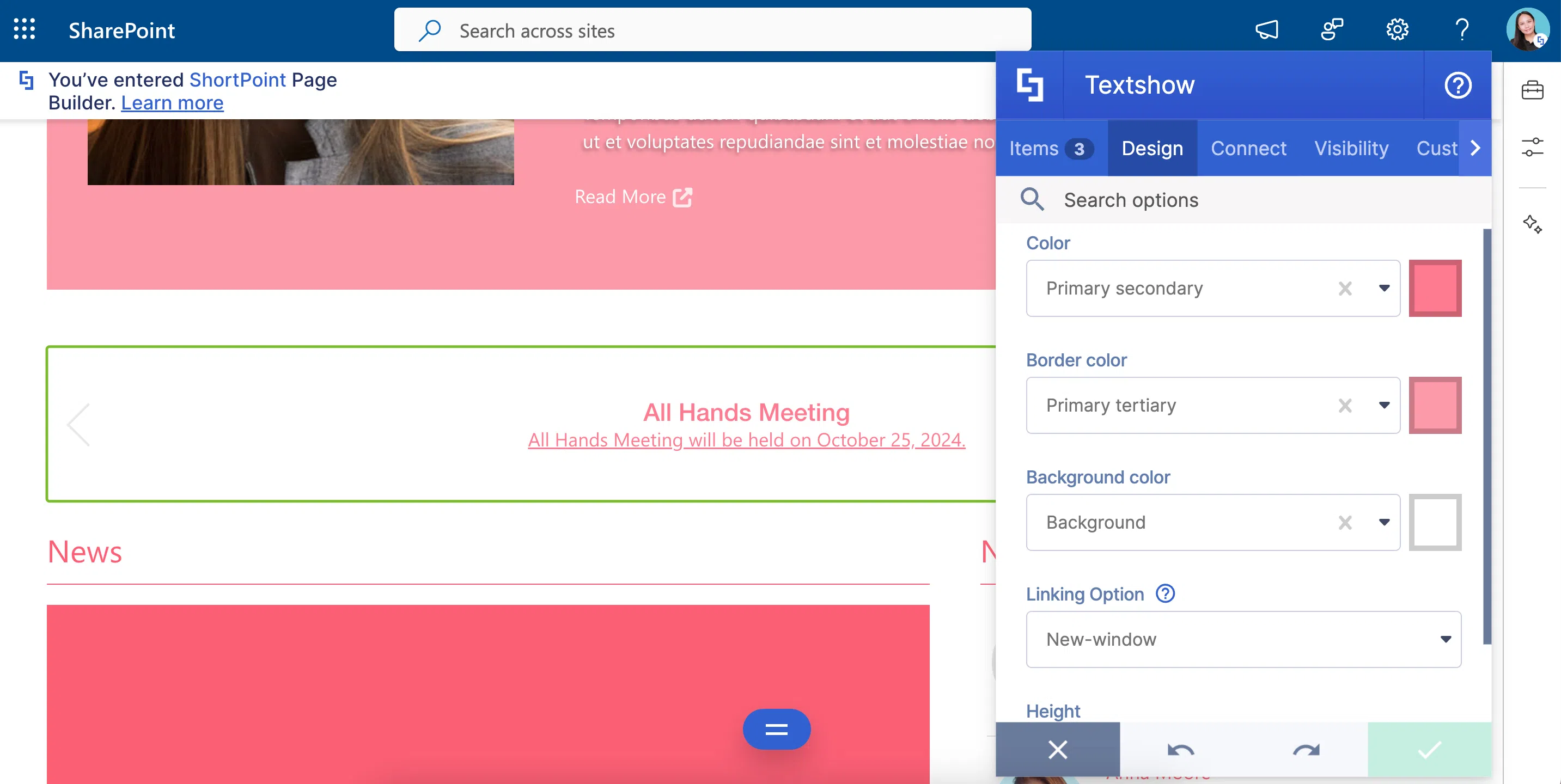
The Textshow’s design is also your choice. It’s your Textshow, after all! Play with the colors and the height all you want.
What are you waiting for?! Add a Textshow to your page now! Check out How to Customize the Textshow Design Element for more details.
Tickers Design Elements
Do you need to show more than one announcement? The Tickers Design Element is perfect for this!
No one likes reading LOOONG lines of text. So, we’re sure your users will LOVE your short and fast-paced updates using the Tickers. All you need is a title and a link.
You can also play around with the Tickers’ style, color, size, speed, and even transitions. There are just sooooo many options to make the Tickers’ design your own!

Excited to use Tickers on your page? Check out How to Customize the Tickers Design Element to get started.
Connect for Text
Adding text directly to ShortPoint Design Elements is good, AMAZING even! But what if you want to show text from another source, like a Document Library or a SharePoint List?
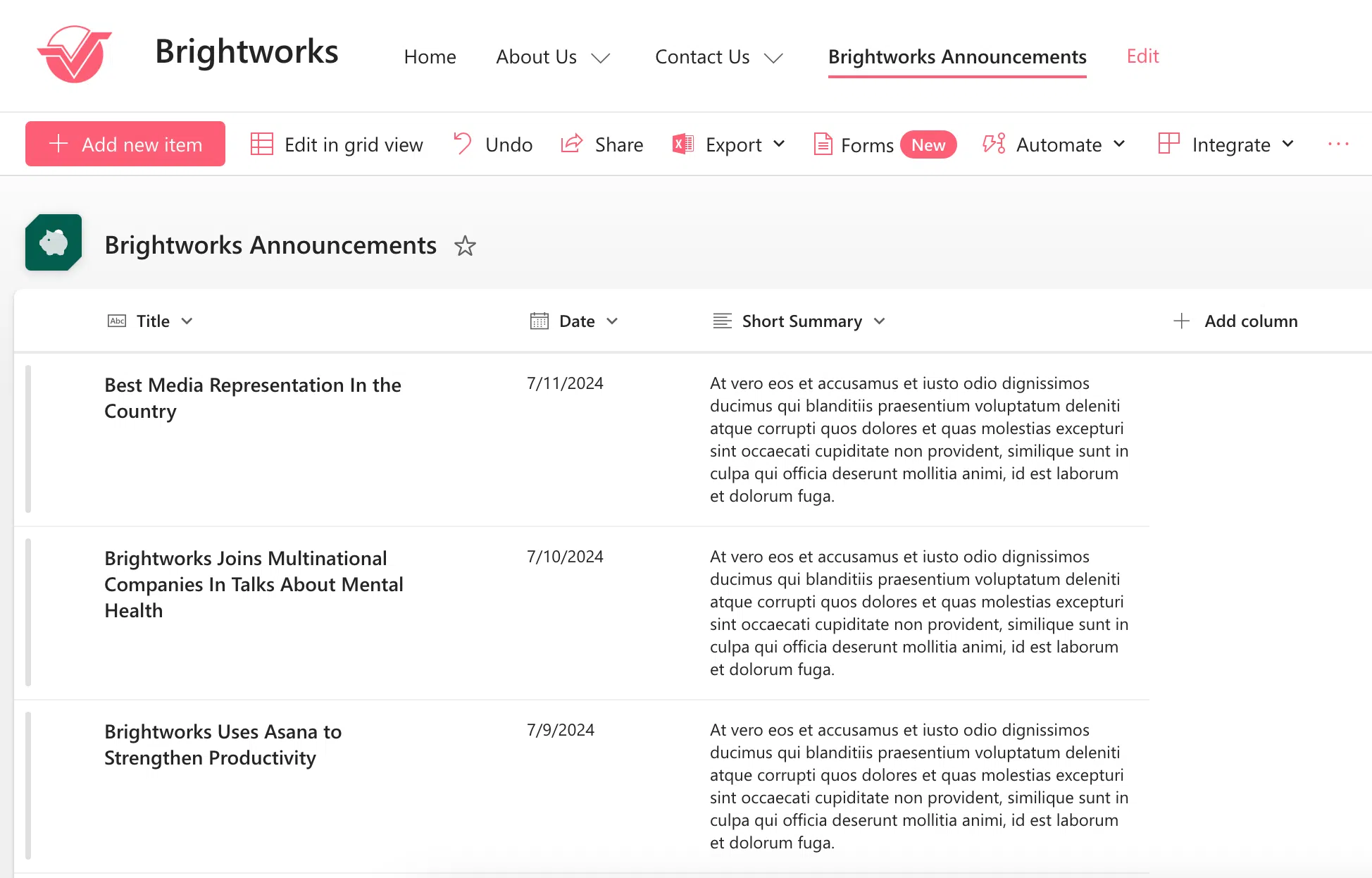
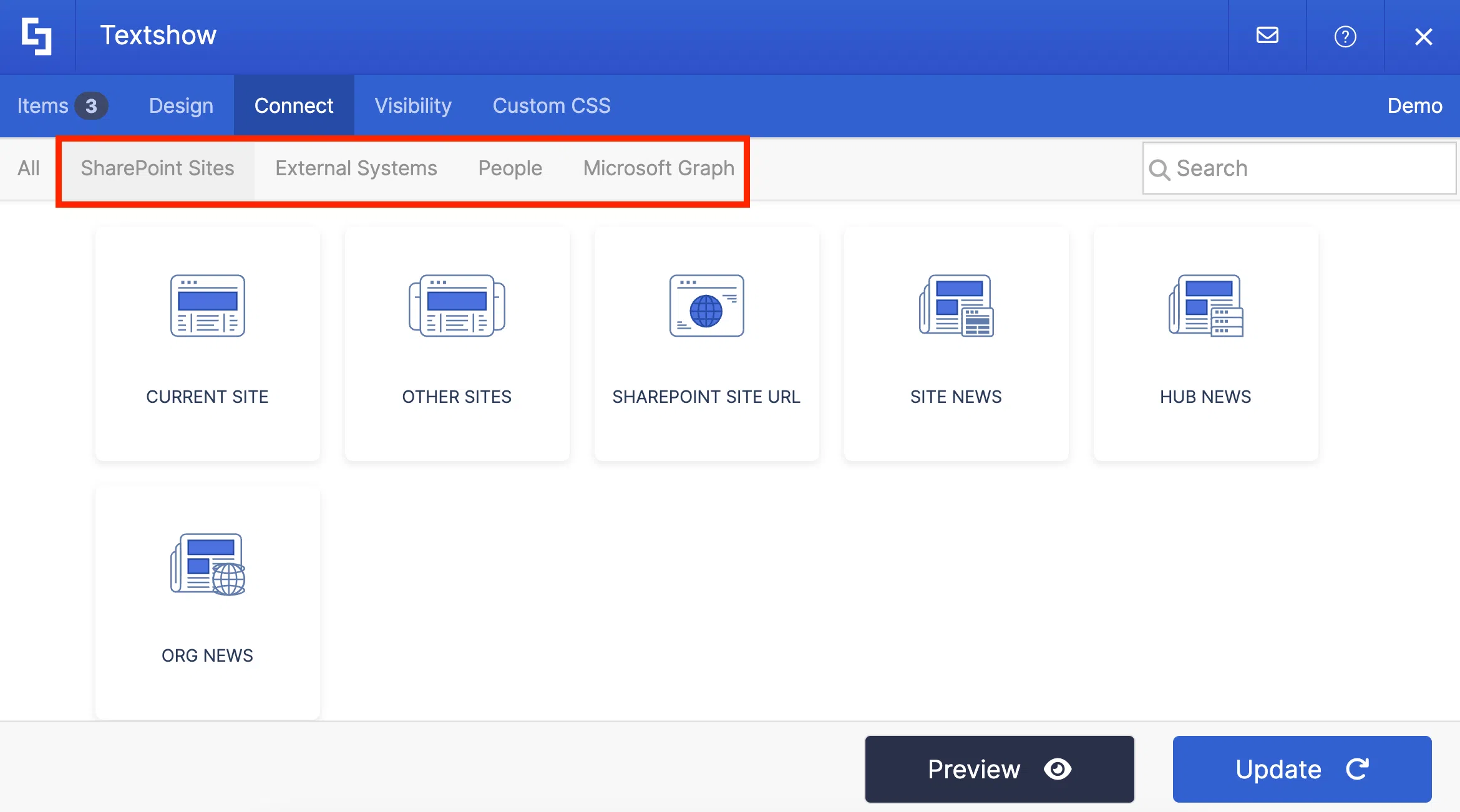
ShortPoint Connect is your best bet! You can find it in the Connect tab of all the Design Elements we talked about.

You have MANY options to connect. You can automatically pull text from your SharePoint sites, your Outlook calendar, and even other external sources (like RSS feeds or Rest API).
Want to see how it works? Let’s connect the SharePoint List we showed earlier to the Textshow Design Element. Notice how the items are copied WORD for WORD. That’s the power of ShortPoint Connect!
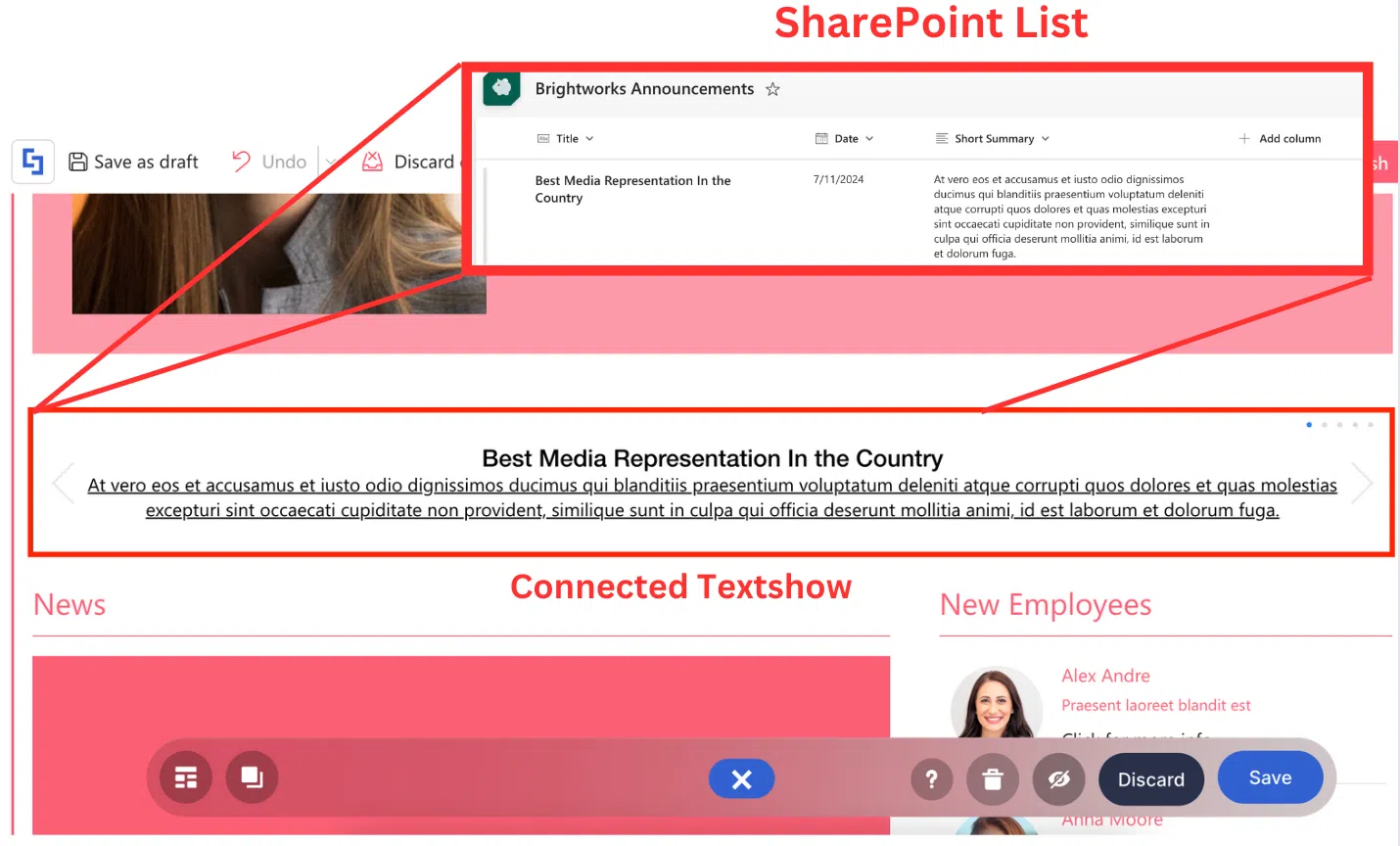
But what if you updated the SharePoint List? Do you have to go back and update the connected Design Element too? The answer is NO!
We want to make the ShortPoint Connect experience as convenient as possible for you. Any changes you make in the SharePoint List or external source will automatically be reflected on your connected Design Element. For example, when we changed “Country” to “Asia” in our SharePoint List, it automatically changed on our connected Design Element too.
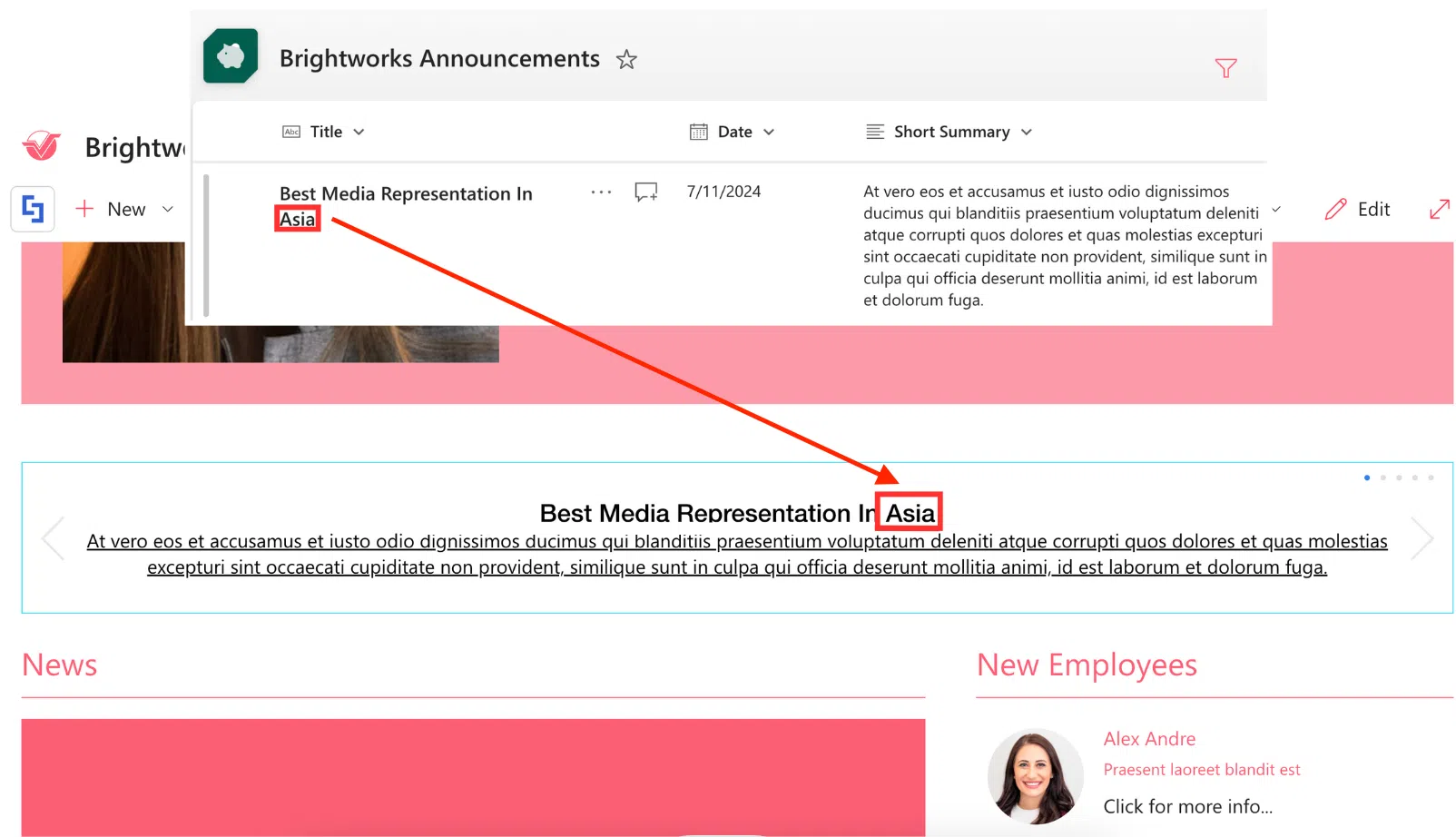
Want to start connecting? Check out ShortPoint Connect: Basic Tutorial to get a step-by-step guide on how to use ShortPoint Connect.
Now that you know all the Design Elements you can use to show different text content, you’re ready to start designing! Just remember all the features we showed you and your users will surely LOVE reading your content.
Best Design Elements for Images
“Add images to the page. It’ll look better!” You’ve probably heard your manager say that line SOOO many times while designing your intranet that you can recite it in your sleep. (Trust us, we get the nightmares too—kidding!).
But we do have to agree with your manager—images do make your intranet MUCH MUCH better. Why? Well, think of the last time you ordered food on an app or a website. Which do you remember better, the photo of that JUICY burger or the description? Most likely, the image, because it appeals to your emotion of craving that burger and wanting to eat it.
This doesn't mean though that you can just throw random images on your page and call it a day. Context and how you display the images still matter. Just imagine suddenly adding a photo of your dog (while cute) in the middle of your HR page without any description. It’ll confuse everyone on your team!
So, to help you display images effectively on your page, we will show you the different ShortPoint Design Elements you can use for images. Let’s check them out!
Image Design Element
The Image Design Element is the most basic Design Element you can use for images.
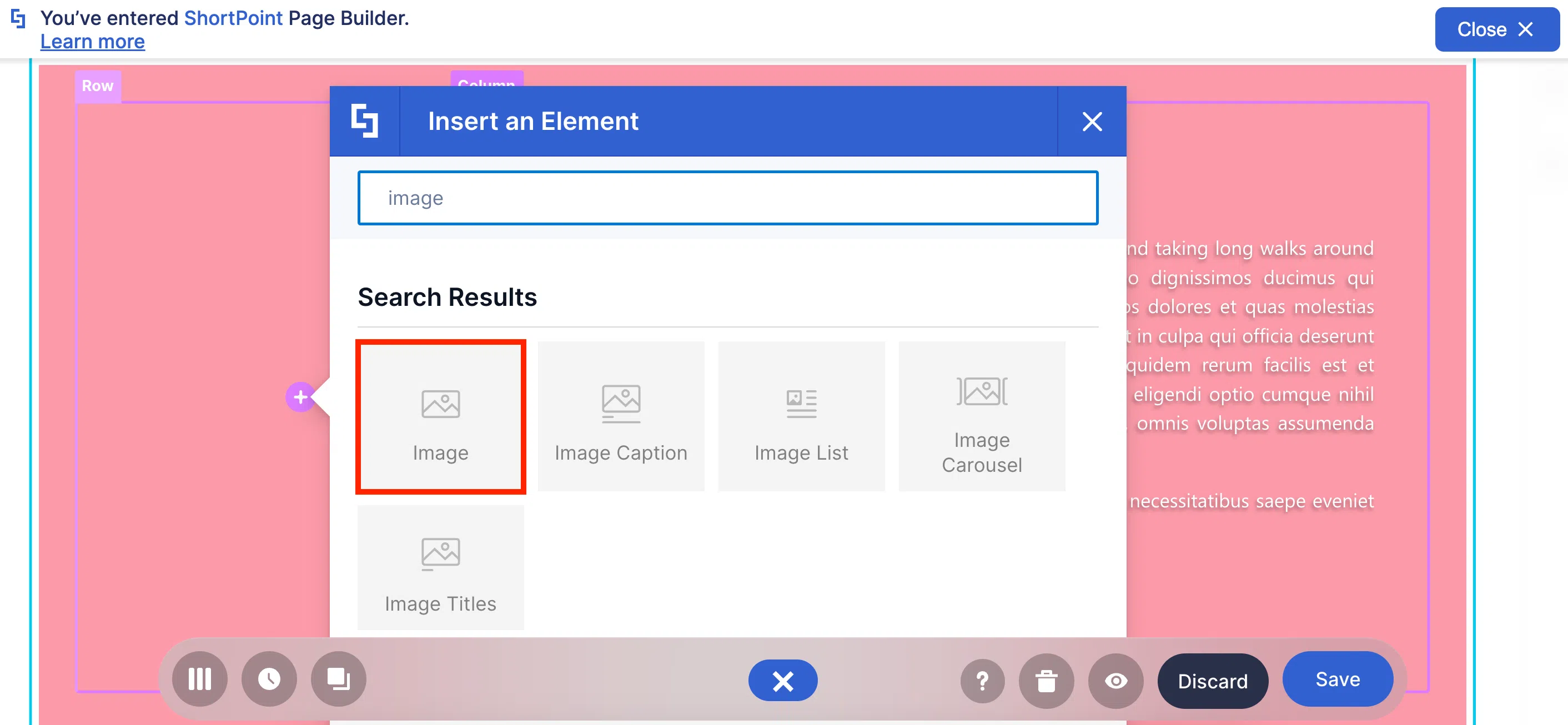
You can use it to add ANY photo you want—be it an employee, your company building, and, yes, even your dog.
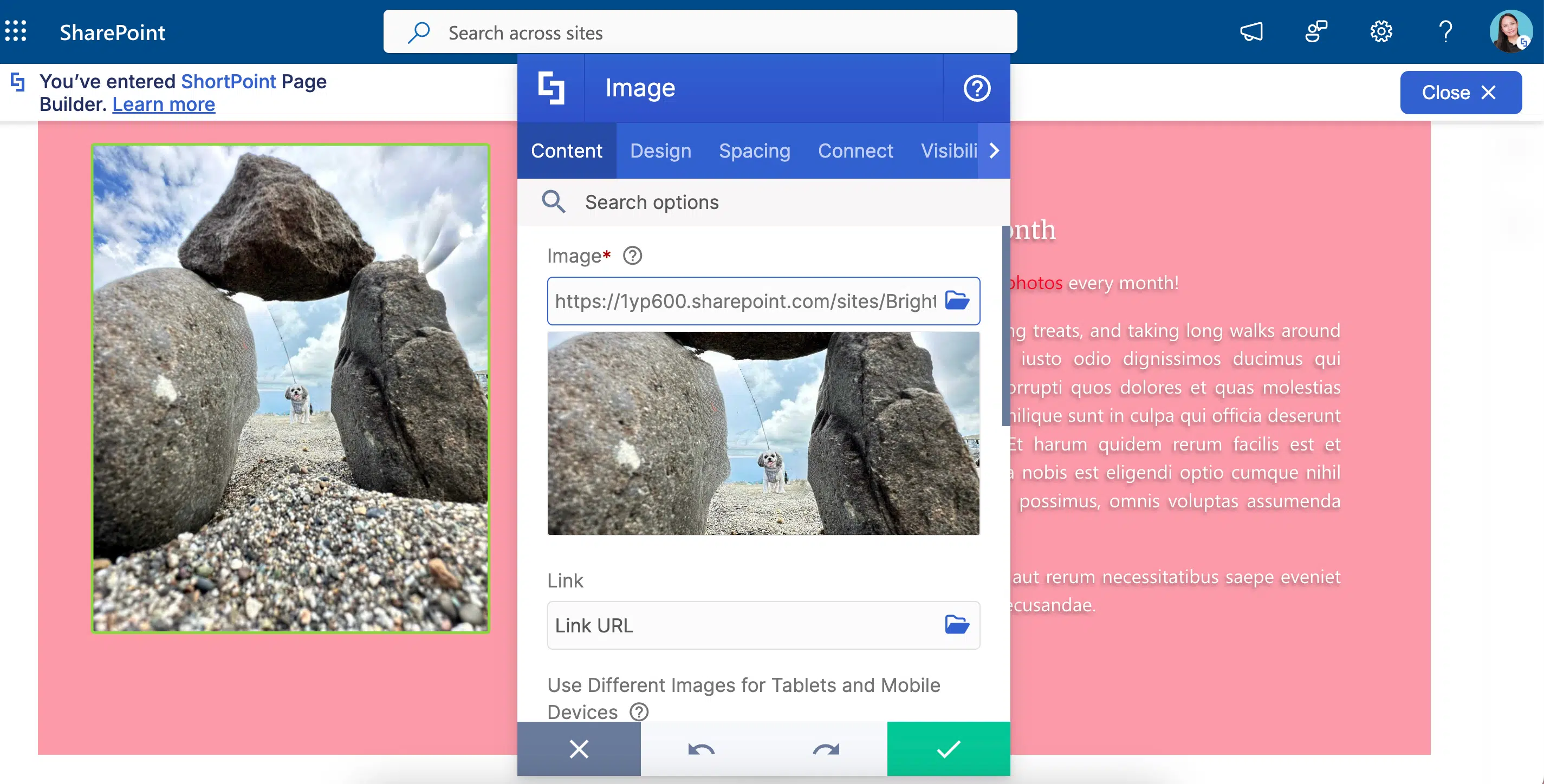
And because context matters, you can pair it with the Text Design Element to add a description. Now, no one will be left scratching their heads wondering why there’s a photo of your dog in the middle of your page!

There’s more! If your team uses your SharePoint page on tablet or mobile devices, you can add a photo specific to that device. Because of this, your images will not be TOO BIG or too small for these gadgets.
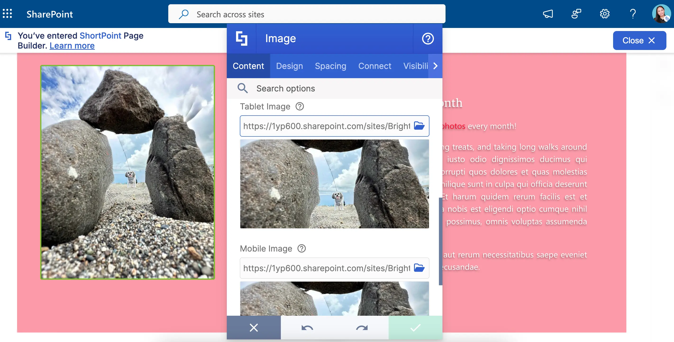
To top it off, you can experiment with the Image’s design. You can add a color overlay and even turn an image into a panorama.
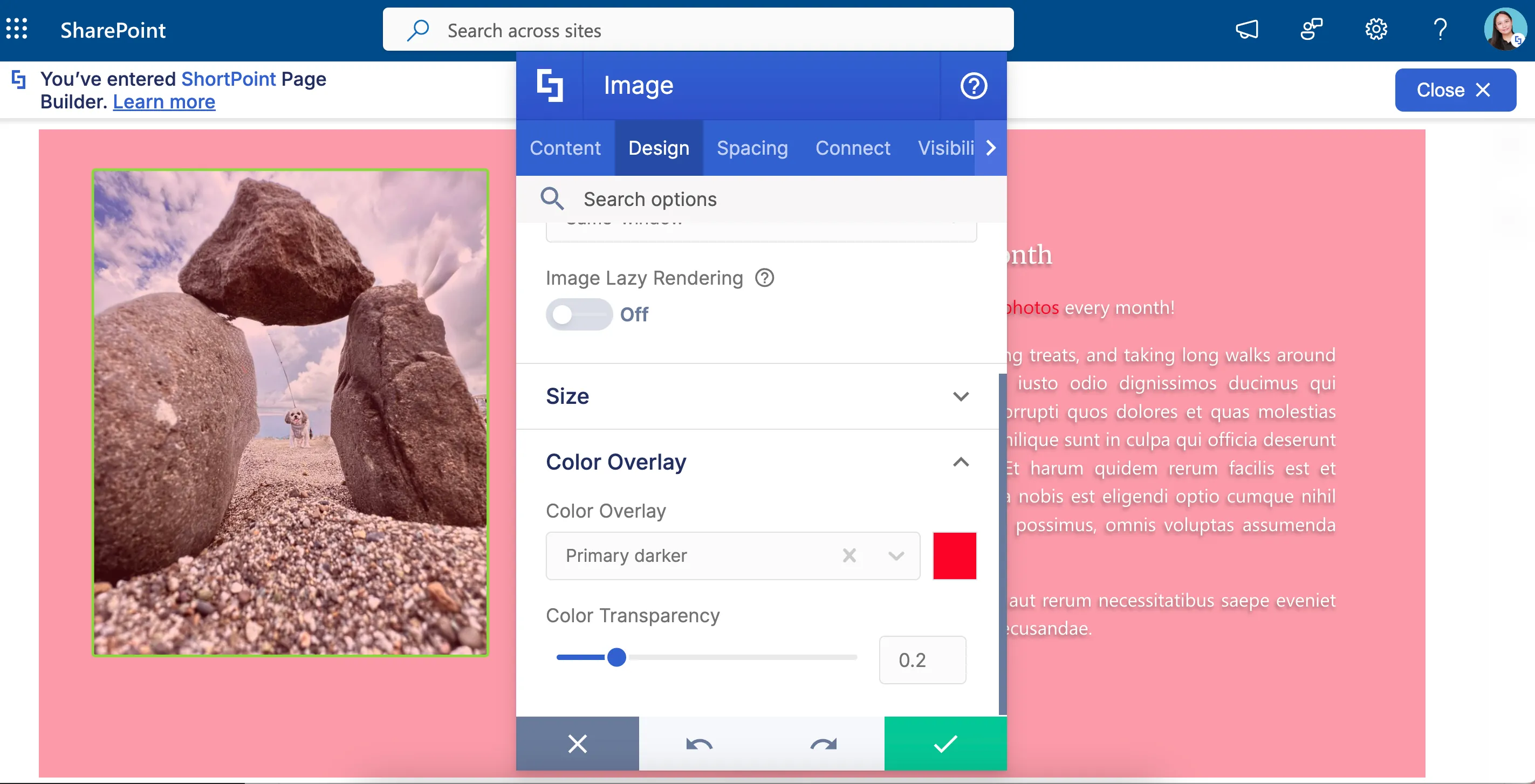
But wait…is it just us or is our image off-center?! You don’t have to worry about that too! You can adjust the spaces around your image. This way, you can easily customize the location of the photo. REALLY, everything is up to you!
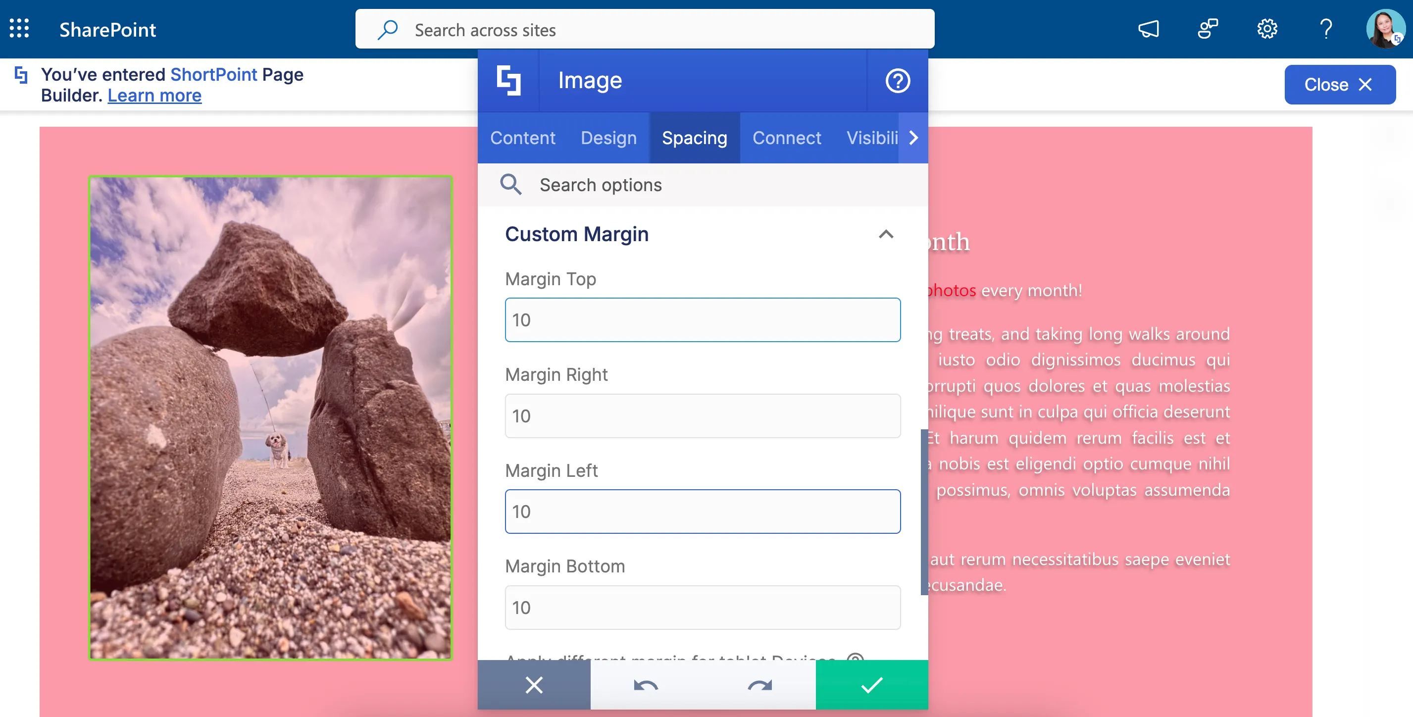
Want to know more about the amazing features of Image? Check out How to Customize the Image Design Element to learn more.
Image Caption Design Element
We know you have to squeeze in A LOT of information on your page. So, pairing an image with the Text Design Element to add a description isn’t always the best option. If you’re running out of space, the Image Caption Design Element is your best alternative.
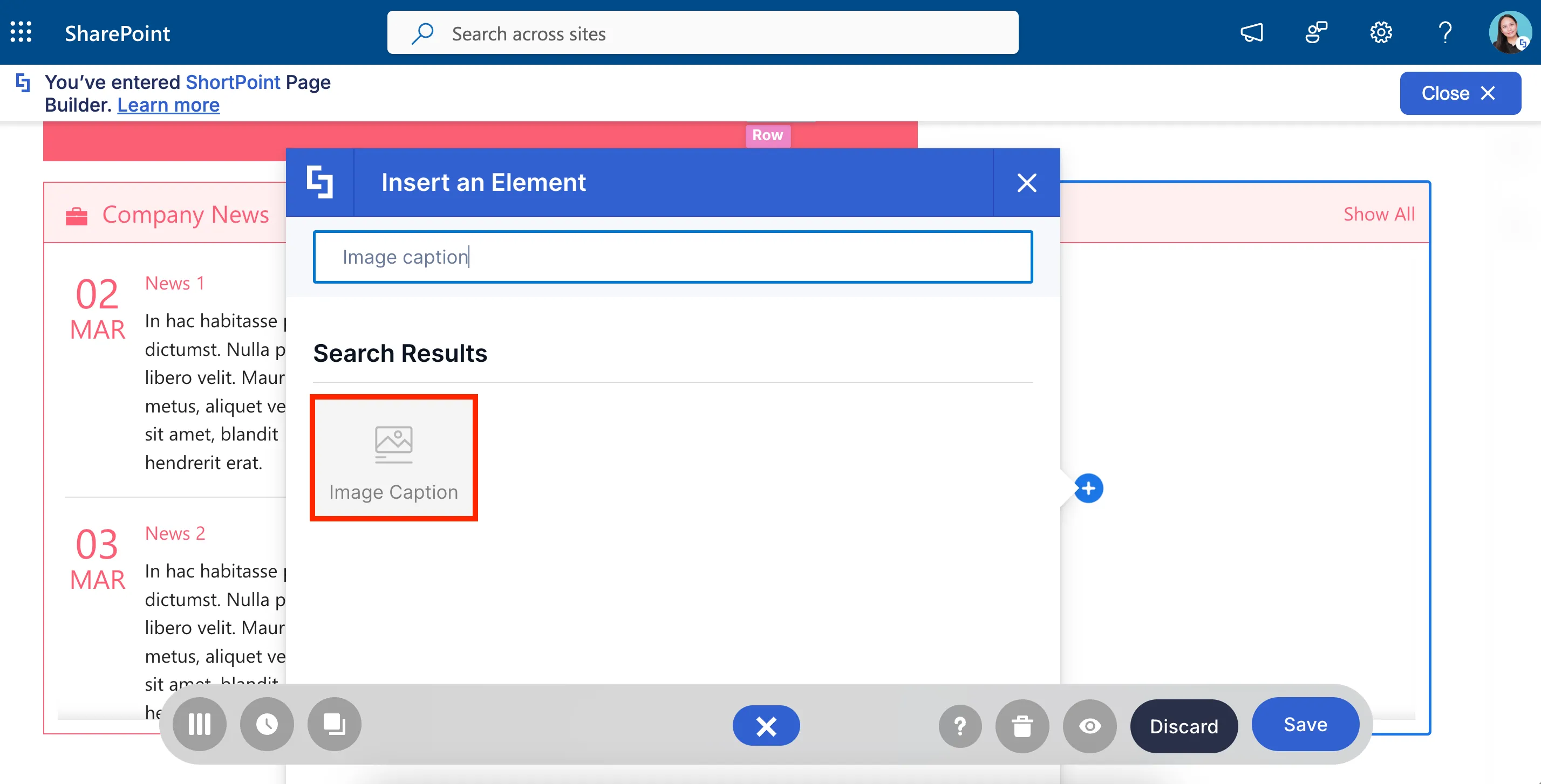
With the Image Caption, all the information your viewers will need for context will be on the photo itself. Truly, a SPACE-SAVER for your SharePoint pages!
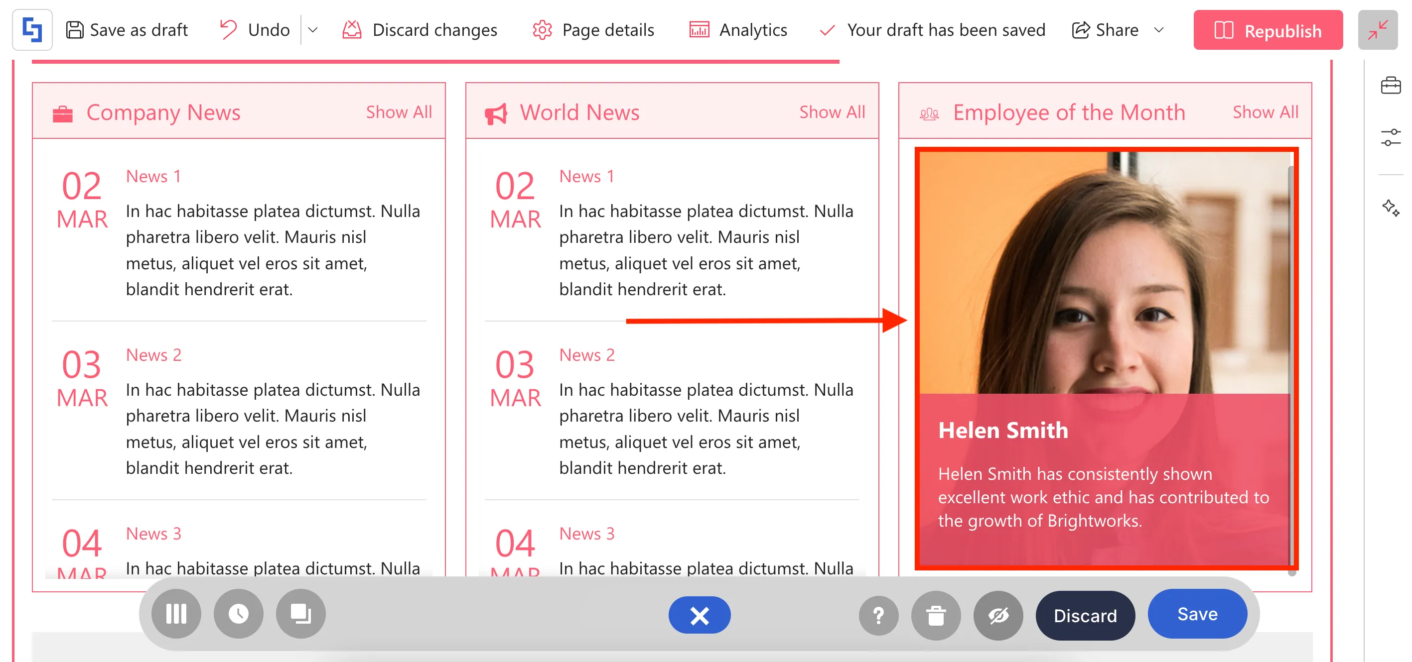
And we’re not even on the best part yet! You can also have fun with the animation style of the description. It has 18 interactive styles that your users can enjoy playing with.
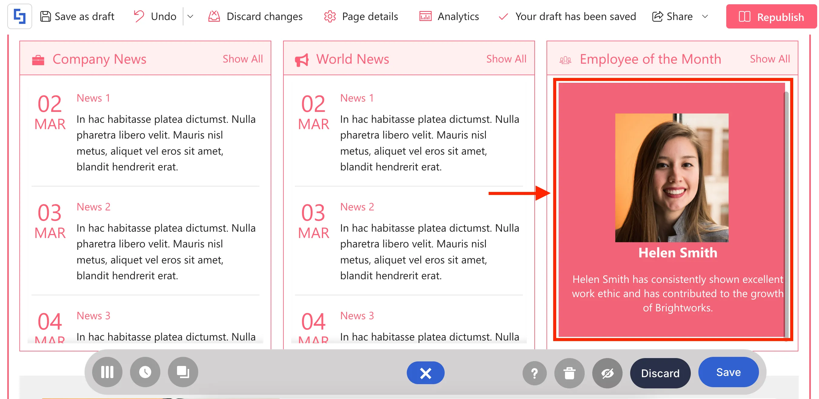
Ready to have fun with the Image Caption Design Element? Go through How to Customize the Image Caption Design Element to see all its features.
Image Titles Design Element
What if you have two, three, four, five, six…fifteen (and we can still keep counting) images to show on your page? You can display multiple images at once using the Image Titles Design Element!
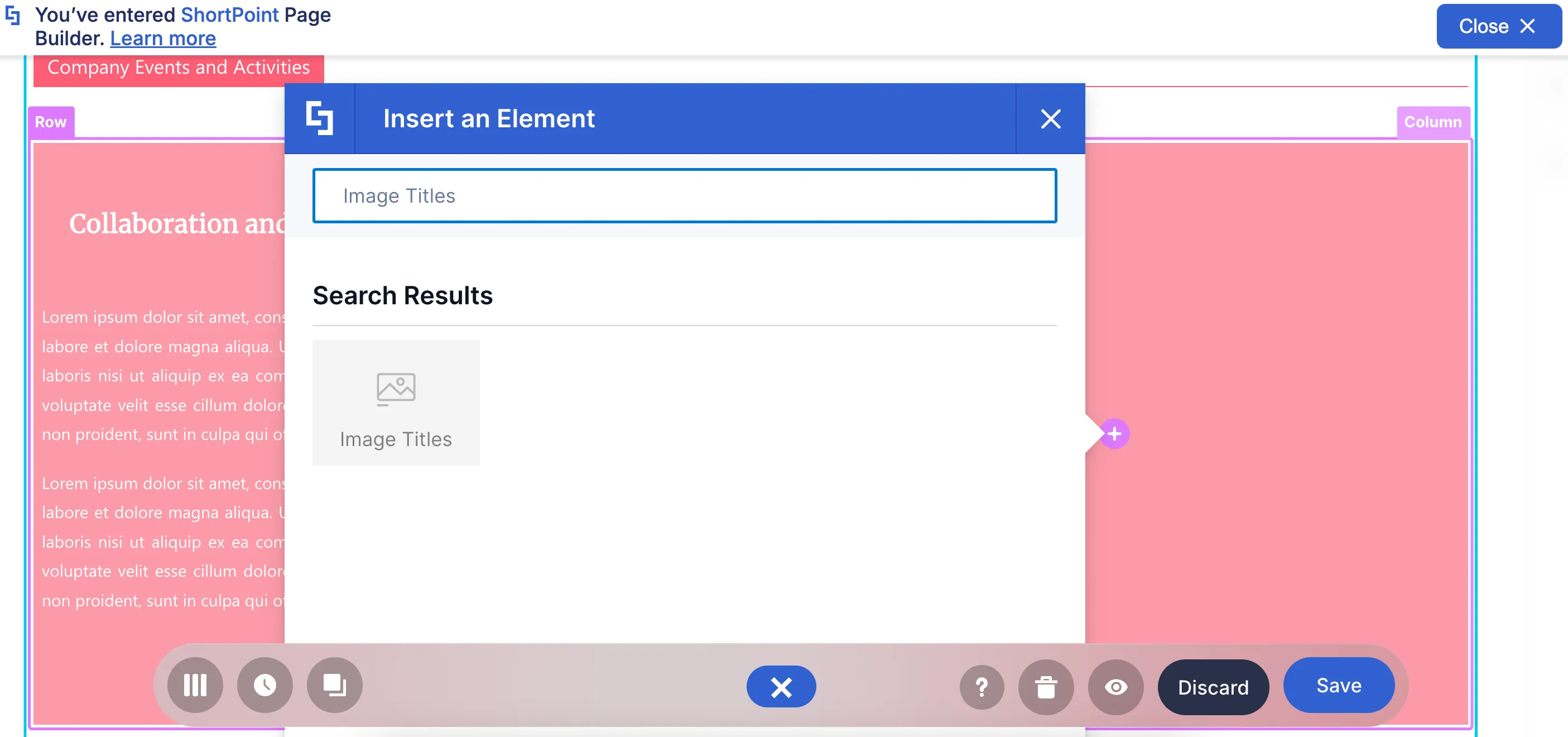
It works like the Image Caption but with MANY images. You can also add a Title and a description for each photo.
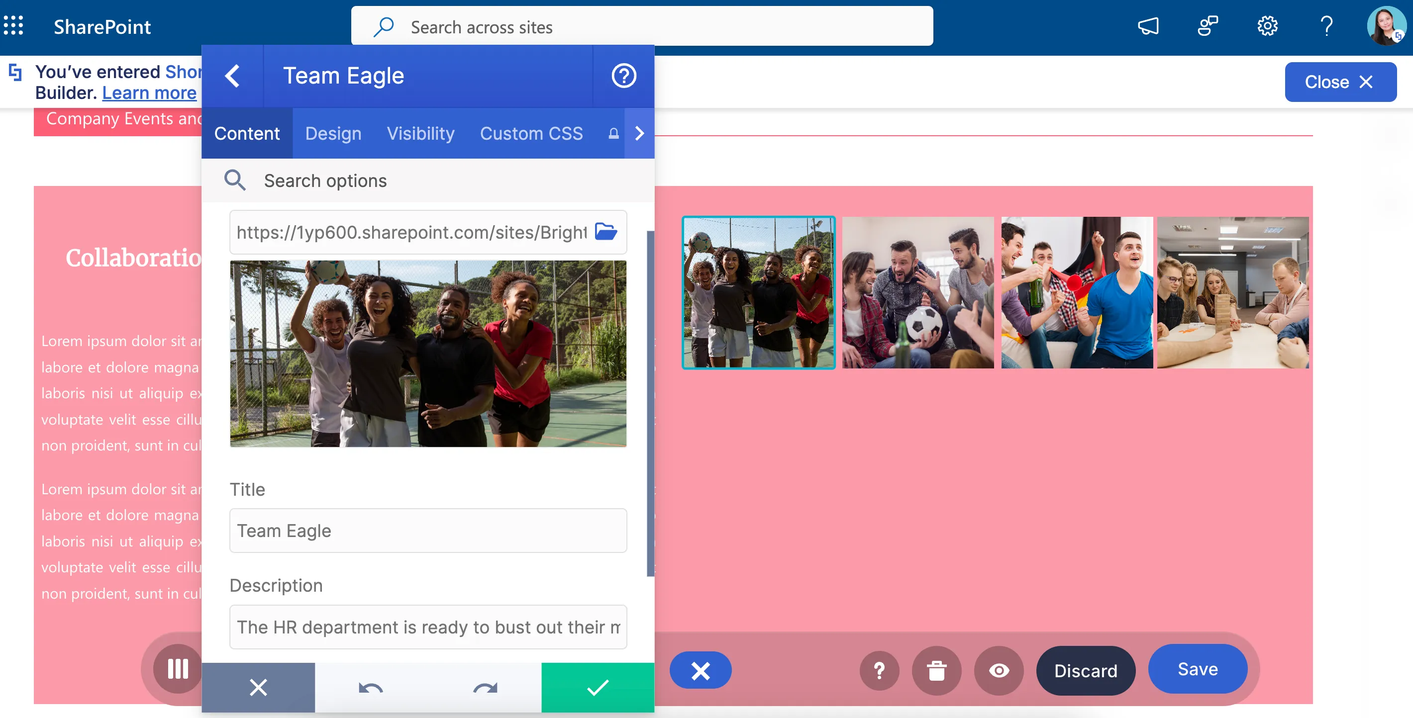
But don’t you think something’s off? We can probably guess what you’re thinking—the photos are too crammed together! Good thing, you can set the maximum number of images shown per line. This allows you to arrange the pictures in the best possible way.
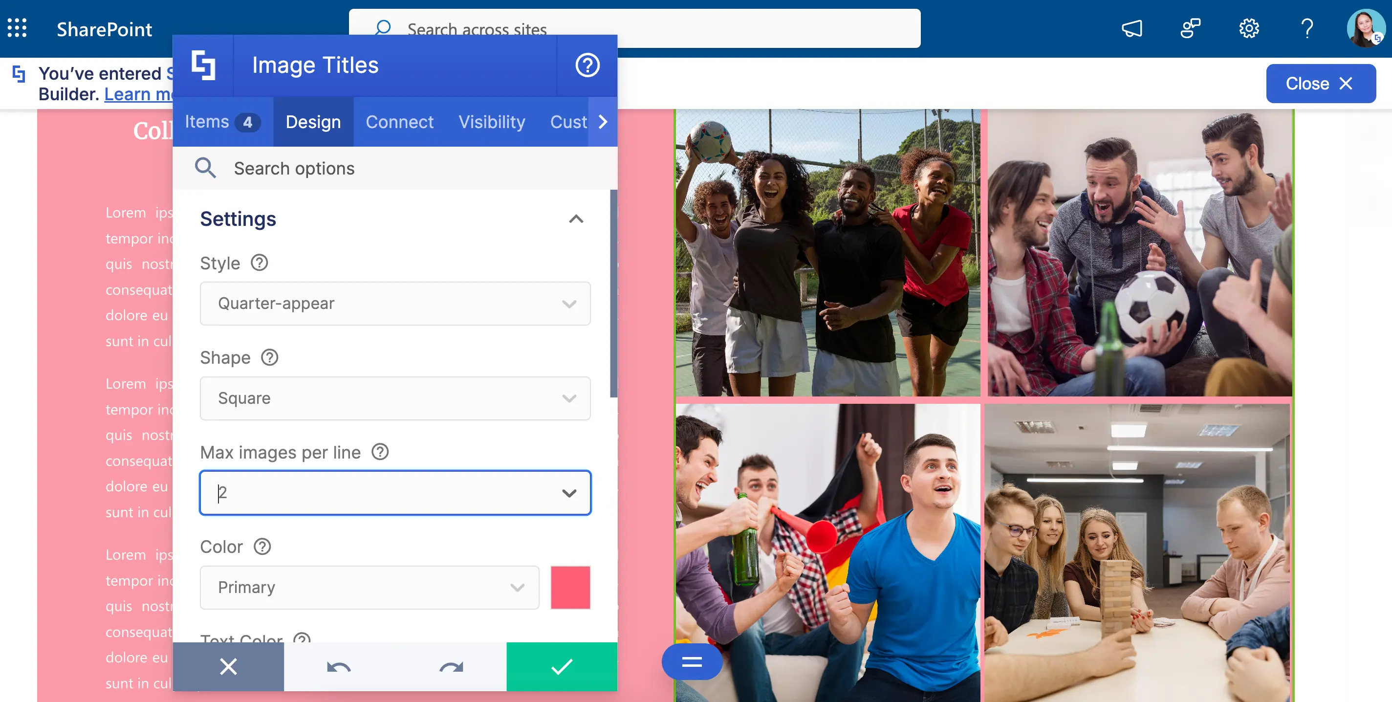
And, like the Image Caption, you can choose from 18 interactive animation styles. Such a cool way to engage your page viewers!
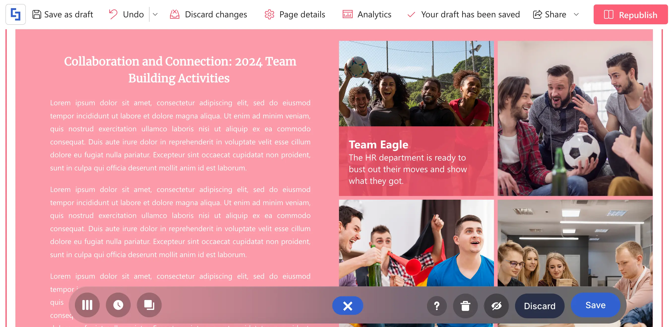
Want to give it a try? Go to How to Customize the Image Titles Design Element to learn how to add it to your SharePoint page.
Slideshow Design Element
But what if you want to give each of your images its shining moment? Slideshow is the best Design Element for you!
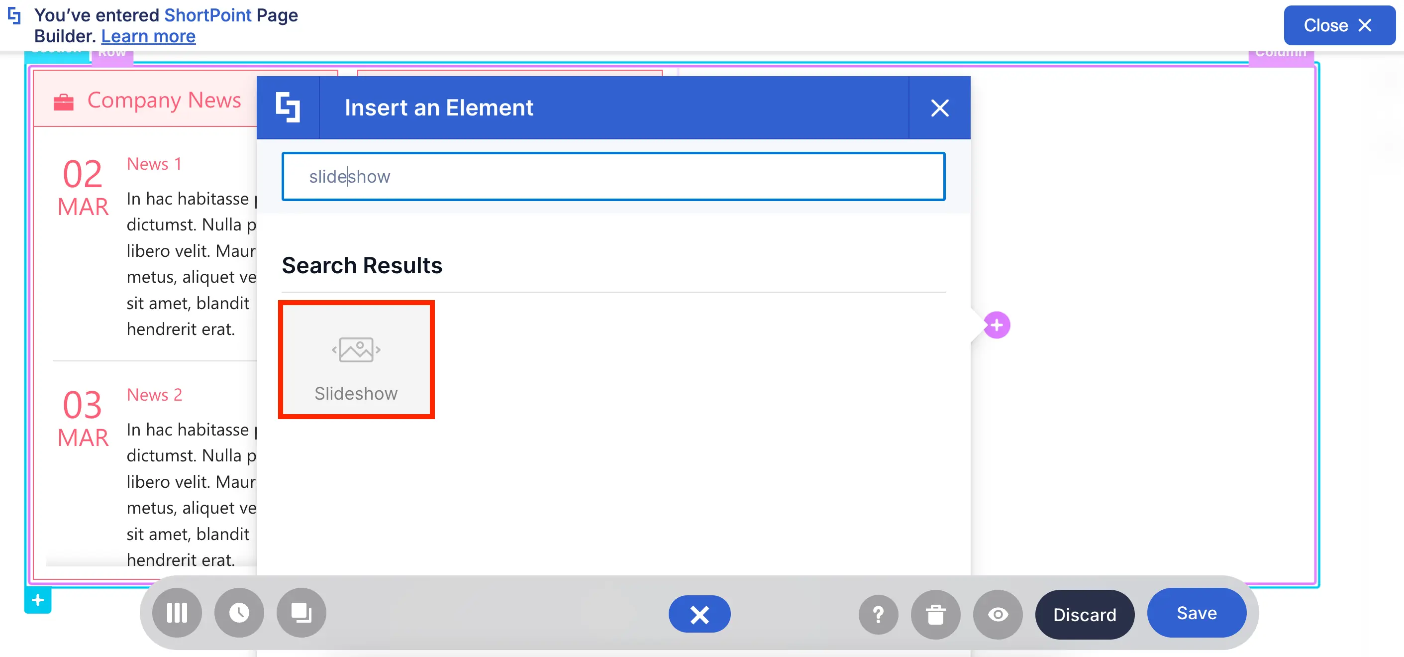
How exactly does the Slideshow give each photo a shining moment? Well, think of a Slideshow like a PowerPoint. When you present it, only one slide appears at a time. The same goes for Slideshows too. Every image you add will have its solo moment!
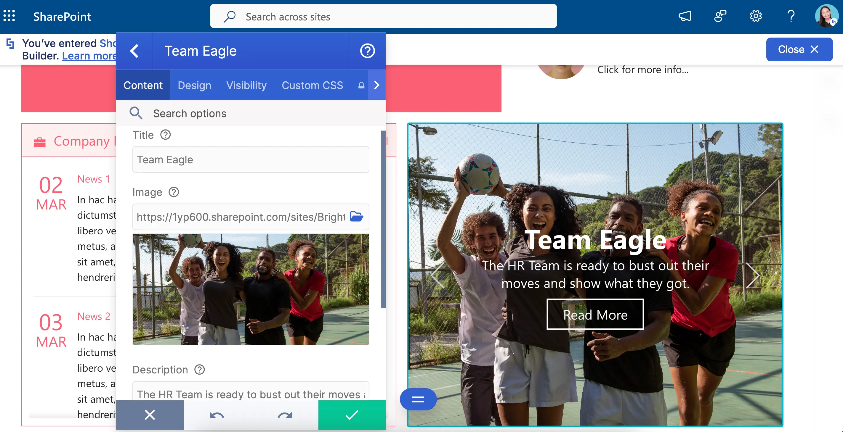
And, of course, you get to pick the design too! You can add a background color, adjust the height, and even choose the loop speed. Just SOOOO many ways to make your Slideshow look the best there is.
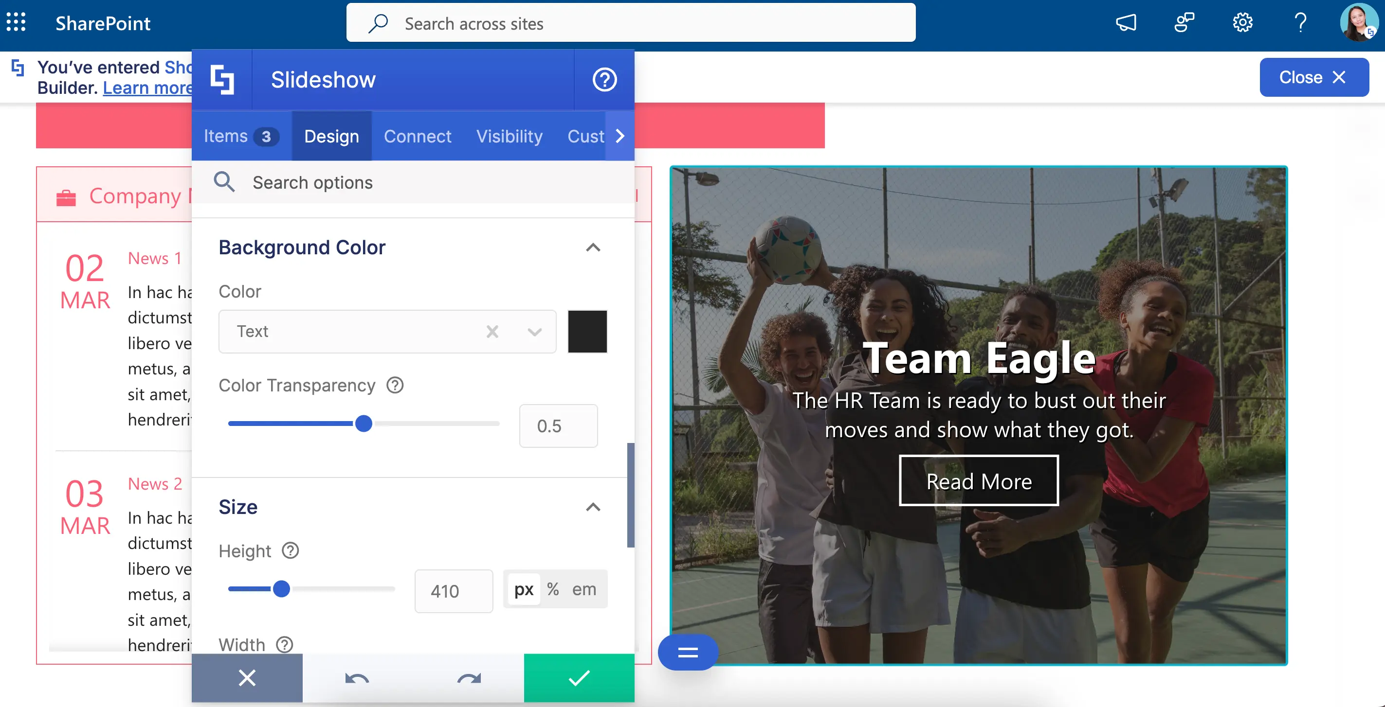
Need to have a Slideshow on your page? Check out How to Customize the Slideshow Design Element to get you started.
Image Carousel Design Element
You don’t have to settle for only one image feature. You can also have two, three, four, five, six, or more with the Image Carousel!
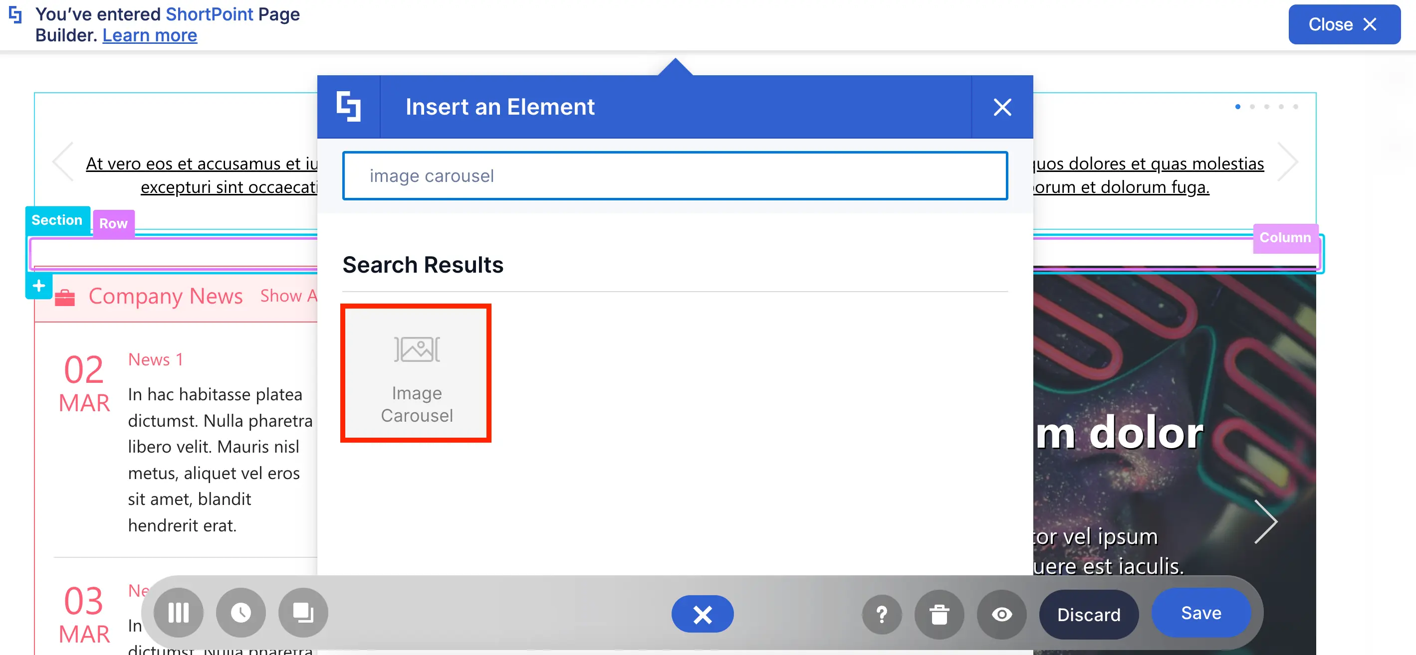
Image Carousel works like the Slideshow. You can add a title and a description for each photo.
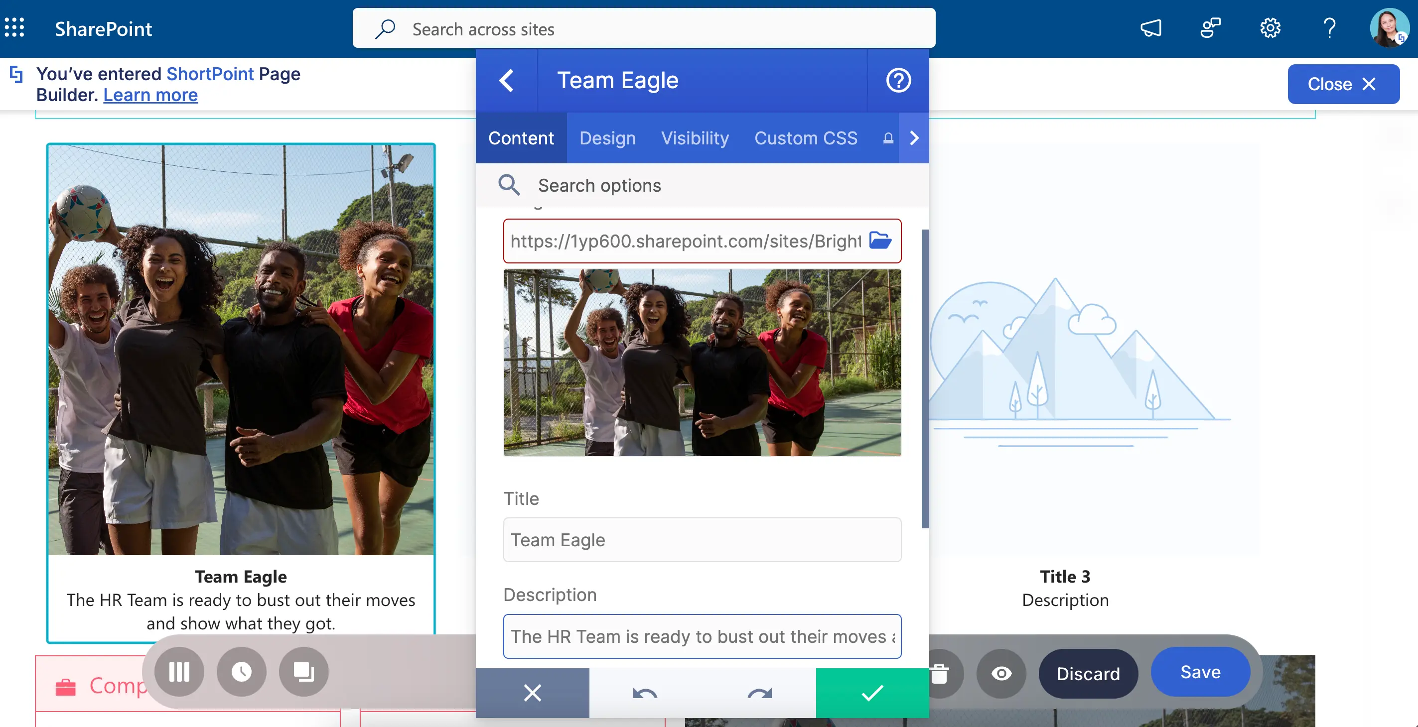
You can also give its design its unique twist! You can choose a background color, add a border, and even customize the border color.
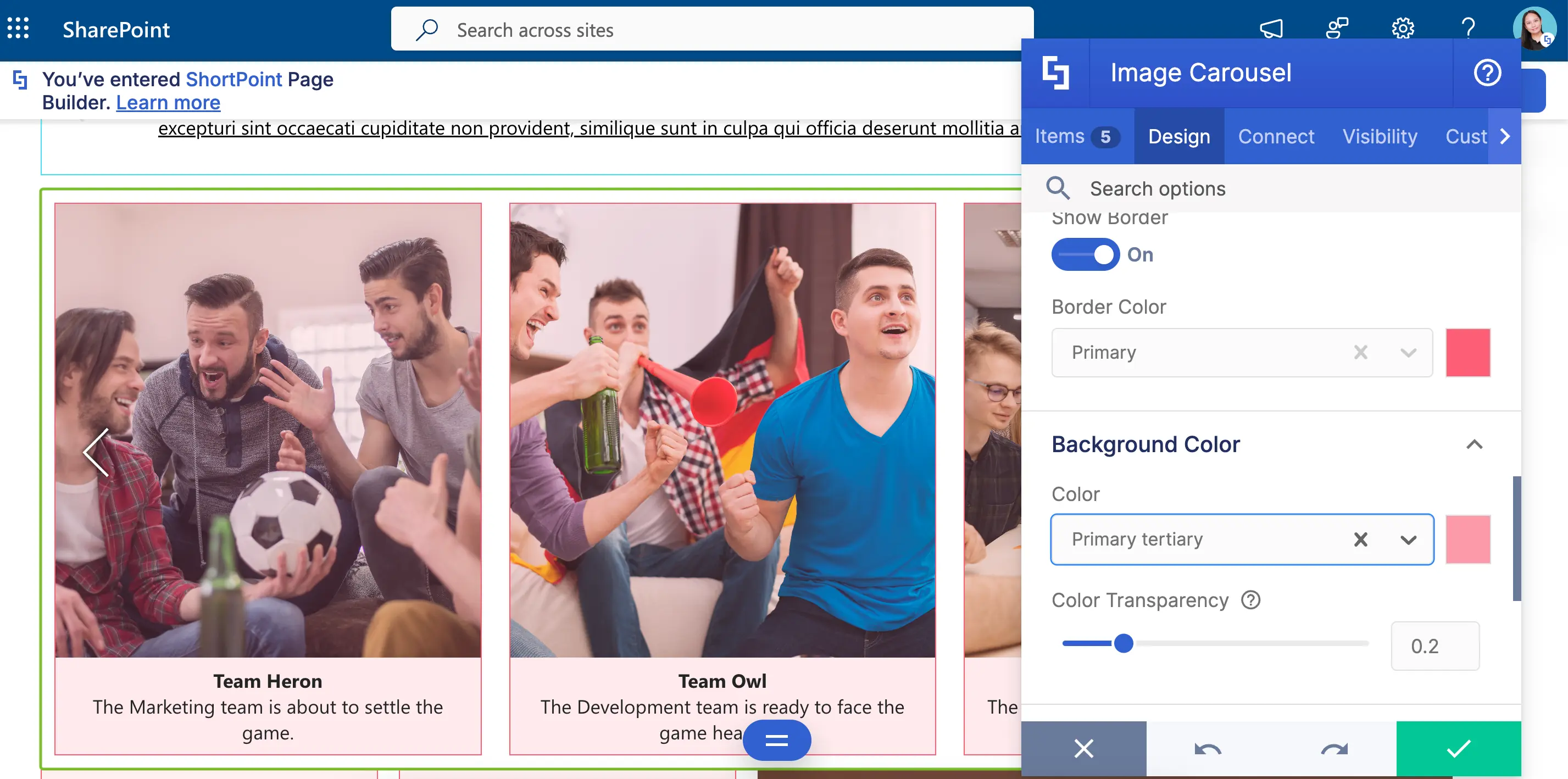
But what sets it apart is the Max Images to Show feature. With this, you can choose how many images to show per slide. No matter how many photos you want to highlight, no one will stop you!

So, you up for some Image Carousel on your page? Learn more about it in How to Customize the Carousel Design Element.
Connect for Images
Remember ShortPoint Connect for Text? You can do the same with Images! Just take a look at this SharePoint List we made. We will connect this to our Image Carousel.
Like the Design Elements for Text, you can also find ShortPoint Connect in the Connect tab of the Design Elements for Images.
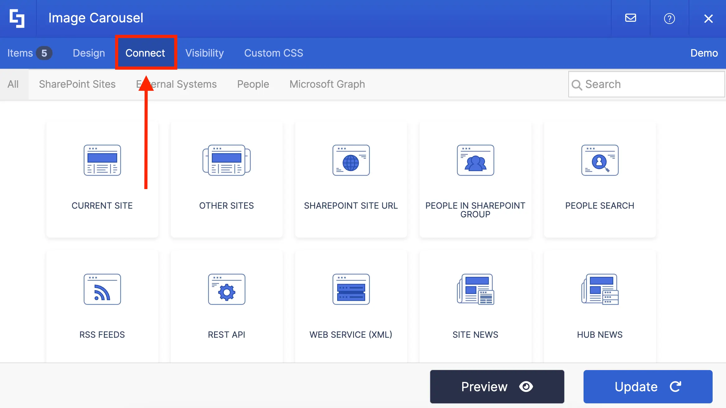
And you will also notice the same ShortPoint Connect options. You can connect to your own SharePoint sites, your Outlook calendar, or even other external sources (like RSS feeds or Rest API).

Here’s what you’re waiting for though! When we connected the Image Carousel to our SharePoint List, EVERYTHING on our SharePoint List is now shown on our Image Carousel—no exception. You can even check back on the SharePoint List if you’re doubting us.
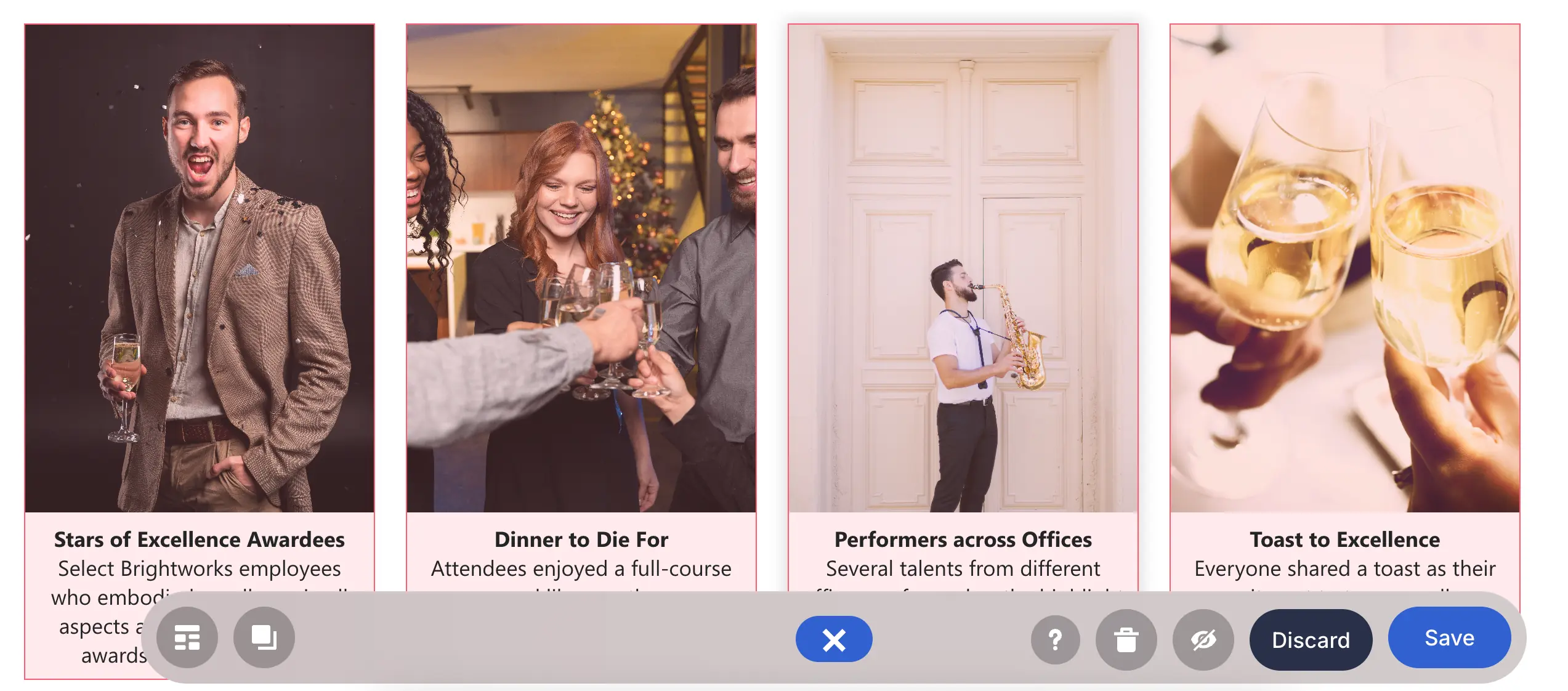
And to make it EVEN better, any changes you make in the SharePoint List or external source will automatically reflect on your connected Design Element. See how when we changed the picture for Stars of Excellence Awardees, the photo on our Image Carousel changed too. Now, that’s what you call CONVENIENCE!
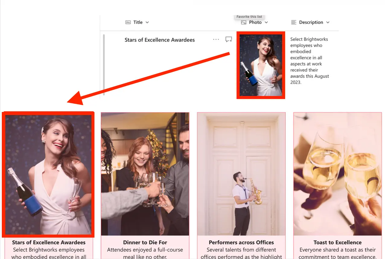
Excited to use ShortPoint Connect? Check out ShortPoint Connect: Basic Tutorial to get a step-by-step guide on how to use ShortPoint Connect.
Best Practices for Images
When choosing images to show on your page, you’ve probably gone with the HIGHEST quality possible. Of course, you can’t settle for blurry images!
But did you know high-quality images can make your pages load slower? Well, now you know! This is because high-quality photos tend to have higher file sizes. It’s a good thing though that ShortPoint has two features that can help you improve page load time.
The first one is the Lazy Load Images feature. You can find it in the Design tab, under the Performance section. When it’s enabled, your images will only load once your users scroll to them. This makes your page load MUCH faster.
Ready to try Lazy Load Images? You can learn more about Lazy Load Images in Enable Lazy Render / Lazy Loading Options on ShortPoint Elements.
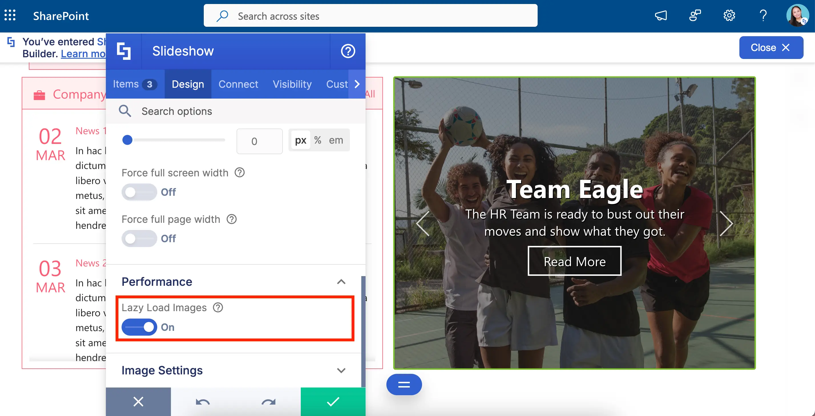
The second one is the Caching options for connected Design Elements. Your connected source can have A LOT of data. Retrieving all that data at once can make your page run slower. To avoid that, you can select from any of the caching options available.
Want to see how each Caching options work? Go to Caching Options for Dynamically Connected ShortPoint Design Elements.
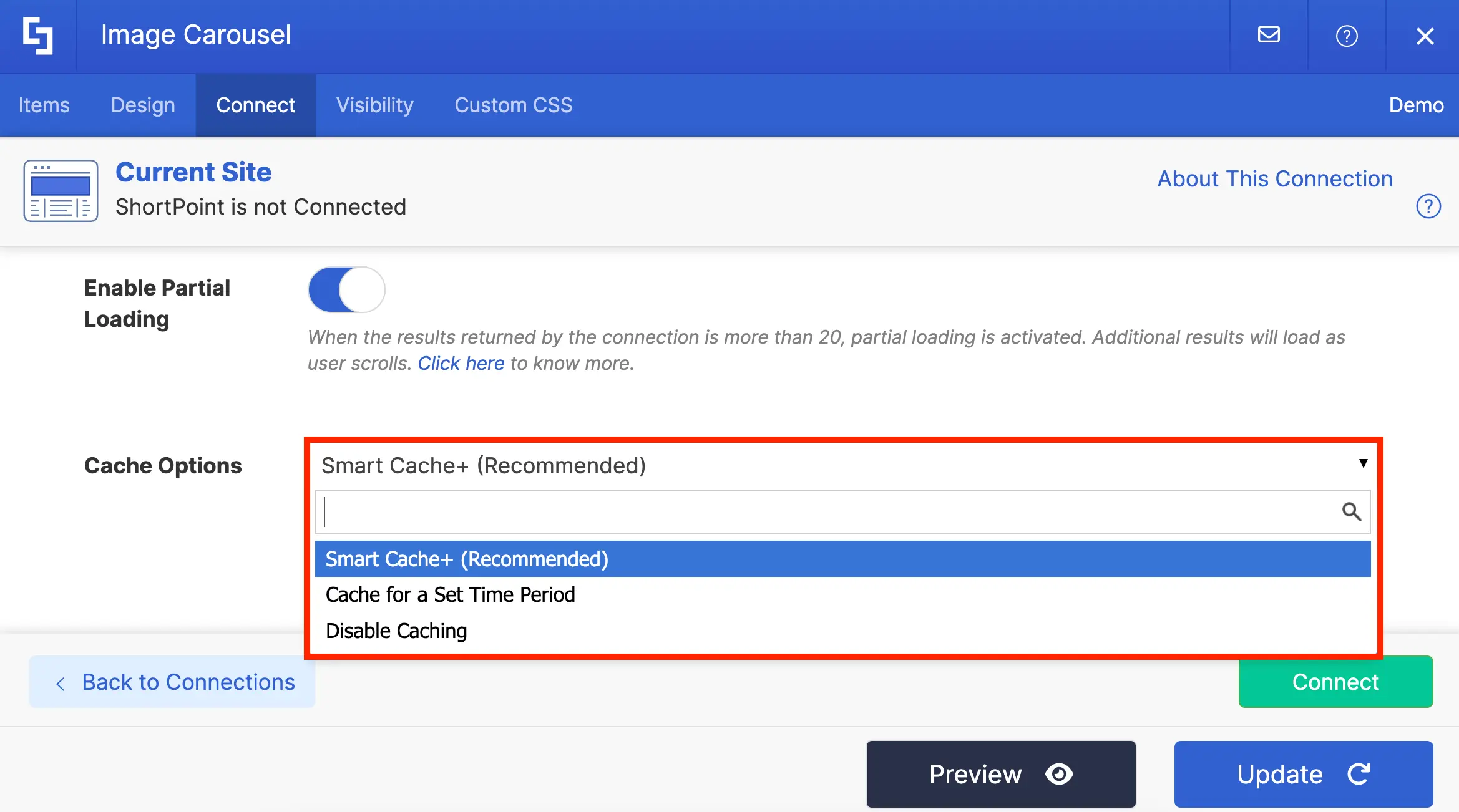
Now, you’re ready to showcase images on your page in the BEST way possible! We’re sure your viewers will ENJOY the new and creative ways you’ve shown your photos.
Best Design Elements for Lists
Lists, lists, lists…that’s probably all you see when you start working. You just can’t avoid it—list of documents, list of events, list of employees, and, the most dreaded of all, list of tasks.
Lists, especially the list of tasks, love to follow you everywhere, even on your SharePoint intranet! This is because (unfortunately) most work processes involve the use of these lists. As your manager says, “You just need a daily reminder of all your backlogs.”
Scary no? But it doesn't always have to be! You can also make them fun, creative, and engaging. How?! With ShortPoint, of course! We will show you the different ShortPoint Design Elements you can use to creatively display lists on your page. Let’s check them out!
Simple List Design Element
As the name suggests, the simplest form of list you can use in ShortPoint is the Simple List Design Element.
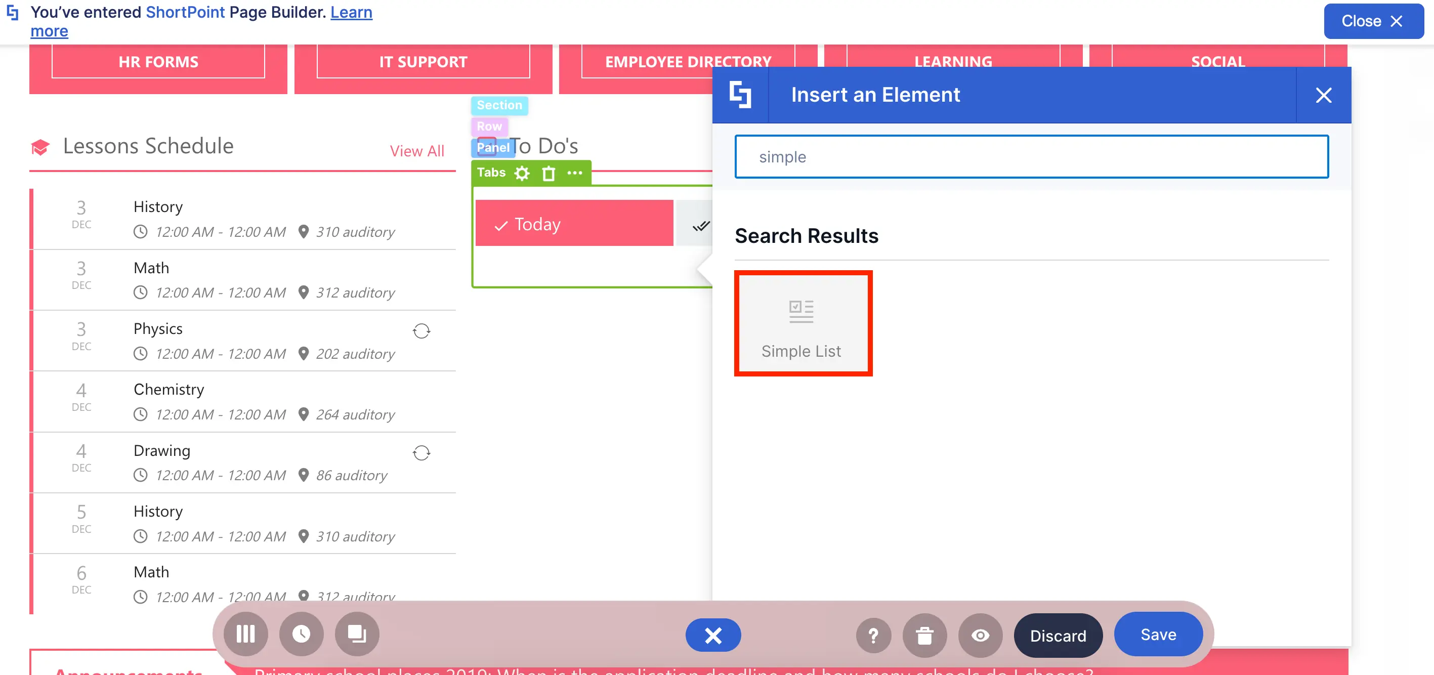
With it, you can easily create any kind of list you want—employee list, special events list, and, of course, your dreaded task list.
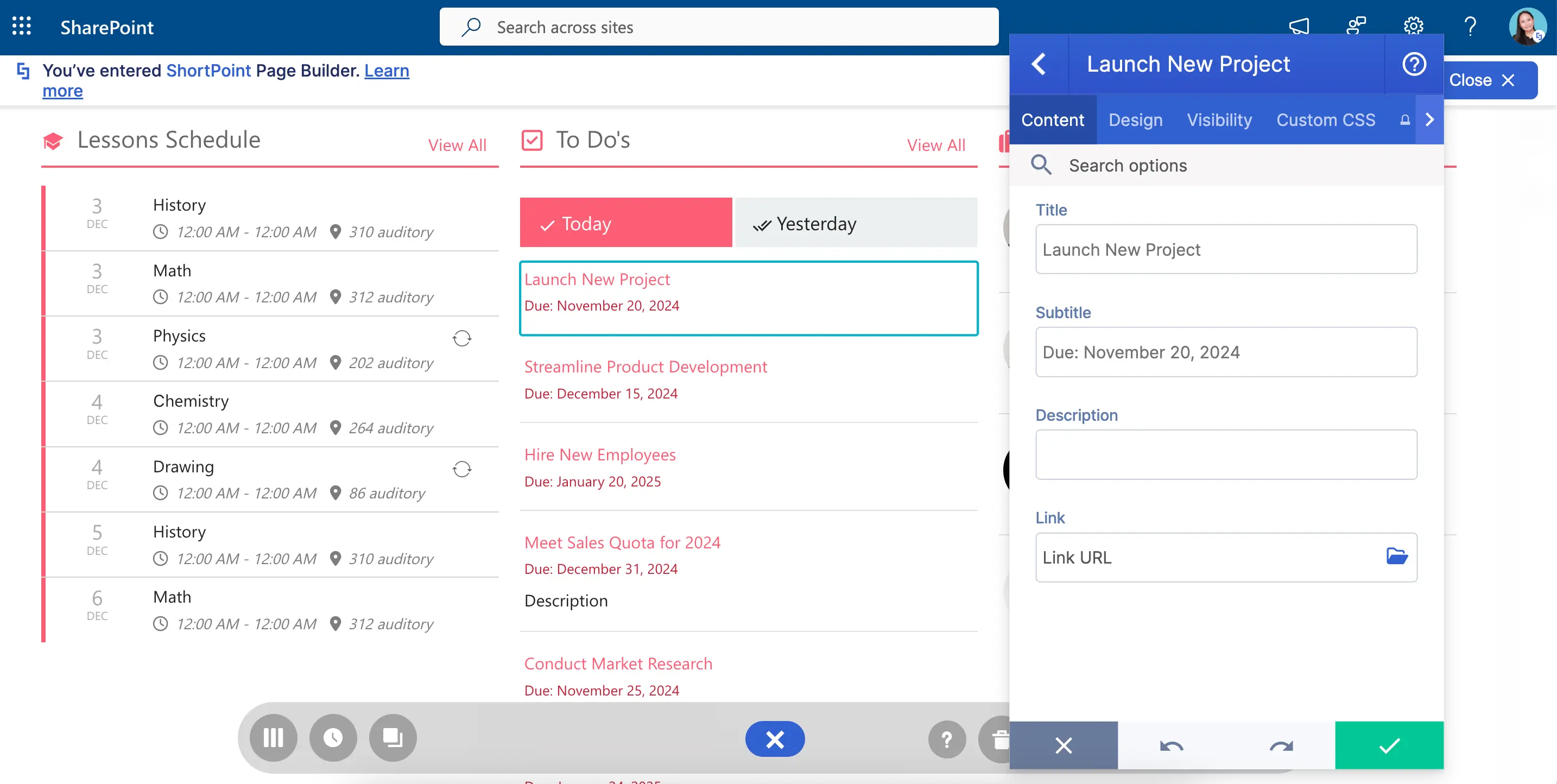
But lists don’t always have to be imposing and scary. It can be colorful too! The Simple List allows you to experiment with its colors and style. Now, even if it’s a headache to finish all those tasks, it’s at least pretty to look at your backlog.
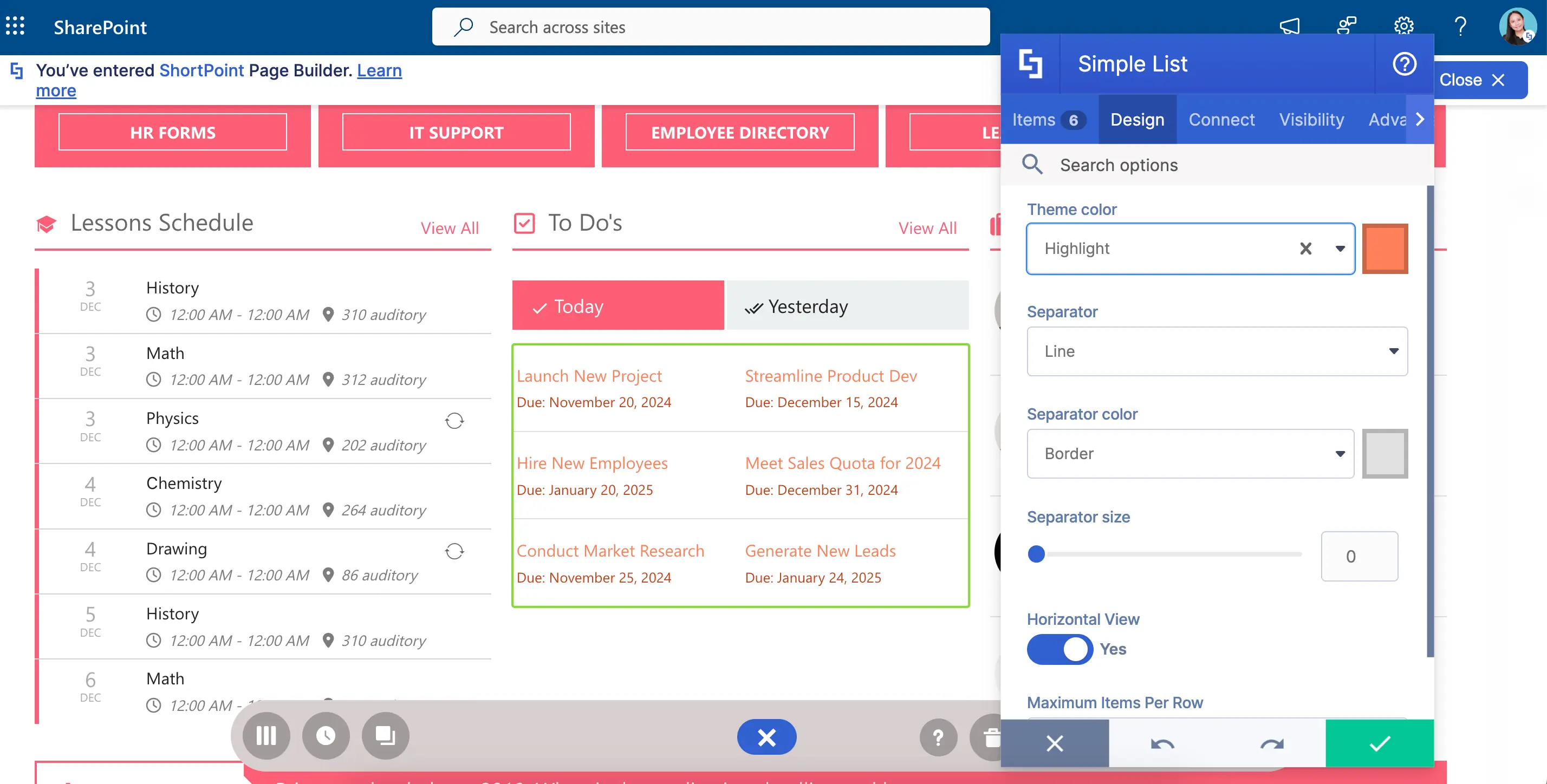
And to top it off, there are more ways to keep your designs fresh like changing the text alignment, adjusting space, and even adding a bold font style.
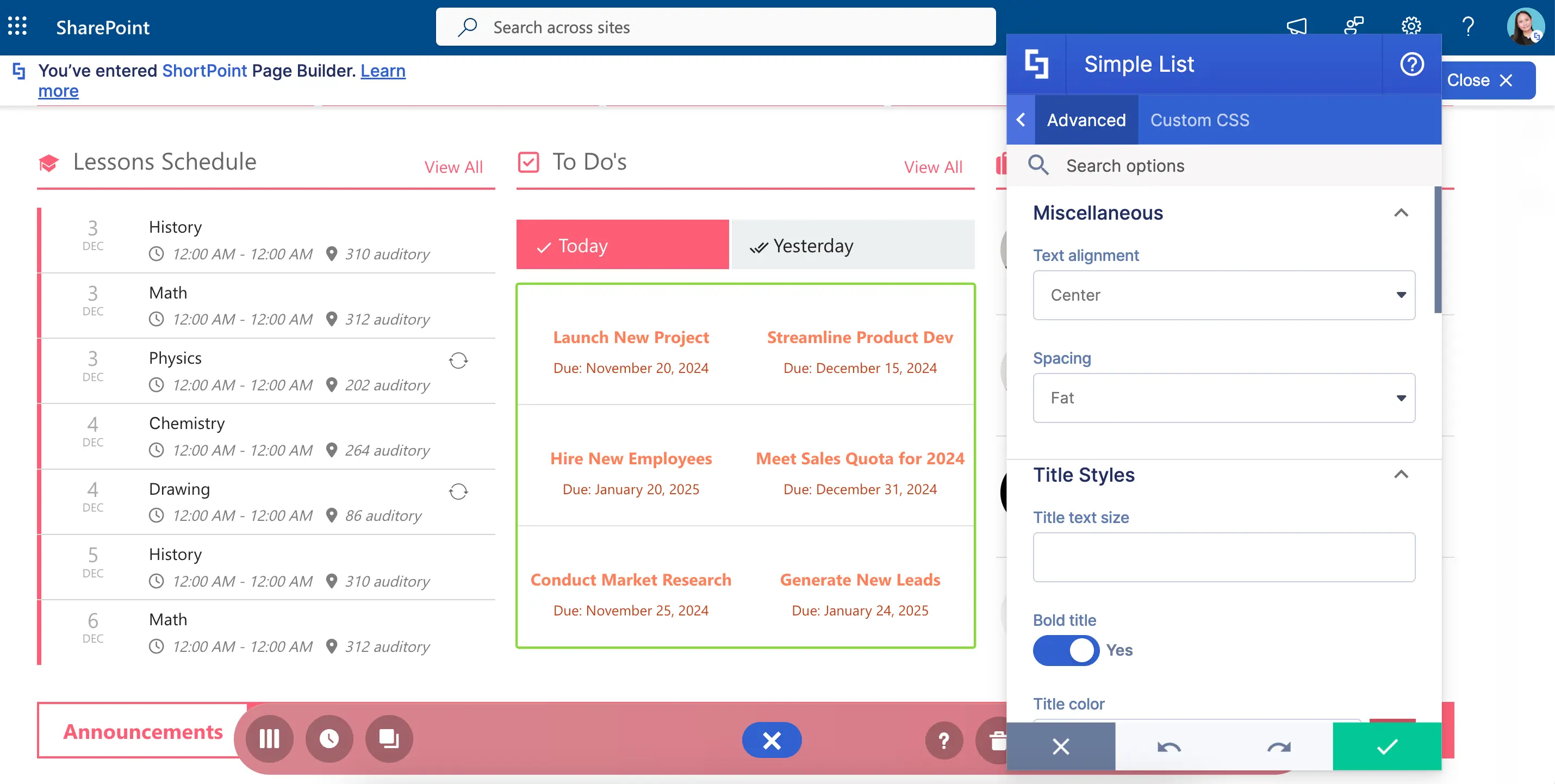
Want to give it a try? Go to How to Customize the Simple List Design Element to learn how to add it to your SharePoint page.
File List Design Element
Have lots of documents to show? Why not display your files in a list using the File List Design Element?!
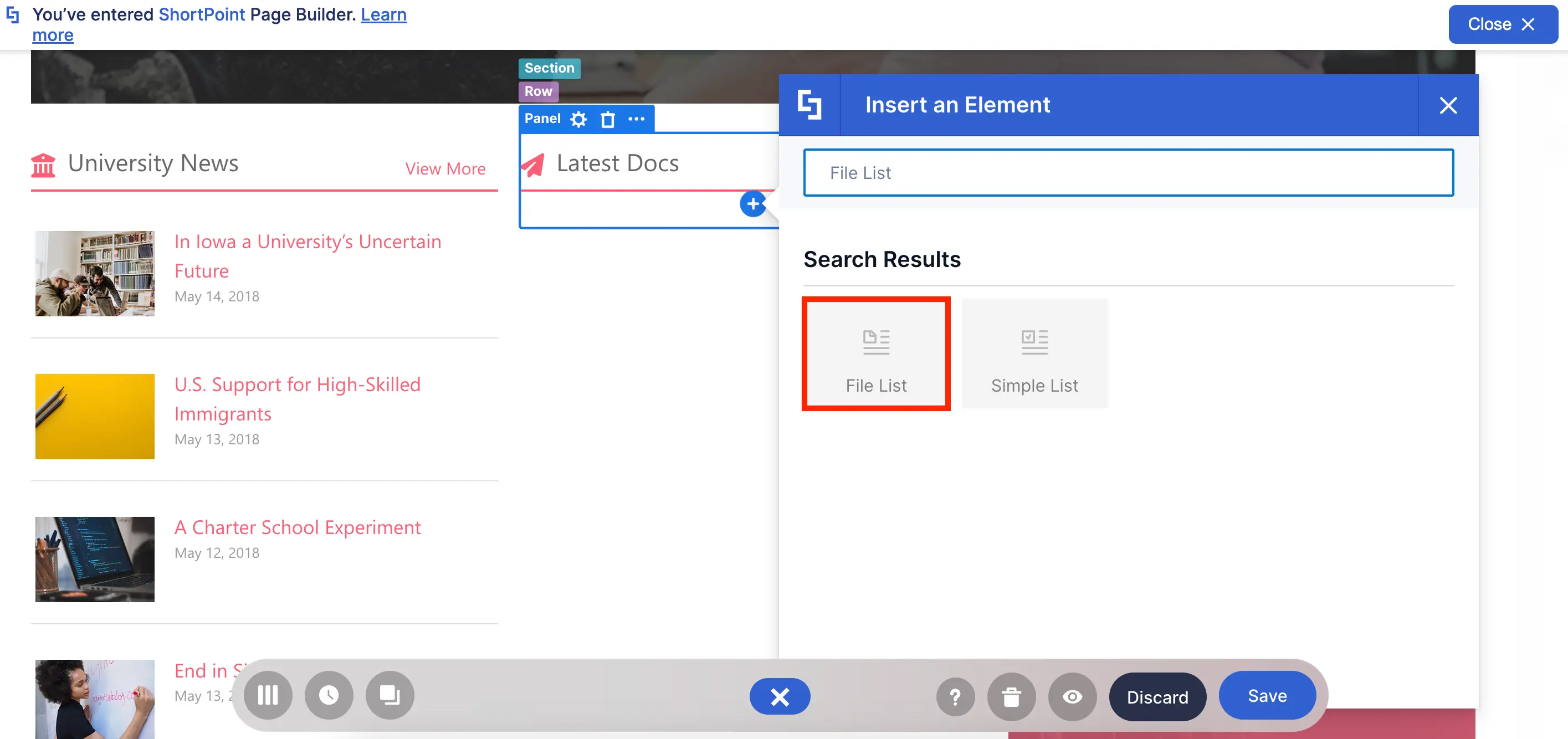
Like the Simple List, you can add a Title, subtitle, description, and attach a link to each file.
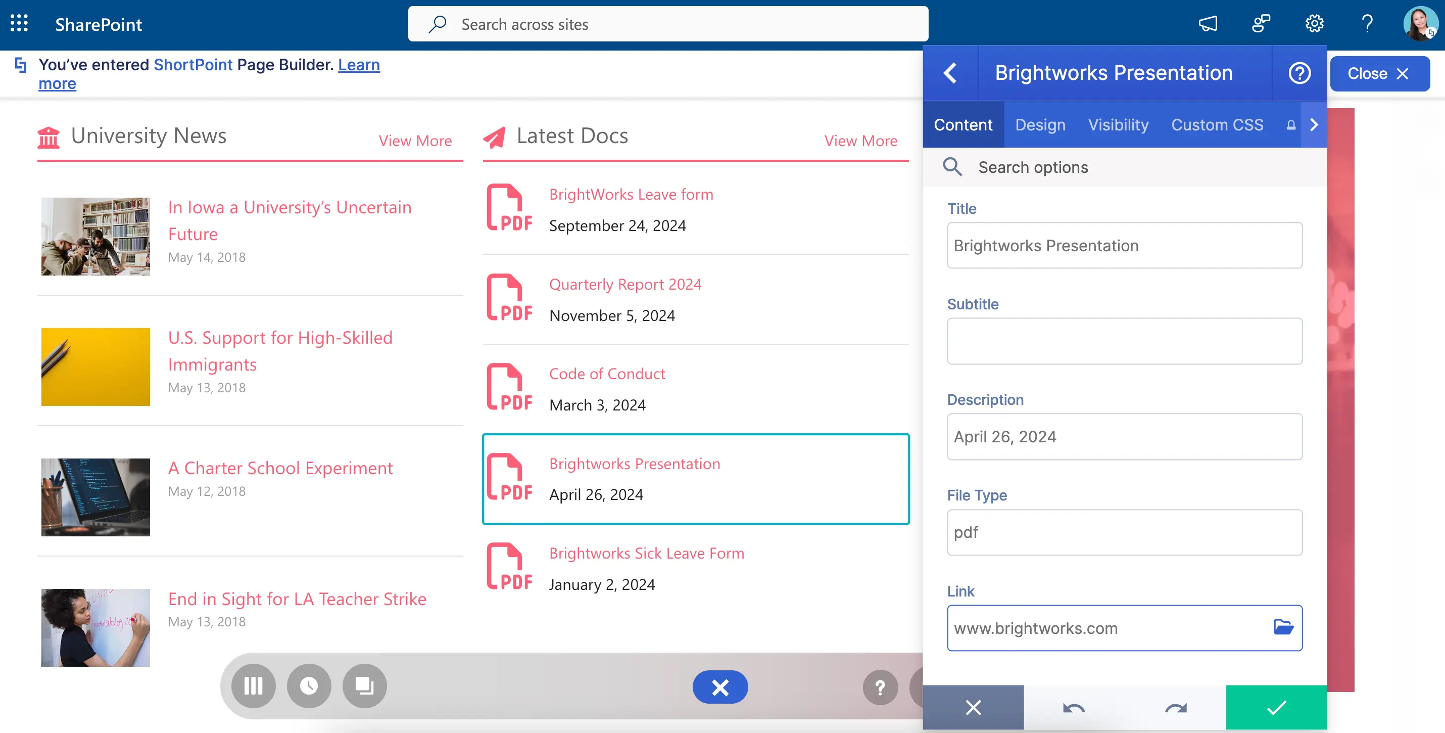
But what makes the File List AMAZING is how you can customize the file type icons. Because of this, you can immediately tell if a file is a PDF, a PPT, or a Doc.
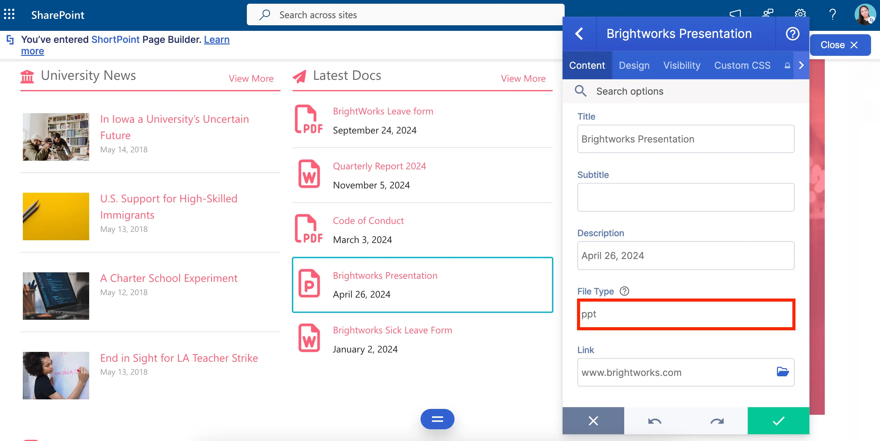
You can also give its design its unique twist! You can choose a one-of-a-kind file icon style that can bring its look to a whole new level.
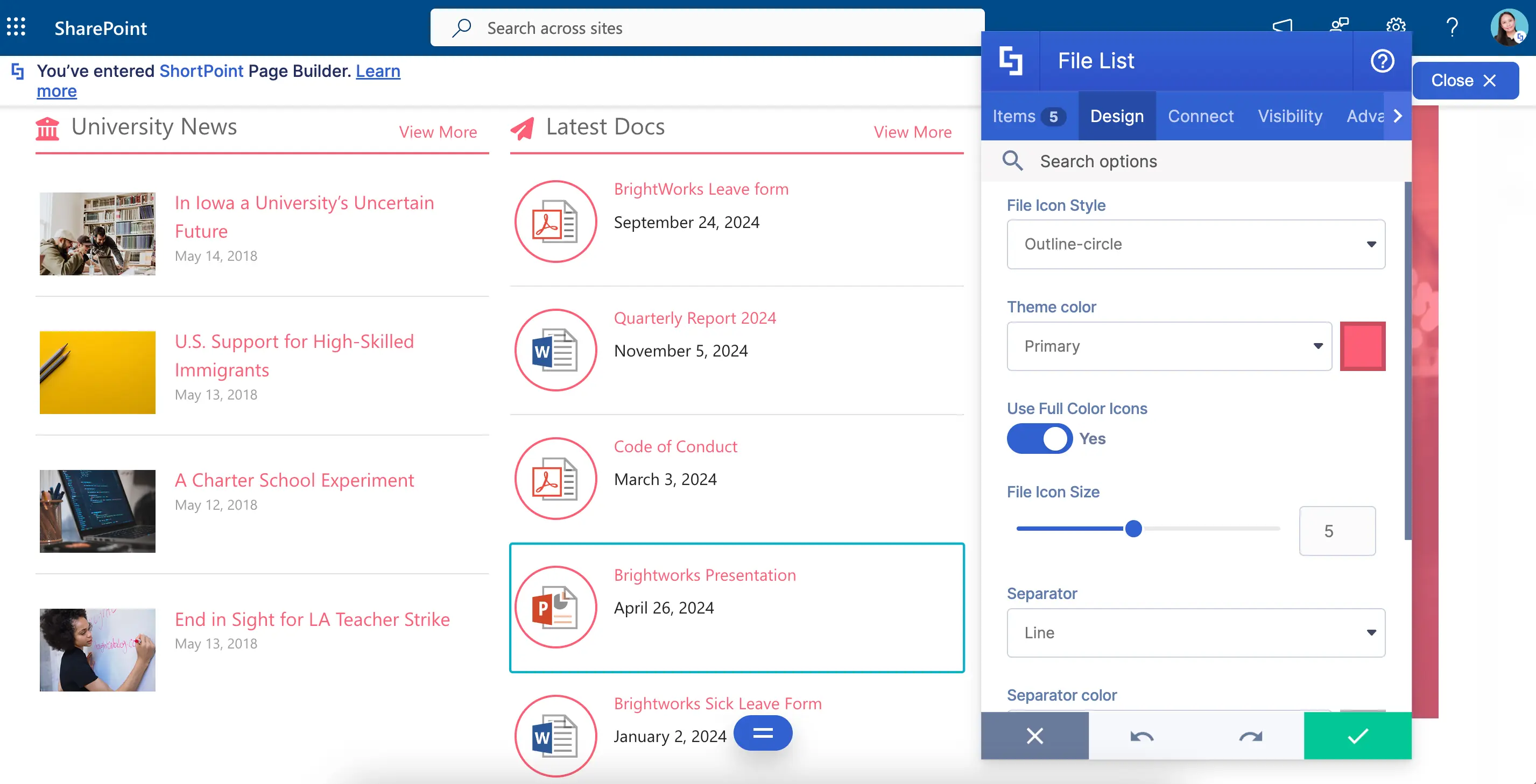
Up for some File List on your SharePoint pages? Check out How to Customize the File List Design Element.
Icon List Design Element
Love the Simple List Design Element but need something a little EXTRA? Try the Icon List Design Element!
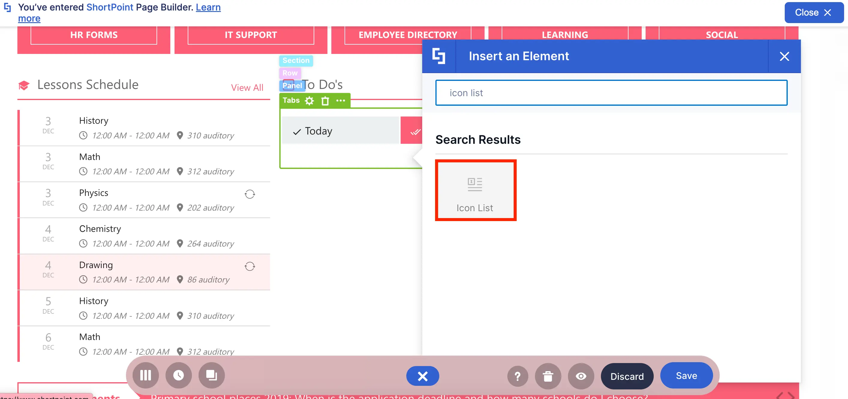
It has all the same options as a Simple List EXCEPT you can choose from hundreds of icons, which adds an eye-catching element to your usually dreary task list.
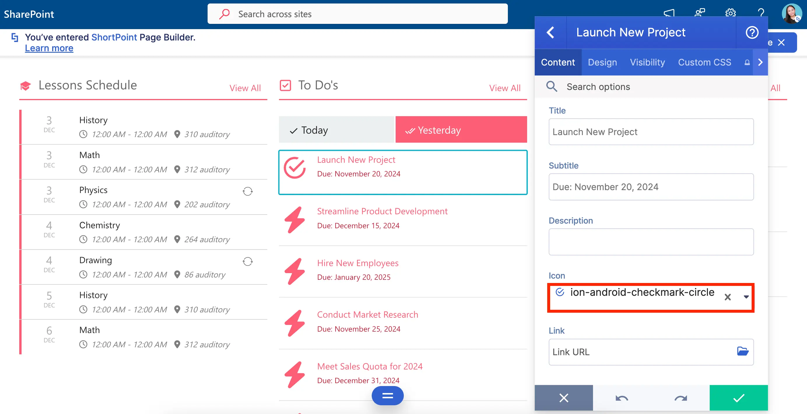
And of course, you can play with its design as much as you want! Change the color? Check. Resize the icons? Check. Customize the style? Check. It has everything you need to turn your scary list into something you and your co-workers will actually LOVE to look at.
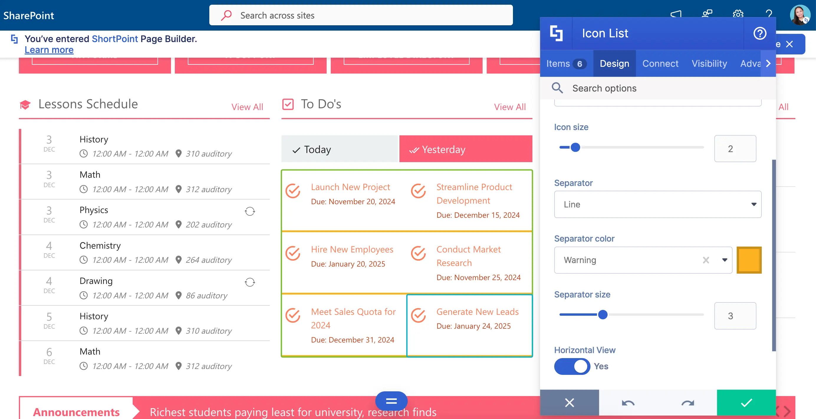
Ready to give your list a new look? Check out How to Customize the Icon List Design Element.
Events Design Element
Want to show off exciting company events and milestones? The Events Design Element is perfect for you!
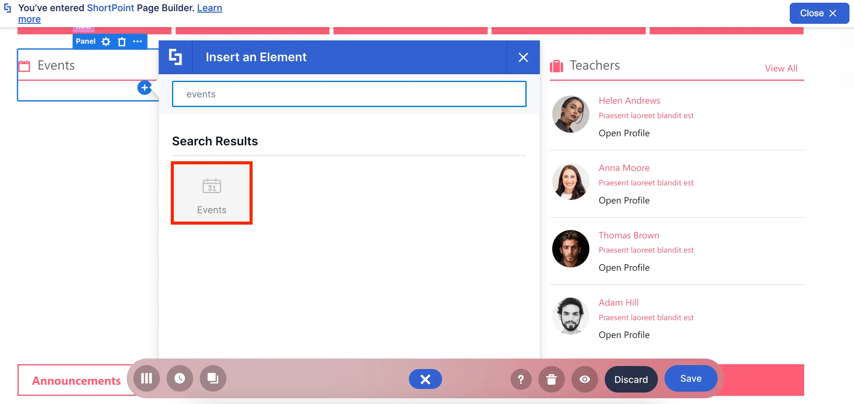
You can add details of your events like you usually do on a regular calendar. Super easy and convenient!
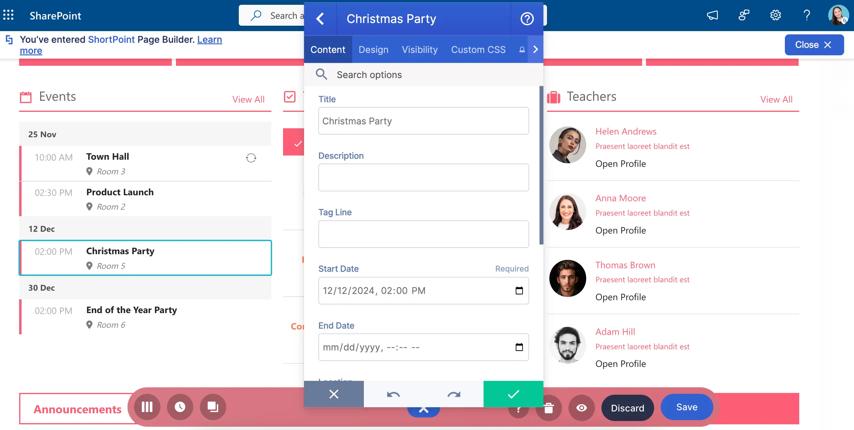
To make things EVEN MORE amazing, you have many design options—from customizing colors and styles to adding new elements like the date today!
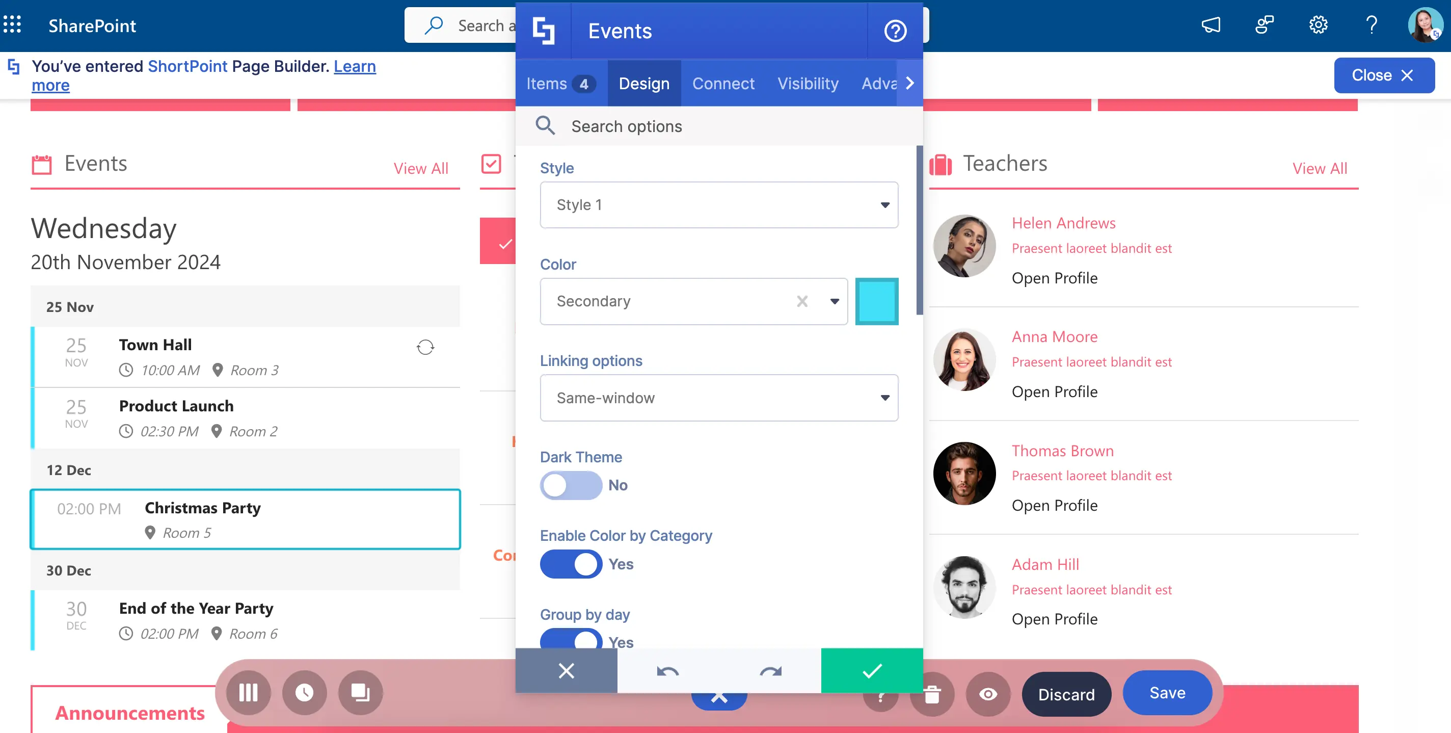
Excited to add Events to your page? Check out How to Customize the Events Design Element.
Date List Design Element
Looking for another design for your special events? We got you covered with the Date List Design Element!
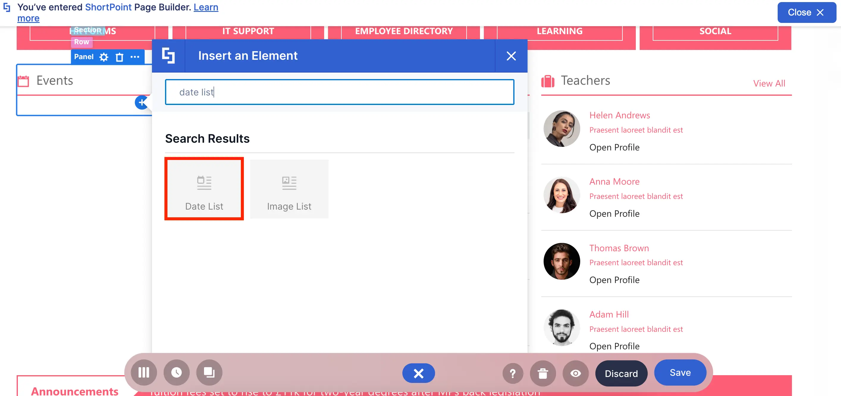
You can include the same details as in the Events Design Element. The key difference is the fresh look it offers!
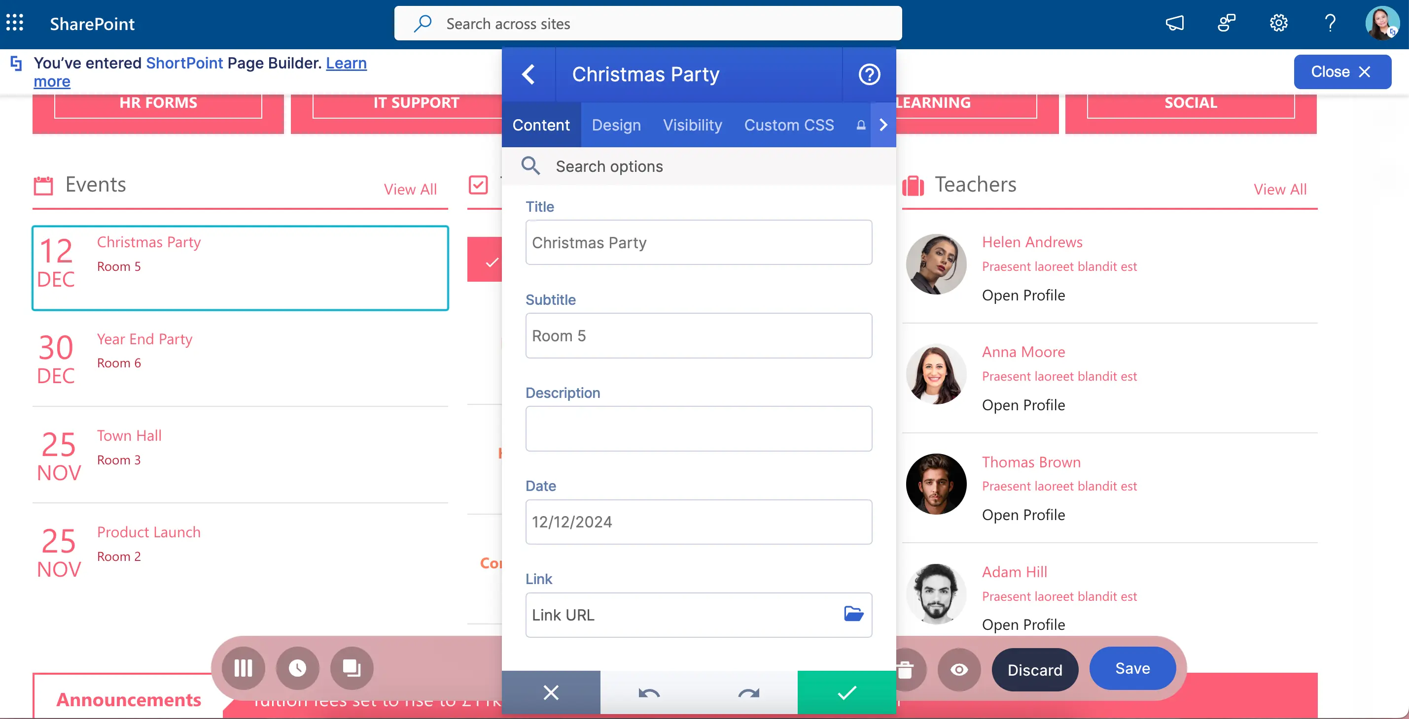
You have three new styles to try, combined with other design options that can make your Date List REALLY stand out.
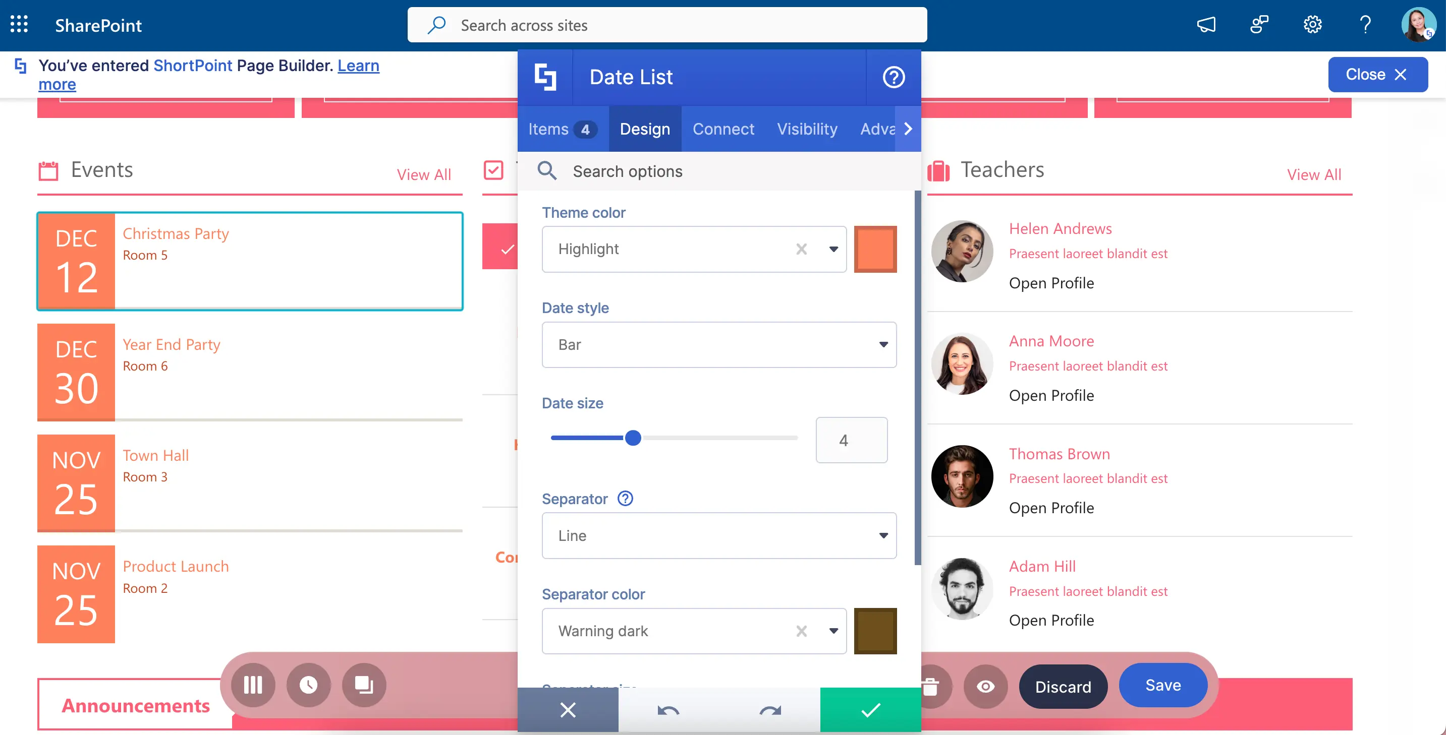
Need a Date List? Check out How to Customize the Date List Design Element to learn how to add it to your page.
Image List Design Element
Looking for the best way to showcase your employees? Or maybe you have a list of announcements you want to feature? Try the Image List Design Element
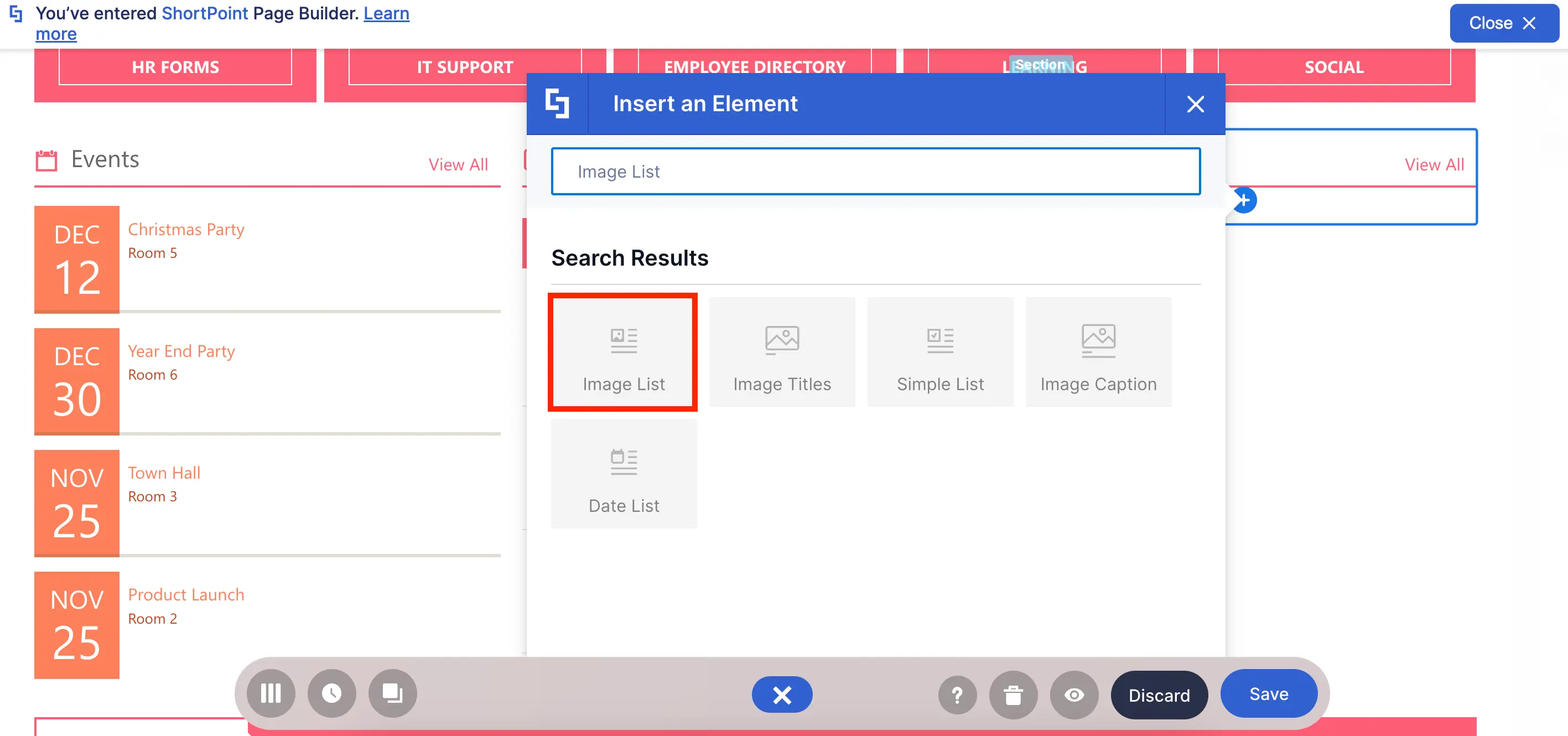
Here, you can add images to your usual list, making it a great way to show off your employees.
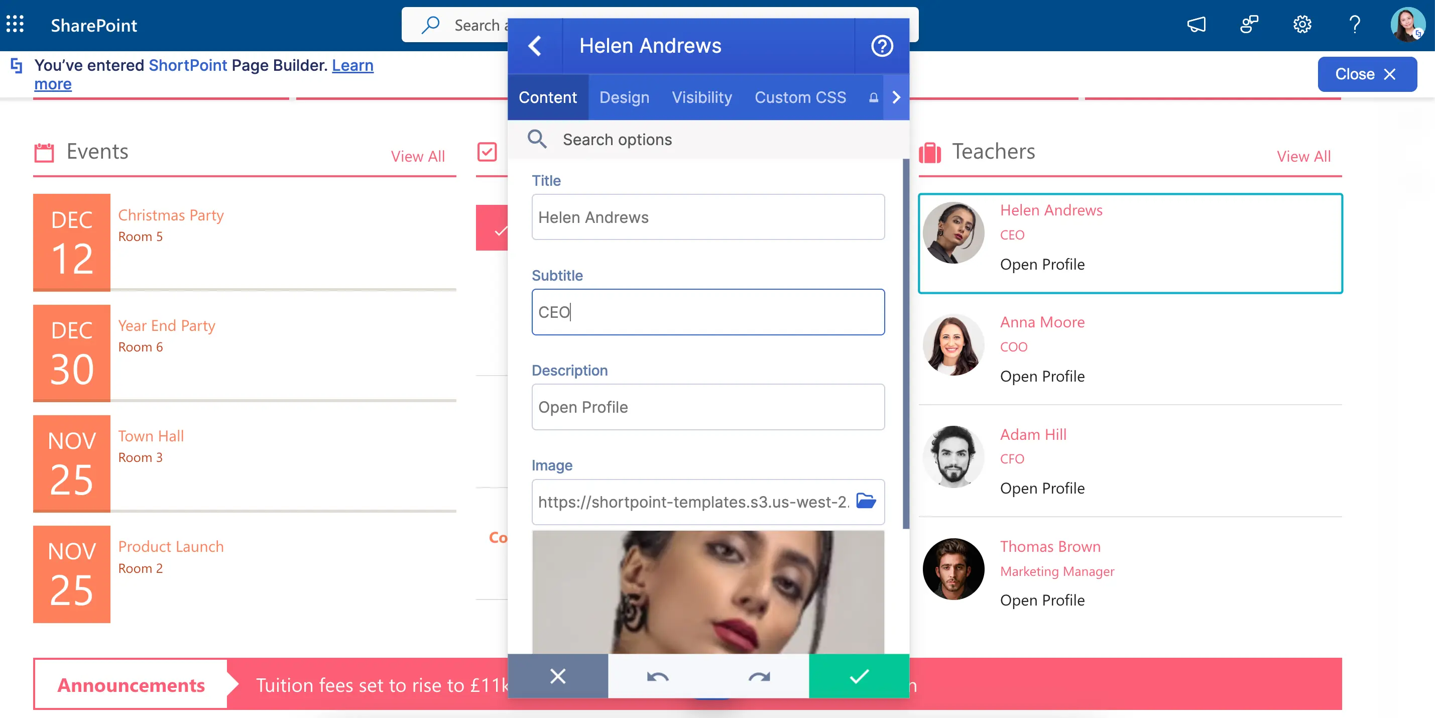
And, as usual, you can put in your own stamp by customizing its design. Play with colors, styles, sizes, and many more.
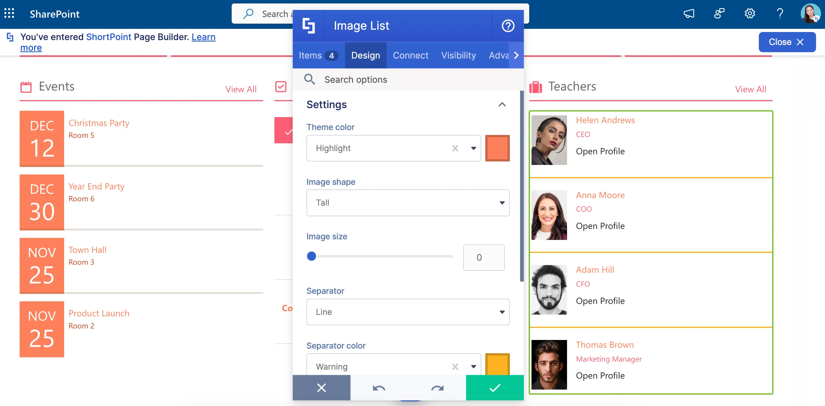
Let’s bring the Image List to your SharePoint pages! Check out How to Customize the Image List Design Element to learn how.
ShortPoint Connect for Lists
But what if you have a LOOOOONGGG list of information? Just imagine manually adding 20 or 30 items to a Design Element. It’s a hassle!
Good thing, ShortPoint has the Connect feature! With it, you can connect a Document Library or a SharePoint List like this one to any Design Element.
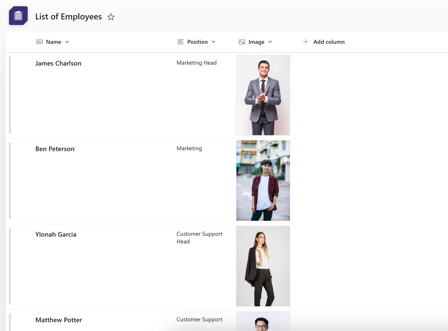
You can find ShortPoint Connect in the Connect tab of all the Design Elements we talked about.
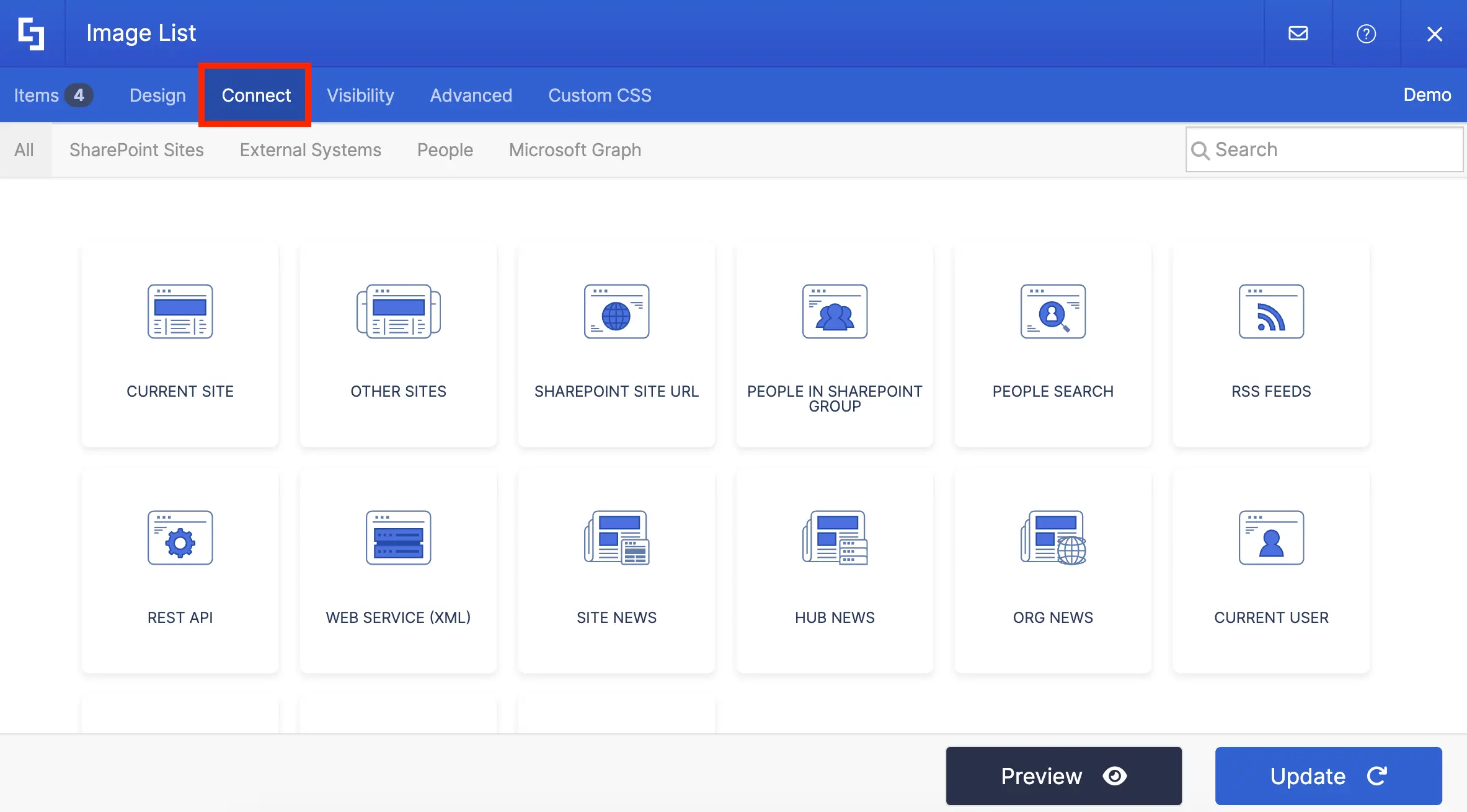
You have MANY options to connect. You can automatically pull information from your SharePoint sites, your Outlook calendar, and even other external sources (like RSS feeds or Rest API).
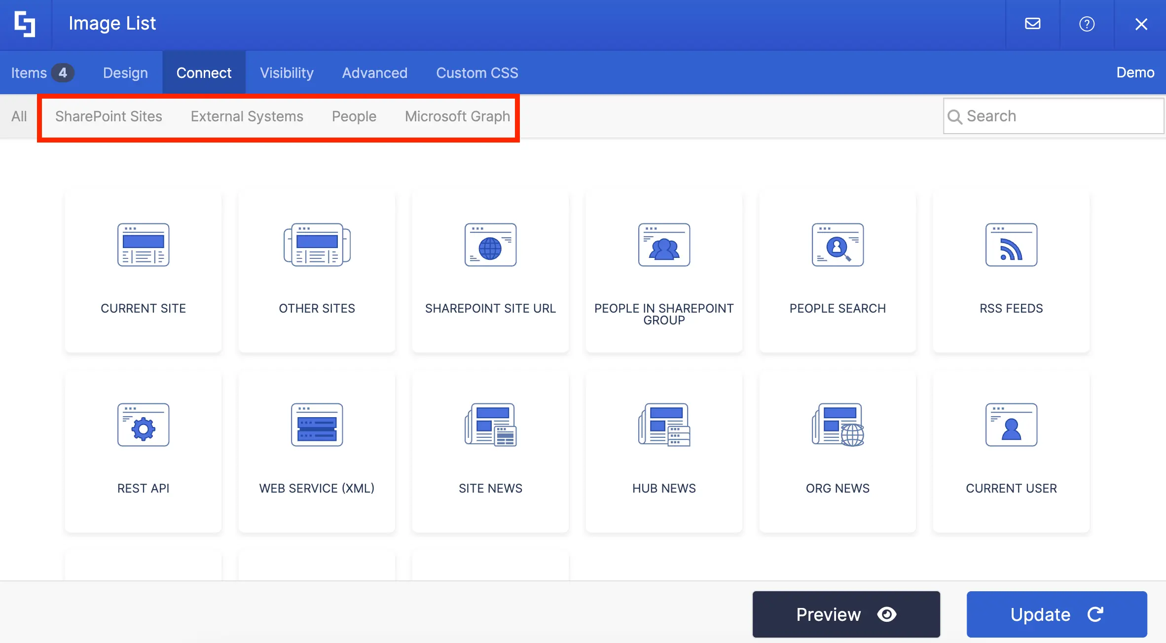
When you connect, ALL the information on your SharePoint List will be shown on your Design Element. Amazing, right?!

But, what’s EVEN MORE amazing is when you edit your SharePoint List, the changes made will also reflect on your SharePoint page. For example, when we changed the image for James Charlson, the image changed on our page too!
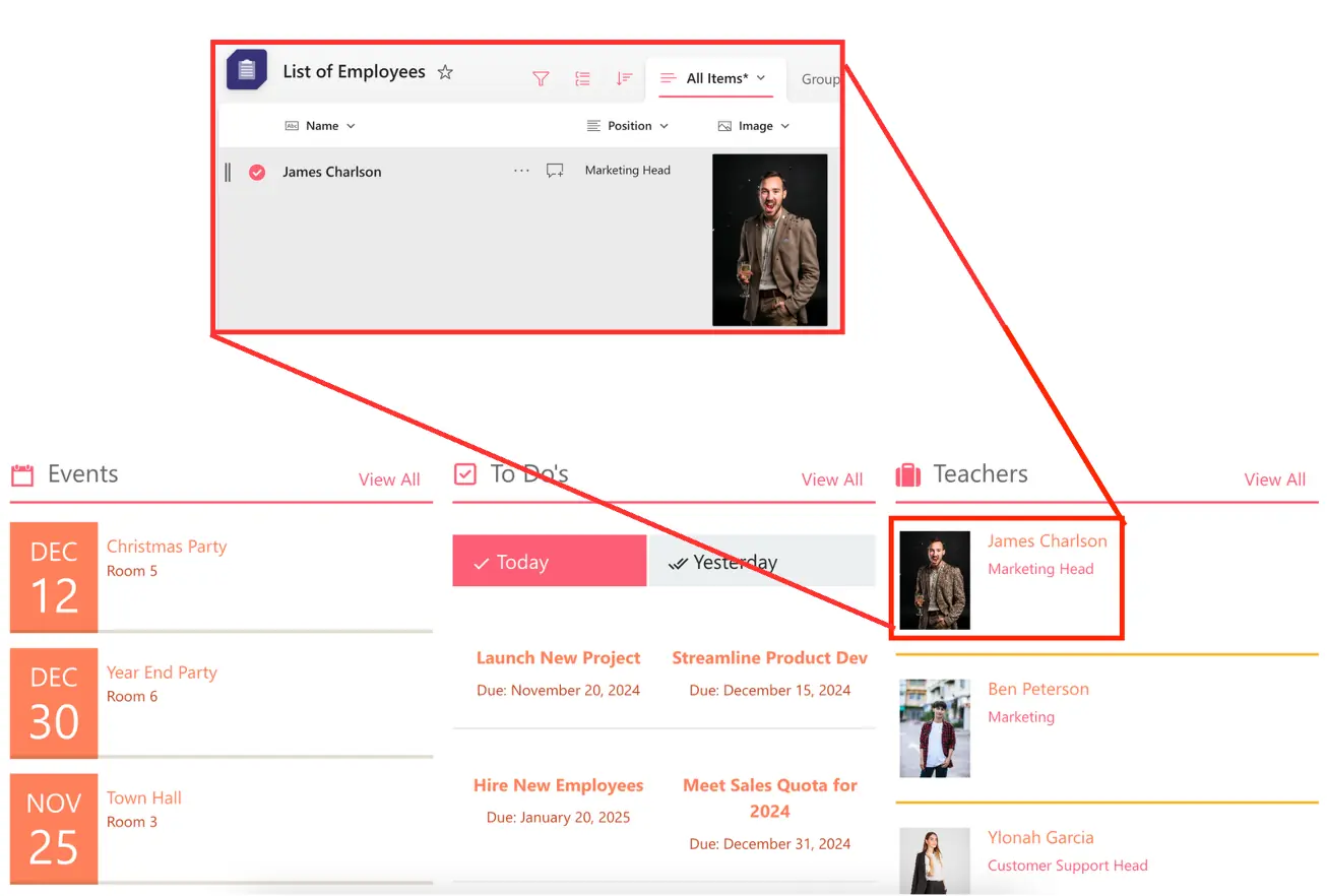
Want to start connecting? Check out ShortPoint Connect: Basic Tutorial to get a step-by-step guide on how to use ShortPoint Connect.
Search & Filter Toolbar
With such long lists on your SharePoint pages, finding the exact information you need can be hard. This is where the Search & Filter Toolbar comes in!
It allows you to add three powerful widgets to your SharePoint pages:
- Search - Adds a convenient search bar that lets you instantly find what you need within a Design Element;
- Filter - Helps you narrow down content based on specific criteria that matter to you;
- Sort - Organizes your information in ascending or descending order with just one click.
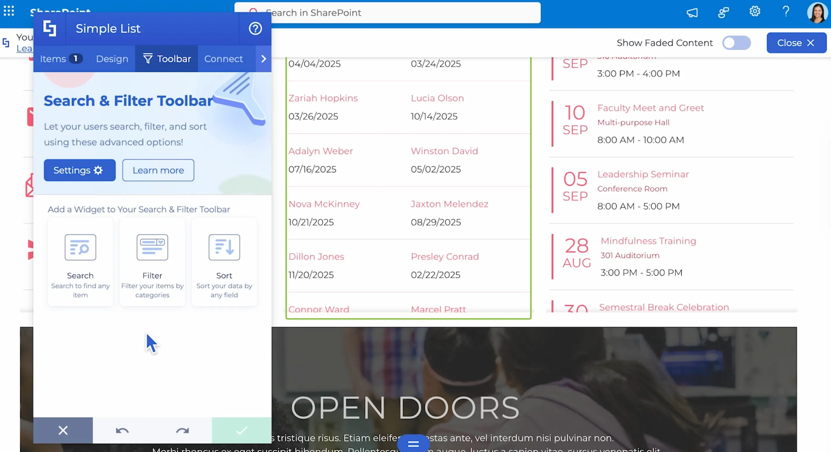
These powerful tools work hand-in-hand to create a list that is not only visually appealing but also user-friendly.
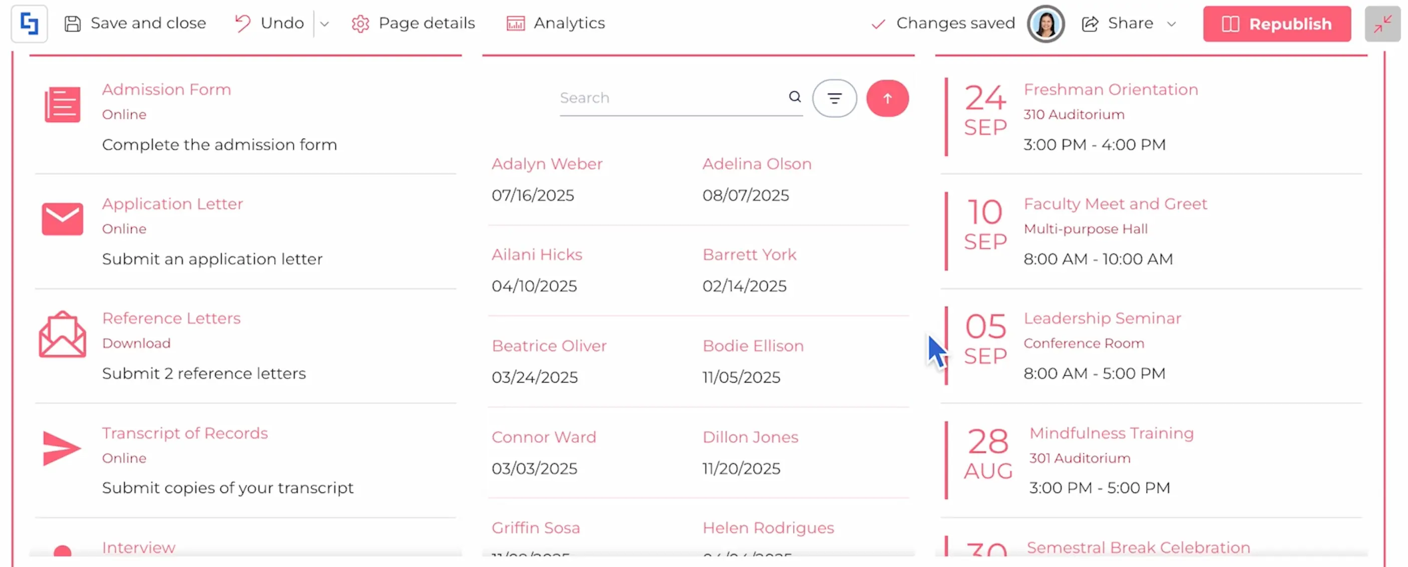
Learn more about the Search & Filter Toolbar in our Getting Started article.
There you have it! Gone are the days of boring, scary, and imposing lists. Now, you’re met with fun, creative, and engaging lists—just what you and your co-workers need to see lists in a new light.
Best Design Elements for Videos and Social Media
Videos and social media are now taking over the world! Let’s face it: they’ve become our go-to way to entertain and inform ourselves.
You can watch videos about any topic under the sun—intranets, SharePoint, ShortPoint, you name it—and you'll likely find it online. In fact, most people prefer watching a quick video over reading paragraphs of text!
And social media? It's where we all hang out these days! We spend hours scrolling, liking, and connecting with content that catches our eye. It's how we stay connected and engaged.
So, with that in mind, your SharePoint intranet should not miss out on the magic of videos and social media. Good news! ShortPoint makes it super simple to bring all that video and social media magic right into your intranet pages. You and your team will ABSOLUTELY love it!
Let’s get into the Design Elements you can use for both videos and social media.
Video Design Elements
We’ll start with videos first! Here are the Design Elements you can use to showcase your amazing and creative videos:
YouTube Video Design Element
By now, you’ve probably watched THOUSANDS of YouTube videos in your lifetime. After all, whether you're learning a new skill, catching up on your favorite creator's latest adventure, or just unwinding with some laughs, YouTube has something for you!
And, you can continue the fun on your own SharePoint intranets with the YouTube Video Design Element! With it, you can showcase any YouTube video on your pages:
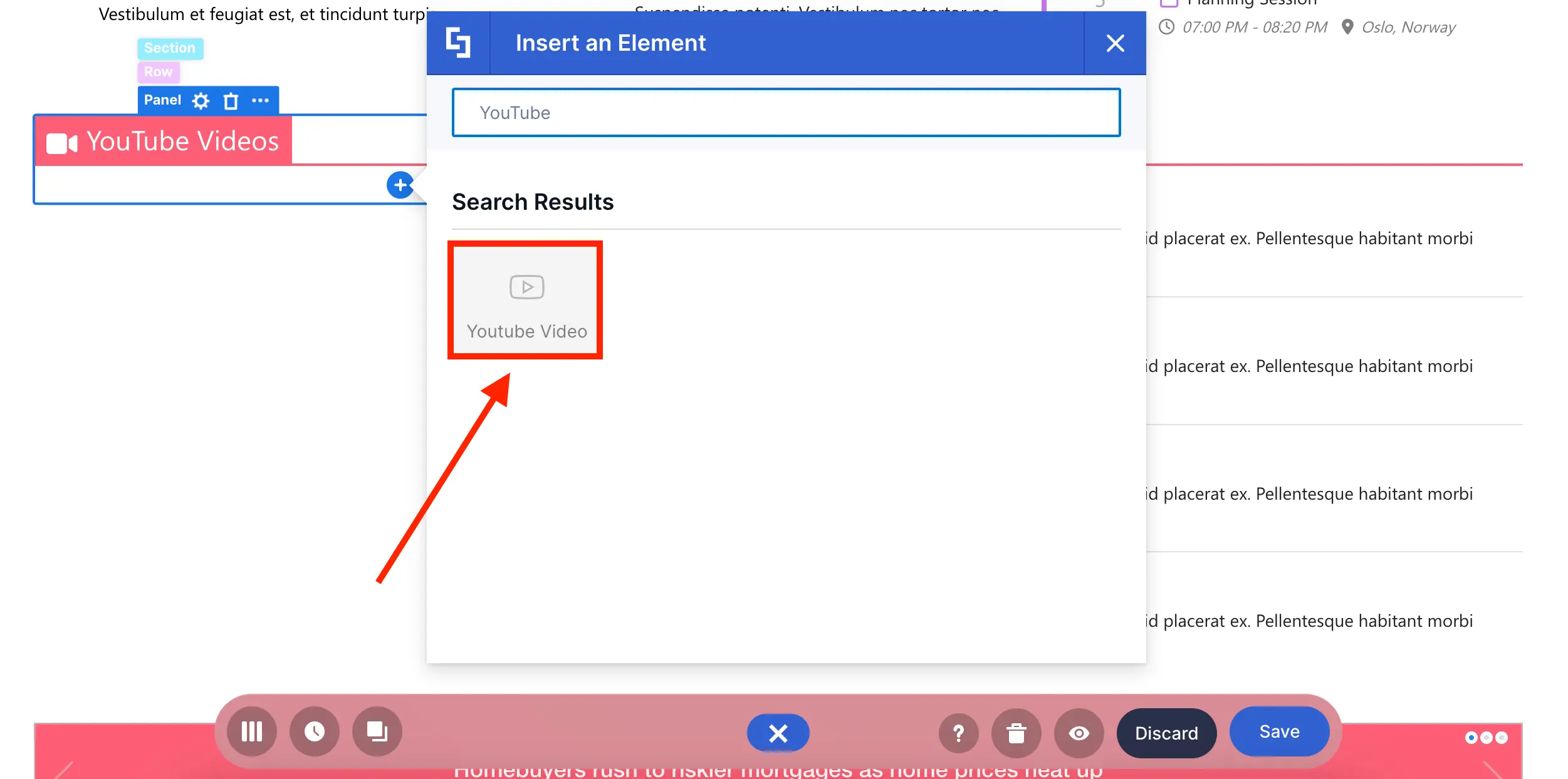
All you need is the exact URL of the YouTube video you want to showcase:
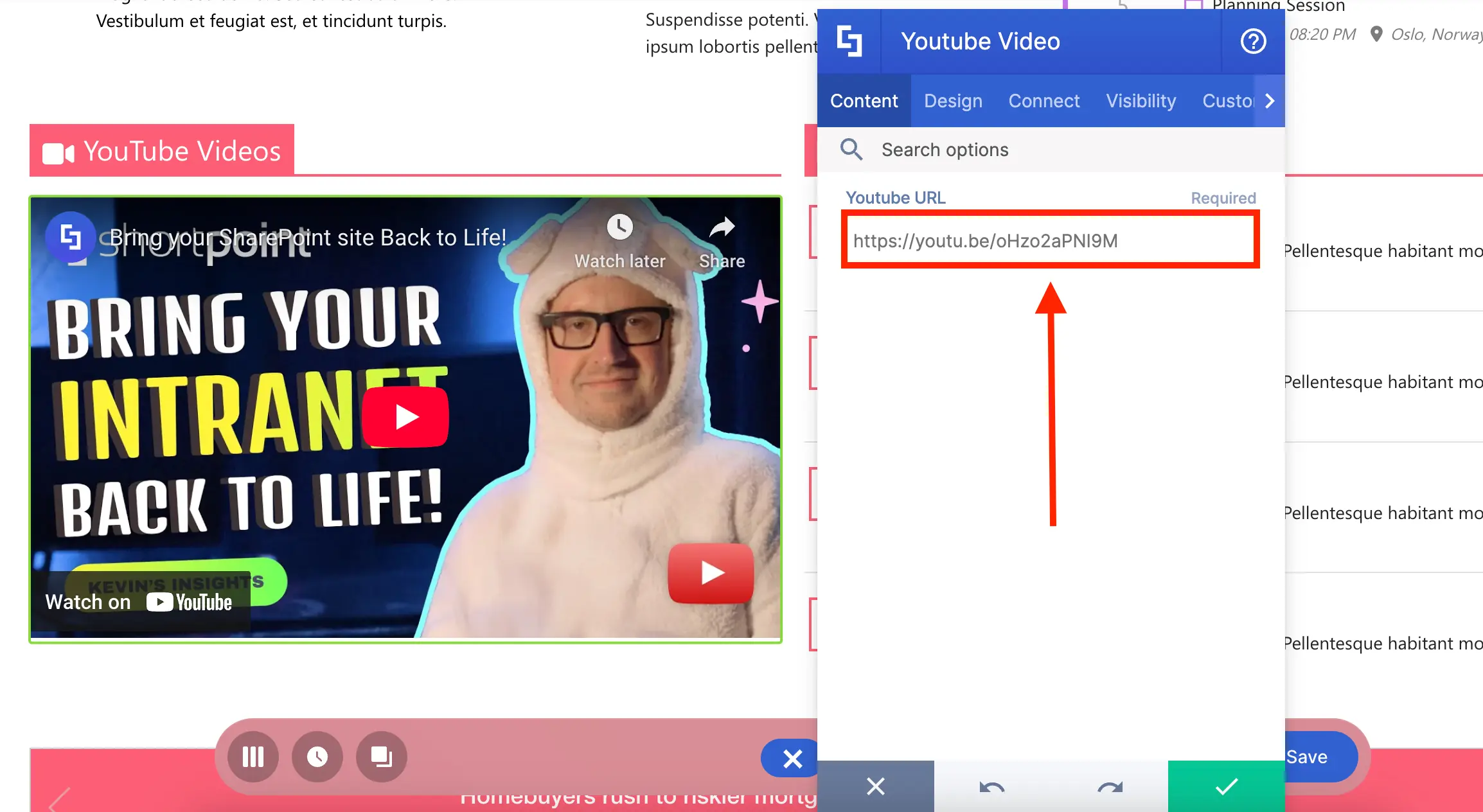
The best part? You can even control how wide the video is displayed on your page:
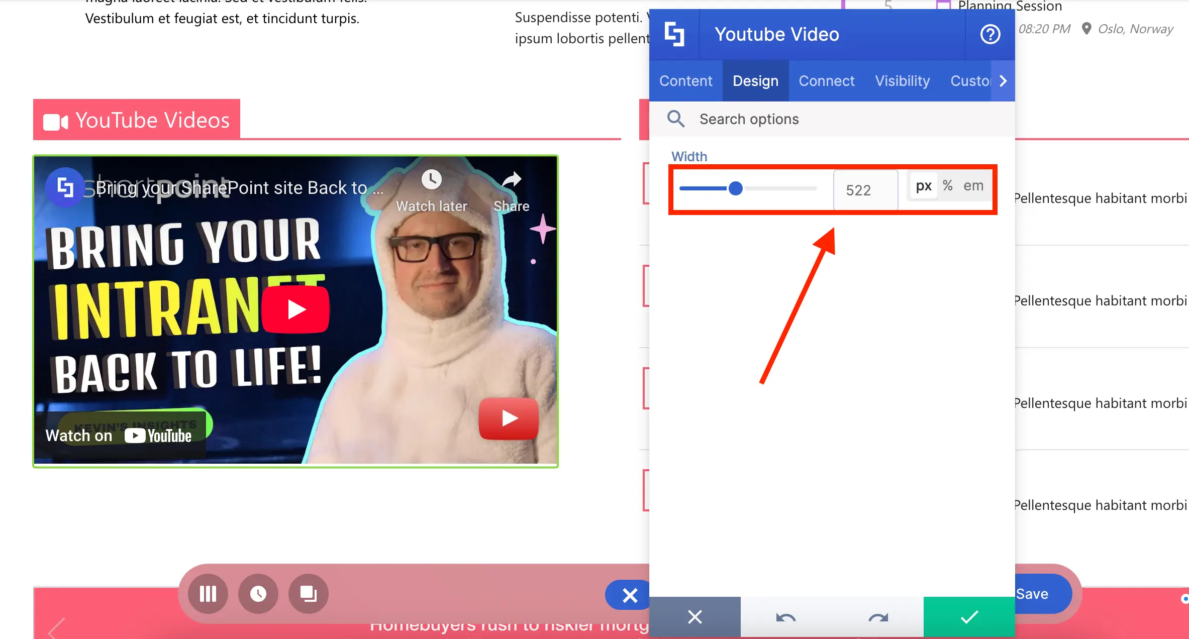
Want to give it a try? Go to How to Customize the YouTube Video Design Element to learn how to add it to your SharePoint page.
Vimeo Video Design Element
If you love creating professional and ad-free videos, there’s a chance you’ve used Vimeo! With the Vimeo Video Design Element, you can now proudly showcase your creative output on your SharePoint pages:
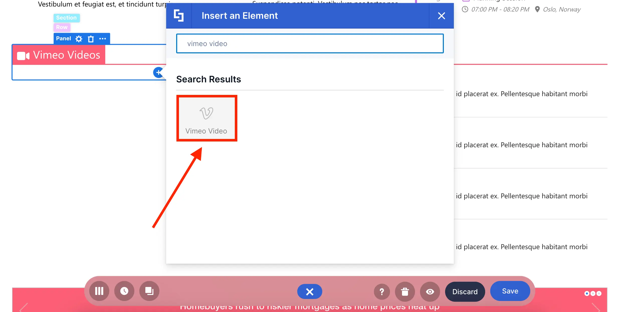
Like YouTube, you only need the video URL:
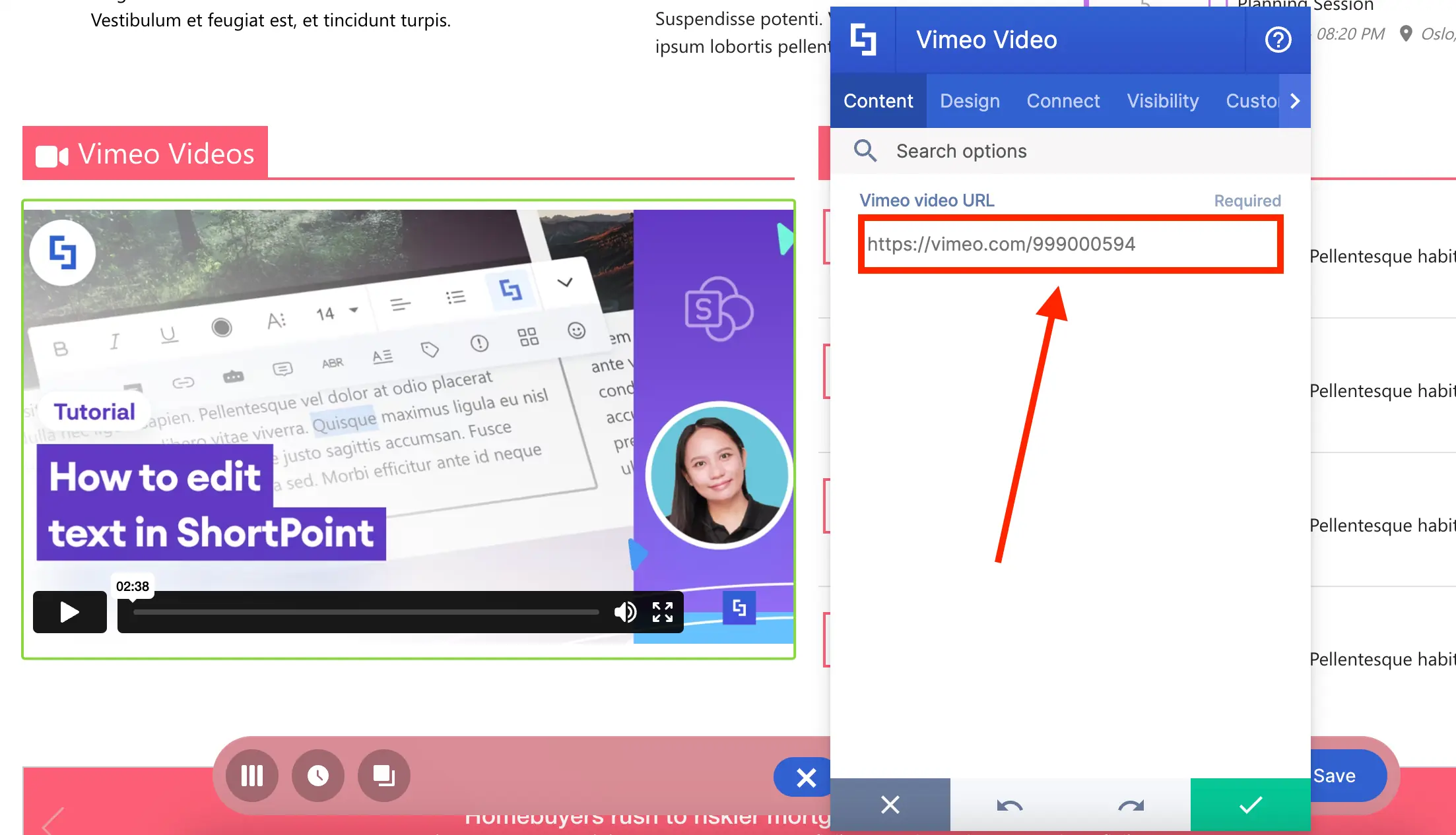
You can also adjust the width of the display:
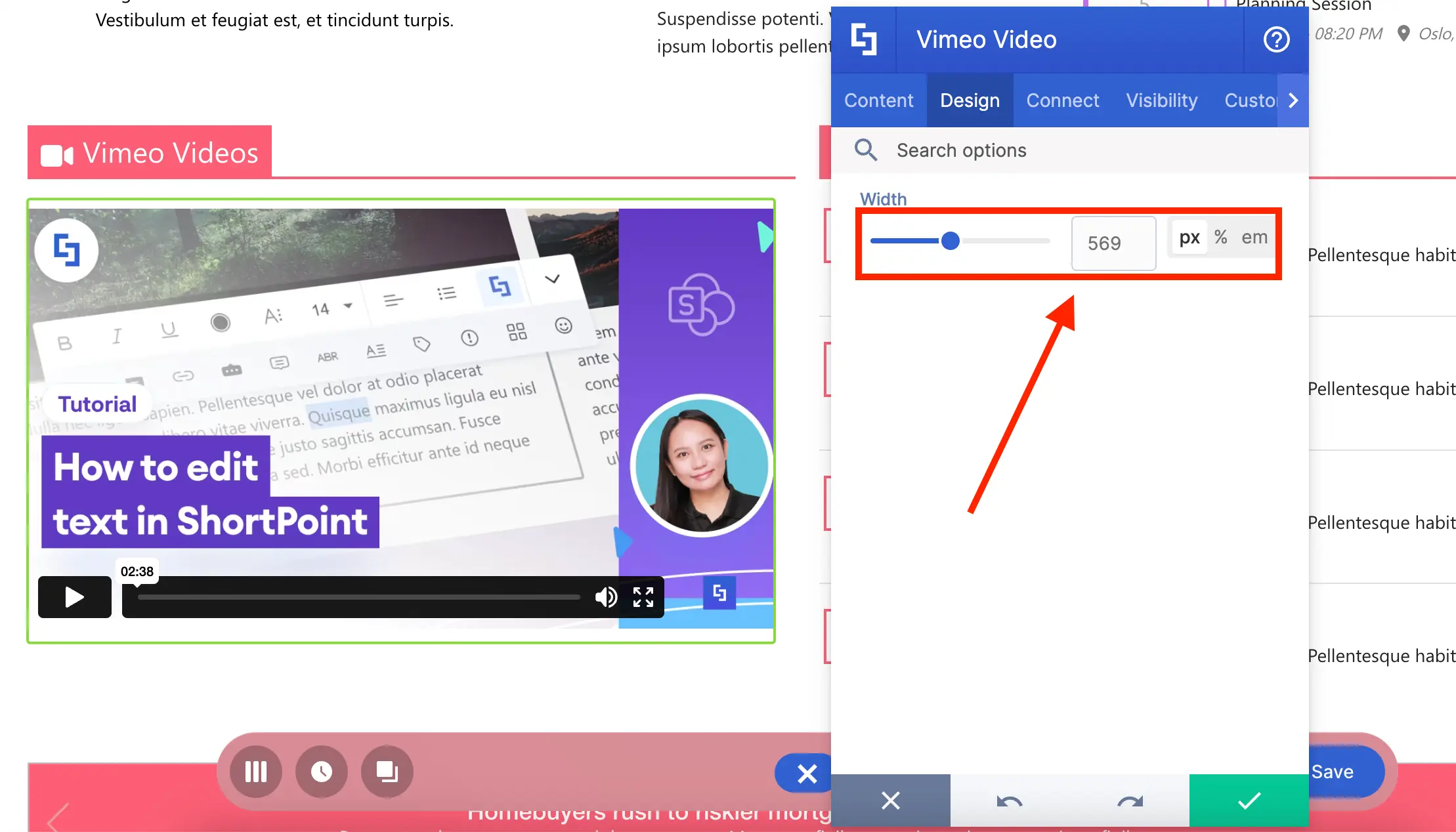
Eager to use Vimeo Video and its features? You can check out How to Customize the Vimeo Video Design Element for a detailed guide on all the customizable options.
Code Design Element
What if there are other video content you want to showcase? Like MS Stream videos, YouTube playlists, or Vimeo playlists? All you need is the Code Design Element and the video’s embed code!
The Code Design Element lets you add HTML, CSS, and Javascript snippets to your SharePoint page:
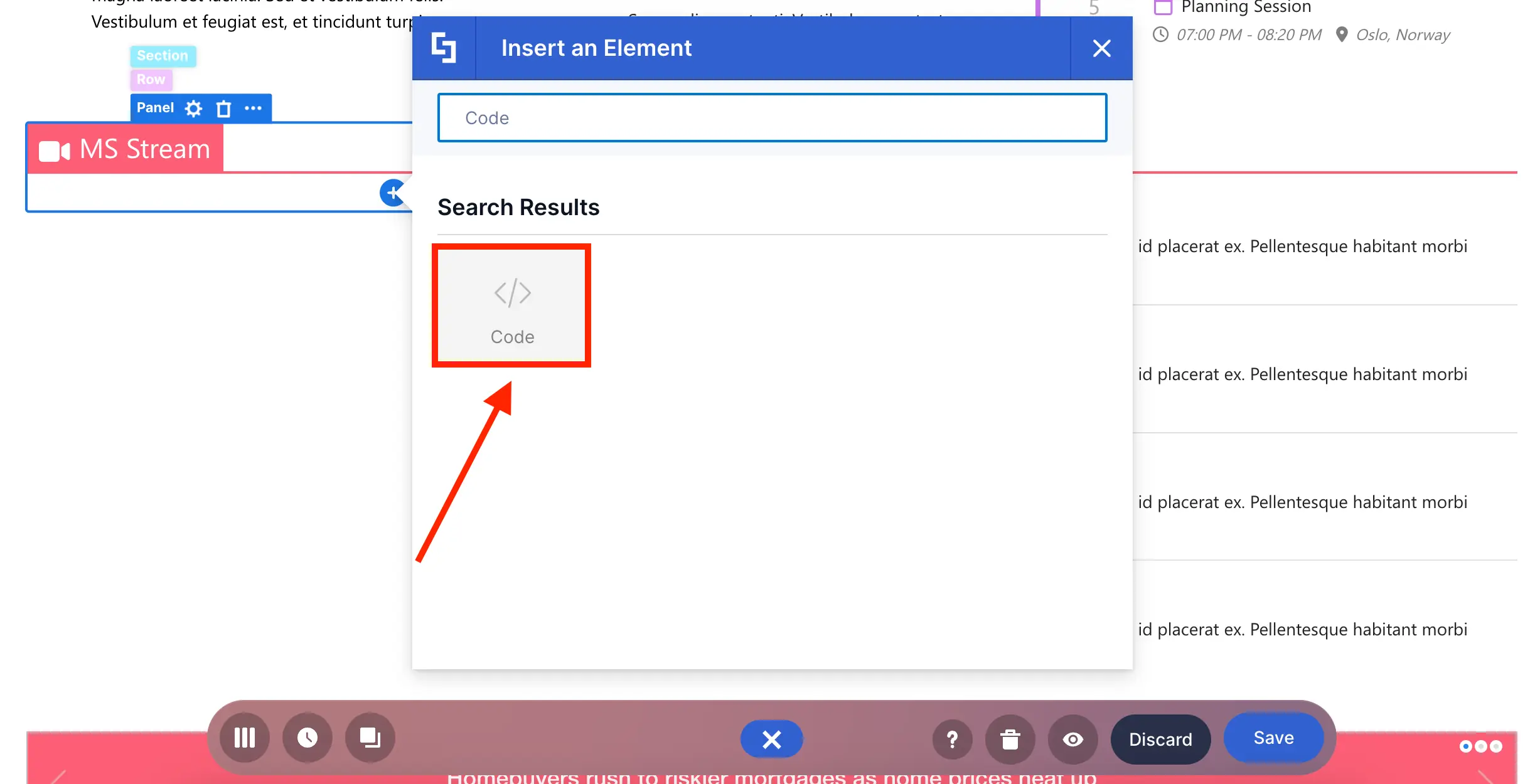
It is dynamic and useful in many scenarios, such as letting you embed videos from Stream:
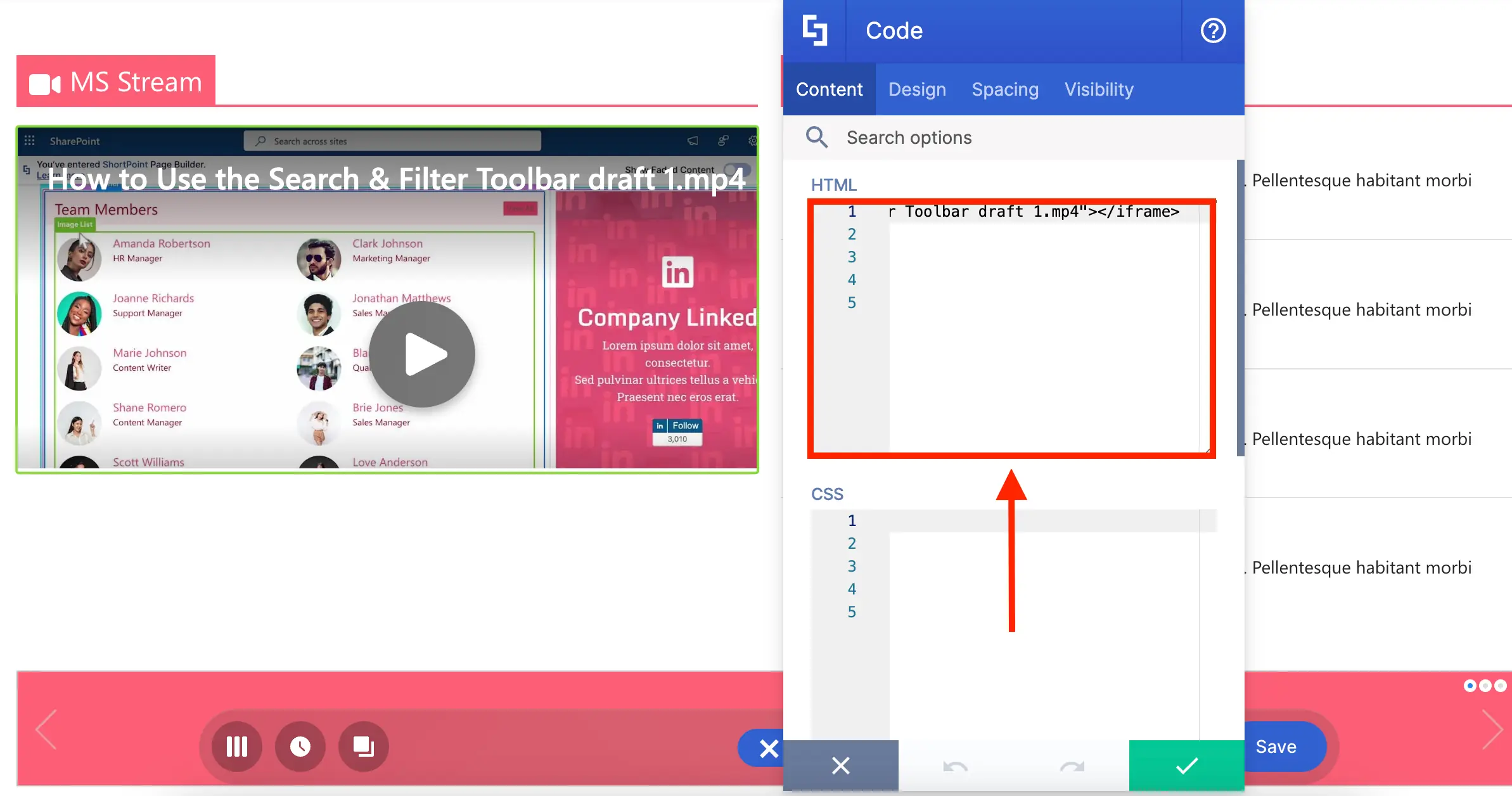
Or feature playlists from YouTube and Vimeo:
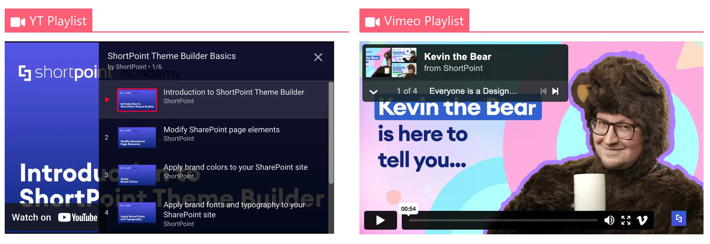
To top it off, there’s even an option to adjust the paddings and margins around the Code Design Element:
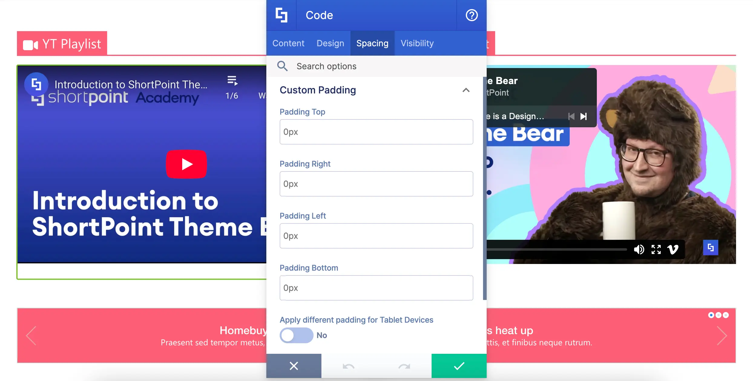
Up for some video embeds on your SharePoint pages? Check out Introducing the Code Design Element.
Social Media Design Elements
Now, let’s continue our doom scrolling and move on to Design Elements you can use for Social Media:
Facebook Design Element
Does your company have a Facebook page? You can showcase it on your SharePoint pages using the Facebook Design Element.
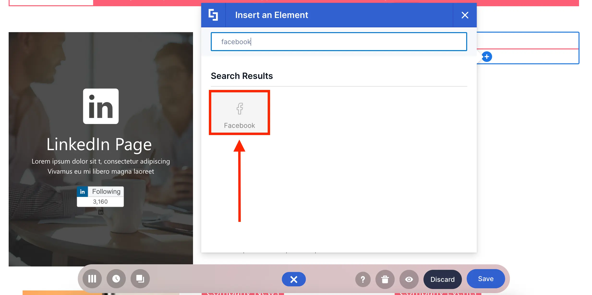
All you have to do is enter your Facebook URL:
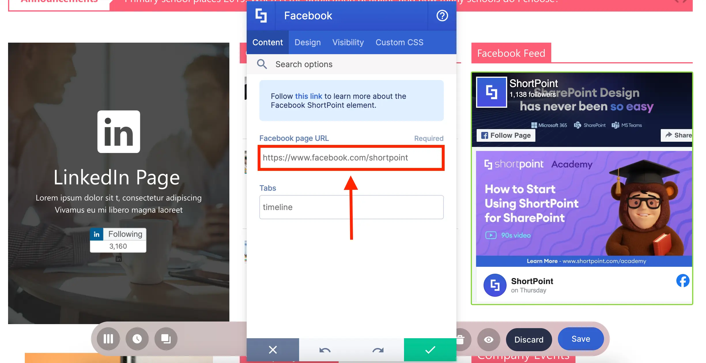
But what makes it unique is that it doesn’t only let you post your timeline. You can also post upcoming events, messages, and many more:
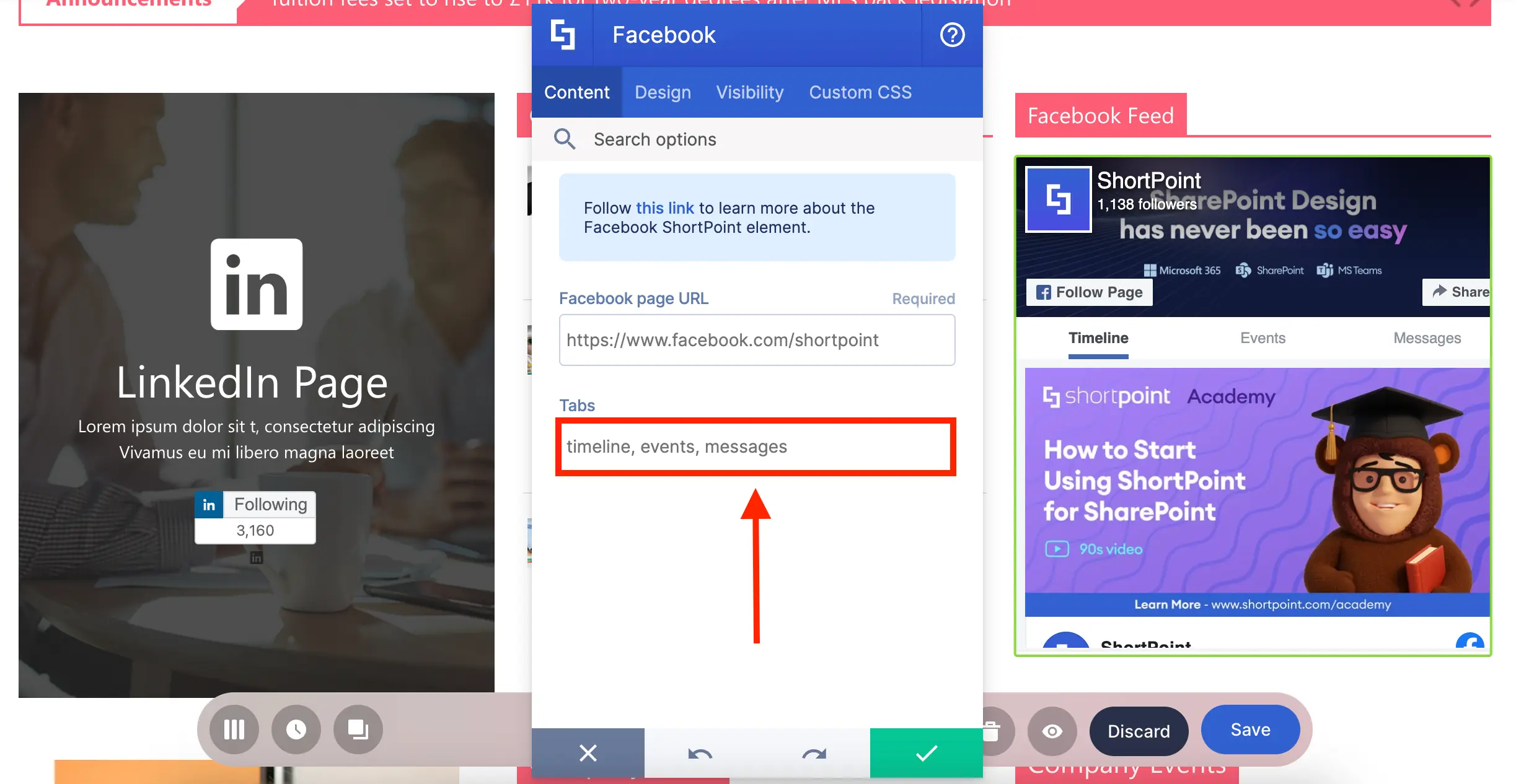
You can even further customize how it looks:
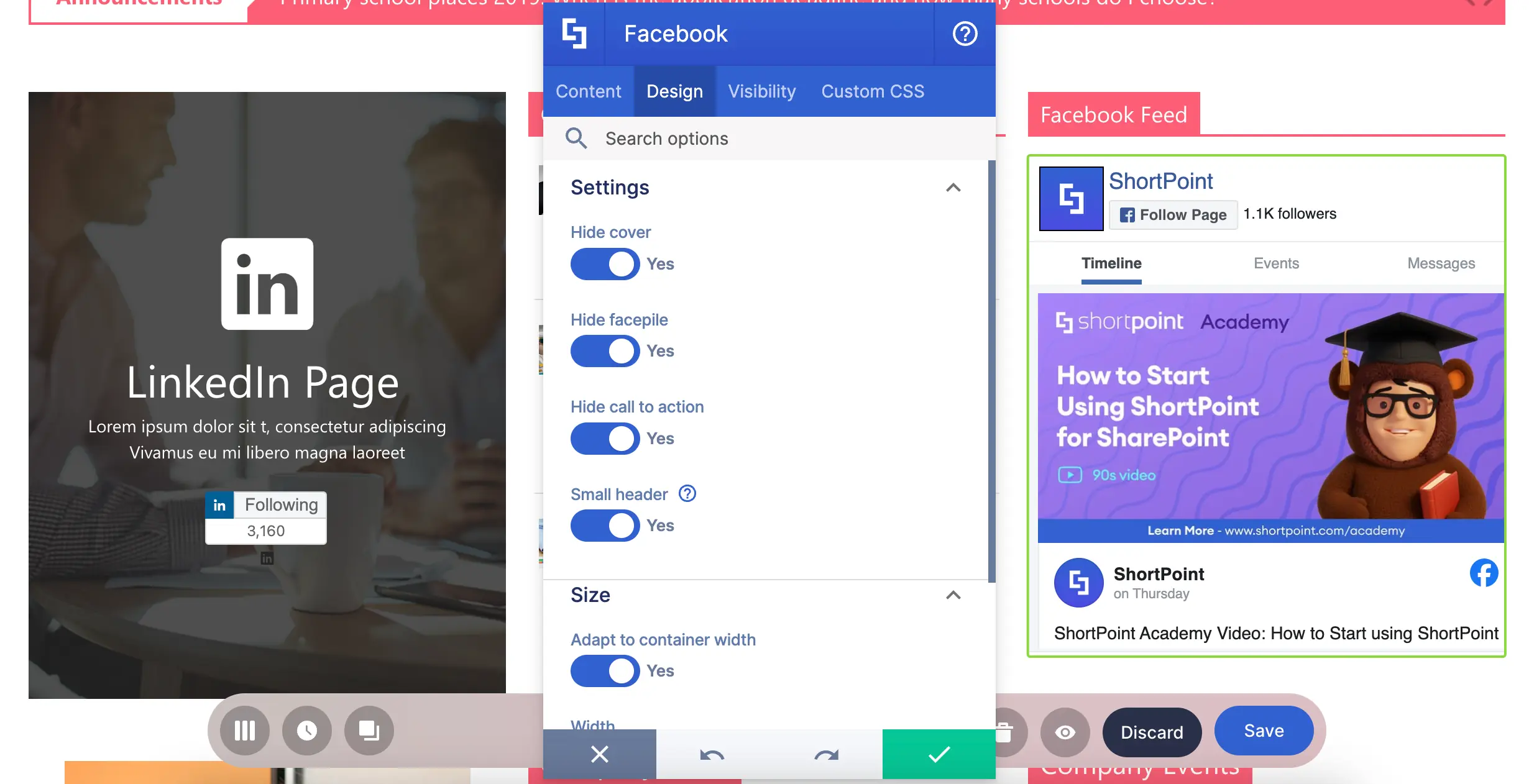
Ready to give the Facebook Design Element a try? Check out Introducing ShortPoint Facebook Design Element.
X Design Element
Is X your main source for company news and updates? Try out the X Design Element and post your profile feed on your page!
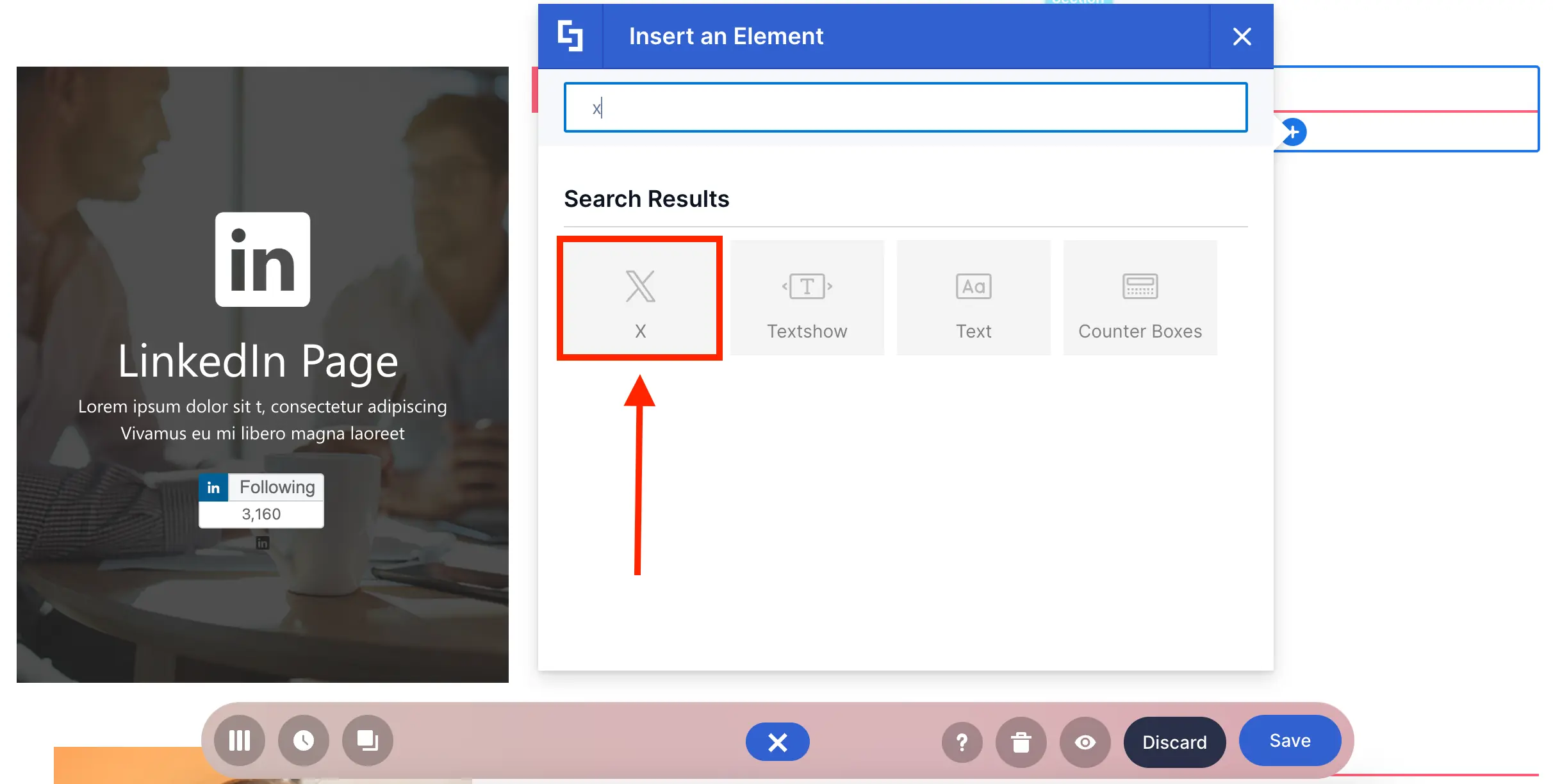
Again, the URL is all you need:
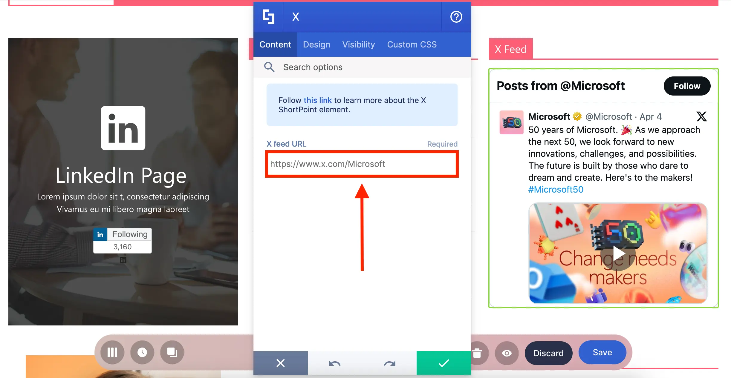
Then, you can choose to use a dark theme and even adjust the display size:
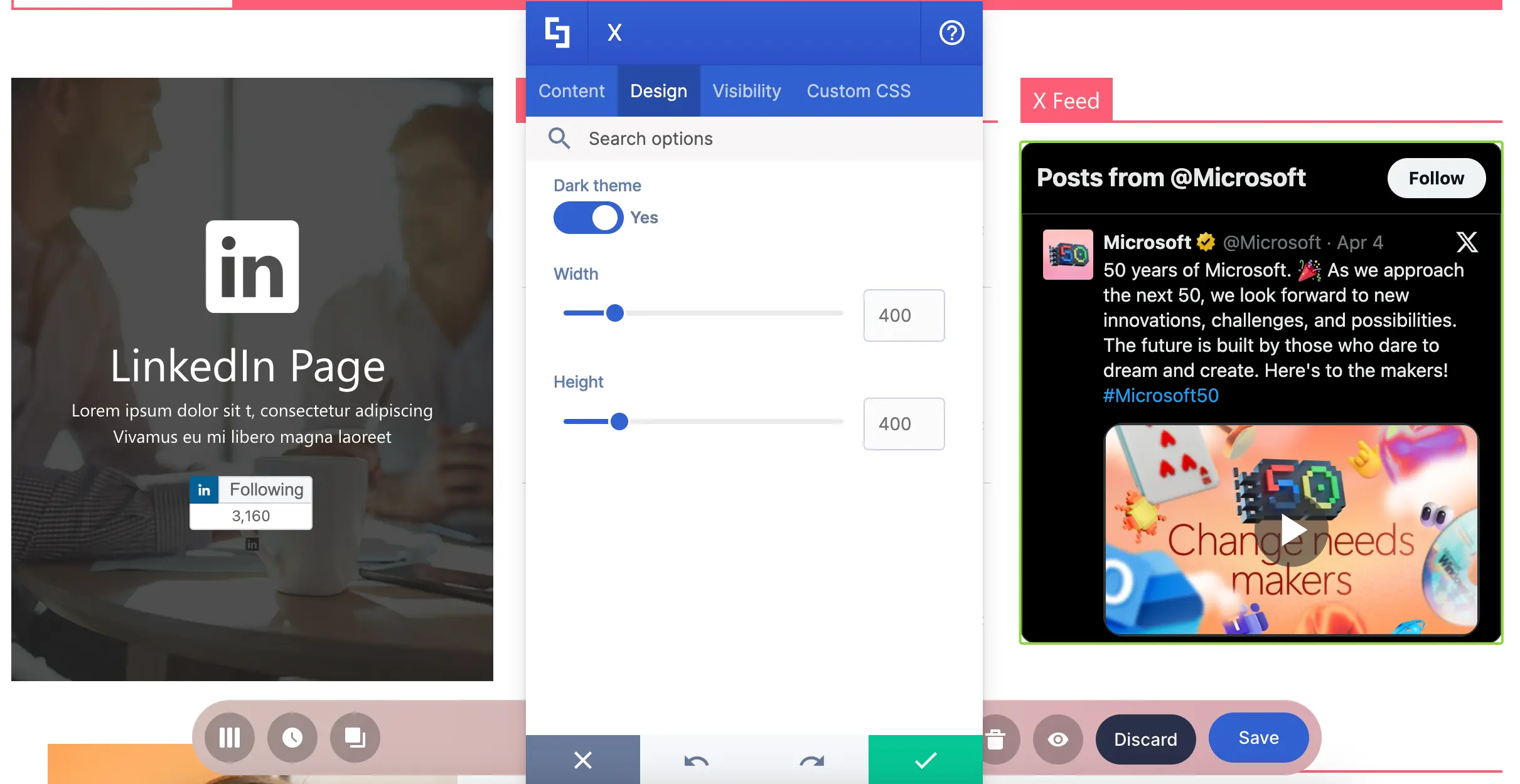
Excited to add your X timeline to your page? Check out Introducing ShortPoint X Design Element.
Instagram Design Element
Love connecting with your followers using Instagram? Why not feature it on your intranet?! You can easily do this using the Instagram Design Element!
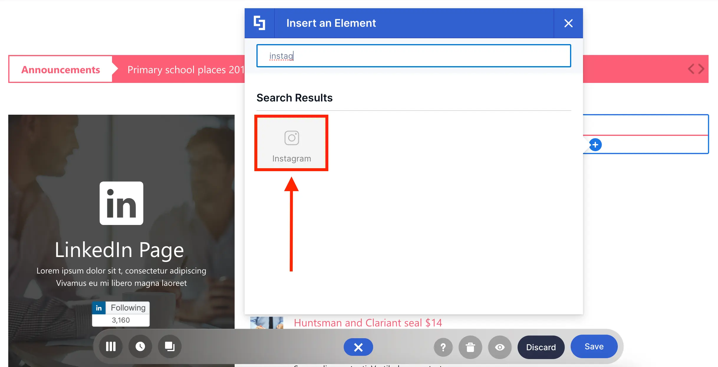
To add an Instagram post, simply add the post URL:
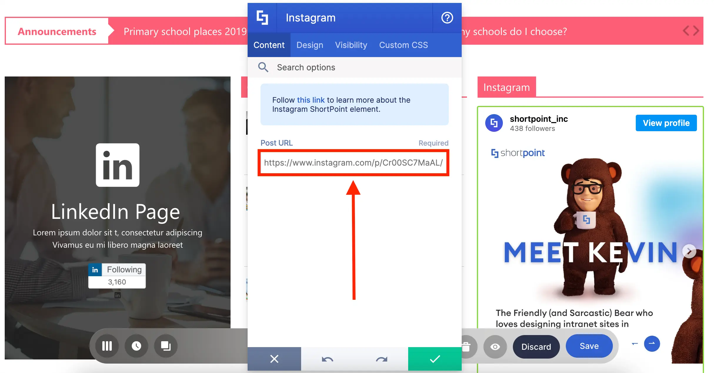
You can even choose to remove the post caption and customize its size:
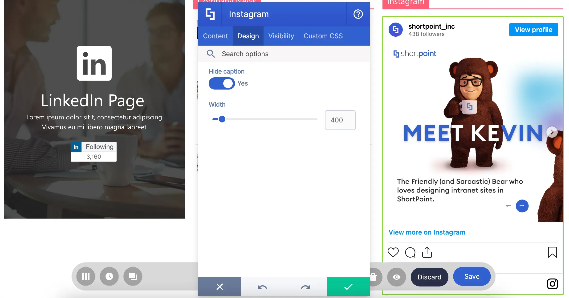
Need Instagram on your page? Check out Introducing ShortPoint Instagram Design Element to learn how to add it to your page.
LinkedIn Design Element
Need more LinkedIn followers? You can display your LinkedIn page's follow button using the LinkedIn Design Element!
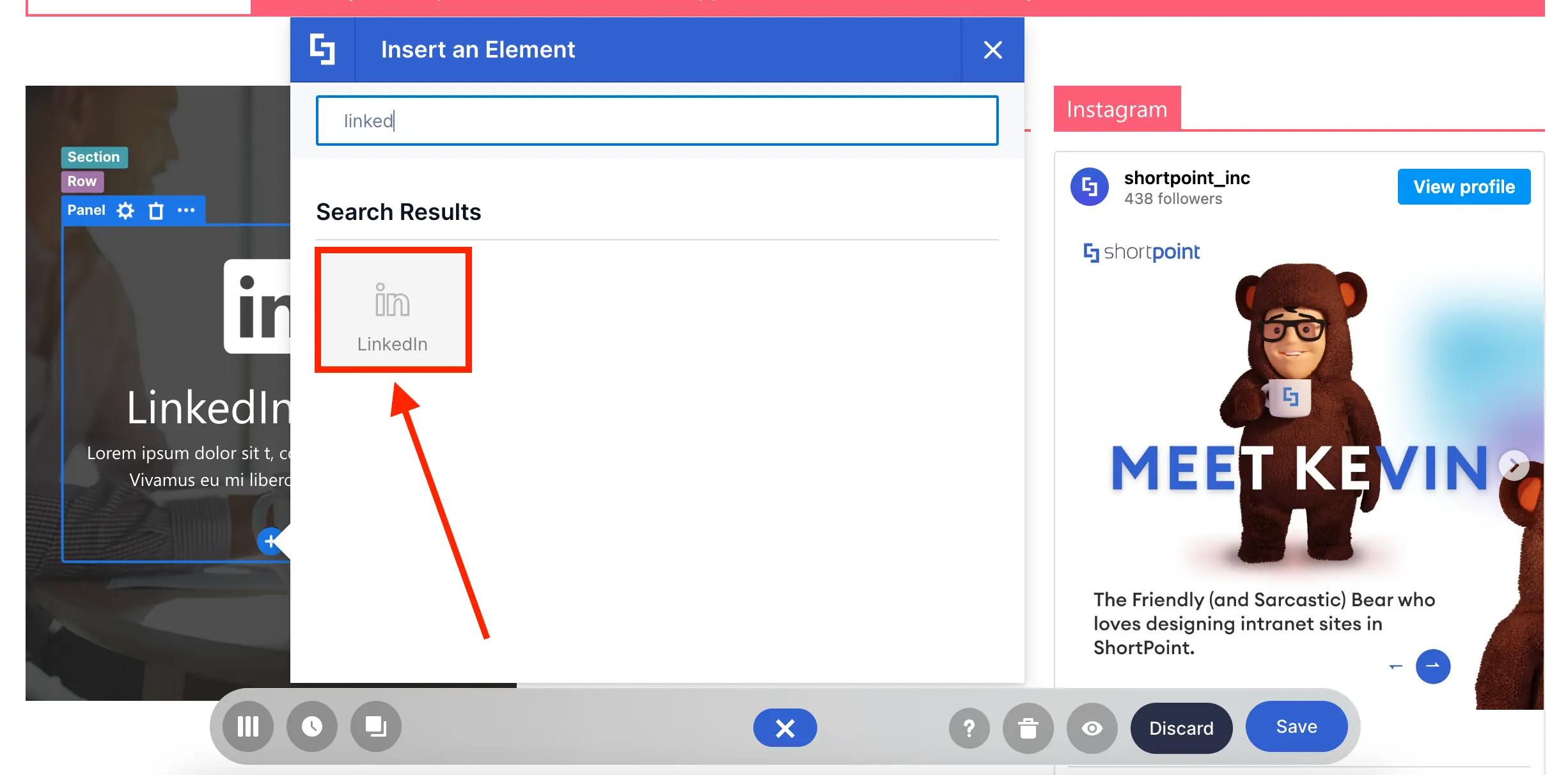
This time, you’ll need your Company ID. You can learn more about how to get the Company ID in Introducing ShortPoint LinkedIn Design Element.

Code Design Element
But, what if you want to display a LinkedIn post on your page? The Code Design Element is here to save the day!
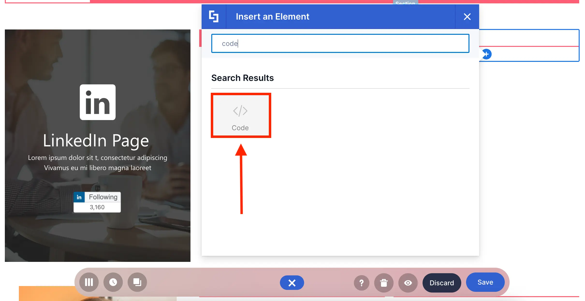
Like in embedded videos, you only need to get the embed code of the LinkedIn post you want to show:
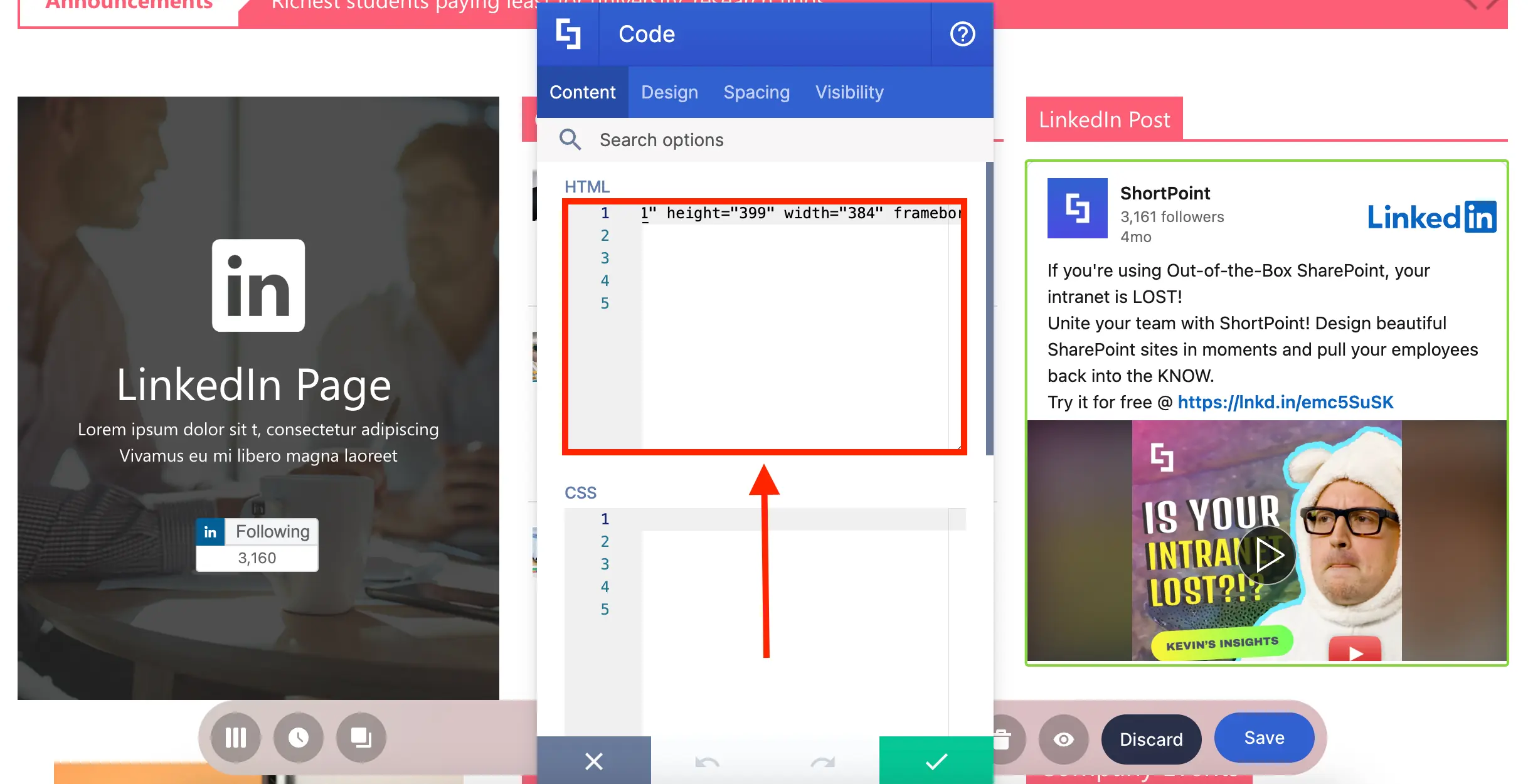
You can also adjust the paddings and margins around the Code Design Element:
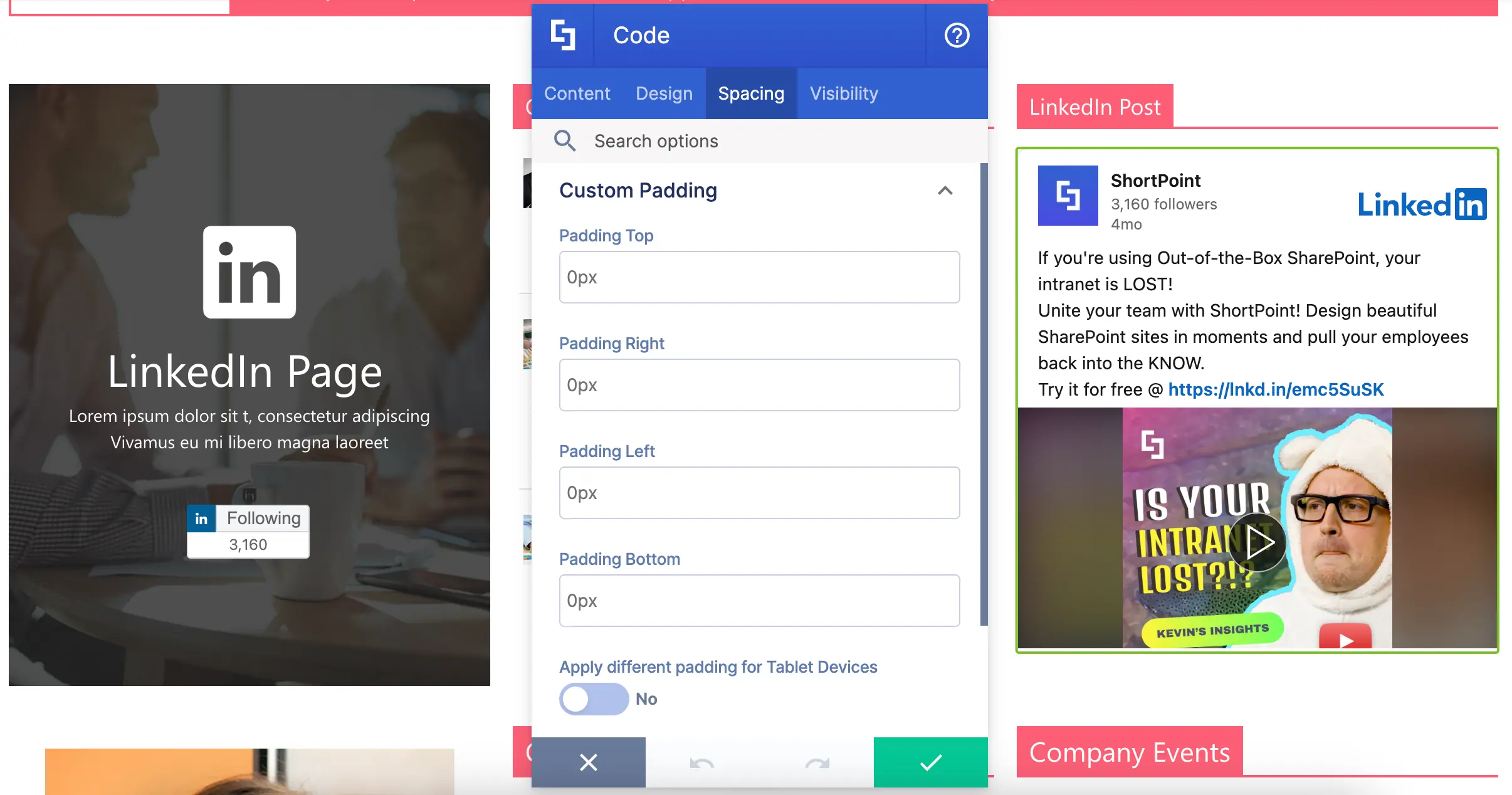
Want to start adding LinkedIn Posts to your page? Check out Introducing the Code Design Element to get a step-by-step guide on how to use the Code Design Element.
That’s it! You and your teammates can now continue your social media hangout on your own SharePoint page.
Key Reminders
Before showcasing your videos and social media content on your SharePoint, there are key aspects you need to consider:
- Privacy Settings
Is your content set to public or private? Are there any view restrictions in place? In most cases, your videos or social media profile must be set to public to be freely viewed by your users.
- User Level Permissions
What type of access do your users need to be able to view items on your page? Ensure that your intended audience has the appropriate permissions.
- Security
Check any platform and security limitations that may impede your user's experience. This could be related to your organization's browser and more.
Videos and social media just have that special magic that grabs our attention like nothing else! They have everyone chatting, sharing, and connecting, proving that it’s where all the excitement happens. The fantastic news is that you can bring this engaging energy right into your intranet spaces using the Design Elements we listed. By adding videos and social media elements, you can transform your page into a place your team actually wants to visit and interact with.
Design Elements for App Integration
We’re finally on the last set of ShortPoint Design Elements! These awesome Design Elements will bring both your company's internal and external apps right into your intranet pages. How cool is that? Imagine having a one-stop digital workspace where you and your team can access everything you need without jumping from one system to another.
Everyone in your team will surely thank you for making their workday flow so much smoother and easier. Ready to explore how these game-changers can transform your intranet experience? Let’s dive right in!
SharePoint Web Part Design Element
We’ll let you in on a little secret: you can actually integrate SharePoint's out-of-the-box web parts within ShortPoint! How? By using the SharePoint Web Part Design Element, of course!

All you need is the page URL where the web part you want to use is published:
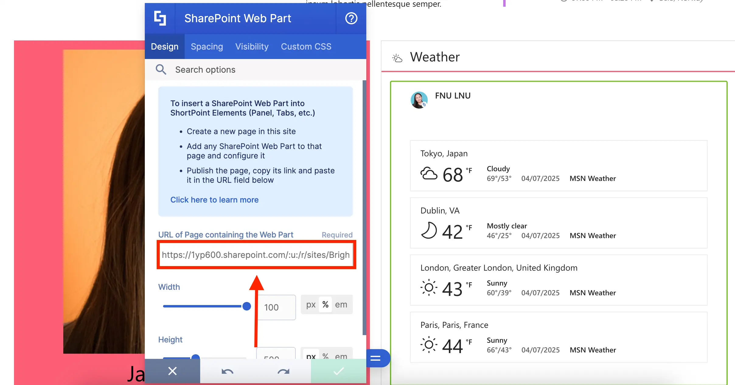
You can even adjust the width and height of the inserted web part:
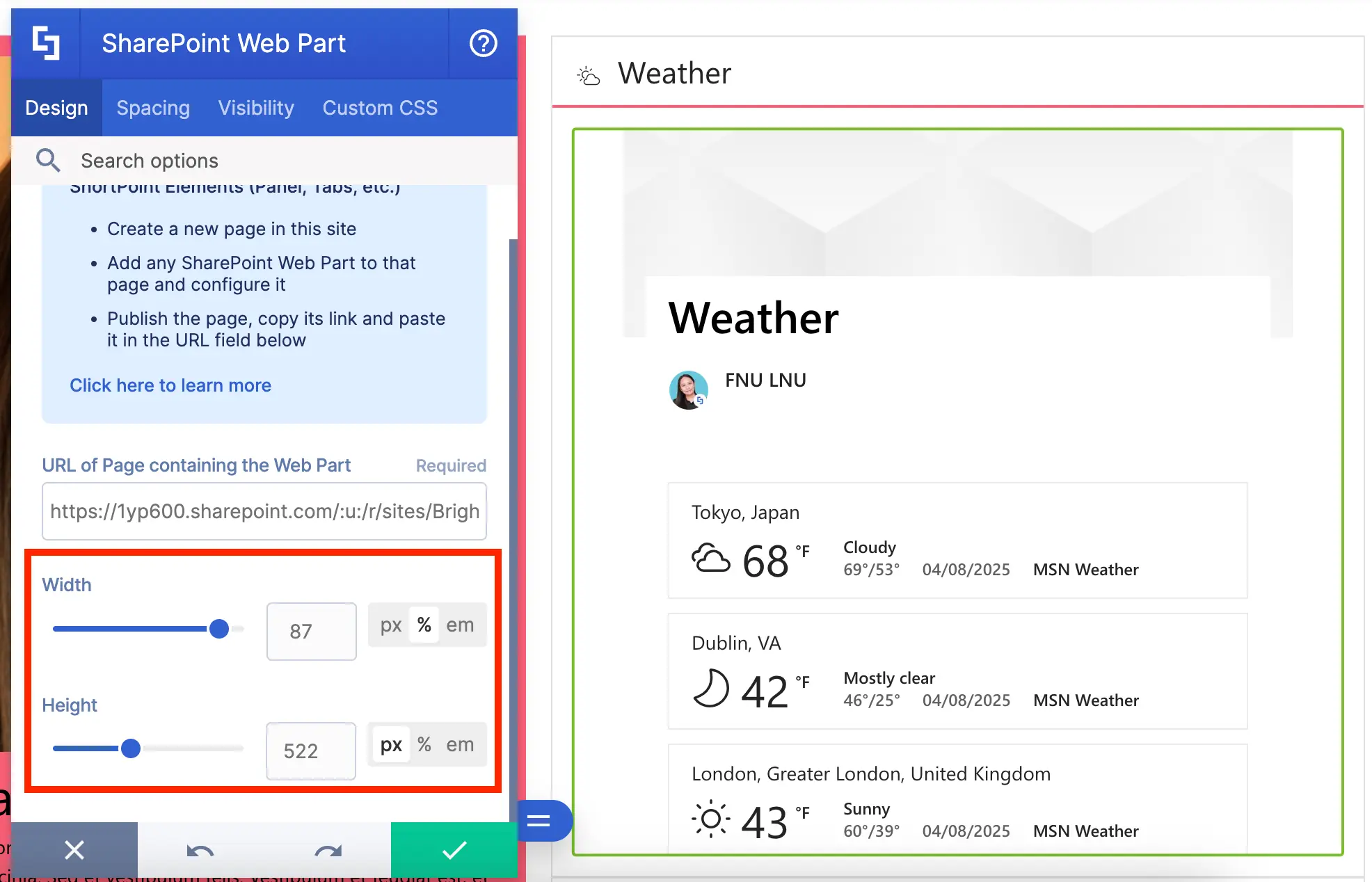
And adjust its paddings and margins:
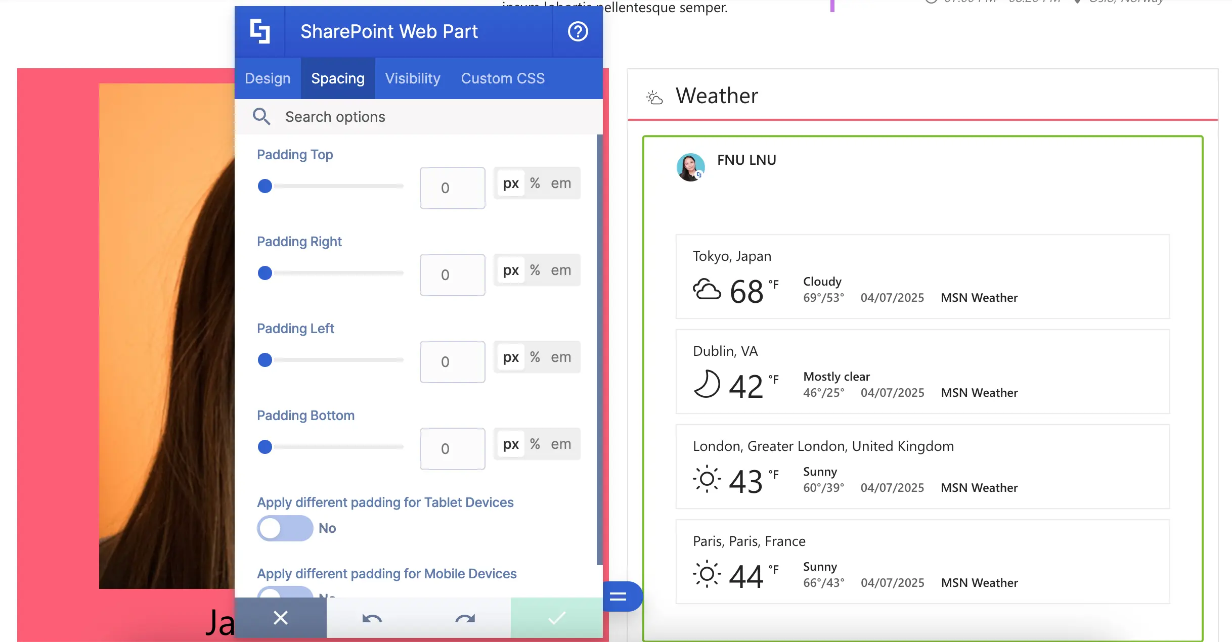
Ready to make the most out of SharePoint web parts? Check out How to Embed a SharePoint Web Part into ShortPoint for a detailed guide on how to use it.
Teams Design Element
Are you an active user of MS Teams? You can actually integrate it into SharePoint using the Teams Design Element! To add it to your page, switch to Grid Mode:
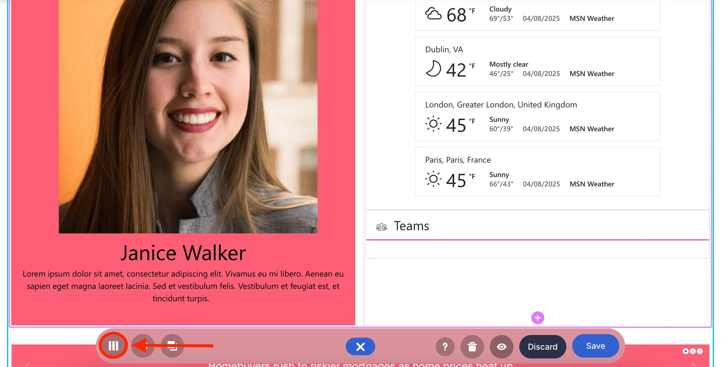
And select Teams:
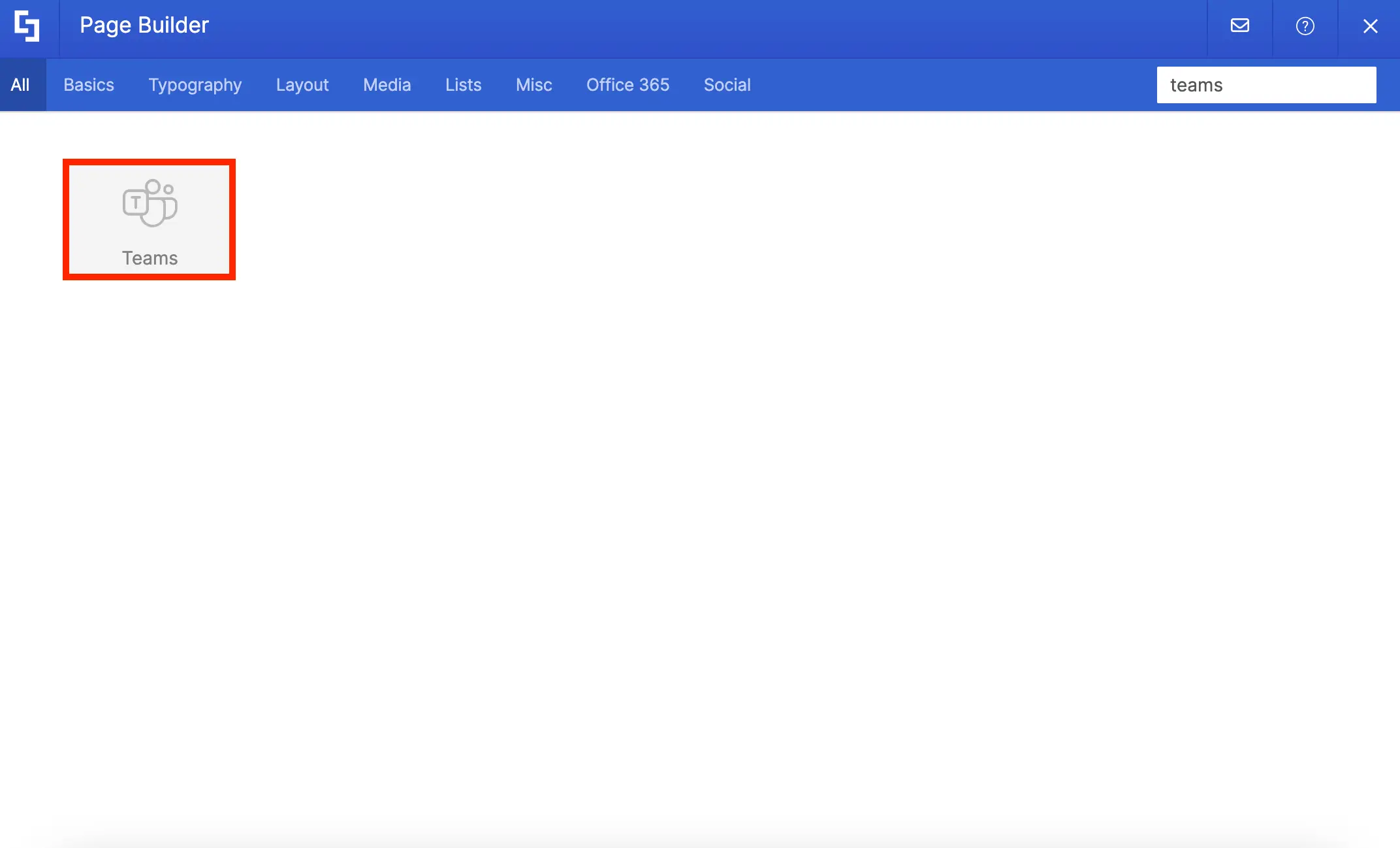
Here, you can show the Teams that you’re a part of or all the Teams in your organization:
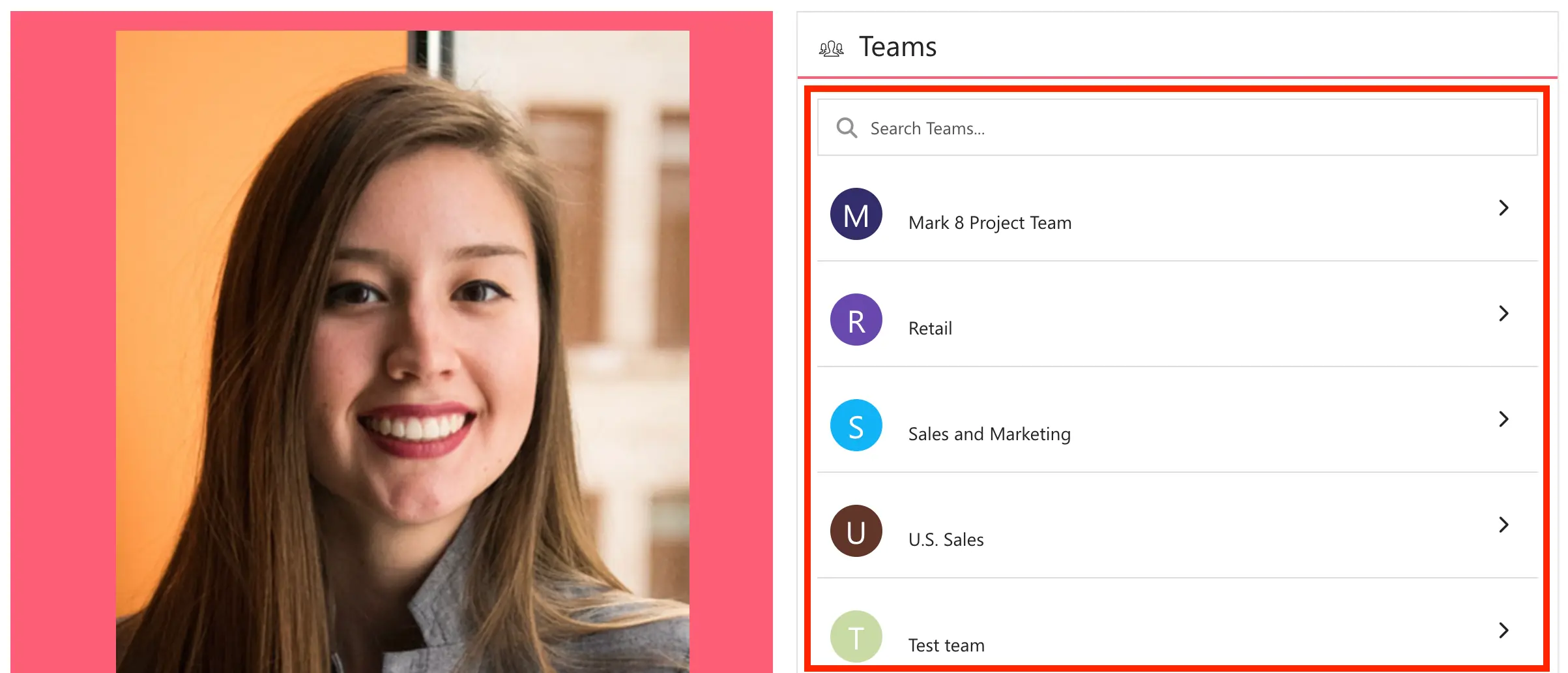
Want to give it a try? Go to How to Customize the Teams Design Element to learn how to add it to your SharePoint page.
Power BI Design Element
Do your teams generate Power BI reports? You may want to showcase them on your page using the Power BI Design Element!
When inserted, it will automatically list all available workspaces, allowing you to showcase all the important reports for your organization:
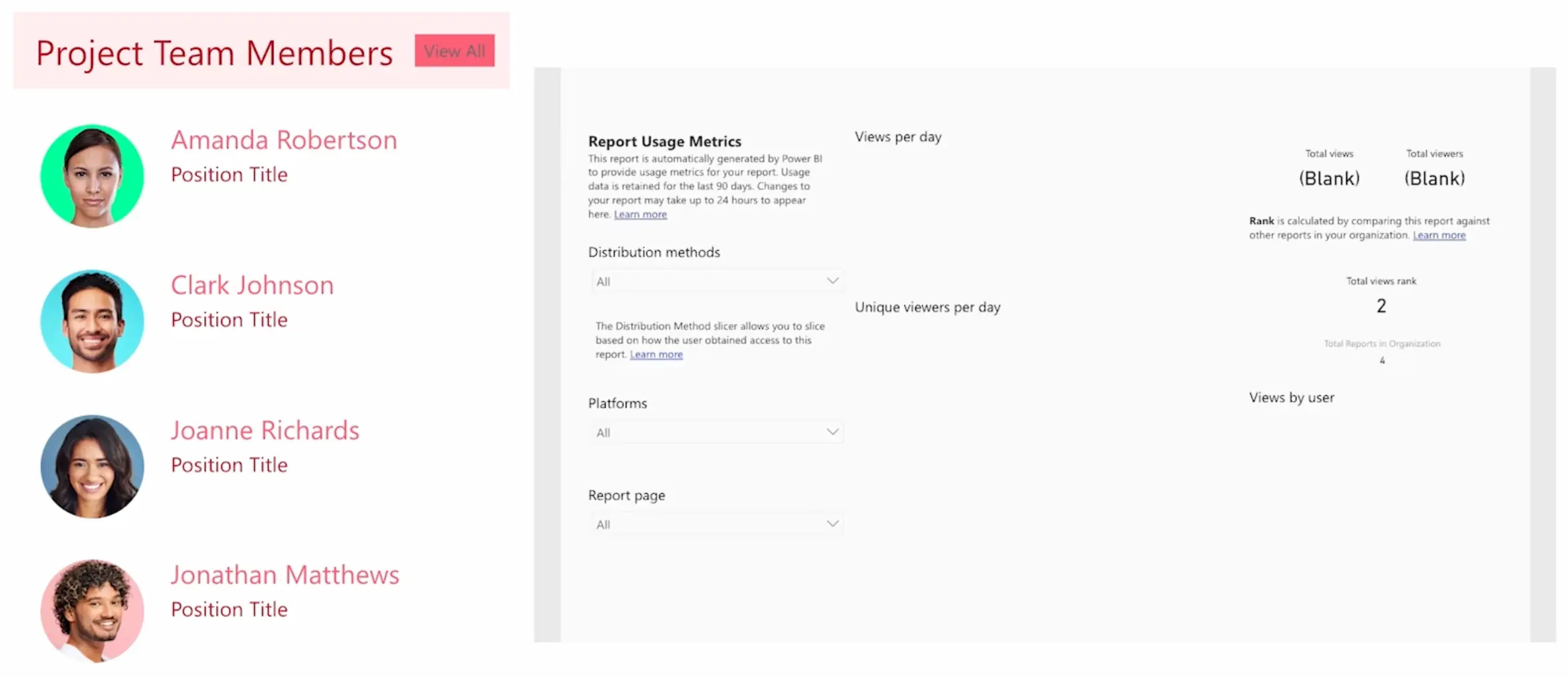
Up for some Power BI on your SharePoint pages? Check out Setting Up Power BI Integration.
Power Apps Design Element
Have any custom Power Apps? You can encourage your users to use them more often by featuring them on your SharePoint Pages! You can add the apps using the Power Apps Design Element.

All you need is your application's PowerApp ID and, voila, you now have it on your page:
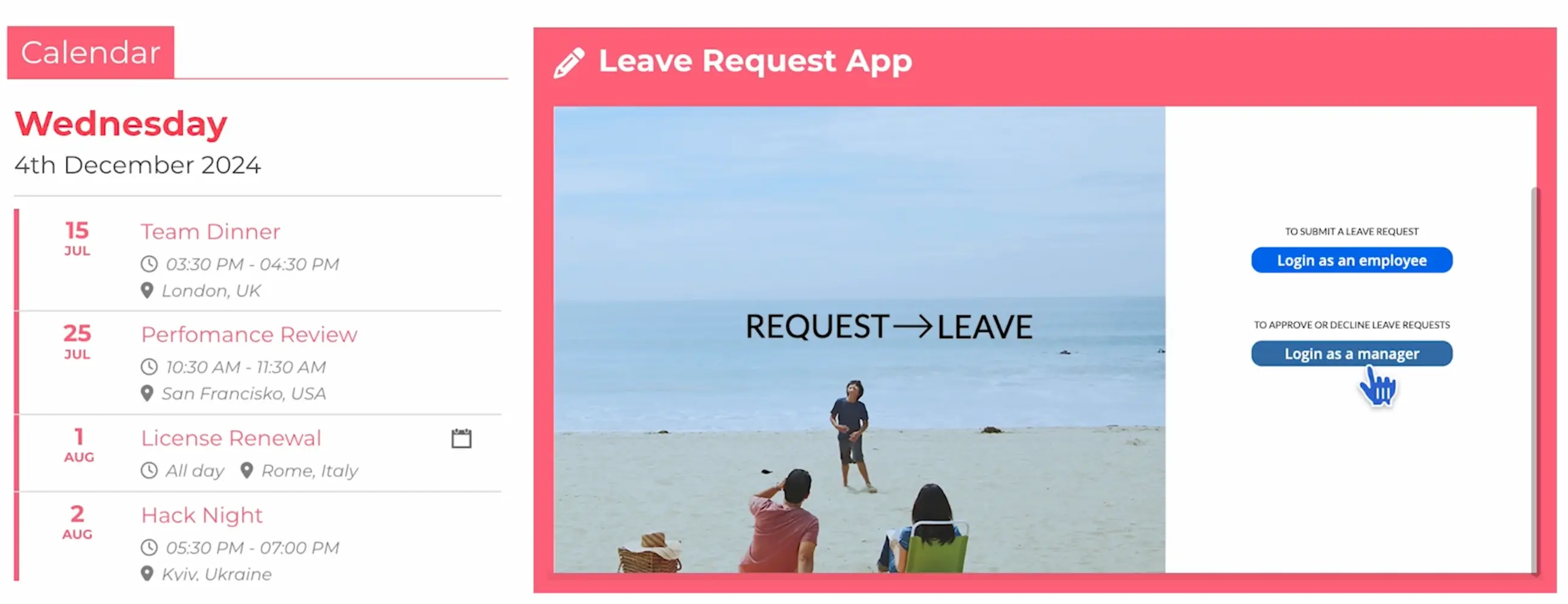
Ready to showcase your apps? Check out Add Your First PowerApps Application to a SharePoint Page.
Code Design Element
Remember how we used the Code Design Element to embed videos? Since it lets you add HTML, CSS, and JavaScript snippets into your page, there are SOOOO many more ways to use the Code Design Element to integrate external applications into your intranet.
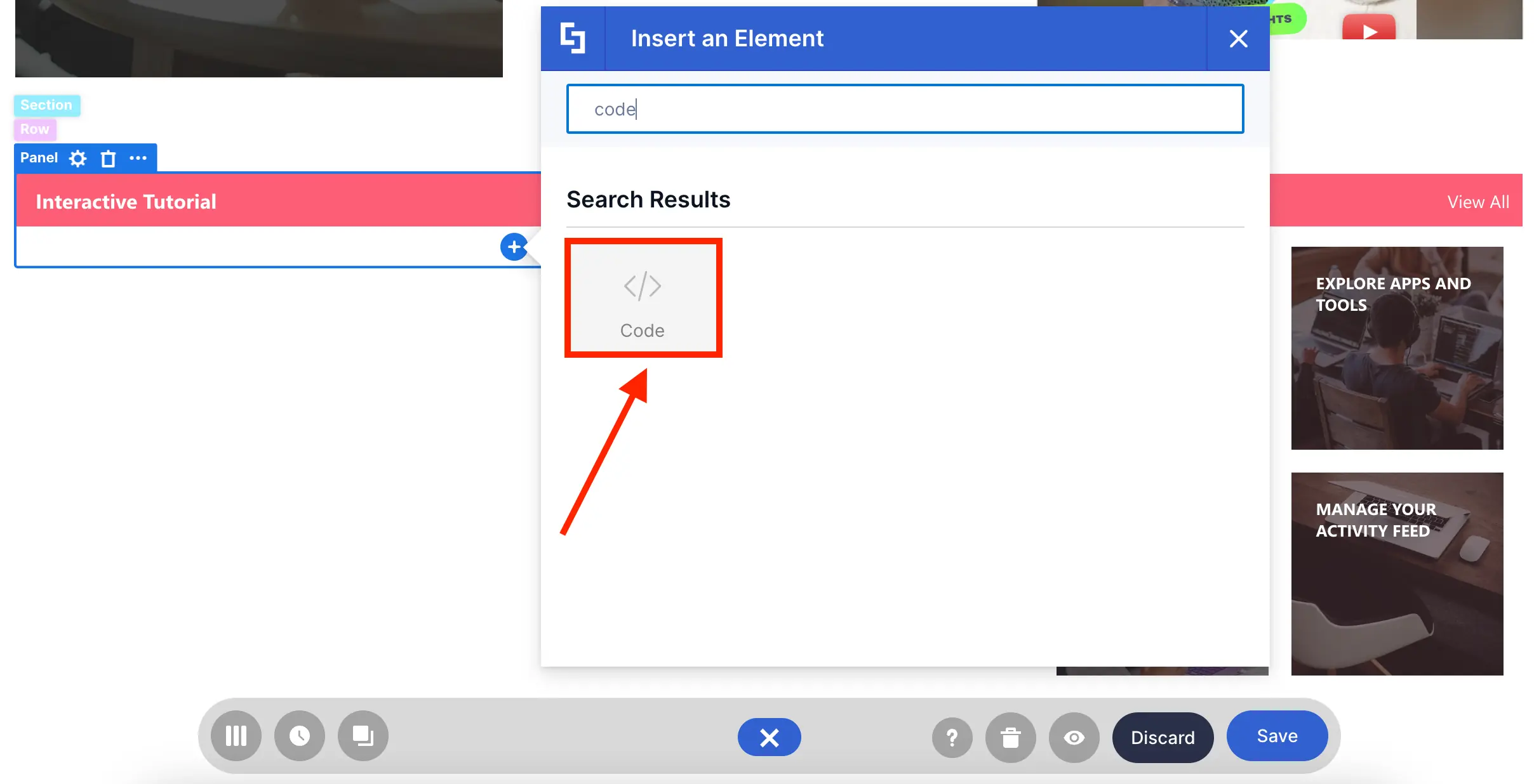
You can use it to add interactive tutorials from Arcade:
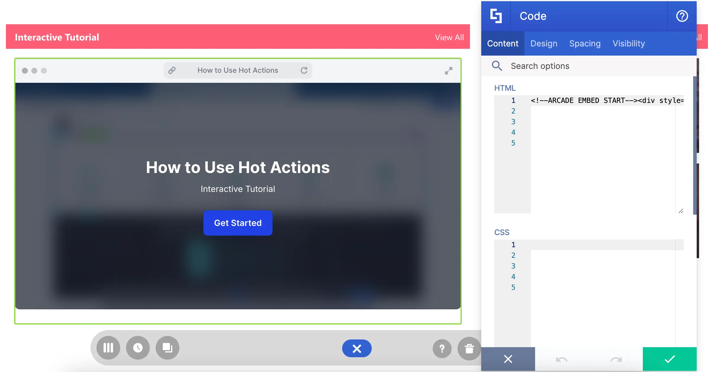
Add Weather Widgets:
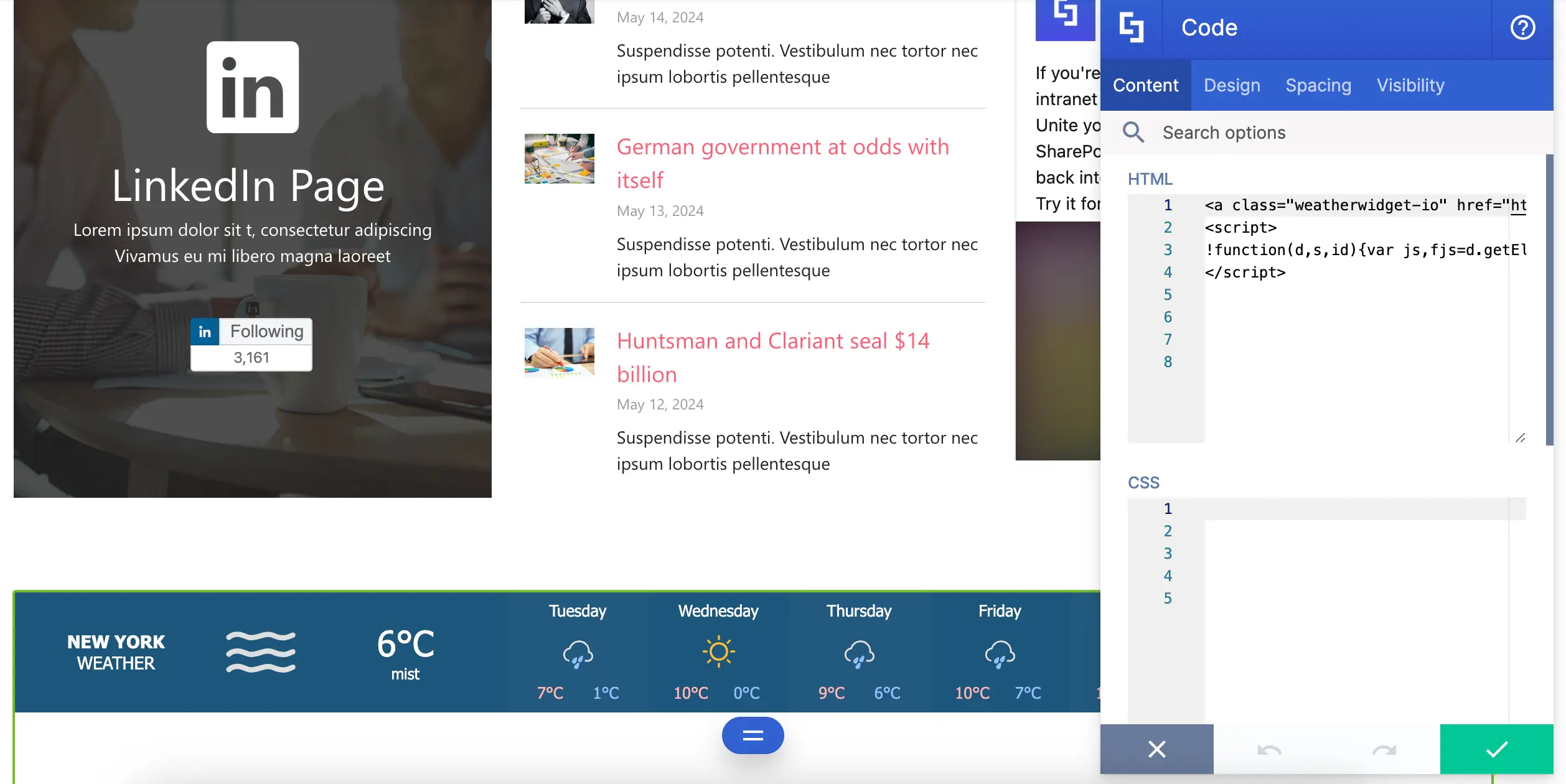
Or even showcase Canva Designs:
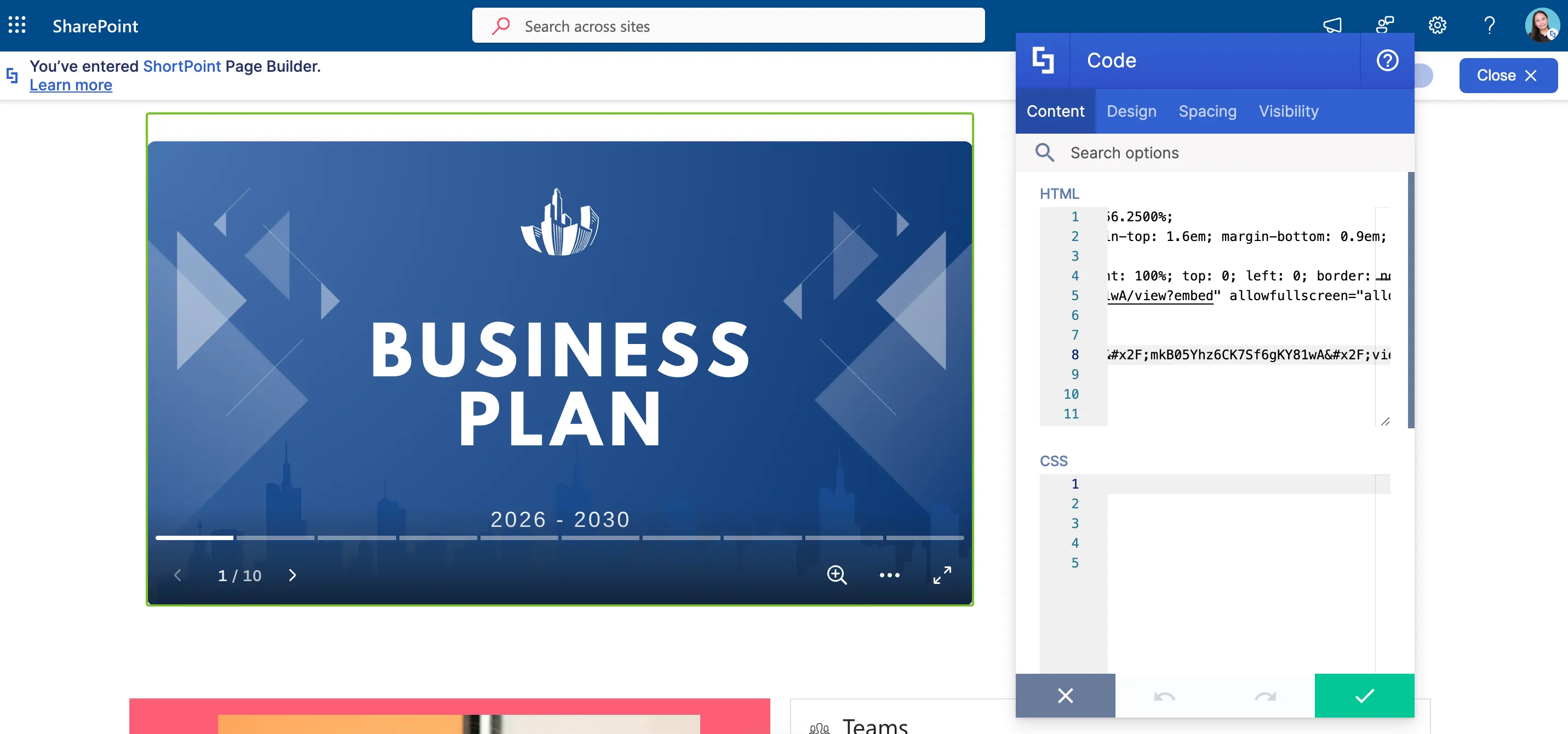
You can explore all the ways you can make the most out of the Code Design Element in the articles below:
- Example Use Cases for ShortPoint Code Design Element: Part 1
- Example Use Cases for ShortPoint Code Design Element: Part 2
With these Design Elements at your disposal, you and your team’s everyday tasks just got easier! No need to switch between tools. Everything you need is in your intranet.
Key Reminders
Before adding any integration on your page, make sure to take not of the following:
- Access Permission
Applications may have its own set of access permissions. Make sure they are fully accessible to your target audience.
- Compatibility
Some solutions may run a set of code that are not supported by the Design Elements. This will result to an error or a blank space on your page. Test your integrations and view them from a user's account before publishing.
- Security
Always consult with your security team when implementing integrations. It's a best practice when using any form of technology.
Now, you’re ready to integrate internal and external apps into SharePoint. It’s simple and useful for everyday tasks!
Content Holder Design Elements
Ever found yourself wishing you could nest one Design Element inside another in SharePoint? Guess what—your wish has been granted!
ShortPoint has created something awesome just for you: Content-holder Design Elements. These special elements let you add other Design Elements right inside them. Imagine adding images, videos, buttons, and so much more within a single container—that’s the superpower of Content-Holder Design Elements.
And it’s easy to spot them too! Just click on the EasyPass tag of any Design Element, and if you see a plus icon pop up, congratulations, you've found a Content-holder!
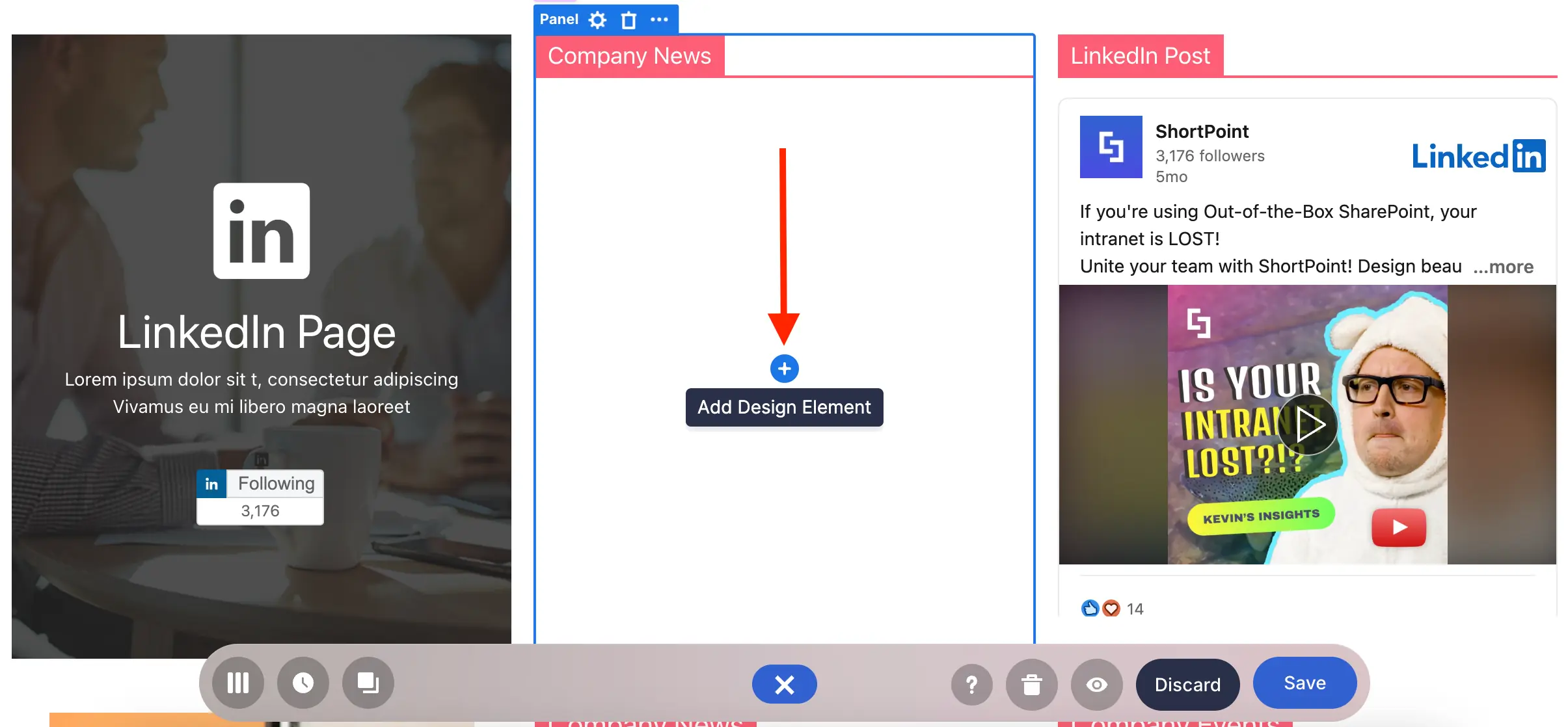
Let’s take you through some amazing Content-Holder Design Elements that you'll definitely want to use on your SharePoint page.
Background Design Element
In some Design Elements, you have the option to customize their background, like in Section, Row, or Column.
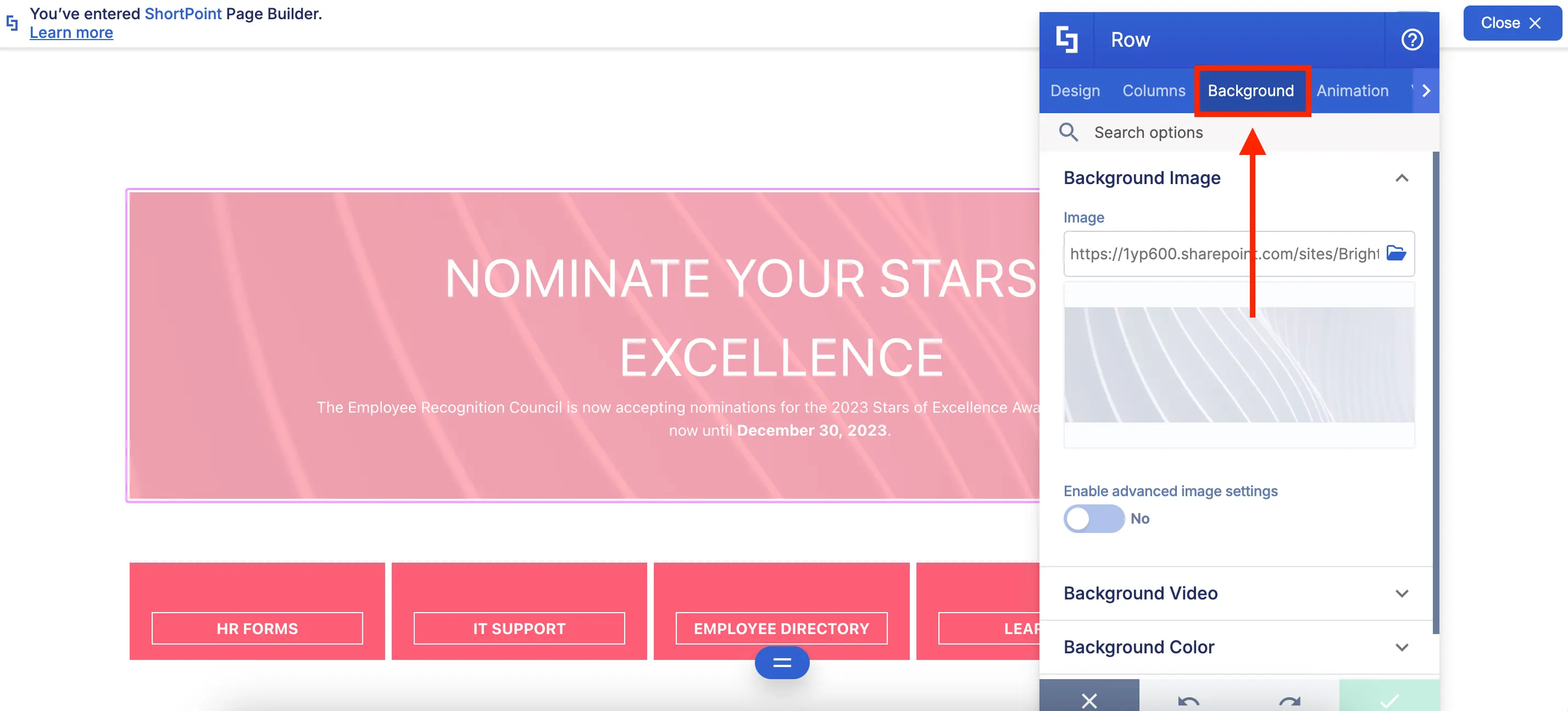
But what if you need to add a background separate from these Design Elements? The Background Design Element is the key!
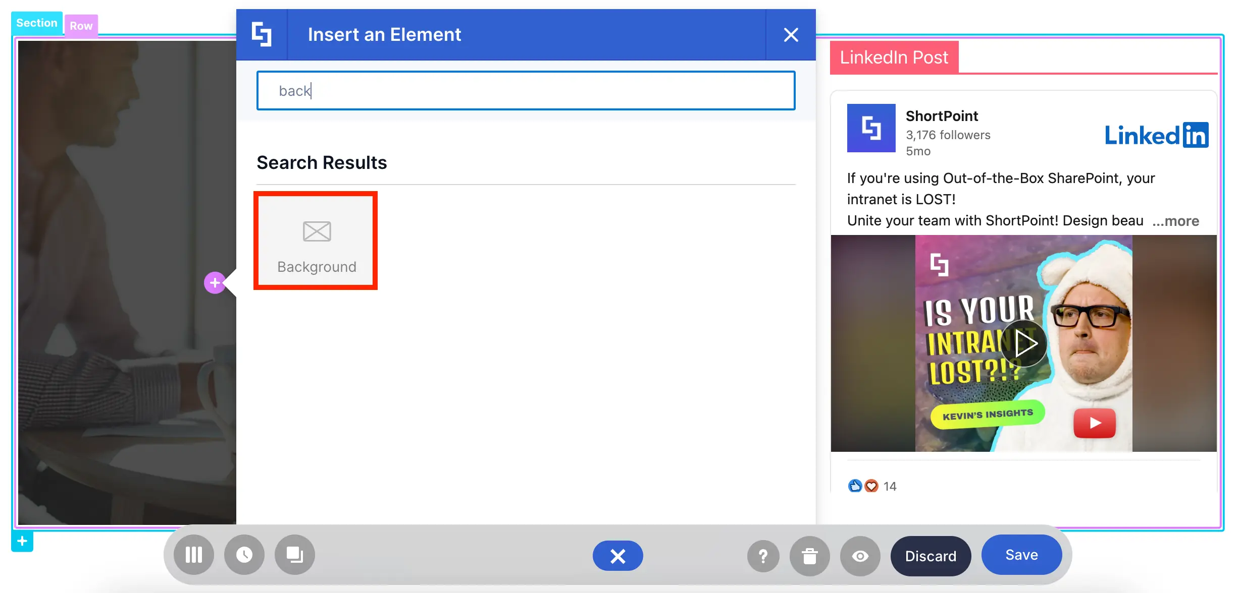
With it, you can select the background you want and modify its design settings:
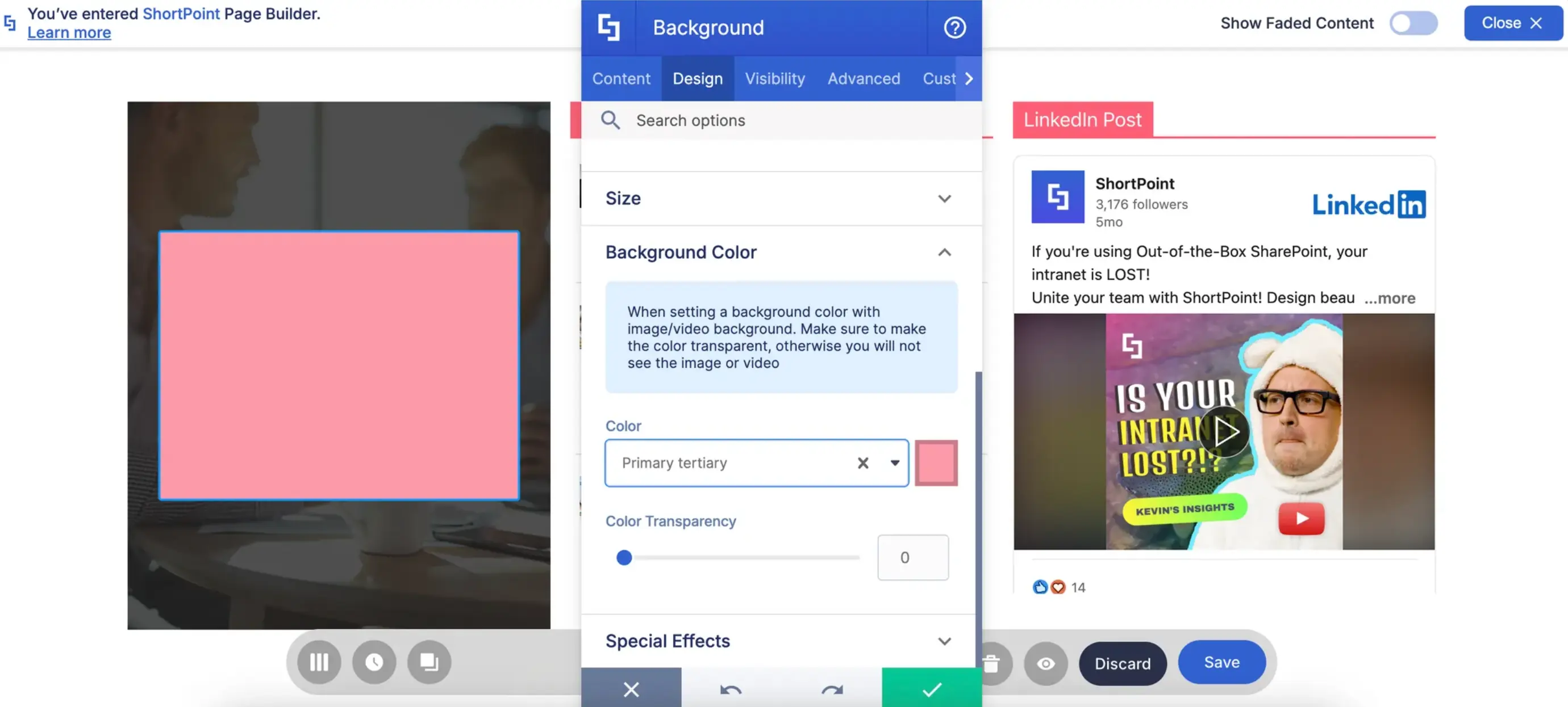
To top it off, you can insert another Design Element where you can display other content:
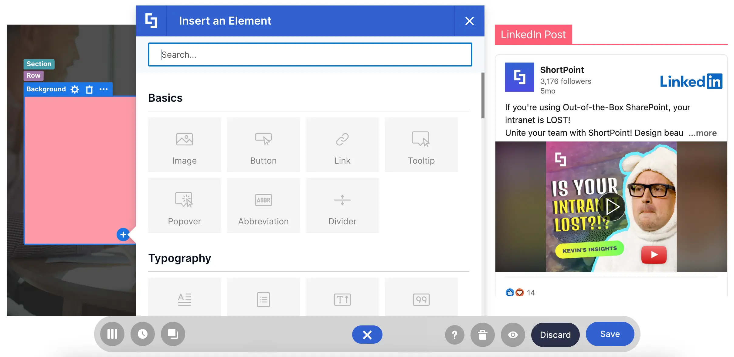
There are more features to discover! You can check all of it in How to Customize the Background Design Element.
Panel Design Element
Need to organize your content? The Panel Design Element gives you that and so much more!
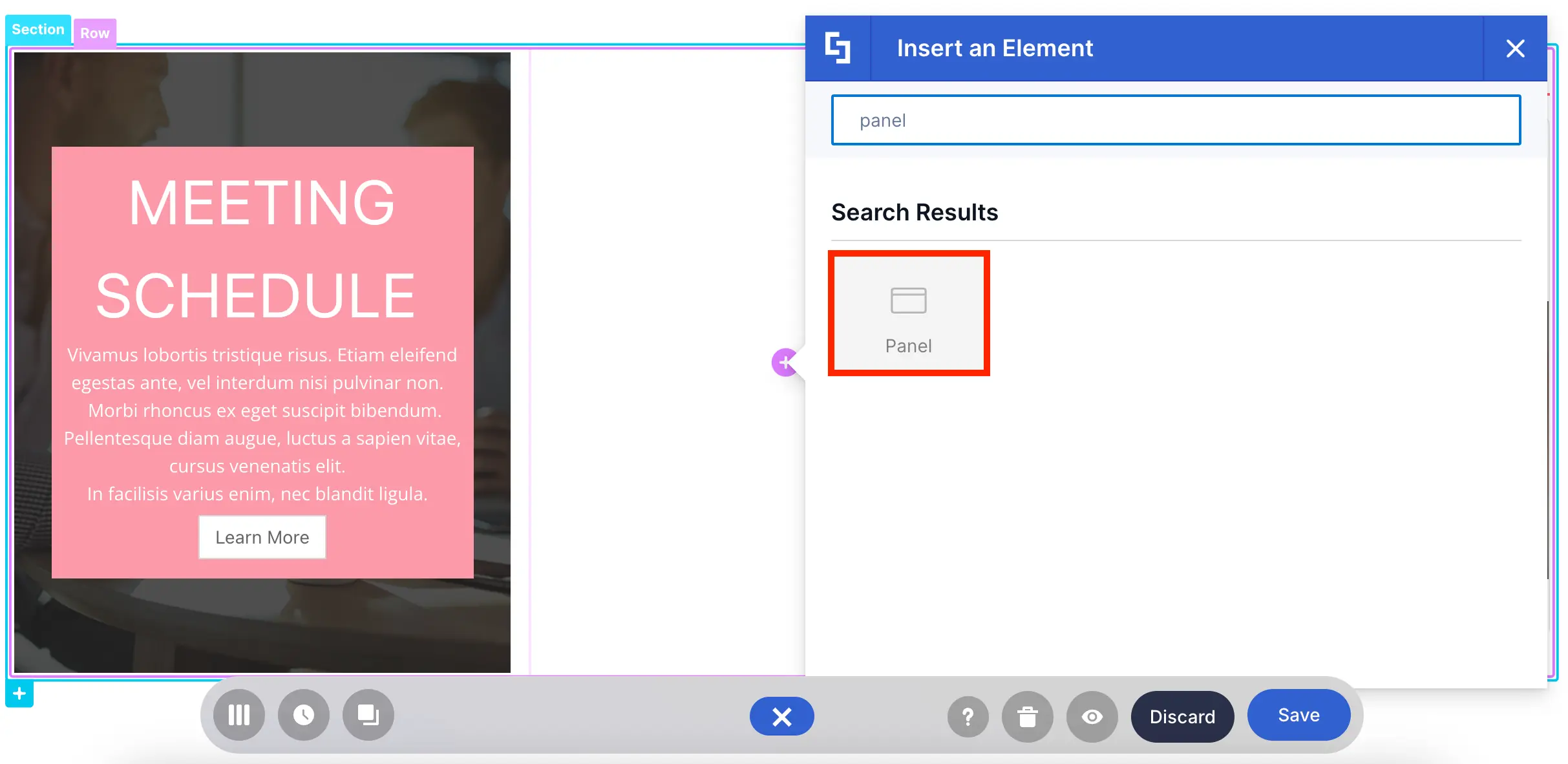
It allows you to add a label to parts of your SharePoint page:
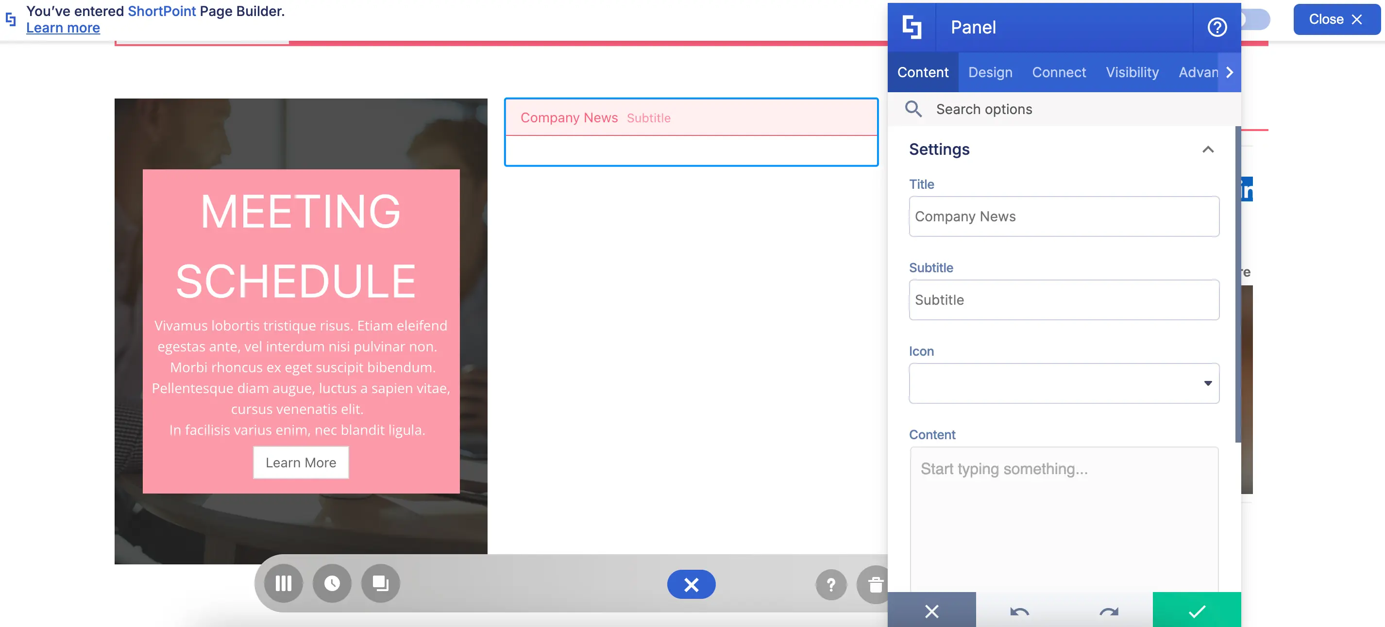
You can even add a subtitle and use an icon:

What’s even more amazing are the different Panel styles. You can mix and match and even change its color:

And since it’s a Content-holder Design Element, you can also add other Design Elements inside:
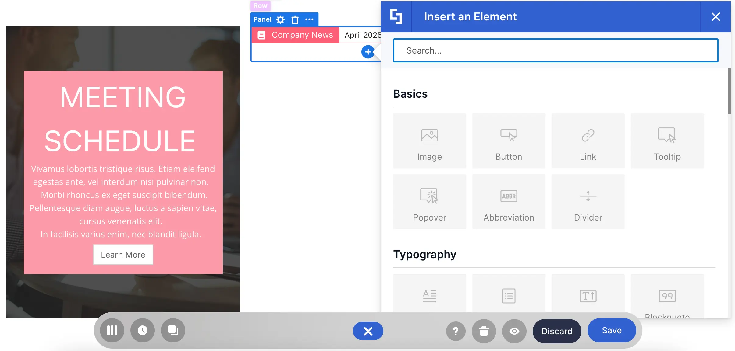
Care to know more? To get more details, check out How to Customize the Panel Design Element.
Tabs Design Element
Too much text in your SharePoint page? You can segment your content into different sections using the Tabs Design Element!
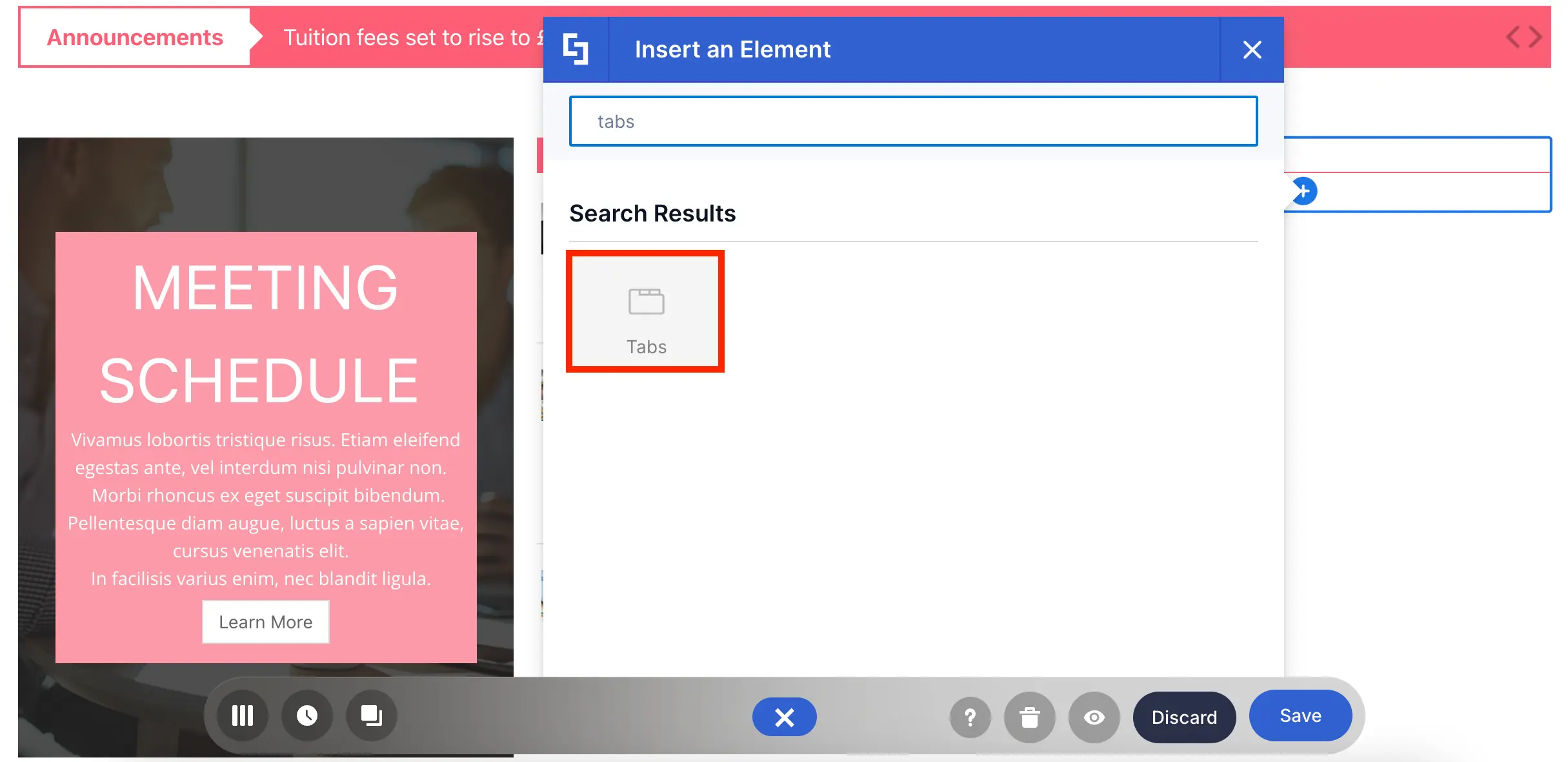
With it, you can separate your content into different tabs:

You can even customize its style, color, size, and so much more:
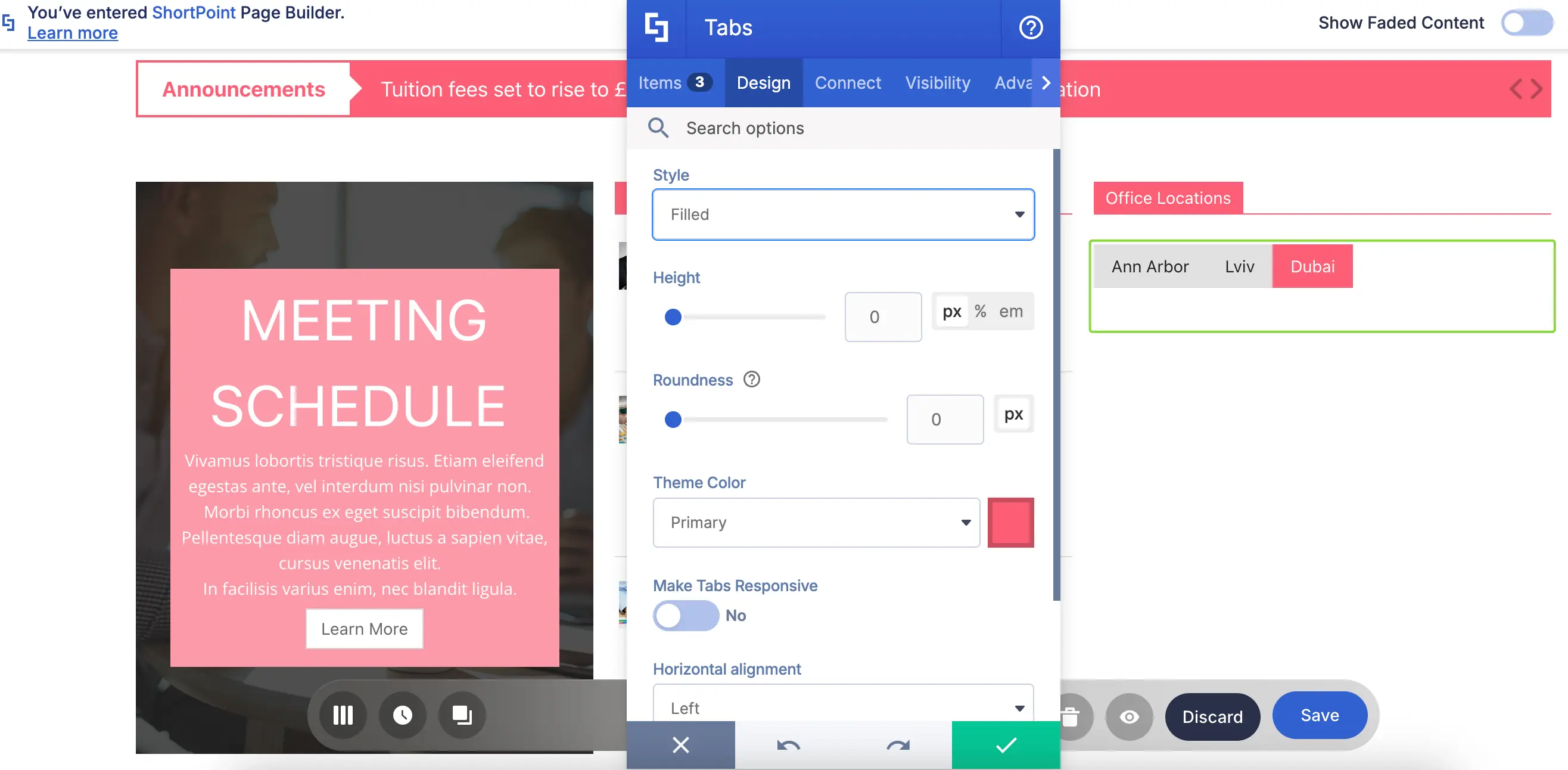
And of course, you can insert other Design Elements inside:
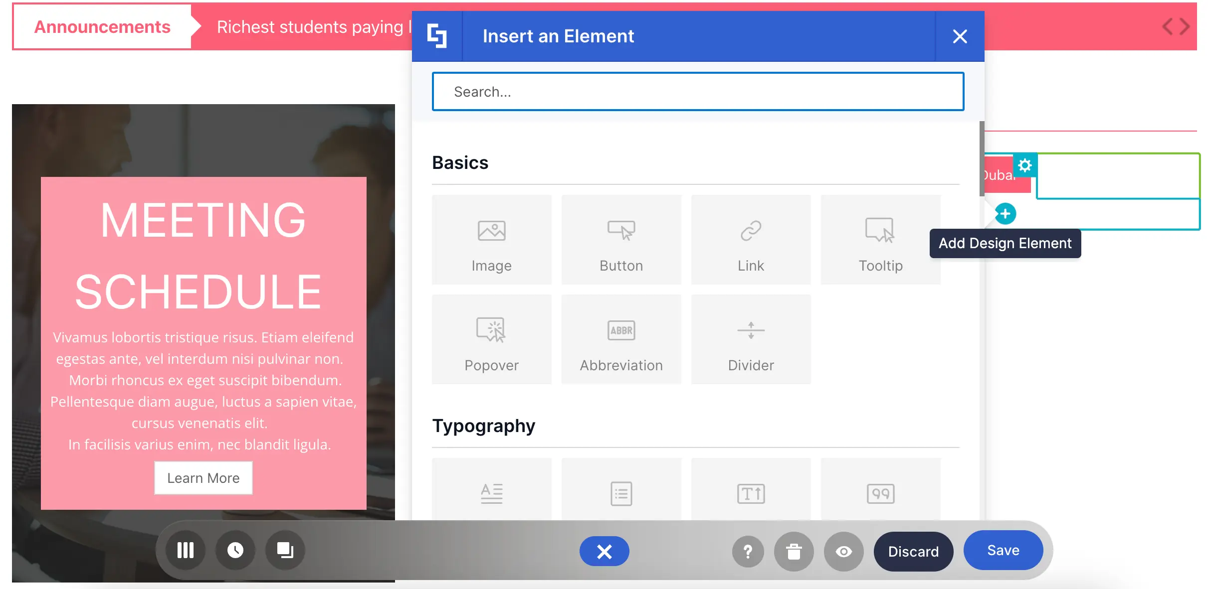
Ready to make tabs? Check out How to Customize the Tabs Design Element before you do to learn more about the features you can tweak.
Accordions Design Element
Need more ways to organize content? You can add a collapsible section to your SharePoint page using the Accordions Design Element!

It works like the Tabs Design Element. The only difference is that it features an expand and collapse action instead of tabs.
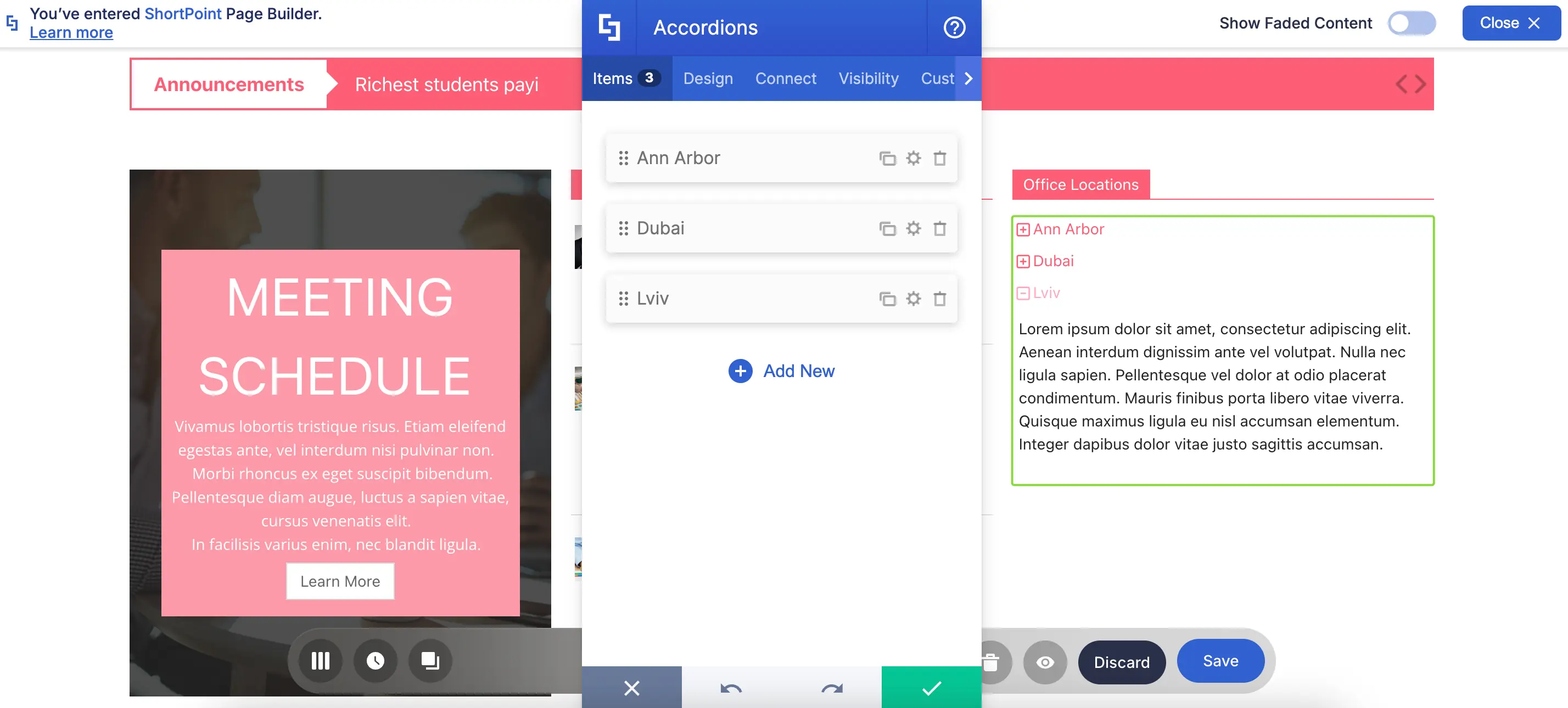
You can also customize its color, size, and so much more:

We might sound like a broken record, but you can add Design Elements inside too:
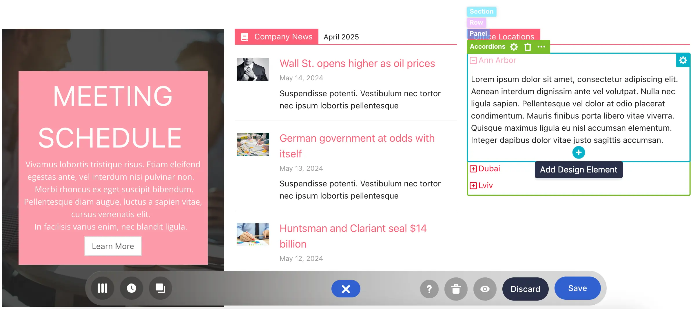
To start creating Accordions, check out How to Customize the Accordions Design Element.
These are just a few of the Content-Holder Design Elements ShortPoint has for you. There is more that you can mix and match to achieve your intranet design goals. Enjoy exploring each one as you continue your ShortPoint design journey.
Was this tutorial helpful? We would like to hear your thoughts on how we can further improve our offering.
We have expert architects ready to assist you so that you can have an intranet up and running in no time.
Our Knowledge Base contains hundreds of resource materials at your disposal. Read more about other tips and tricks in using ShortPoint.