Animated Header
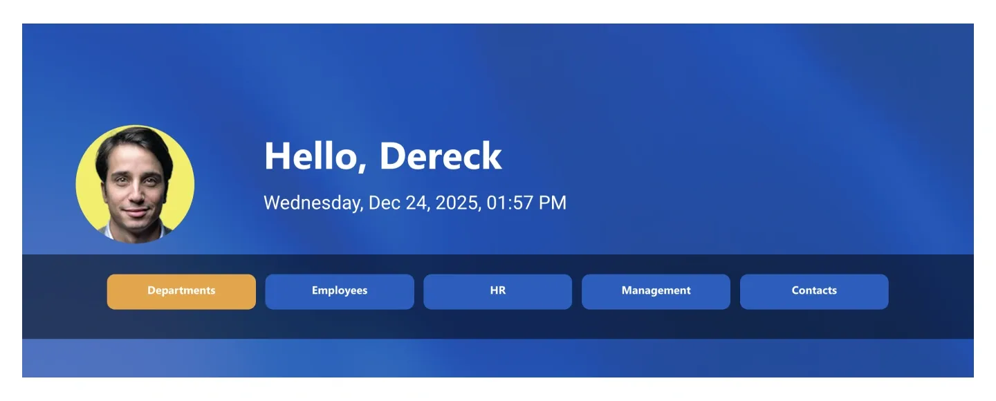
Personal header with a round profile photo, greeting, live date and time, and a row of animated pill navigation buttons. It pulls the current user's profile.
Personal header with a round profile photo, greeting, live date and time, and a row of animated pill navigation buttons. It pulls the current user's profile.
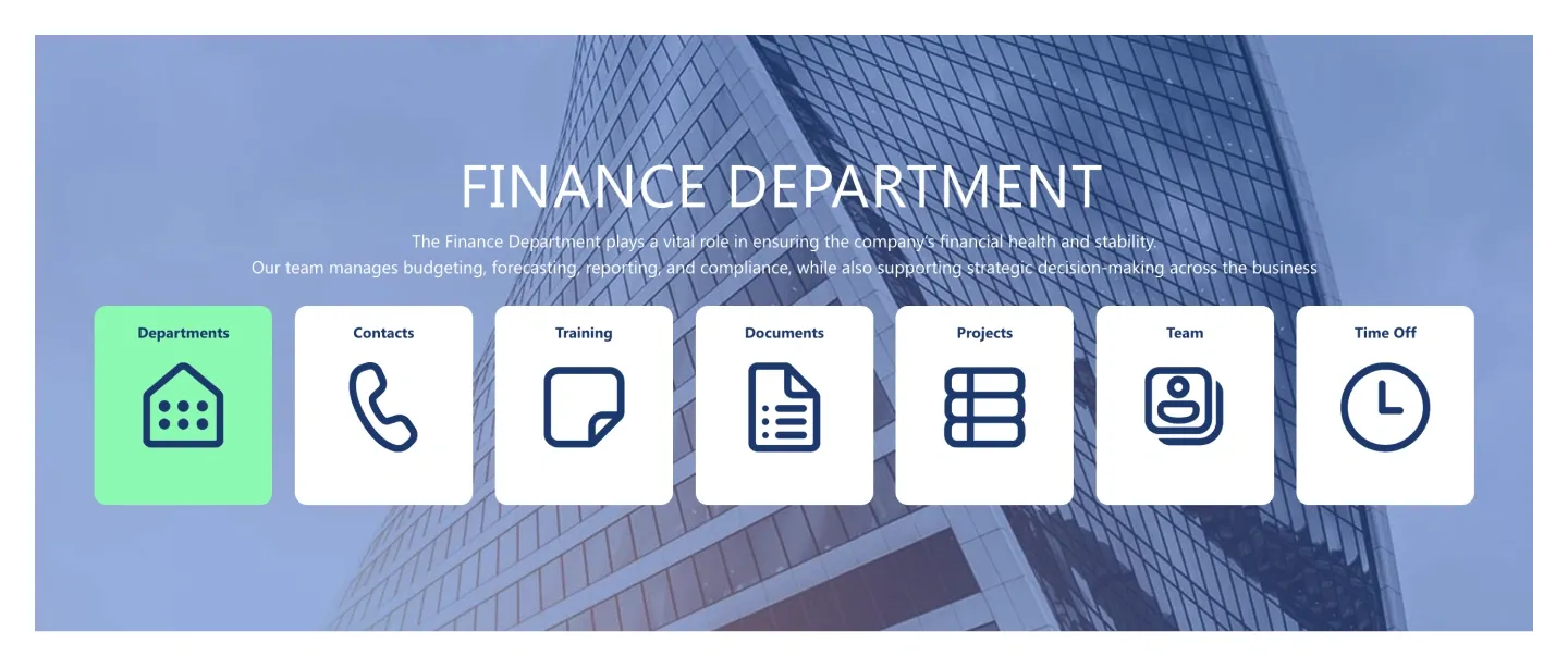
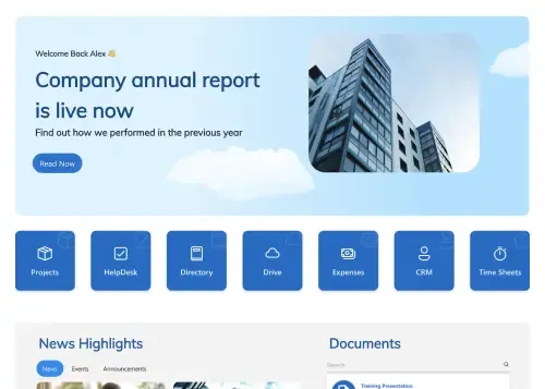
Department hero over a background image with title, intro line, and a row of seven icon tiles for quick navigation.
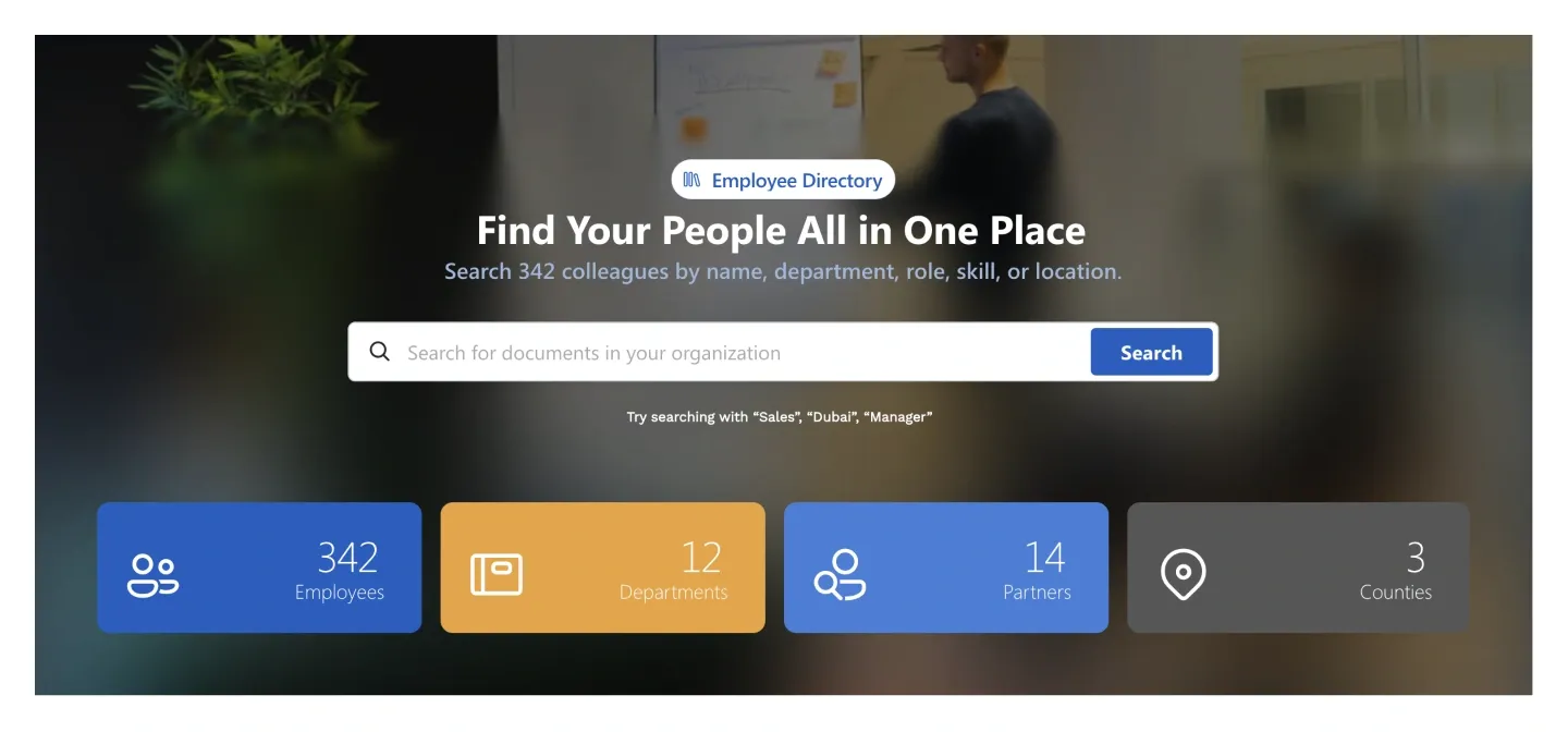
Directory-style hero with a search bar and suggestion hints, above four stat tiles with icons and counts.
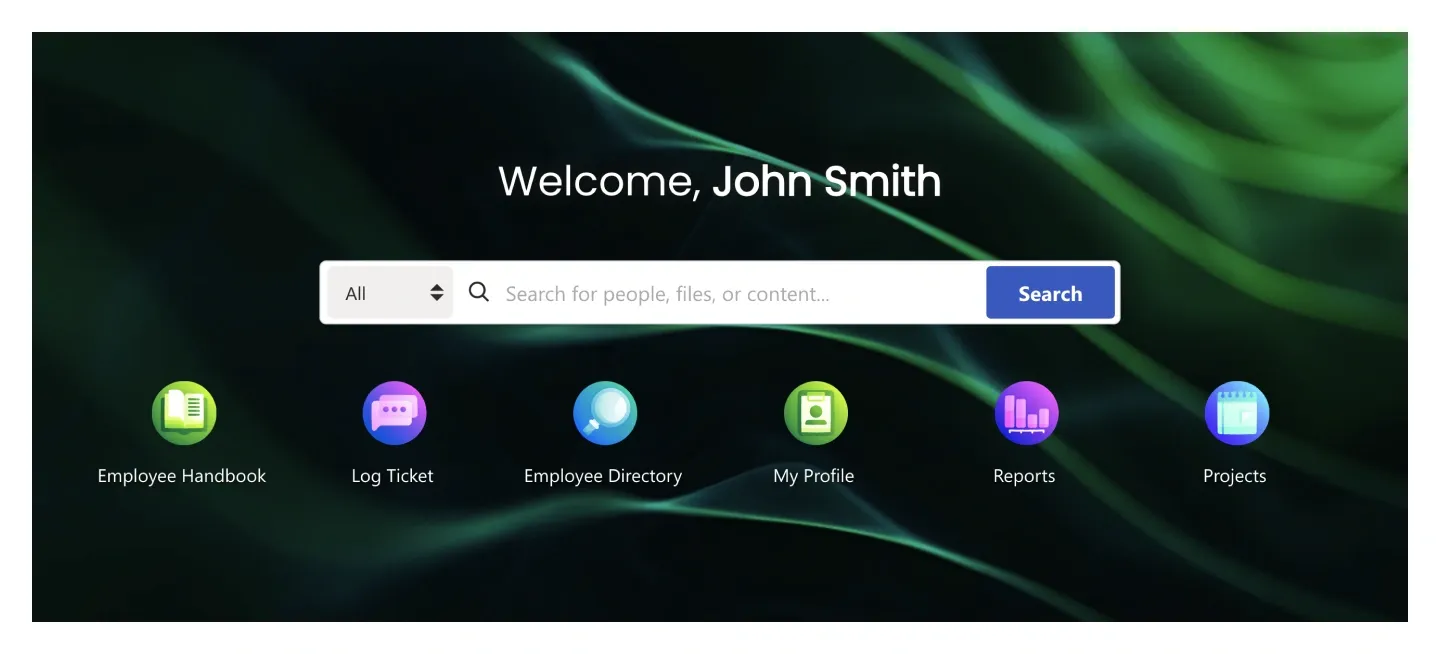
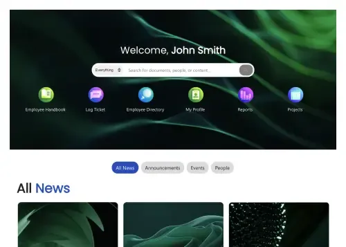
Background hero with personal greeting, a scoped search bar, and six round app icons with labels. It's a homepage header built around search.
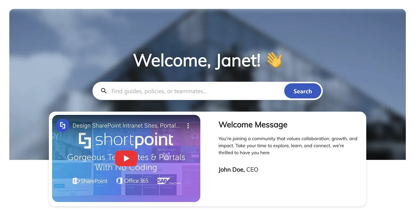
Background hero with greeting and search bar, plus an overlapping card holding an embedded video and a leadership welcome message.
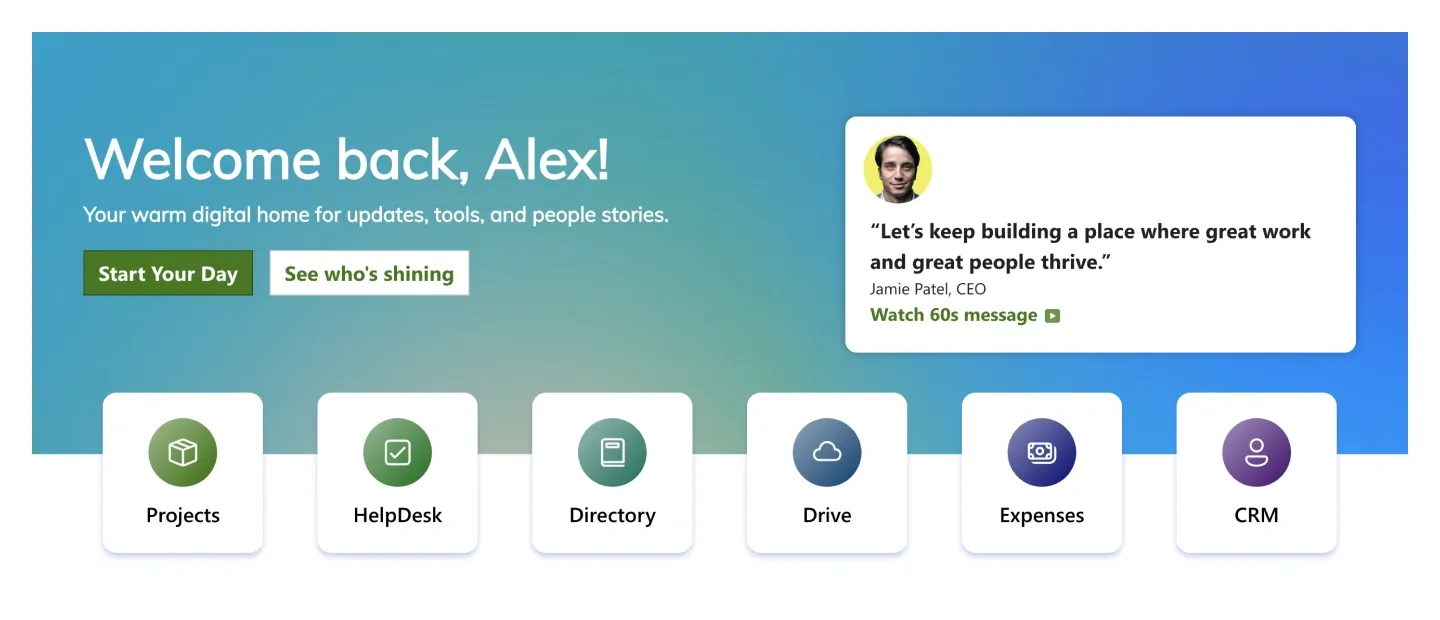
Gradient welcome hero with two buttons, a leadership quote card with photo, and a row of six app shortcut tiles.
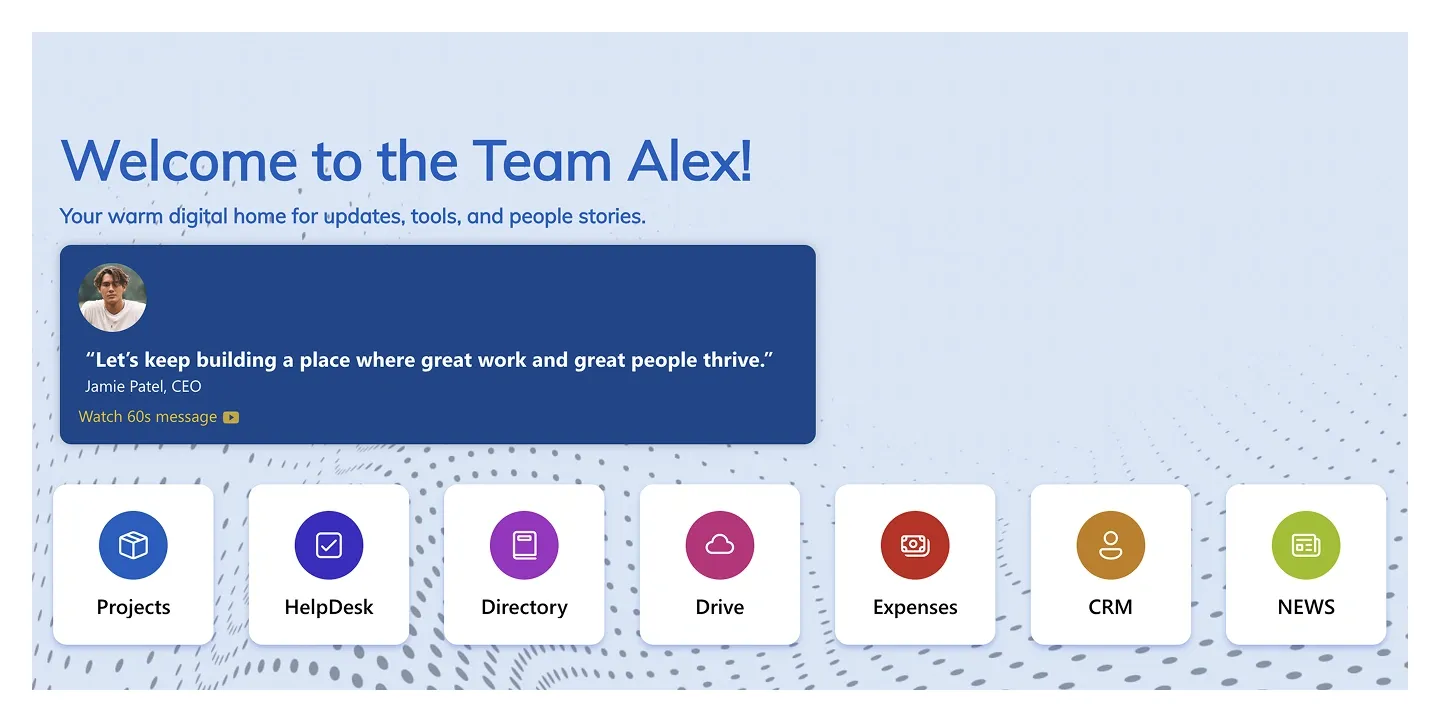
Light welcome hero with a leadership quote card and seven icon shortcut tiles. It's a calmer variant of Header 12.
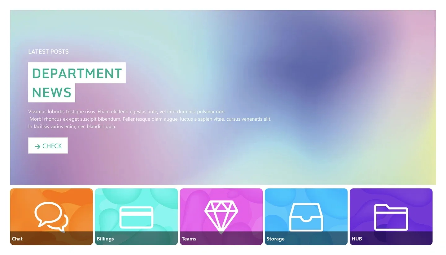
Gradient hero with a headline block, paragraph, and button, above a row of five bold icon tiles with labels.
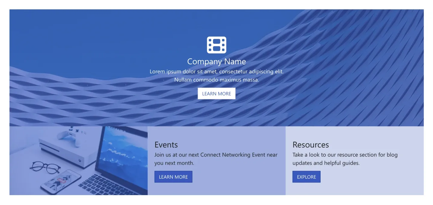
Banner with centered icon, title, and button, above an image panel and two text columns with buttons. It's a hero with built-in sub-sections.
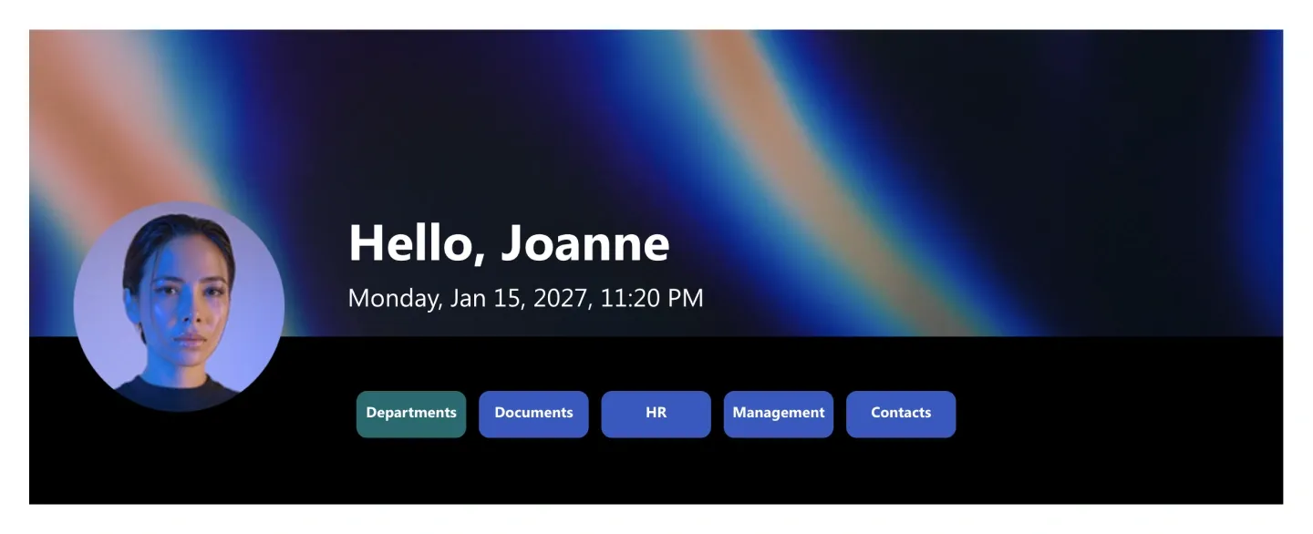
Background hero with a large circular portrait, personal greeting, live date, and a row of navigation pills.
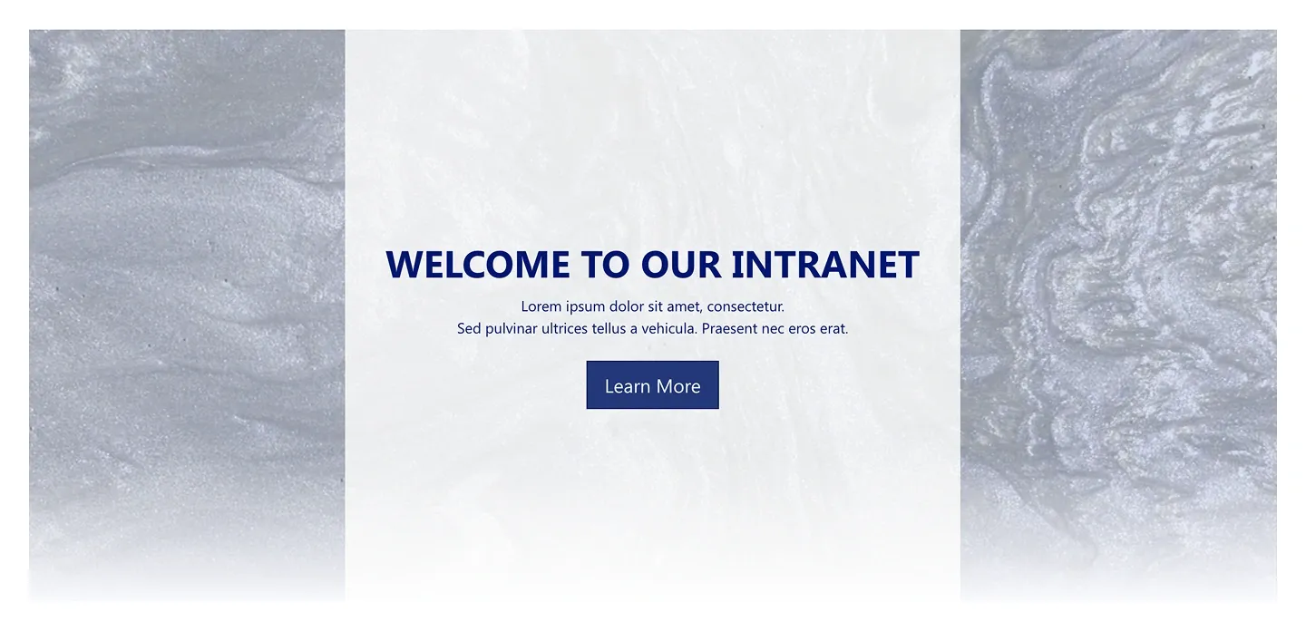
Textured hero with a centered headline, two lines of copy, and one button. It's text-light and image-free.
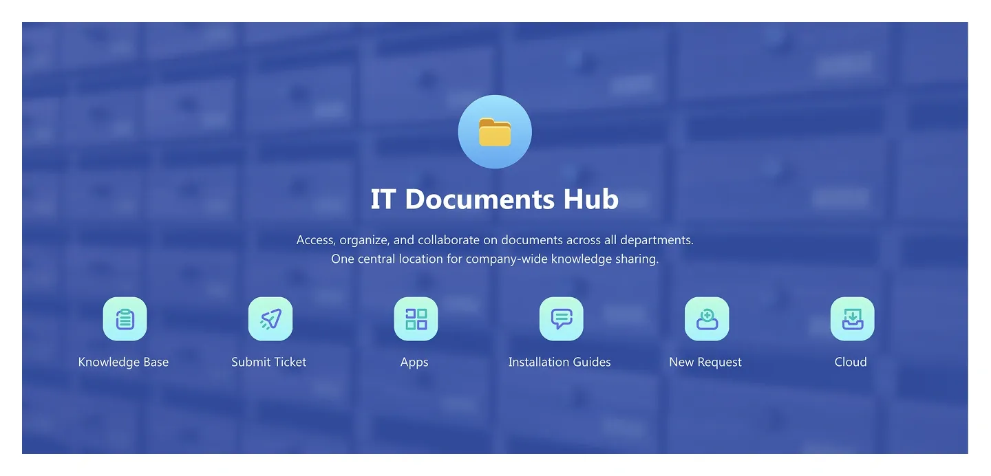
Background-image hero with a centered icon, hub title, and tagline, and six icon shortcuts along the bottom.
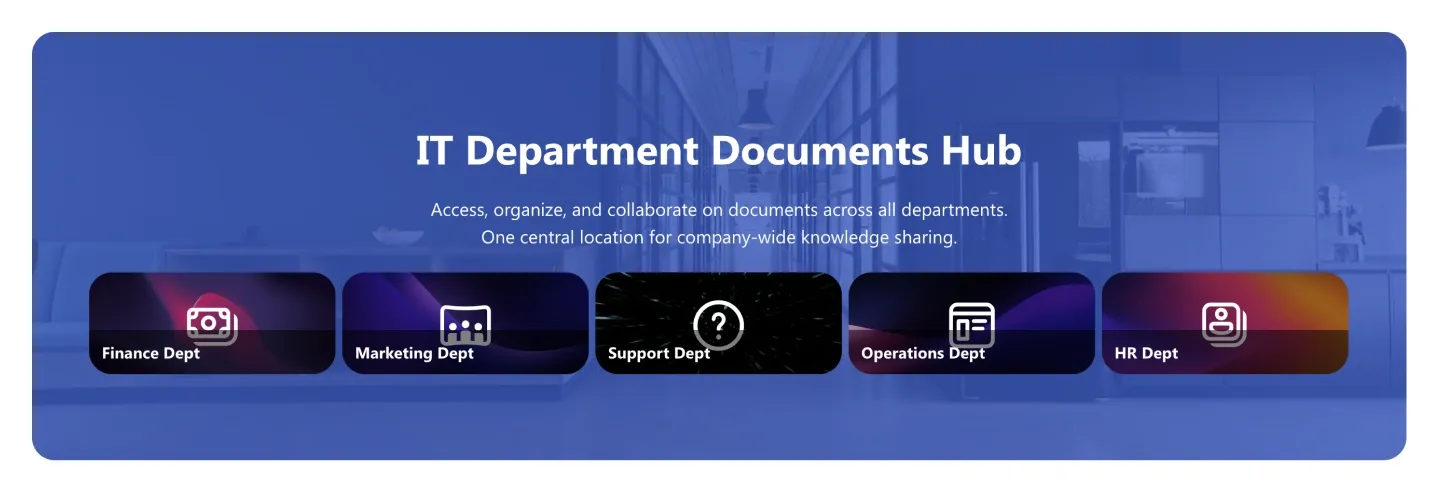
Hub hero with title and tagline, above five image tiles with overlaid labels. Each tile represents one department or area.
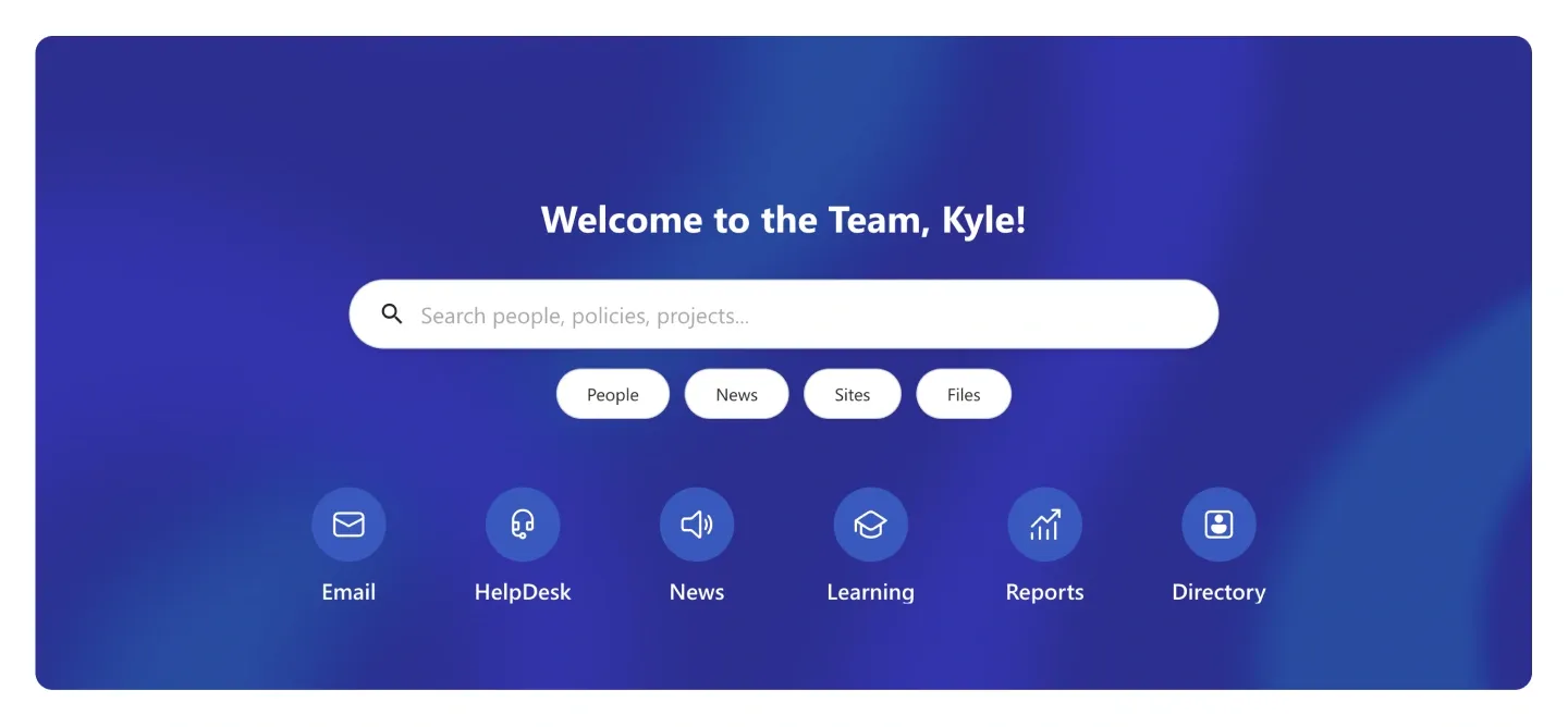
Gradient welcome hero with a rounded search bar, scope pills, and six round icon shortcuts.
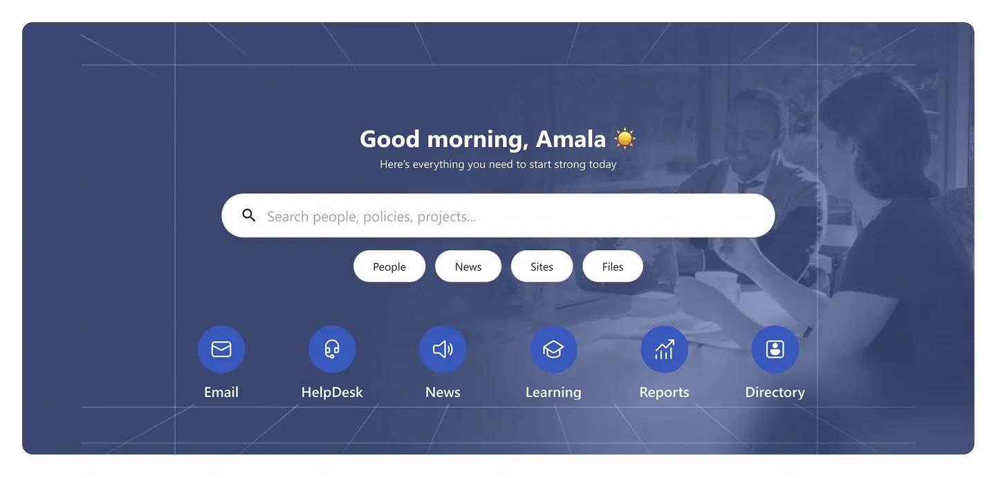
Background-image welcome hero with search bar, scope pills, and six round icon shortcuts. It uses the same structure as Header 8, with a photo background.
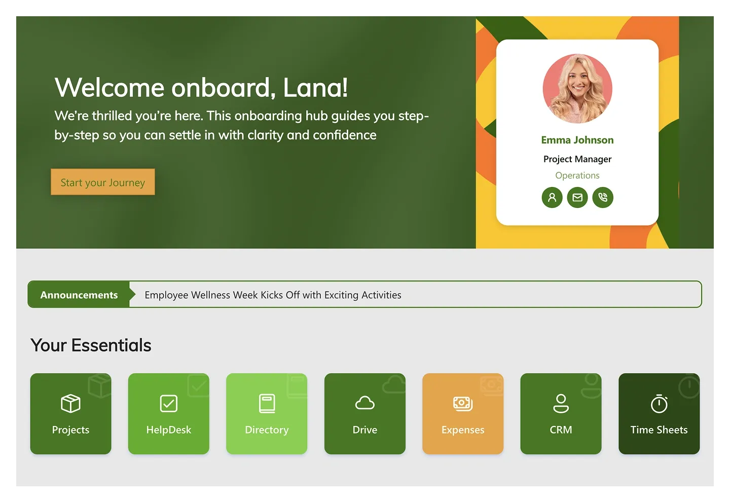
Onboarding hero with welcome message and button, a contact card for a buddy, an announcement ticker, and a row of essentials tiles.

Minimal gradient hero with a centered icon, title, and two-line tagline. It's built for pages that need a header, not a dashboard.
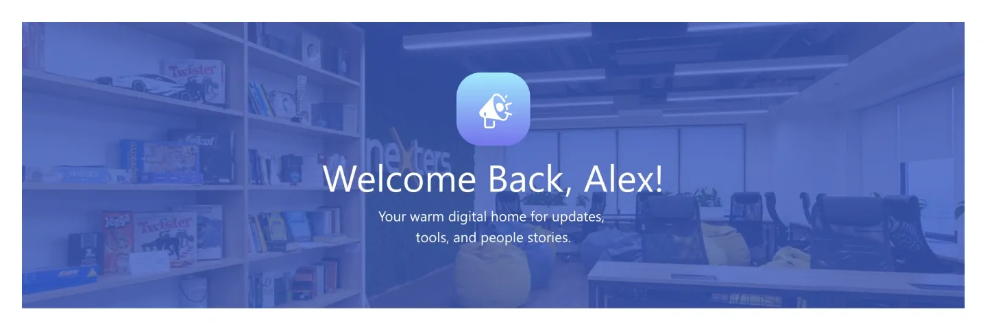
Background-image hero with a centered app icon, personal welcome headline, and short tagline.
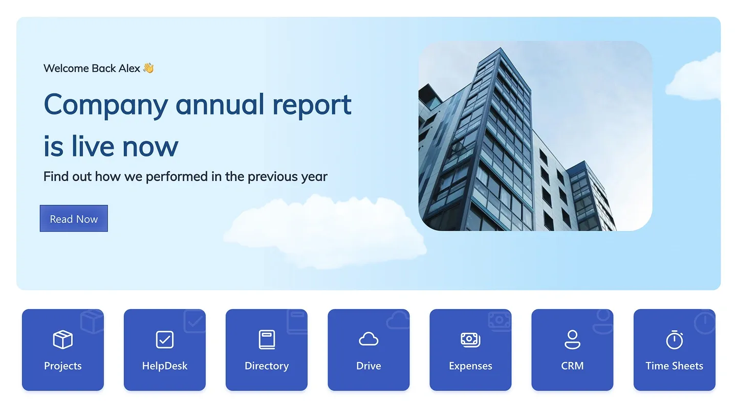
Announcement hero with headline, subline, button, and image, above a row of seven icon shortcut tiles.
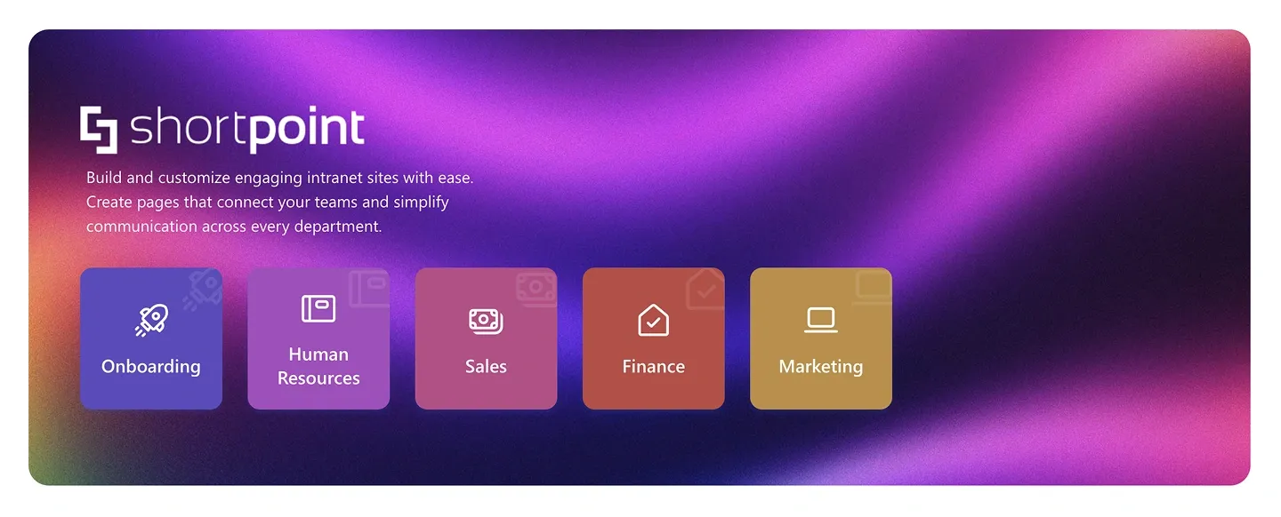
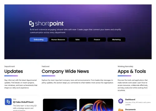
Gradient hero with logo, three-line intro, and five department tiles with icons. It's an organization-level landing header.
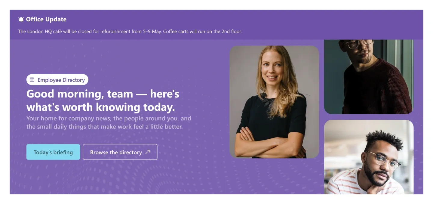
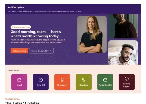
Hero with an update ticker on top, a badge, greeting, tagline, two buttons, and a mosaic of three photos.
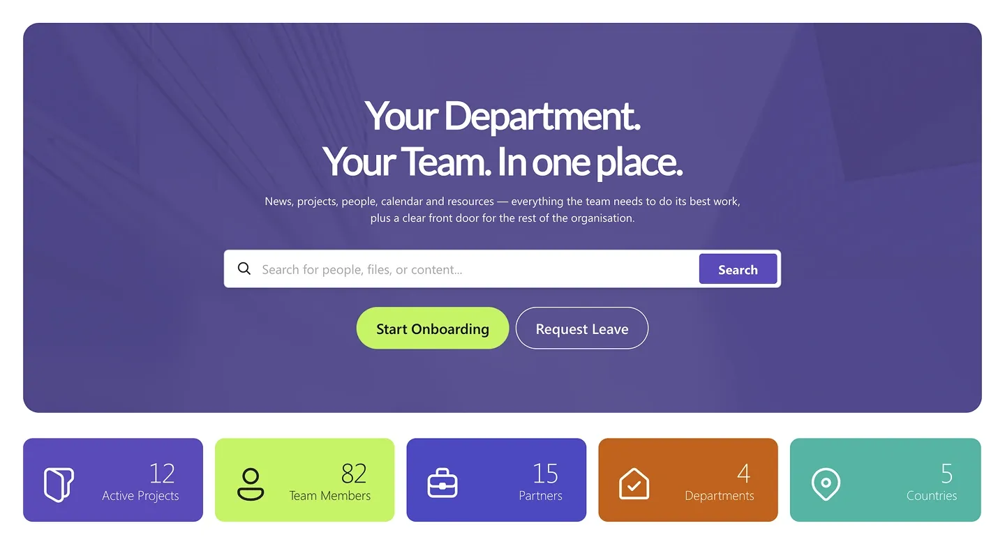
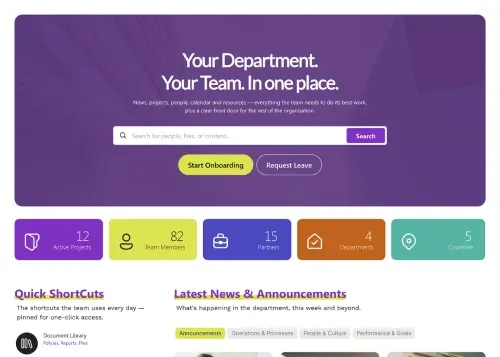
Department hero with two-line headline, search bar, and two action buttons, above five stat tiles with icons and counts.
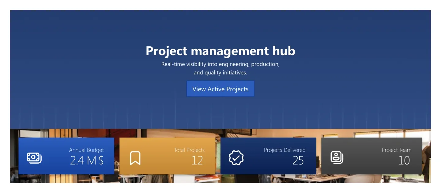
Hero with title, tagline, and button, over a four-tile KPI strip with icons. It connects to list data for live numbers.
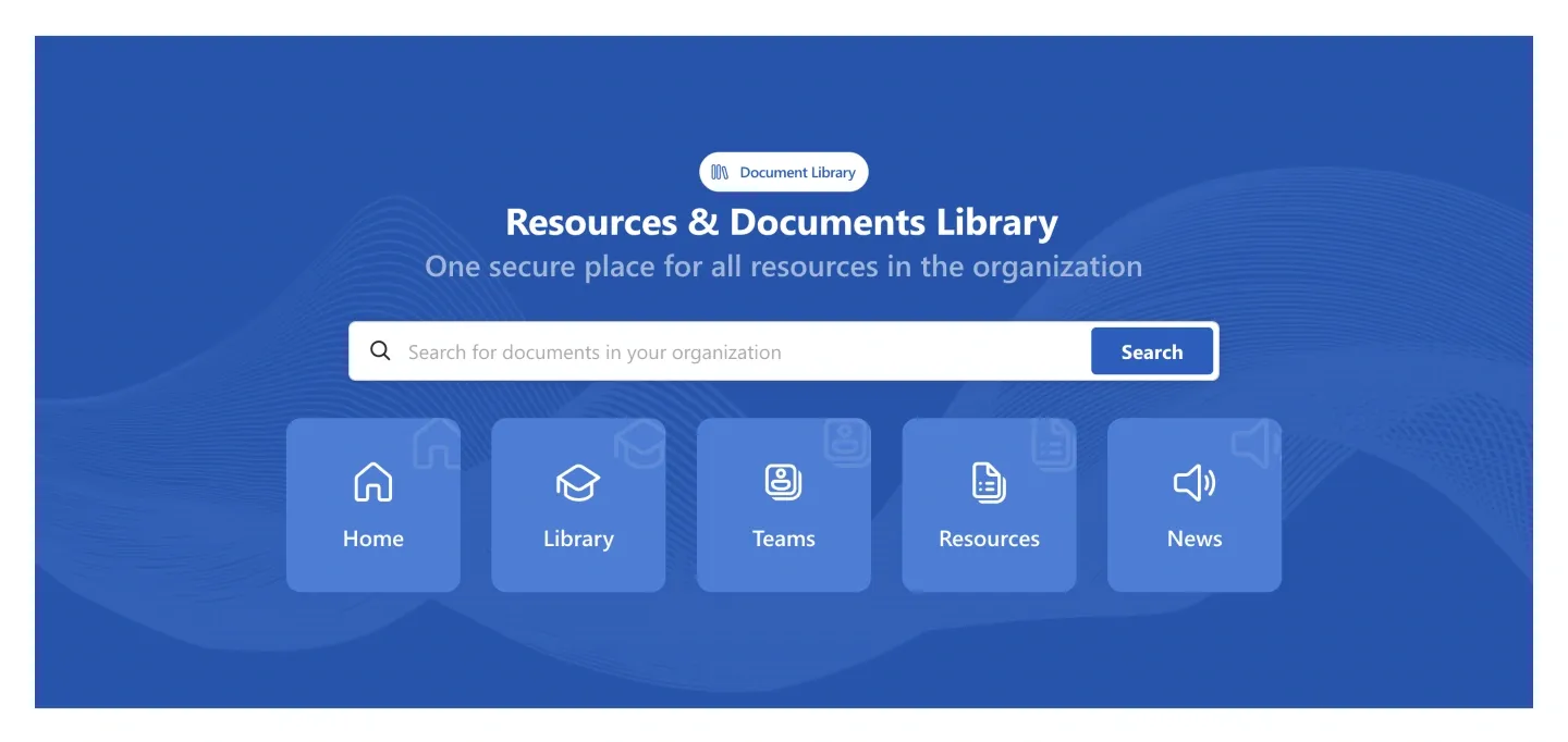
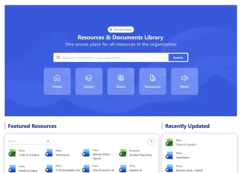
Library hero with a badge, title, tagline, document search bar, and five icon shortcuts.
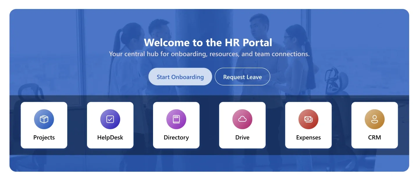
Background-image hero with headline, tagline, two action buttons, and six round icon tiles. It's a portal front door.
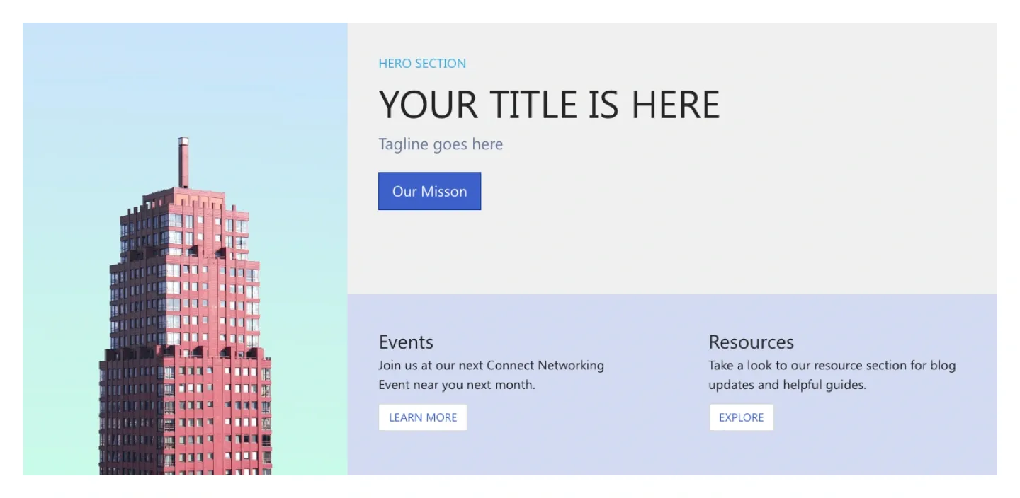
Split hero with a tall image on one side and title, tagline, and button on the other, above two text columns with buttons.
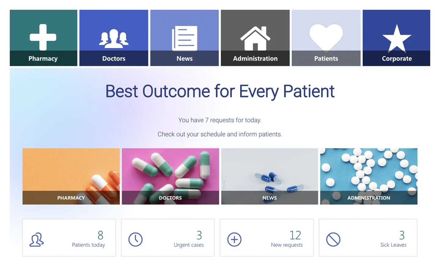
Header with a row of icon tiles, a centered headline, four image tiles, and a row of daily stat cards. It's built for clinical or operations dashboards.
A SharePoint header section is a pre-built hero banner for the top of a page that tells people where they are and what they can do there. SharePoint's Hero web part gives you tile and layer layouts with up to five items. ShortPoint header sections add what it can't: a personalized greeting with the live date, a search bar, app shortcuts, stat tiles, an update ticker or an embedded video, all in one responsive block, so you never fight SharePoint banner image sizes again. Compare every design in the carousel, from a minimal title banner to full welcome headers with search and app shortcuts, and preview each one live.
Use ShortPoint to build a branded SharePoint hero banner in minutes. Pick a header section, swap the image and headline, connect quick links to your Microsoft 365 apps, and keep fonts and colors consistent using Theme Builder across every page.
Describe the section you need and let AI Designer write and build the block.
Swap layouts, resize the block and edit every piece of content visually.
Apply your brand colors, typography and corner radius in one place.
Pull headlines, dates and items from SharePoint lists so the block updates itself.
Reuse the same section across every department page and site.
Proper labels, contrast and keyboard support for every reader.
Link straight to Microsoft Forms, Planner, Teams or any external tool.
Pre-styled variants that match the rest of your page.
Built from standard ShortPoint elements you can reuse anywhere else.
Everything stays readable and tappable when the block stacks on mobile.
Add a branded SharePoint hero banner to any page in under an hour. No coding required.
Start free trial & add ShortPoint to your site : Click "Start a Trial" and get access to ShortPoint instantly. No credit card needed. Sign in with your Microsoft 365 credentials to activate your trial instantly, or download the package manually and activate it from there.
Insert a Section : Edit your SharePoint page, insert the ShortPoint web part, and pick any header section (Hero, Onboarding Hero, Animated Header, Hero Navigation) from the Sections tab of the Templates Library. It drops into your page as a ready-made block you can move, duplicate, or restyle.
Customize & Publish : Replace the placeholder content with your own, connect your SharePoint data sources, apply your company branding with Theme Builder, and publish the page for immediate use.
A hero is the large banner at the top of a page that introduces the site and points people to key links. SharePoint's built-in hero web part offers a few fixed layouts; ShortPoint header sections give you 27 fully editable designs instead.
ShortPoint headers are responsive, so any wide, high-resolution image (around 1920 px wide) works. You can set focal point, overlay, and height in the editor rather than cropping to a fixed SharePoint banner size.
Yes, every header section works with both Microsoft 365 and on-premises SharePoint. That includes SharePoint Online in Microsoft 365, as well as SharePoint Server Subscription Edition, 2019, 2016, and 2013 for on-premises environments.
Yes, you can change the colors, fonts, and layout of any header section. Edit text, images, buttons, and spacing directly, or apply your brand once with Theme Builder so colors and fonts stay consistent across every header on the intranet.
Yes, several header sections include link tiles or a navigation strip built in. You can connect each link to any SharePoint page, document, or Microsoft 365 app, so people can jump straight to what they need from the header itself.
Yes, you can copy and paste the same header onto other pages or sites. This makes it easy to keep department, team, or regional pages consistent, without rebuilding the header from scratch each time.