
ShortPoint Design Elements
Introduction to ShortPoint Design Elements
Have you ever used Design Elements on your SharePoint page? Whether it's your first time or your hundredth time using it, this is the perfect course for you!Let's start with giving you a quick overview of Design Elements and how it works.

What are ShortPoint Design Elements?
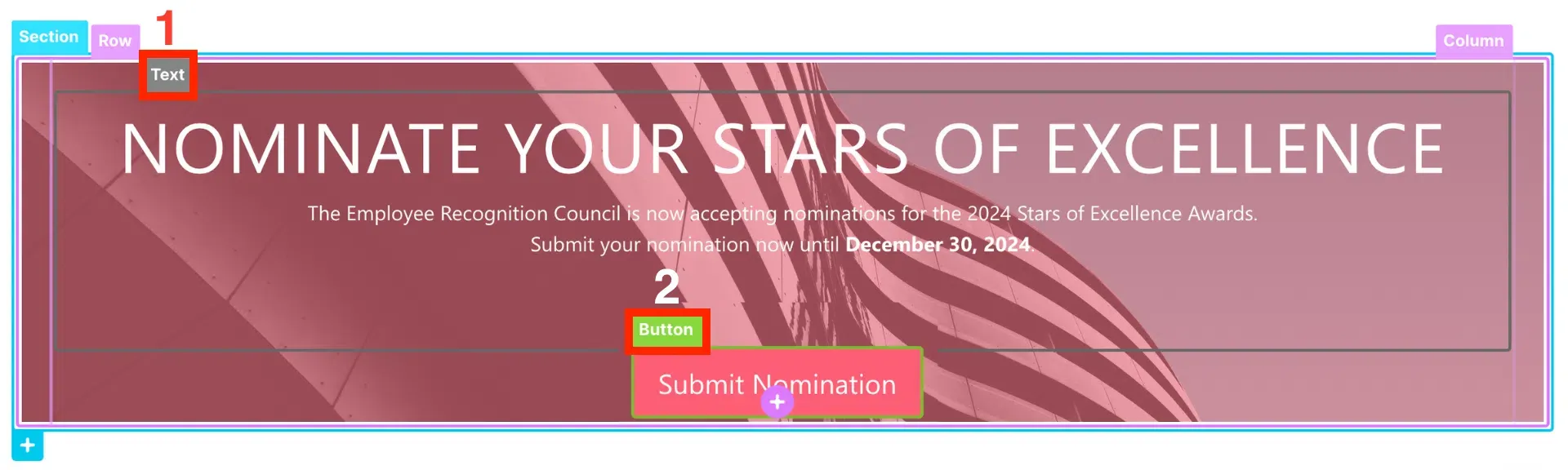
In Live Mode, you will find colorful EasyPass tags that display the Design Elements used to create the page.
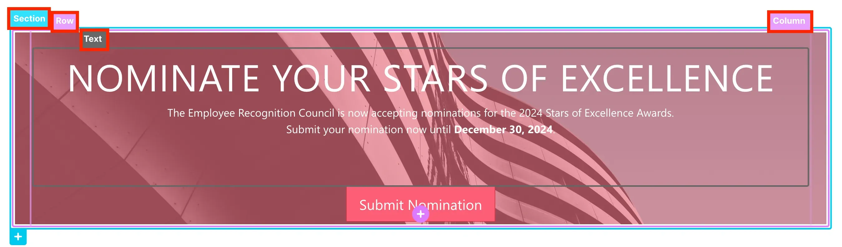
While using the EasyPass tags, you will notice [1] Sections, [2] Rows, and [3] Columns all over your page. They serve as the building blocks of the ShortPoint web part. They support the layout and structure of the page. And, within them, you can add any Design Element that best fits your content.
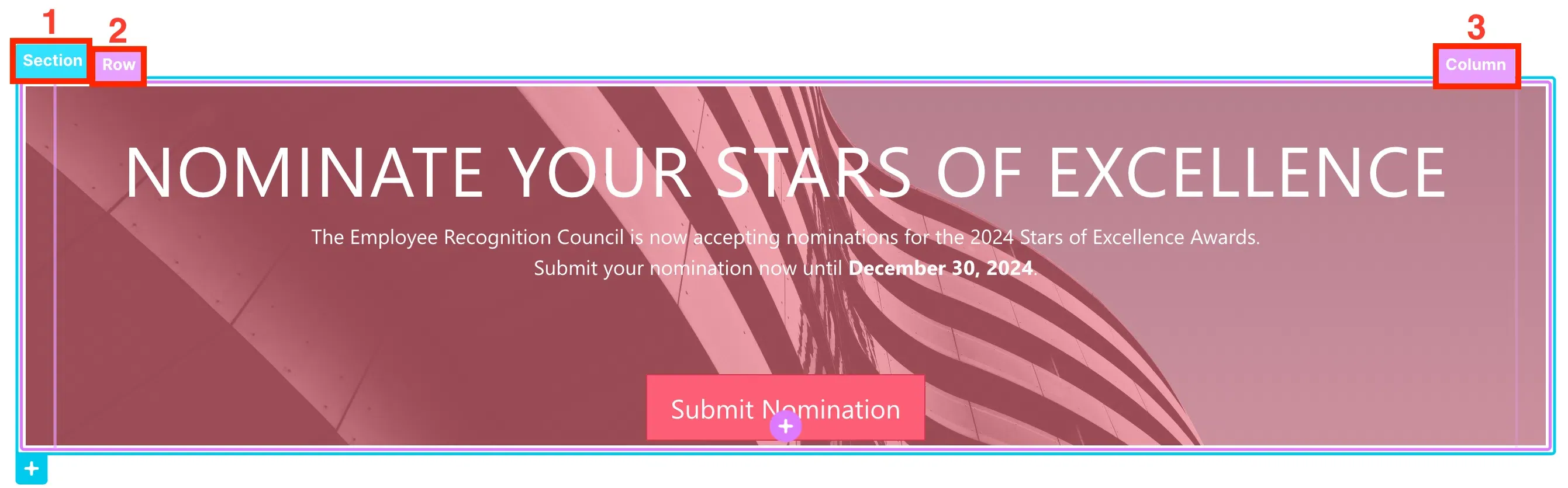
ShortPoint Design Elements are pre-built and pre-designed page elements. They are used to present information in many ways. For example, we have a [1] Text Design Element that captures the user's attention and a [2] Button Design Element that asks them to take action.
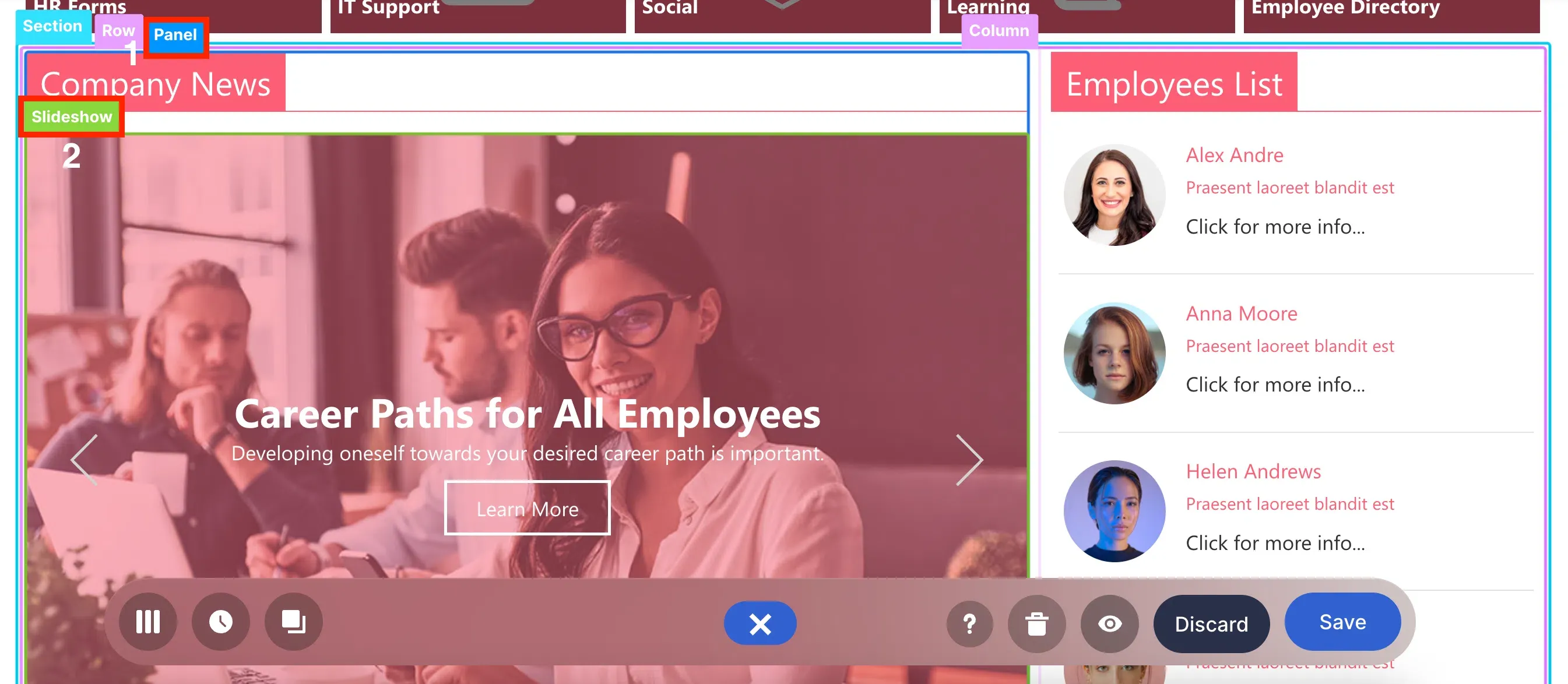
Another example is this [1] Panel Design Element which serves as a container for the [2] Slideshow Design Element that showcases news and other relevant company updates.
These are just a few of the Design Elements you can use to build your SharePoint site pages. You will learn more about them in the next tutorials. For now, let's dive into ShortPoint's two editing interfaces.
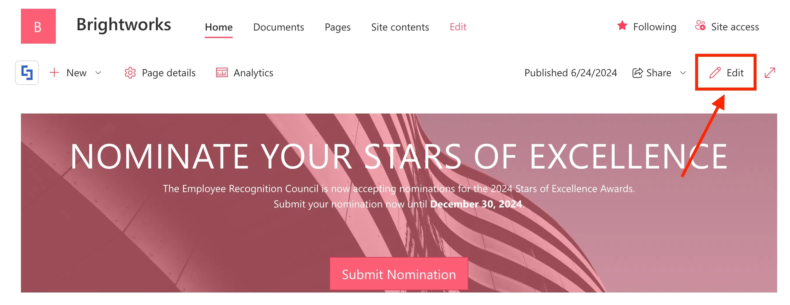
To access the editing interfaces, you must first edit the ShortPoint web part. To do this, click Edit in the upper-right corner of your page:

Select the ShortPoint tag:
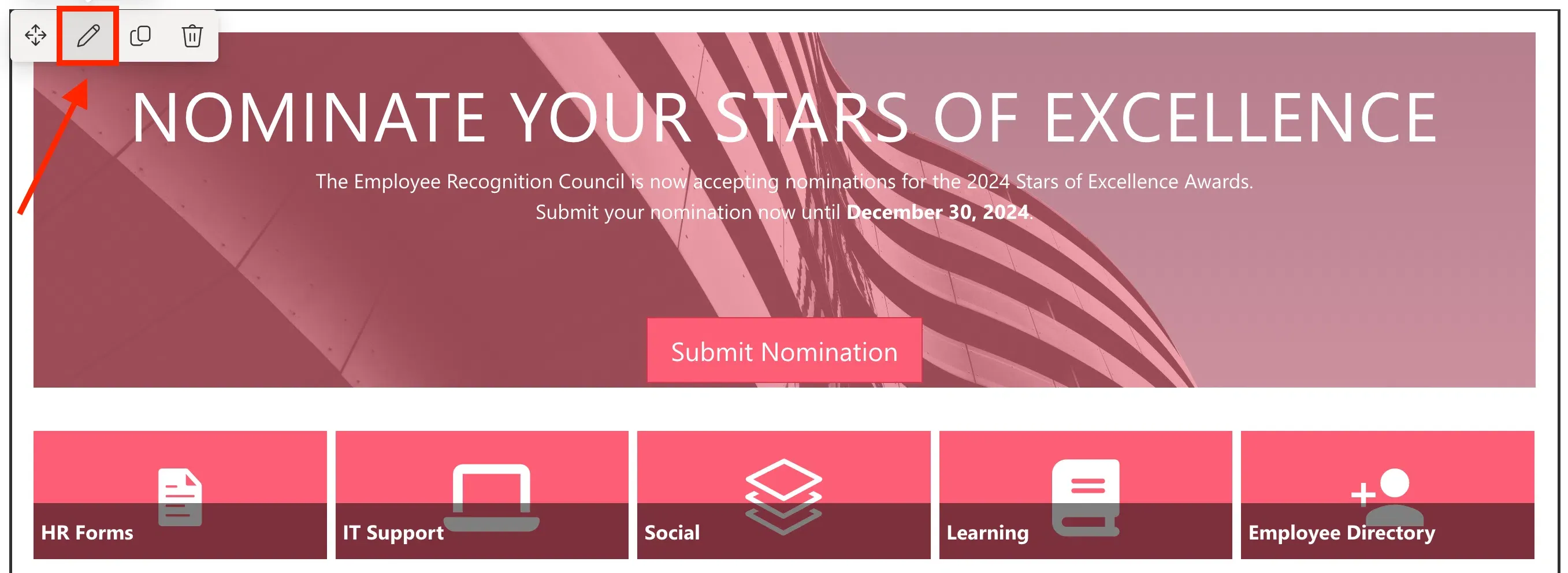
And click the pencil icon:
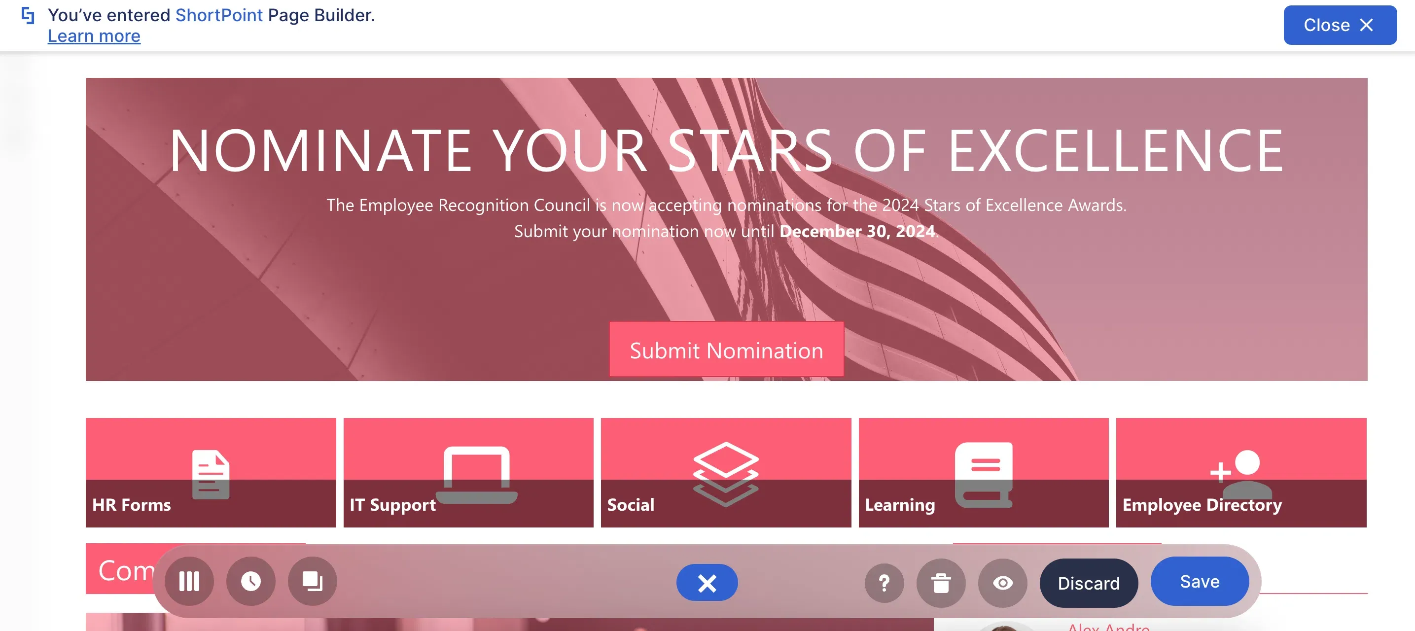
You will now be able to see Live Mode, which is the main editing interface of ShortPoint. Here, you will have a fully visual design experience. You will be able to see the changes you make in real-time.
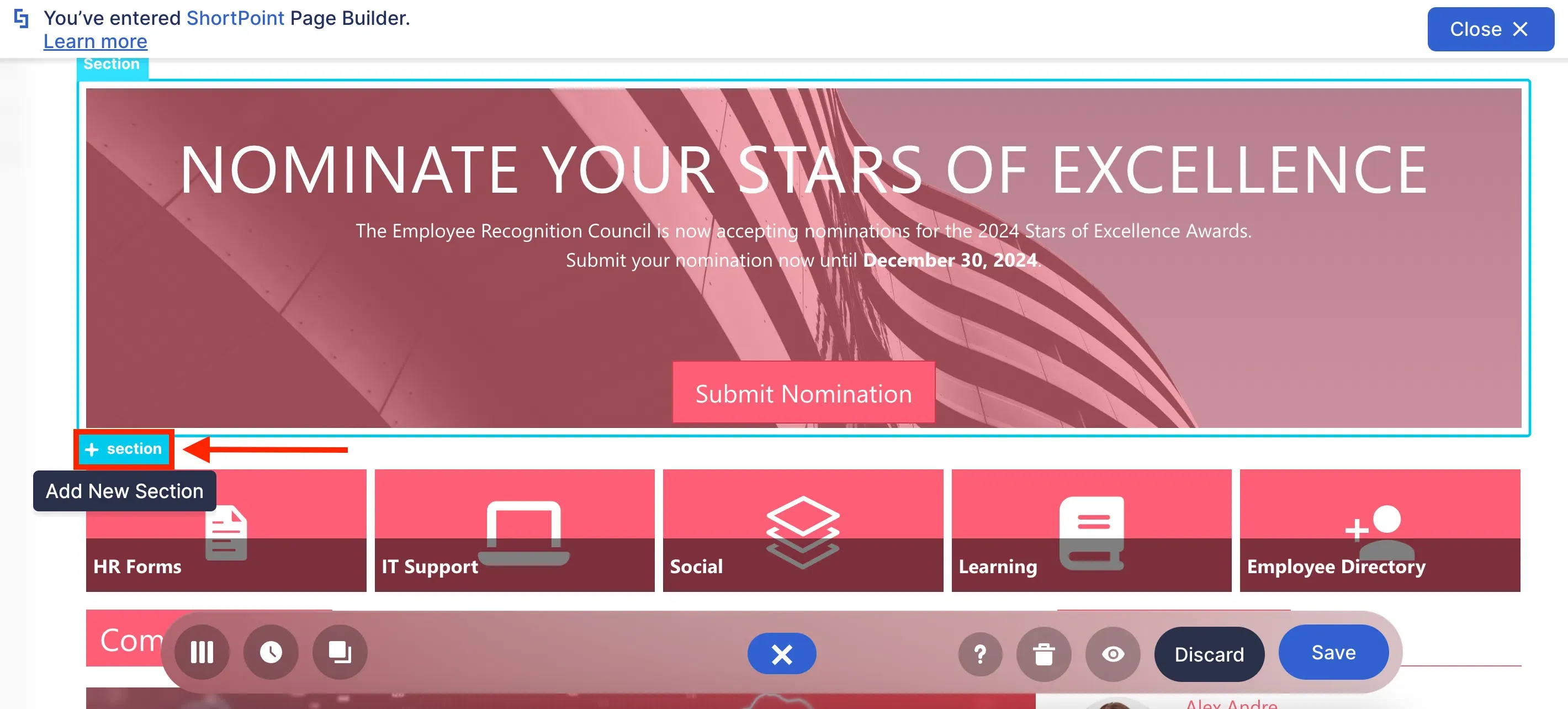
To add Design Elements in Live Mode, click + section:

Then, select the Choose Layout icon:
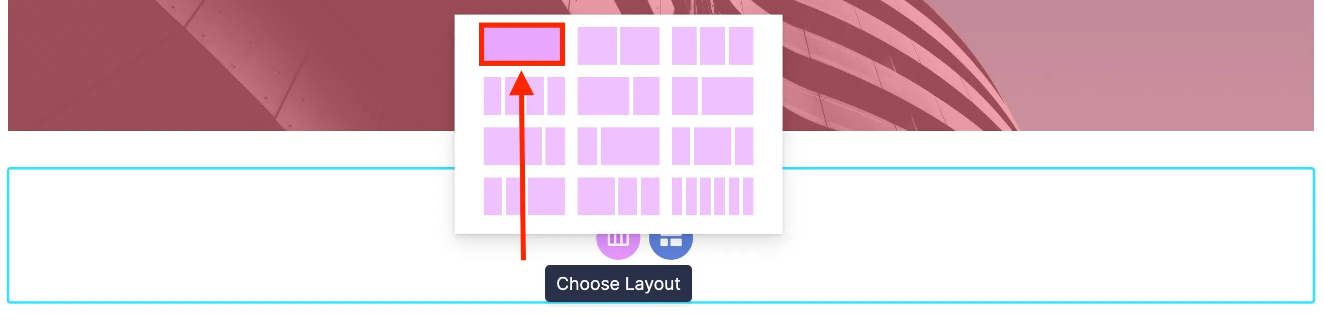
From the list of layouts available, select the one you prefer:
Add and edit Design Elements in Live Mode
Click the plus icon to open the vast selection of Design Elements you can use:

You can [1] use the search bar to look for the Design Element you want to add or [2] scroll down until you see the Design Element you want to insert:
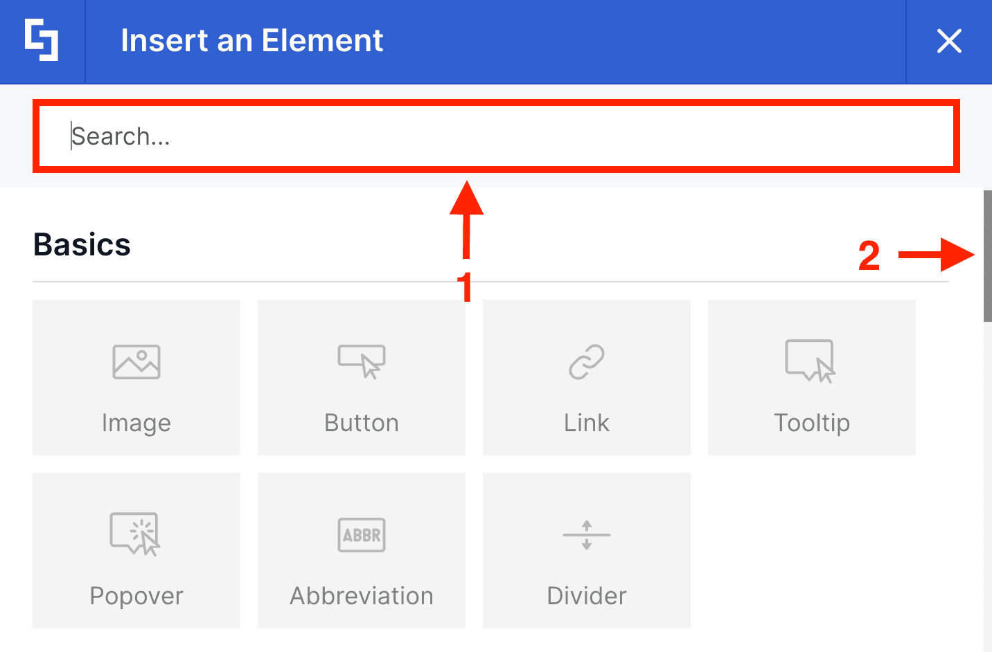
Once selected, the Design Element settings window will open. The default contents and view of the Design Element will be inserted into your page.
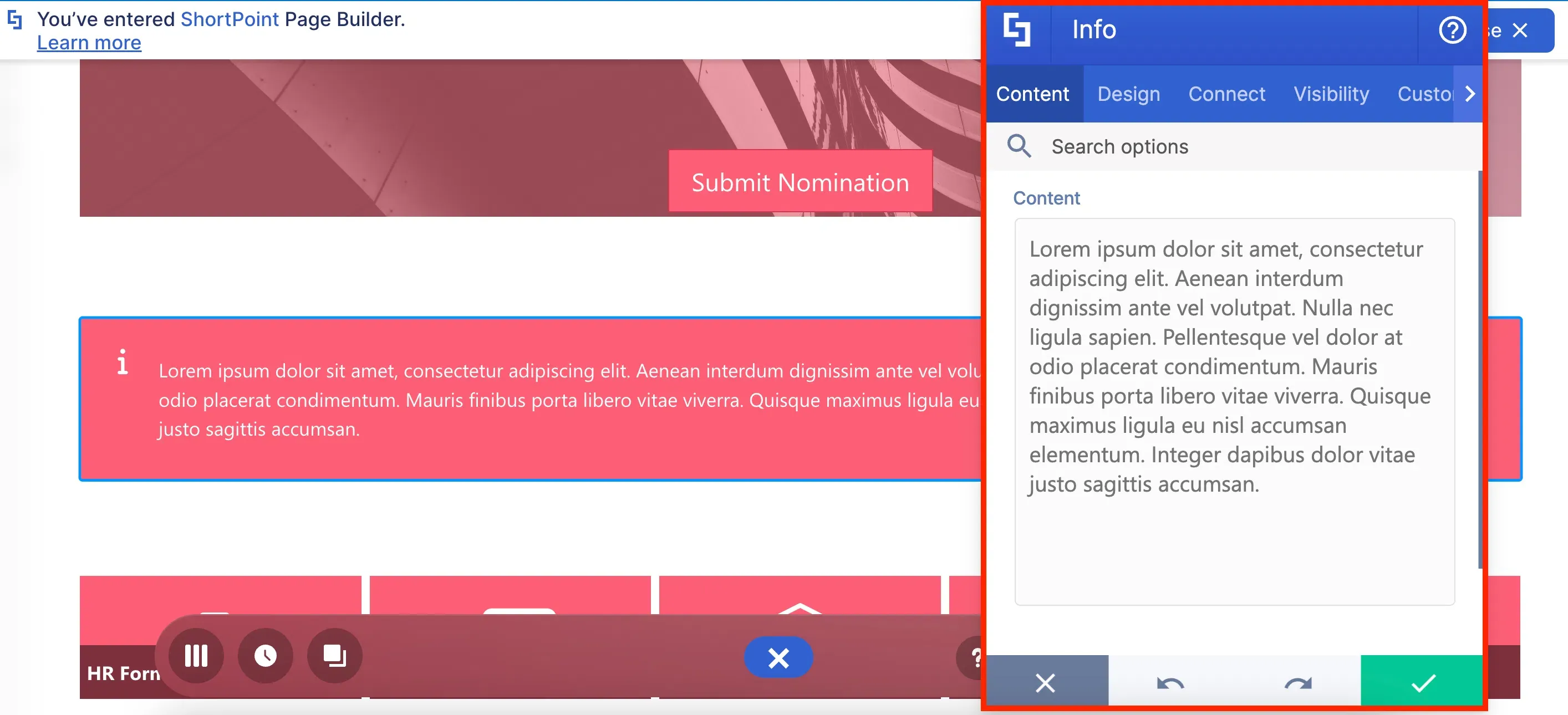
Using the tabs inside the settings window, you can customize how the selected Design Element will appear on the page. Each tab contains specific controls for the features and functionality of the Design Element.
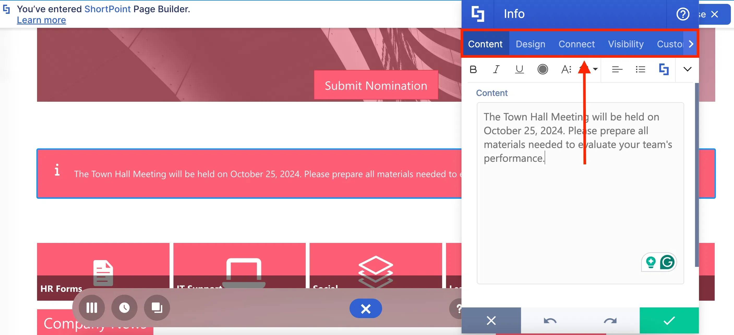
For example, the Design tab allows you to customize the look of your Design Element (including changing the style, color, and more):
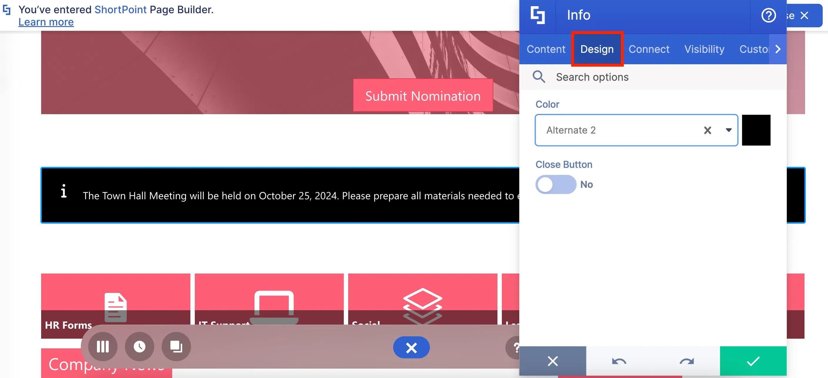
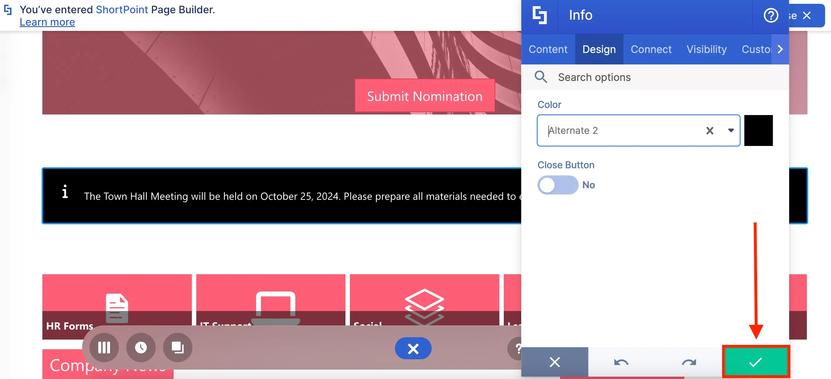
After editing the Design Element, click the green check mark to apply your changes:
In case you want to edit the Design Element further, simply click the EasyPass tag of the Design Element:
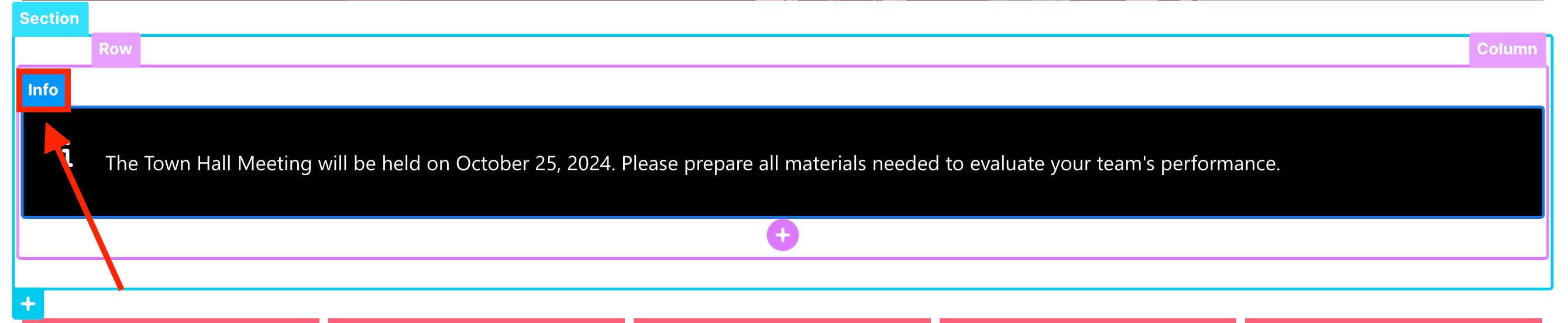
And click the cogwheel icon:

Clicking the EasyPass tag also allows you to delete the Design Element, copy it, duplicate it, and more in the other actions dropdown.
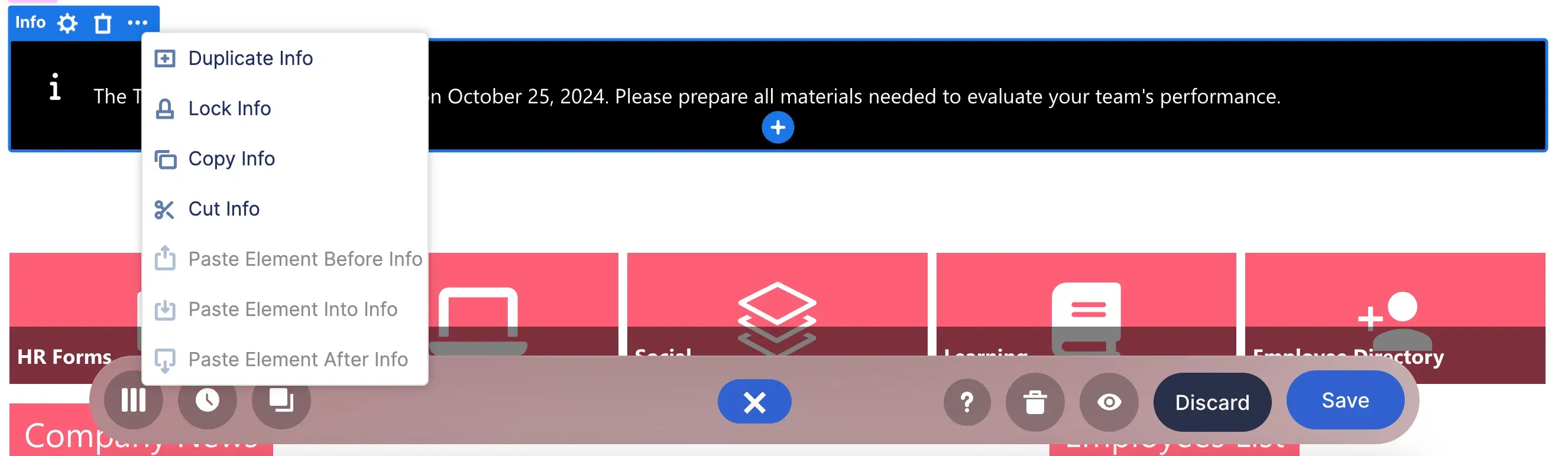
Now, let's move on to Grid Mode. To access it, click the Switch to Grid Mode icon:
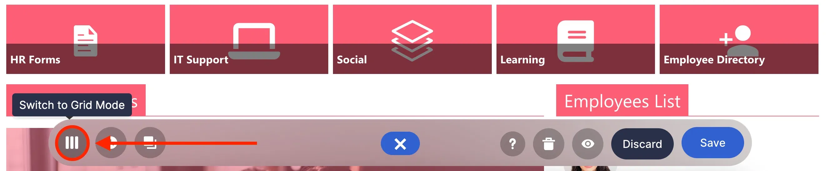
Grid Mode is an outline-based interface. It is most useful when accessing features that are not yet available in Live Mode.
Add and edit Design Elements in Grid Mode
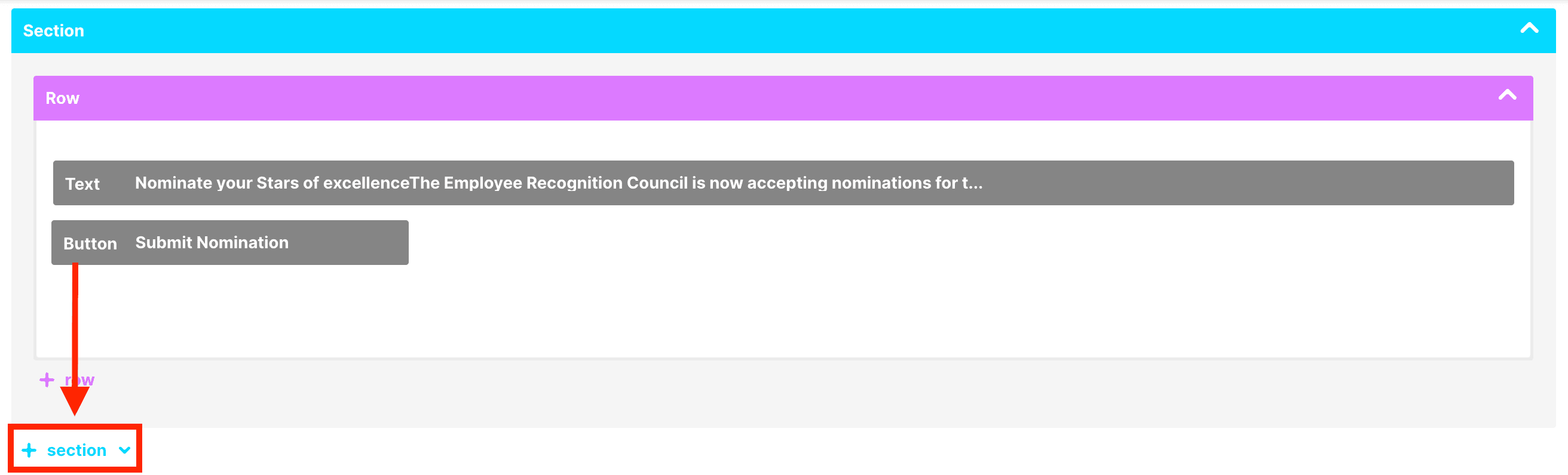
The experience in adding and editing Design Elements is pretty much the same as in Live Mode. Click + section:
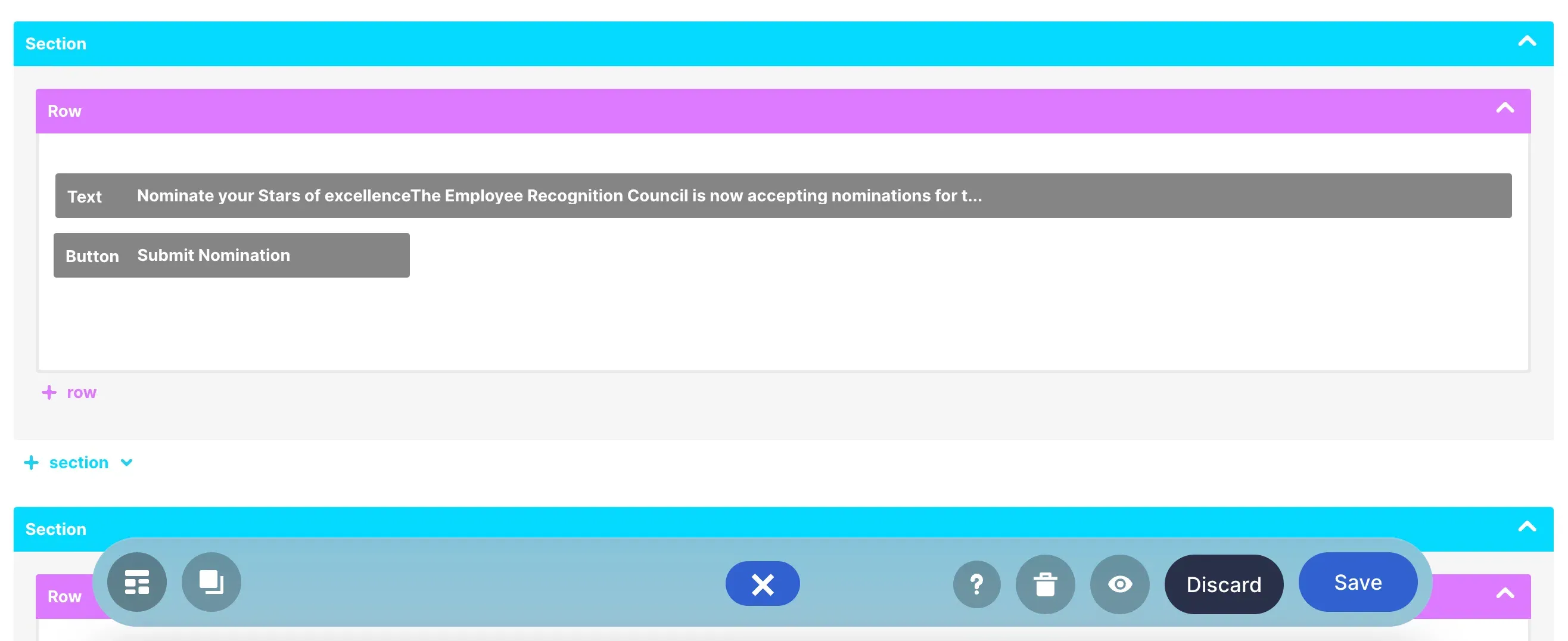
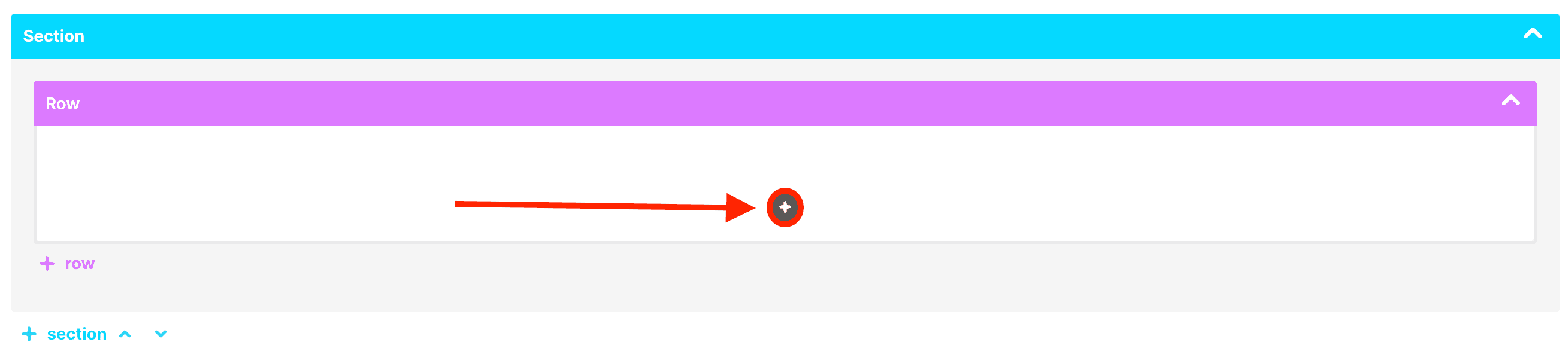
Then, click the plus icon to see the library of Design Elements:
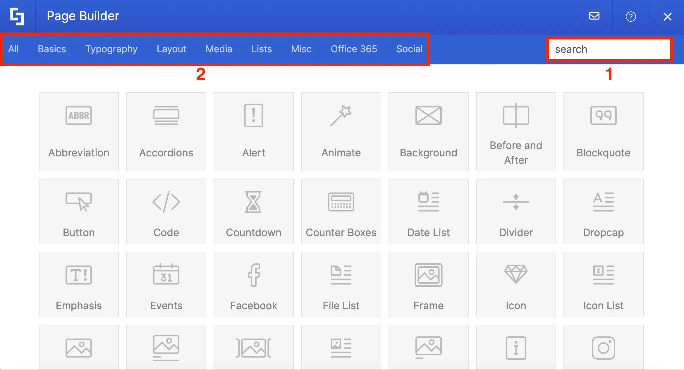
You can [1] use the search bar to look for the Design Element you want to add or [2] select the category of the Design Element you want to insert:
Like Live Mode, there are tabs that you can use to customize how the selected Design Element will appear on the page:
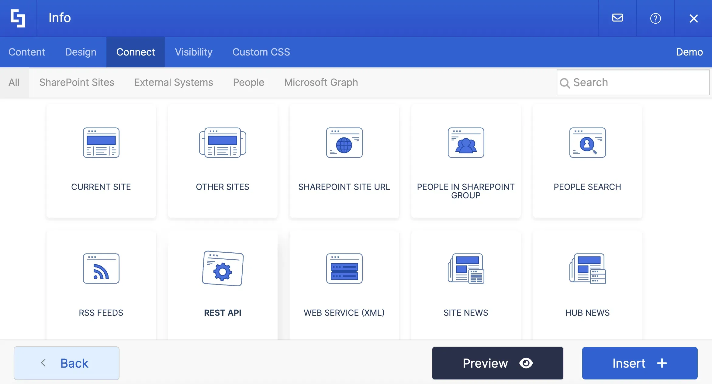
In Grid Mode, however, you can use two tabs that are currently not yet available in Live Mode. The first one is the Connect tab which allows you to create dynamic content for internal and external data sources.
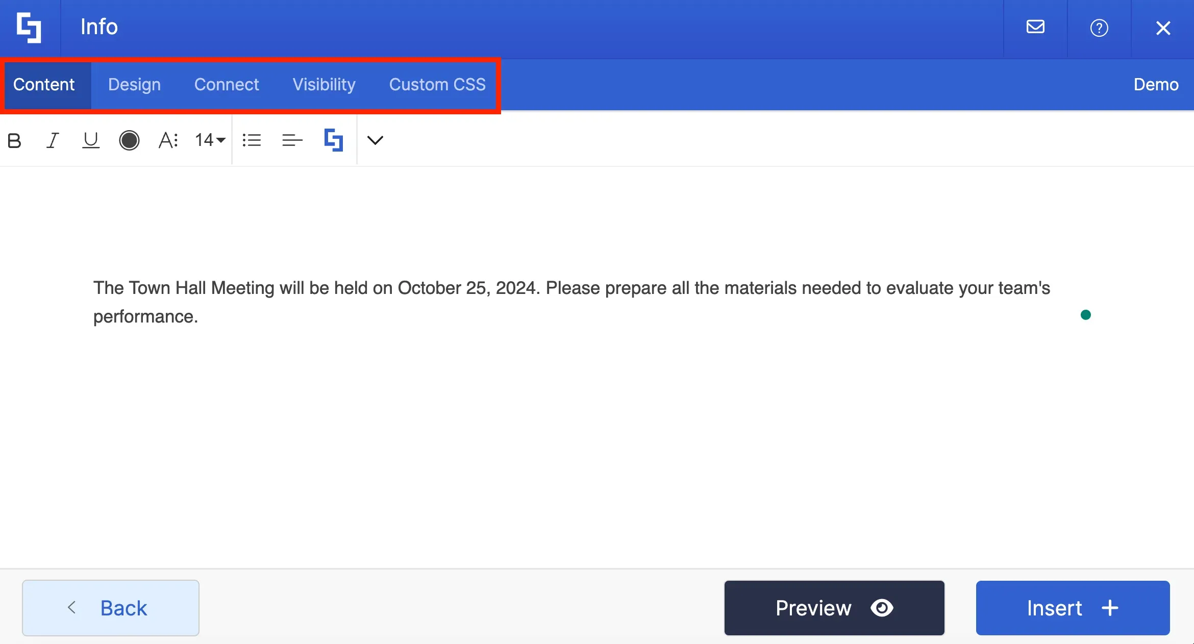
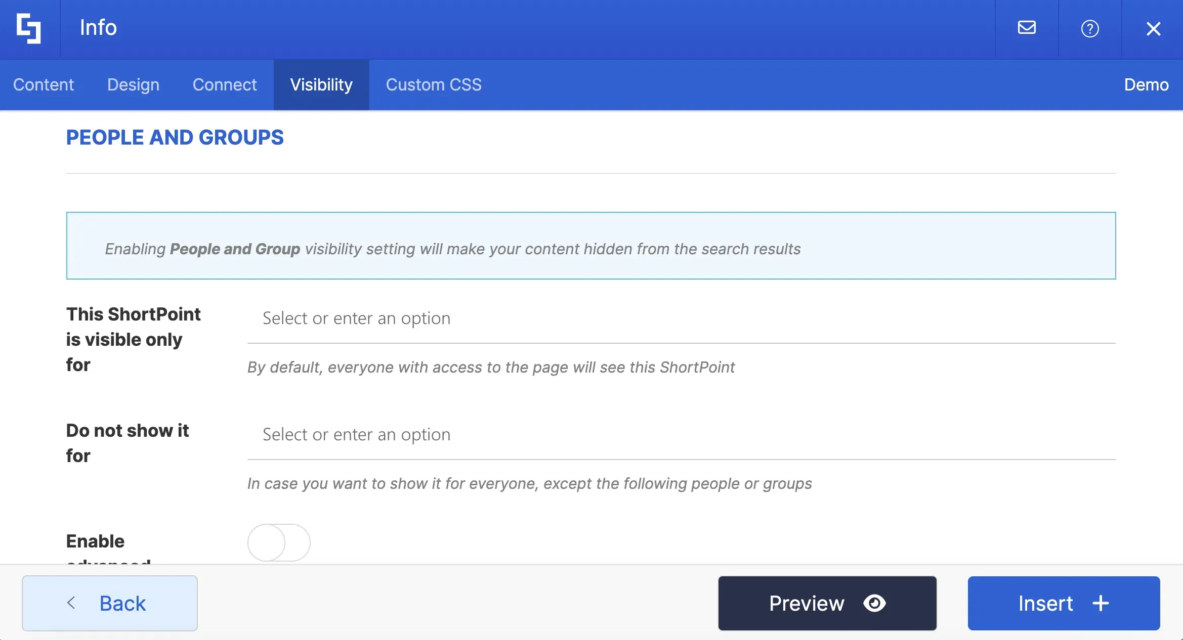
And the second one is the Visibility tab which allows you to control the people and the devices authorized to see the Design Element:
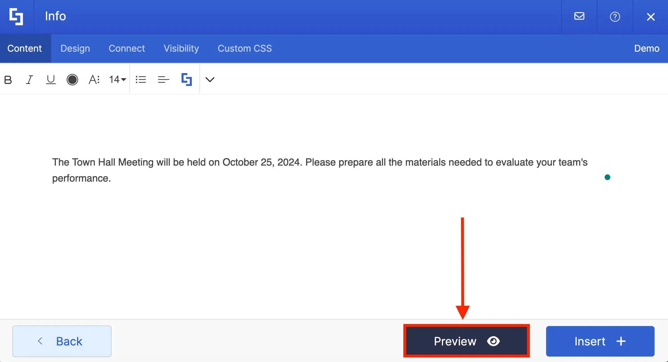
Unlike Live Mode, you cannot see a live view of your changes. To see how a Design Element will look on your page, click Preview:
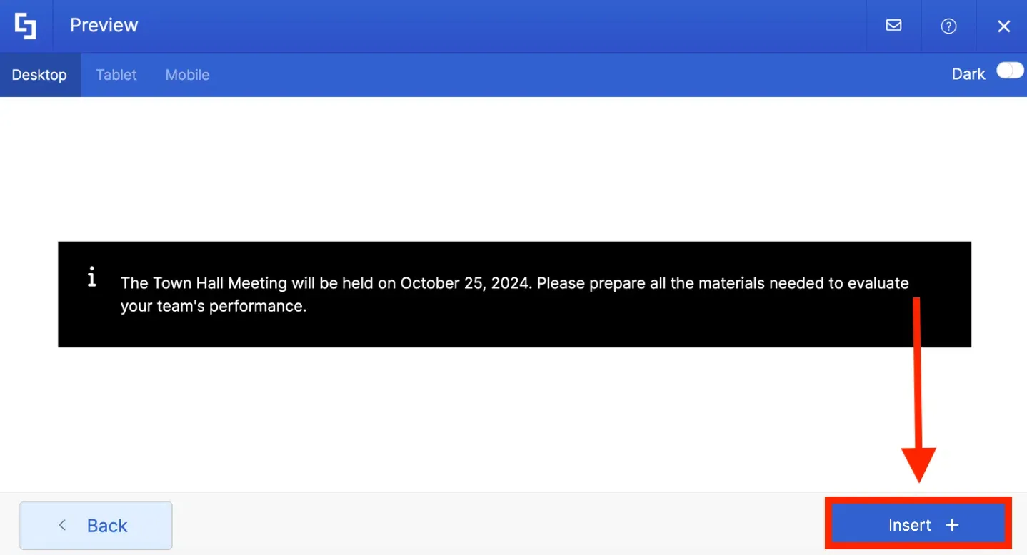
Then, select Insert to apply your changes
To edit Design Elements, in case of a mistake, simply click the cogwheel icon. Then, repeat the process above:
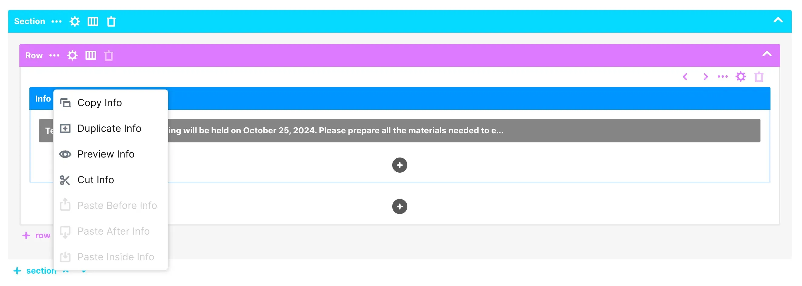
You also have the option to delete Design Elements, copy it, duplicate it, and more

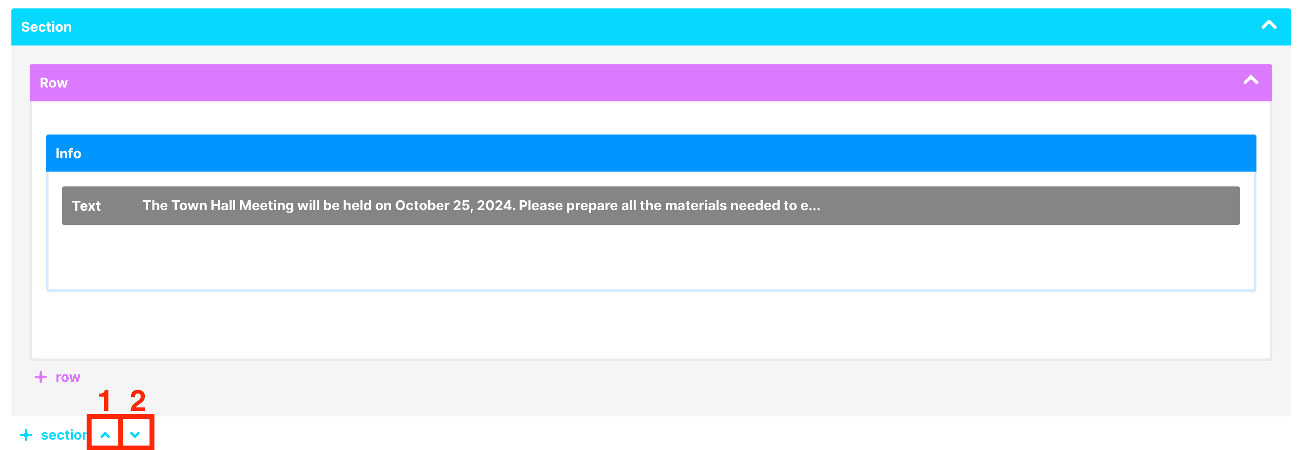
Grid Mode also allows you to move Sections and Row. To do this, click the [1] up arrow to move the Section above or click the [2] down arrow to move the Section below:
There you have it! That's how easy it is to add, edit, and customize Design Elements in ShortPoint.