What’s New in ShortPoint: 11 Design Elements for Faster, On-Brand SharePoint Design
Creating stunning, functional SharePoint sites just got even easier. ShortPoint's latest release introduces eleven powerful new Design Elements that will revolutionize how you build and customize your SharePoint pages. Whether you're crafting an engaging digital hub, building a team knowledge base, or organizing content for a better user experience, these 11 new elements give you the creative freedom and functionality you need to bring your vision to life.
Why The New Design Elements Matter for Your SharePoint Success
At ShortPoint, we understand that great design isn't just about aesthetics—it's about creating experiences that work. Your SharePoint site should be more than functional; it should be intuitive, engaging, and perfectly aligned with your brand. That's why we've developed these 11 new Design Elements to address the most common challenges organizations face when building modern SharePoint sites.
Meet Your New Creative Toolkit
1. Search Box Design Element: Find Anything, Instantly
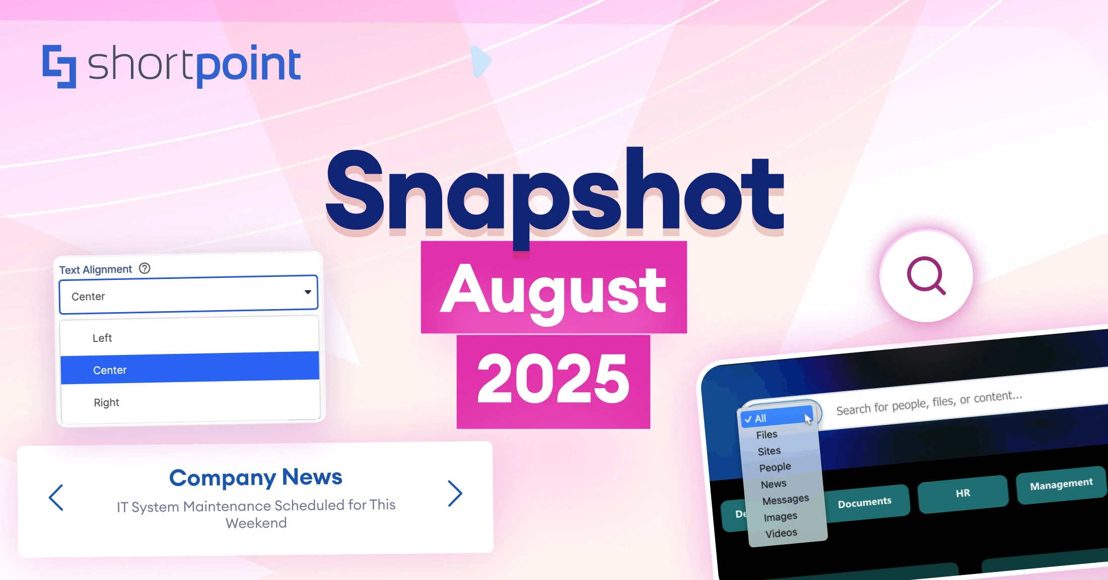
Your users shouldn't have to hunt through folders and pages to find what they need. The new Search Box Design Element transforms how people interact with your SharePoint Site Collection by providing instant access to any content, file, or information.
Key Benefits:
- Seamlessly integrates with your existing SharePoint content
- Customizable styling to match your brand
- Instantaneous results across your entire site collection
- Mobile-responsive design for users on any device
Perfect for intranets, knowledge bases, and large content repositories where quick information access is critical.
Learn how to use the Search Box Design Element
2. Quick Links Design Element: One-Click Navigation
Why make users dig through menus when they can get where they need to go instantly? The Quick Links Design Element provides a streamlined way for users to immediately access the sites or pages they need with a single click.
Key Benefits:
- Customizable styling and layouts
- Icon support for visual recognition
- Responsive grid system for organized presentation
- Easy link management and updates
Ideal for dashboard pages, navigation hubs, or any area where quick access to important resources is essential.
Learn how to use the Quick Links Design Element
3. Steps Design Element: Processes Made Clear
Complex processes don't have to look complicated. The Steps Design Element displays workflows, procedures, or any sequential information in a clear and visually appealing way that guides users through each stage.
Key Benefits:
- Sequential numbering with customizable styling
- Visual representation of complex steps
- Flexible content options for different process types
- Easy to update and modify as processes change
Perfect for onboarding procedures, how-to guides, workflow documentation, or any content that benefits from step-by-step presentation.
Learn how to use the Steps Design Element
4. Person Cards Design Element: Showcase Your Team in Style
People are at the heart of every organization, and now you can feature your team members in a creative and informative way. The Person Cards Design Element goes beyond basic contact information to create engaging team showcases that build connections and trust.
Key Benefits:
- Professional, polished presentation of team members
- Customizable content and styling options
- Integration with SharePoint user profiles
- Perfect for leadership pages, department showcases, or company directories
Whether you're introducing new hires, highlighting department leaders, or creating a company-wide directory, Person Cards make it easy to put faces to names and build stronger organizational connections.
Learn how to use the Person Cards Design Element
5. FAQs Design Element: Build Professional FAQ Sections
Every organization has questions that come up repeatedly. The FAQs Design Element allows you to create polished, professional FAQ sections that provide instant answers while maintaining a clean and organized appearance on your SharePoint pages.
Key Benefits:
- Expandable/collapsible question format for better user experience
- Easy content management and updates
- Searchable FAQ content
- Consistent styling that matches your site design
Transform scattered information into organized, accessible answers that reduce email queries and improve user satisfaction.
Learn how to use the FAQs Design Element
6. CTA Card Design Element: Guide Users to Action
Every great SharePoint page should guide users toward specific actions. The CTA (Call-to-Action) Card Design Element provides the perfect tool for creating compelling, action-oriented content that drives user engagement and achieves your business goals.
Key Benefits:
- Eye-catching design that stands out on your pages
- Customizable buttons and styling to match your brand
- Different style options for different types of calls-to-action
- Directly links to forms, pages, and critical information
Whether you want users to download a resource, attend an event, or contact a department, CTA Cards make it impossible to miss the next step.
Learn how to use the CTA Card Design Element
7. News Cards Design Element: News That Gets Noticed
Keep your organization informed and engaged with the News Cards Design Element. Display your news and announcements in gorgeous, attention-grabbing cards that look professional and deliver information effectively.
Key Benefits:
- Automatic integration with SharePoint news
- Multiple card layouts and styling options
- Featured image support for visual impact
- Easily redirect users to the main news sources
Update your news and announcements from basic lists into engaging content that encourages readership and keeps your organization connected.
Learn how to use the News Cards Design Element
8. Image Boxes Design Element: Visual Impact Made Simple
They say a picture is worth a thousand words, and the Image Boxes Design Element proves it. Display your information alongside stunning images in beautifully crafted boxes that grab attention while keeping everything streamlined and user-friendly.
Key Benefits:
- Seamless image integration with text content
- Flexible design options for different content
- Hover effects and interactive elements
- Optimized image handling for fast loading
Perfect for showcasing projects, highlighting achievements, creating portfolio sections, or any content where visual appeal drives engagement.
Learn how to use the Image Boxes Design Element
9. Icon Boxes Design Element: Information That Catches the Eye
Sometimes the best way to communicate is through visual storytelling. The Icon Boxes Design Element allows you to showcase information in beautifully designed boxes that are both eye-catching and functional, perfect for highlighting services, features, or key information points.
Key Benefits:
- Extensive icon library with customization options
- Flexible design configurations
- Brand-consistent color and styling options
- Responsive design that looks great on all devices
Ideal for service offerings, feature highlights, process steps, or any content that benefits from visual organization and clear hierarchy.
Learn how to use the Icon Boxes Design Element
10. Content Boxes Design Element: Text Content That Shines
Great content deserves great presentation. The Content Boxes Design Element makes showcasing your text content a breeze with pre-designed containers that catch the eye while keeping everything neat and easy to navigate.
Key Benefits:
- Clean, professional styling that enhances readability
- Multiple style options for different content
- Consistent formatting across all your text content
- Easy content updates and management
Perfect for policy updates, announcements, feature descriptions, or any text-heavy content that needs visual appeal without distraction.
Learn how to use the Content Boxes Design Element
11. Gradient Text Design Element: Typography That Stands Out
Sometimes your message needs that extra visual impact. The Gradient Text Design Element adds stunning gradient effects to your text, creating eye-catching typography that commands attention while maintaining readability.
Key Benefits:
- Extensive gradient customization options
- Brand-consistent color controls
- Multiple text styling options
- Perfect for headlines and call-out content
Enhance ordinary headings and important messages into visually striking elements that align perfectly with your brand identity.
Learn how to use the Gradient Text Design Element
The ShortPoint Advantage: Why These Elements Matter
These eleven new Design Elements represent more than just additional features—they're solutions to real-world SharePoint challenges that organizations face every day. Here's what makes them special:
Seamless Integration: Every element works perfectly with your existing SharePoint environment and other ShortPoint components. No complex setup, no compatibility issues - just click, insert, and customize.
Brand Consistency: Maintain your organization's visual identity across all elements with comprehensive styling options, color controls, and layout flexibility.
User-Friendly Design: Built with the end-user in mind, these elements create intuitive experiences that require no training or explanation.
Mobile-First Approach: Every element is fully responsive and optimized for mobile devices, ensuring your content looks perfect on any screen size.
Future-Proof Technology: Built on modern web standards and continuously updated to work with the latest SharePoint features and updates.
Getting Started with Your New Design Elements
Ready to revolutionize your SharePoint experience? These new Design Elements are available now in the latest ShortPoint release. If you're already a ShortPoint user, you can access them immediately through your Design Element library. New to ShortPoint? Now is the perfect time to discover why thousands of companies trust ShortPoint for their SharePoint design needs.
Getting started is simple:
- Install or update to the latest ShortPoint version
- Access the new Design Elements from your element library
- Click and add them to your pages
- Customize styling and content to match your needs
- Publish and watch your SharePoint site shine
Master Design Elements with ShortPoint Academy
The ShortPoint Academy offers a comprehensive course specifically focused on how to use Design Elements effectively. This hands-on course will teach you:
- Best practices for selecting and implementing Design Elements
- Advanced customization techniques for each element type
- Design principles that create professional, engaging pages
- How to combine multiple elements for maximum impact
- Troubleshooting common implementation challenges
- Real-world examples and case studies
Your SharePoint site should be more than functional—it should be exceptional. With these eleven new Design Elements, you have everything you need to create engaging, professional, and user-friendly SharePoint experiences that truly represent your organization.
The future of SharePoint design is here, and it's easier than ever to implement. Whether you're building a new intranet, refreshing existing pages, or creating specialized content areas, these Design Elements provide the creative freedom and professional results your organization deserves.
Ready to see what's possible? Start your ShortPoint journey today and discover why we're the trusted choice of Fortune 500 companies and small businesses worldwide. Your beautiful, functional SharePoint site is just a few clicks away.
Want to learn more about implementing these Design Elements? Check out our comprehensive guides in the ShortPoint Support Center, or contact our 5-star support team for personalized assistance. At ShortPoint, exceptional customer service isn't extra—it's included with every license.
We also have a dedicated team of SharePoint Architects who can help you build your pages and sites fast. Connect with Professional Services and they will be happy to assist you with achieving your goals.
Read our latest snapshots
Ignite your vision. Install ShortPoint directly on your site, or play in sandbox mode. No credit card required.


