Cool SharePoint Page Design Ideas: 12 Creative Ways to Make Your Site Stand Out
A cool SharePoint page design idea is a specific technique — not a whole template — that you drop into an existing page to make it more useful, more engaging, and honestly more fun to use: a live social feed, an interactive map, a recognition wall, a countdown timer. Unlike picking "the best" full site design for a given page type, these SharePoint design ideas mix and match across any homepage, team site, or communication page you already have. This article covers 12 of them, the exact ShortPoint Design Element that powers each one, and how to add it to your own SharePoint site. If you're choosing a complete design for a specific page type instead (homepage, communications, knowledge hub, onboarding, or project management) see The Best SharePoint Site Designs (With Real Examples) for evaluation criteria and a working example of each.
By Yvette Tunguia, Content Unit Manager at ShortPoint • Last updated: July 2026
What makes a design idea cool (and not just decorative)
A design idea earns a place on this list, and earns the "cool" label, if it does two things: it gives employees a reason to interact with the page instead of just scrolling past it, and it can be added to an existing SharePoint page without a full redesign. Purely decorative changes like a new color or a bigger banner don't qualify on their own. Think of these as creative examples of individual techniques rather than full site designs: each one below is paired with the ShortPoint Design Element that makes it possible and a note on which kind of page it tends to suit best.
2.7×
Employees who believe their success is recognized are 2.7× more likely to be highly engaged (Quantum Workplace). That's the logic behind most of the ideas here: interaction and recognition earn repeat visits in a way a static banner never will.
Source: Quantum Workplace
12 cool SharePoint page design ideas
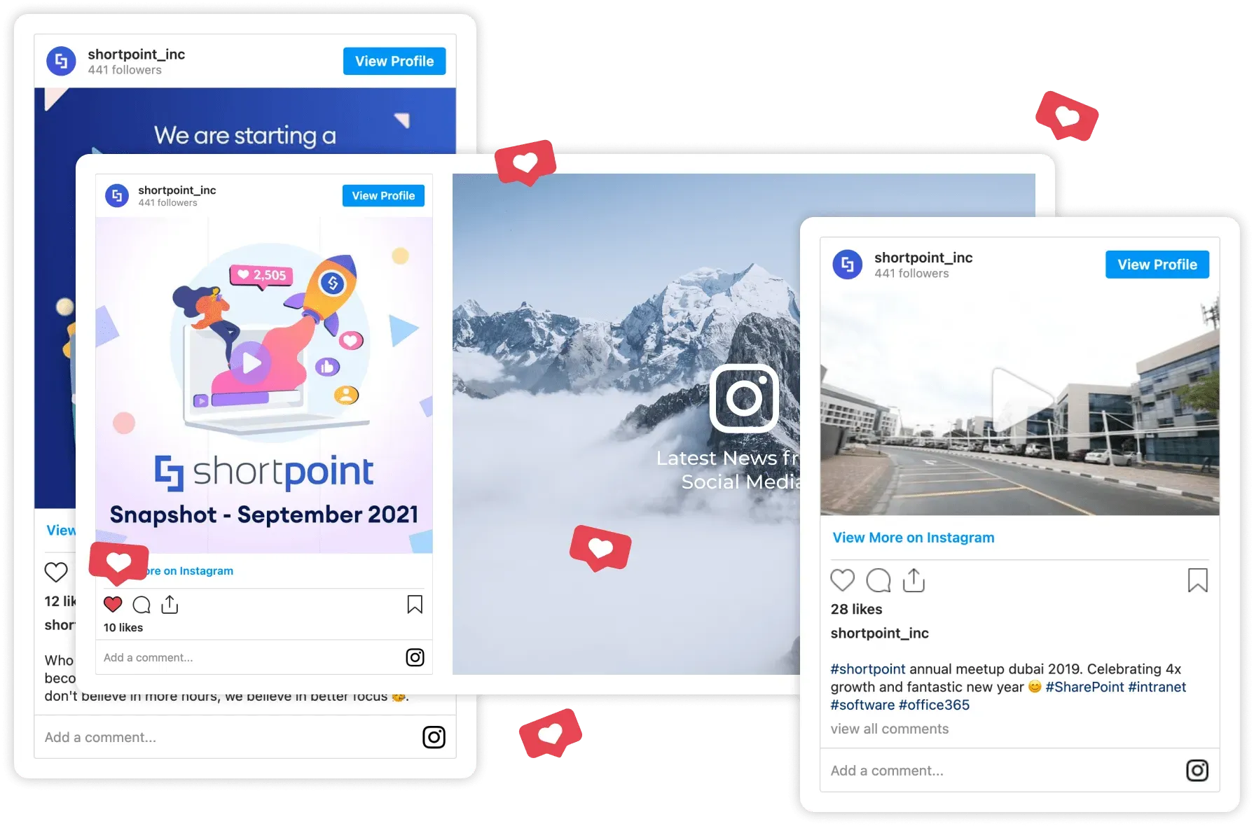
1. Bring a social media feed onto the page
Embedding your company's social feed directly on a SharePoint page turns a one-way announcement into something employees can see updating in real time. In ShortPoint, each platform has a dedicated Design Element — Facebook , X , YouTube , and Viva Engage — that updates automatically as new posts go live. The first three reinforce your public brand presence on a homepage or marketing/comms hub; the Viva Engage element goes a step further by pulling internal conversations onto the page, which supports internal comms and encourages collaboration by letting employees see colleagues talking, not just the company broadcasting.
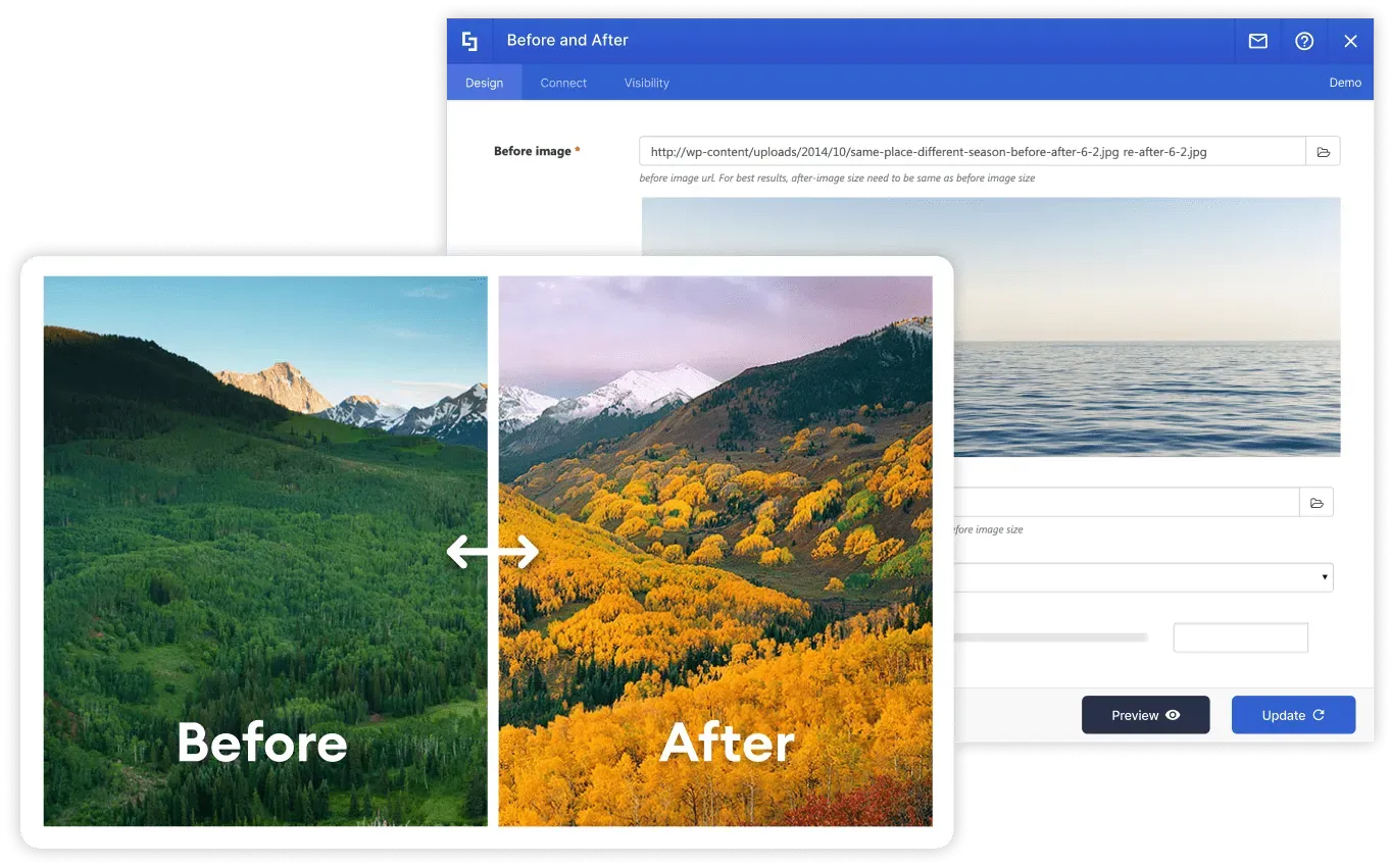
2. Add a before-and-after slider employees can drag
Some updates are easier to show than to announce: a rebrand, an office renovation, a redesigned product, a refreshed intranet page. The Before and After element puts two images in one frame with a draggable slider between them, so employees physically reveal the change themselves instead of glancing at two static screenshots. That small moment of interaction is exactly what makes people stop scrolling. And it works on almost any page, from a comms hub announcing the new brand to a facilities page showing the renovated office floor.
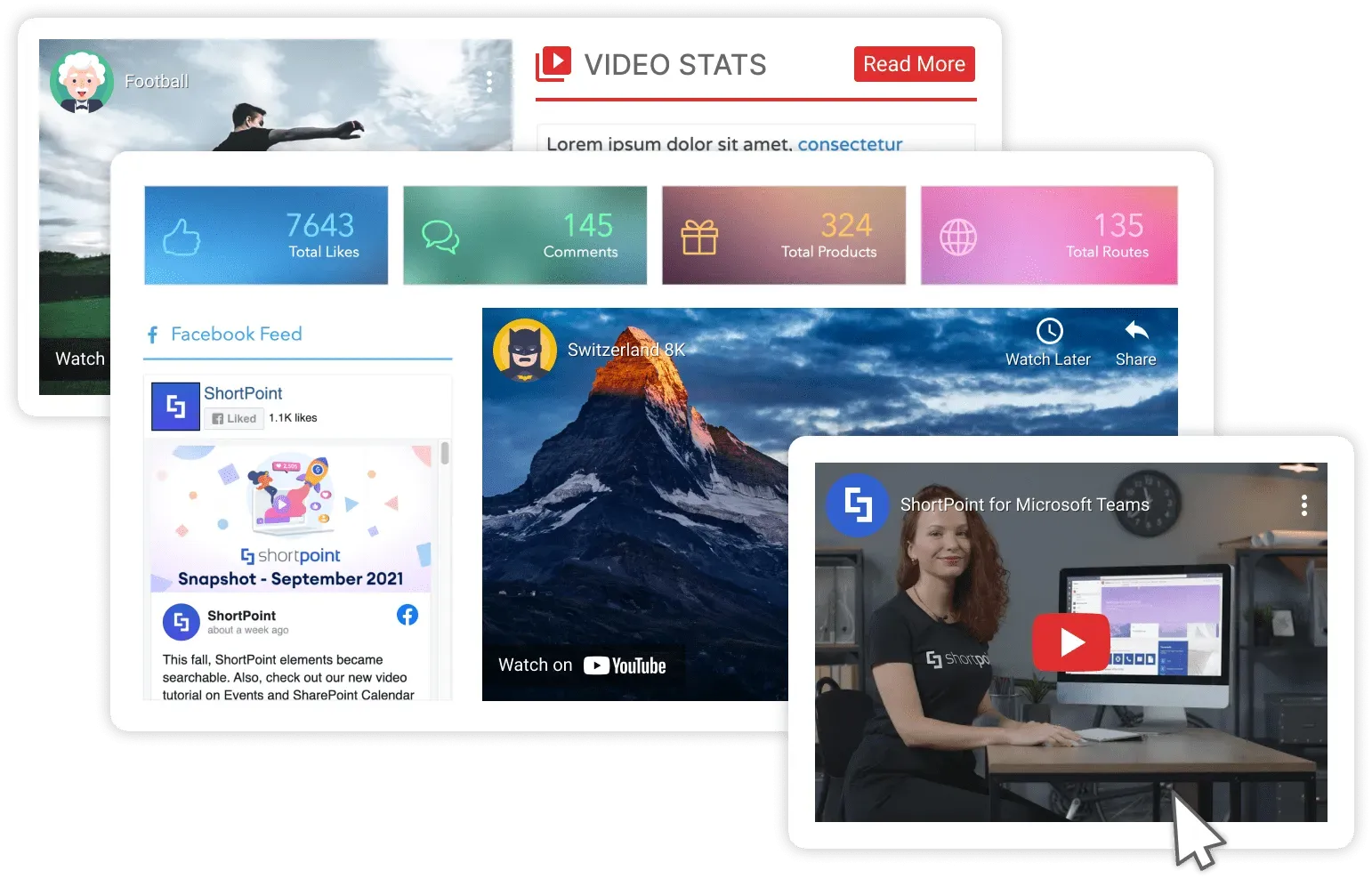
3. Build a video-first tutorial section
Replace a page of written instructions with a video-led layout: organize content with the Tabs or Accordions element, embed the videos with the YouTube Video or Vimeo Video element, and put document downloads underneath with the File List element. Employees searching for "how do I..." find the video first, and the supporting document is there if they need to double-check a detail. This is a strong fit for a knowledge base, an IT support page, or any knowledge management hub.
4. Add an employee recognition wall
Dedicate a section of any team or HR page to recognizing employees by name such as top performers, work anniversaries, or peer shout-outs. It's a small addition, but it's one of the more reliable ways to increase the number of people who actually visit the page more than once — recognition is one of the strongest levers for engagement (see the figure above). The Person Cards element is purpose-built for this, displaying names, photos, and job titles in a scannable profile grid; the Image Boxes element works as a lighter, photo-led alternative for one-off shout-outs.
5. Add a quick links hub so every department finds its page fast
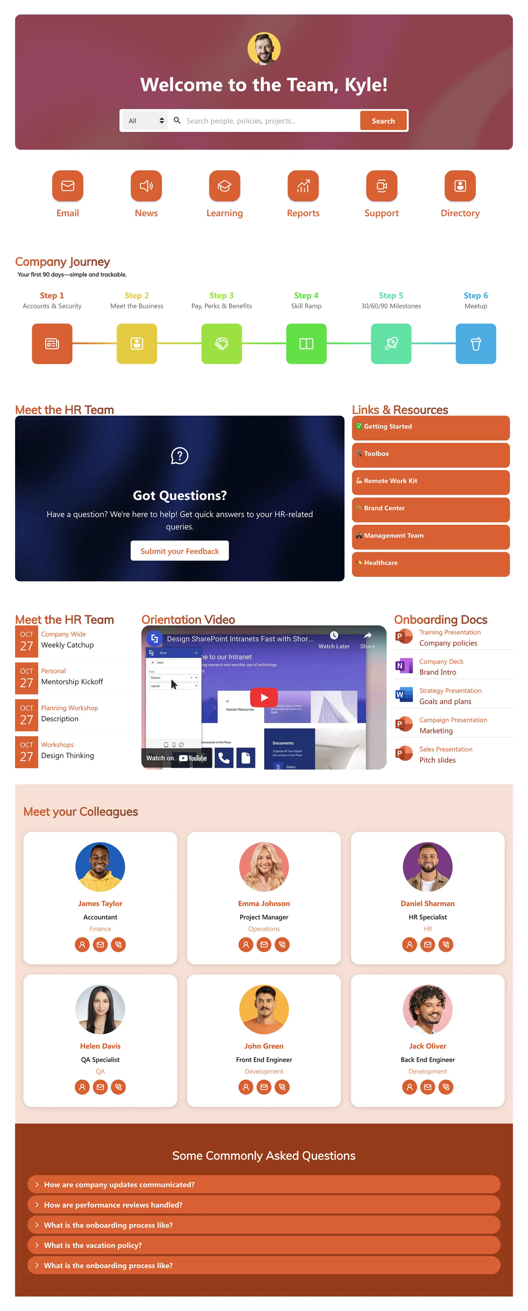
Over 47% of digital workers struggle to find the information they need at work (Gartner), so a clear route out of the homepage matters more than it looks. Rather than packing content for five departments into one page, give each of them a shortcut: a quick links hub near the top where Finance, Sales, and Marketing each jump straight to their own space in one click. The Quick Links element is purpose-built for this, delivering instant access to frequently visited pages, documents, or tools in a compact block — and the Tiles element works as a more visual alternative when you want larger, image-led navigation. It keeps the homepage light while still feeling personalized, because the first thing every employee sees is a path made for them.
6. Add a live countdown for dates that matter
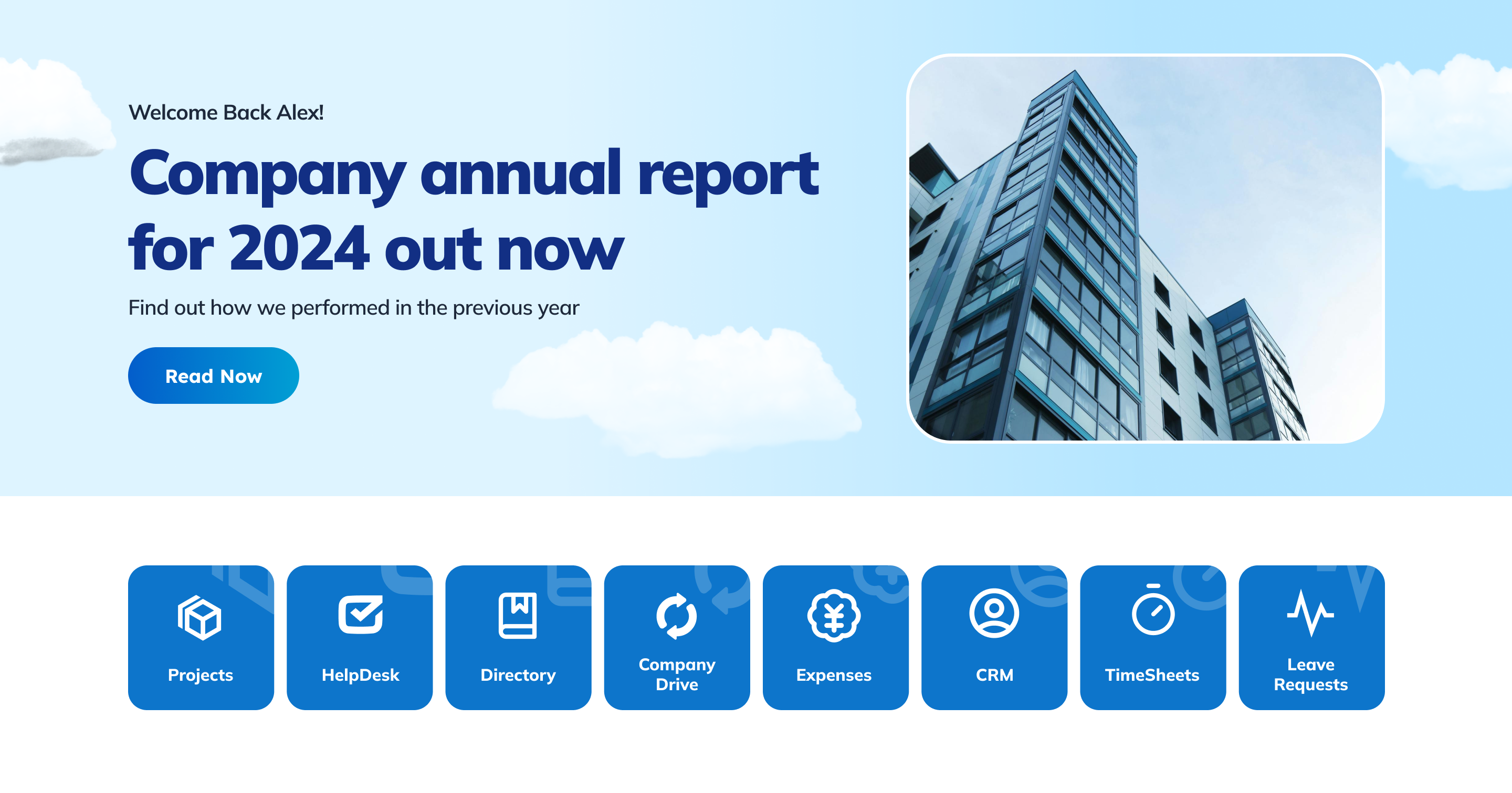
A countdown to open enrollment, a product launch, or an all-hands event creates a small sense of urgency and gives people a reason to check back. The Countdown element handles this out of the box, and it's a lightweight addition to a homepage or communications page. On a page built around a specific campaign or milestone, a countdown pairs naturally with an animated metrics counter showing progress toward the goal.
Tip: countdowns work best when the date actually matters to the reader. Overusing them on routine content trains employees to ignore them.
7. Pull in real-time data instead of a static summary
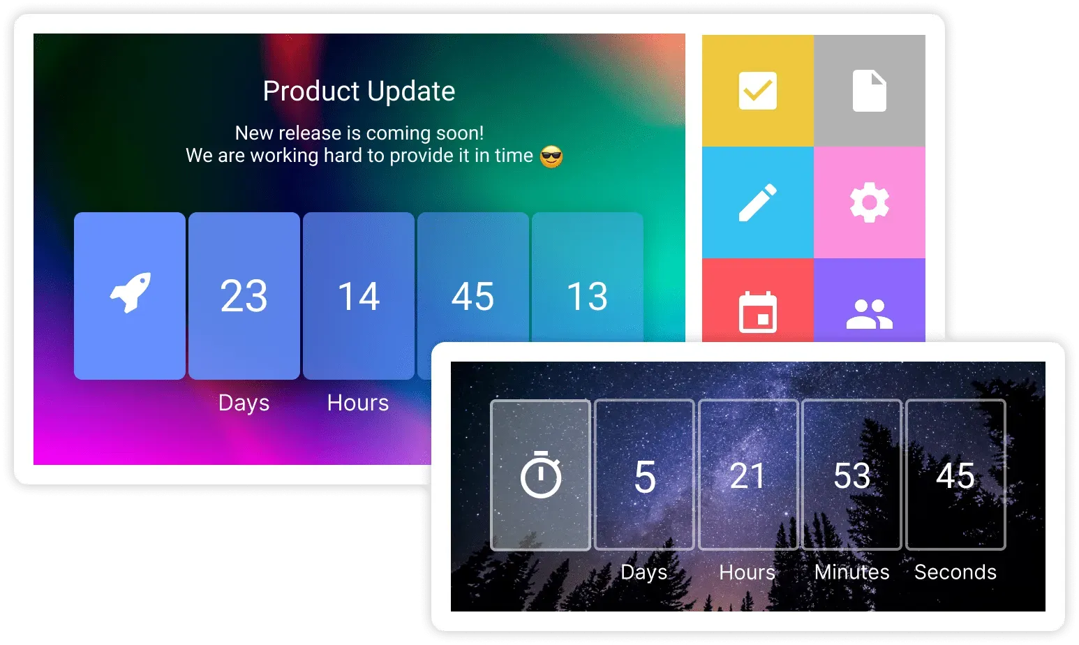
A dashboard fed by embedded Power BI reports, Microsoft Planner, or an external database gives employees stronger data visualization and a live number instead of a report that's out of date the day after it's published. This is where ShortPoint's Connect feature matters most — it's built specifically to bring Microsoft 365 tools and other business data from 27+ sources into the SharePoint environment without custom development, feeding compatible elements like List , News Cards , and Image Boxes with live content. It's a natural fit for a project or operations hub.
8. Personalize the page into a "My Hub" experience
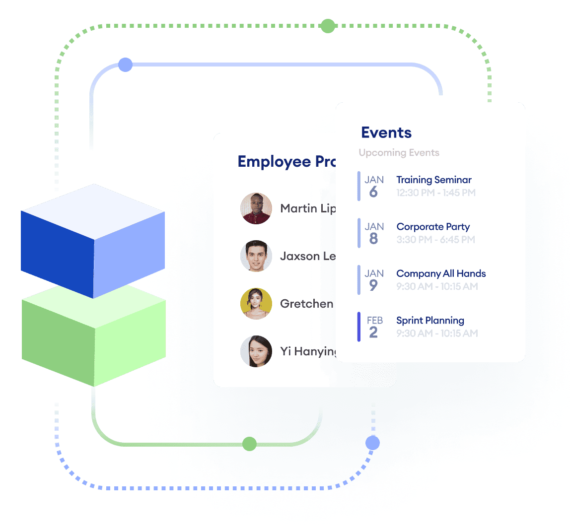
Instead of showing one static homepage to everyone, display content based on who's viewing it — a core move in thoughtful digital workplace design — so the page feels built for the individual employee rather than the whole company at once. ShortPoint's Visibility feature does exactly this: it shows or hides any Design Element based on user groups, departments, or device types, so HR can see different content than Sales on the same page at the same URL. ShortPoint Connect takes it a step further by filling those elements with content specific to the viewer: Microsoft Teams channels related to them, their upcoming Outlook events, files they've recently modified, and more. So two employees opening the same page each see their own working day. Even a partial version — a targeted announcement panel and a filtered task list — noticeably increases how relevant a homepage feels.
9. Put your locations on an interactive map
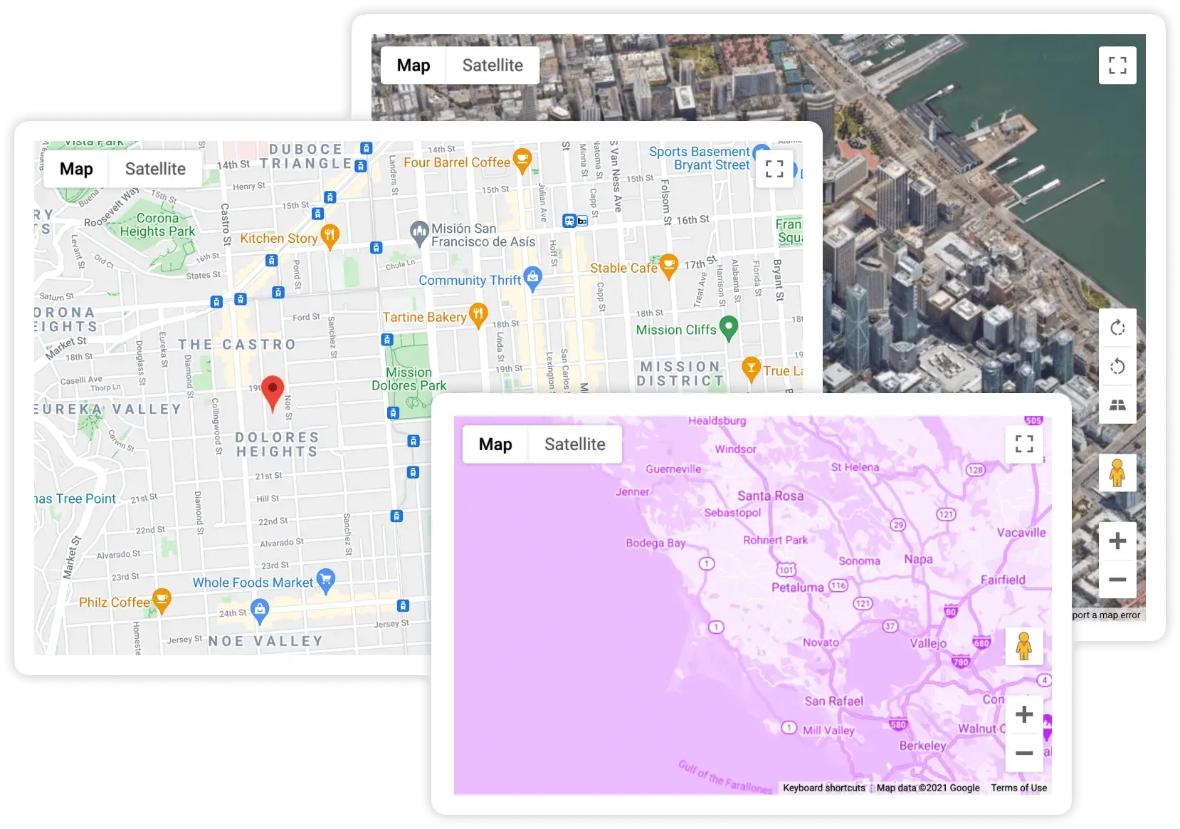
For any organization spread across more than one place (branch offices, retail stores, clinics, campuses) an embedded map gives the page a practical reason to be visited beyond reading news. The Map element embeds an interactive Google Map directly on your SharePoint page, so employees can find an office address, get directions to an off-site event, or see every branch location at a glance without leaving the intranet. It's a natural fit for a contact page, a visit-us section, or a new-hire onboarding page that answers "where do I go on day one."
10. Add a metrics counter tied to a real goal
A simple animated counter — units shipped, tickets resolved, safety days, fundraising totals — turns an abstract company goal into something visible and shareable. The Counter Boxes element animates the numbers counting up as the page loads, and it works especially well alongside a Countdown element on a page built around a specific campaign or milestone.

11. Refresh one layout across two different brand looks
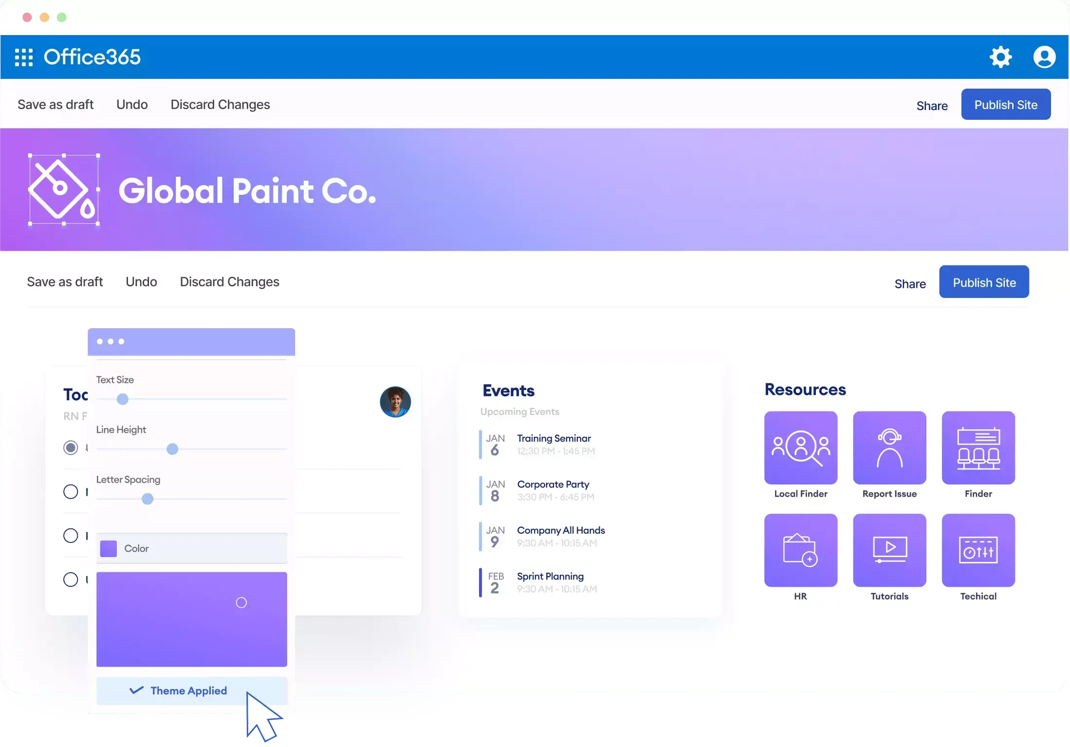
You don't need two different page structures to look distinct across two brands, regions, or sub-companies. Apply the same layout with a different palette, logo, and fonts through Theme Builder . This is a useful idea to test before committing to a full redesign, since it shows how much a layout depends on branding versus its underlying content.
12. Add a searchable FAQ block to any long page
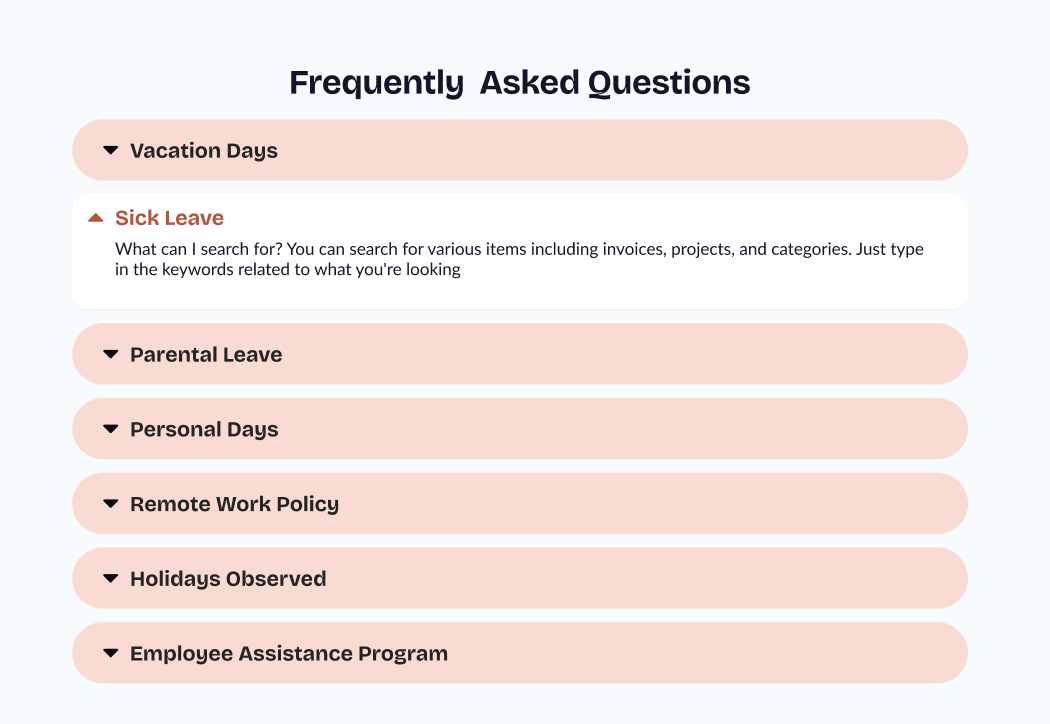
Any page that answers recurring questions including HR policies, IT setup, a project hub, benefits from a compact FAQ section at the bottom instead of forcing employees to scan the whole page again. The FAQs element presents questions in an expandable accordion format, and you can make it genuinely searchable by adding the Search widget from the Search & Filter Toolbar , so employees type a keyword and jump straight to the answer. It also gives you a natural place to answer the exact questions employees are already asking your help desk.
Use ShortPoint AI Designer to speed up ideation
Deciding which of the ideas above to try can take as long as building the page itself, especially when you're weighing a countdown timer against a metrics counter, or wondering whether a personalized homepage is worth the effort before you've seen it. ShortPoint AI Designer shortens that decision by generating a working draft in minutes instead of hours: describe the idea in a prompt, such as "add a before-and-after slider and a countdown to our homepage," and AI Designer builds a page that already includes it, so you're reacting to a real layout instead of imagining one.
That speed comes with a reliability advantage over sketching ideas in a slide deck or a whiteboard. Because AI Designer draws from ShortPoint's existing library of Design Elements and templates, every idea it generates is built from publishable components, not a visual concept someone still has to figure out how to implement afterward. That means you can test three or four ideas from this list in the time it used to take to mock up one, and every version you compare is a working starting point you can refine and ship.
Tip: when you're not sure which idea fits, ask AI Designer for more than one version of the same page. Comparing two working drafts side by side is a faster way to choose than debating it in the abstract.
For prompt ideas that map directly to techniques like these, see SharePoint AI Prompts: 25 Prompts to Build Intranet Pages . For a complete walkthrough of the tool, see Introducing ShortPoint AI Designer .
How to bring these ideas to your own SharePoint site
None of the ideas above require custom development. ShortPoint's Page Builder lets you place any of these components visually in Live Mode, and the Design Elements library — from Person Cards and Counter Boxes to Map, Before and After, and the social feed elements — covers every idea on this list. For the full catalog with a tutorial for each element, see the complete guide to ShortPoint Design Elements . If you'd rather start from a full page and adapt it, ShortPoint AI Designer can build a first draft from a prompt or a reference image, which you can then customize with these ideas. Once a design idea works on one page, ShortPoint's Copy & Paste feature lets you carry it to another page or site without rebuilding it.
For Microsoft's own gallery of modern SharePoint site designs, see the SharePoint Look Book from Microsoft Adoption .
Frequently asked questions
New to ShortPoint? Start a free 15-day trial, no credit card required, or talk to our team to see which of these ideas fits your intranet best.
Ignite your vision. Install ShortPoint directly on your site, or play in sandbox mode. No credit card required.