12 SharePoint Intranet Examples for 2026, and Why Each One Works
Note: Every example below is a template-based design from the ShortPoint library, so you can open it, copy it and rebuild it on your own SharePoint site without code. We’ve paired each one with the customer stories of organizations running the same pattern.
Most SharePoint intranet examples online fall into two camps: screenshots of real company intranets you can admire but not inspect, or template galleries with no explanation of why one layout works and another doesn’t. This guide sits in between. Twelve SharePoint site examples — homepages, HR and onboarding hubs, an IT help desk, document and knowledge hubs, a team site, a social hub, a news centre and a frontline homepage — each with the design decision that makes it work and the template to copy it from. Ready to build? Start a free trial .

Luisa Silva, CMO at ShortPoint | Updated: September 10, 2026 • 14 min read
12
Intranet examples
12M+
Users on ShortPoint intranets
350K+
SharePoint sites designed
15 days
Free trial, no credit card
Key Takeaways
- Copy the pattern, not the colors. The best SharePoint intranets are built around employees’ top tasks, reachable in two clicks — the branding is the easy part.
- Twelve intranet types, not twelve HR pages. This guide covers homepages, HR, onboarding, IT, documents, knowledge, team sites, social, news and frontline — because a search-first homepage and a frontline launcher solve different problems.
- Connected beats static. Every example pulls news, people, events and documents from live Microsoft 365 data, so the page maintains itself.
- Templates launch in weeks, not months. Organizations that start from a proven template and launch a homepage plus one or two hubs get to adoption fastest.
Built for 2026
This edition adds five intranet types that weren’t here before — dashboard, IT help desk, team site, social hub and frontline — plus AI Designer prompts you can paste to generate any layout below, and customer stories for the patterns in production.
Jump to a Template
What the best SharePoint intranet designs have in common
Before the examples, the six patterns you’ll see repeated. These are what to copy.
| Pattern | What it looks like in practice | Why it matters |
|---|---|---|
| Top-tasks homepage | The five to seven things employees do most — handbook, tickets, payroll, directory, news — sit above the fold | People return to an intranet that saves them time, not one that looks nice |
| Two-click rule | Every high-frequency task is reachable within two clicks of the homepage | Navigation depth is the biggest predictor of “I’ll just email HR instead” |
| Search first | A prominent search box in the header or hero, plus search inside every document hub | Beyond roughly fifty documents, browsing stops working |
| Self-service hubs | Dedicated HR, IT and document pages with FAQs, forms and request links | Each answered question is one fewer support ticket |
| Live data, not static text | News, events, people and documents pulled from SharePoint lists, libraries and the Microsoft Graph | Static pages go stale in weeks; connected pages maintain themselves |
| Streams, not one feed | News split by category with a ticker for urgent notices | Different audiences and urgency levels need different containers |
Still deciding on structure rather than looking at designs? Start with our guide to modern SharePoint intranet design , which covers information architecture first.
SharePoint intranet homepage examples
The homepage is the digital front door and the page most SharePoint company intranet projects get wrong — usually by trying to show everything. These three intranet homepage examples make three different bets about what employees arrive to do.
-
Homepage
1. The daily-start homepage
Intranet Layout 2 · trending in the template library
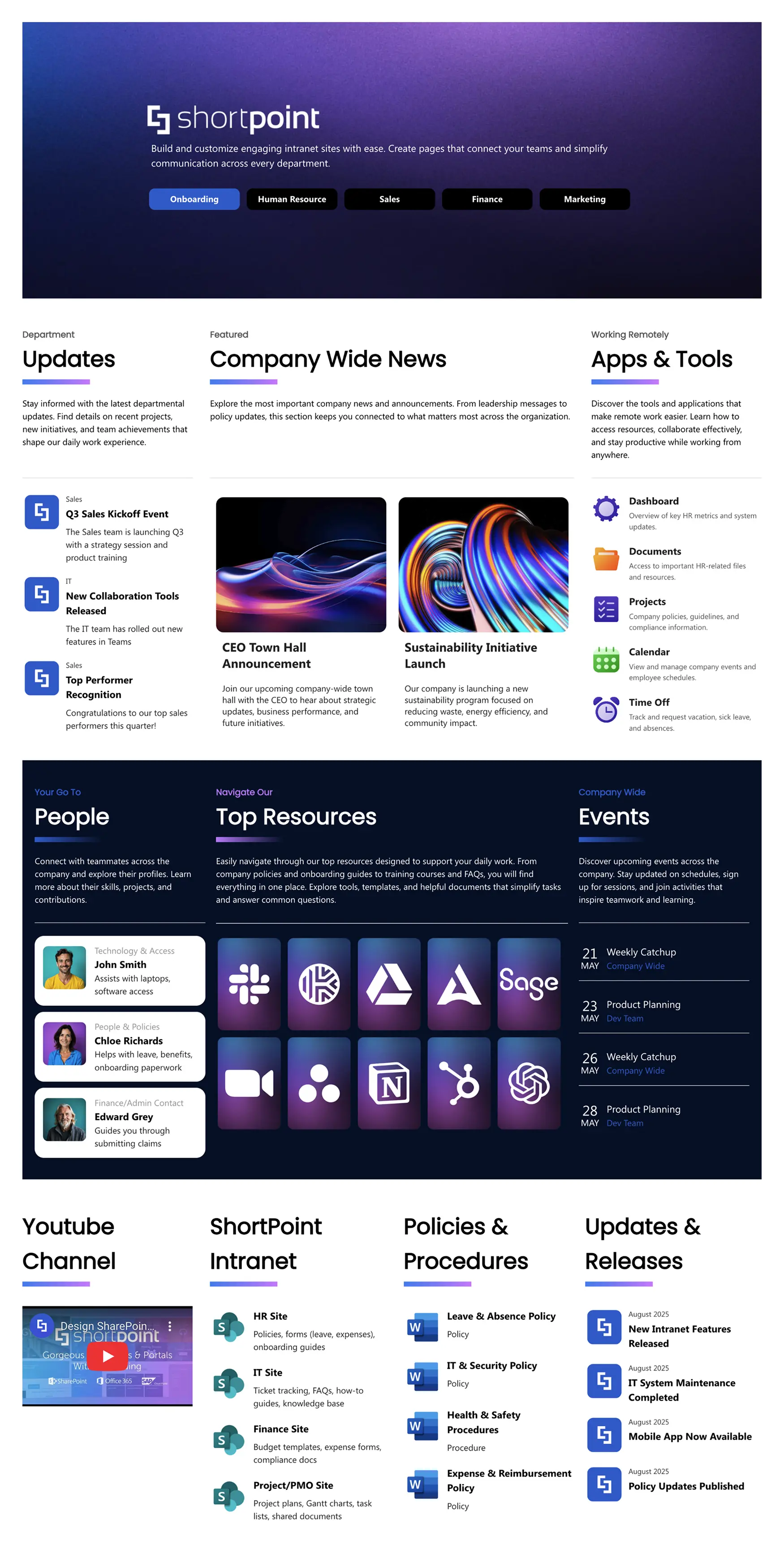
Built around what an employee needs in the first five minutes of the day. Three essentials sit up front — department updates, company news and core applications — with people cards for go-to contacts, a “Top Resources” block of the most-used links, and an events panel for what’s coming up.
Why it works: It makes a bet on daily habit. Nothing on the page needs explaining and the most-clicked links are one click away, which is what turns an intranet from a launch-day novelty into a browser home page.
Best for: Organizations that want a single, calm starting point for company-wide information and tools.
Who runs this pattern: Dubai Silicon Oasis Authority rebuilt its intranet on ShortPoint in two weeks instead of an estimated three months. Read the story
See the template -
Homepage
2. The search-first homepage
Intranet Layout 6 · trending in the template library
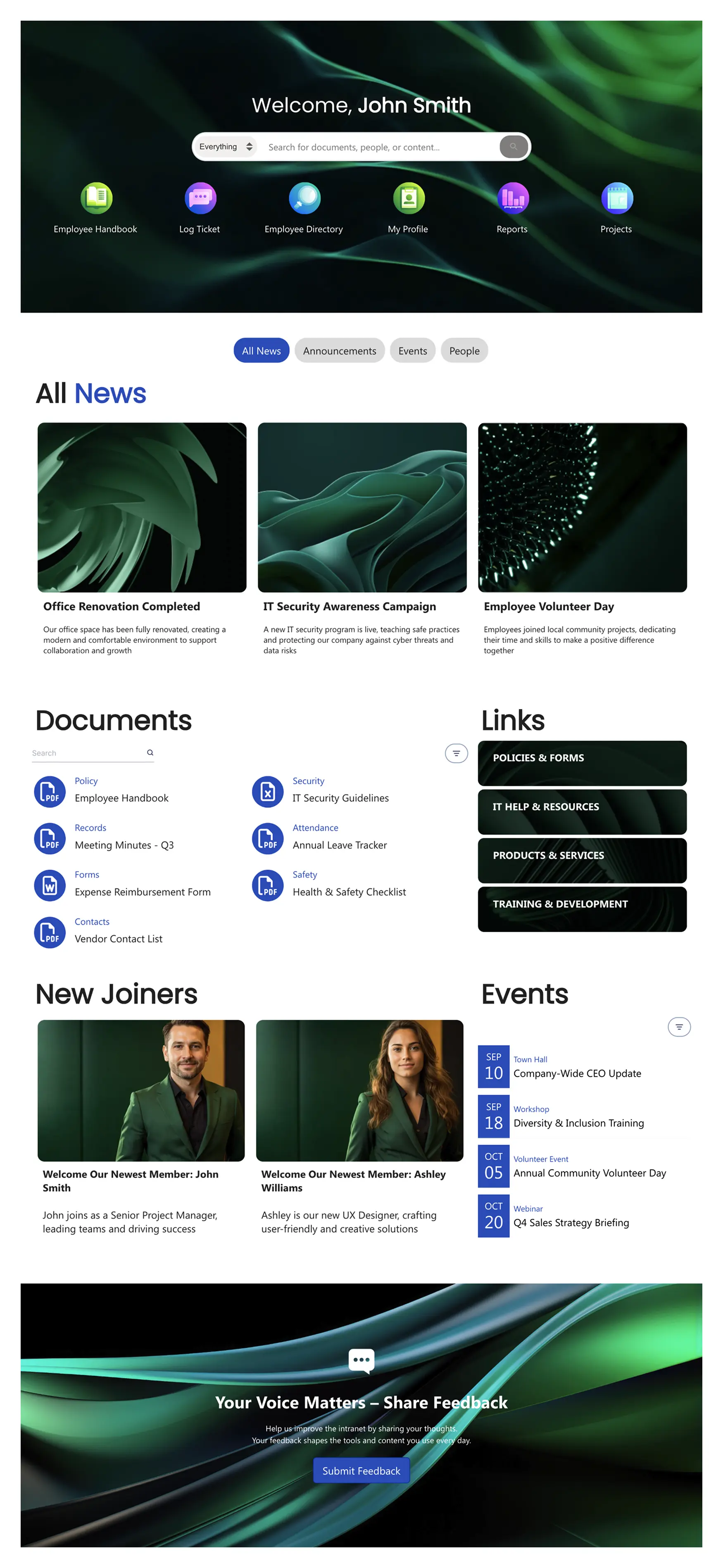
A personalized hero and a large search box dominate the top of the page. Quick icons jump straight to self-service destinations — handbook, IT tickets, payroll — while topic buttons filter news to what’s relevant. New joiner profiles add a human touch, and a feedback banner gives employees a way to say what’s missing.
Why it works: It assumes people arrive with a question, not to browse. Search and self-service icons answer “where do I…?” before anyone has to ask a colleague — the fastest way to cut support tickets.
Best for: Organizations whose main complaint is “nobody can find anything.”
Who runs this pattern: Southern New Hampshire University replaced a vendor intranet that had become a constant pain point. Read the story
See the template -
Homepage
3. The dashboard homepage
Intranet Home 4

A KPI counter row and an alert banner sit above a grid of department tiles, with apps, resources, team information and schedules below. The page reads more like an operations console than a newsletter.
Why it works: Fast-moving organizations need to know where things stand before they read about them. Live counters connected to SharePoint lists give everyone the same numbers, and the alert banner carries operational notices without hijacking the layout.
Best for: Operations-heavy companies, multi-site organizations, and any team that already lives in dashboards.
Who runs this pattern: World Acceptance Corporation’s small team shipped a portal they never expected to be able to build in-house. Read the story
See the template
More homepage inspiration
For more on SharePoint homepage best practices and communication site examples:
HR, onboarding and IT SharePoint site examples
Human resources SharePoint site examples are the most searched-for department pages, and IT is close behind — between them they field more repeat questions than every other team combined. These three designs turn those questions into self-service.
A quick walkthrough on building SharePoint sites like these without code.
-
HR
4. The HR self-service hub
HR 11
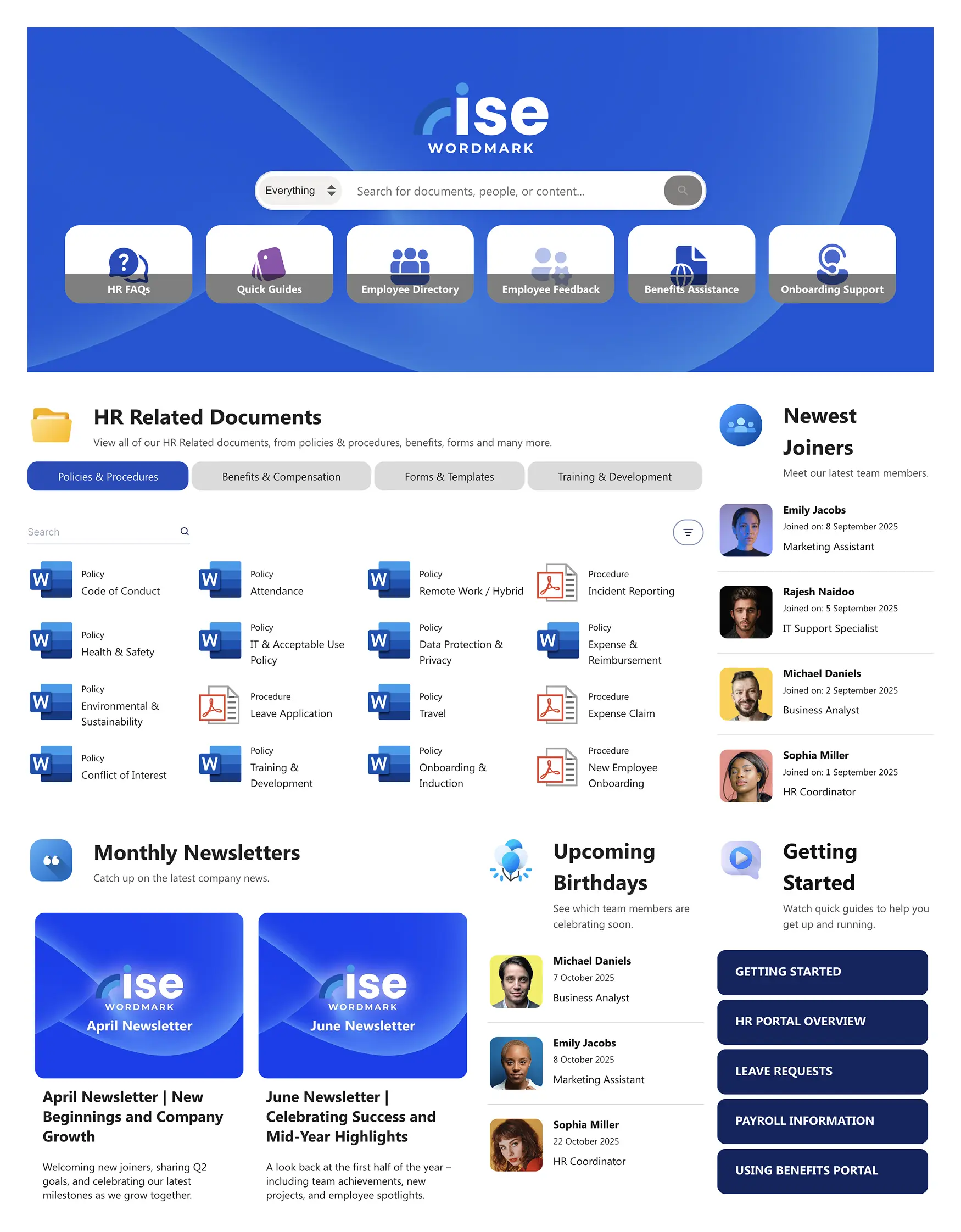
Universal search and quick links sit in the header. The main body is a document center with tabs for Policies, Forms and Benefits, flanked by widgets for new joiners and company news, and a “Getting Started” section with quick actions for the most common requests.
Why it works: Tabs turn one overwhelming library into three manageable ones. Employees pick the category first, then search within it — the same mental model they use in a filing cabinet.
Best for: HR teams with a large volume of documents that employees need to find without help.
Who runs this pattern: Knoll stopped spending development dollars on an intranet that still wasn’t right. Read the story
See the template -
Onboarding
5. The onboarding journey
Onboarding 1
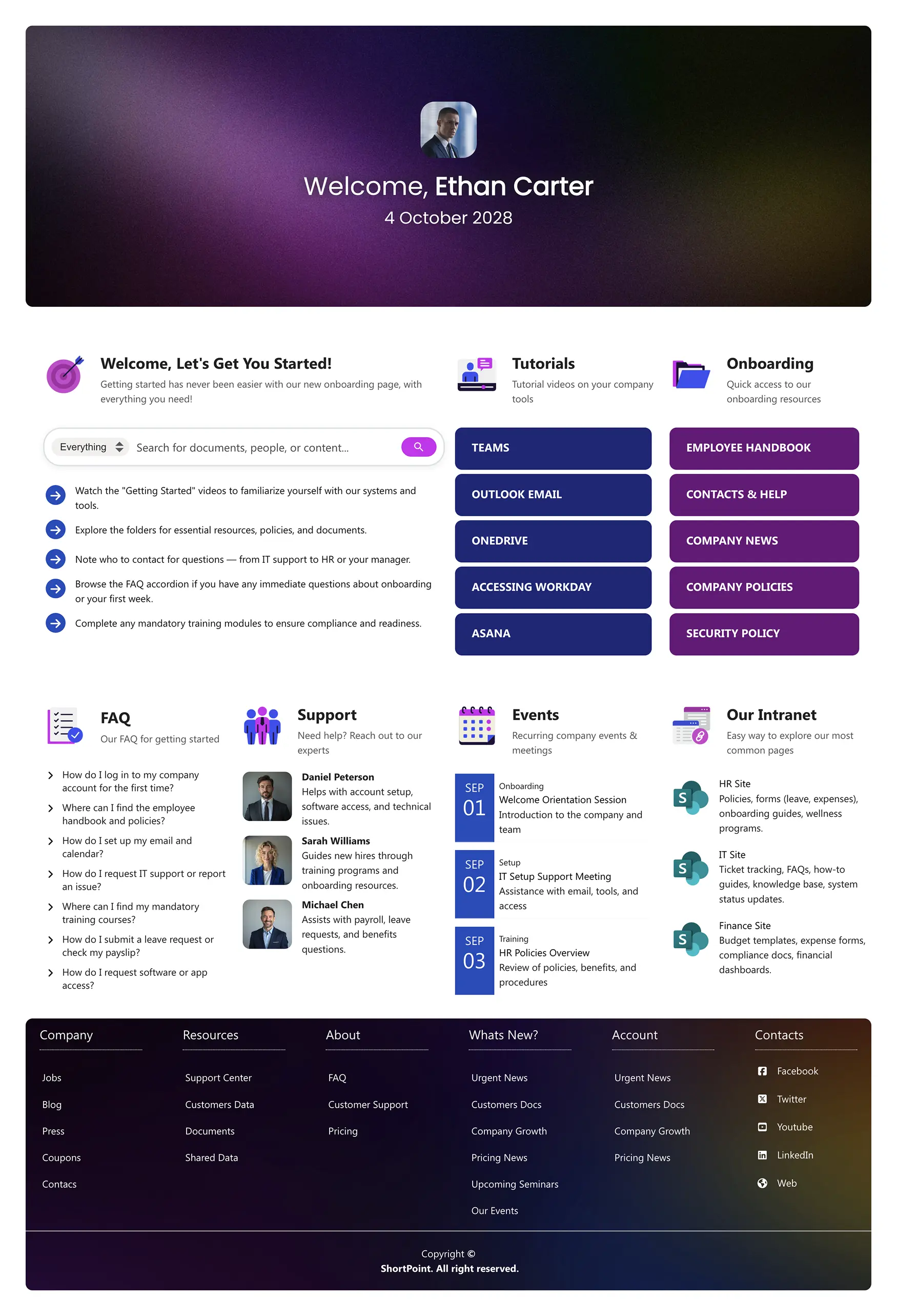
A personalized welcome, a “Let’s Get You Started” checklist, quick links to Outlook and Teams, and direct access to the employee handbook. Further down: tutorials, upcoming events and the contacts a new hire will need in their first weeks.
Why it works: Onboarding is a sequence, and this page is structured as one. The checklist gives new hires a sense of progress, and putting the handbook and team contacts on the same page removes the “who do I ask?” problem entirely.
Best for: Companies standardizing the first-week experience across teams and locations.
See the template -
IT
6. The IT help desk
IT Helpdesk
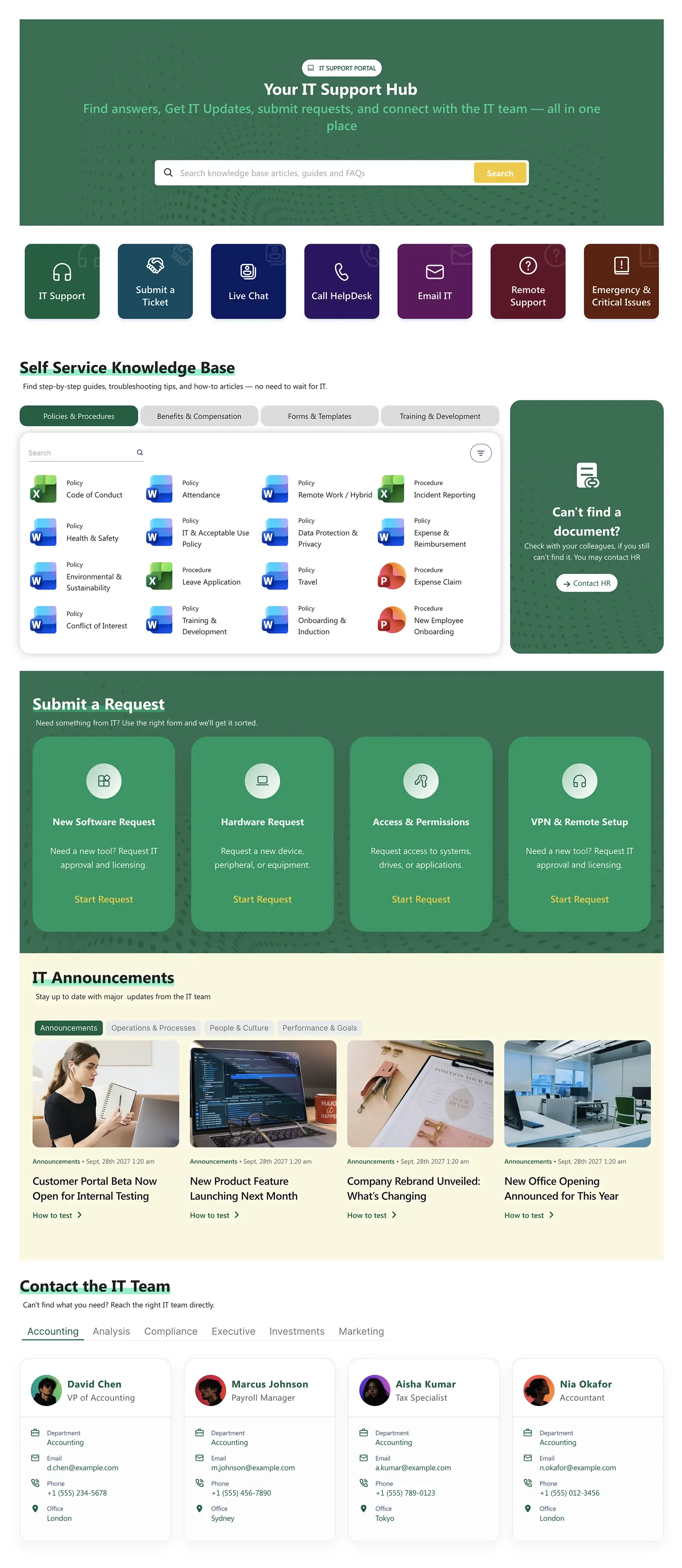
A searchable knowledge base sits at the top, followed by request links for the most common tickets — access, hardware, software — a system-status and alerts panel, and a contacts block for when self-service isn’t enough.
Why it works: It puts the answer before the form. Most IT tickets are repeat questions, so surfacing the knowledge base above the request button deflects a large share of them, and the status panel stops the “is it just me?” tickets during an outage.
Best for: IT teams that want to cut ticket volume and give employees one predictable place to go for support.
Who runs this pattern: A national TV network built internal sites its multi-generational workforce actually finds friendly. Read the story
See the template
Plan the structure before you pick a design
For more on SharePoint HR best practices and examples:
- → How to structure an HR SharePoint site
- → The full set of HR SharePoint templates
- → More SharePoint onboarding templates
Also in the library: HR 2 (centralized HR portal with three content streams) and HR 12 (employee services hub with FAQ and team directory).
SharePoint document hub, knowledge base and team site examples
Employees lose real time every week hunting for files, answers and the right colleague. These three SharePoint hub site examples shorten that search — for documents, for institutional knowledge, and for a department’s own work.
-
Documents
7. The searchable document hub
Documents 1
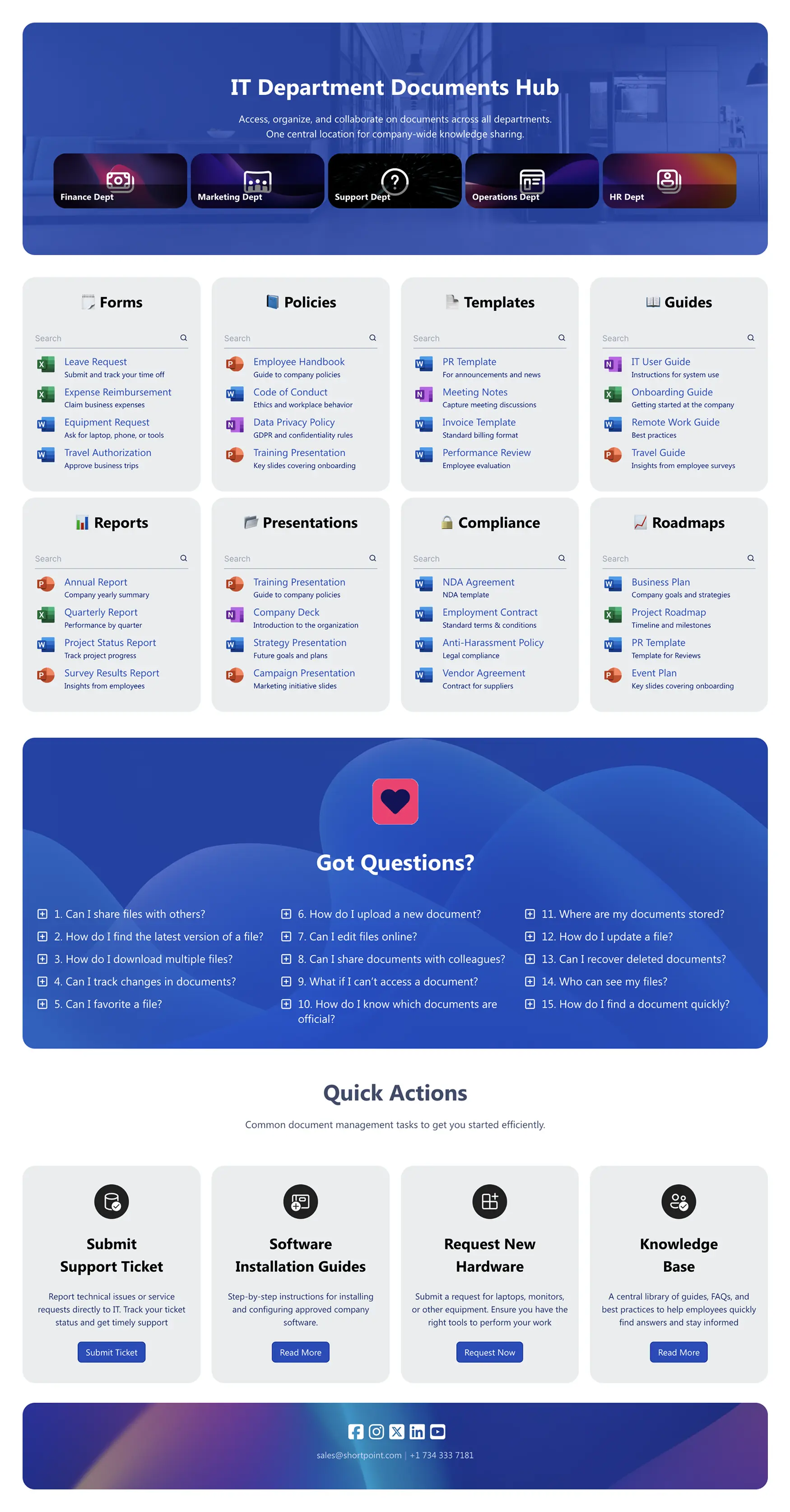
Forms, policies, templates and compliance documents sorted into clear categories. A hero with department shortcuts speeds navigation, integrated search finds individual files, and an FAQ block handles the recurring “where is…?” questions.
Why it works: Categories plus search is the only combination that scales past a few dozen files. Browsing alone fails at volume; search alone fails when people don’t know the document’s name.
Best for: Companies consolidating official documents from several departments into one place.
Who runs this pattern: Liliʻuokalani Trust called its ShortPoint project one of the smoothest it had ever run. Read the story
See the template -
Knowledge Base
8. The knowledge base
Knowledge Portal
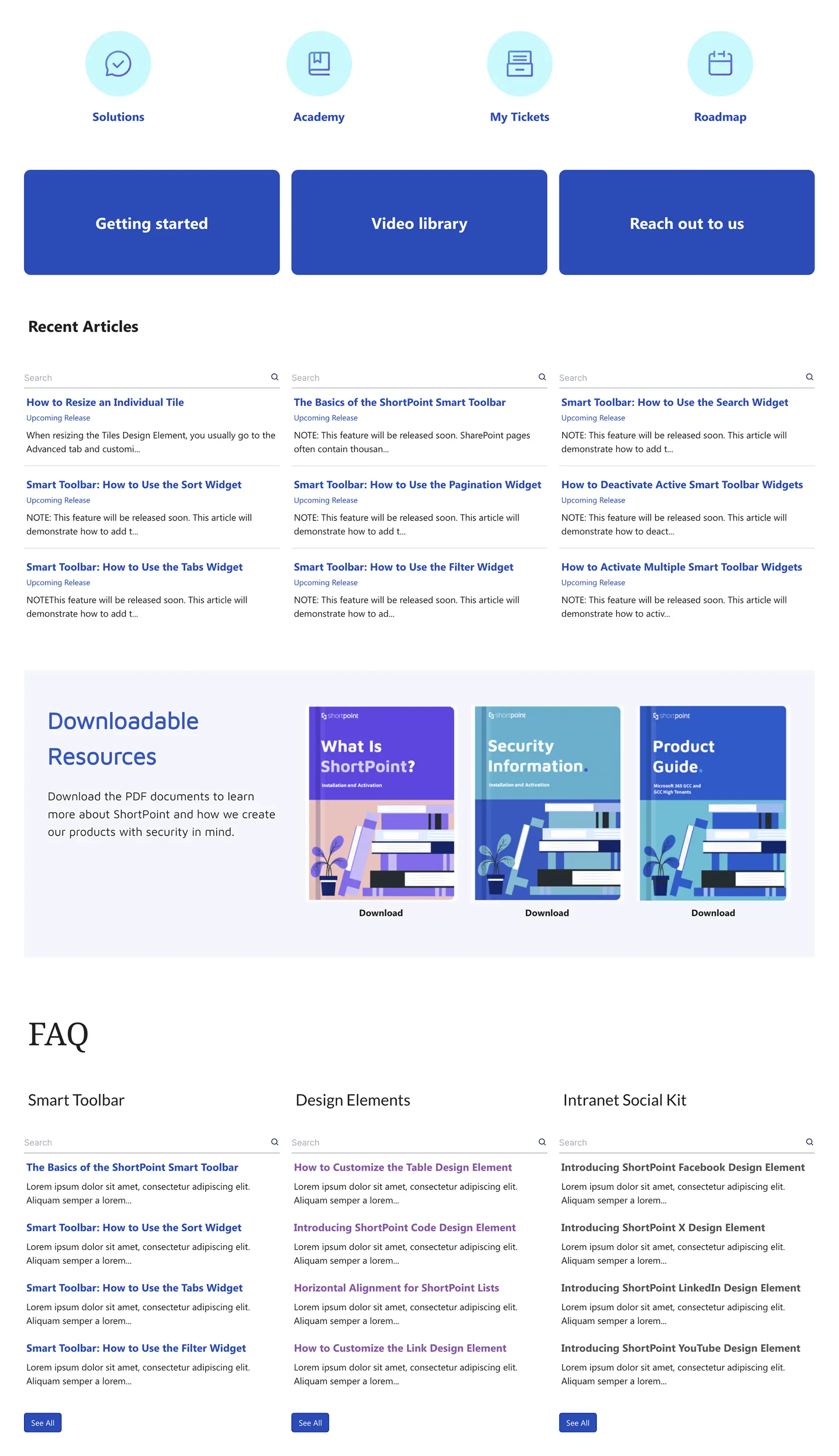
Documents, FAQs and help resources come together in one structured hub. The visuals and section labels are easy to swap, so the same architecture works for IT, HR, Legal or Operations, and the layout adapts cleanly to tablets and phones.
Why it works: A knowledge base only earns trust when every department’s version looks and behaves the same. Reusing one pattern means employees learn the layout once.
Best for: Organizations rolling out self-service knowledge across several departments at once.
See the template -
Team Site
9. The department team site
Team Home
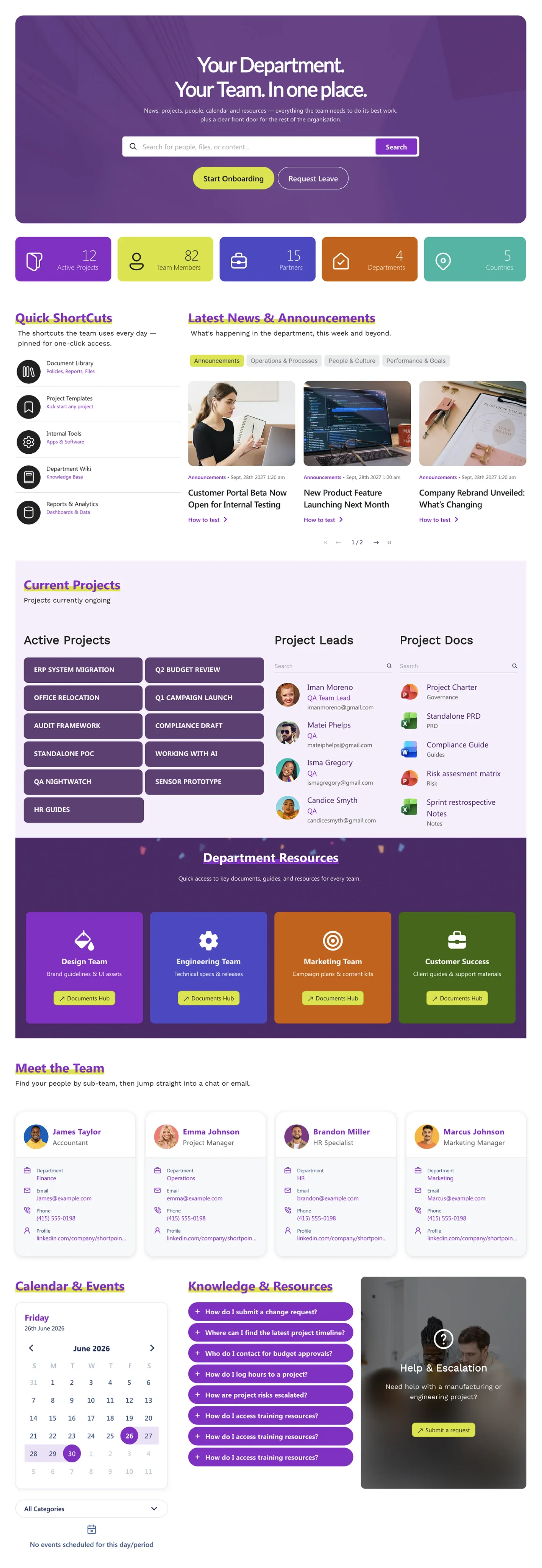
Team news, current projects, goals, a shared calendar, a small knowledge base and a directory — everything one department needs to run its week, on a single page that links out to the company-wide intranet above it.
Why it works: A department hub inherits navigation, brand and search from the intranet and narrows the scope to what the team owns. That separation keeps the homepage clean and gives each department a space it will actually maintain.
Best for: Finance, Legal, Operations and any cross-functional team that has outgrown a shared folder. It is also the answer to “team site or communication site?” — see the FAQ below.
See the template
Make every hub above pull live data
Every hub above can pull documents, FAQs and status data live from SharePoint lists, libraries and the Microsoft Graph. New to that?
For document workflows that collect files as well as publish them, see Documents 2 and its OneDrive invoice-upload panel.
SharePoint social hub, news centre and frontline examples
Internal communications owns most intranets, and the three designs it asks for most are a place for culture, a place for news, and a version that works on a phone in a warehouse. Here is one of each.
-
Social
10. The social and culture hub
Social Layout 1
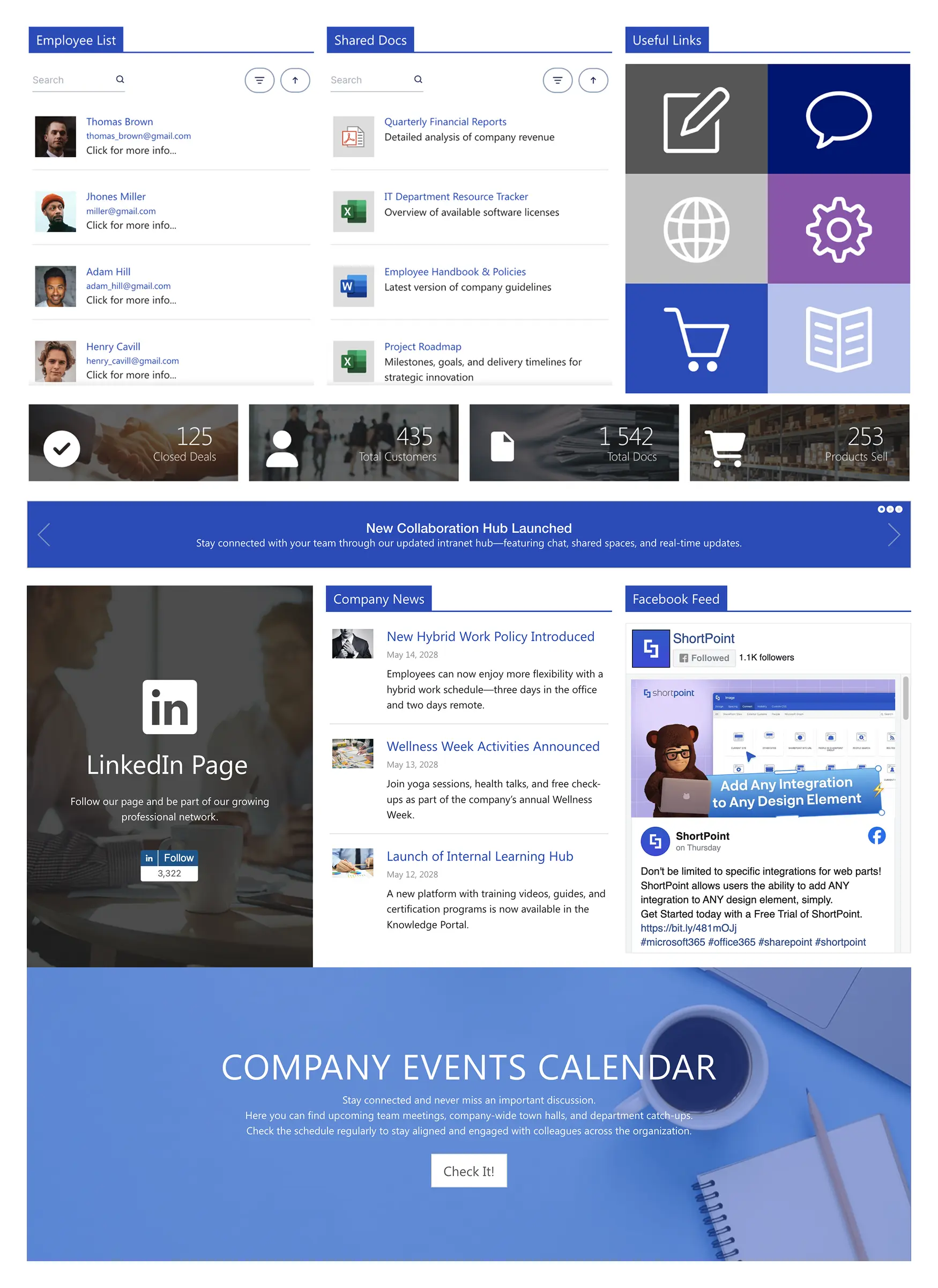
An activity feed, a poll widget, a recognition section and shortcuts to events and documents. Conversations from Viva Engage or Teams can be surfaced alongside company news, so the page shows what employees are saying as well as what leadership is announcing.
Why it works: Engagement follows visibility. Putting recognition and polls on the homepage tells people their voice belongs there — and gives internal comms a reason to expect return visits that news alone rarely earns.
Best for: Media, retail and any company where employee engagement is a board-level metric.
See the template -
News
11. The news centre
News Portal 6
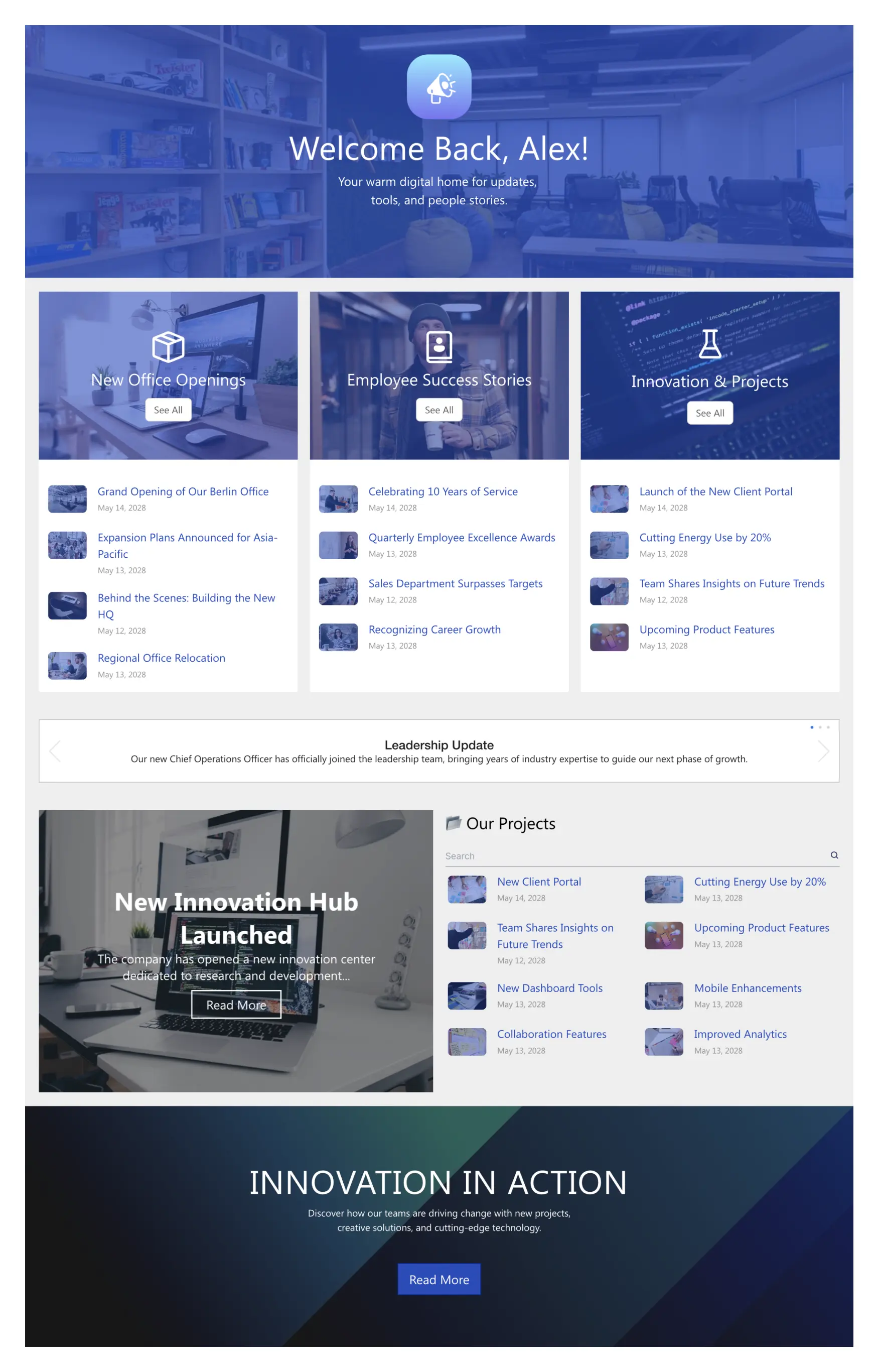
Three content streams surface what matters now — office openings, employee wins and innovation projects — while a leadership ticker carries time-sensitive notes and a feature banner announces major launches. The layout is deliberately skimmable.
Why it works: The streams separate urgency from celebration. Leadership notices get their own ticker so they are never buried under a birthday post, and the magazine-style grid rewards a quick daily check.
Best for: Companies with a high volume of news across locations that needs categorizing to stay readable.
Who runs this pattern: Partner BCN turned intranet design into a consulting practice on the back of it. Read the story
See the template -
Frontline
12. The frontline homepage
Retail 4
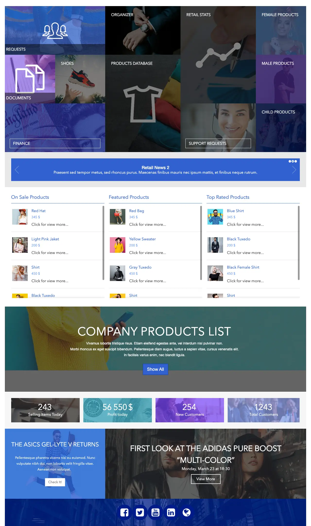
Shift schedule first, then short company news, quick links for timesheets and safety documents, and employee profiles — laid out for a phone held in one hand between customers, not a monitor.
Why it works: A meaningful share of most workforces will only ever see the intranet on a mobile screen. A layout that leads with the two things a frontline worker checks — when am I working, what changed — earns daily use; a desktop layout shrunk to a phone gets ignored.
Best for: Retail, logistics, healthcare, hospitality and field services. The same pattern adapts to any deskless workforce.
See the template
A milestone-driven variant
For a version of the news centre with an events slideshow and story blocks for launches and achievements, see News Portal 5 .
The ShortPoint toolkit behind every example
Every design above is assembled from the same no-code toolkit, inside your existing SharePoint Online, Subscription Edition or on-premises environment.
AI Designer
Describe the page you want and get a complete, on-brand SharePoint page back. Reshape any template with a sentence.
Page Builder
Drag-and-drop layouts in Live and Grid Modes. Multi-column sections, tabs, accordions and carousels native SharePoint doesn’t offer.
Theme Builder
Apply your colors, fonts and logo across every page and site in a few clicks — once, not page by page.
Connect
Link any element to SharePoint lists, libraries, calendars and 27+ sources including the Microsoft Graph, so pages update themselves.
80+ design elements
People cards, file lists, FAQs, counters, steps, news cards, quick links — the building blocks of every pattern on this page.
Responsive and accessible
Every template is mobile-first and built on WCAG 2.1 / ADA-friendly patterns, so the frontline example works as well as the dashboard.
How to copy these SharePoint intranet examples
You don’t need a developer to recreate any of the designs above. The same three steps work whether you start from a template or from a written description.
1. Start from the template, not a blank page
Open the example you want in the template library , insert it on a SharePoint page and edit layout and content visually in Page Builder. You inherit a validated structure, mobile-ready layout and accessible patterns, and spend your time on content rather than columns. Ready to try? You can start a free trial any time.
💡 The payoff: DSOA cut an intranet rebuild estimated at three months down to two weeks by starting from templates. Case study
2. Apply your brand once
Use Theme Builder to apply your colors, fonts and logo across every page in a few clicks. Consistent branding is what makes an intranet feel official rather than a side project — and doing it globally means you never restyle a page again.
🎨 Design tip: Brand the theme before you build the second page, not after the tenth.
3. Connect live data and launch iteratively
Link news, events, people and document sections to your SharePoint lists, libraries and Microsoft 365 sources with ShortPoint Connect , so the pages maintain themselves. Then launch a homepage plus one or two department hubs, test with a handful of employees, and add the rest once you know what they actually click.
Or describe it and let AI build it
If you would rather start from words than a template, ShortPoint AI Designer generates a complete, on-brand SharePoint page from a description, and any template above can be reshaped the same way. A prompt for the search-first homepage (example 2) looks like this:
AI Designer prompt: Build an intranet homepage with a personalized hero and a large search box, a row of six quick-link icons for the employee handbook, IT tickets, payroll, benefits, the help desk and the people directory, a company news section filtered by topic, a new joiners panel and a feedback banner at the bottom.
Treat the output as a first draft you refine. For a wider look at what AI can and can’t do for intranets, see AI for SharePoint .
Timeline: template-based vs. custom development
Template-based approach
- Week 1: Pick templates, apply brand
- Week 2: Connect content, test with 5–10 employees
- Week 3–4: Refine and launch homepage + first hubs
Typical total: 2–4 weeks
Custom development
- Months 1–2: Requirements and wireframes
- Months 3–4: Design mockups and revisions
- Months 5–6: Development, testing, fixes after Microsoft updates
Typical total: 6+ months
These examples vs. the SharePoint Look Book
If you searched for SharePoint intranet examples you have probably seen Microsoft’s SharePoint Look Book, now part of the Microsoft Adoption site. It’s a good, free source of layout ideas for communication sites and team sites, and worth a look.
Where the examples in this guide differ is in what happens after inspiration. Look Book designs are static starting points built from standard web parts, with the branding limits that come with out-of-the-box SharePoint. The templates above are fully editable page layouts with one-click branding, elements native SharePoint doesn’t offer, and live connections to lists, libraries and the Microsoft Graph. Use the Look Book to agree on a direction with stakeholders; use these examples when you need to ship it.
For inspiration beyond SharePoint, our roundup of company intranet examples covers intranets across platforms.
Ready to build a better intranet?
Stop building from scratch. Copy any example above, brand it in minutes and launch in weeks, not months. No code required.
Frequently Asked Questions
Yes. SharePoint Online is included in most Microsoft 365 plans and is the most widely used intranet platform in the world. Out of the box you get communication sites, news, document libraries and search. The examples in this guide show what a SharePoint intranet looks like when you add a no-code design layer for branding, layout flexibility and live data connections — without leaving Microsoft 365.
Start with a communication site as your homepage, add department hub pages (HR, IT, documents, news), and connect each section to live SharePoint lists and libraries so content stays current. The fastest route is to start from a SharePoint intranet template, apply your brand with Theme Builder, and launch a homepage plus one or two hubs before building everything else.
Good SharePoint intranet examples share the same traits: a homepage built around employees’ top tasks, prominent search, self-service hubs for HR and IT, live data instead of static text, and news split into streams. The 12 examples above — daily-start, search-first and dashboard homepages, an HR hub, an onboarding journey, an IT help desk, a document hub, a knowledge base, a team site, a social hub, a news centre and a frontline homepage — each demonstrate one of these patterns.
A custom-developed intranet typically takes several months of requirements, design and development. Starting from a template with a no-code page builder, most organizations launch a homepage and two or three department hubs in two to four weeks. Dubai Silicon Oasis Authority, for example, cut an intranet rebuild estimated at three months down to two weeks.
A team site is for a group working together — shared files, tasks and private conversations, with everyone able to edit. A communication site is for broadcasting to a wide audience — company news, HR portals, homepages — where a few people publish and many read. Most examples in this guide are communication-site designs; the department team site (example 9) shows the team-site pattern.
Yes, if it is designed for a phone first. Frontline homepages lead with a large icon-based launcher for shift schedules, timesheets and safety documents, keep news short, and drop anything that only works at desktop width. Example 12 shows this pattern, and templates built mobile-first adapt to phones and tablets without extra configuration.
Yes. With a no-code design tool you can replace the default header, footer, theme and page layouts, and add elements like tabs, accordions and carousels that native SharePoint doesn’t provide. The result is a fully branded intranet indistinguishable from a custom-built site while still running on supported SharePoint Online. See how to make a SharePoint site look like a website.
No. ShortPoint uses per-designer licensing: you only license the people who build pages and manage the theme. Every other employee can view and use the pages at no extra cost, which is why the examples above are practical for organizations of any size. See pricing for details.
Methodology and sources
Every example is a template from the ShortPoint library, described from its live preview. Customer outcomes are taken from published ShortPoint customer stories ; the two-weeks-versus-three-months figure is from the DSOA case study. Timeline ranges are typical of template-based versus custom SharePoint intranet projects and are not guarantees. Design patterns reflect established intranet usability practice and ShortPoint’s experience across 350,000+ sites.
Ignite your vision. Install ShortPoint directly on your site, or play in sandbox mode. No credit card required.