The Best SharePoint Site Designs (With Real Examples)
The best SharePoint site designs combine a clear visual hierarchy, quick links to key resources, mobile-ready layouts, WCAG 2.1 accessibility, and self-service editing so non-technical teams can keep content current without waiting on IT. For internal communications, HR, and IT teams at mid-to-large enterprises and SMBs on Microsoft 365, those choices directly affect how quickly employees find information, how well internal communications land, and how much effort it takes to maintain the intranet. Put simply, the best SharePoint sites are the ones employees actually want to use, not just the ones that look good in a screenshot. In this article, we will list what to judge a design against, real examples across the categories that matter most — homepage, communications, knowledge hub, onboarding, and project management hub — and how to build them yourself with ShortPoint .
13%
Only about 13% of employees open their company intranet daily, and 31% never use it at all (Social Edge Consulting, 2025). That gap is the whole reason design matters: an intranet earns attention through usability, not decoration.
Source: Social Edge Consulting, 2025
Quick answer
A SharePoint site design qualifies as "the best" when it combines strong visual hierarchy, fast access to key resources, mobile responsiveness, WCAG 2.1 accessibility, and easy self-service editing — not just good looks.
By Yvette Tunguia, Content Unit Manager at ShortPoint • Last updated: July 2026 • 9 min read
What makes a SharePoint site design the best?
Five criteria separate a genuinely effective SharePoint design from one that just looks good in a screenshot:
- Visual hierarchy — the most important content (announcements, quick links, events, active task lists) is visible without scrolling, and secondary content is clearly subordinate to it.
- Quick-link accessibility — users reach the tools, documents, or sites they need in one or two clicks from the homepage, with navigation kept concise rather than cluttered.
- Mobile responsiveness — the layout adapts cleanly to phone and tablet screens. This isn't a nice-to-have: an estimated 80% of the global workforce is deskless (BCG), and most of those employees reach the intranet on a phone between tasks, if they reach it at all.
- Accessibility — color contrast, keyboard navigation, and screen-reader support meet WCAG 2.1, so the design works for every employee.
- Self-service editing — content owners can update text, images, and links without submitting a ticket to IT.
For a broader look at what separates a functional intranet from a great one, see What Makes a Good Intranet?
How do you evaluate a SharePoint intranet design?
Use the five criteria above as a checklist against any design, whether it is your own site, a vendor template, or one of the SharePoint design examples below. Ask three practical questions:
- Can a new employee find the three things they need most (news, directory, key tools) in under 10 seconds?
- Does the design still work if the browser window is 375px wide?
- Could someone outside IT update the homepage banner this afternoon?
If the answer to any of these is no, the design has a gap worth fixing before it ships.
The best SharePoint site designs, by category
Rather than one long, undifferentiated gallery, here's one representative example per category, each a real template from the ShortPoint library and judged against the criteria above. If a category interests you, the linked guide has more examples and live demos.
Best design for an intranet homepage
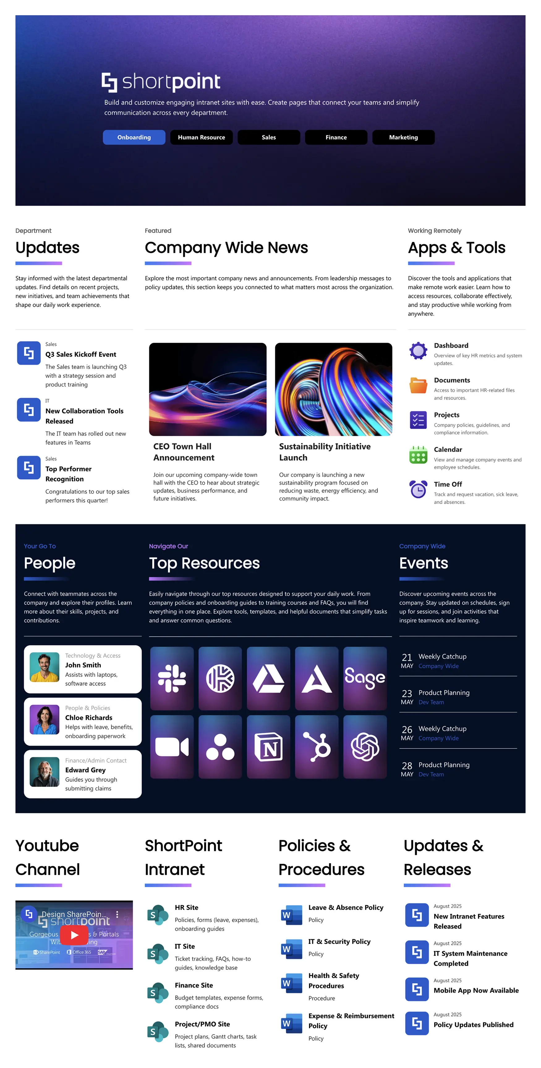
A strong homepage design leads with a branded header stating the intranet's purpose, followed by department-based navigation — tabs like Onboarding, HR, Sales, Finance, and Marketing — that let employees filter the page down to what's relevant to their own team instead of scanning everything. From there, company-wide announcements, department updates, and events each get their own dedicated, scannable zone rather than competing with navigation for attention, and visible dates on the events and release feed keep the page looking current rather than stale.
Two details push this from good to best: a people directory that lists named contacts with a one-line reason to reach them (who to ask about leave, IT access, or expense claims), extending quick-link accessibility beyond tools to people; and a dense but organized tools grid that gives one-click access to daily apps instead of burying them in a menu. It scores well on visual hierarchy, quick-link accessibility, and freshness, and because it's built with ShortPoint's Design Elements, non-technical staff can rearrange any of these zones without code.
See more homepage-specific examples in Best SharePoint Homepage Templates for Your Intranet .
Best design for corporate communications
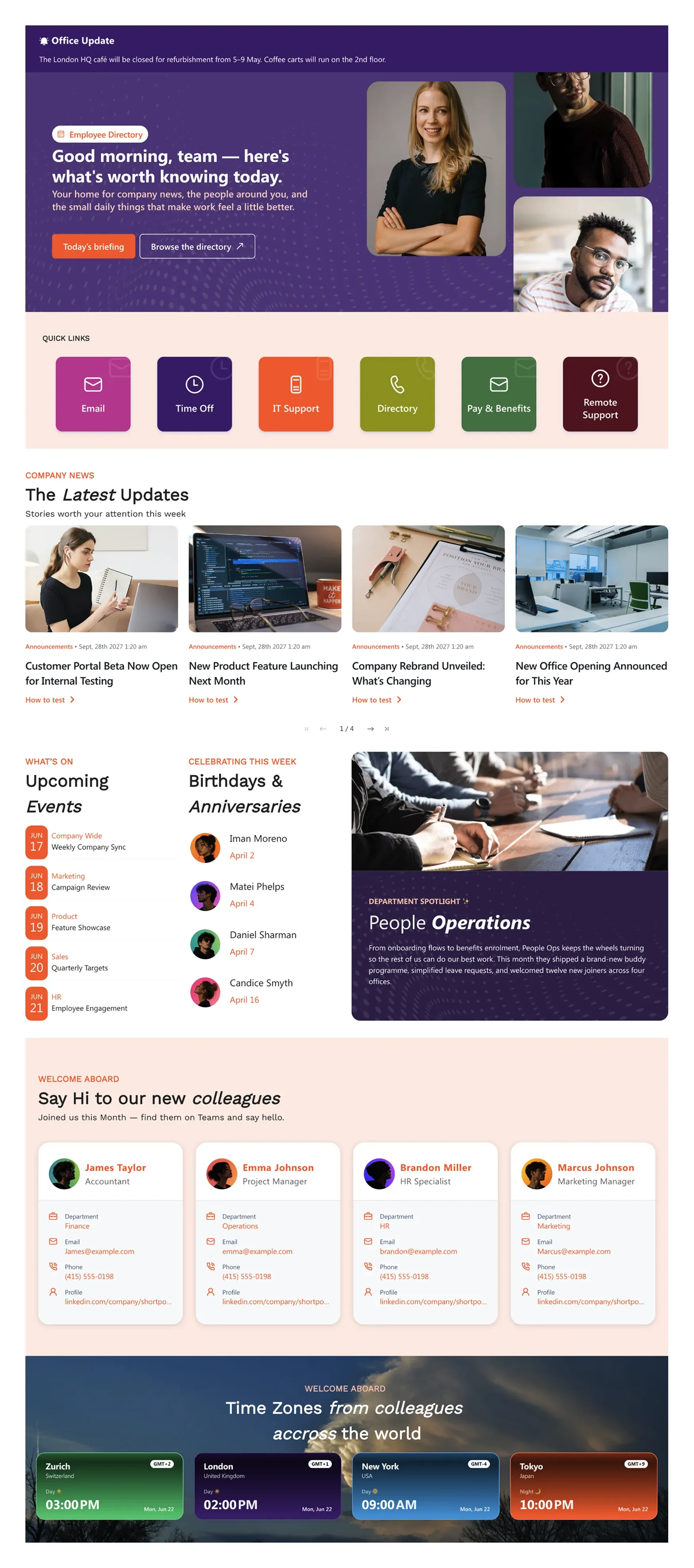
Communication-focused pages need to move a reader from "informed" to "acting" — a company update should stay scannable and end in a clear next step, not just text. This design puts a time-sensitive alert banner above the hero for anything urgent, then follows it with a hero built around two clear calls to action and a quick-links row for common requests like IT support and pay & benefits. The news feed is paginated rather than an endless scroll, and instead of generic filler, the page builds connection through employee-recognition content — birthdays and anniversaries, a department spotlight, and welcome cards for new hires — plus a time-zone strip for distributed teams. Each of these gets its own distinct visual treatment instead of blurring together in one long feed.
See more in Best SharePoint Communication Page Designs for Your Organization .
Best design for a knowledge hub
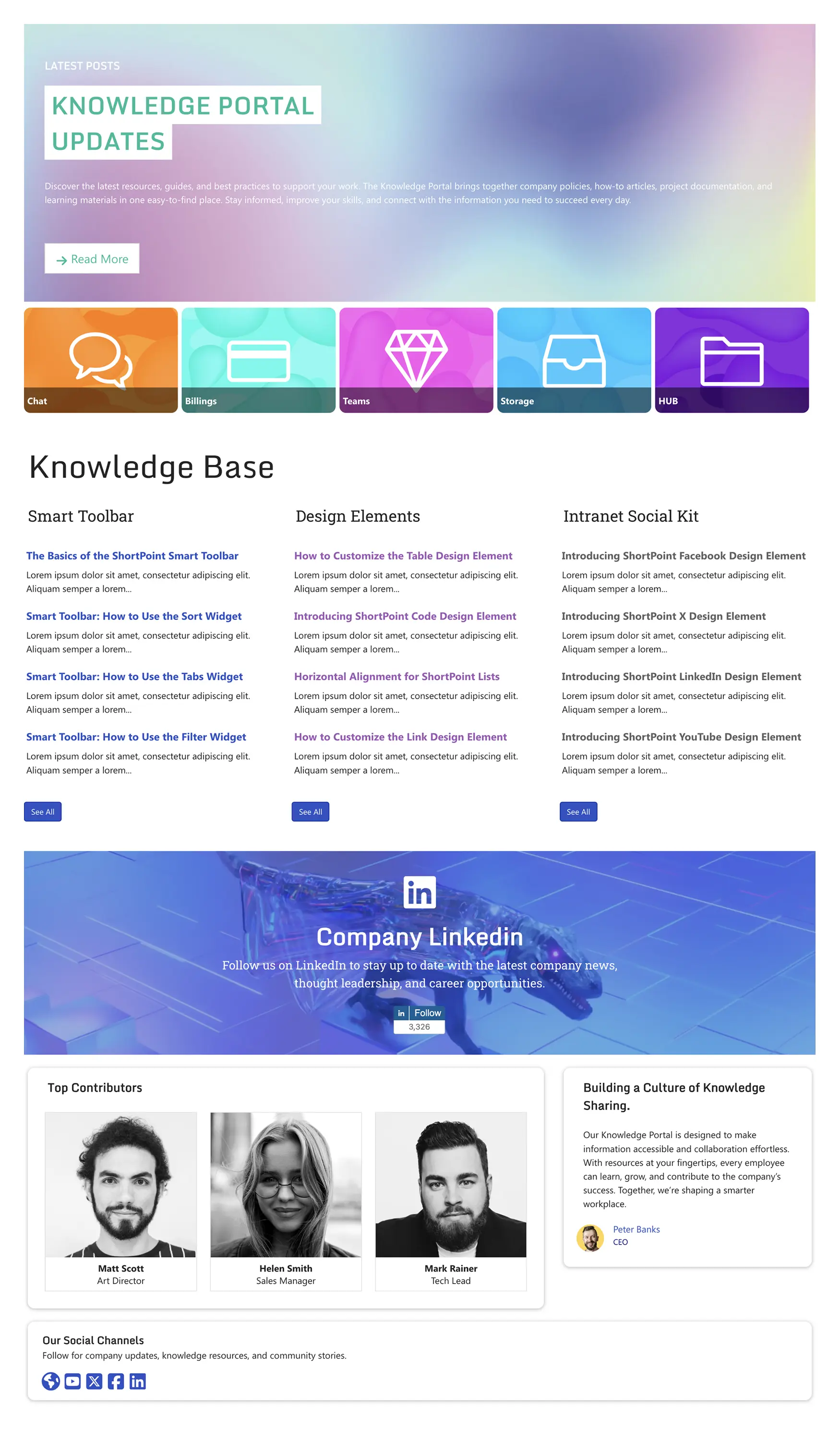
Knowledge-driven intranets live or die on findability, and this design proves it directly: content is grouped into real topic categories rather than generic service tiles, with the most relevant article titles surfaced immediately under each one and a "See All" link to browse the full category when needed. That means employees see actual answers before they ever have to search or click through a folder structure. A separate quick-access row above it (chat, billing, teams, storage, and a hub link) handles daily tool access on its own, so the knowledge base section itself stays focused purely on content. It also builds knowledge-sharing into the page's culture, not just its structure, with a "Top Contributors" section recognizing the people who keep the content current — a detail that frames the knowledge base as a living resource rather than a static archive.
See more in Best SharePoint Templates for Document Management & Knowledge Base .
Best design for onboarding
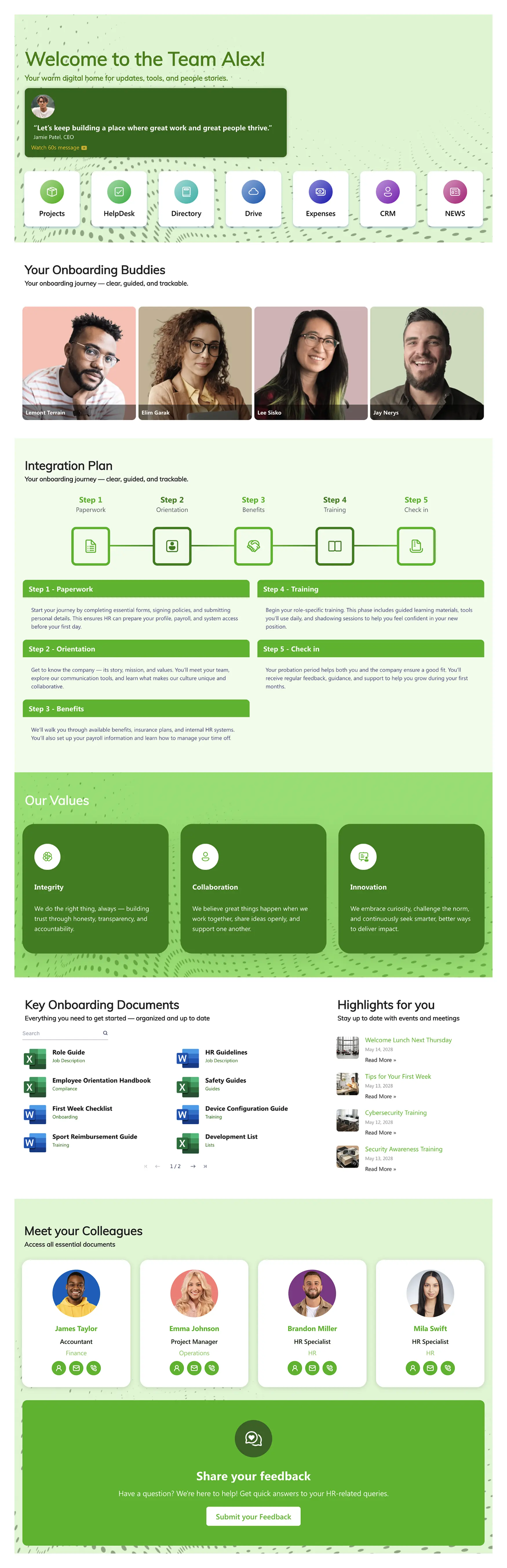
New-hire pages work best as a guided checklist rather than a wall of links, and this design leads with exactly that: a five-step "Integration Plan" (Paperwork, Orientation, Benefits, Training, Check-in) laid out as a visual progress path, so new employees always know what's done and what's next. It backs that structure with real support rather than just documents: a personalized welcome with a short video message from the CEO, named "onboarding buddies" assigned to help the new hire settle in, and a colleague directory beyond the buddy list. Key documents are searchable and grouped by purpose (job descriptions, compliance forms, training guides) instead of being dumped into one list, and a "highlights" feed surfaces first-week events like a welcome lunch alongside required trainings. A feedback prompt at the bottom gives new hires a direct way to ask questions instead of guessing.
See more in Best SharePoint Onboarding Templates for Employee Onboarding .
Best design for a project management hub
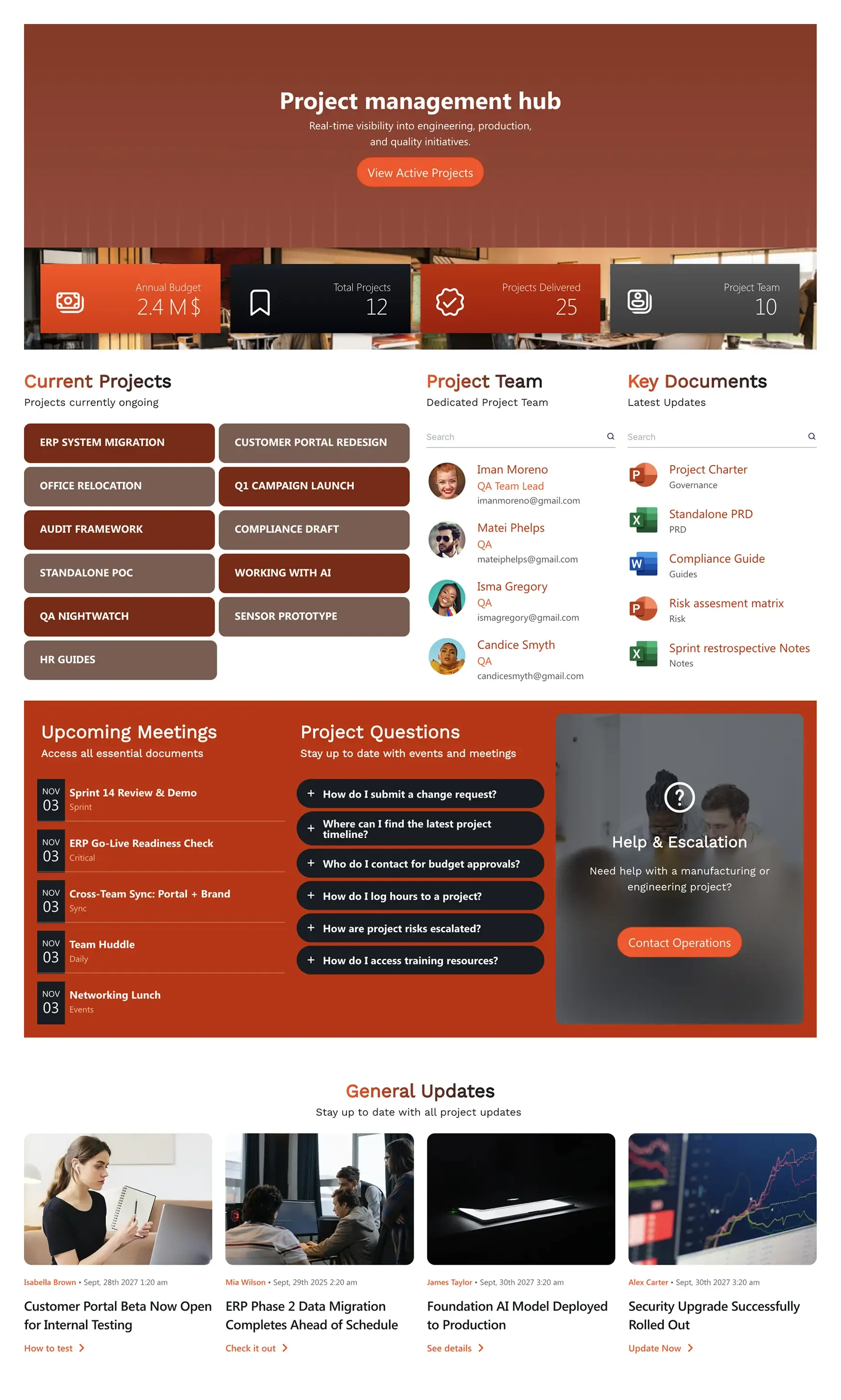
Project pages work best when they answer "where do things stand" before anything else. This design leads with a KPI bar (annual budget, total projects, projects delivered, team size) so anyone landing on the page gets top-line status in seconds, then splits into a project list, a searchable project team panel, and a searchable key-documents panel instead of one long feed. A "Project Questions" accordion handles recurring logistics questions (change requests, timelines, budget approvals, logging hours) directly on the page, and a "Help & Escalation" card gives a clear path to Operations when something falls outside self-service. Project-specific updates keep the news feed relevant to the audience instead of generic company news.
See the SharePoint Project Management Template for the ready-to-use version of this layout.
Build the best SharePoint design with ShortPoint AI Designer
Evaluating every template against the criteria above takes time. ShortPoint AI Designer shortcuts that work by building pages that already reflect the best designs in ShortPoint's library because it's trained on them, not on a blank canvas.
There are three ways to build with it:
- From a prompt — describe the page you want in plain language (e.g. "a homepage for a finance team with quick links, a news feed, and an events calendar"), and AI Designer generates a complete layout.
- From an image — upload a reference image or screenshot of a design you like, and AI Designer builds a matching SharePoint page from it.
- From a template — start with any design from the Templates Library and use AI Designer to edit and refine it rather than building from scratch.
Why this matters for "best": because AI Designer draws on ShortPoint's existing library of proven designs, the pages it produces start with the same hierarchy, quick-link placement, and accessibility patterns covered in the evaluation criteria above already built in, instead of requiring you to check for them after the fact.
For prompt ideas, see SharePoint AI Prompts: 25 Prompts to Build Intranet Pages . For a full walkthrough of the tool, see Introducing ShortPoint AI Designer .
How to apply the best SharePoint designs with ShortPoint
Every example above is achievable without custom development. ShortPoint AI Designer gets you to a first draft fastest. You can begin from a prompt, a reference image, or an existing template. Every design covered above is also available as a ready-to-use starting point in the Templates Library , so none of them have to be built from a blank page. From there, ShortPoint's Page Builder lets you fine-tune layouts visually in Live Mode, Design Elements provide the individual components (quick links, news feeds, image galleries, and more), and Theme Builder applies your brand's colors and fonts across every page in a few clicks.
Once a design is working the way you want, ShortPoint's Copy-Paste feature lets you carry it from one page, or one site, to another, so you don't have to rebuild the same layout twice.
Explore the template library →Bringing it all together
The best SharePoint sites aren't defined by trend or taste. They're defined by whether employees can find what they need quickly, on any device, and whether your team can keep the site updated without a developer on standby. Use the five criteria above to judge any design, start from one of the category examples or a proven template in the library, and let AI Designer handle the first draft so you're refining a strong layout instead of building one from scratch.
New to ShortPoint? Start a risk-free 15-day trial today , no credit card required. Or connect with one of our sales experts to schedule a personalized demo and discover how to build the best SharePoint site designs tailored for your company's needs.
Start your free 15-day trial →Frequently asked questions
Ignite your vision. Install ShortPoint directly on your site, or play in sandbox mode. No credit card required.