What Makes a Good Intranet? Features, Design & Principles That Drive Adoption
This guide covers the features, design principles, and real examples that separate good intranets from forgotten ones. Whether you're building from scratch or redesigning an existing site, these are the fundamentals that matter.
Most intranets fail. Not because the technology is bad or the budget was too small, but because the intranet becomes a digital notice board that employees learn to ignore. It happens gradually — the homepage goes stale, people can't find what they need, and within six months the intranet is something employees visit only when HR sends a mandatory link.
A good intranet is the opposite. It's the first tab employees open in the morning. It's where they find the tools they need, the news that matters, and the people they work with. And building one isn't about chasing features — it's about understanding what actually drives employees to come back.
By Luisa Silva, Growth Manager at ShortPoint • Last Updated: April 9, 2026 • 11 min read
The Features Every Good Intranet Needs
Feature lists can be endless, so let's focus on the ones that consistently show up in intranets with high adoption rates. These aren't nice-to-haves — they're the core capabilities that employees expect from a modern intranet.
Search That Actually Works
If employees can't find what they're looking for within 10 seconds, they'll leave your intranet and send an email instead. Effective intranet search goes beyond basic keyword matching. It should search across pages, documents, news posts, and people. It should surface results ranked by relevance, not by date. And it should handle natural queries — if someone types "how do I submit PTO," the intranet should return the relevant HR page, not a list of every page that contains the word "submit."
On SharePoint, the built-in search is functional but often returns noisy results. Organizations that invest in refining their search experience — through managed metadata, content tagging, and search-enhancing tools — see dramatically higher intranet usage.
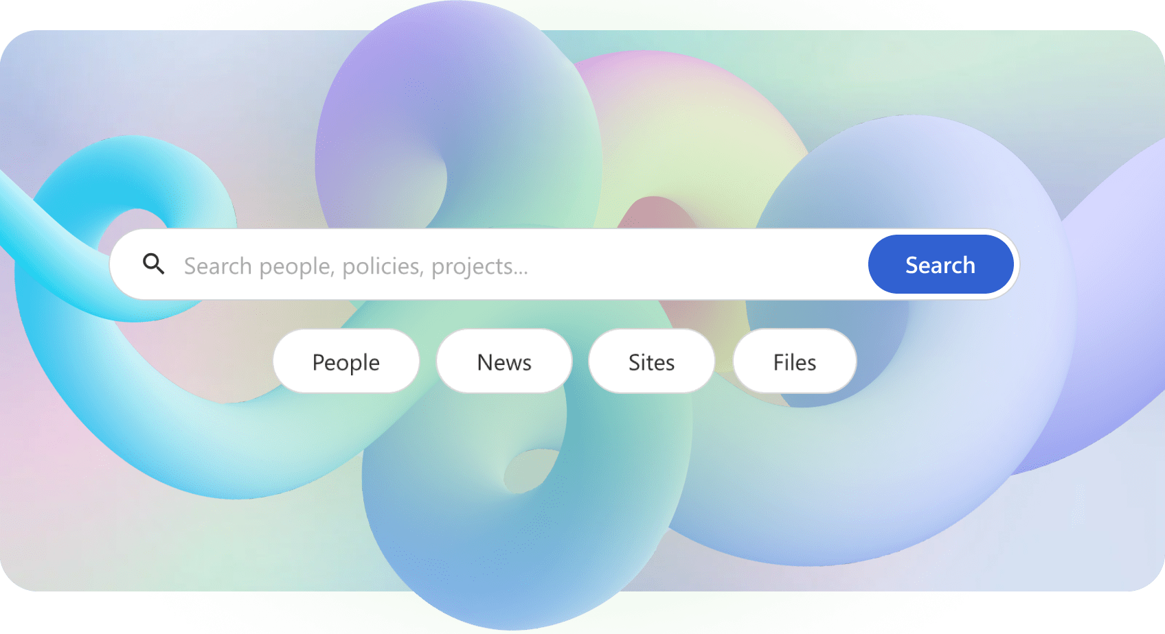
Enhance SharePoint Search — ShortPoint Search Box
Personalized Content
A marketing manager and a warehouse supervisor don't need the same homepage. Good intranets show employees content relevant to their role, location, and department. This means targeted news (the sales team sees sales updates, operations sees operations updates), personalized quick links to the tools each person uses most, and role-specific resource pages.
SharePoint supports audience targeting through Microsoft Entra ID groups, which lets you show or hide specific web parts based on a user's group membership. The more relevant the content, the more employees will return.
Company News and Communication
Internal communication is the backbone of any intranet. Employees need a single, reliable place to find company announcements, leadership updates, policy changes, and team news. The best intranets treat news as a first-class feature — with dedicated news sections on the homepage, the ability for department leads to publish to their teams, and a clear archive so nothing gets lost.
SharePoint News is one of the strongest native features for this purpose. News posts can be published from any site and rolled up across the organization using hub sites and the organizational news feature.
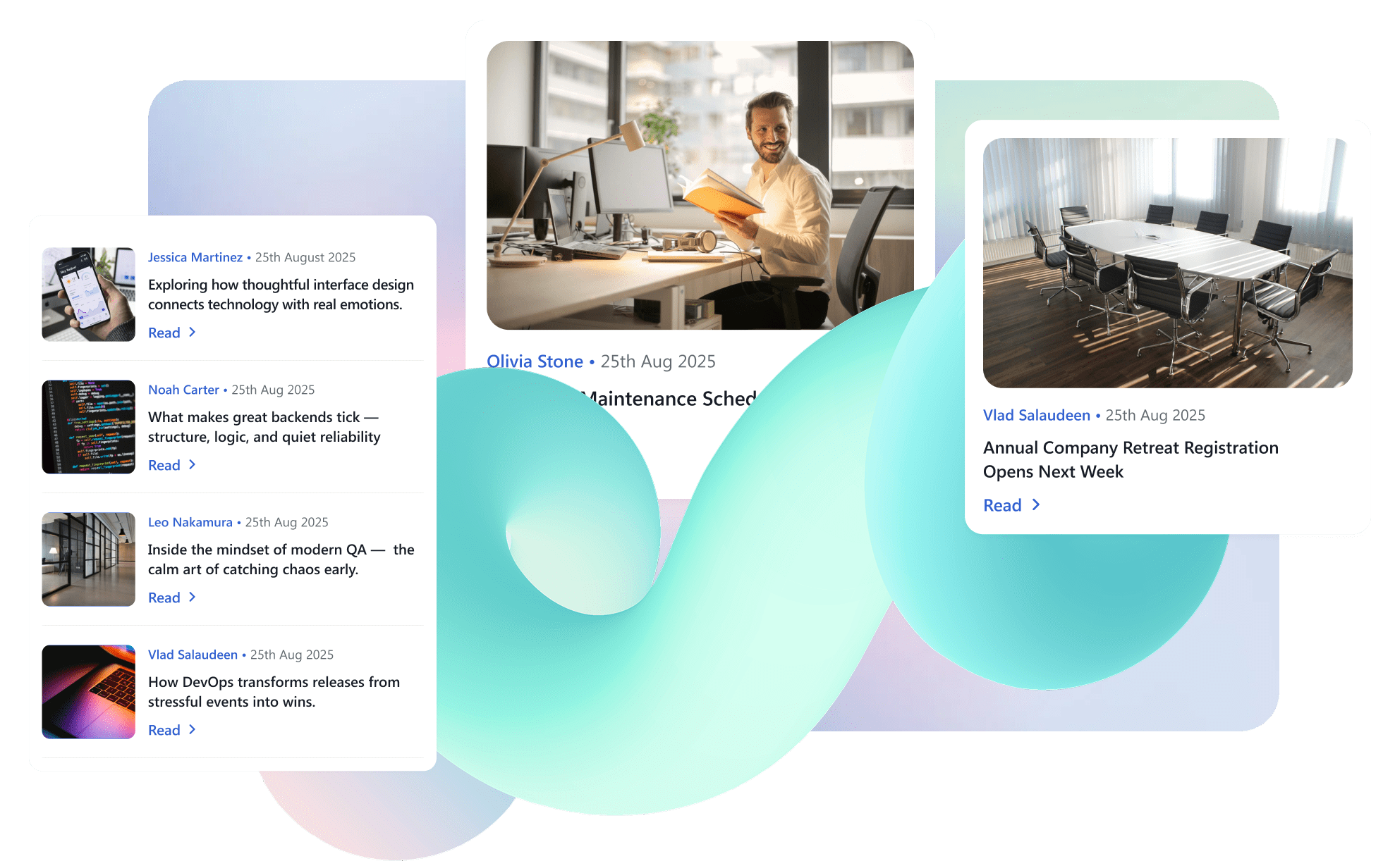
ShortPoint News Cards element — Present news and announcements in an eye-catching card
Quick Links and App Shortcuts
Employees use the same set of tools every day — the HRIS system, expense reporting, time tracking, project management, the IT helpdesk. A good intranet puts shortcuts to all of these tools in one place, usually prominently on the homepage. When the intranet becomes the single starting point for the workday, usage goes up naturally — not because the intranet itself is exciting, but because it's genuinely useful.
View more SharePoint templates examples
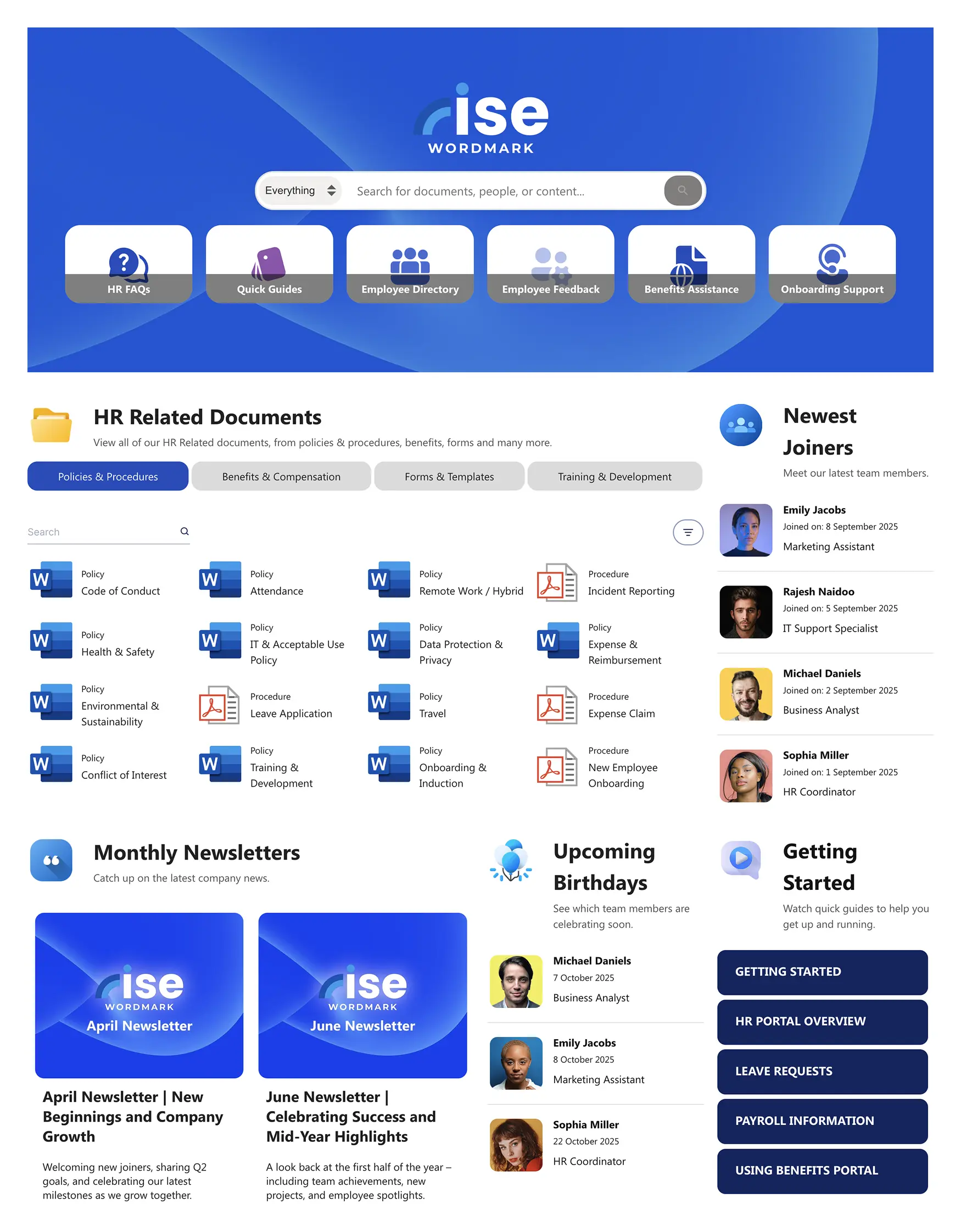
People Directory and Org Chart
Finding the right person in a large organization shouldn't require guessing at email addresses. A searchable people directory with photos, job titles, departments, and contact information is a standard feature of good intranets. Even better: an org chart that visualizes reporting structures, making it easy for employees to understand who does what and who reports to whom.
On SharePoint, you can build a people directory using the People web part and Microsoft Graph data. Tools like ShortPoint's Person Cards element take this further with richer profiles and flexible layout options.

SharePoint People Directory: Build It with ShortPoint Person Cards
Events and Calendar
Employees want to see what's happening — company-wide town halls, team offsites, training sessions, benefits enrollment deadlines. An integrated events section that pulls from shared Outlook calendars keeps the intranet current and gives employees a reason to check it regularly.
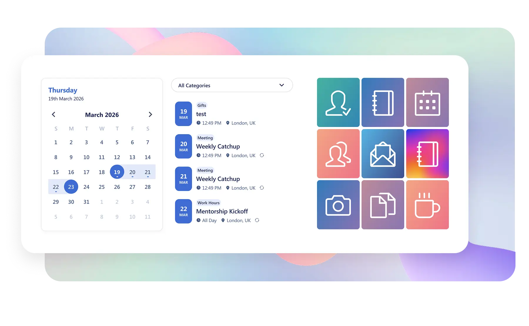
Embed Outlook Calendar in SharePoint — ShortPoint Calendar Card
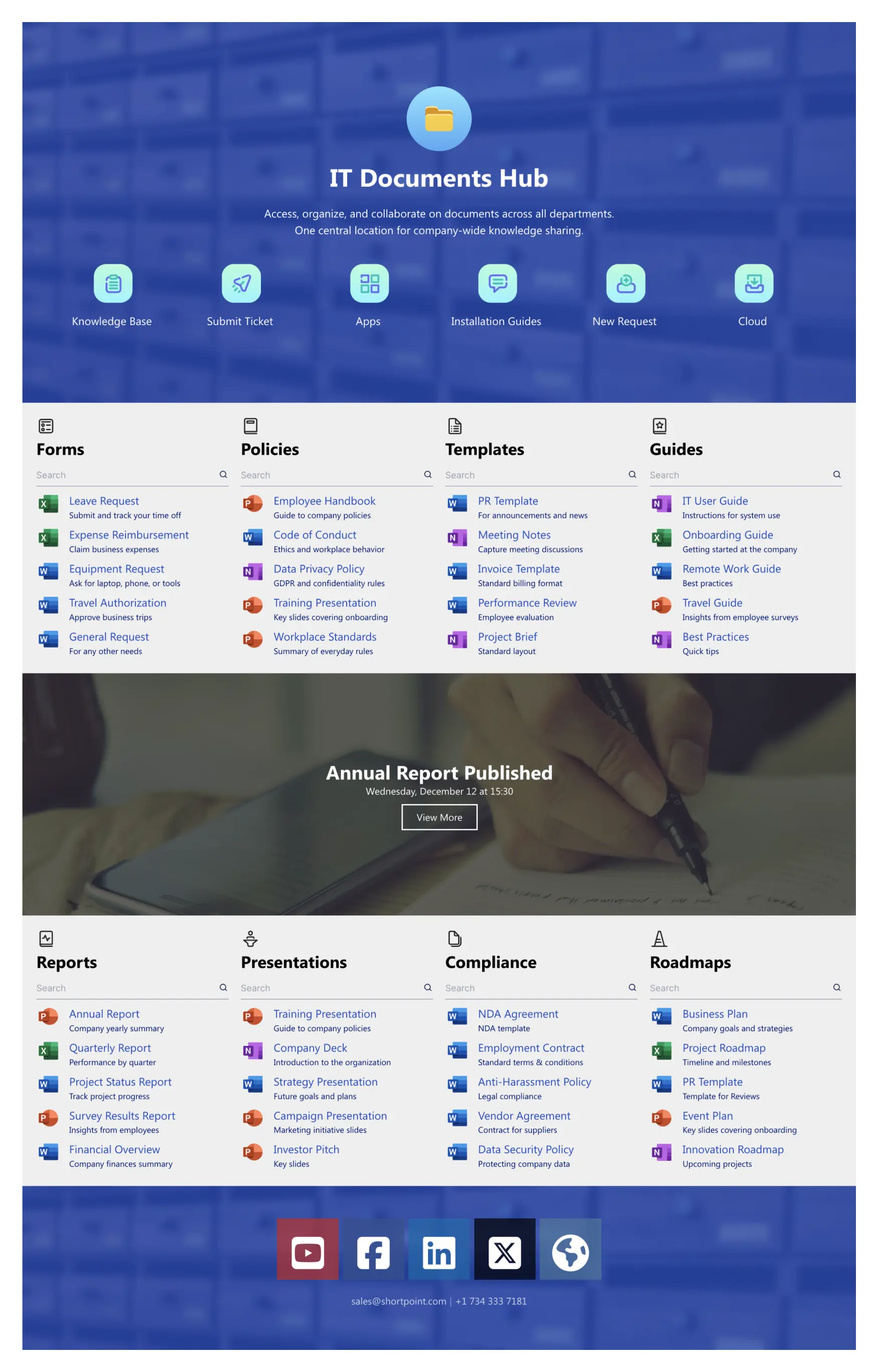
Document Management
Policies, templates, training materials, brand assets — every organization has a library of documents that employees need access to. A good intranet makes these easy to find, well-organized, and always up to date. The worst intranets have documents scattered across dozens of SharePoint libraries with no logical structure. The best ones have a clear document center with folders by department, consistent naming conventions, and prominent search.
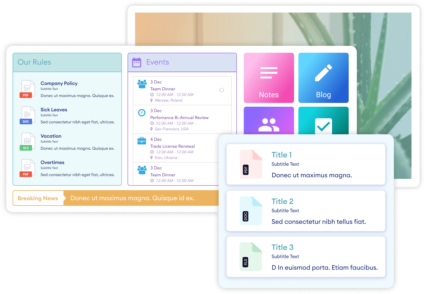
Display Files and Folders in SharePoint — ShortPoint File List
Mobile Access
Remote and frontline workers don't sit in front of a desktop all day. A good intranet works just as well on a phone or tablet. This means responsive page layouts, readable text at mobile screen sizes, and touch-friendly navigation. If 30% or more of your workforce is mobile or deskless, mobile experience isn't a bonus — it's a requirement.
Intranet Design Principles That Actually Matter
Features get you started. Design is what determines whether employees actually enjoy using the intranet. The following principles are drawn from patterns in the most adopted and well-regarded intranet designs.
Put Employee Needs First, Not Company Messaging
The most common intranet mistake is designing the homepage around what leadership wants to broadcast rather than what employees need to do. A massive CEO video banner and three rows of corporate announcements might make the comms team happy, but employees scroll past it to find the link they came for.
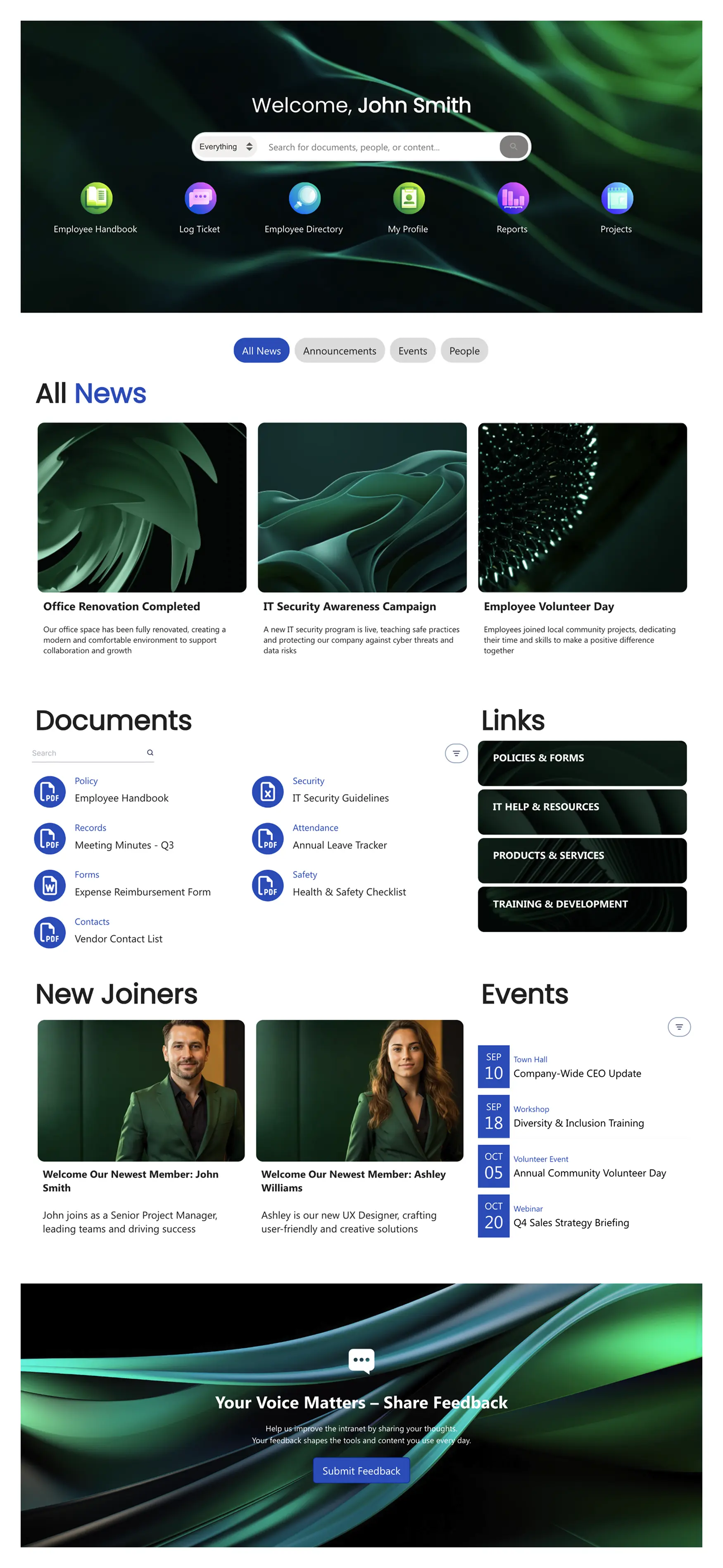
Flip the priority. Place the tools and resources employees use most frequently at the very top of the page — quick links, app shortcuts, and a strong search bar. Then add company news and communications below. Then layer in engagement content like events, recognition, and culture pieces further down. This hierarchy mirrors how employees actually use the intranet: utility first, information second, engagement third.
Keep It Clean and Uncluttered
Visual clutter kills usability. When everything screams for attention, nothing gets it. Good intranet design uses generous white space, clear visual hierarchy, and a limited number of items on any given page.
A practical rule: if your homepage has more than 10-15 distinct content blocks, it probably has too many. Prioritize ruthlessly. Each element on the page should earn its space by being something the majority of employees need or use regularly. Everything else belongs on a linked subpage, not the homepage.
Design for Scanning, Not Reading
Employees don't read intranet pages — they scan them. They look for the link they need, the headline that's relevant, or the button that gets them to their next task. Good intranet design accommodates this by using clear section headings, concise text, visual icons alongside links, and a logical top-to-bottom flow.
Avoid dense paragraphs of text on the homepage. If you need to communicate something detailed, link to a dedicated page for it. The homepage should be scannable in 5 seconds.
Make Navigation Intuitive
If employees need a tutorial to find things on your intranet, the navigation has failed. Good navigation is shallow (3 clicks or fewer to reach any page), consistently structured, and labeled in plain language.
A common structure that works well: a top navigation bar with 5–7 main categories (Home, HR, IT, News, Resources, My Tools, Help), each with a focused dropdown. Avoid jargon in navigation labels — "Employee Services" is clearer than "People Operations Hub." Test your navigation by asking a few employees to find specific pages. If they can't do it in under 15 seconds, simplify.
Use Your Brand — Don't Default to Generic
An intranet that uses default SharePoint colors and the Segoe UI font everywhere sends a subtle message: "We didn't invest in this." Applying your company's brand — colors, fonts, logo, photography style — transforms the intranet from a generic Microsoft tool into something that feels like it belongs to your organization.
On SharePoint, native theming offers limited brand control (a handful of preset color combos and no custom fonts). ShortPoint's Theme Builder solves this — you can apply exact brand colors, upload custom fonts, add your logo, and set layout styles that carry across every page. The difference is immediately noticeable: the site stops looking like "SharePoint" and starts looking like your company.
Make It Visual
Modern intranet design leans heavily on visual elements — icons for quick links rather than plain text lists, card-based layouts for news and resources, hero images that make the homepage feel alive. Employees are conditioned by consumer web experiences to expect visually polished interfaces. An intranet that looks like a 2015 internal wiki will struggle for adoption, even if the content is excellent.
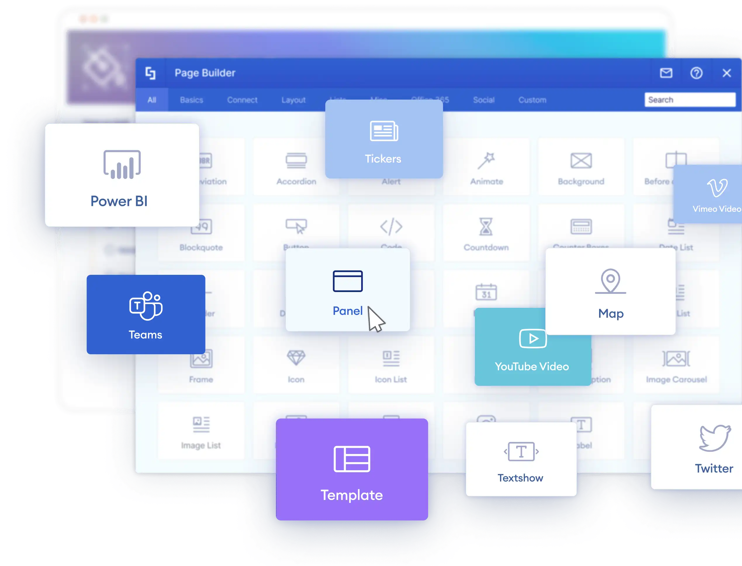
This is one area where native SharePoint is noticeably limited. The out-of-the-box web parts are functional but visually constrained. Design tools like ShortPoint bridge this gap with 60+ design elements — from hero captions and image carousels to icon boxes and content cards — that give you the visual quality of a modern website inside SharePoint.
What Does a Good Intranet Look Like? Real Examples
Principles are useful, but seeing them in action makes the difference. Here are the design patterns that show up repeatedly in well-adopted intranets.
The Homepage That Gets Visited Daily
The strongest intranet homepages follow a consistent structure: a search bar and personalized greeting at the very top, followed by quick links to daily-use tools, then a company news section, then an events calendar and people highlights. The best ones personalize this — showing different quick links and news based on the employee's department or location.
For real examples of this pattern, see company intranet examples built on SharePoint, where each example breaks down the layout decisions and what makes them work.
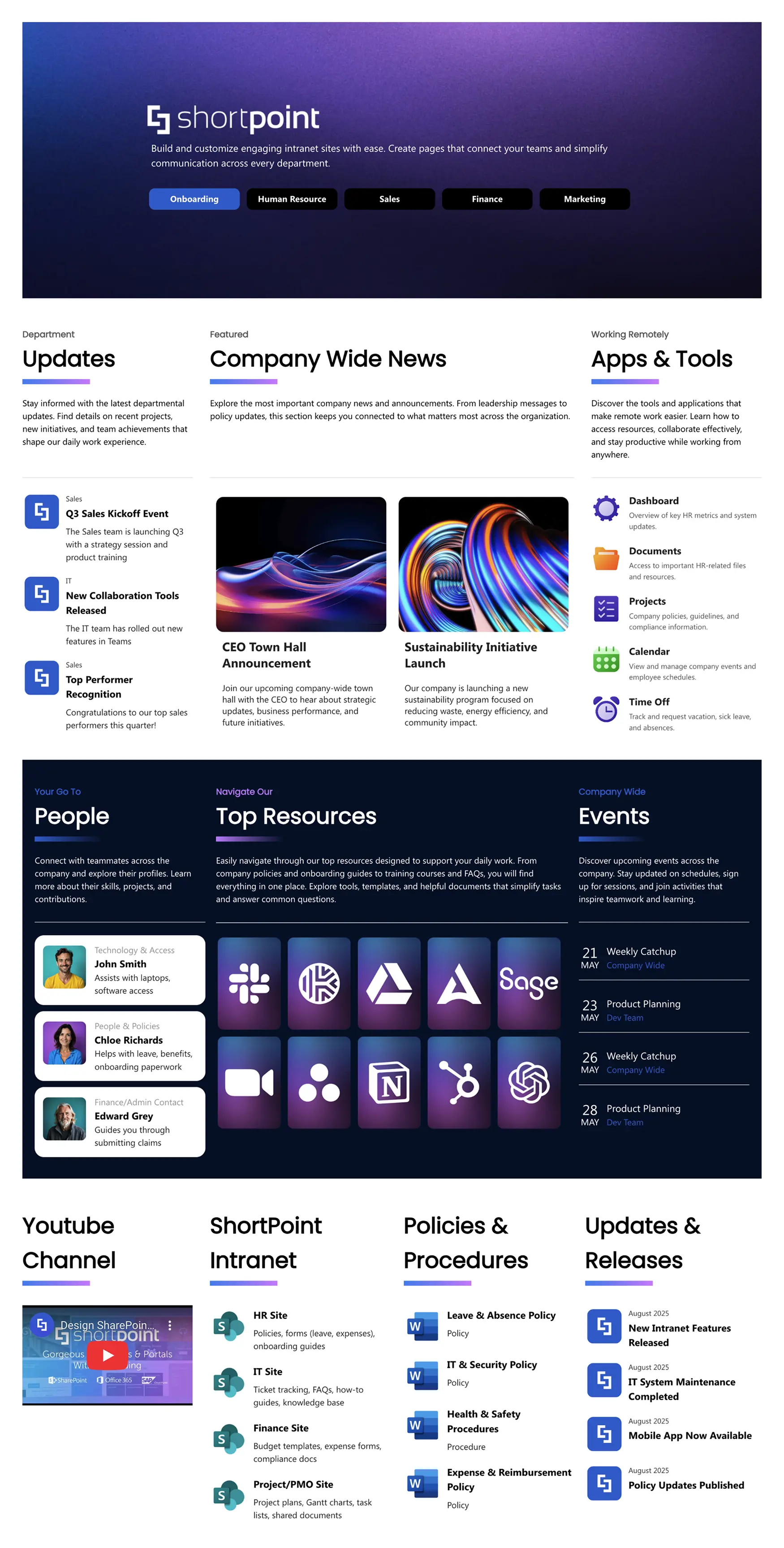
The HR Hub Employees Rely On
HR pages are typically the second-most-visited section of any intranet, after the homepage. The best HR hubs organize content by employee lifecycle stage — pre-boarding, onboarding, day-to-day (benefits, PTO, payroll), and offboarding. They include self-service links (benefits portal, PTO request, pay stubs) prominently at the top, with policies and detailed resources available but not cluttering the primary view.
For HR-specific design inspiration, see HR SharePoint templates.
The Clean Department Site
Department sites work best when they resist the temptation to replicate the homepage. A department site should have a clear hero banner identifying the department, a focused set of quick links to the team's specific tools and resources, a team news or updates section, and a team directory. Keep it narrower in scope and visually consistent with the main intranet branding.
View this SharePoint document management template
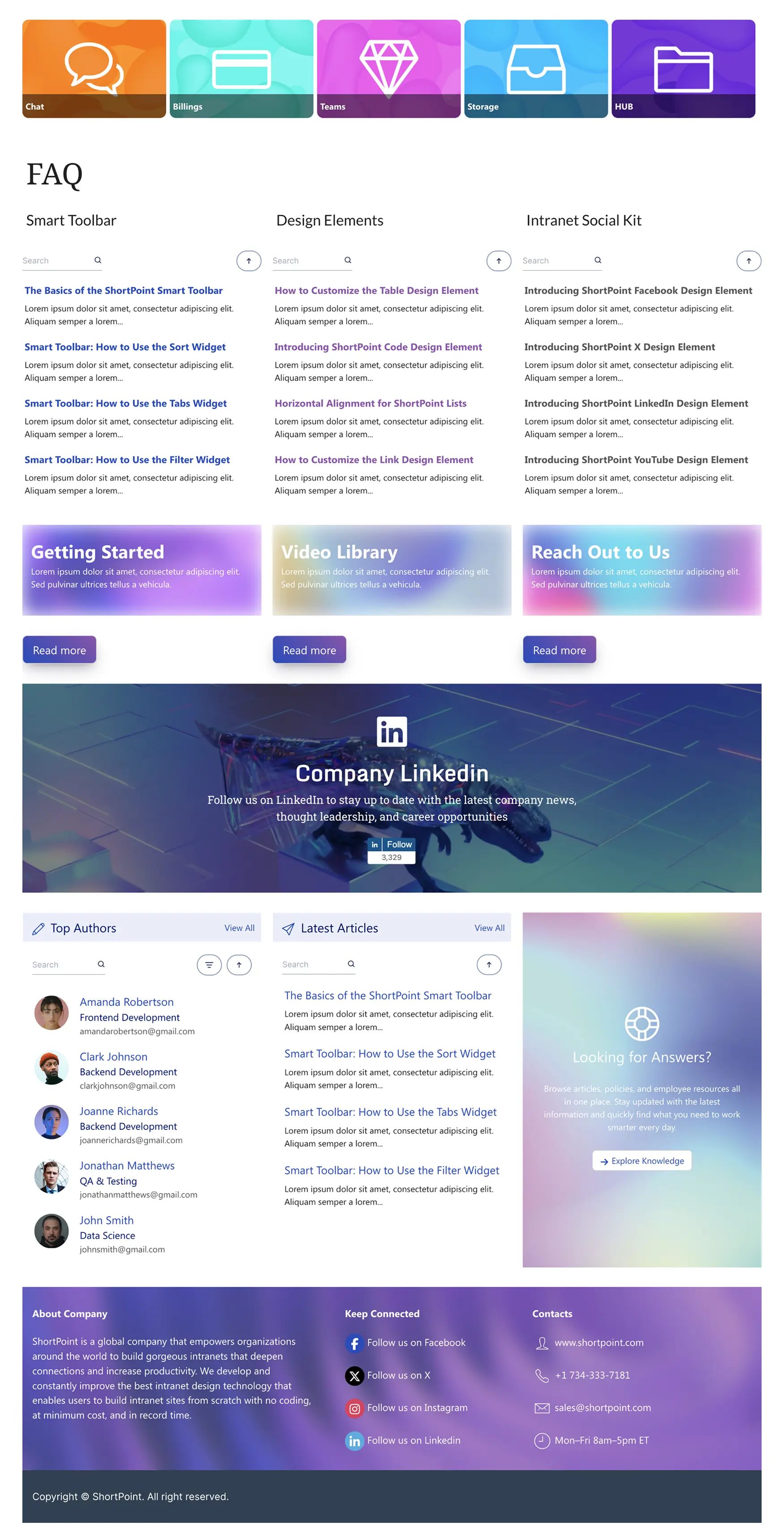
The Knowledge Base That Reduces Support Tickets
A self-service knowledge base (for IT, HR, or operations) can dramatically reduce internal support tickets. The best ones feature a prominent search bar, clear categorization by topic, step-by-step articles with screenshots, and an FAQ section for quick answers. For templates and structure ideas, see SharePoint document management and knowledge base templates .
Modern Intranet Design: What's Changed
Intranet design has evolved significantly over the past few years. If your intranet was built more than two or three years ago, it's likely out of step with current expectations. Here are the shifts that define modern intranet design.
From Desktop-First to Mobile-Ready
With remote work and frontline employees accessing intranets from personal devices, responsive design is now mandatory. Pages need to work at any screen width. Navigation needs to be thumb-friendly. Content blocks need to reflow naturally from multi-column desktop layouts to single-column mobile views.
From Static Pages to Dynamic Content
The old model of an intranet was a collection of static pages that someone in comms updated quarterly. Modern intranets are dynamic — news feeds update automatically, events pull from live calendars, people data syncs from the directory, and KPI dashboards refresh in real time. The intranet becomes a living system rather than a digital filing cabinet.
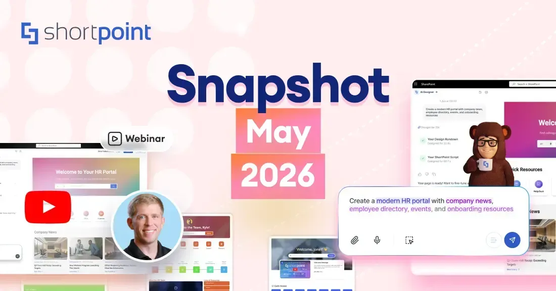
From Manual Building to AI-Assisted Design
The newest evolution in intranet design is AI-powered page building. Instead of manually selecting web parts, configuring layouts, and fighting with alignment, tools like ShortPoint AI Designer let you describe the page you want in plain language and have AI generate it for you. This shifts the bottleneck from "how do I build this page" to "what should this page contain" — which is a much better problem to be solving.
For teams without dedicated designers or developers, AI-assisted design means a professional-looking intranet is achievable in days instead of months. And because it works inside SharePoint, there's no platform migration required.
How to Evaluate Whether Your Intranet Is Good
If you already have an intranet and want to assess whether it's working, here are the signals to look for.
Adoption rate is the most telling metric. What percentage of employees visit the intranet at least once per week? Best-in-class intranets see 70–85% weekly active usage. Below 40% suggests significant problems with content relevance, design, or discoverability.
Search success rate tells you whether employees can find what they need. If search analytics show a high percentage of queries returning zero results, or if employees are searching for the same terms repeatedly, your content structure or search configuration needs work.
Content freshness matters more than people think. Check the date of the most recent news post on your homepage. If it's more than a week old, the intranet looks abandoned — even if the resource pages underneath are solid.
Bounce rate on the homepage reveals whether the homepage is useful. A high bounce rate means employees land on the homepage and leave immediately without navigating deeper. This usually points to a design that doesn't surface the right content quickly enough.
Support ticket volume for questions that could be answered by the intranet (password resets, benefits questions, policy lookups) is an indirect measure. If tickets stay high despite the information being on the intranet, it means employees either can't find it or don't trust it.
Frequently Asked Questions
The most important features are effective search, personalized content, internal news and communications, quick links to daily-use tools, a people directory, events calendar, document management, and mobile access. The specific feature mix depends on your organization's size and needs, but these eight cover the foundation that most employees expect.
A good intranet looks clean, branded, and modern. It uses your company's colors and identity rather than defaulting to generic platform styling. The homepage is scannable, with clear sections for tools, news, and events. Pages use visual elements like icons, cards, and images rather than dense text. And it works well on both desktop and mobile screens.
On SharePoint, the platform itself is included with Microsoft 365 licenses. The variable cost is design and configuration. Building with native SharePoint web parts costs nothing but requires significant time. Using a design tool like ShortPoint (starting from $1,998/year) dramatically reduces build time and delivers a more polished result. Custom development with a SharePoint consultancy typically starts at $15,000–$50,000 or more depending on scope.
Start by diagnosing the problem — is it a content issue (stale or irrelevant), a design issue (cluttered or outdated), or a structure issue (people can't find things)? The three highest-impact quick wins are usually: refreshing the homepage design, improving navigation labels and structure, and adding personalized quick links to the top of the page. For a deeper approach, consider using analytics to understand what employees search for and where they drop off.
Yes — SharePoint is the most widely used intranet platform in the world, and it's capable of powering excellent intranets. Its limitations are primarily in design customization and visual polish, not in core functionality. Tools like ShortPoint fill the design gap with professional templates, advanced design elements, and AI-powered page building, turning SharePoint from a functional platform into a genuinely good-looking intranet.
SharePoint is a platform — a set of tools for building sites, managing documents, and publishing content. An intranet is a concept — a private internal website for an organization's employees. SharePoint is the most common platform used to build intranets, but an intranet can also be built on other platforms. Think of it like the difference between WordPress (a platform) and a blog (a concept).
Building Something Better
A good intranet isn't defined by how many features it has or how expensive it was to build. It's defined by whether employees use it. That comes down to three things: giving people the content they need, making it easy to find, and wrapping it in a design that doesn't feel like a chore to look at.
If you're building a new intranet on SharePoint — or rethinking an existing one — start with the principles above and work forward from there. For ready-made design inspiration, browse 100+ SharePoint templates or start a free trial to see how ShortPoint can help you build an intranet worth visiting.

Luisa Silva
Growth Manager, ShortPoint
Luisa is the Growth Manager at ShortPoint. She translates customer insights and ShortPoint solutions into practical, no-code guides for SharePoint and Microsoft 365 intranets. Focusing on intranet design, HR, knowledge hubs, and internal comms, her work is all about helping you achieve faster launches and higher adoption rates.
Ignite your vision. Install ShortPoint directly on your site, or play in sandbox mode. No credit card required.